Book/Magazine Covers (All) · Book/Magazine Covers (Jones) · Illustration Art · Jeffrey "Jeff" Catherine Jones · Look Here · N. C. Wyeth

Look Here: The cavalcade of Jones covers continues…

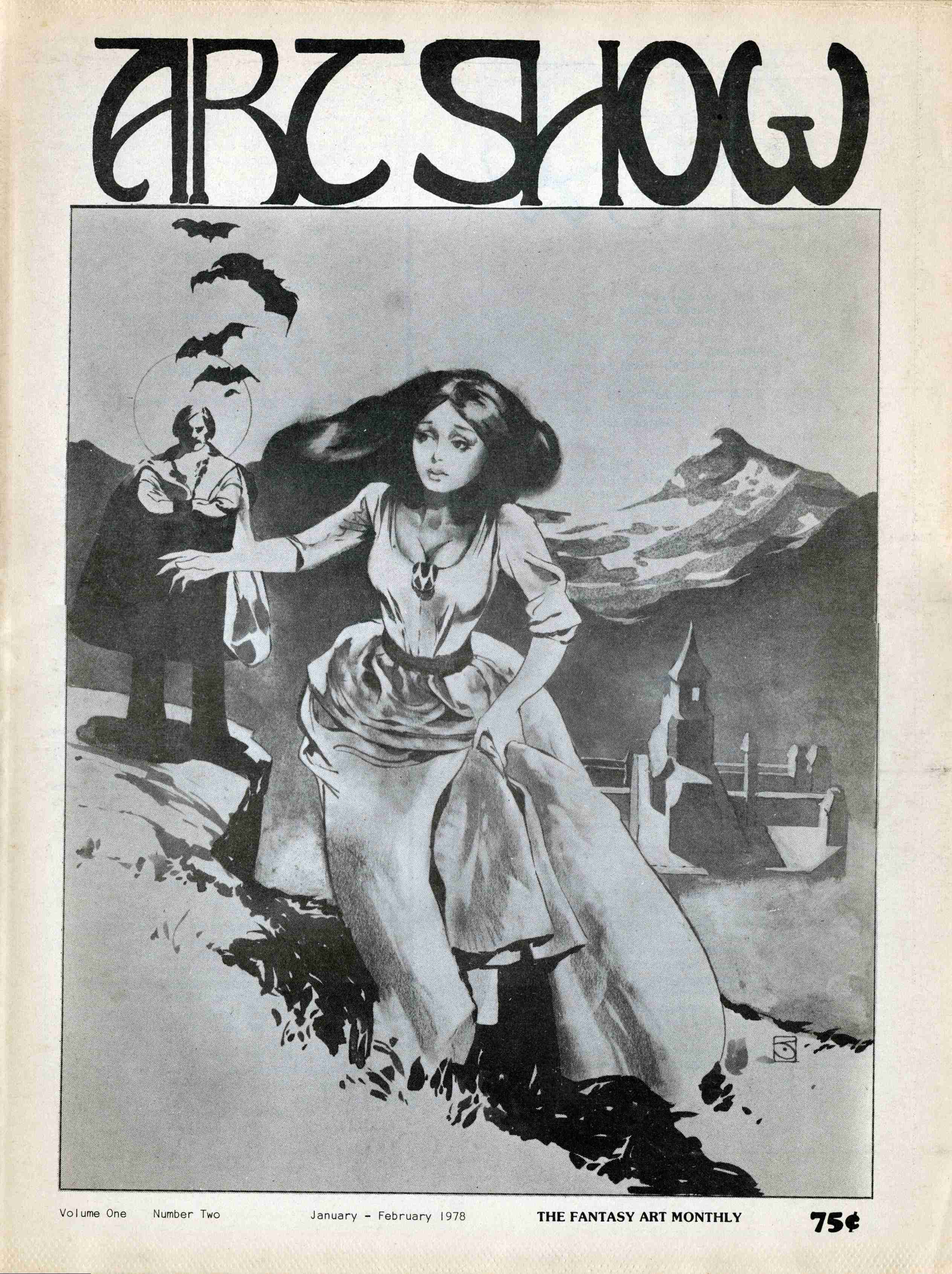
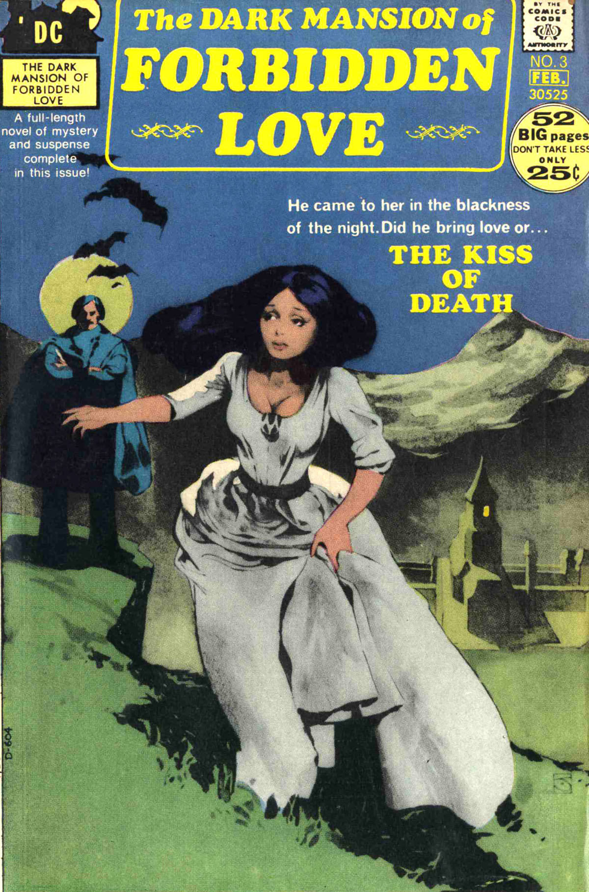
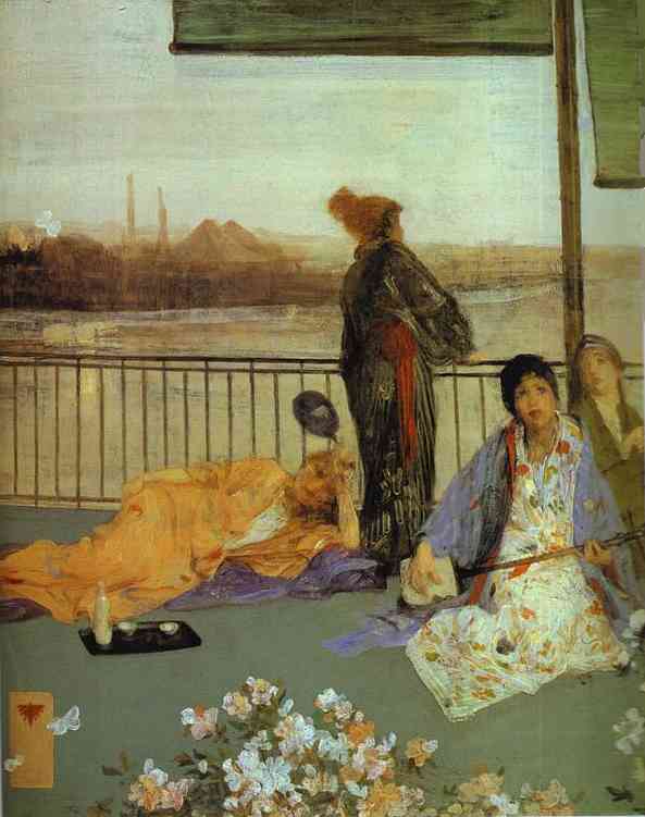
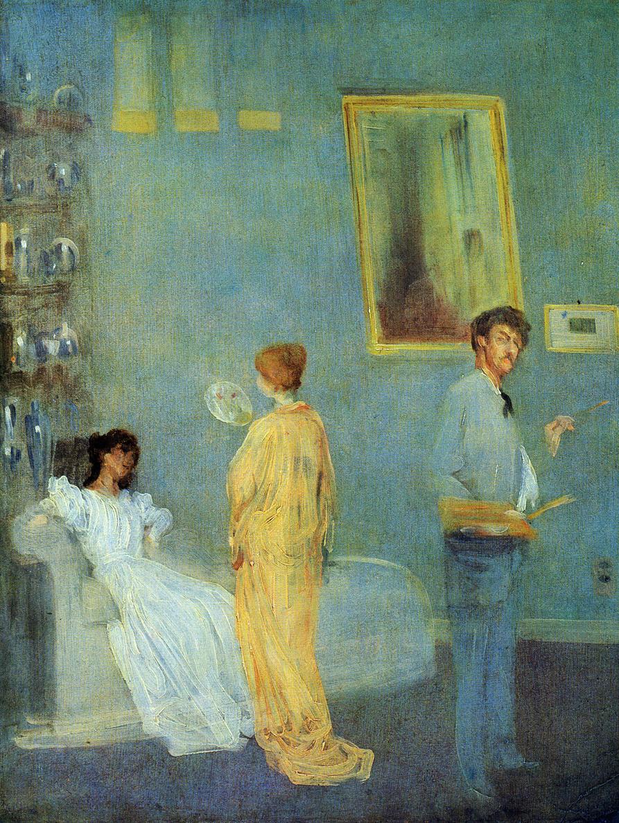
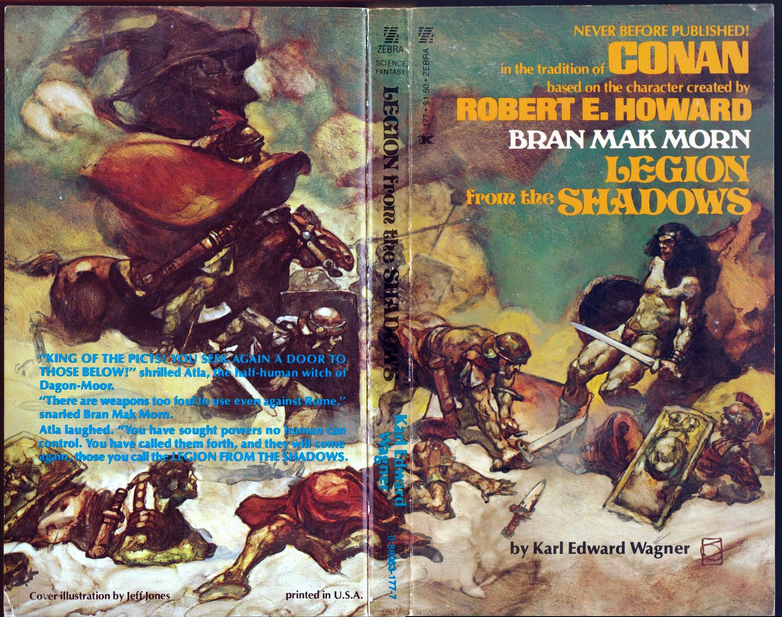
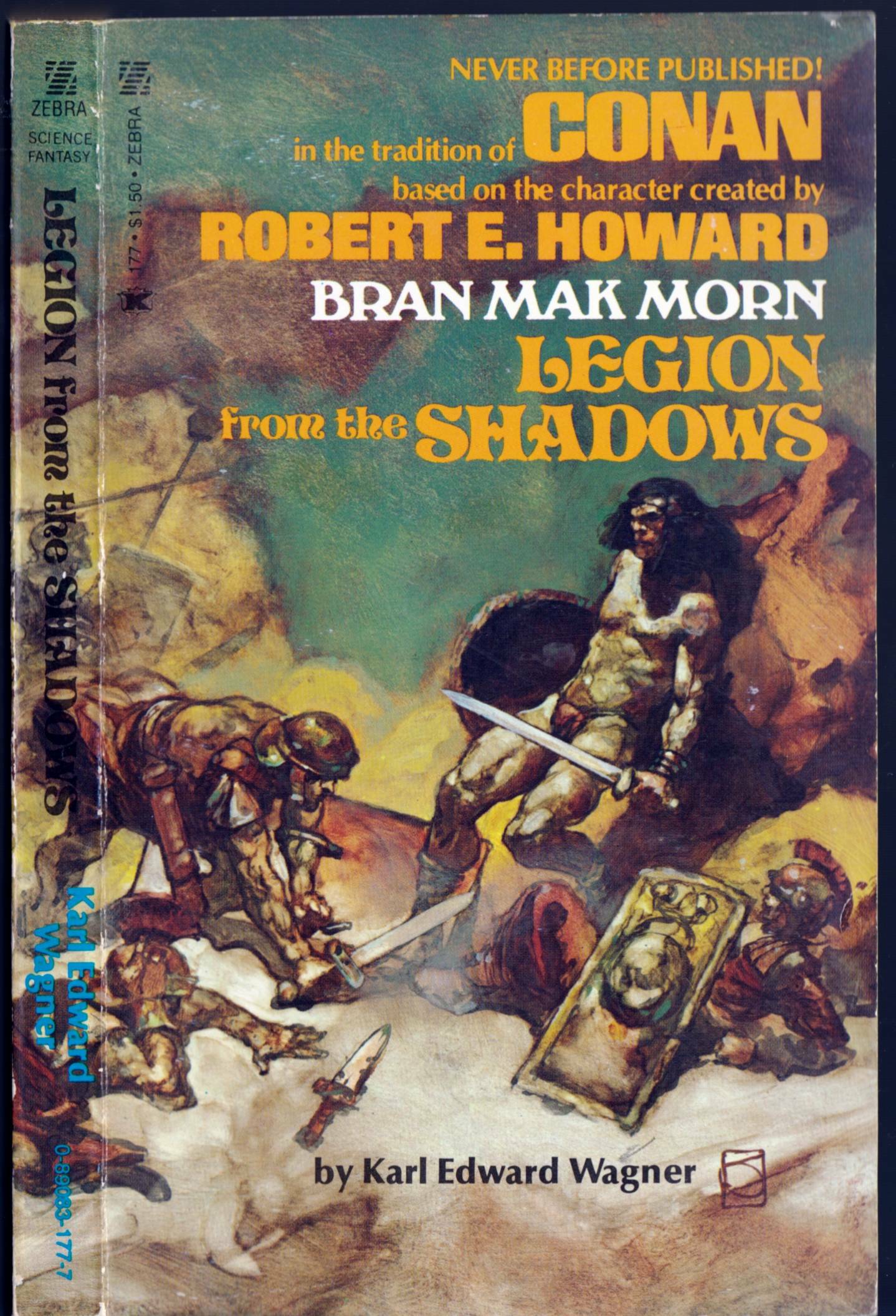
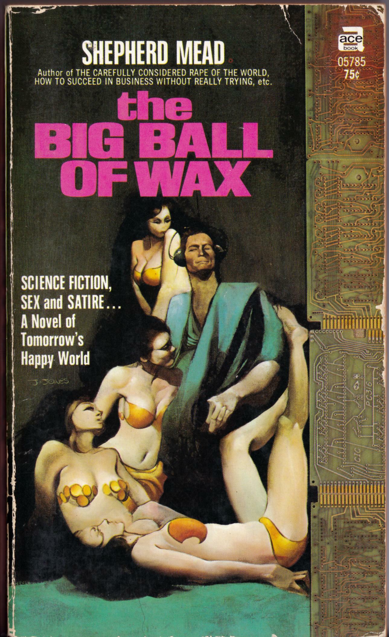
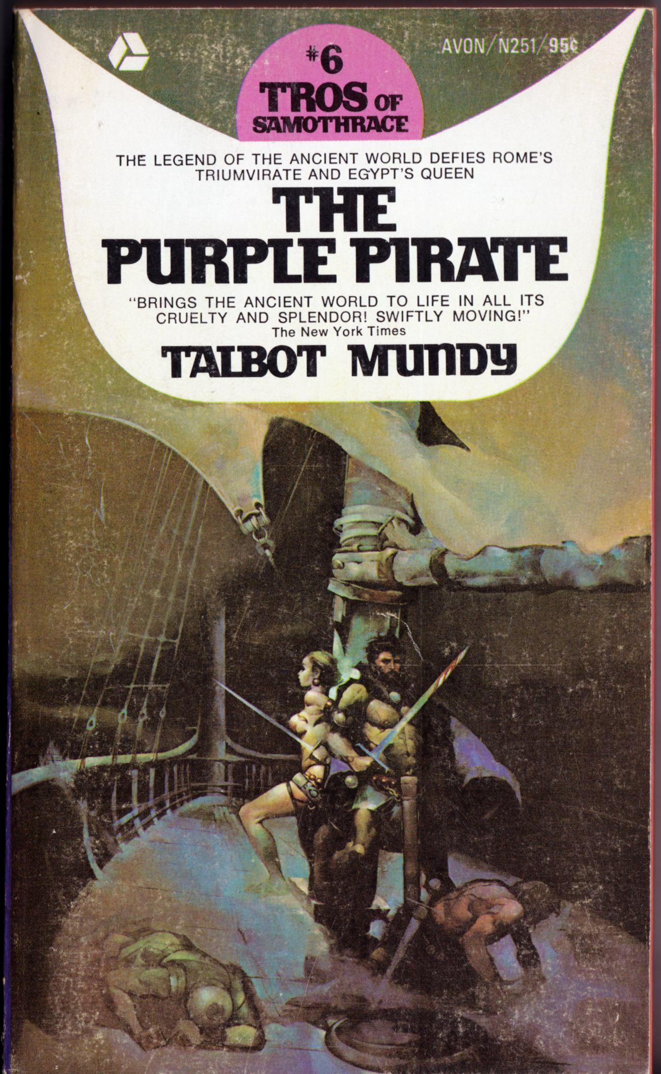
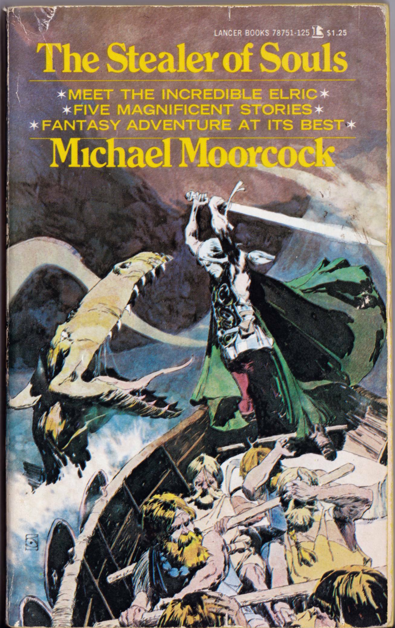
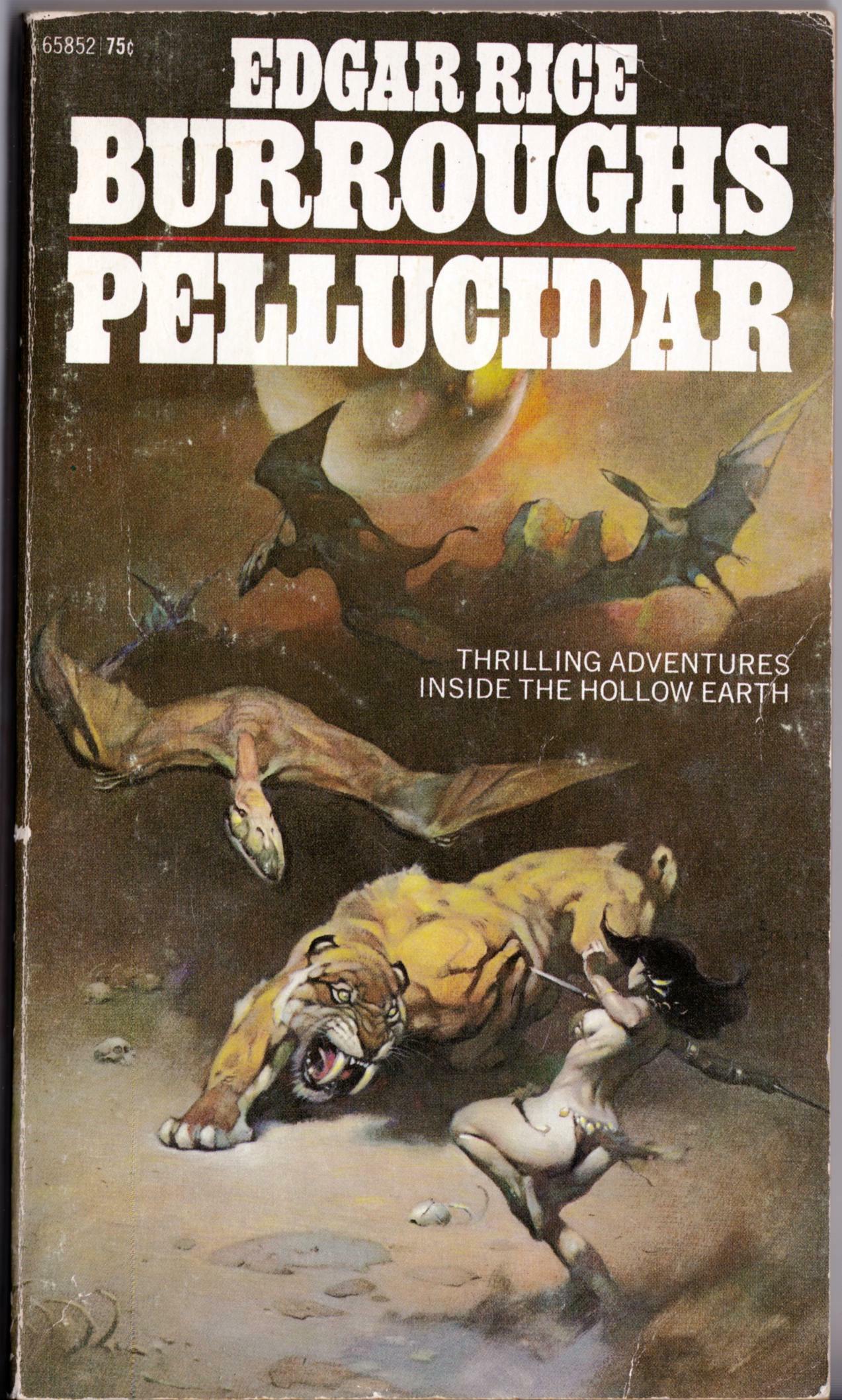
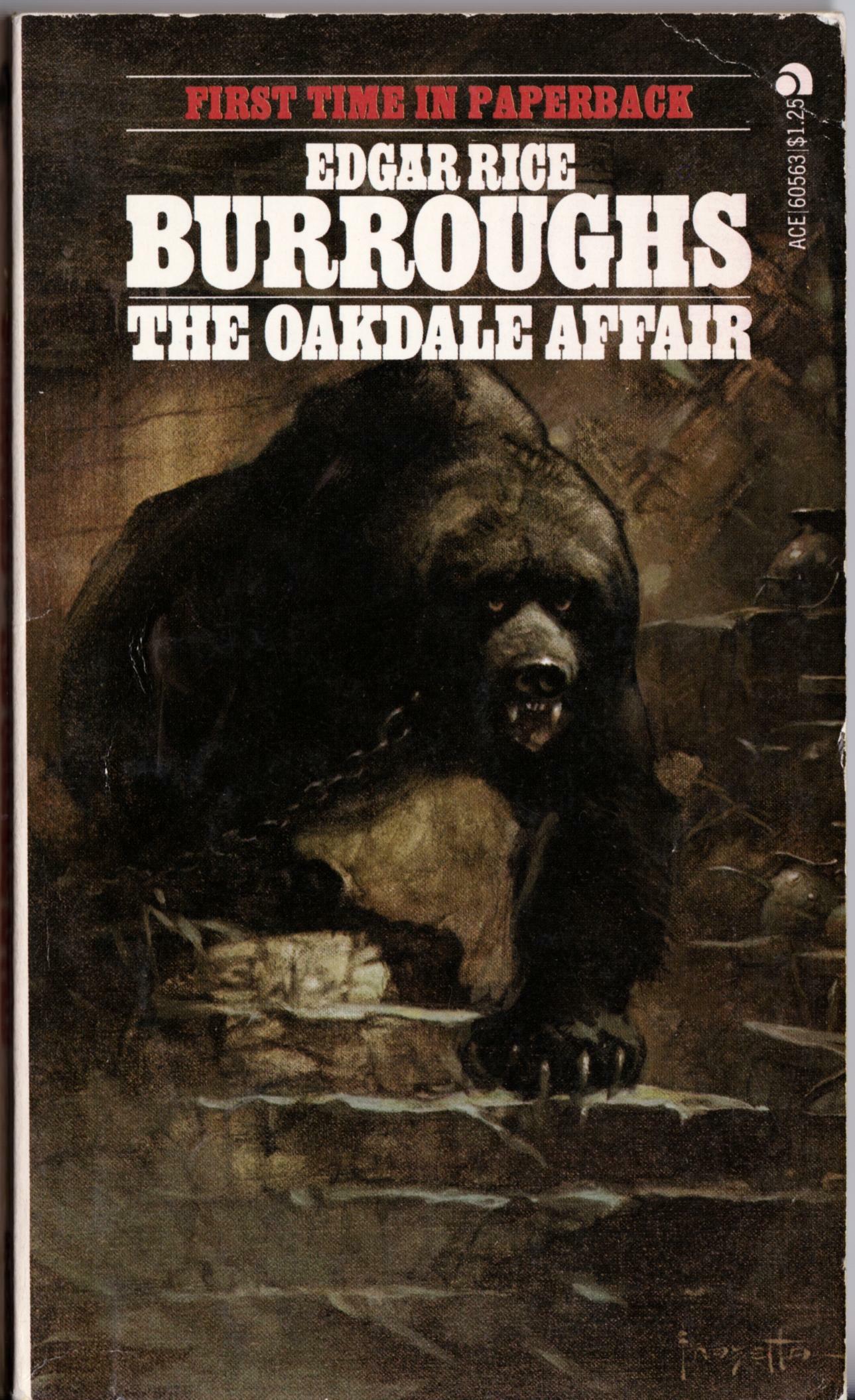
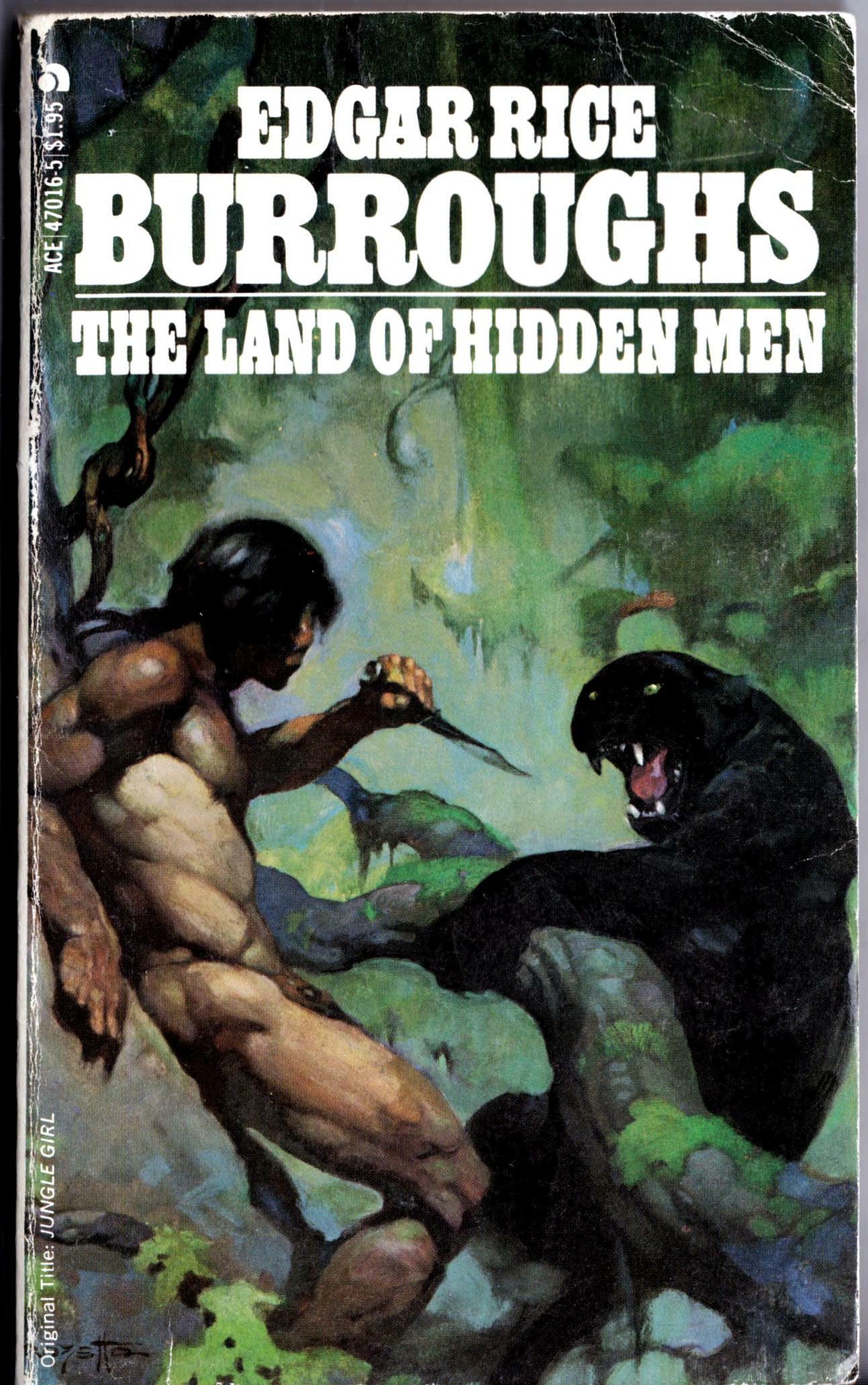
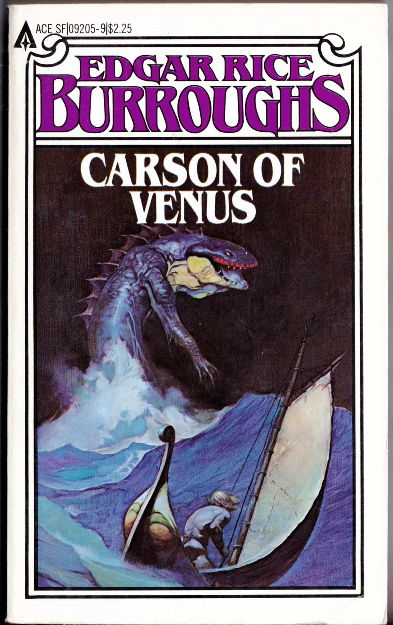
Here are three more covers with art by Jeffrey Jones, scanned from the copies I have on hand at RCN headquarters here in the Queen City and posted below in order of publication:

[CLICK IMAGES TO ENLARGE]

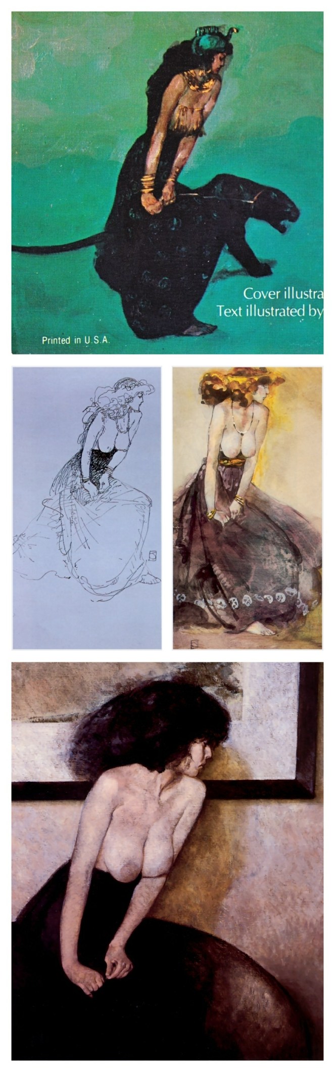
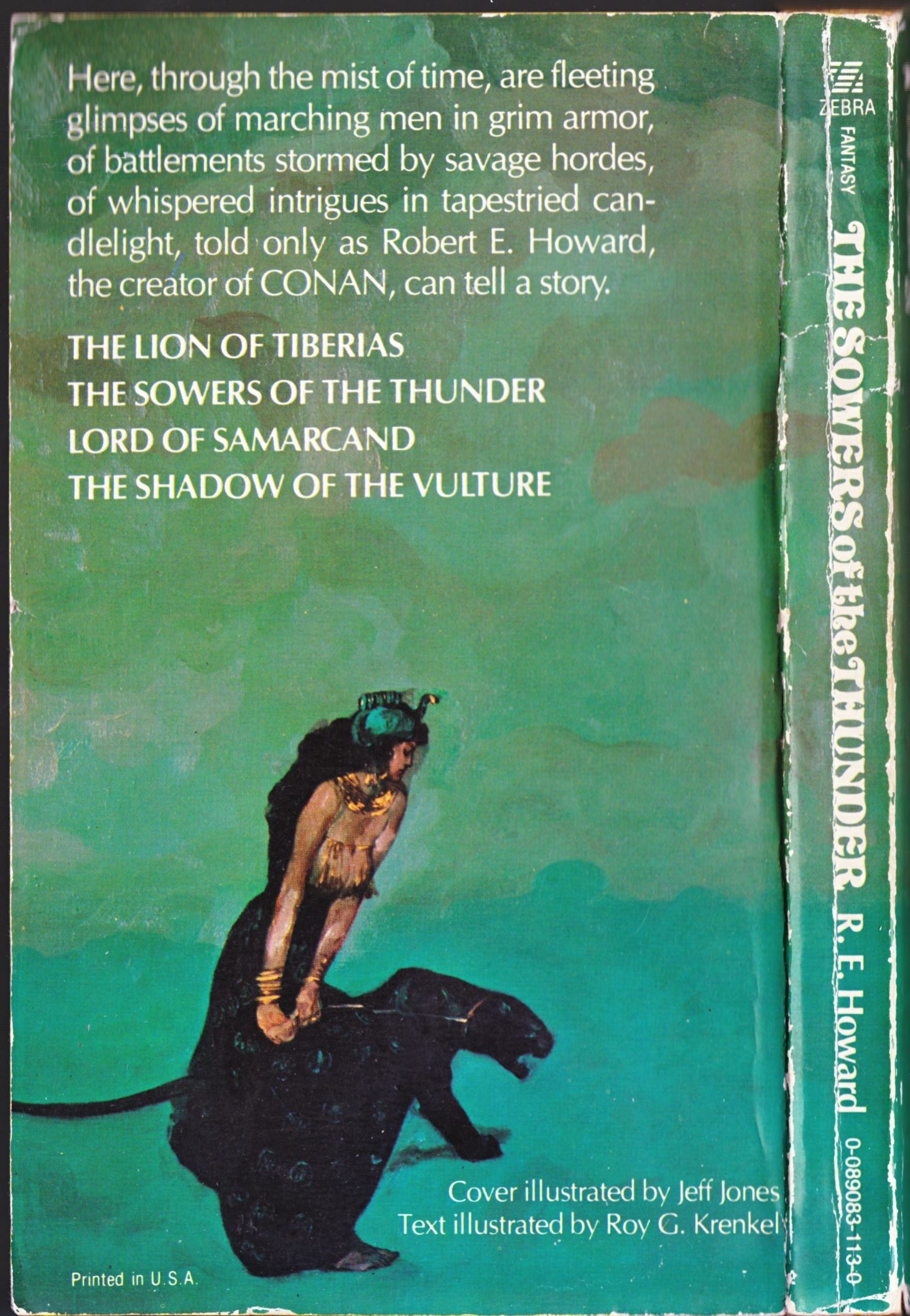
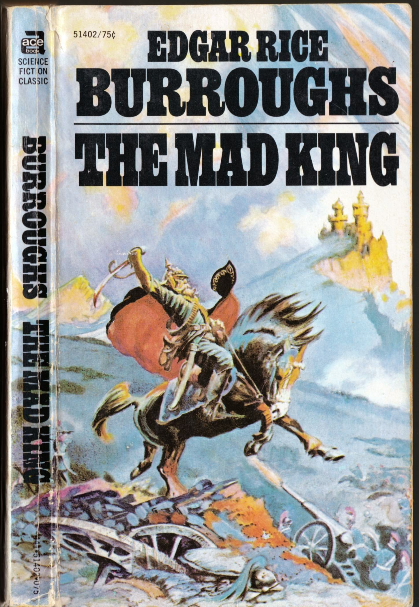
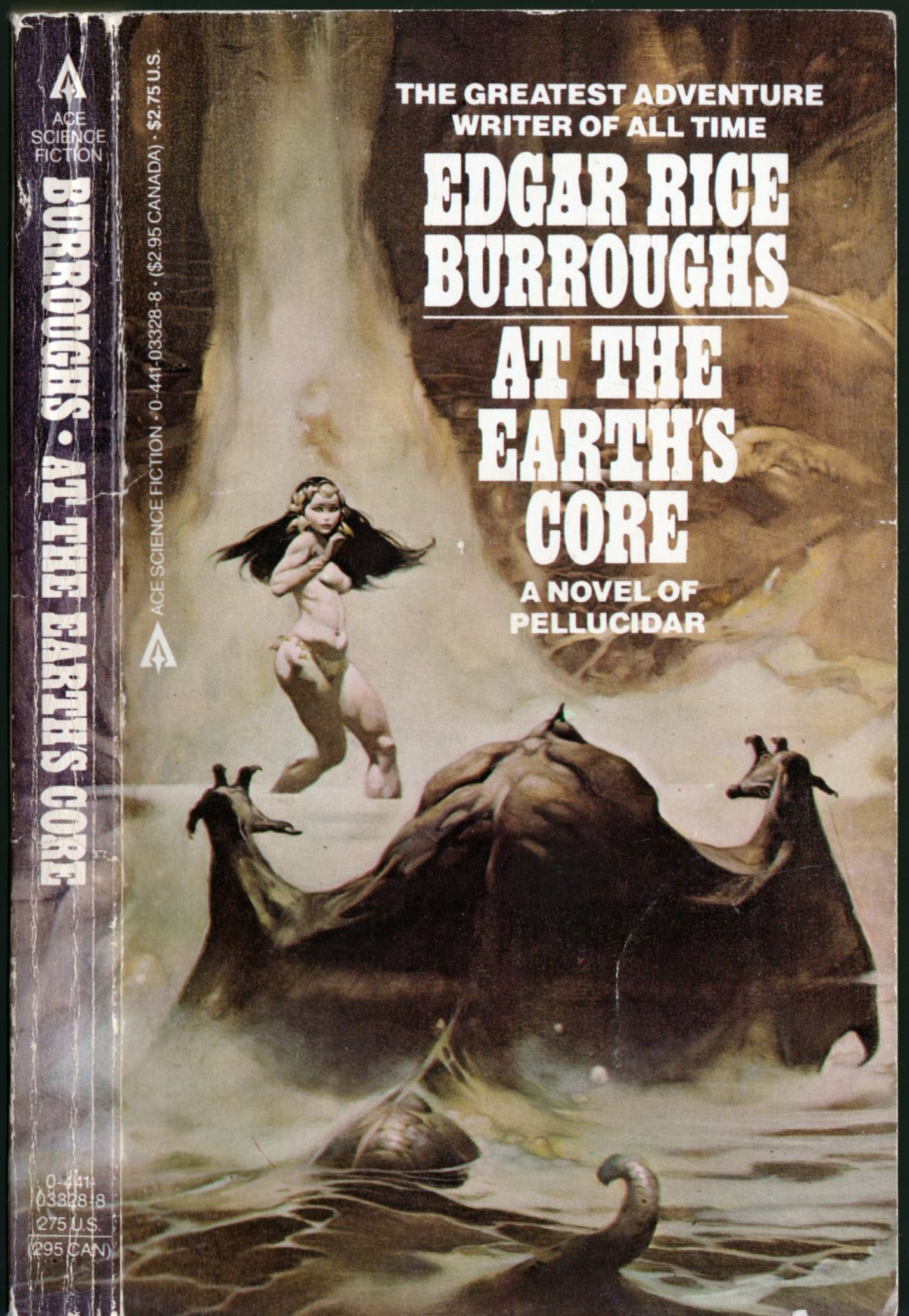
You can see the photo reference for the first cover — which, in terms of draughtsmanship and painting technique, I would describe as the weakest of the three, though I do find the composition interesting — on Jeffrey Jones’s official Web site. It’s the first image on this page, right beside the figure reference for the painting Age of Innocence.

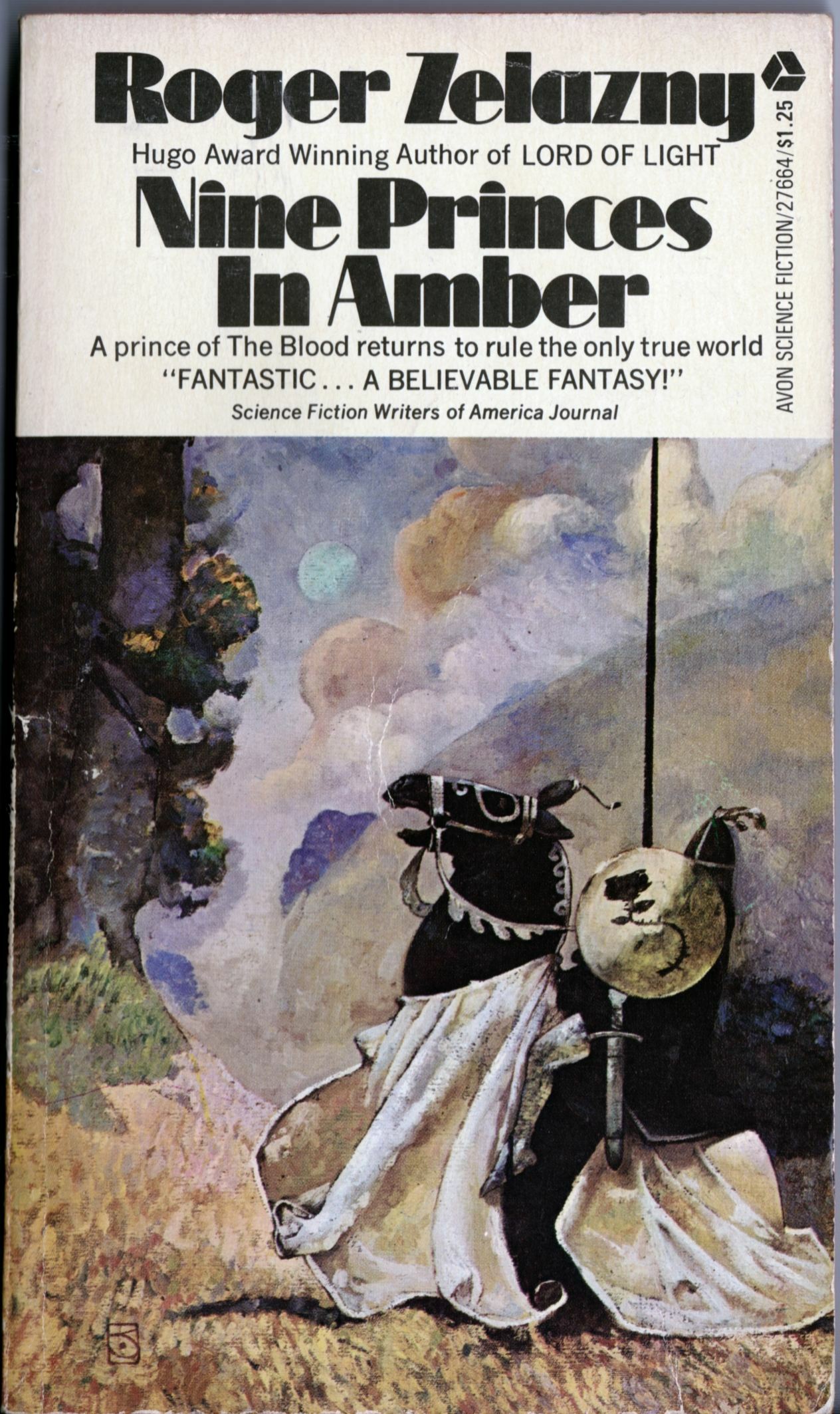
The N. C. Wyeth influence is pretty obvious in Jones’s Nine Princes cover — see, for instance, Wyeth’s paintings for Robin Hood, etc. Years later, Jones revisited the idea of the knight on horseback in his Game of Thrones painting. Notice how the Wyeth influence is no longer right on the surface in the later painting but has been absorbed and transformed into a style that is less about trying on techniques and motifs like pieces of clothing and more about the pleasure of manipulating and thinking in paint.

Keywords: Day of the Beasts, The Dirdir, Nine Princes in Amber.

Bill Sienkiewicz · Comics · Fernando Fernandez · Here, Read · Look Here

Look Here, Read: “The Circles Trilogy” by Fernando Fernandez

Here’s a 10-page story by Spanish comics artist and illustrator Fernando Fernandez that was published in the collection, Son of Heavy Metal, in 1984:

Although I wish the story amounted to more than a poorly thought out variation on Kubrick’s 2001: A Space Odyssey, I do admire how the bold contrasts and the variety of illustration techniques on display here give the story such an opulent, even decadent, feeling. As I recall, several other Spanish artists, including fan-favourite Jose Gonzalez (1939–2009), used to switch back and forth between mediums in the stories they drew for Vampirella, although in black and white, the effect is somewhat different.

In a couple of spots, Fernandez’s work reminds me of Bill Sienkiewicz’s painted comics, but I have no idea whether Sienkiewicz would count Fernandez as an influence. Maybe, maybe not.

———-

Born in Spain on 07 February 1940, Fernando Fernandez passed away in Barcelona this past summer, on 09 August 2010, at the age of 70.

Comics · Here, Read · Look Here · M. K. Brown

Look Here, Read: “Self Portrait” by M. K. Brown

From Arcade volume 1, number 5 (Spring 1976), here’s a comic two-page comic by the incomparable M. K. Brown:

Click here to read “Self-Portrait” in colour online. Lots of other M. K. Brown comics on that site as well, so be sure to take a look around! You won’t regret it.

I went looking for a book collection of M. K. Brown’s comics to light up my life, but I couldn’t find one. My conclusion: this is not the best of all possible worlds.

Connections · Drawings and Sketches (Jones) · Illustration Art · Jeffrey "Jeff" Catherine Jones · Look Here

Look Here: Four variations on a “meaningless gesture,” by Jeffrey Jones

This post is a sequel to a previous effort that featured two Zebra-Kensington REH covers, with art by Jeffrey Jones (as usual, click the image below to view a larger version):

jeffrey-jones_variations-on-a-meaningless-gesture

“After a few years in NYC a friend of mine, a great artist, much older than me, the late Roy G. Krenkel, told me that I was the Master of the Meaningless Gesture. Well, I do this in my art because I don’t want to tell anyone anything. Also in my words, like my poem. I want the people to bring themselves to the work, based on their own experience.”
— Jeffrey Jones, autobiography


Book/Magazine Covers (All) · Book/Magazine Covers (Jones) · Ephemera (Jones) · Illustration Art · Jeffrey "Jeff" Catherine Jones · Look Here

Look Here: “Colour Your Dreams” and more by Jeffrey Jones

When I win, you win:

No, I didn’t win that copy of Dark Mansion of Forbidden Love from an ebay auction, but I thought you might appreciate having a scan readily available to compare with the black-and-white original art that appeared on the cover of Art Show. As you can see, it was the fact that Jones’s original black-and-white artwork was mostly continuous tone that gave the Dark Mansions cover its striking appearance, which I’d characterize as somewhere between a typical comic book cover and a hand-coloured photograph.

Book/Magazine Covers (All) · Book/Magazine Covers (Jones) · Connections · Fine Art · Illustration Art · Jeffrey "Jeff" Catherine Jones · Look Here · Zebra/Kensington Covers (Jones)

Look Here: Two Zebra/Kensington REH covers, with art by Jeffrey Jones

As I noted on this blog a long time ago, Jones’s paintings for Zebra Books/Kensington Publishing Corporation were one of the high points of the artist’s career as a cover artist. What I find interesting when I compare the two covers posted below, though, is the difference in Jones’s imagery and technique from one to the other. Whereas Legion from the Shadows features a rather abstractly composed fantasy battle scene delineated in thin washes of oil paint with relatively little opaque overpainting — some of the lightest lights in the painting have been created simply by wiping out the paint to expose the white ground — The Sowers of the Thunder explicitly hearkens back to the imagery and technique of James McNeill Whistler as evidenced in works such as Variations in Flesh Colour and Green: The Balcony and The Artist’s Studio, both of which I’ve included below for the sake of easy comparison. Whistler and Robert E. Howard — an odd couple if ever there was one!

[CLICK IMAGES TO ENLARGE]

The final two images above provide a comparison between the figure in the right foreground of The Sowers of the Thunder and the original art for one of the plates in Jones’s As a Child portfolio (Colchester, CT: Black Lotus, 1980).

Keywords: Bran Mak MOrn, The Sowers of the Thunder, Legion from the Shadows.

Book/Magazine Covers (All) · Book/Magazine Covers (Jones) · Connections · Frank Frazetta · Illustration Art · Jeffrey "Jeff" Catherine Jones · Look Here

Connections: Frazetta and Jones

[CLICK IMAGES TO ENLARGE]

The helmeted, injured soldier in the lower left quadrant of Frank Frazetta’s Buccaneer/Destroyer painting and the helmeted, injured soldier/sailor in the lower left quadrant of Jeffrey Jones’s painting for Talbot Mundy’s The Purple Pirate are not exact copies of each other, as you can plainly see above, and yet, they do seem to share a certain family resemblance. So much so, that one might venture to guess that one of the painters has been “inspired by” the other in this detail… however, it’s not at all clear to me who was inspired by whom. Near as I can tell, the Jones cover was published first, in 1970; the Frazetta, second, in 1971. So make of that what you will…

Keywords: The Buccaneer, The Purple Pirate Talbot Mundy, L. Sprague de Camp, Lin Carter.

Book/Magazine Covers (All) · Book/Magazine Covers (Jones) · Illustration Art · Jeffrey "Jeff" Catherine Jones · Look Here

Look Here: Three more paperback covers with art by Jeffrey Jones

Yes, more.

[CLICK IMAGES TO ENLARGE]

I’ve looked at a lot of art by Jeffrey Jones over the years, and I have a pretty good memory for images, so I’m always surprised when I come across a Jones cover that I’ve never seen before. That’s the case with The Purple Pirate by Talbot Mundy, which just yesterday I stumbled upon among the used paperbacks at the local Value Village store. It’s unfortunate the book isn’t in better condition, but it was so cheap, and so rare, that I couldn’t pass it up in the hope of finding a better copy at some later date. There’s a sort-of Frazetta swipe on that cover, too; or maybe Frazetta sort-of swiped from Jones. (Anyone know which painting came first?) It’s the fallen soldier in the lower left of the painting. In my next post, I’ll provide a side-by-side comparison so you can see what I mean.

Keywords: The Big Ball of Wax, The Purple Pirate, The Stealer of Souls.

Book/Magazine Covers (All) · Frank Frazetta · Illustration Art · Look Here

Look Here: Six Ace ERB covers with art by Frazetta

What’s this? My fourth post today?

Yes… yes, it is…

[CLICK IMAGES TO ENLARGE]

Seems the designers at Ace couldn’t decide whether Ace’s 1970s reprint series of Edgar Rice Burroughs novels looked better with the art wrapped around to decorate the spine (as pictured above) or with coloured type on a white background (not pictured). No doubt, there was a lot of annoying input from marketing about which design would be more attractive on the store shelves and ultimately produce better sales…

The more elaborate Carson of Venus design is the odd man out here, I know, but since it is the last Edgar Rice Burroughs paperback with cover art by Frazetta that I have on hand, I thought I might as well throw it in as a bonus!

Keywords: The Mad King, Pellucidar, The Oakdale Affair, The Land of Hidden Men, At the Earth’s Core, Carson of Venus.