"This day's experience, set in order, none of it left ragged or lying about, all of it gathered in like treasure and finished with, set aside." –Alice Munro, "What is Remembered"
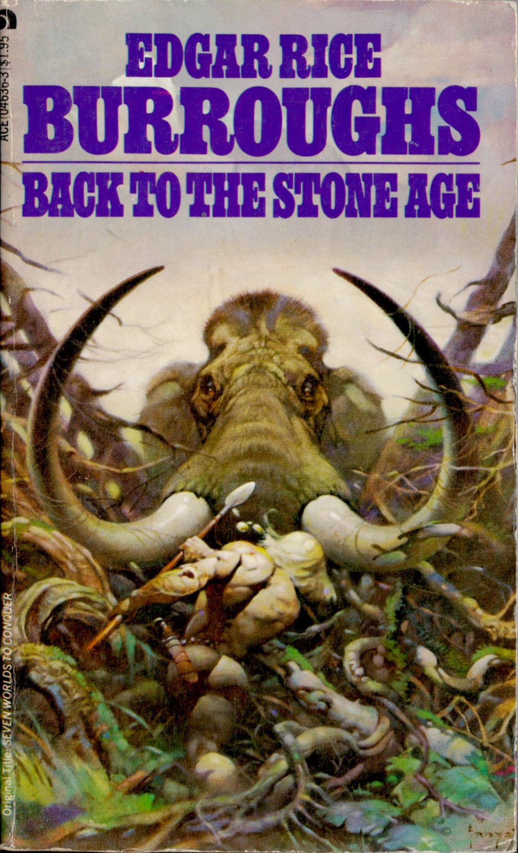
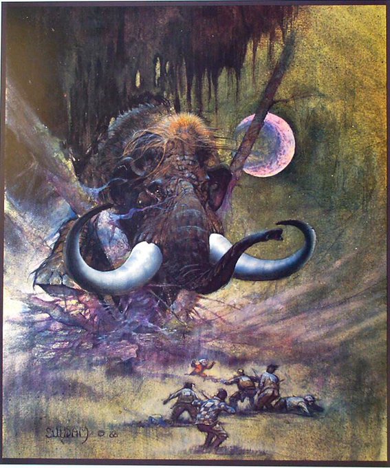
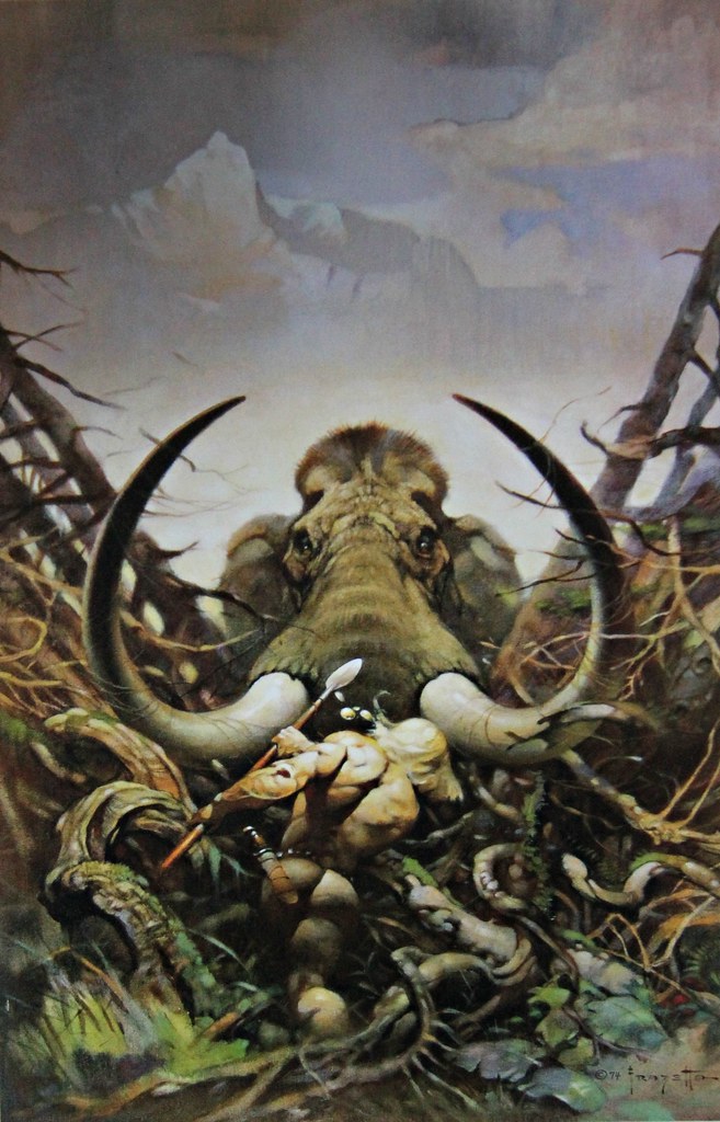
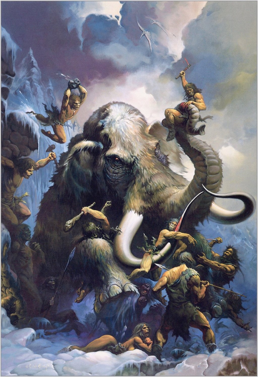
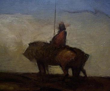
ABOVE: Edgar Rice Burroughs, Back to the Stone Age (NY: Ace, 1978), with cover art by Frank Frazetta.ABOVE: Art Suydam, Mammoth (1980).ABOVE: Frank Frazetta, Mammoth (1974).
I scanned the cover of Back to the Stone Age by Edgar Rice Burroughs, with pulse-poundin’ art by Frank Frazetta, from the copy of the paperback edition in my personal library.
Arthur Suydam’s Mammoth was published as a poster/print in both an unsigned and a signed and limited edition by Glimmer Graphics in 1990. I borrowed the image of Mammoth from the Glimmer Graphics site.
Suydam’s stories in Heavy Metal and Epic Illustrated were among the best those magazines had to offer.
Frazetta, of course, is Frazetta.
BONUS IMAGES:
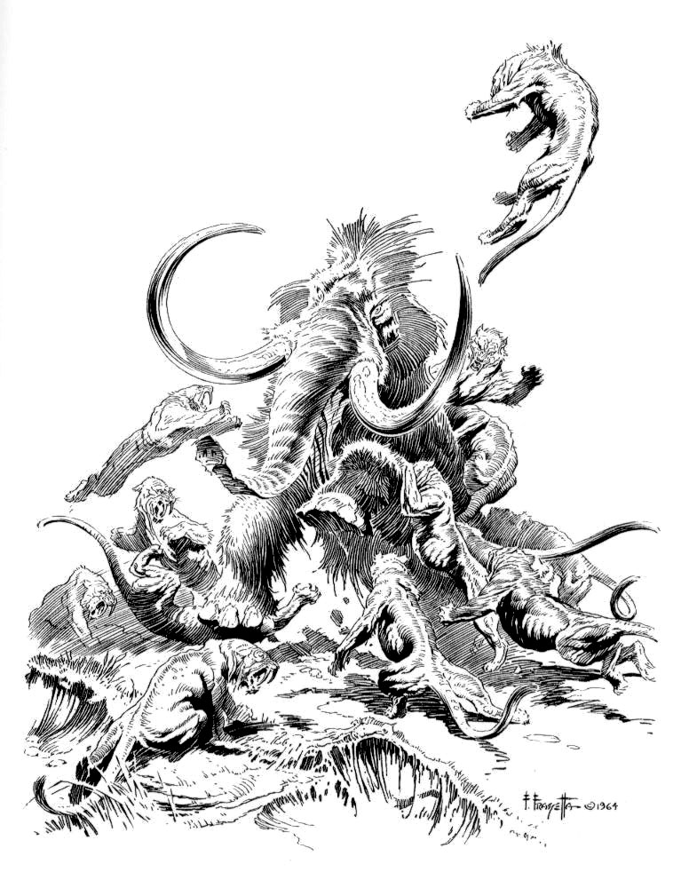
ABOVE: Frank Frazetta, Stone Age [Mammoth and Sabre-Toothed Cats] (1964).ABOVE: Frank Frazetta, Tyrannosaurus and Cavemen (n.d.)ABOVE: Ken Kelly, Mammoth and Cavemen (1991).
Perhaps those “Bonus Images” ought to have been a “Connections” post all on their own.
New from Todd Adams and Glimmer Graphics: a beautiful signed-and-numbered Giclée print of a shimmering seascape by Jeffrey Jones entitled The Great Cloud. The print is strictly limited to 75 copies and is available now!
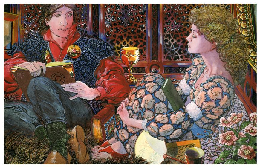
On 05 March 2010, Glimmer Graphics, known to readers of this blog as the publisher of an ongoing series of first-rate prints and posters by Jeffrey Jones, will release Poetry (see above image), a lush new 22 x 15 inch limited-edition giclée print by Barry Windsor-Smith. Each of the 375 prints that make up the edition will be signed and numbered and will be presented in a foil-stamped linen folder with a tipped-on colour plate. The unit price is US$135, shipped and insured, and you may pay in full or with installments. To place your order, click here.
This is NOT a paid advertisement. If the money BWS makes from the print enables him to complete work on his long-awaited Monsters graphic novel, that will be payment enough. The previews on BWS’s site are gorgeous!
The Barry Windsor-Smith Conan Archives Volume 2 HC (Publication Date: 19 May 2010) — “The two Barry Windsor-Smith archives collect all of the historic and influential Conan the Barbarian comics drawn by Barry Windsor-Smith,” including his adaptation of Robert E. Howard’s “Red Nails”!
Todd Adams of Glimmer Graphics has a beautiful new limited edition print by Jeffrey Jones available for purchase on his company’s Web site. “I have published over 50 fine art prints through the years,” writes Todd, “and this is the finest print quality I have seen to date.” Here’s a link to the order page. And here’s a copy of the image Todd sent out to promote the print:
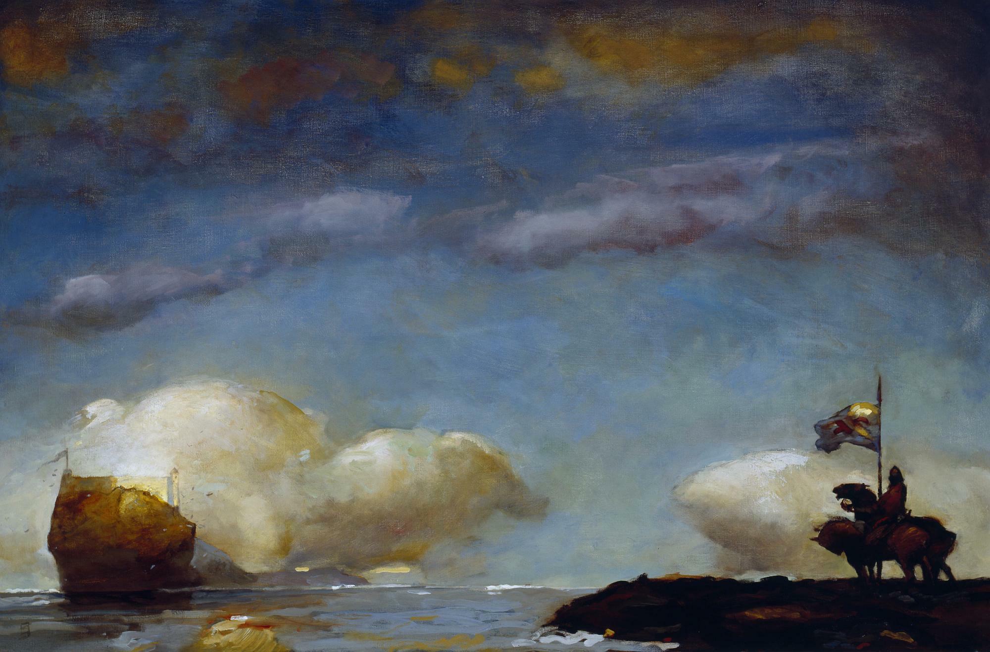
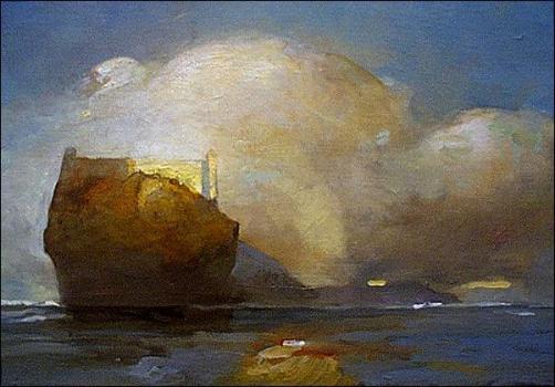
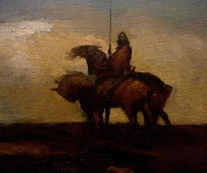
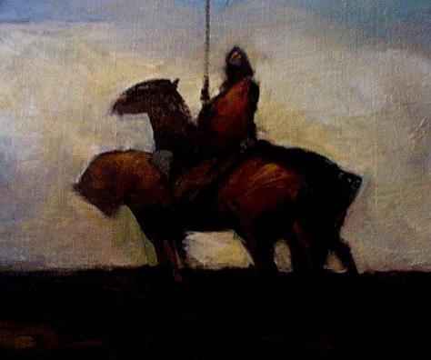
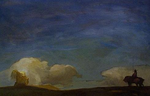
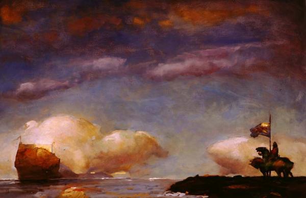
ABOVE: Jeffrey Jones, A Game of Thrones (c. 2000), oil on canvas.
Jones created the above painting for Meisha Merlin Publishing’s deluxe limited edition of the first book in George R. R. Martin’s “A Song of Fire & Ice” epic. The new Glimmer Graphics print is comprised of 375 signed and numbered copies, as well as 25 artist proof copies, all on 500 g/m² acid-free, ultra-smooth paper. Sheet size is 22 x 16 inches, with an image size of 19 x 12.5 inches.
BONUS CONTENT (added 13 December 2011):
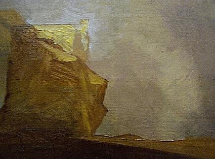
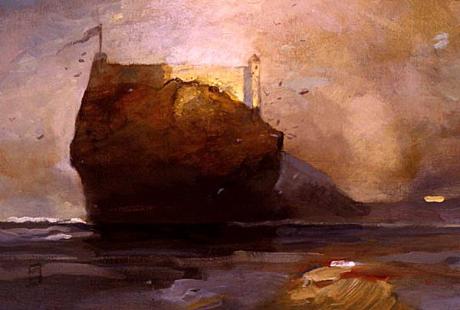
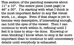
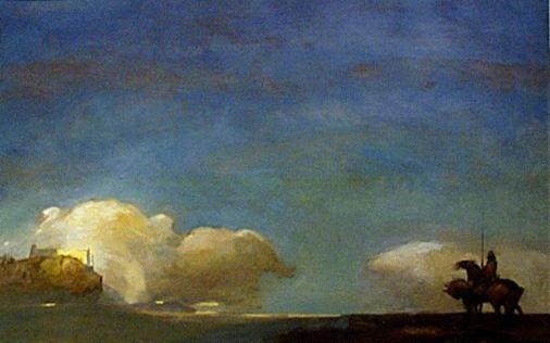
What follows are all of the images from a “work in progress” page that appeared on Jeffrey Jones’s official website, which since Jones’s death has disappeared from the Web; the images are presented in the same order that Jones presented them on the original page:
On a separate page entitled “Painting Methods,” Jones wrote:
I stretch my own canvases and prefer linen, unprimed. Two coats of gesso with sanding on each dry coat. Bristle brushes, filberts give me the texture and quality of surface I like. I use no mediums, just turpentine. My palette consists of three yellows, yellow ochre pale, raw sienna and chrome yellow. The reds I use are venetian, burnt umber, burnt sienna and cadmium. I like oxide of chromium for green, all other greens are mixed. Ultramarine is the only blue I use. When painting I consider complements and mix them together on the palette, using a bit of a complement in each mixture. For example, I might make a purple using ultramarine and venetian red and add a bit of ochre to temper it. If I use a yellow I add a little purple to temper that color. I never use black but mix it using several dark colors together. I like to paint wet in wet to keep the painting “soupy”.
I usually start a painting with a house painting brush, covering up the white of the canvas and laying in dark and light shapes. Then come some middle tones. I think in tone at first and color later. I do a lot of scraping and wiping in the beginning-at this point it’s all rather abstract.
I don’t know how many ways there are of working but what I’ve found, and it took some time, is perhaps peculiar to me. The most exciting thing is a blank white canvas or piece of paper–anything can happen. This is why I’ve long ago gotten away from scripts and manuscripts. I’m not really an illustrator. It’s probably my education in German Abstract Expressionism where whatever happens on a piece of art happens all the time. There is no real beginning and no end, there is just a time to abandon. I honestly never know what the “finish” will look like. I’ve said this before so bear with me here. The work and I have a “conversation”. There are times it listens to me and times I must listen to it. As long as it’s a “we” process there are no dull bits. There are impasses where I have to put it aside for a while but that’s not boredom. Boredom can just be another word for anger. For almost 30 years I have written my own comics, and the writing is done along with the drawing, not beforehand. It’s the same with painting. The narrative, which is often ambiguous, evolves with time. If it does indeed ever get dull then it is finished.
I always use titanium white because of it’s opaqueness and covering ability. It doesn’t matter which white you use, mixing white with any primary color will give you a pasty pastel. You have to mix the colors before adding white. Also lack of pastiness depends on which colors are next to each other.
…Howard Pyle advised his students, “Put light colors next to light colors and dark colors next to darks, then where you want the viewer to descend, put dark next to light.” This is a good rule of thumb.
Please note that the above description of Jones’s material preferences and process in oil has been cut and pasted, without alteration, from the original “Painting Methods” page on Jones’s official website.
BONUS CONNECTION (added 24 February 2014):
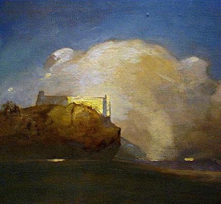
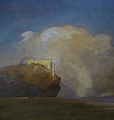
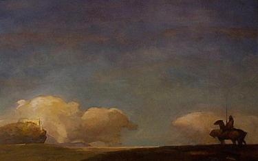
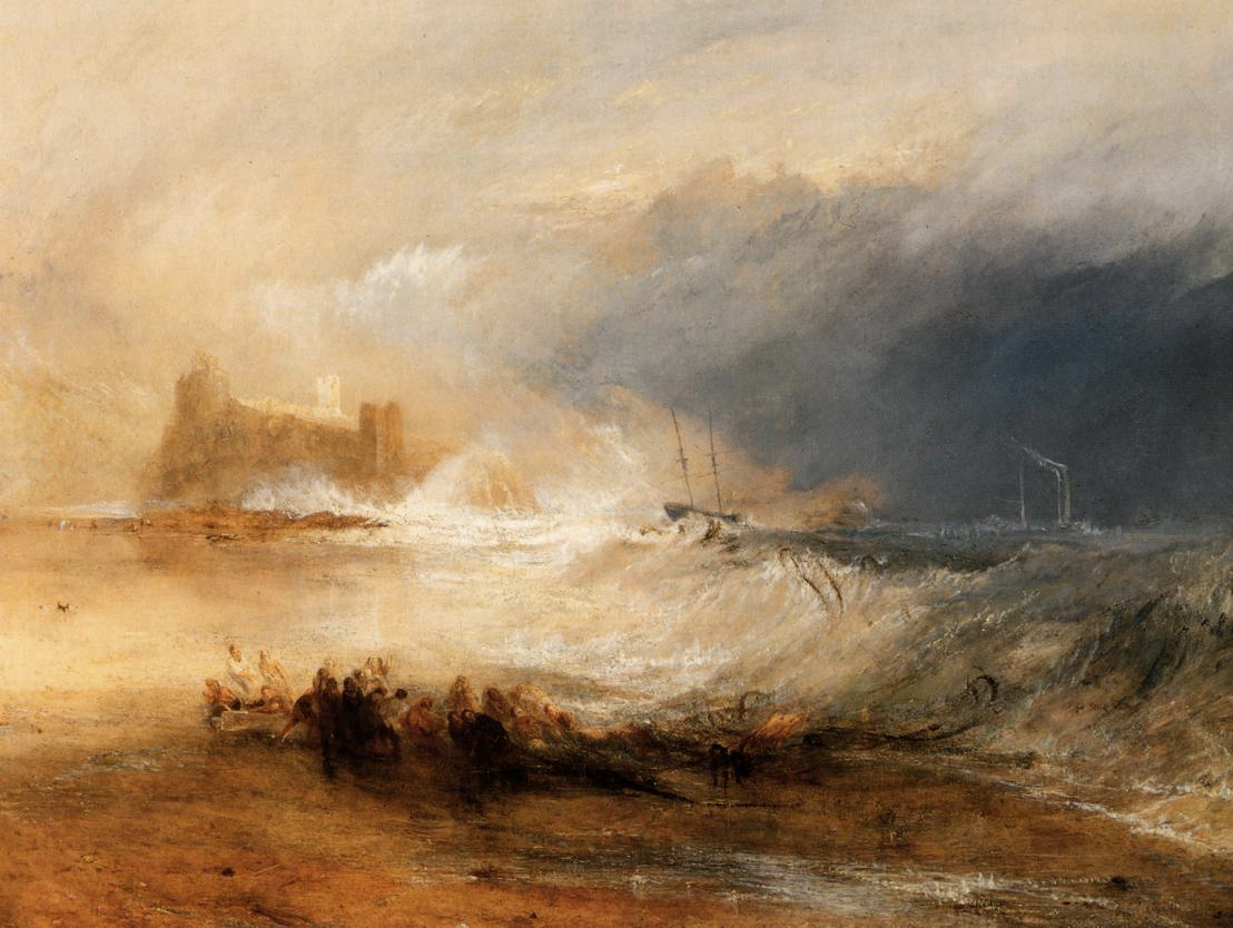
ABOVE: Joseph Mallord William Turner, Wreckers, Coast of Northumberland (c. 1834), oil on canvas, 125.9 x 90.5 cm. Collection of Yale Center for British Art, New Haven, Connecticut, USA. Via Wikimedia Commons.
ABOVE: Jeffrey Jones, A Game of Thrones (c. 2000), oil on canvas.
If you’re a fan of Jeffrey Jones’s art, and you’d love a lovely print to hang on your wall, Todd Adams of Glimmer Graphics has a number of items that might interest you:
ABOVE: Jeffrey Jones, Age of Innocence (Glimmer Graphics, 1992), signed and numbered print, 24 x 35 in.
ABOVE: Jeffrey Jones, Blind Narcissus (Glimmer Graphics, 1992), signed artist-proof copies, 24 x 35 in., US$150 plus shipping.
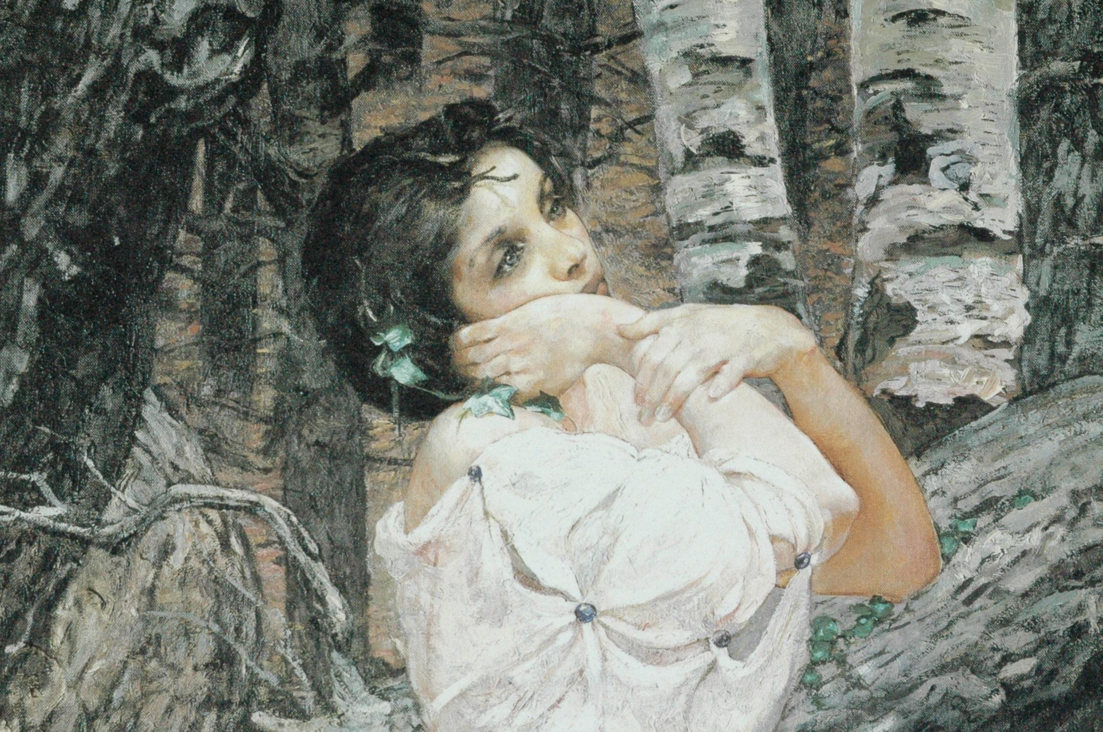
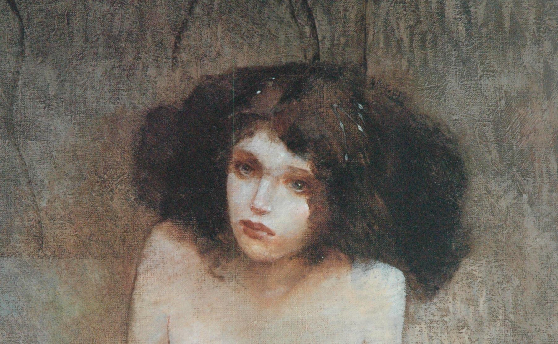
ABOVE: Jeffrey Jones, detail of Blind Narcissus.
ABOVE: Jeffrey Jones, Carol (Glimmer Graphics, 1990), signed and numbered print, 18.5 x 24 in.
ABOVE: Jeffrey Jones, Dragon Slayer (Glimmer Graphics), signed and numbered print, 15 x 20 in.
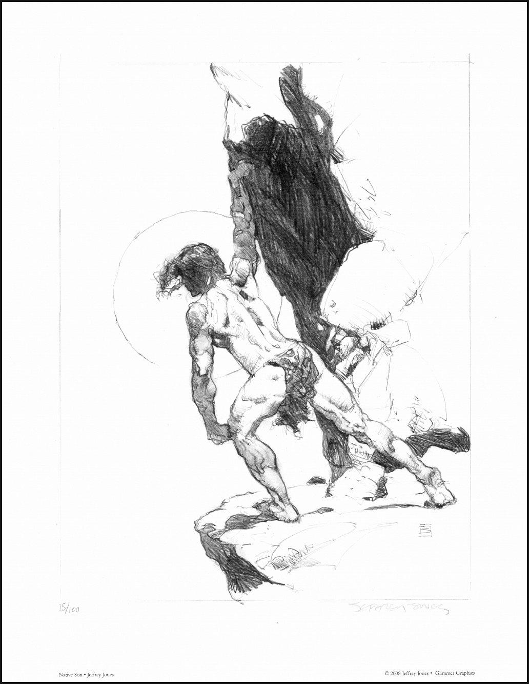
ABOVE: Jeffrey Jones, Native Son (Glimmer Graphics, 2008), signed and numbered print on acid-free stock, 11 x 14 in., US$20 plus shipping. I recently ordered a copy of this one for myself.
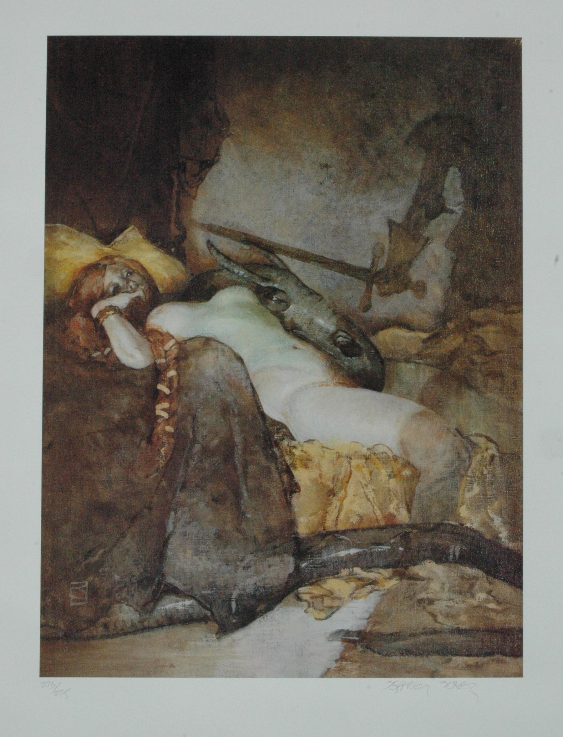
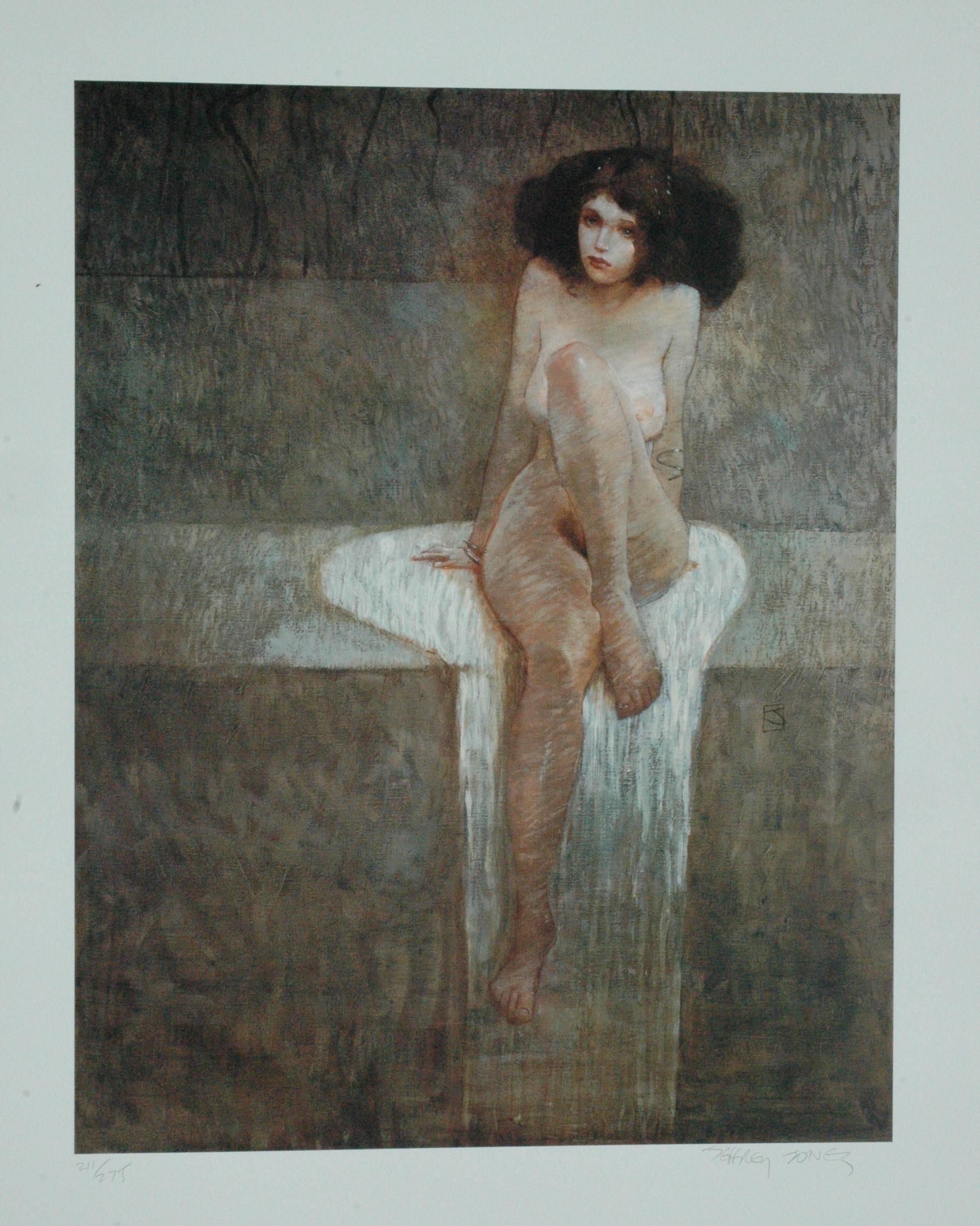
ABOVE: Jeffrey Jones, Seated (Glimmer Graphics), signed and numbered print, 15 x 20 in., $45 plus shipping.
ABOVE: Jeffrey Jones, detail of Seated.
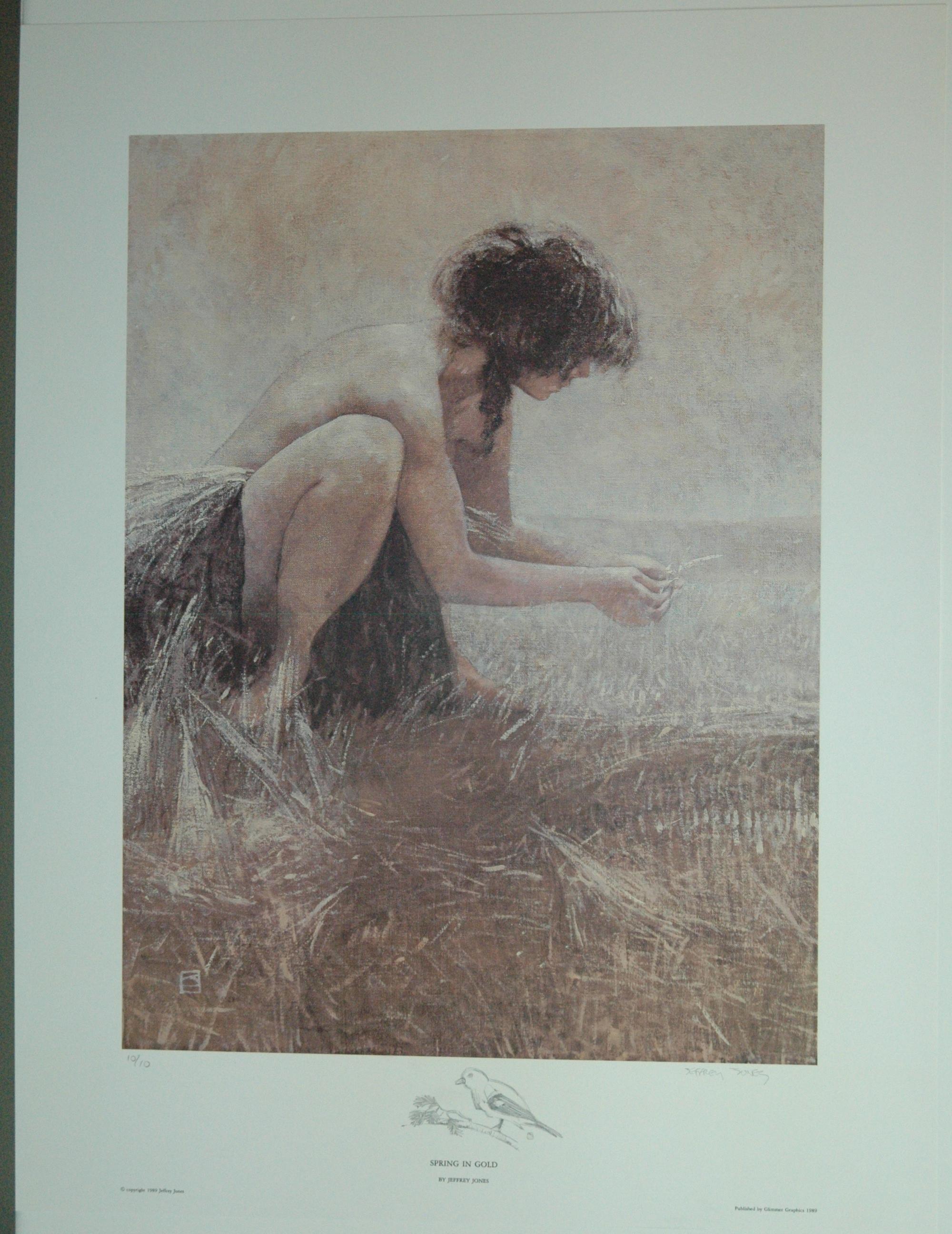
ABOVE: Jeffrey Jones, Spring in Gold (Glimmer Graphics, 1989), poster, 20 x 26 in., US$10 plus shipping.
ABOVE: Jeffrey Jones, Undying Wizard (Glimmer Graphics, 1992), signed and numbered print, 20 x 15 in., US$45 plus shipping.
ABOVE: Jeffrey Jones, Vampire Mother (Bruce Brenner, 1974), signed and numbered print, 11 x 14 in.
Although the above images — with the exception Age of Innocence and Native Son — were provided via email directly to me, RC, by publisher Todd Adams, the information regarding sizes, prices, dates, and so on, in the captions under each image is NOT official and is included simply to give you a general idea of what to expect should you decide to contact Todd to place an order.
In other words, any errors here are the sole responsibility of this Web site, which is in no way associated with Todd Adams or his company, Glimmer Graphics.
Todd’s contact email, which I’m making available here with Todd’s permission, is neo1948@comcast.net, and I can tell you from first-hand experience that Todd DOES accept payment via PayPal, which to me as a buyer is always a plus for online transactions.


