"This day's experience, set in order, none of it left ragged or lying about, all of it gathered in like treasure and finished with, set aside." –Alice Munro, "What is Remembered"


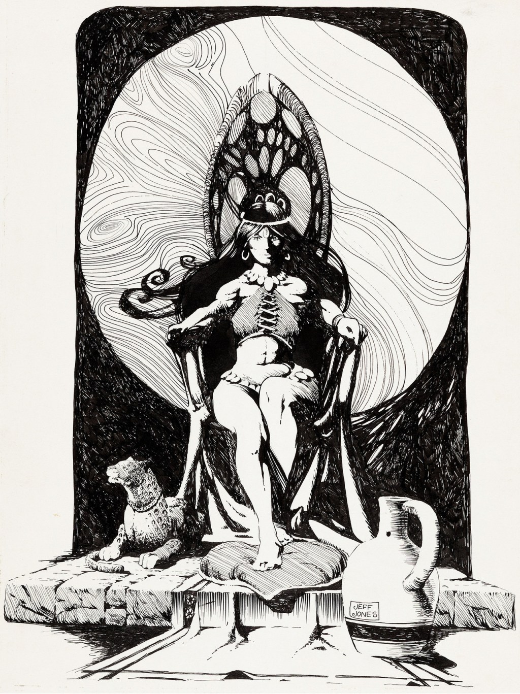
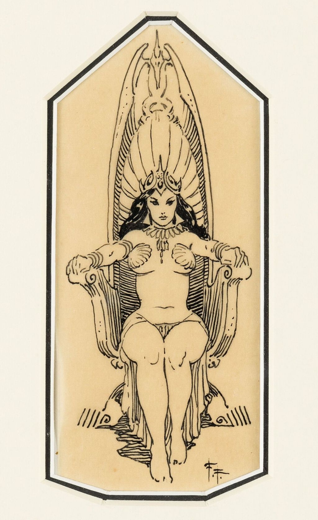
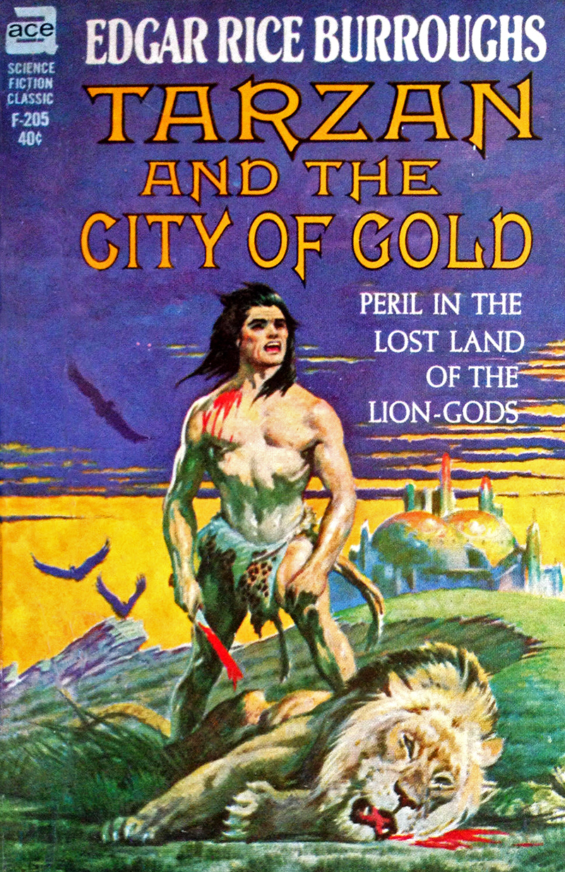
Whether or not you think that a big Frazetta and Burroughs fan like a young Jeffrey Catherine Jones might have been “inspired” by Frazetta’s title-page illustration for Burroughs’ Tarzan and the City of Gold, you surely must agree that Jones’s fan art is all kinds of wonky. Particularly egregious from a pure drawing standpoint is Jones’s botched handling of the perspective of the woman’s arms and the failure of construction that is her shrivelled right hand. Frazetta handles the same pose/angle/elements simply and with aplomb, and he is able to do so partly because he has made the throne large enough, or the woman small enough, to give himself room to operate. In particular, notice that the cylindrical forms of both of the woman’s arms are reinforced by the curves of the wrist and upper arm bands — Jones does this on one wrist, and it’s effective — and the spaces between the large, swooping arms of the throne and the outstretched arms of Frazetta’s woman effectively, along with the subtle dimensional edges of the throne and a bit of tone, push the back of the throne back in space, so that the pose is believable. In fact, as an overall strategy here, Frazetta maintains a strict contrast between the open, unrendered figure and the very simply shaded/rendered elements that surround her. Jones, on the other hand, fills the spaces between the woman’s arms and her body with black ink, and makes the woman too large for the throne, so that the arms have no space to extend toward the viewer and rest on the arms of the throne in a natural way. What Jones does not seem to realize at this point is that no amount of deep shadow and scratchy rendering can solve bad figure construction.
There are other problems with Jones’s illustration, of course, but I’m just gonna leave it there.
Anyone who has delved into the archive of this site will know that I am a huge admirer of Jones’s work, but what this illustration shows is that everyone has to start somewhere, and that that somewhere is often far distant from where one ends up. In other words, and in short, there’s hope for us all, if only we will do the work.
BONUS IMAGES:
What interests me about these juxtapositions is not merely Achilleos’s obvious debt to Frazetta but that each of the artists revised his original composition after first publication. Whether the compositions are better or worse now, you can decide for yourself. In both instances, however, the changes were probably driven by what I like to call “the tyranny of second thoughts.” That is, once one gets it into one’s head that improvements are possible, it is damned difficult to resist sacrificing what one has for the promise of something better.
[CLICK IMAGE TO ENLARGE]


Dig the fancy bladework of the attacker in Maren’s painting!
BONUS IMAGES:
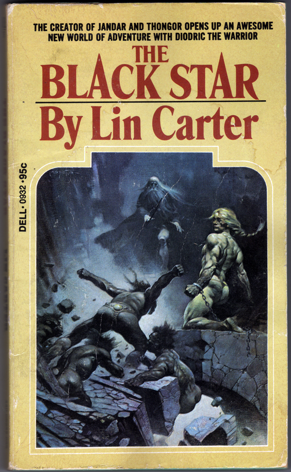


More cover scans today, all of paperbacks in my personal library:
[CLICK IMAGE TO ENLARGE]


[CLICK IMAGES TO ENLARGE]


My books. My scans. You’re welcome.
[CLICK IMAGES TO ENLARGE]
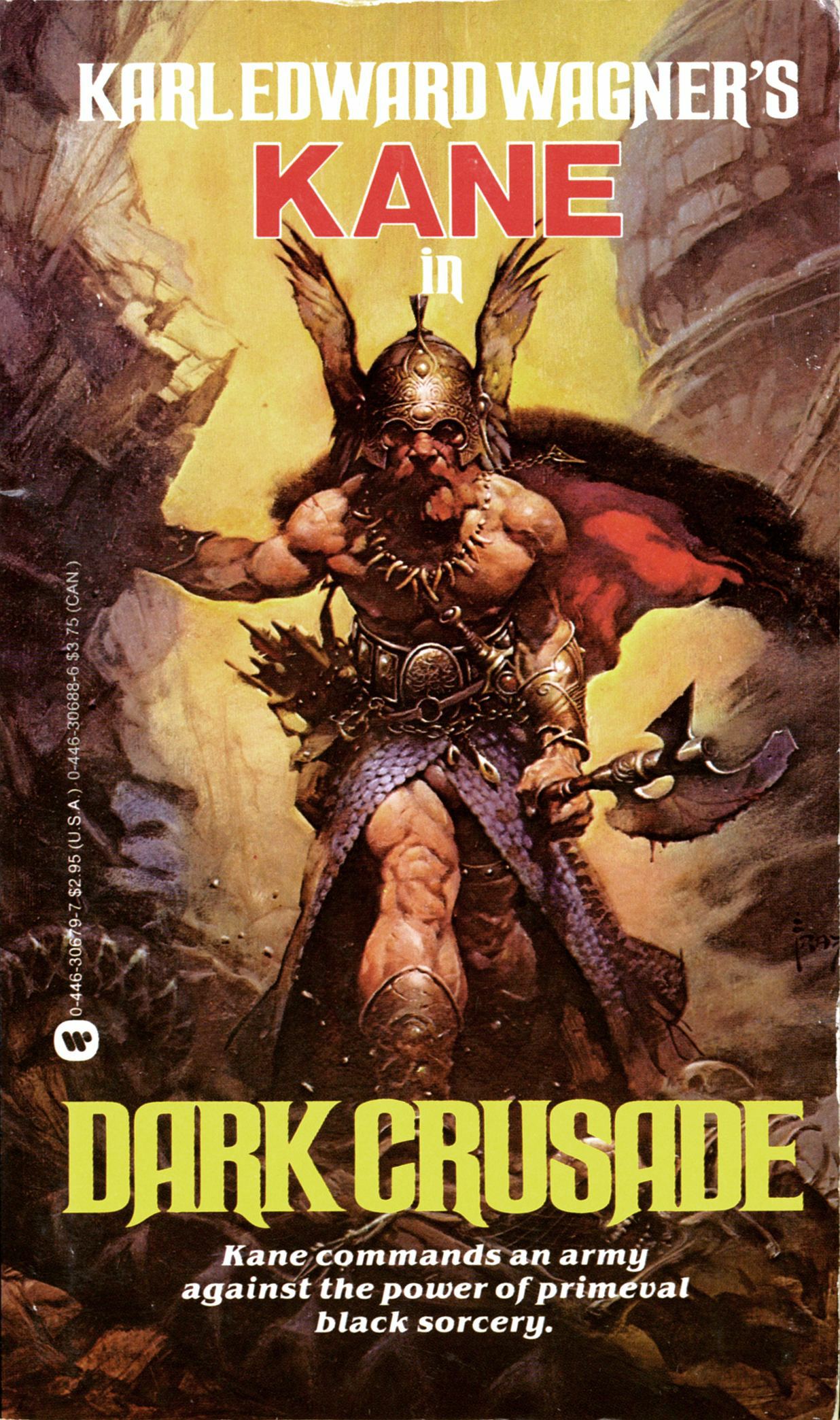
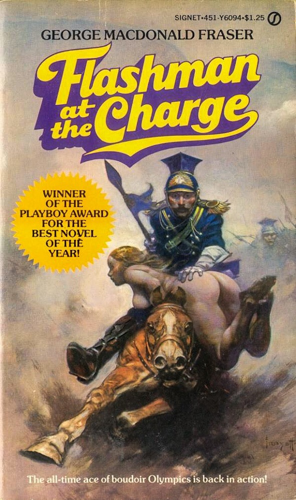
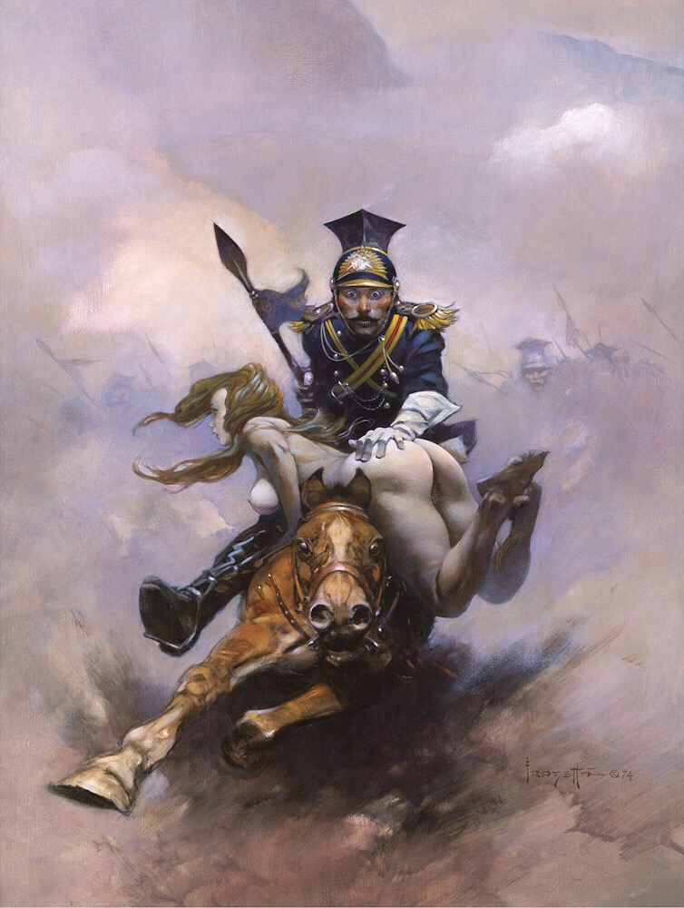
ABOVE: Karl Edward Wagner, Dark Crusade (NY: Warner Books, 1983), with cover art by Frank Frazetta.
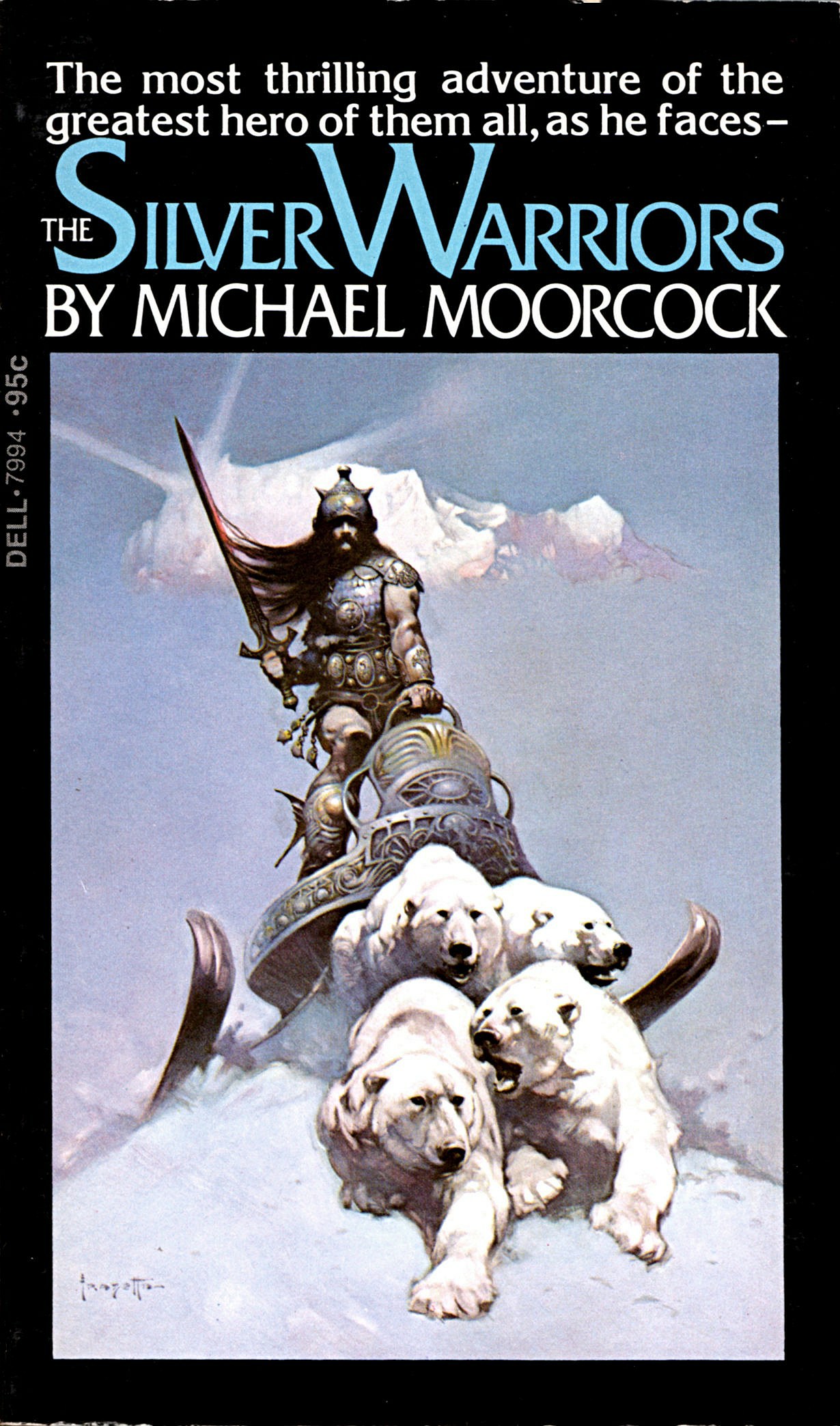
ABOVE: Michael Moorcock, The Silver Warriors (NY: Dell, 1973), with cover art by Frank Frazetta.
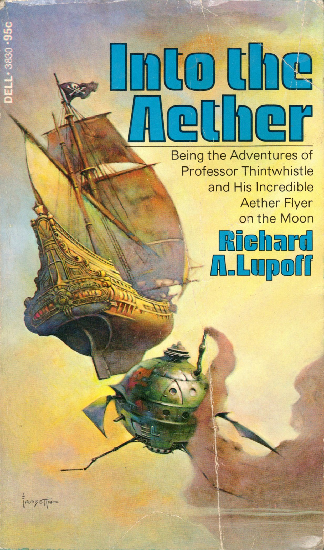
ABOVE: Richard A. Lupoff, Into the Aether (NY: Dell, 1974), with cover art by Frank Frazetta.
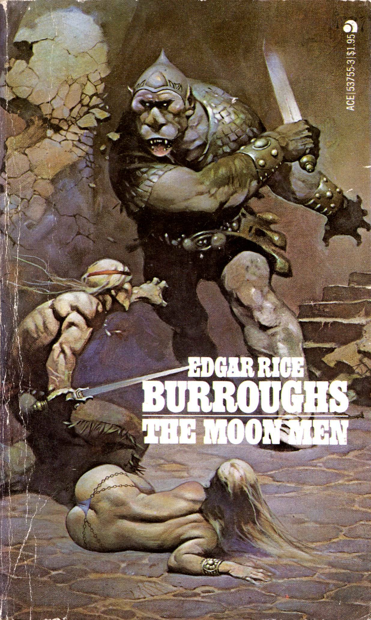
ABOVE: Edgar Rice Burroughs, The Moon Men (NY: Ace, 1978), with cover art by Frank Frazetta.
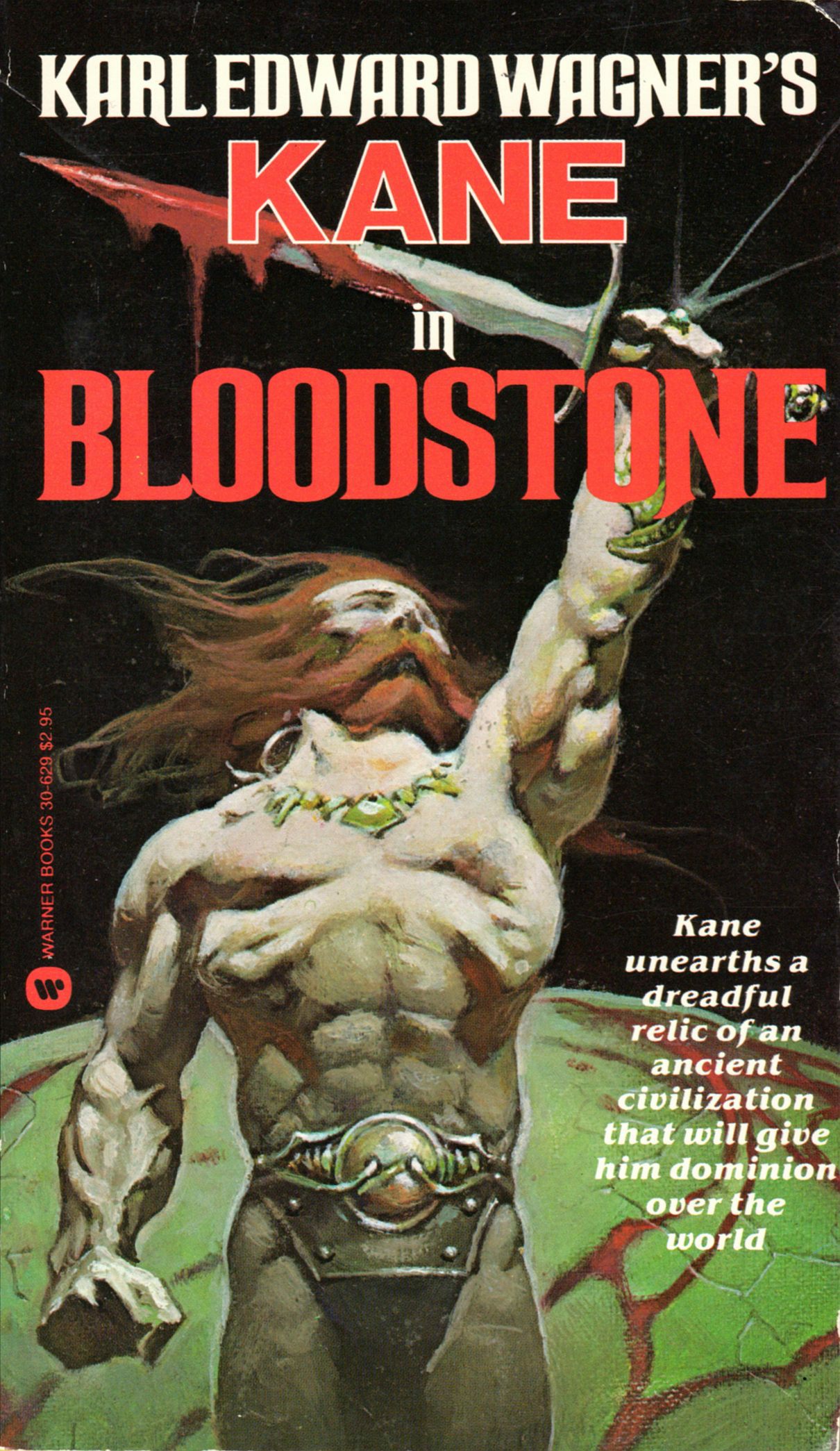
ABOVE: Karl Edward Wagner, Bloodstone (NY: Warner Books, 1983), with cover art by Frank Frazetta.
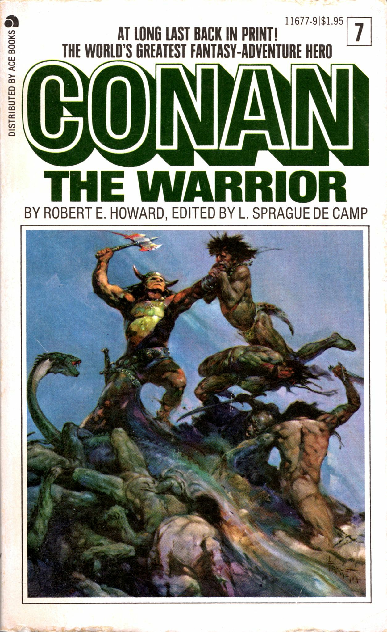
ABOVE: Robert E. Howard, Conan the Warrior (NY: Ace, n.d.), with cover art by Frank Frazetta.
From Manhunt #11 (August-September 1948), here’s an instalment of “‘Trail’ Colt, U.S. Marshal” entitled “The Robber of Rainbow Buttes,” with visuals vigorously delineated by “Fritz,” a.k.a. Frank Frazetta:
[CLICK IMAGES TO ENLARGE]
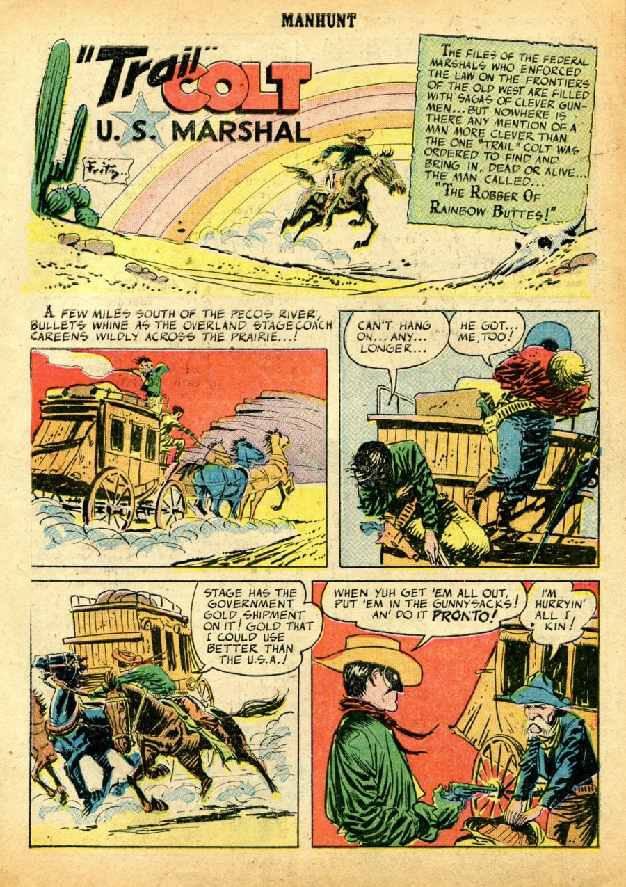
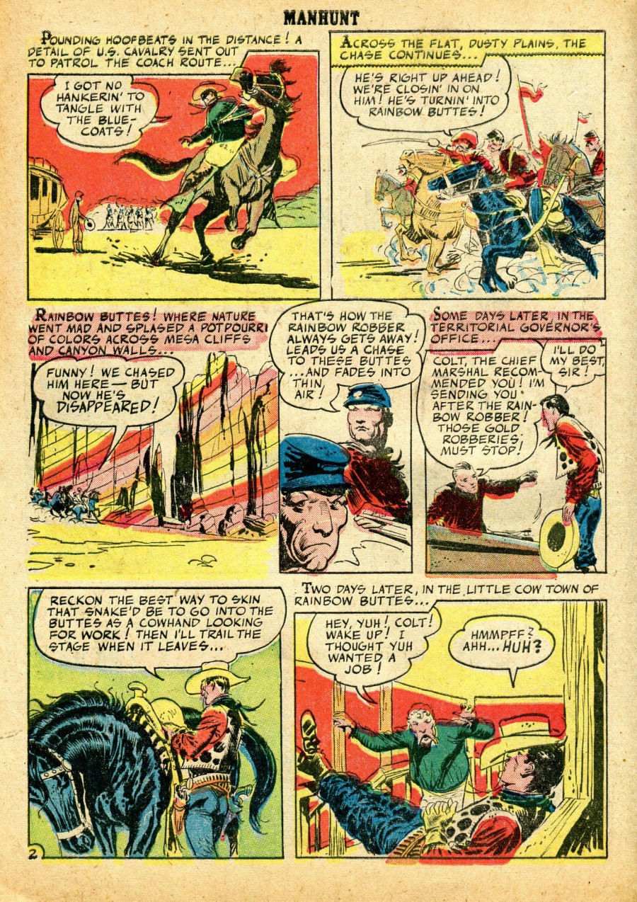
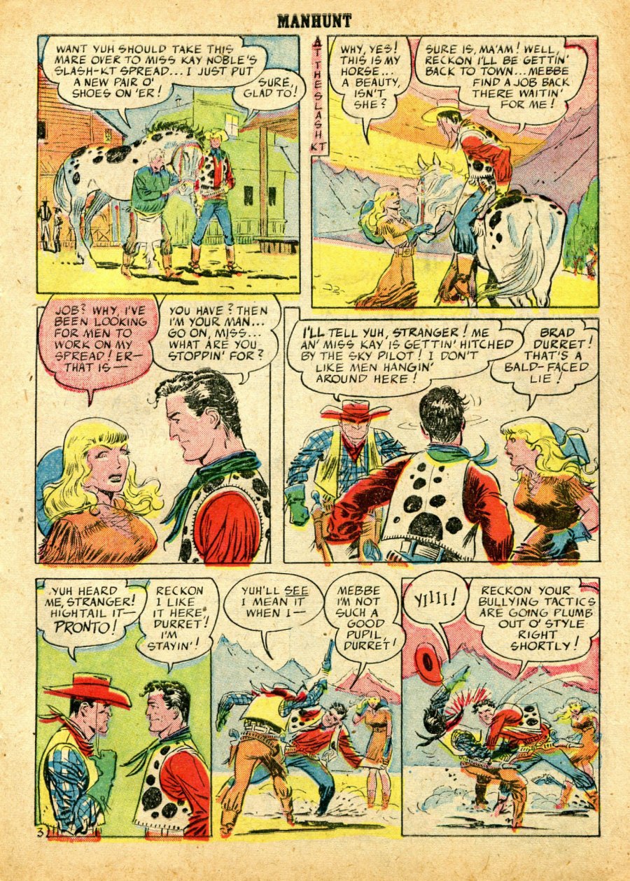
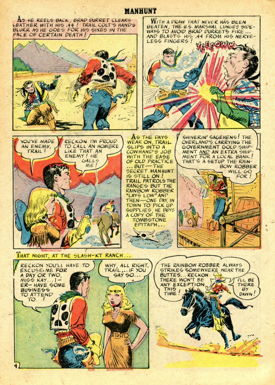
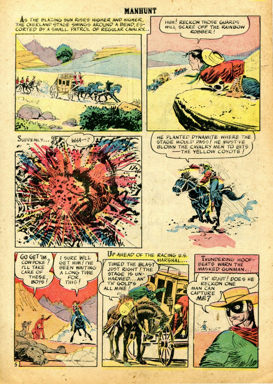
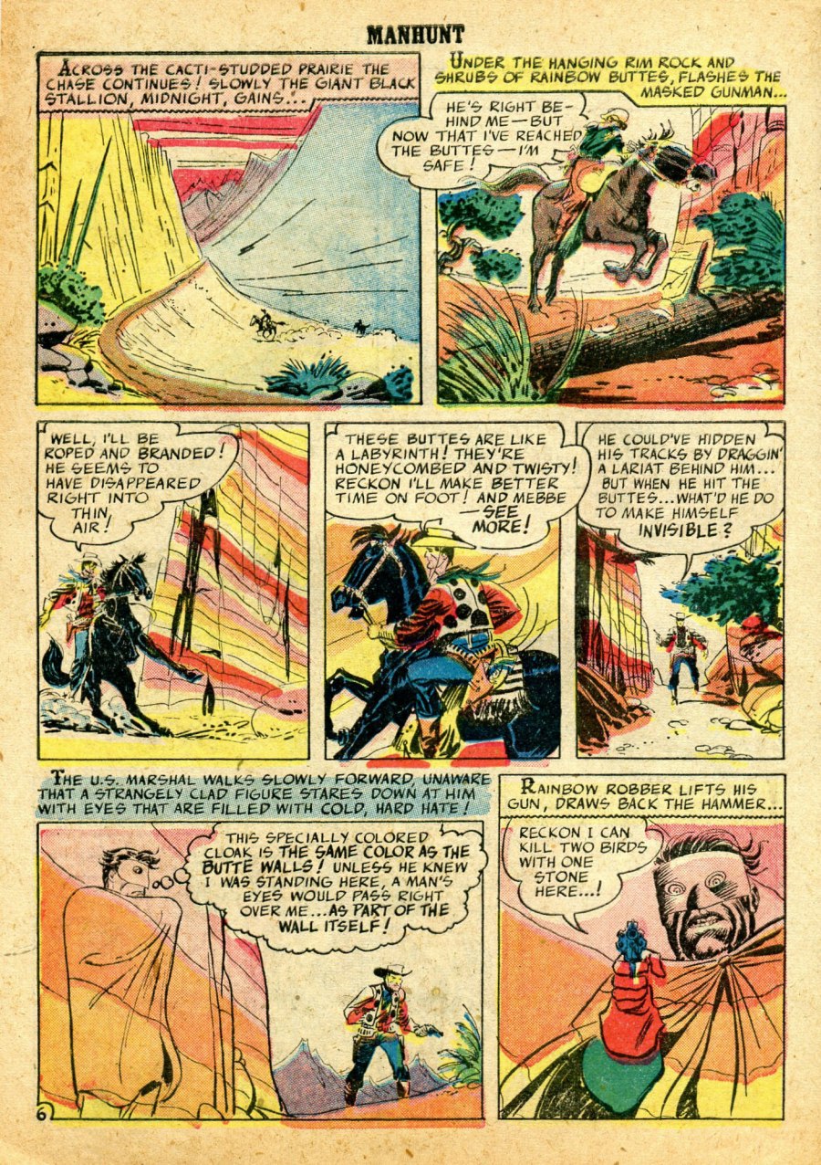
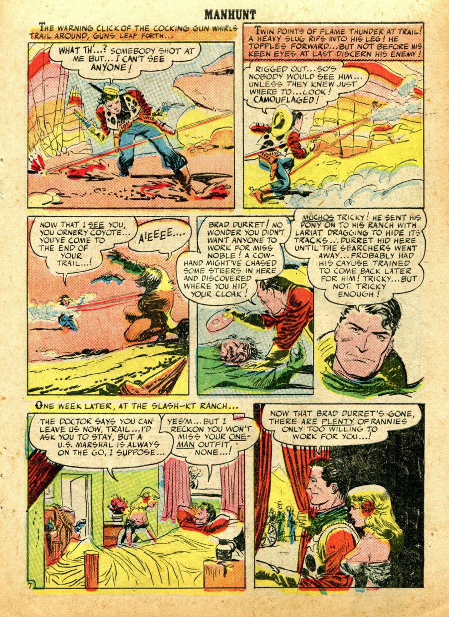
— via The Digital Comic Museum —
I’m not going to put forth any arguments here regarding a possible chain of influence from Wyeth to Fischl to Frazetta (because I don’t think there is one), the relative quality of the three paintings pictured below (because none of them is truly first rate), the relative merits of “fine art” versus “illustration art” (because I don’t care about the issue), etc. I just have a hankering to see these three paintings mashed together in one post:
[CLICK IMAGES TO ENLARGE]
BONUS IMAGES:

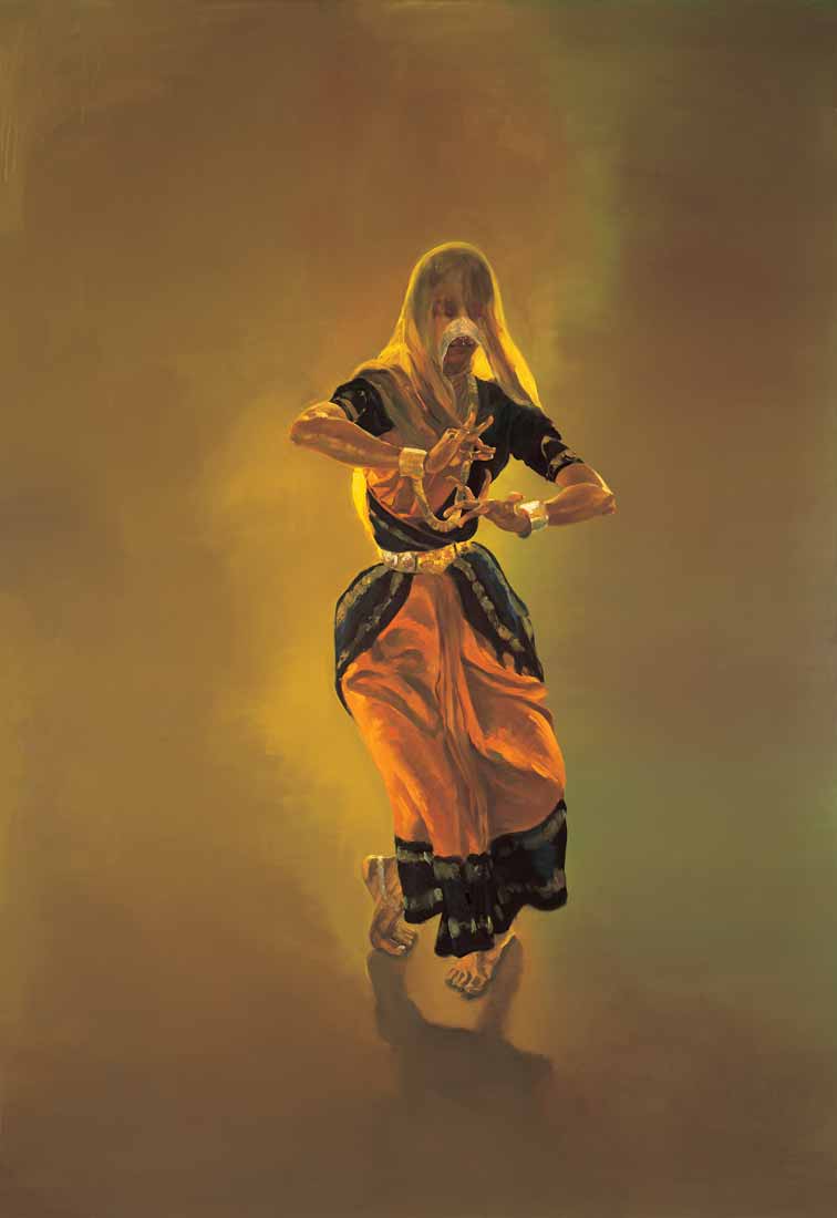
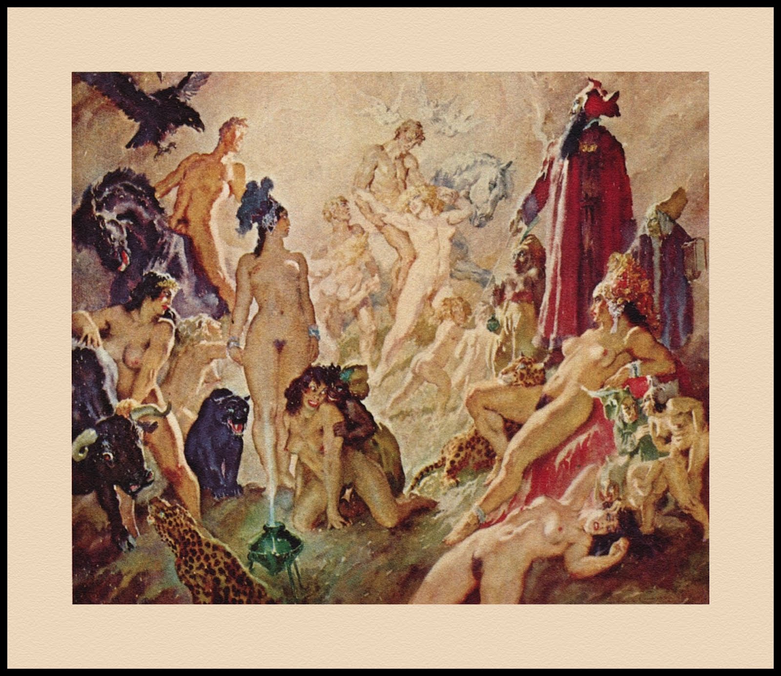
I’ve never thought much of Frazetta’s line-and-watercolour painting, Tarzan Meets La of Opar, which, rumour has it, originally featured Tarzan naked with an erect penis. (According to a Frazetta friend who claims to have witnessed the event, the artist edited the painting before he sold it to an insistent collector.) Although Frazetta’s “true fans” have a tendency to turn cartwheels of joy over every jot of ink and tittle of paint that flowed from their hero’s pens and brushes, the colour scheme, the physical types, the awkward body language of La (with one arm, one hand, and both feet completely hidden from view!), the composition, none of it here is prime Frazetta in my humble opinion.
I think the picture begins to make more sense, however, if one sees it as Frazetta’s attempt to absorb the influence of the amazingly prolific Australian cartoonist, illustrator, painter, sculptor, etc., etc., Norman Lindsay. The connection here, if there is one, would have been made possible by Frazetta’s friend, mentor, and educator in art history, Roy Krenkel, who was himself a true fan of Lindsay and so almost certainly would have brought the man’s art to Frazetta’s attention.
Anyway, so you might look and decide for yourself what’s what, here’s Frazetta’s modest effort sandwiched between two of Lindsay’s epic watercolours:
[CLICK IMAGES TO ENLARGE]
I suppose some people will think I’ve gone pretty far out on a limb here. But I don’t think I have. Many commentators over the years have parroted that line that, of course, Norman Lindsay influenced Roy Krenkel and Frank Frazetta. Only trouble is, few if any have ever seen fit to get down to cases and count the ways. Why be so timid? Half the fun of looking at pictures involves learning from others, and attempting to suss out for oneself, the various pathways of influence, both obvious and devious, from one artist to another, from one art form to another.