

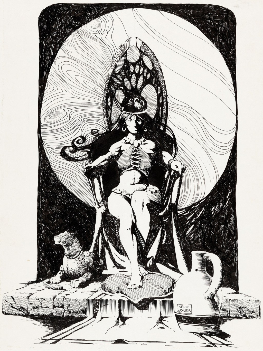
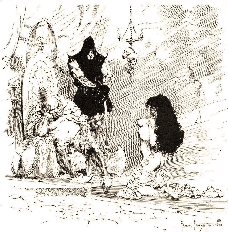
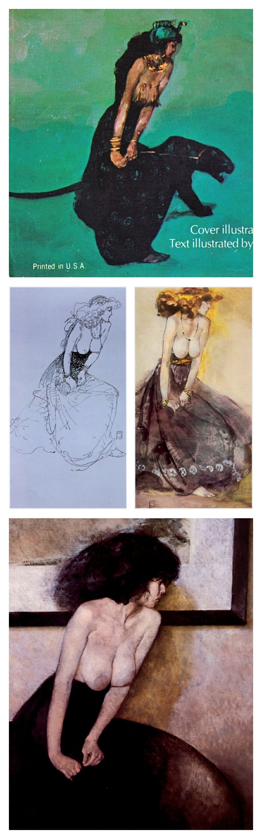
Whether or not you think that a big Frazetta and Burroughs fan like a young Jeffrey Catherine Jones might have been “inspired” by Frazetta’s title-page illustration for Burroughs’ Tarzan and the City of Gold, you surely must agree that Jones’s fan art is all kinds of wonky. Particularly egregious from a pure drawing standpoint is Jones’s botched handling of the perspective of the woman’s arms and the failure of construction that is her shrivelled right hand. Frazetta handles the same pose/angle/elements simply and with aplomb, and he is able to do so partly because he has made the throne large enough, or the woman small enough, to give himself room to operate. In particular, notice that the cylindrical forms of both of the woman’s arms are reinforced by the curves of the wrist and upper arm bands — Jones does this on one wrist, and it’s effective — and the spaces between the large, swooping arms of the throne and the outstretched arms of Frazetta’s woman effectively, along with the subtle dimensional edges of the throne and a bit of tone, push the back of the throne back in space, so that the pose is believable. In fact, as an overall strategy here, Frazetta maintains a strict contrast between the open, unrendered figure and the very simply shaded/rendered elements that surround her. Jones, on the other hand, fills the spaces between the woman’s arms and her body with black ink, and makes the woman too large for the throne, so that the arms have no space to extend toward the viewer and rest on the arms of the throne in a natural way. What Jones does not seem to realize at this point is that no amount of deep shadow and scratchy rendering can solve bad figure construction.
There are other problems with Jones’s illustration, of course, but I’m just gonna leave it there.
Anyone who has delved into the archive of this site will know that I am a huge admirer of Jones’s work, but what this illustration shows is that everyone has to start somewhere, and that that somewhere is often far distant from where one ends up. In other words, and in short, there’s hope for us all, if only we will do the work.
BONUS IMAGES:
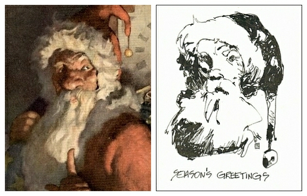


