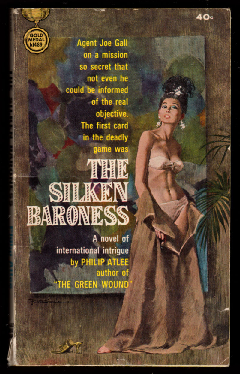
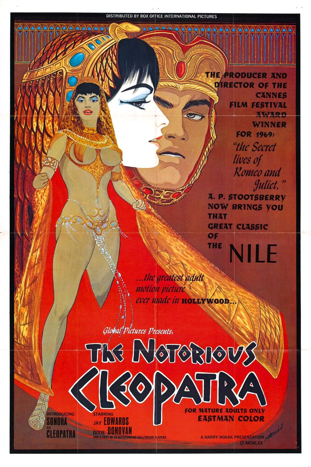
Philip Atlee, The Silken Baroness (Gold Medal Books, 1964), with cover art by Robert E. McGinnis.
"This day's experience, set in order, none of it left ragged or lying about, all of it gathered in like treasure and finished with, set aside." –Alice Munro, "What is Remembered"

Philip Atlee, The Silken Baroness (Gold Medal Books, 1964), with cover art by Robert E. McGinnis.


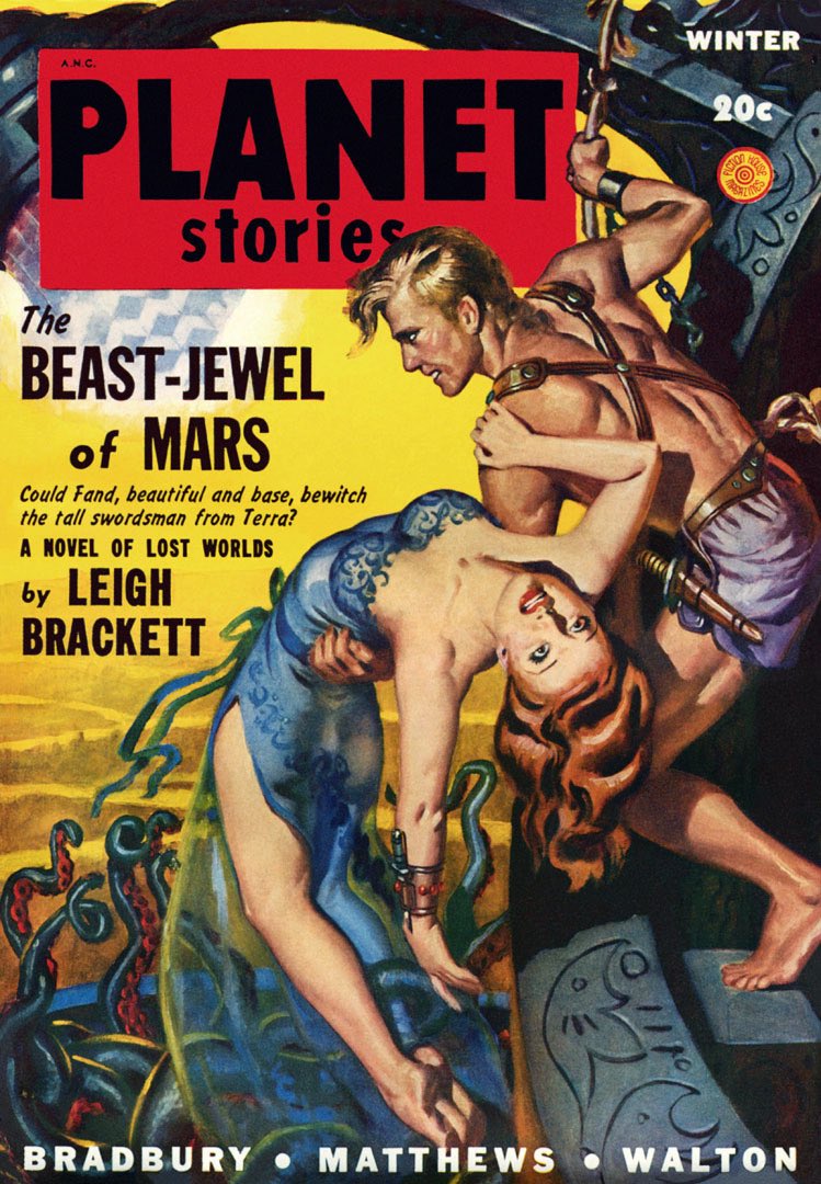
Picked this book up recently in an attempt to reduce the SF credit that I have at a local used bookstore because I took in box of SF paperbacks in an attempt to thin the herd but was unable to get cash for them. It’s a vicious circle, folks! Probably better to give the books to local charity sales, which is what I usually do.


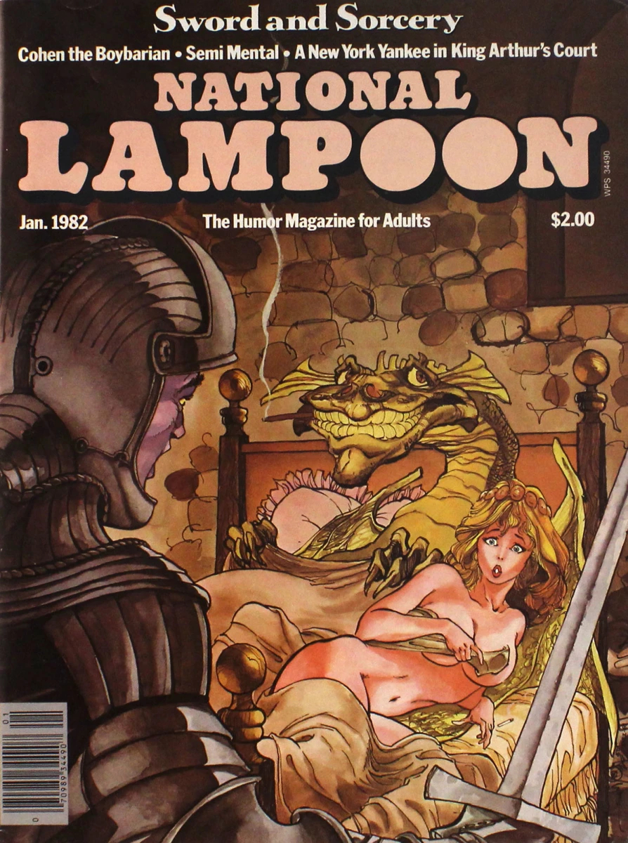
The love triangle between the knight, the damsel, and the dragon depicted in both the Jones painting and the Simonson cover is oddly, unintentionally, wryly symbolic. As many comics fans know, Walt Simonson’s wife, Louise, had previously been married to Jeffrey Jones. Jeffrey and Louise had met at college in 1964, married in 1966, and eventually divorced some time in the early 1970s, or so it has been vaguely reported. Meanwhile, Louise Jones apparently met Walt Simonson in 1973, they began dating in 1974, and they married in 1980. Thus, in a sense, Jones was the knight who lost the damsel to the dragon, and what’s more — adding insult to injury, so to speak — failed to win the competition, if one may refer to it as such, with Simonson to have work published on the cover of National Lampoon. Or maybe Jones suggested Simonson for the job when his (Jones’s) painting was rejected. That’s a nice thought, though I have zero evidence to back it up…

The fantasy painting by Daina Graziunas displayed below accompanied the story “Hope’s End” by Marv Wolfman, published in Epic Illustrated vol. 1, no. 2 (June 1980), pp. 22-23. I have removed some text and the magazine gutter from the image so we can all better appreciate Daina’s art. Apologies to Daina, however, if I’ve somehow messed it up.


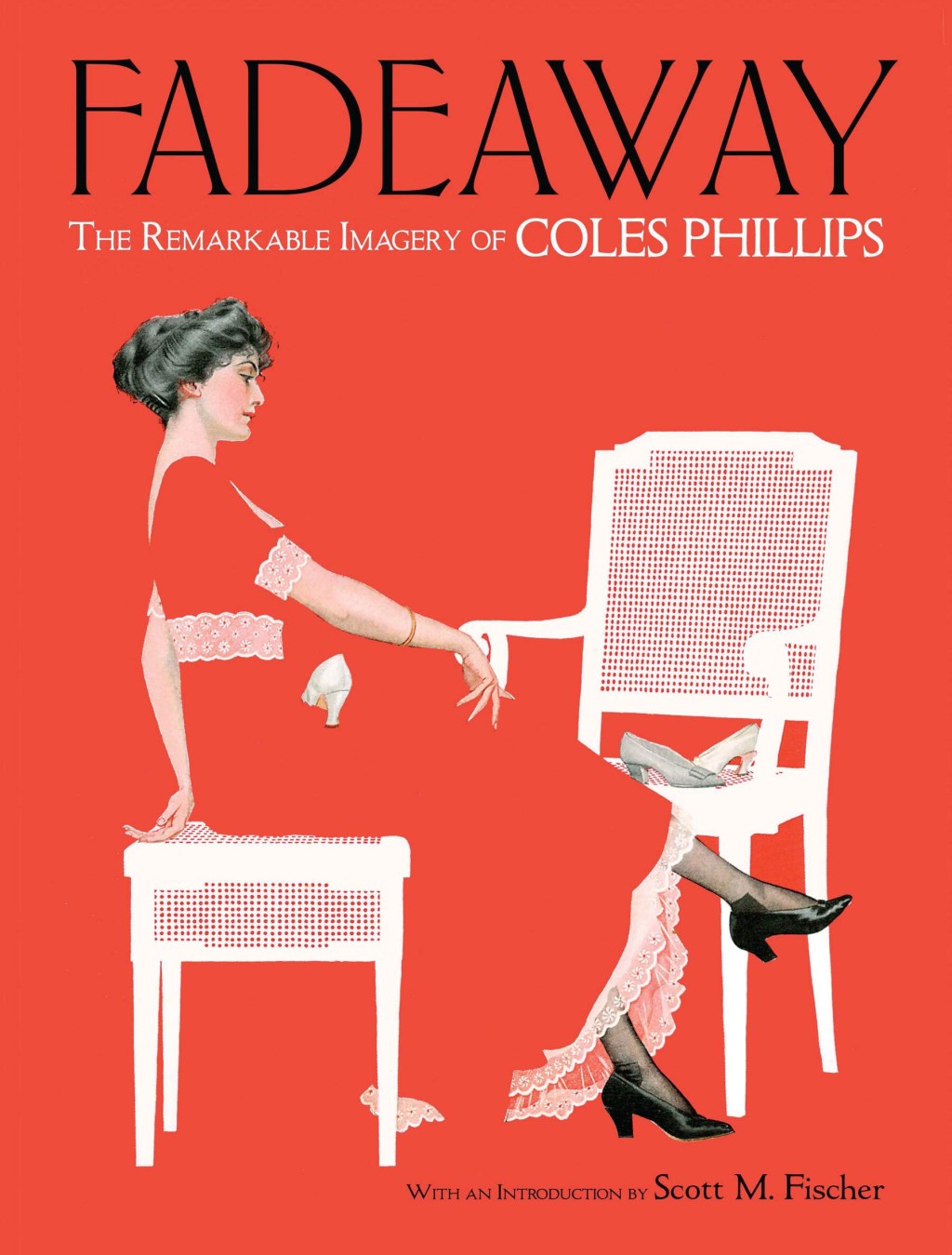
Yes, I am familiar with the work of Clarence Coles Phillips. In fact, a book about Phillips and his work was published in 2019. Lovely!