
Yes, I am familiar with the work of Clarence Coles Phillips. In fact, a book about Phillips and his work was published in 2019. Lovely!
"This day's experience, set in order, none of it left ragged or lying about, all of it gathered in like treasure and finished with, set aside." –Alice Munro, "What is Remembered"

Yes, I am familiar with the work of Clarence Coles Phillips. In fact, a book about Phillips and his work was published in 2019. Lovely!
Old news, I know… but anyway… it’s the style that’s important here:
[CLICK IMAGE TO ENLARGE]


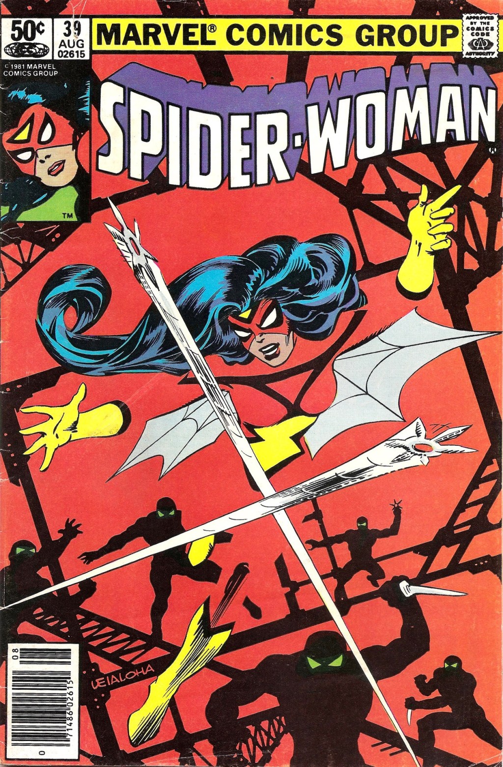
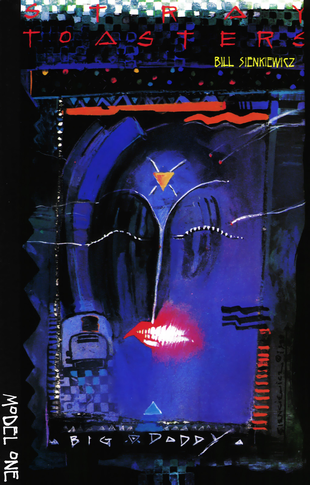
An homage done the right way by Sienkiewicz!
(If you know of a closer match, please feel free to post a link in the comments. I don’t have time to search… )
An all-star roster of artists has contributed prints and original art — see gallery page one and page two — to Macab Films to support the documentary, Better Things: The Life and Choices of Jeffrey Catherine Jones, and Bill Cox, a “premium gallery owner” at ComicArtFans.com, has stepped up to assist with the sale of the works.
At the moment, twelve prints are available for purchase, including these three:
And thirty-three (!) original drawings and paintings are available, including these five:
If you have the money to spend, your support will be greatly appreciated, I have no doubt, so act now to reserve your favourites. Those links again: prints, original art page one, original art page two.
BONUS NONSENSE:
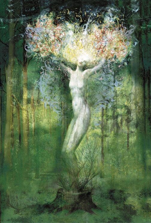
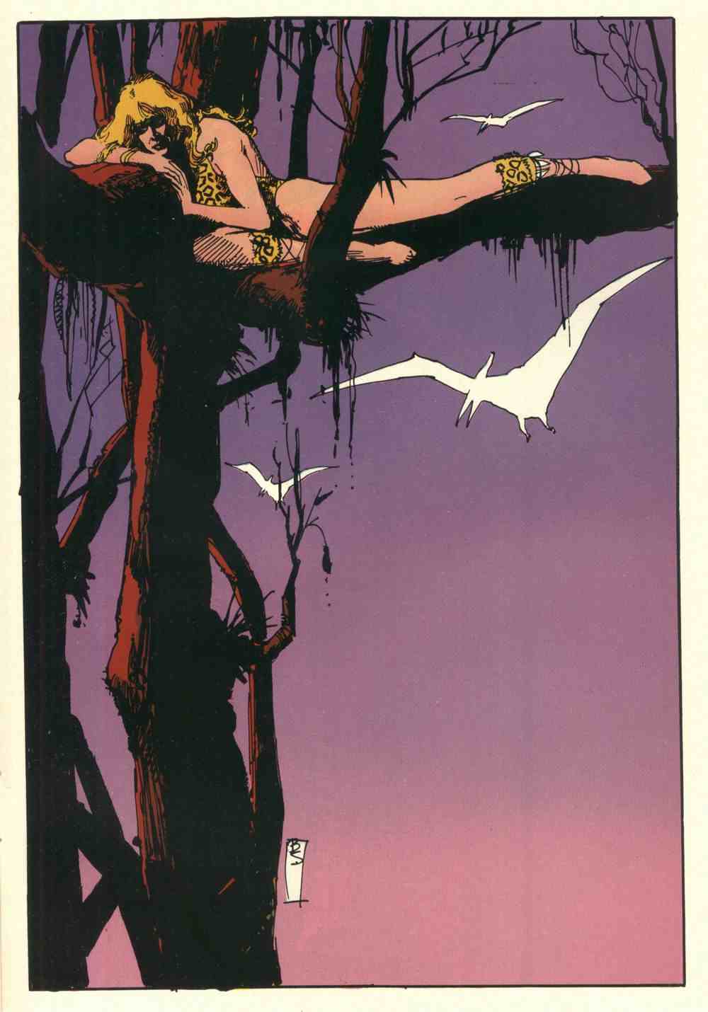
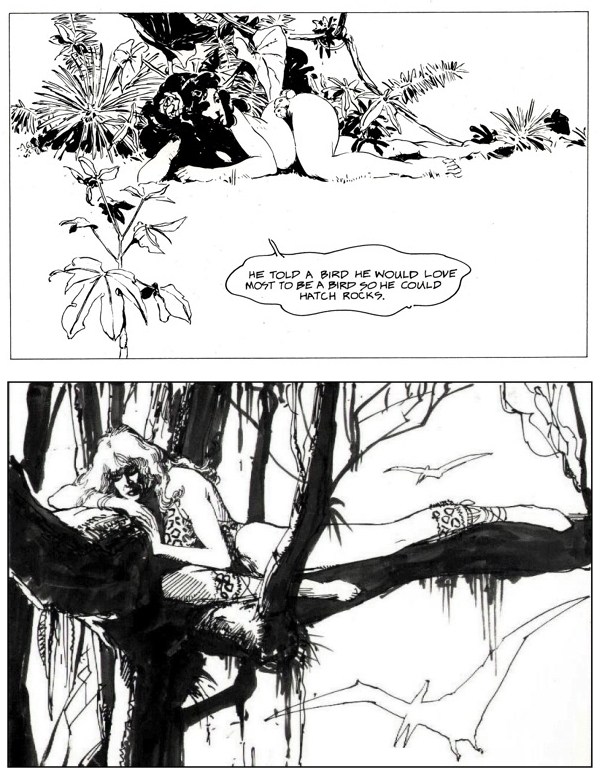
I wonder… do you suppose it is possible that Bill Sienkiewicz based the composition of the painting he donated to Better Things on the following illustration by Jones himself:
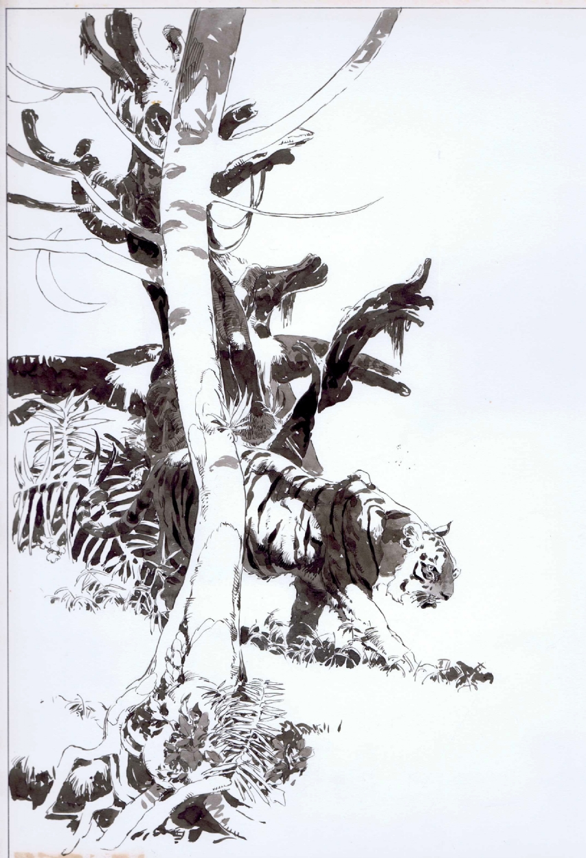
Just for fun, here’s a side-by-side:
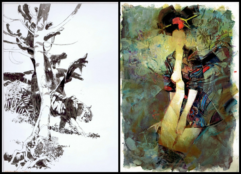
You know what? I think it’s possible… or maybe it’s just a lovely coincidence…
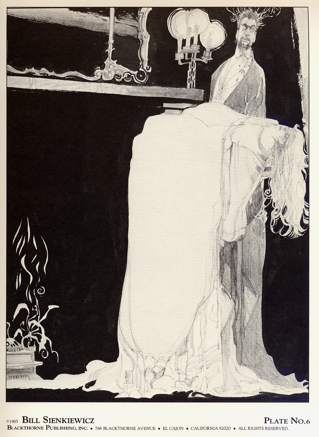
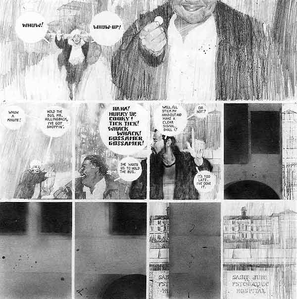
Vampyres (Blackthorne Publishing, 1985):
[CLICK IMAGES TO ENLARGE]


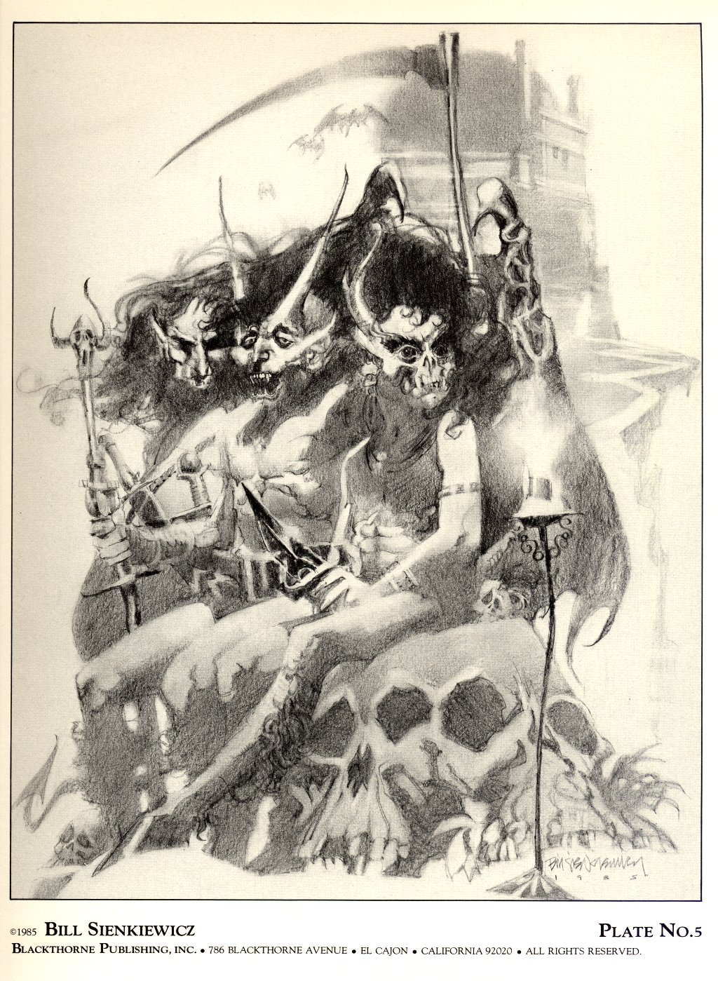
Vampyres II: The Undead (Blackthorne Publishing, 1985):
[CLICK IMAGES TO ENLARGE]


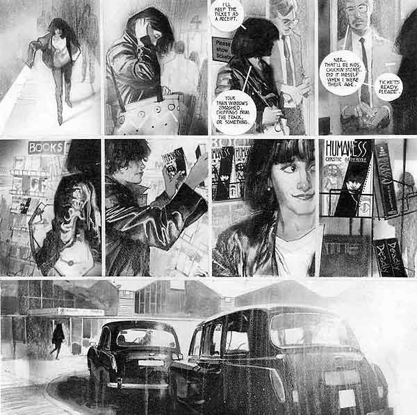
Here’s a 10-page story by Spanish comics artist and illustrator Fernando Fernandez that was published in the collection, Son of Heavy Metal, in 1984:
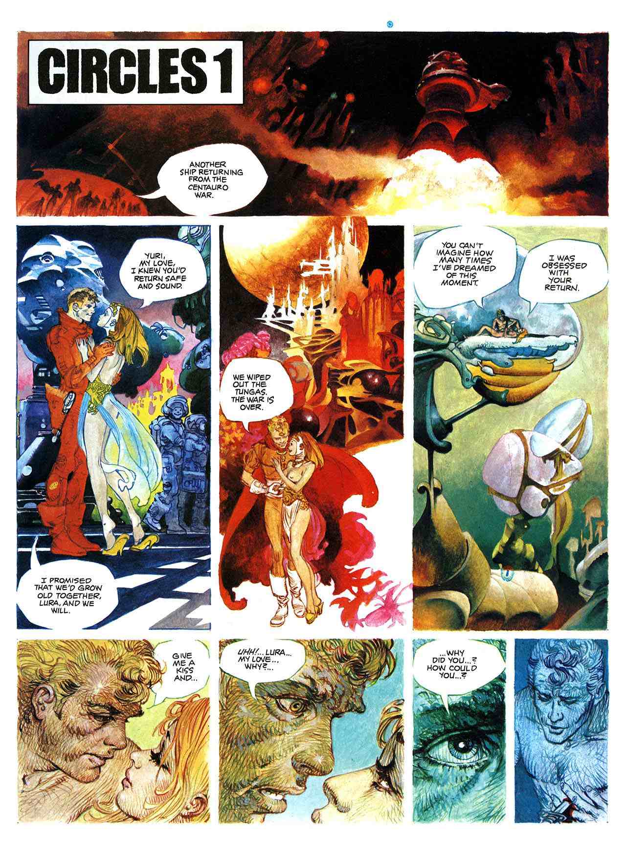
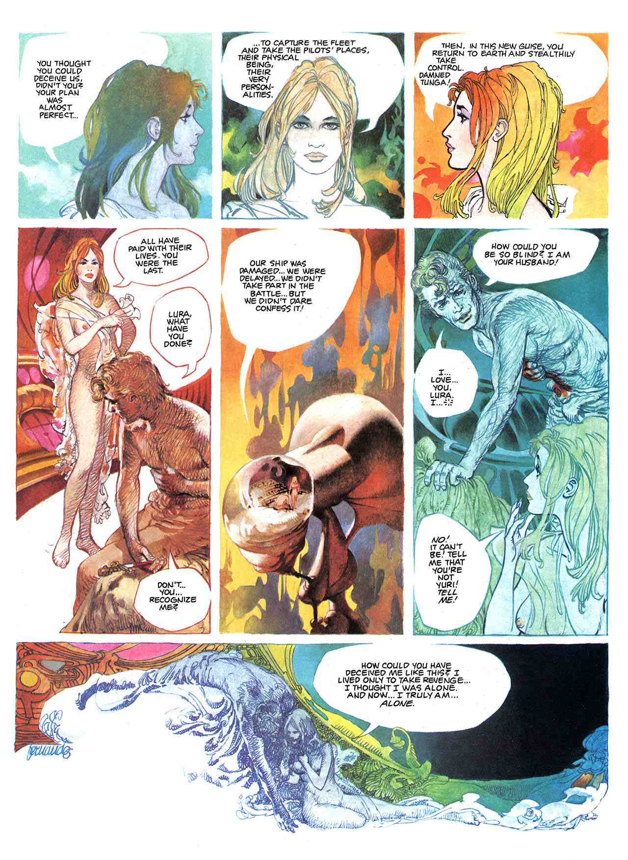
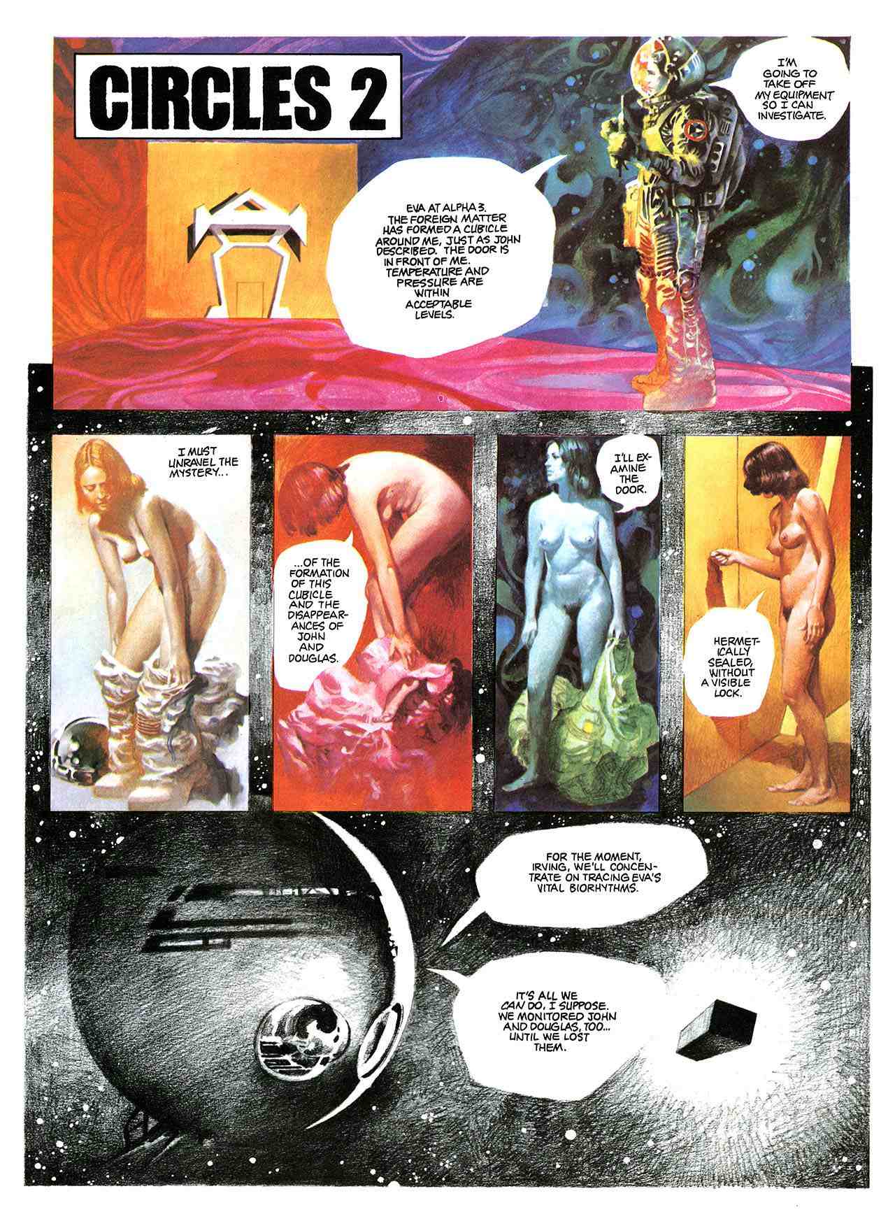
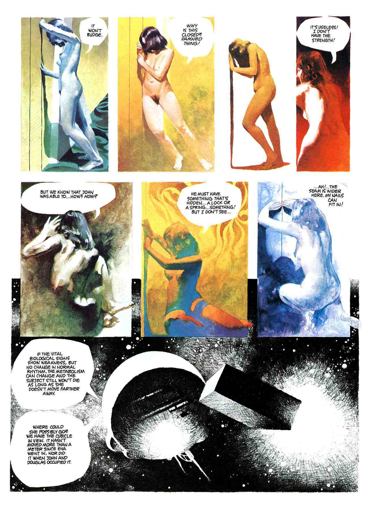
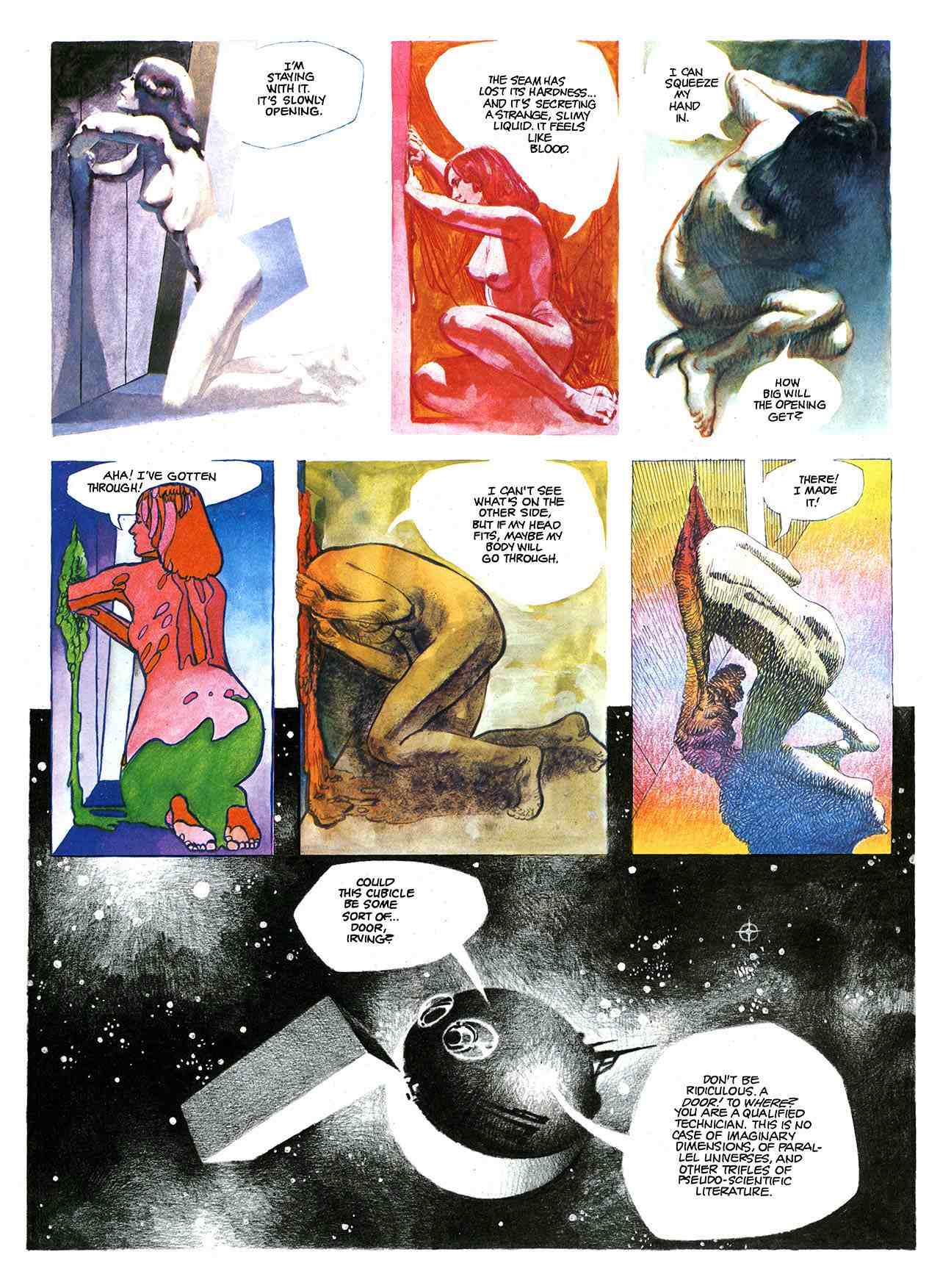
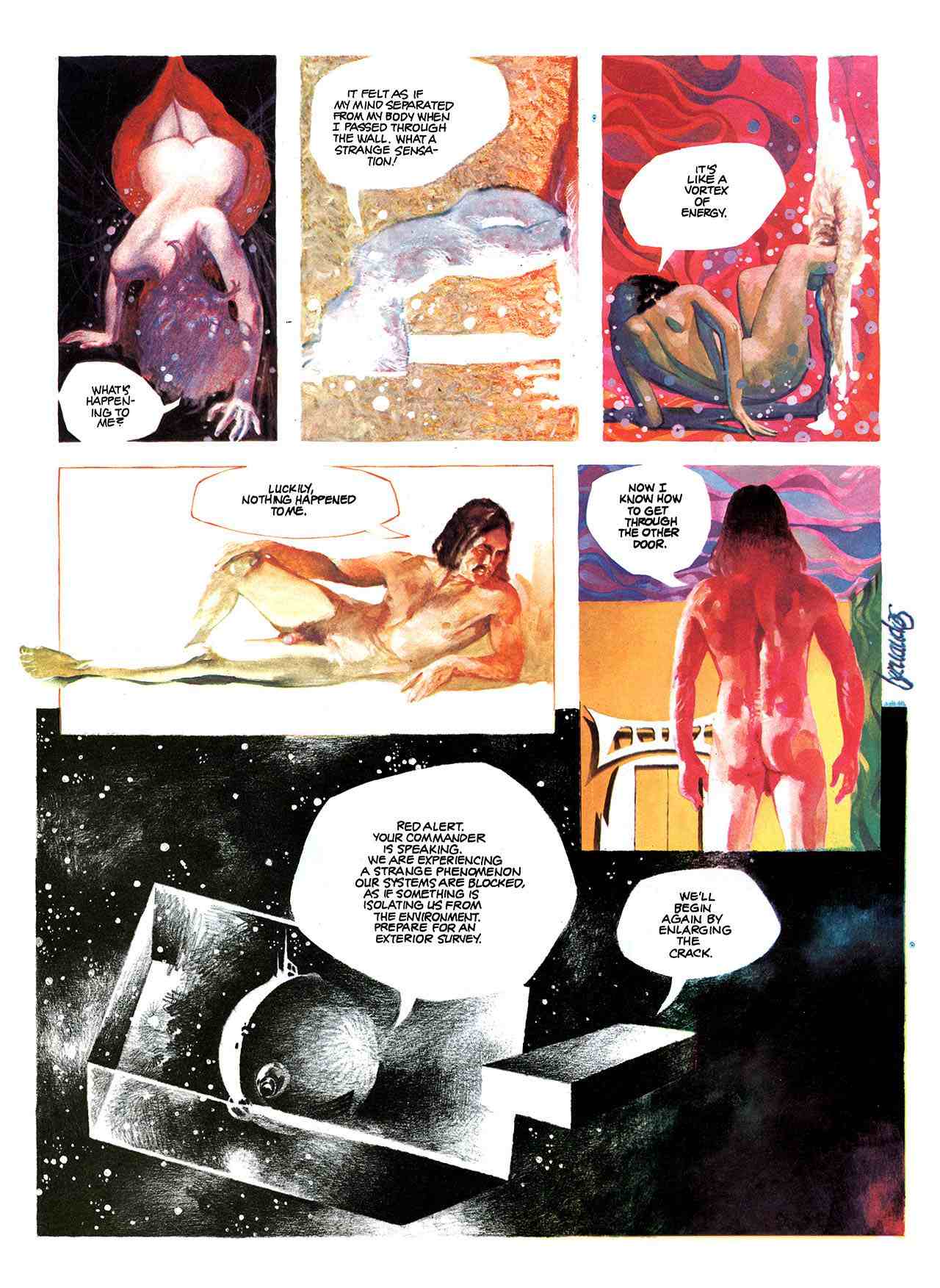
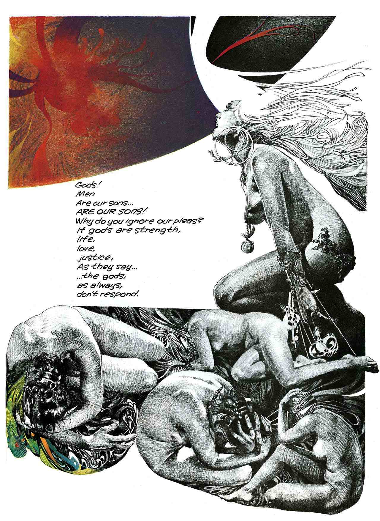
Although I wish the story amounted to more than a poorly thought out variation on Kubrick’s 2001: A Space Odyssey, I do admire how the bold contrasts and the variety of illustration techniques on display here give the story such an opulent, even decadent, feeling. As I recall, several other Spanish artists, including fan-favourite Jose Gonzalez (1939–2009), used to switch back and forth between mediums in the stories they drew for Vampirella, although in black and white, the effect is somewhat different.
In a couple of spots, Fernandez’s work reminds me of Bill Sienkiewicz’s painted comics, but I have no idea whether Sienkiewicz would count Fernandez as an influence. Maybe, maybe not.
———-
Born in Spain on 07 February 1940, Fernando Fernandez passed away in Barcelona this past summer, on 09 August 2010, at the age of 70.
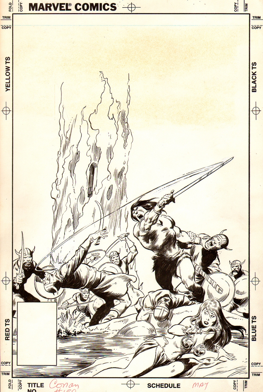
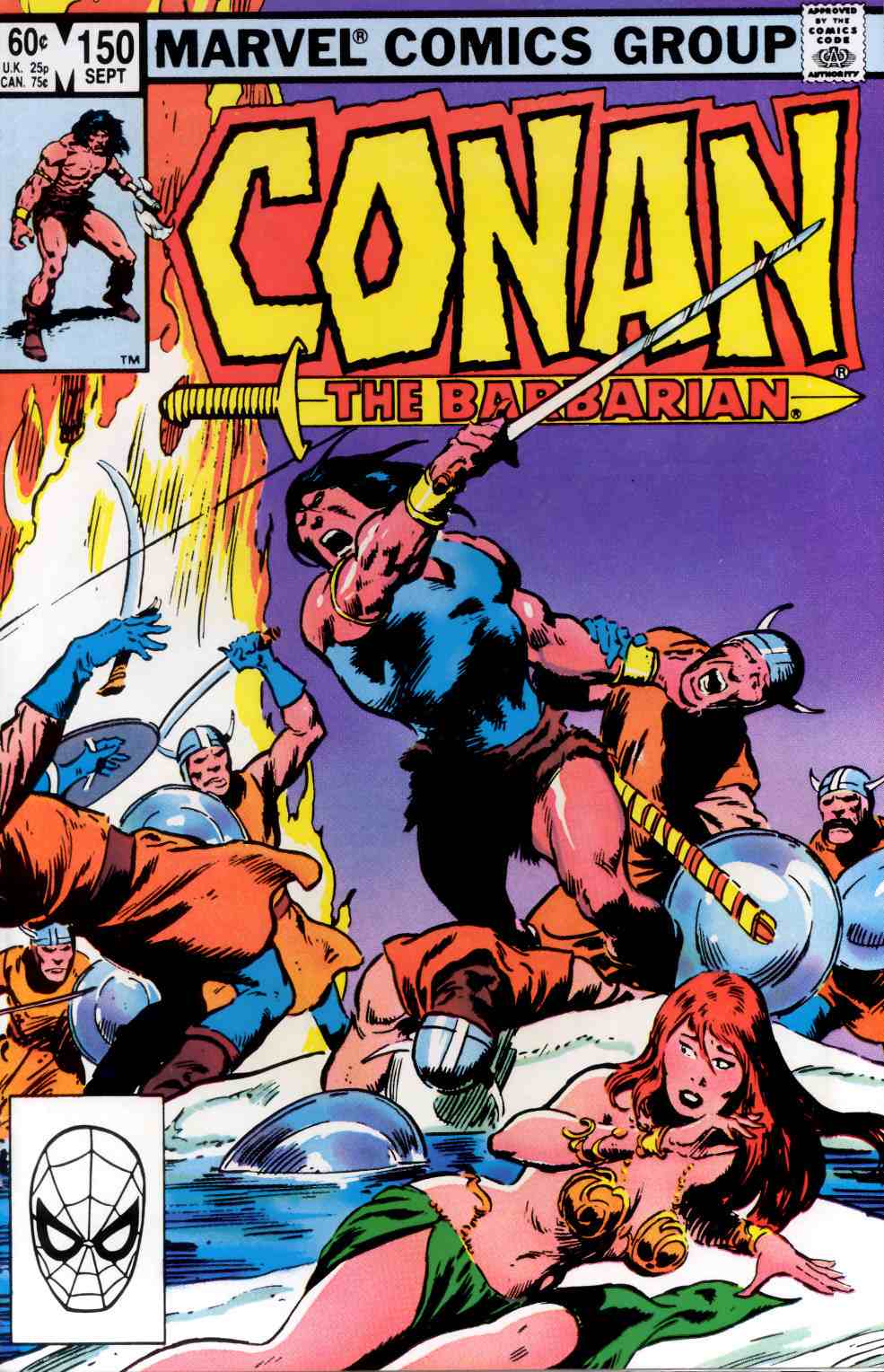
What’s interesting to me about the above comparison is how much of John Buscema’s original composition for the cover of Conan the Barbarian #150 was cropped out of the printed version, presumably either by editor Larry Hama or by editor-in-chief Jim Shooter. Maybe if Buscema hadn’t shown Conan chopping a guy through the throat with his sword, the editors would have published it uncut. Maybe.
The only issues of Conan that I have ever searched through dusty back-issue boxes to find and add to my collection were issues in which Barry Smith inked Barry Smith, John Buscema inked John Buscema or Gil Kane inked Gil Kane. The unpublished cover of Conan the Barbarian #150 looks like pure John Buscema to me.
Bonus Video:
Here’s a youtube video that includes footage of John Buscema pencilling and then inking a pin-up of Captain America along with footage of Bill Sienkiewicz creating a quick portrait Electra with marker, brush and ink, and white-out:
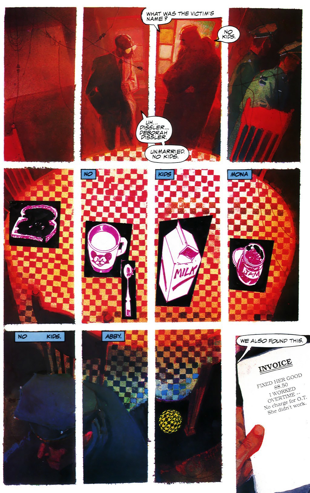
From Marvel Fanfare #8 (May 1983), “The Bill Sienkiewicz Portfolio,” coloured by Christie Scheele:


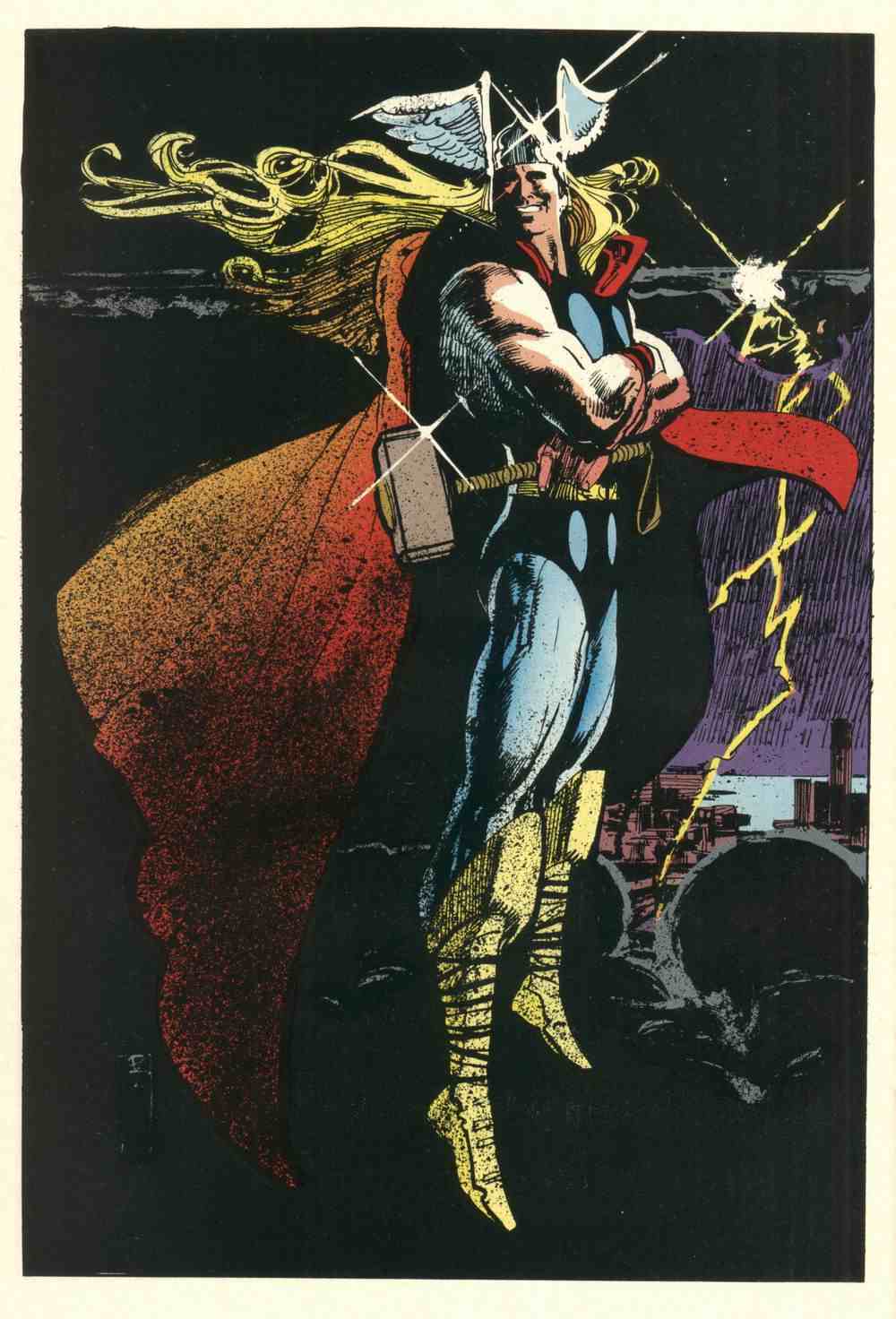
Notice Sienkiewicz’s Jeffrey Jones-inspired signature. Not really any evidence of Jones’s influence in the drawing, however. Ralph Steadman, maybe. Bob Peak, definitely — especially in the Thor image, but in some of the others as well. Neal Adams, definitely — all over the place. Jones, not so much.
To my eye, at least.
For one thing, Sienkiewicz’s figures are just not specific enough. They’re not carefully observed. There are no details that make you think, yes, that’s how a body really looks, and yes, that’s how it moves! Jones’s best drawings are filled with such details.
Seven years later, Sienkiewicz was hard at work on the artwork for Big Numbers, where he combined a loose mixed-media illustrative technique with extensive photo reference. Here’s a random sample from issue #1, as featured on Bill Sienkiewicz’s official Web site (where the style is explicitly identified as “photo-realistic”):
And here’s another:
It was a relatively original synthesis of the influences that Sienkiewicz had formerly worn on his sleeve, but still — to my eye — Sienkiewicz’s Big Numbers style owed more to work such as Richard Diebenkorn’s mixed-media figure drawings (see, for instance, Diebenkorn’s Seated Woman No. 44 [1966] posted below) — along with a certain highly influential school of heavily photo-referenced but painterly illustration art that emerged in the 1960s and steamrolled into the 1970s and beyond (Bernie Fuchs comes to mind here, and Robert Heindel, and the various Spanish illustrators whose photo-based work in ink, pencil, charcoal, oil, etc., came to dominate the Warren comics magazines, especially Vampirella) — than it ever did to Jones’s Idyl or I’m Age strips.

Nor did Sienkiewicz’s work have to resemble Jones’s, for Sienkiewicz to claim Jones as an influence.
Because the simple fact is, one can be influenced by a fellow artist’s example of artistic independence, integrity, and experimentation without latching on to specific aspects of his or her style…
BONUS IMAGE:
From 1988, a page from Stray Toasters, to compare with the illustration by Robert Heindel that I linked to earlier:
[CLICK IMAGES TO ENLARGE]

When I saw that second cover with the raggedly applied paint, the swooping linear accents, and the colourful little shapes fluttering along the edges of the forms, I immediately was reminded of certain works by Bill Sienkiewicz and by his teacher/mentor, Barron Storey. Like this well-known cover, for instance:
But would either Sienkiewicz or Storey recognize Powers as an influence? I have no idea…
BONUS LINK:
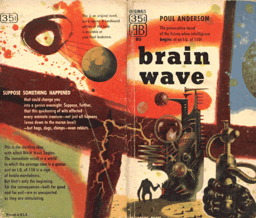
The Powers Compendium — the images are tiny, but there sure are a lot of them! I see that the Compendium site also includes that same little scan of the wraparound Brain Wave cover.
