Bernie Wrightson · Heads Up!

Heads Up: CREEPY PRESENTS: BERNIE WRIGHTSON

Coming in October 2011 from Dark Horse:

Here’s the publisher’s description:

All of horror legend Bernie Wrightson’s Creepy and Eerie short stories, color illustrations, and frontispieces are finally collected in one deluxe hardcover [ISBN-10: 1595828095; ISBN-13: 978-1595828095]! These classic tales from the 1970s and early 1980s include collaborations with fellow superstars and Warren Publishing alumni Bruce Jones, Carmine Infantino, Howard Chaykin, and others, as well as several adaptations and original stories written and drawn by Wrightson during one of the most fruitful periods of his career! All stories and images in this collection are restored with care and reprinted in the same oversized format as Dark Horse’s award-winning Creepy Archives and Eerie Archives series.

If this is to be a continuing series of artist-focused collections, the next book ought to be a Corben collection… and then Nino!


PREVIOUS ANNOUNCEMENT:

Bernie Wrightson · Heads Up!

Heads Up: FRANKENSTEIN ALIVE, ALIVE! by Niles and Wrightson

Coming soon from IDW:

I’ll update this post when more details are released.


UPDATE (06 March 2012):

Here’s the latest information, from IDW’s publishing solicitations for May 2012:

Few works by comic-book artists have earned the universal acclaim and reverence that Bernie Wrightson’s illustrated version of Mary Wollstonecraft Shelley’s Frankenstein was met with upon its original release in 1983.

Nearly 30 years later, Wrightson returns to his passion project with a comic series that picks up at the end of the classic novel, hailed as one of the greatest horror stories of all time. Frequent Wrightson collaborator Steve Niles provides the script for this epic, decades in the making.

While appearing to be in black and white, each page was scanned in color to mimic as closely as possible the experience of viewing the actual original art, showing off the exquisitely detailed brush work of one of the greatest living artists in comics today.

Each issue will also include supplemental materials, including interviews, essays and a serialization of the original prose story by Shelley.

B&W • 32 pages • $3.99

With very few exceptions, I simply don’t buy comics any more; however, I have a suspicion that this series will eventually be published as a hardcover companion to the Dark Horse edition of Mary Shelley’s Frankenstein, illustrated by Bernie Wrightson, when it’s done. But if not, I guess I’ll just have to do without it.

Bernie Wrightson · Comics · Comics (Jones) · Here, Read · Jeffrey "Jeff" Catherine Jones · Look Here · RIP: Jeffrey Catherine Jones (1944 - 2011)

Look Here, Read: “The Believer,” reconstructed by Rotomago

On 30 May 2011, I received a private message from Rotomago — co-creator, with the Serb artist Vuyacha, of a forthcoming graphic novel inspired by the pied piper of Hamelin, creator and maintainer of the Alberto Breccia Bibliografía, and a sometimes visitor to Ragged Claws Network — who made me an offer I couldn’t refuse. After confiding to me, in very personal and moving terms, his thoughts on the recent death of Jeffrey Catherine Jones, Rotomago wrote:

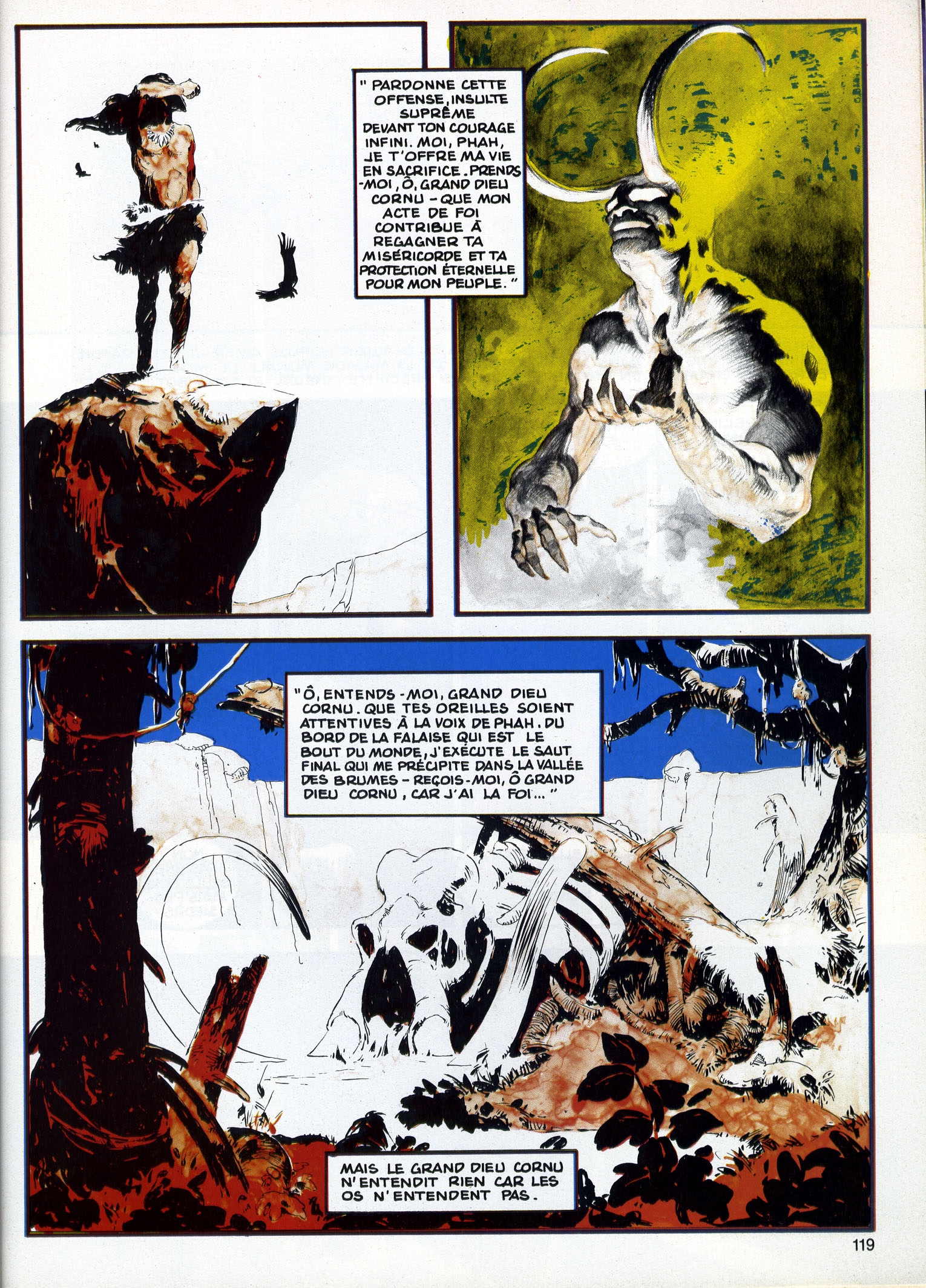
As a way to bring my little rock to the cenotaph, I have a curiosity you may like to put on your website. In the Jeff Jones site, the story THE BELIEVER by Jones and Wrightson is featured. It is mentioned that: «unfortunately the two colors were printed in reverse». The same version is reproduced in the recent book on Jones but it was published in an other way in France, in a four color process printing, in the magazine Special USA n°14/15 in June 1985.

So there it was, out of the blue: in tribute to Jeffrey Jones, a fellow I didn’t know and who didn’t know me wanted provide my blog with scans of “The Believer,” by Jeffrey Jones and Bernie Wrightson, as it was published in a French magazine in 1985, with the colours printed in a way that brought the piece more into line with the intentions of the artists.

I immediately accepted the offer. But it didn’t stop there. The next day, Rotomago emailed me another note, which read, in part, as follows:

Please wait one more day for the Believer. Since both versions are flawed, the original with reversed duotone, the French in four colors with an addition of blue and yellow, I’m actually building a third “virtual” one.

Since I hadn’t yet seen the French version, I had to take Rotomago’s word that it was flawed in some way, but I definitely was intrigued by the promise of a “virtual” version of the story. I did, however, email Rotomago to ask him, please, if he would, to send me the flawed French version as well as his new and improved version. I explained that my plan, hatched at that very moment, was to display the two versions that he would have in hand once he was done together with the original version, which I already had on display here at RCN, in a single post. I said I thought it would be instructive.

This morning, I received the files, and now here I am, ready to share them with you.

But please note: if you wish to share the “virtual” version of “The Believer” with others — I know I can’t stop you — I hope that you will acknowledge Rotomago as the wizard who has brought the story as close as it has ever been to the original intentions of Jones and Wrightson and perhaps even give credit to RCN as the source of the files. Or better yet, don’t just take the files and re-post them but instead simply link to this post.

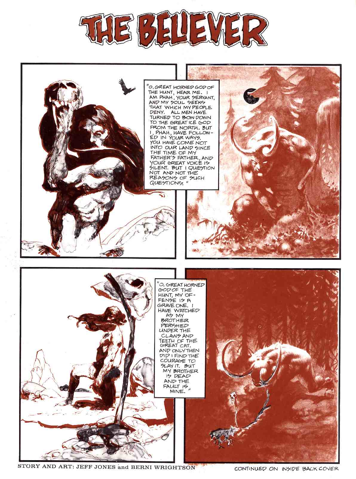
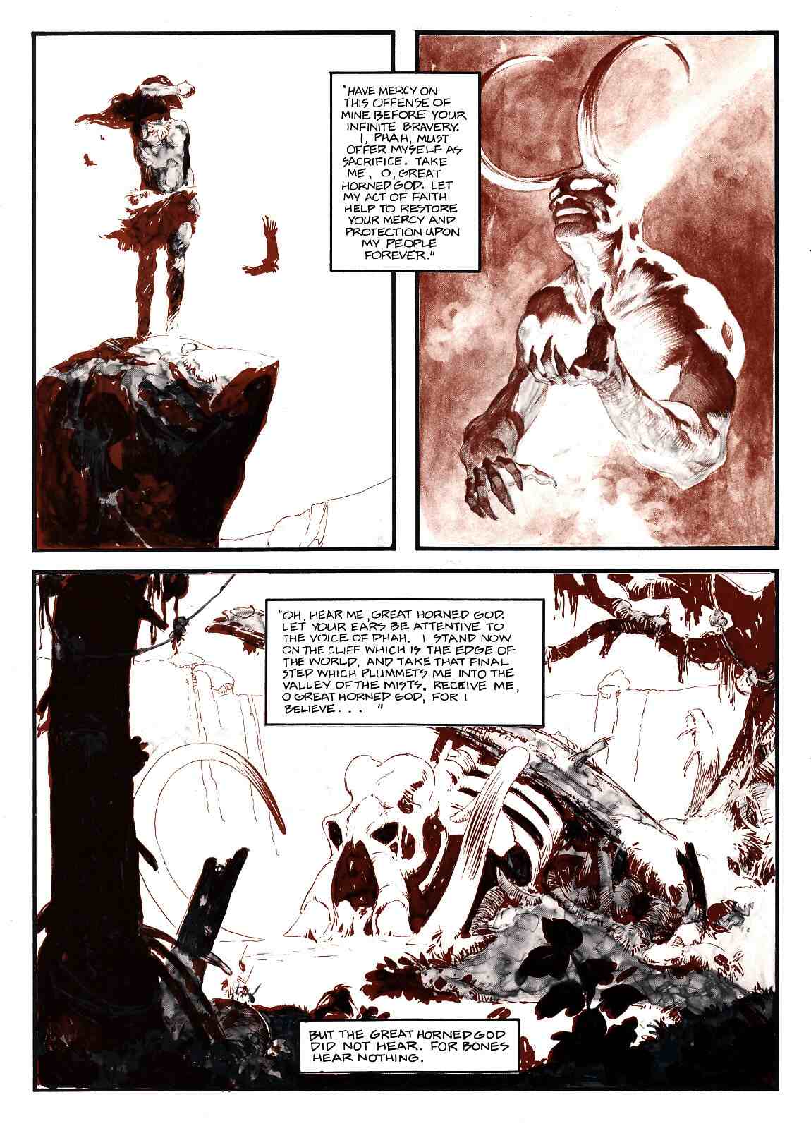
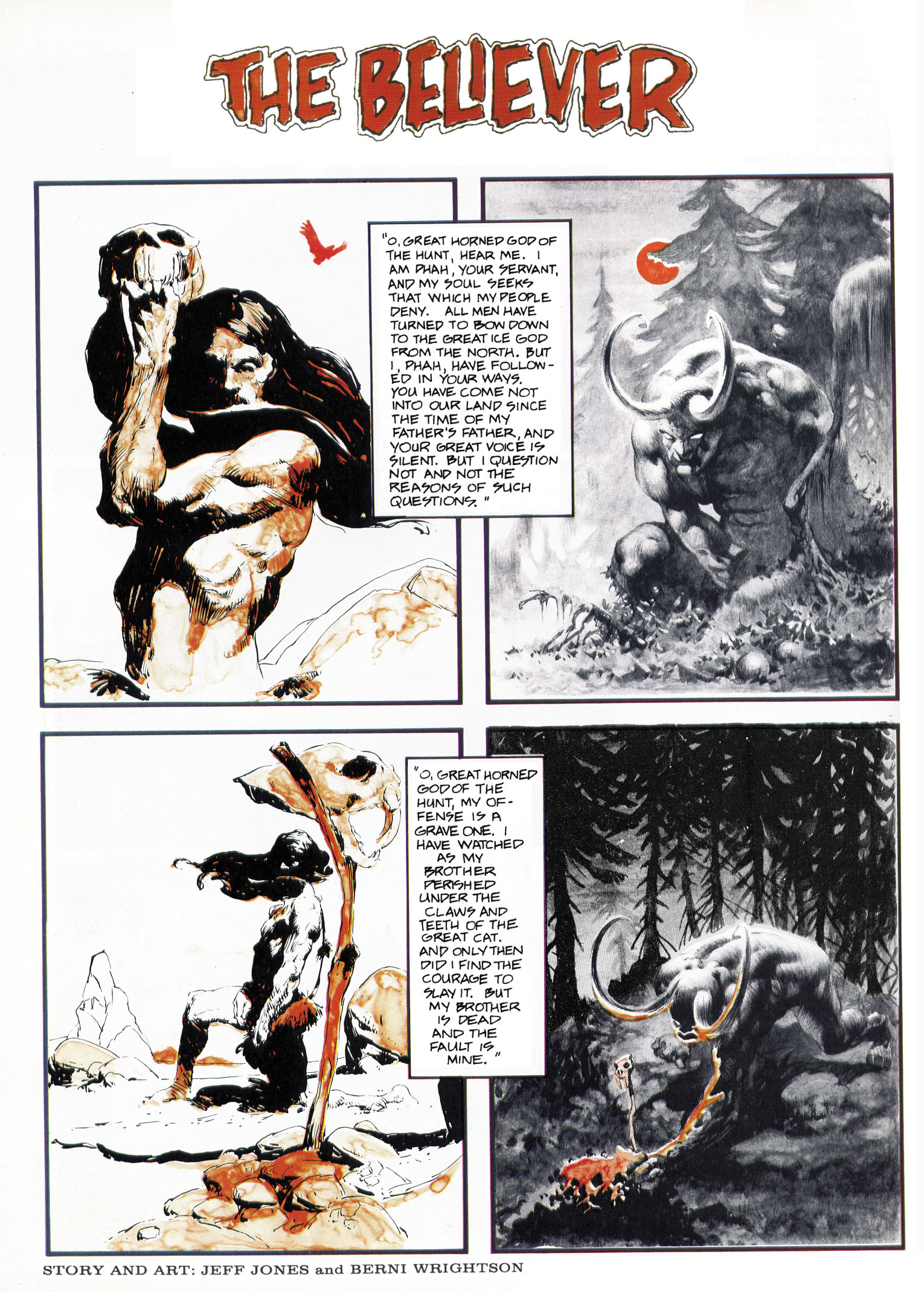
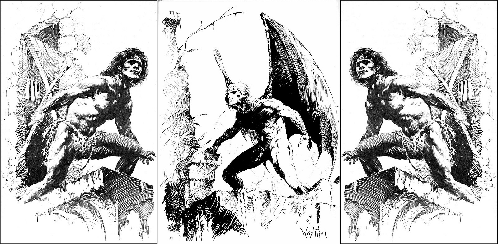
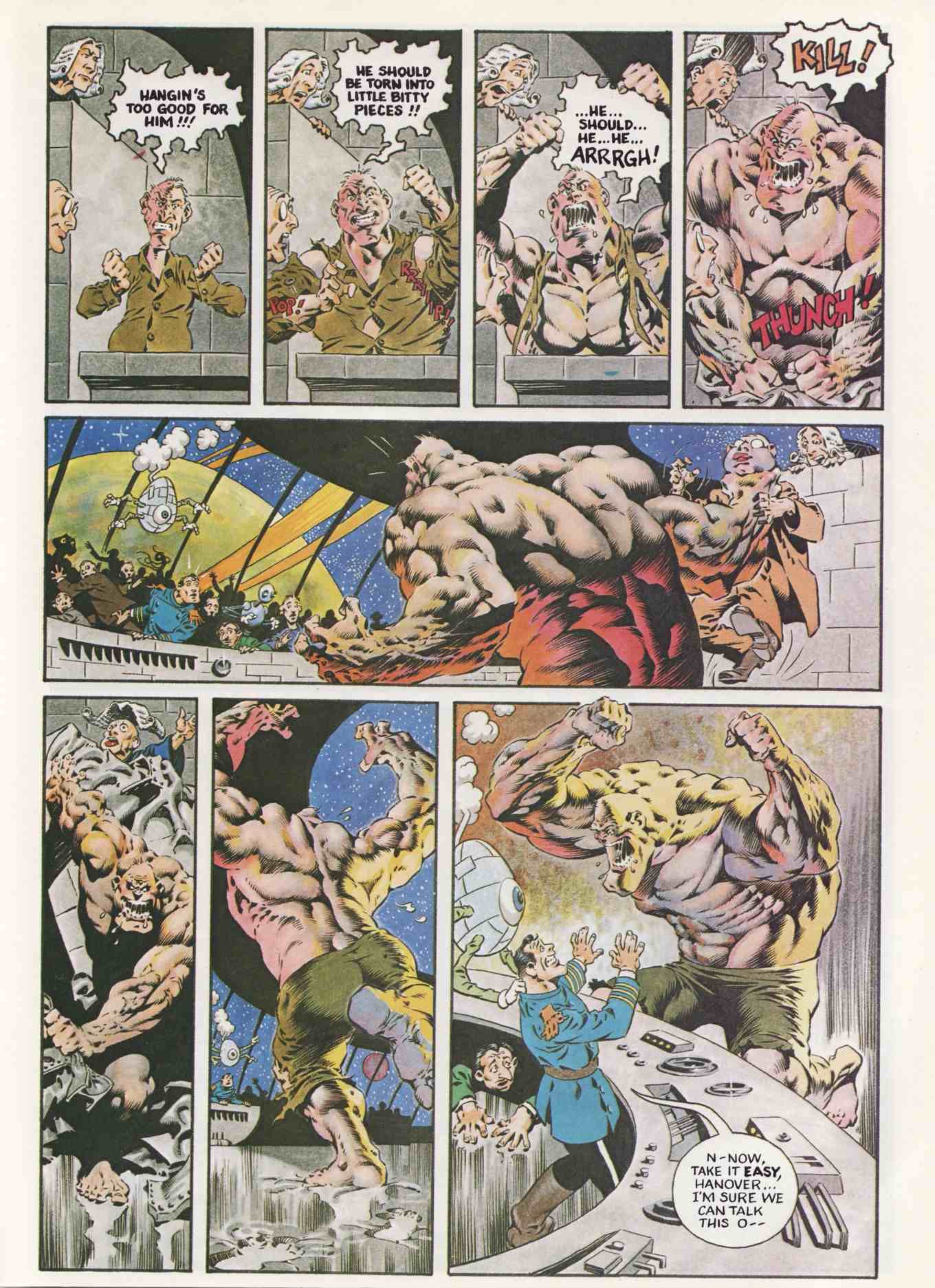
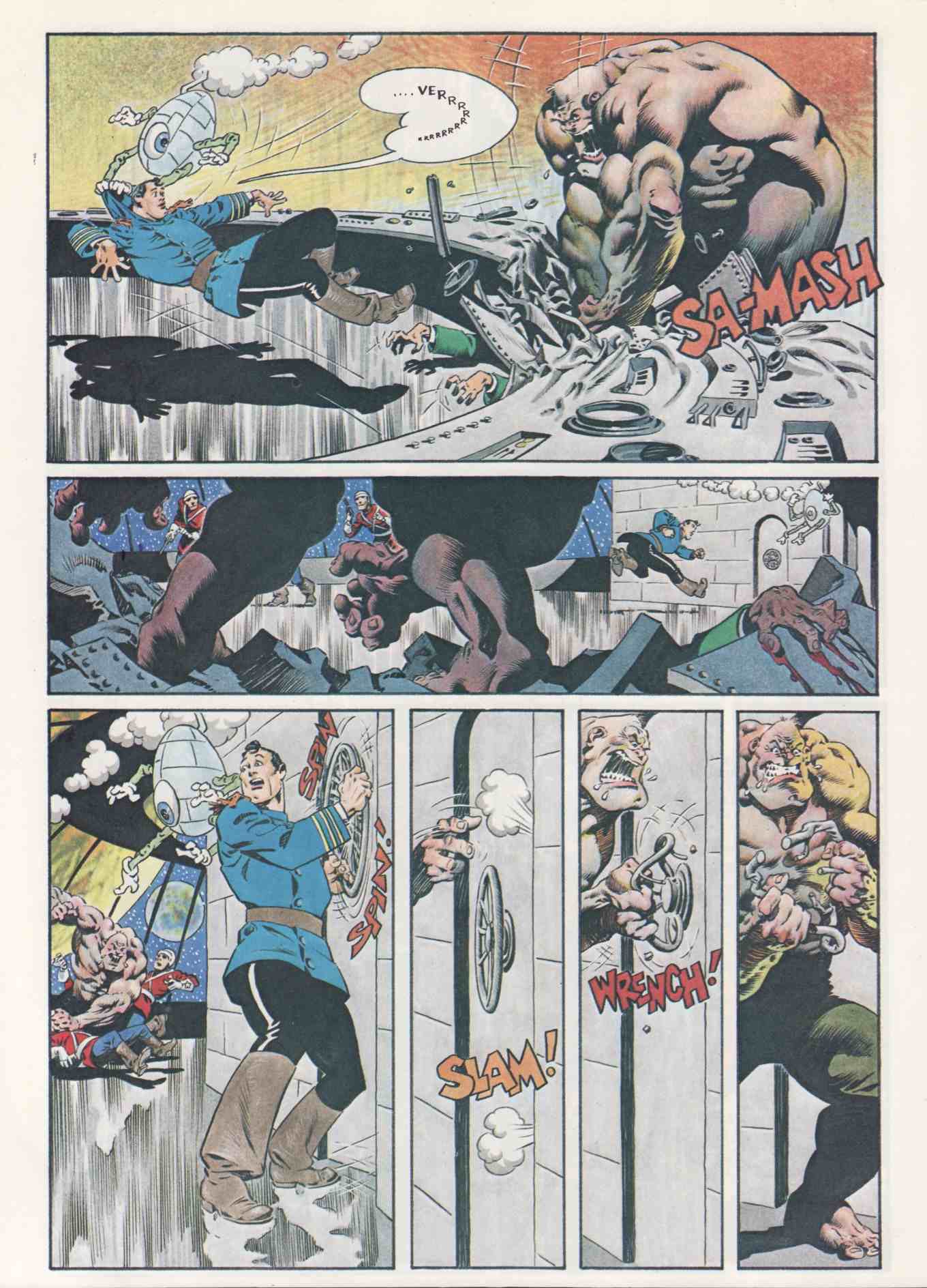
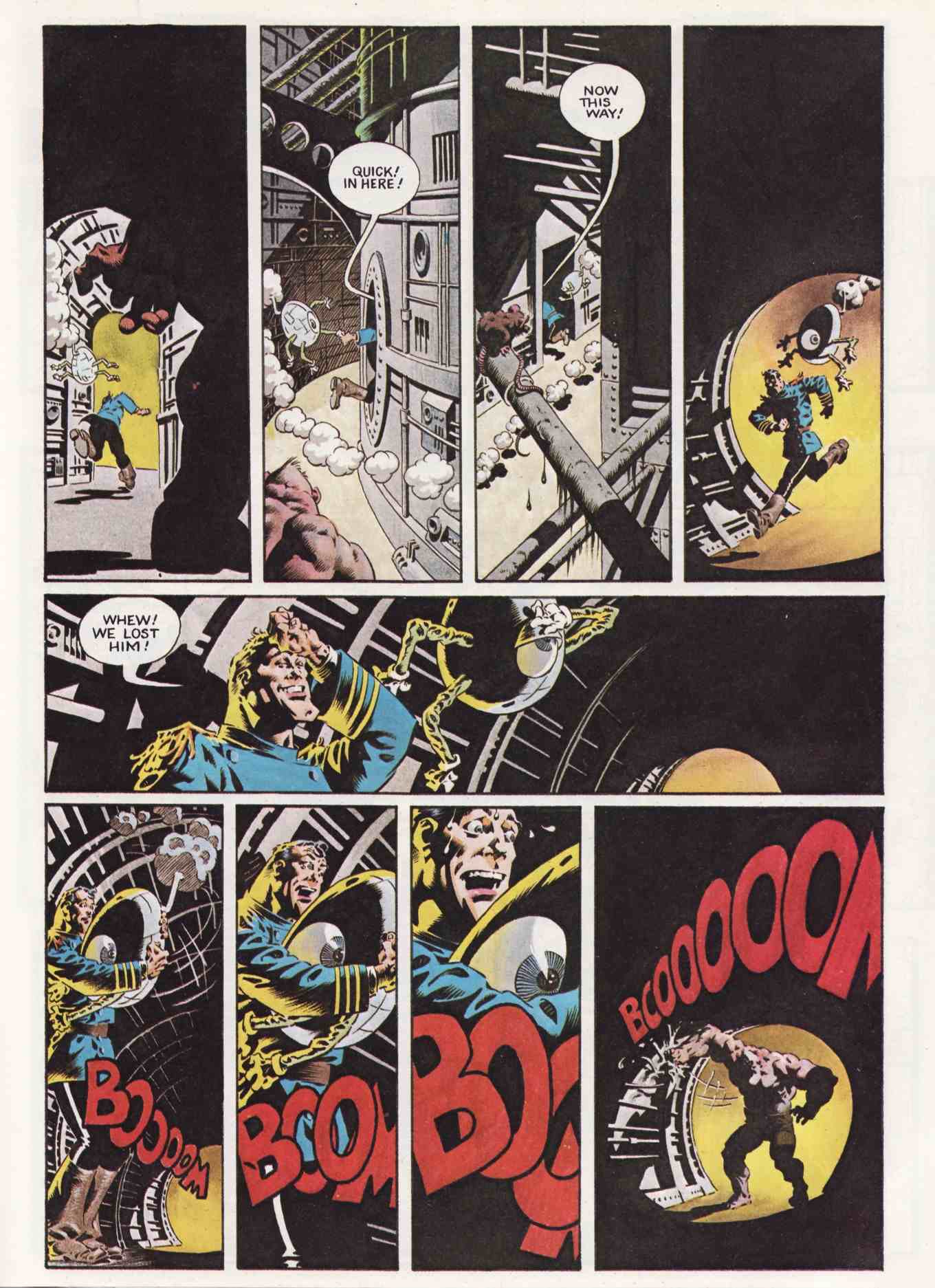
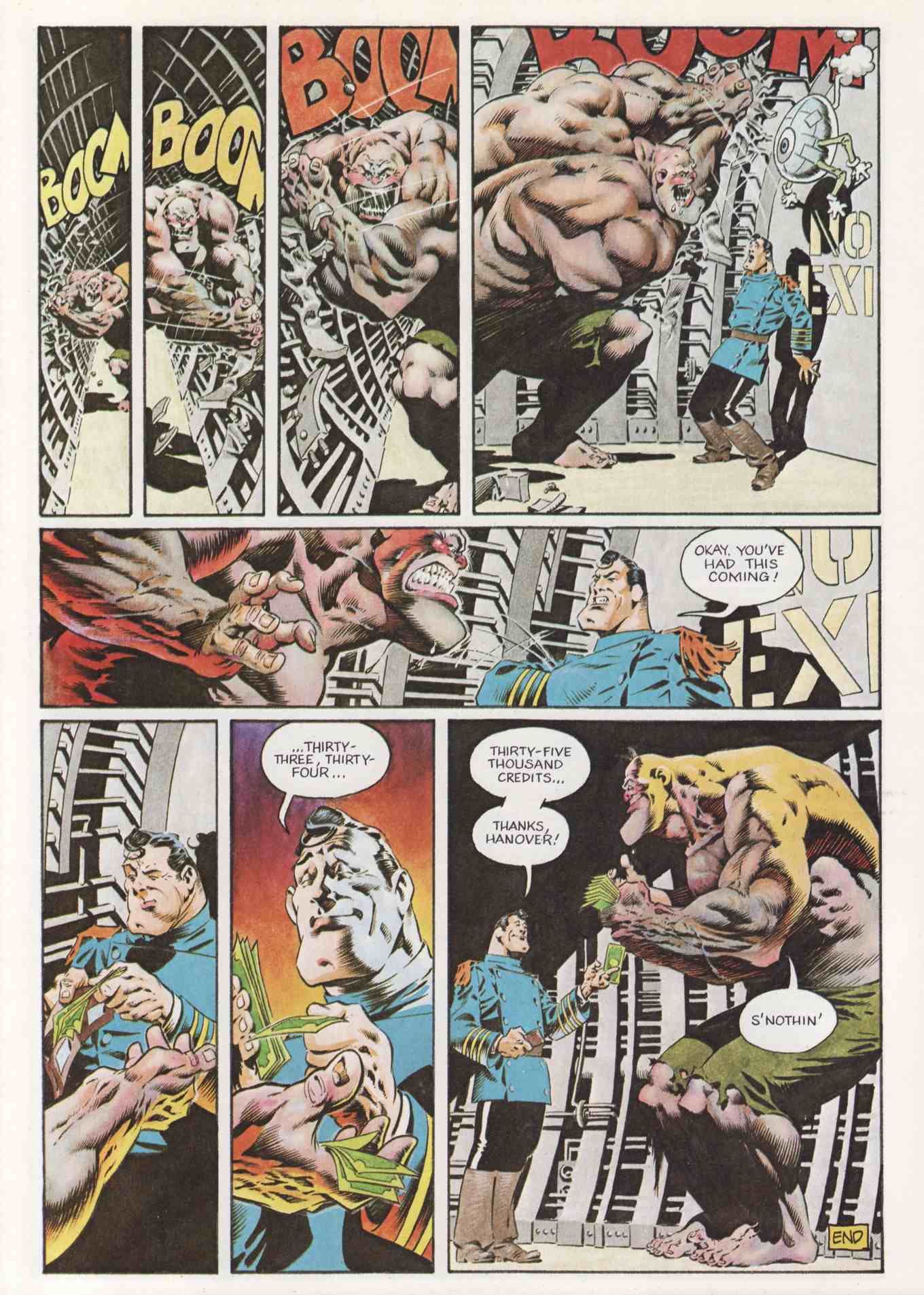
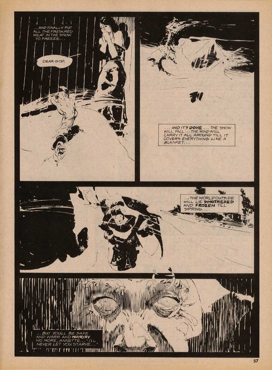
Anyway, that being said, let’s take (another) look at “The Believer” as it originally appeared on the inside-front and inside-back covers of Vampirella #33, way back in 1974; notice that, although most of the panels look okay despite the printing error, one panel in particular, the last panel on the first page, is extremely difficult to decipher:

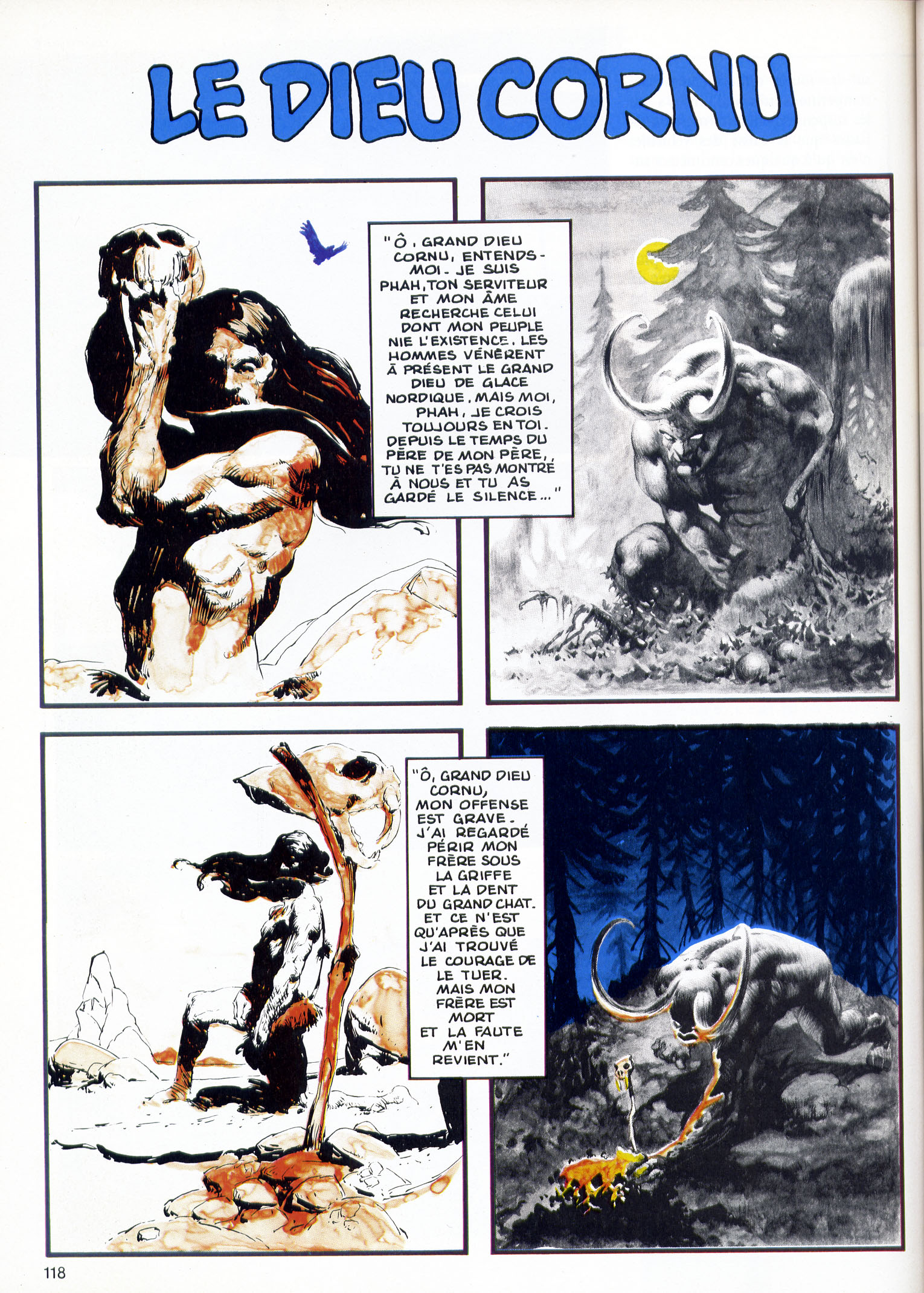
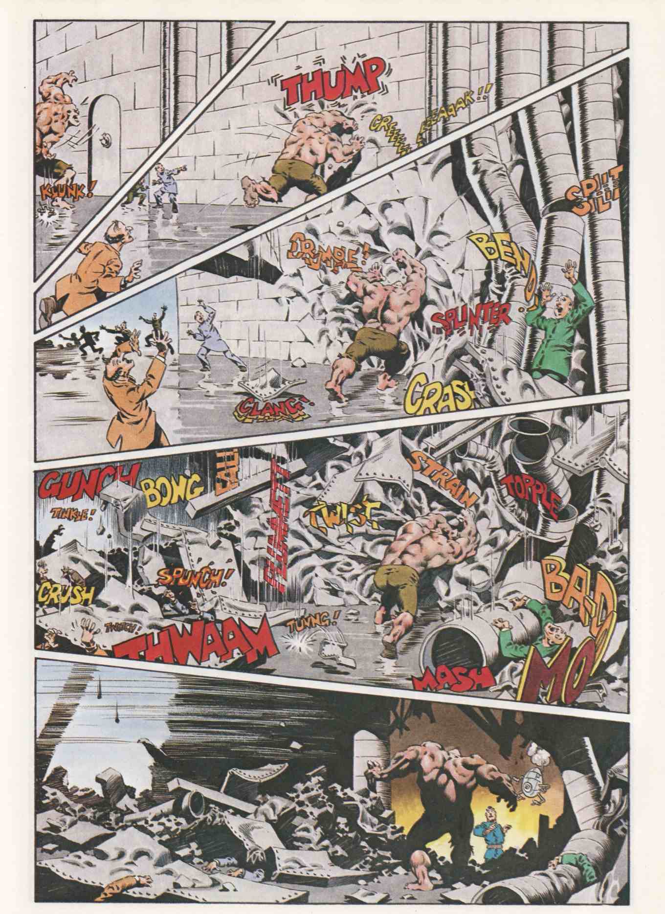
Next up is the version of “The Believer” that appeared, in French, in Special USA #14/15 in June 1985, just over ten years after the story’s original publication; notice that, with four colours at their disposal rather than two, the powers that be at Special USA took it upon themselves to tart up the art with obtrusive swatches of deep cerulean blue and acid yellow:

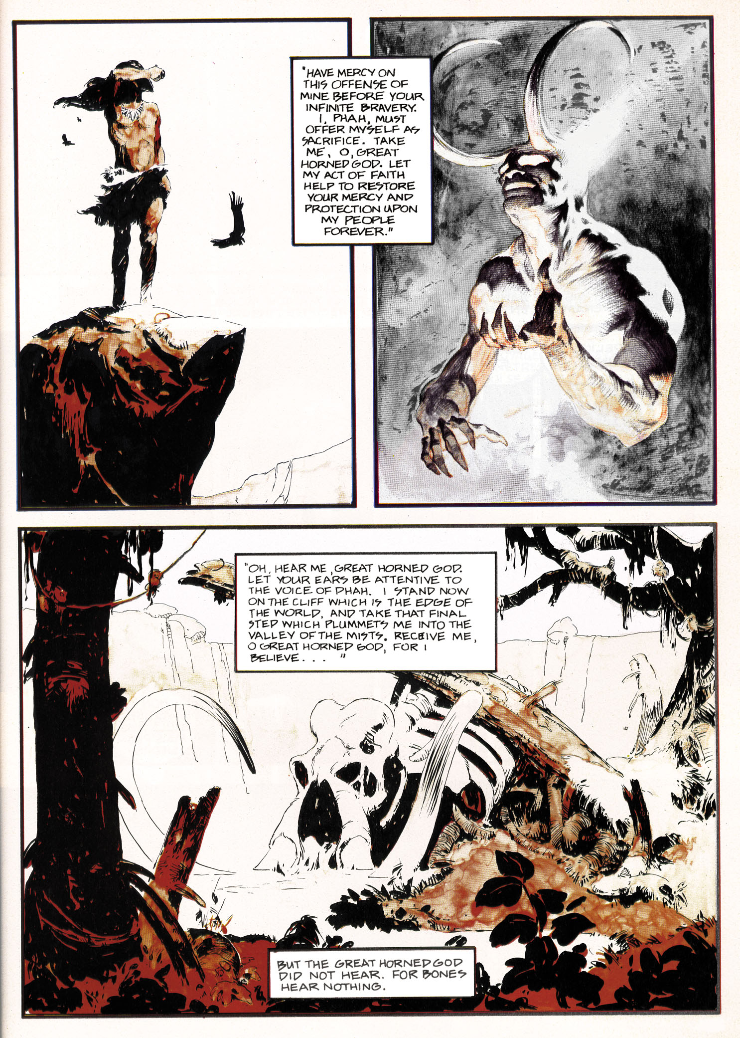
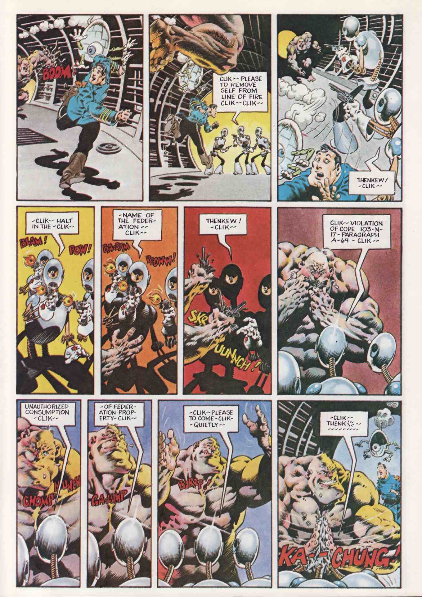
And now, at last, here’s Rotomago’s reconstruction of “The Believer,” with the colours as they ought to have been printed way back in 1974:

In the message that accompanied the files, Rotomago shared the following observations, which I will now share with you:

It surely would be feasible to make a decent reconstructed version fitted for publication. It would require multiple high-quality scans of both versions, a subtle balance of the colors layers, some alteration in the place of colors layers as the overlapping of colors is not always correct in the French version, a very long pixel by pixel cleansing (especially to remove the green stains [probably added by the French color engraver] in the background of Wrightson’s Page2 Panel2), as well as a slight increase in the size of pages to avoid blurring.

But for the web view, I hope that this far from perfect version, will do the job.

Note that after having spent some time studying these two pages on my screen, my fancy for them has even more increased! Such delicate and subtle pictures!

Although I, for one, sort of miss the fiery red-orange cast of Wrightson’s horned-god panels as they appeared in the original printing, I’m sure that fans of Jeffrey Jones and Bernie Wrightson will want to thank Rotomago for the terrific work he has done to reconstruct “The Believer” that should have been but wasn’t. But even if they don’t, I know that I personally want to thank him, again, for his surprising, unsolicited contribution to this site and for going the extra mile to enhance our appreciation of a story that many have admired over the years but none have seen reproduced in exactly this way before, ever.

Finally, one more time, here are the links to Rotomago’s blogs:

Alberto Breccia Bibliografía
le charmeur de rats

Bernie Wrightson · Connections · Frank Frazetta · Illustration Art · Look Here

Connections: Frazetta and Wrightson

Flipping through the second issue of the E.C. fanzine, Squa Tront, I came across a profile of Bernie Wrightson that made me chuckle. Published in September 1968 — the same year that, according to his official Web site, Wrightson “turned pro” — the profile includes a short biographical and artistic statement as well as three full-page reproductions of Wrightson’s work. In the statement, the man formerly known as “Bernard Albert Wrightson” explains why he has decided to go by the name “Berni” instead of “Bernie” (a decision he later reversed); he forthrightly acknowledges his longstanding fascination with and admiration for the work of Frank Frazetta; and he vigorously defends himself from the charge that his own work is overly indebted to that same artist: “He’s [Frazetta has] probably inspired me more than anyone else and to this day, I hear so much about my copying or ‘swiping’ from him. Well, I have never had a piece of Frazettart [sic] on the board while working. This is just my natural way of drawing, as I was drawing like this long before I ever laid eyes on his work. It’s just my misfortune (?) that our work appears similar.” Trouble is, Wrightson, who was only about 20 years old at the time, says right in his statement that he “became interested in art at about age twelve and when I was fifteen, ‘discovered Frazetta.'” Now, I don’t know what kind of prodigy Wrightson was, but if he was drawing like Frazetta long before he ever laid eyes on Frazetta’s work, then clearly he would have had to have been doing so between the ages of 12 and 15… which, to my mind, definitely does not pass the… uhm… uh… anyway, from Squa Tront #2 (September 1968), here’s “Profile: Bernie Wrightson,” along with an illustration by Frazetta, originally published in the Canaveral Press edition of E.R.B.’s Tarzan and the Castaways (1965), that did NOT appear in Squa Tront but, in light of Wrightson’s statement, holds a certain interest, I think.

Do you see now why “Profile: Berni Wrightson” made me chuckle? Ah, the impetuousness of youth!

Of course, Wrightson would eventually synthesize his influences to produce some of the best horror comics and illustrations of the 1970s and beyond. But he clearly hadn’t done so in 1968. And from all the work I’ve seen, I’d argue that he didn’t do so for a few more years after that. Which, btw, is a perfectly normal path of development for an artist, right down to the denials…

Bernie Wrightson · Comics · Here, Read · Look Here · Separated at Birth?

Separated at Birth? James Garner and Captain Sternn

Okay, I admit it. This one isn’t an original.

From page 13 of Comic Book Profiles #2 (Spring 1998), here’s Bernie Wrightson’s answer to the question “How did Captain Sternn come about?”: “I realized when I was working on Running Out of Time for Kitchen Sink that Captain Sternn came out of my teenage years, from the movie, The Great Escape. It was always one of my favorite movies. When I was a kid, all my friends identified with the Steve McQueen character, but I was fascinated with the James Garner character, who played a con man. He was a really smooth liar, just this side of being oily. I realized that Captain Sternn looks like James Garner from the Great Escape. So I guess that’s where it came from.”

BONUS CONTENT (added 07 August 2010):

Here’s Wrightson’s first “Captain Sternn” story, as it appeared in Heavy Metal, vol. 3, no. 3 (June 1980):

[CLICK IMAGES TO ENLARGE]

Bernie Wrightson · Comics · Comics (Jones) · Here, Read · Jeffrey "Jeff" Catherine Jones · Look Here

Look Here: “The Believer” by Jeffrey Jones and Bernie Wrightson

UPDATE (01 June 2011):

Look Here, Read: “The Believer,” reconstructed by Rotomago

Also, please note that I’ve replaced the JPEGs that used to be displayed in this post with the larger versions that I uploaded on 01 June 2011.

Bonus Links:

Bernie Wrightson’s Official Web Site

Ebay Feedback Profile for Jeffrey Jones – buy some art!