
Okay, I admit it. This one isn’t an original.
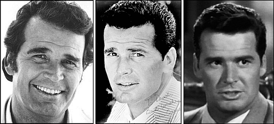
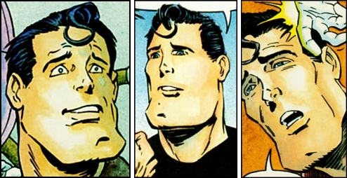
From page 13 of Comic Book Profiles #2 (Spring 1998), here’s Bernie Wrightson’s answer to the question “How did Captain Sternn come about?”: “I realized when I was working on Running Out of Time for Kitchen Sink that Captain Sternn came out of my teenage years, from the movie, The Great Escape. It was always one of my favorite movies. When I was a kid, all my friends identified with the Steve McQueen character, but I was fascinated with the James Garner character, who played a con man. He was a really smooth liar, just this side of being oily. I realized that Captain Sternn looks like James Garner from the Great Escape. So I guess that’s where it came from.”
BONUS CONTENT (added 07 August 2010):
Here’s Wrightson’s first “Captain Sternn” story, as it appeared in Heavy Metal, vol. 3, no. 3 (June 1980):
[CLICK IMAGES TO ENLARGE]
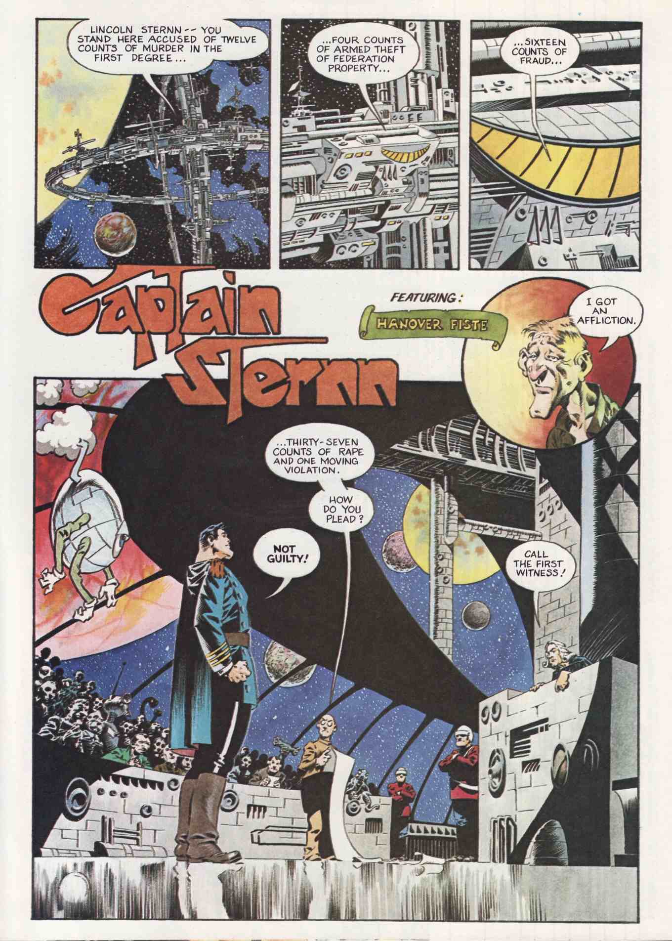
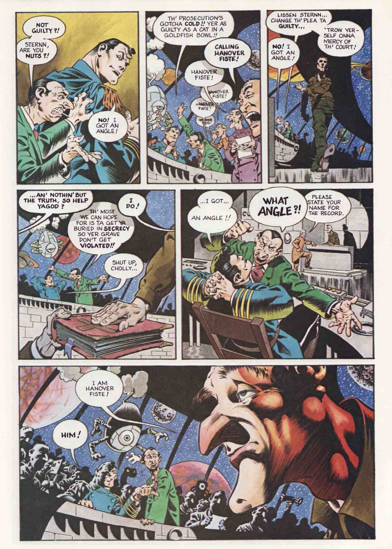

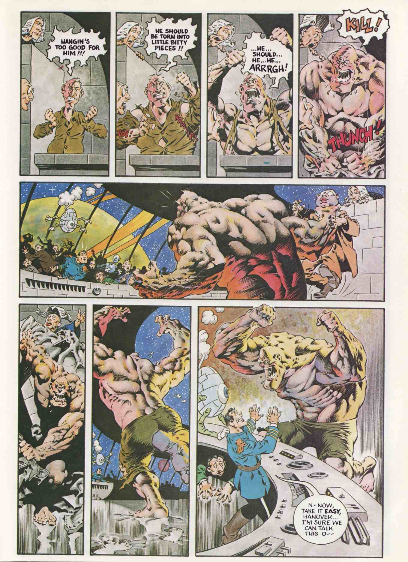
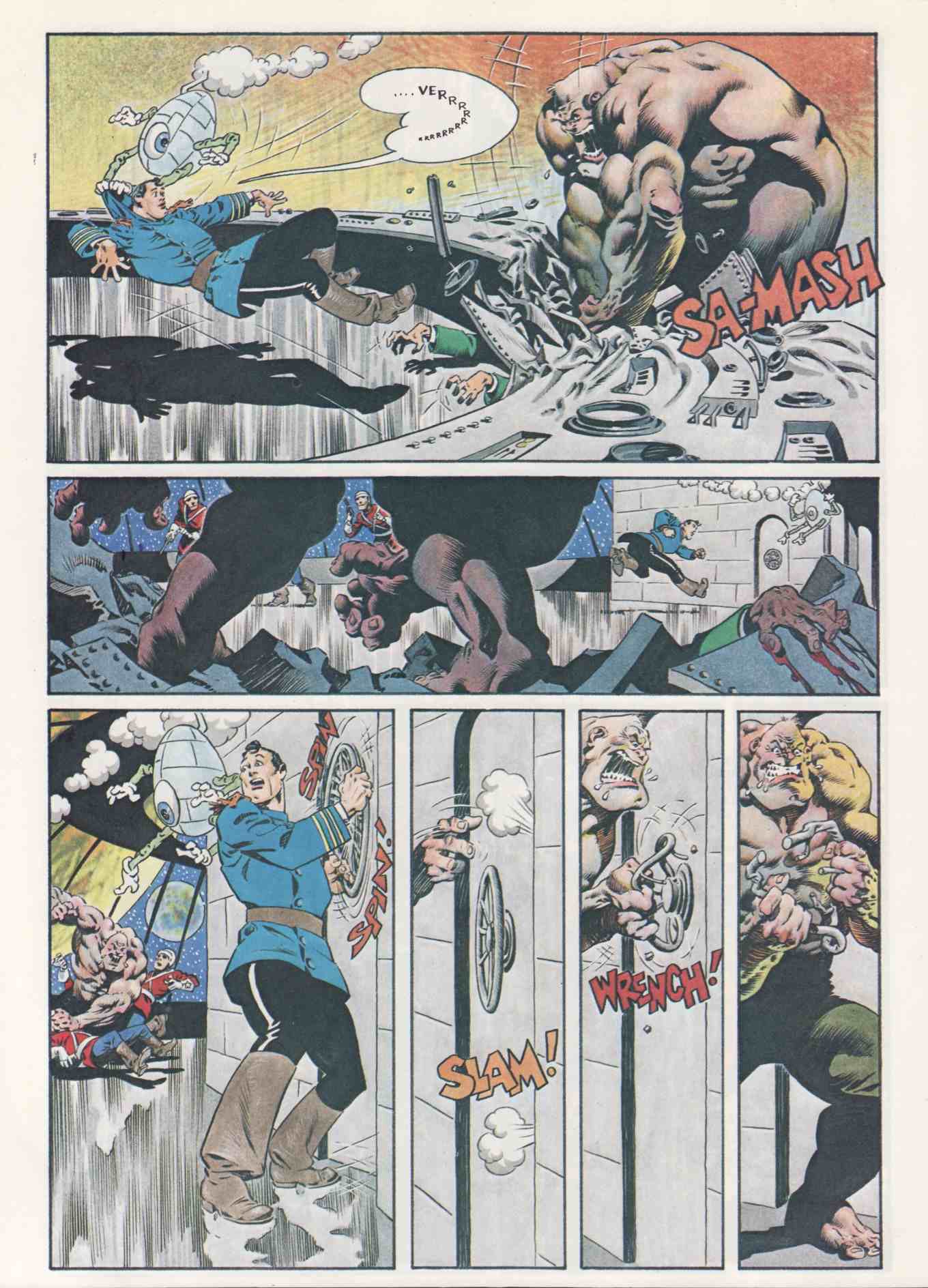
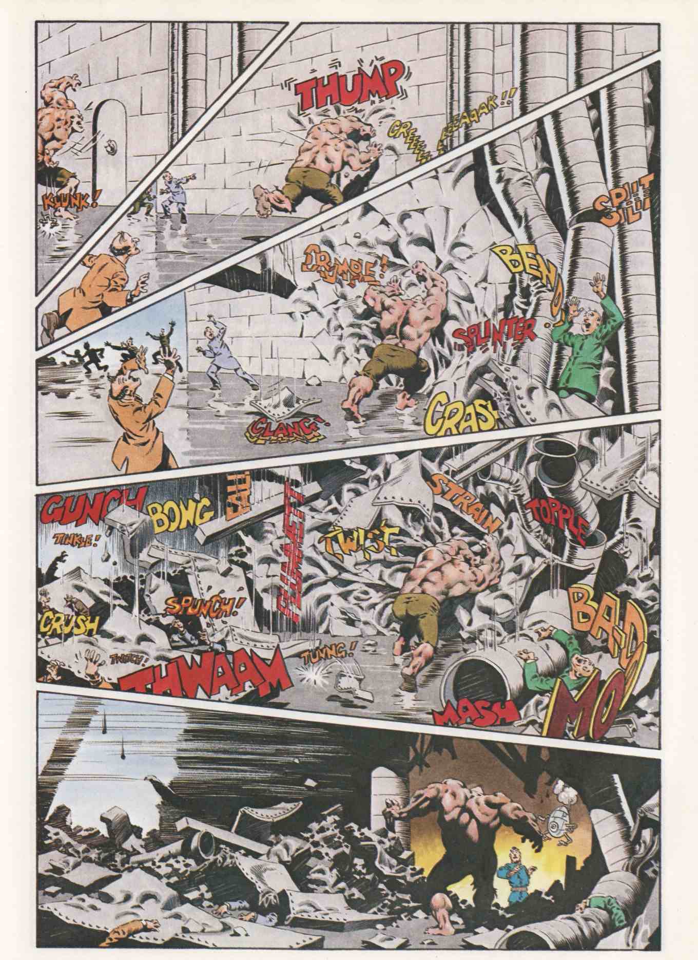
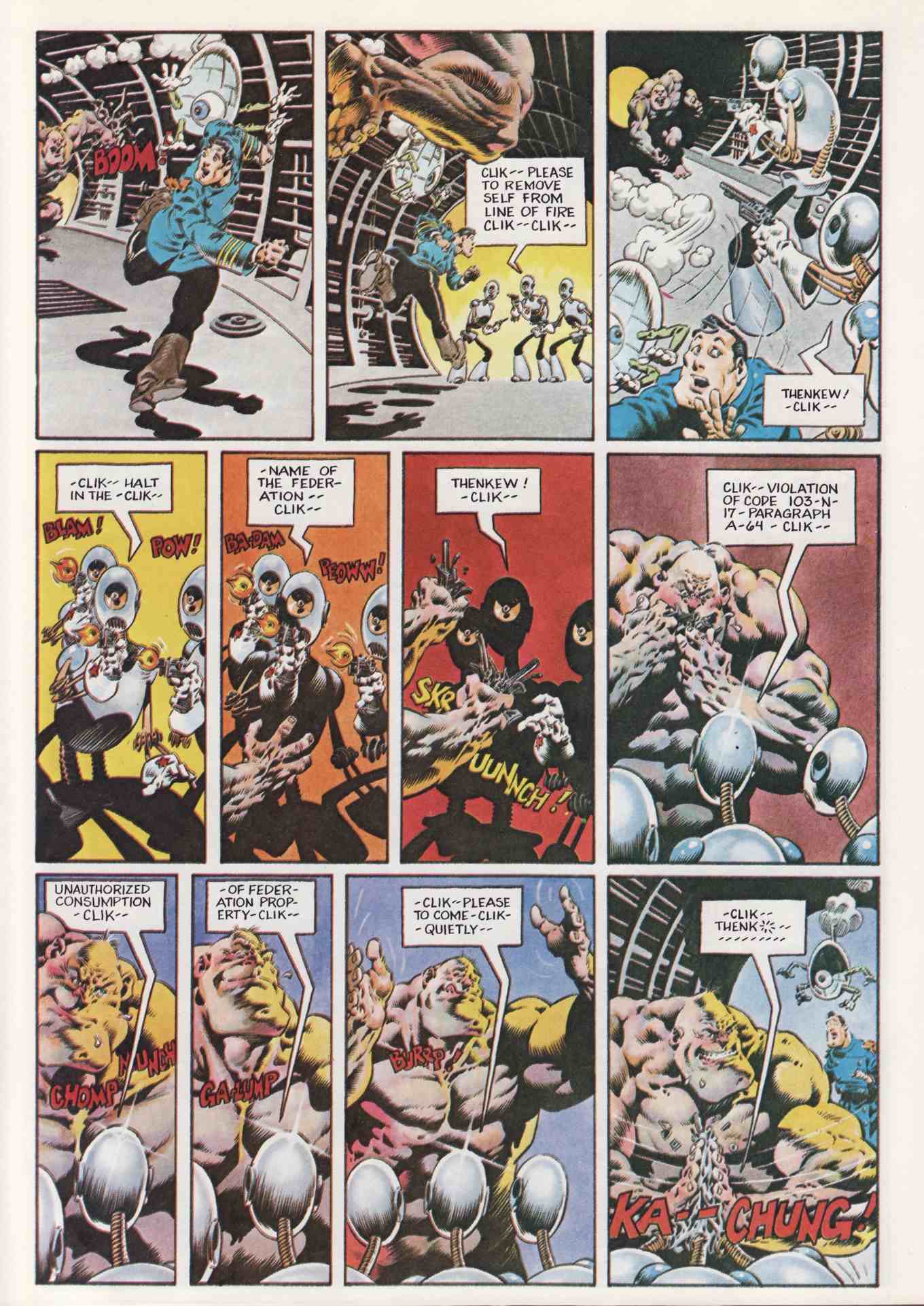
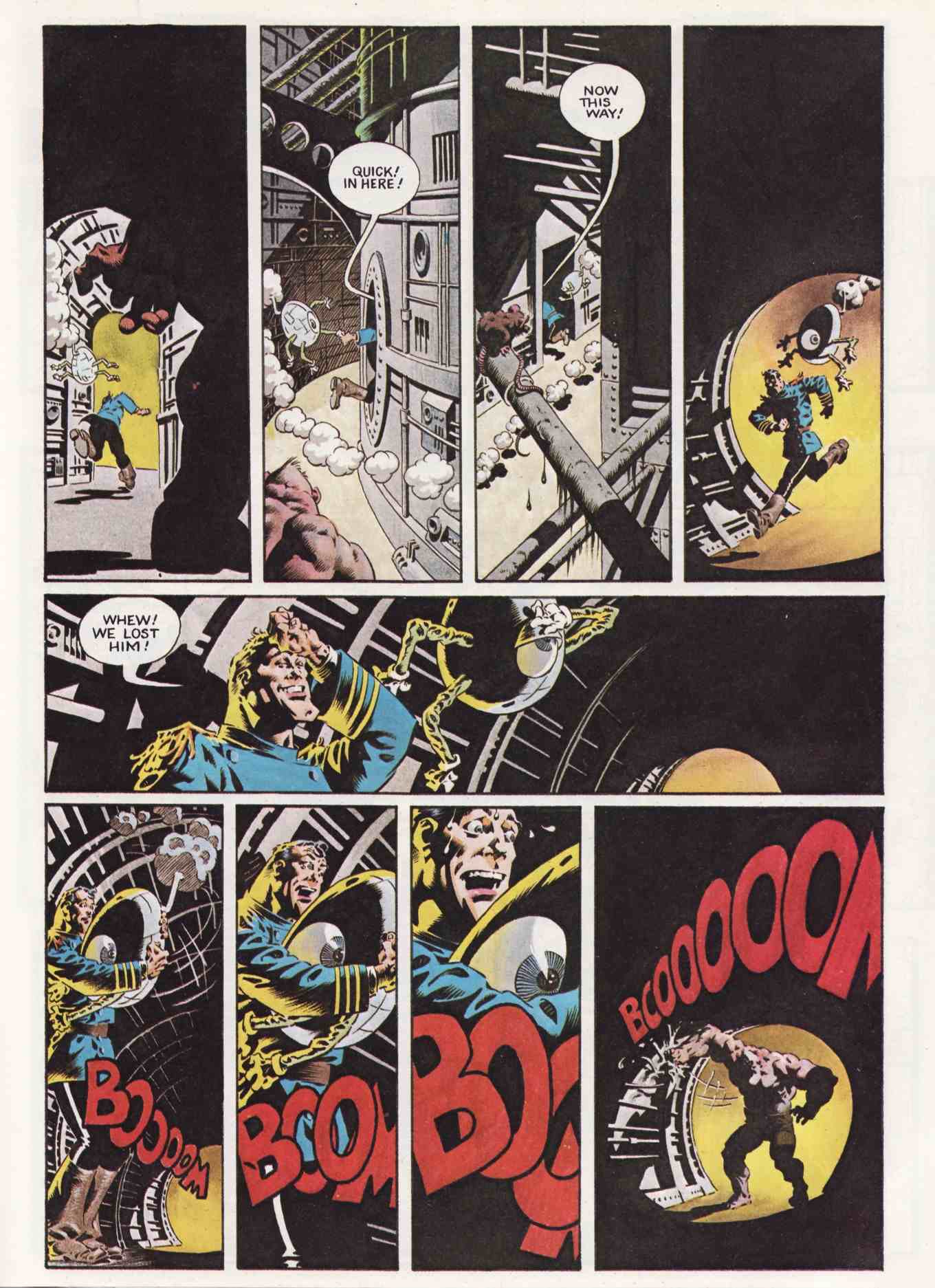
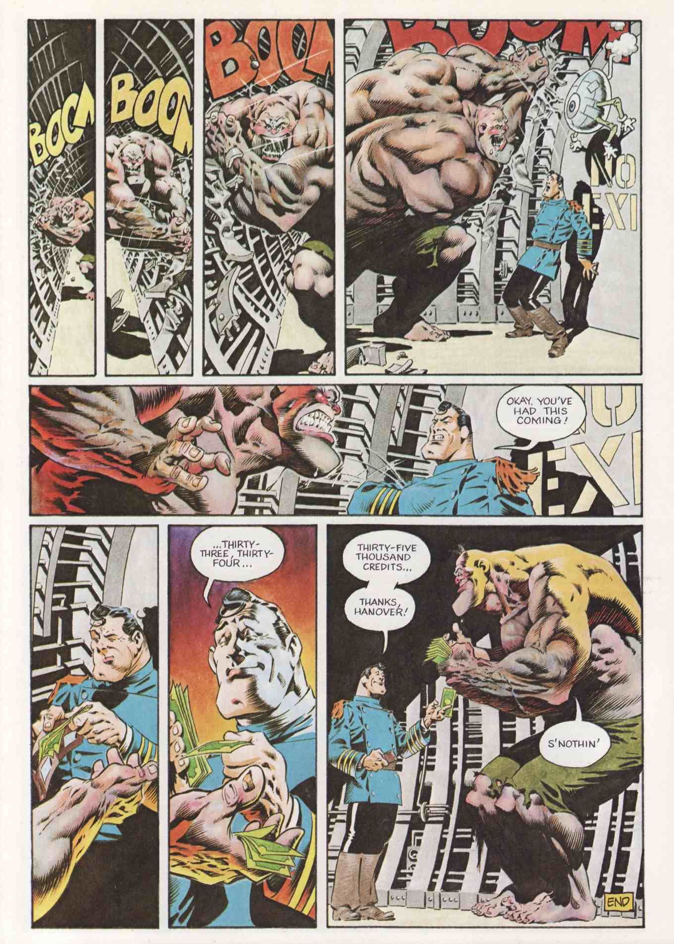

The original Capt. Sternn short story that appeared in a 1980 HEAVY METAL issue (the one with the H. R. Giger cover) was, in my opinion, the best artistic treatment the character would receive, showing a lot of E.C. era Wallace Wood influence in lovely pen, brush, and ink, topped by watercolour (or perhaps Dr. Martin’s dyes).
A short bio of Berni Wrightson in a DC reprint book of his work mentioned his adolescent fascination with the Universal horror films, as well as Errol Flynn’s swashbucklers. The latter rings a bell in this case: the original Capt. Stern short story begins with a courtroom scene of his numerous offences being listed. The scenario and ‘camera angles’ reveal the influence of a very similar scene in “Captain Blood” (1940), a film in which Flynn portrays the titular pirate.
I think you’ll enjoy the comparison should you see this part of the classic film, having Wrightson’s short story at hand.
LikeLike
Correction: the 1940 Errol Flynn film is “The Sea Hawk” (“Captain Blood” was from 1935), and contains the aforementioned trial scene.
LikeLike
I scoured the ‘net, but was surprised that no one had scanned that Captain Sternn story from HEAVY METAL June, 1980 in its entirety. Here are two pages that I found:
page 2

page 4

(in French)
Berni Wrightson drew this 6 pager circa 1978, but it sat around for a few years until Neal Adams, acting as agent, sold it to HEAVY METAL magazine. In my estimation it is the last truly great comics story that Wrightson ever drew. He has frequently said that the Frankenstein illustrations of 1976-80 burned him out artistically, and that nothing afterwards was ever quite the same. Sad, but true. Granted, there are some occasionally good moments in his FREAKSHOW and CREEPSHOW graphic novels of the early ’80s, but as a whole these cannot compete with the work that he did for DC and Warren in the ’70s. Wrightson’s current pencil drawings reveal that his talent really hasn’t diminished at all. It may be that he grew tired of drawing the ‘same old same old’ after a certain point in time. In the ’70s he was growing, breaking new ground, and increasing in understanding, but by the ’80s he settled into a comfortable low-to-mid gear coast. When any creative person stops learning, he/she ‘crystallises’ and the work grows stale, and sometimes becomes even a pale imitation of former artistic victories.
LikeLike
While I think you’re right to single out Wrightson’s work from the 1970s for special commendation, Chris, I think you’re only half right, or maybe even only a third right, about why Wrightson’s work has changed over time. By way of explanation, here are two short excerpts from “Wrightson’s Warren Days,” a conversation between Wrightson and Jon B. Cooke that was published in Comic Book Artist #4 (1999) and is available to read online:
That bit seems to support your view, Chris; however, there’s more…
And here’s an excerpt from an online interview with Drew Weing — one of a new generation of ambitious, craft-conscious comic creators — that gets to the heart of why so many creators who start out trying to out-craft their peers and impress the world with their traditional artistic chops eventually end up opting for a more simplified art style:
Drew Weing’s Set to Sea, published by Fantagraphics, is in stores now! Click here to view “a little demo thing” of the process by which Weing created the “Set to Sea” art.
LikeLike
Thanks for scanning that story! I haven’t seen it in almost 30 years. A real beauty, a bit like Eisner and Wood in some places (or maybe I should cite the Eisner-Wood THE SPIRIT ON THE MOON Sunday pages of the early ’50s).
It makes sense commercially (not chuffed about using that word) that an artist would ease up on detail, especially in comics, in order to increase output—or as Frazetta did, to leave comics and pour all that effort into single illustrations and one-shot paintings.
LikeLike