Illustration Art · Jeffrey "Jeff" Catherine Jones · Prints (Jones) · Walt Simonson

Connections: Brunner, Jones, Simonson

ABOVE: Howard the Duck #1 (Jan 1976), with cover art by Frank Brunner.
ABOVE: Jeffrey Catherine Jones, “Dragon Slayer,” oil painting originally commissioned, and then rejected, for the January 1982 issue of National Lampoon. It was published as a print by Glimmer Graphics in 1992.
ABOVE: National Lampoon, vol. 2, no. 42 (Jan 1982), with cover art by Walt Simonson.

The love triangle between the knight, the damsel, and the dragon depicted in both the Jones painting and the Simonson cover is oddly, unintentionally, wryly symbolic. As many comics fans know, Walt Simonson’s wife, Louise, had previously been married to Jeffrey Jones. Jeffrey and Louise had met at college in 1964, married in 1966, and eventually divorced some time in the early 1970s, or so it has been vaguely reported. Meanwhile, Louise Jones apparently met Walt Simonson in 1973, they began dating in 1974, and they married in 1980. Thus, in a sense, Jones was the knight who lost the damsel to the dragon, and what’s more — adding insult to injury, so to speak — failed to win the competition, if one may refer to it as such, with Simonson to have work published on the cover of National Lampoon. Or maybe Jones suggested Simonson for the job when his (Jones’s) painting was rejected. That’s a nice thought, though I have zero evidence to back it up…

Drawings and Sketches (Jones) · Edgar Rice Burroughs · Frank Frazetta · Illustration Art · Jeffrey "Jeff" Catherine Jones

Connections: Frank Frazetta (1963) and Jeffrey Catherine Jones (1970)

ABOVE: Title page of Edgar Rice Burroughs, Tarzan and the City of Gold (Ace, 1963; F-205), with spot illustration by Frank Frazetta.
ABOVE: Jeffrey Catherine Jones, illustration published on the back cover of Bill Thailing’s Catalog #212, 1970.

Whether or not you think that a big Frazetta and Burroughs fan like a young Jeffrey Catherine Jones might have been “inspired” by Frazetta’s title-page illustration for Burroughs’ Tarzan and the City of Gold, you surely must agree that Jones’s fan art is all kinds of wonky. Particularly egregious from a pure drawing standpoint is Jones’s botched handling of the perspective of the woman’s arms and the failure of construction that is her shrivelled right hand. Frazetta handles the same pose/angle/elements simply and with aplomb, and he is able to do so partly because he has made the throne large enough, or the woman small enough, to give himself room to operate. In particular, notice that the cylindrical forms of both of the woman’s arms are reinforced by the curves of the wrist and upper arm bands — Jones does this on one wrist, and it’s effective — and the spaces between the large, swooping arms of the throne and the outstretched arms of Frazetta’s woman effectively, along with the subtle dimensional edges of the throne and a bit of tone, push the back of the throne back in space, so that the pose is believable. In fact, as an overall strategy here, Frazetta maintains a strict contrast between the open, unrendered figure and the very simply shaded/rendered elements that surround her. Jones, on the other hand, fills the spaces between the woman’s arms and her body with black ink, and makes the woman too large for the throne, so that the arms have no space to extend toward the viewer and rest on the arms of the throne in a natural way. What Jones does not seem to realize at this point is that no amount of deep shadow and scratchy rendering can solve bad figure construction.

There are other problems with Jones’s illustration, of course, but I’m just gonna leave it there.

Anyone who has delved into the archive of this site will know that I am a huge admirer of Jones’s work, but what this illustration shows is that everyone has to start somewhere, and that that somewhere is often far distant from where one ends up. In other words, and in short, there’s hope for us all, if only we will do the work.

BONUS IMAGES:

ABOVE: Frank Frazetta, original art for the title page (see above) of Edgar Rice Burroughs, Tarzan and the City of Gold (Ace 1963; F-205). Frazetta’s illustration of the woman on her throne looks good in print, but the gorgeous original art shows how much the delicate subtlety of the line work was blunted by the pulp-novel reproduction.
ABOVE: Edgar Rice Burroughs, Tarzan and the City of Gold (Ace, 1963; F-205), with cover illustration by Frank Frazetta.
ABOVE: Frank Frazetta, The Executioner (1955). Here, Frazetta has made the same “mistake” as Jones did in the illustration I highlighted above. The baddie on the throne is fat, yes, but the throne itself, which shares some decorative elements with Frazetta’s later design, is pathetically, laughably, squat and tiny, so not only does the fat man not fit in it at all but nobody else in the scene would sit comfortably in it either, although… maybe in this case, that’s the point, i.e., to make the bad guy look buffoonish. As we have seen, however, when Frazetta took at second run at that design in 1963, he made improvements that showed he knew how to do it “right.”

Book/Magazine Covers (All) · Book/Magazine Covers (Jones) · Heads Up! · I'm Age · Idyl · Illustration Art · Jeffrey "Jeff" Catherine Jones

Heads Up: IDYL – I’M AGE by Jeffrey Jones

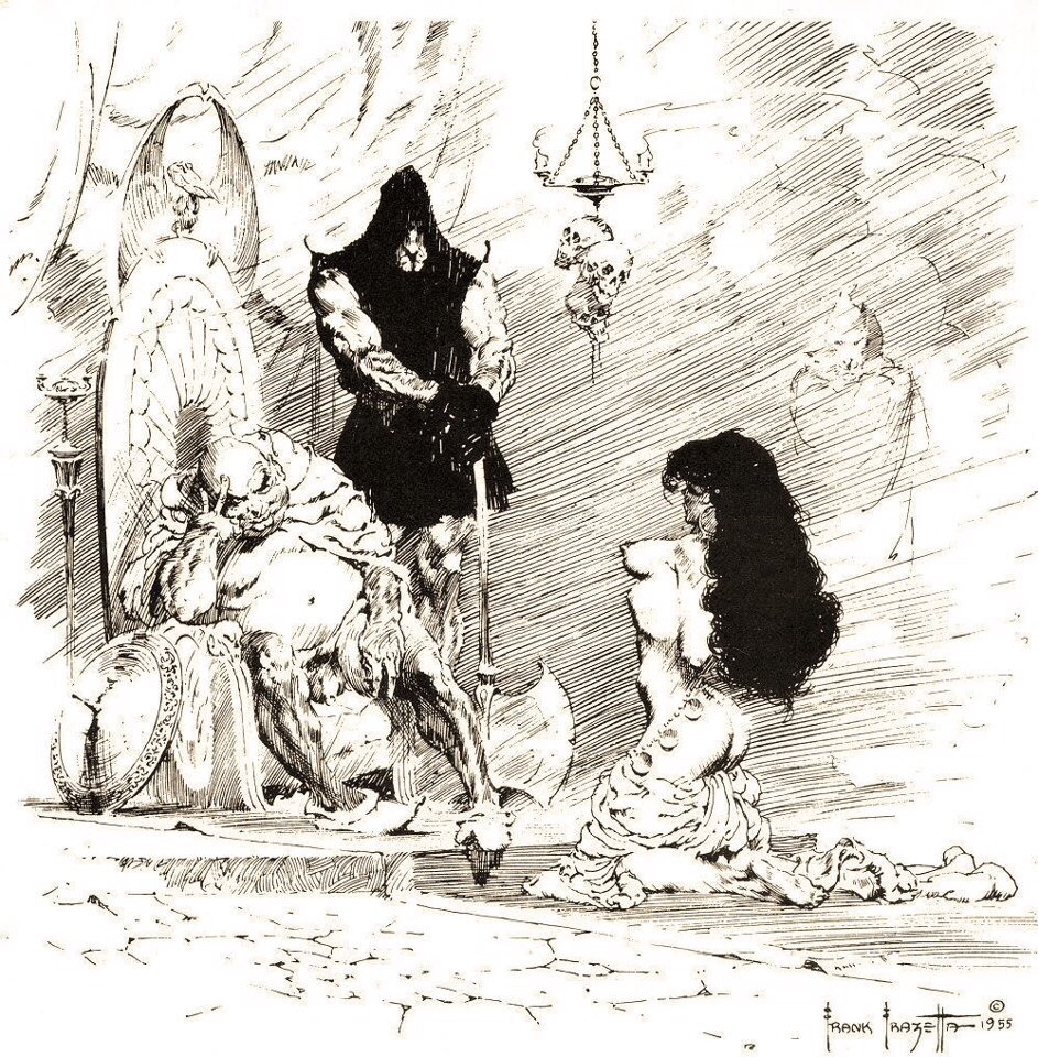
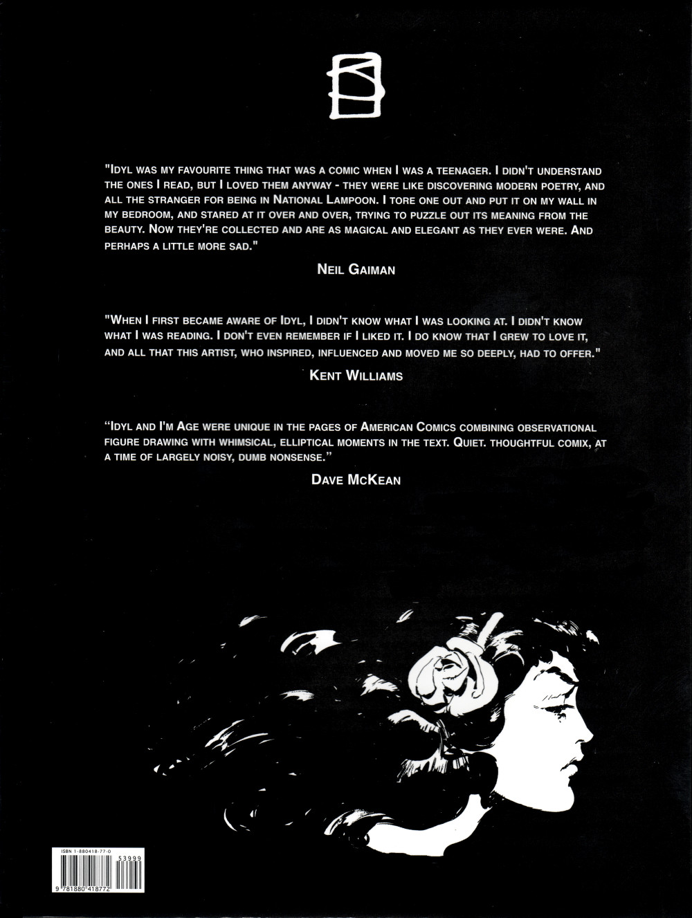
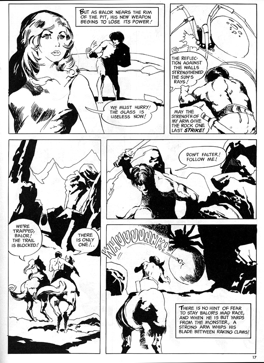
Late to the party again… but life (and laziness!) gets in the way… anyway… last year, near the end of the summer, Donald M. Grant published the first-ever all-in-one collection of two comic strips by Jeffrey Jones: Idyl, which originally ran in National Lampoon in the 1970s, and I’m Age, which ran in Heavy Metal in the early 1980s.

I received my two hardcover copies of the collection in the autumn of 2015 — I ordered from Amazon.com as neither the hardcover nor the softcover edition was unavailable through Amazon.ca, although I suppose I could have ordered directly from the publisher, which would have netted me a complimentary copy of Jones’s cartoon book, It’s Garbage Coming — and now I’m here to let you know that I have one complaint and one concern about the book.

My complaint is that Grant has failed to include one of the I’m Age strips in the new collection and instead of going back to press to correct the error has been encouraging buyers to download a JPEG of the strip via a link on the order page, print it off at home, and slip it into the book, which I’ve done, of course, though I’m not happy about it. The overall number of strips is small. Was it really such a difficult task to create a complete, master list of strips and proofread the collection accordingly? Mistakes happen, sure. And yes, yes, going back to press to correct a publisher’s error (vs. a printer’s error) would have been prohibitively expensive. But COME ON!!!

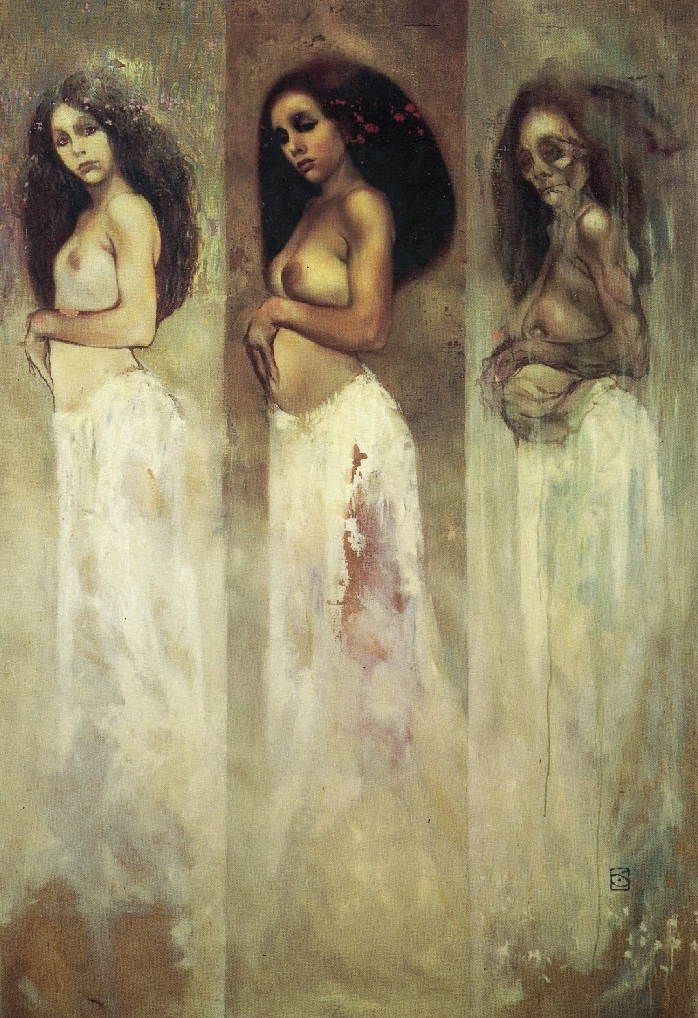
My concern is that the introductory and other text in the collection completely ignores Jones’s struggle, in later years, to claim a more authentic identity for herself as a woman. No mention, even, of the name change from Jeffrey Jones to Jeffrey Catherine Jones. Now, Jeffrey Catherine Jones was, by all accounts, perfectly content to let her old friends continue to refer to her as Jeffrey, and of course, the major collection of her art published during her lifetime, with her participation, after she began her transition, bore the title, Jeffrey Jones: A Life in Art. Still, it seems wrong to me for Jones’s “friends” to act, now (or then), as though Jeffrey *Catherine* Jones never existed! The omission is especially egregious in George Pratt’s “Afterword,” which recounts an outing that was filmed, in part, by Maria Paz Cabardo for her documentary, Better Things: The Life and Choices of Jeffrey Catherine Jones. If you’ve seen the footage, you know very well what I’m talking about!

In fact, I think a strong case could be made that, far from being irrelevant to the strips, Jones’s ongoing gender-identity struggle was central to them. Pity that neither Jones’s publisher nor her friends were ready, willing, or able to imagine the possibility!

Anyway, I do love the work. And I do recommend the book, because the sad fact is, it’s the only game in town if you want to have two of Jones’s three major comic strips available in your non-virtual library in a convenient format at a reasonable cost.

Connections · Illustration Art · Jeffrey "Jeff" Catherine Jones · Look Here · Photos

Connections: Jeffrey Jones and the great unknown

Stumbling around on tumblr today, I came across an uncredited image that reminded me of something I had seen before…

If anyone recognizes that photo and can tell me when and where it was published, I’d love to hear from you. And if you have a copy of the publication and could supply me with a better scan, well, that’d be just peachy.


UPDATE (22 June 2015):

Thanks to the inspired efforts of an anonymous reader (see the comments section below), we now have the precise context for Jones’s “reference photo” posted above. The source is a photo layout titled “Secrets From My Diary,” shot by J. Frederick Smith, for the December 1973 issue of VIVA (vol. 1, no. 3). And thanks to the efforts of fans on the VFILES site, we can view the photo in the context of the original NSFW article/layout:

[CLICK IMAGES TO ENLARGE]

The scans are small, yes, even if you click to enlarge them, but the information is much appreciated. Thanks, hsc!

Gustav Klimt · Jeffrey "Jeff" Catherine Jones · Look Here

Look Here: “Descent” (1977) by Jeffrey Jones

Here’s an image that I gingerly scanned from my personal copy of the legendary Dragon’s Dream book, The Studio, and posted on my tumblr, TRANSISTORADIO, on 27 April 2015:

[CLICK IMAGES TO ENLARGE]

Not sure if this has been remarked previously, perhaps it has, but it seems clear enough to me that the masked, pregnant woman in Jeffrey Jones’s Descent (1977) was inspired by the old woman in Gustav Klimt’s The Three Ages of Woman (1915):

Jones, of course, painted his own version of the “three ages of woman” (which — I know, I know — has already been identified by numerous Jones fans as an “homage” to Klimt):

Book/Magazine Covers (All) · Book/Magazine Covers (Jones) · Illustration Art · Jeffrey "Jeff" Catherine Jones · Look Here

Look Here: Two more covers with art by Jeffrey Jones

One of the following covers with art by Jeffrey Jones is pretty badly scuffed. Can you guess which one it is?

[CLICK IMAGES TO ENLARGE]

If I ever come across a better copy of The New Adam, I’ll probably buy it. I only purchased the battered copy that you see above at a local church sale because I couldn’t, at that moment, remember having seen one before, ever.

As for my copy of The Hand of Kane, I have to say, it’s in much better condition than the scan makes it look.

And so it goes…

Keywords: Jeffrey Jones, The Hand of Kane by Robert E. Howard, The New Adam by Stanley G. Weinbaum.

Comics · Comics (Jones) · Here, Read · Jeffrey "Jeff" Catherine Jones · Look Here

Look Here, Read: “The Guardian Spiders,” with art by Jeffrey Jones

From The Charlton Bullseye vol. 1, no. 1 (1975), here’s “The Guardian Spiders,” with art by Jeffrey Jones and script by the great unknown:

[CLICK IMAGES TO ENLARGE]

According to the authors of Jeffrey Jones: The Definitive Reference, Jones drew “The Guardian Spiders” for King Comics in 1967. Unfortunately for the artist, however, King failed to publish the story before they closed shop for good in December of 1967 and sold various titles and inventory to Gold Key and Charlton. And thus it was that “The Guardian Spiders” languished unloved in the files at Charlton for seven years or so until the editors at The Charlton Bullseye arranged for its first publication in their zine.

Album Covers · Book/Magazine Covers (Jones) · Illustration Art · Jeffrey "Jeff" Catherine Jones · Look Here

Look Here: CONJURE WIFE, with cover art by Jeffrey Jones

Took me a while to find a nice, cheap copy of Fritz Leiber’s Conjure Wife with “Woman fleeing from…” cover art by Jeffrey Jones, but in the summer of 2013 I got lucky… and now that I’ve finally gotten around to scanning it, I can show you what it looks like:

[CLICK IMAGES TO ENLARGE]

Book/Magazine Covers (All) · Illustration Art · Jeffrey "Jeff" Catherine Jones · Look Here

One last time, with feeling, it’s… BETTER THINGS!

The final phase of the Indiegogo fundraiser for the documentary Better Things: The Life and Choices of Jeffrey Catherine Jones — the distribution of the donation perks/rewards — is underway right now, and today, I am happy to report that I have received a package from producer/director Maria Cabardo that includes a DVD of the film, the Jones-tribute art book, six postcards, and two neatly folded copies of the film’s huge poster.

The art book, which bears the title, Jeffrey Catherine Jones and Better Things, is graced with a wistful cover designed by John Pinsky. Here’s a scan:

[CLICK IMAGES TO ENLARGE]

Jeffrey Catherine Jones and Better Things also comes with a paper band designed by Christina Graf. Here’s scan of the book with the band in place:

And here’s a rough-and-ready scan of the six postcards, arranged in two rows of three on the surface of my flatbed scanner:

Please note that all of the images on the postcards are also reproduced in the art book, so if you like what you see here, you’ll like what you’ll find there.

Although I myself am happy to have the art book in my collection, I have no plans to review it for this or any other site. Just so you know.

Also, I do not plan to post a formal review of the documentary here at RCN. In case anyone is wondering.

I am pleased to note, however, that both my name and the name of this website are preserved for posterity in the acknowledgements on the inside back cover — which makes the book a doubly lovely souvenir for me.

Thanks, Maria!

It’s been fun. But now I’m done.

Over and out.

Illustration Art · Jeffrey "Jeff" Catherine Jones · Look Here

Look Here: THE WORLD’S DESIRE by Jeffrey Jones

Here’s a painting by Jeffrey Jones that I wanted to display on Transistoradio in close proximity to Arnold Bocklin’s In the Sea (1883), but all I could find online was a tiny image, so I scanned the reproduction in Jeffrey Jones: A Life in Art and posted it there, and now — lucky you! — I’ve decided to post it here, too:

[CLICK IMAGES TO ENLARGE]


BONUS IMAGES: