[CLICK IMAGES TO ENLARGE]

"This day's experience, set in order, none of it left ragged or lying about, all of it gathered in like treasure and finished with, set aside." –Alice Munro, "What is Remembered"

[CLICK IMAGES TO ENLARGE]
I’m sure there are many skeptical viewers out there who roll their eyes whenever I post speculative “connections” like my last one (or this one from 2011), so today I’ve decided to post a connection that the artist himself has said was deliberate. Take a look, and perhaps ask yourself if you would have noticed Jeff Wall’s formal references to Delacroix’s Death of Sardanapalus (1827) if the connection hadn’t been pointed out to you:
[CLICK IMAGES TO ENLARGE]

ABOVE: Eugène Delacroix, Death of Sardanapalus (1827), oil on canvas, 496 x 392 cm. Via RCN.
ABOVE: Jeff Wall, The Destroyed Room (1978), transparency in lightbox, 234 x 159.1 cm. Collection of National Gallery of Canada. Via MoMA.
Here’s how Wall interprets his own work:
[…] When I made The Destroyed Room, I worked in reference to the design of commercial window displays of clothing and furniture. I think of these as tableaux morts as opposed to tableau vivants. At the time, they had become very violent, mainly because of an influence from the punk phenomenon which was quickly filtering into the whole cultural economy. At the same time, the picture’s subject matter had something to do with aggression, violence, and revenge in domestic life. I was very interested in Delacroix’s Death of Sardanapalus, partly because I was lecturing on Romanticism. I think the Sardanapalus is a very important picture, historically and psychologically, because it shows the eroticized ideal of military glory which characterized the Napoleonic period being turned inward, back toward domestic life at the end of that epoch, at the beginning of the modern, bourgeois, neurotic private life. This painting interested me as a kind of crystal. My subject was made with this crystal, by passing my ideas and feelings through the historical prism of another work. I felt that this made the subject richer, more suggestive, more aggressive. It was important to filter The Destroyed Room through this other picture because I think I was trying to establish a space for myself by suggesting which historical directions and problems were important to me.
I know that in some ways this is a very artificial way of going about things, very manneristic even, but it was a way to begin, and I had to begin.
[SOURCE: “Typology, Luminescence, Freedom: Selections from a Conversation with Jeff Wall,” in Jeff Wall. Selected Essays and Interviews (New York, NY: The Museum of Modern Art, 2007), pp. 186-87.]
And:
In The Destroyed Room, I was interested in a “remaking” of an existing image, a sort of mannerist attitude toward it. The Delacroix painting seemed very modern to me. I see a lot of so-called “old” art that way. Why shouldn’t we be able to relate to it as contemporary? […]
I was particularly interested in violence at that time, for whatever reason. I was teaching at the university, concentrating on the earlier part of the nineteenth century, and got intrigued by the way that monumental paintings — Delacroix’s preeminent among them — wove together themes of war and military glory, on the one hand, and the conflicts of private life on the other. The intertwining of these two spheres is almost emblematic of that whole period.
[SOURCE: “A Democratic, a Bourgeois Traditon of Art: A Conversation with Jeff Wall by Anne-Marie Bonnet and Rainer Metzger,” in Jeff Wall. Selected Essays and Interviews (New York, NY: The Museum of Modern Art, 2007), p. 246.]
In other words, and in short, not every connection between two works of art is what comic-book guys would dismiss as a swipe.
I must admit, I really do feel ridiculously pleased with myself whenever I notice a possible connection like this…
[CLICK IMAGES TO ENLARGE]
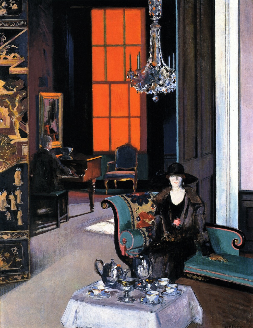
ABOVE: Francis Campbell Bolleau Cadell, Interior: The Orange Blind (c.1927), oil on canvas, 86.5 x 112 cm. Via TRANSISTORADIO.

ABOVE: Francis Bacon, Study for a Portrait, March 1991 (1991), oil and pastel on canvas, 147.5 x 198 cm. Collection of National Galleries of Scotland, UK. Via TRANSISTORADIO.
[CLICK IMAGES TO ENLARGE]

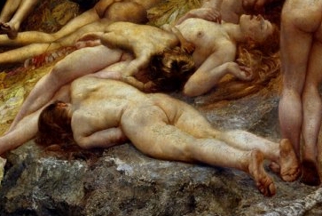
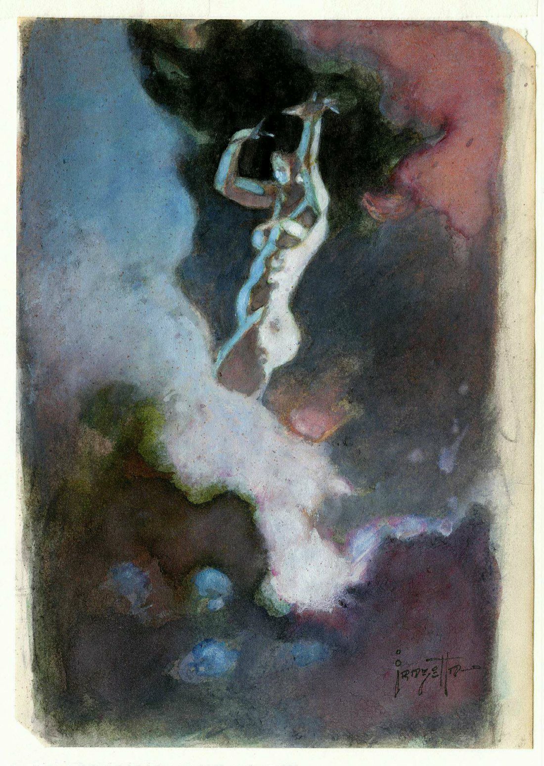
ABOVE: Julius Kronberg, Nymph and Fauns (1875), oil on canvas, 130 x 269 cm. Collection of Nationalmuseum, Stockholm, Sweden. Via Wikimedia Commons.
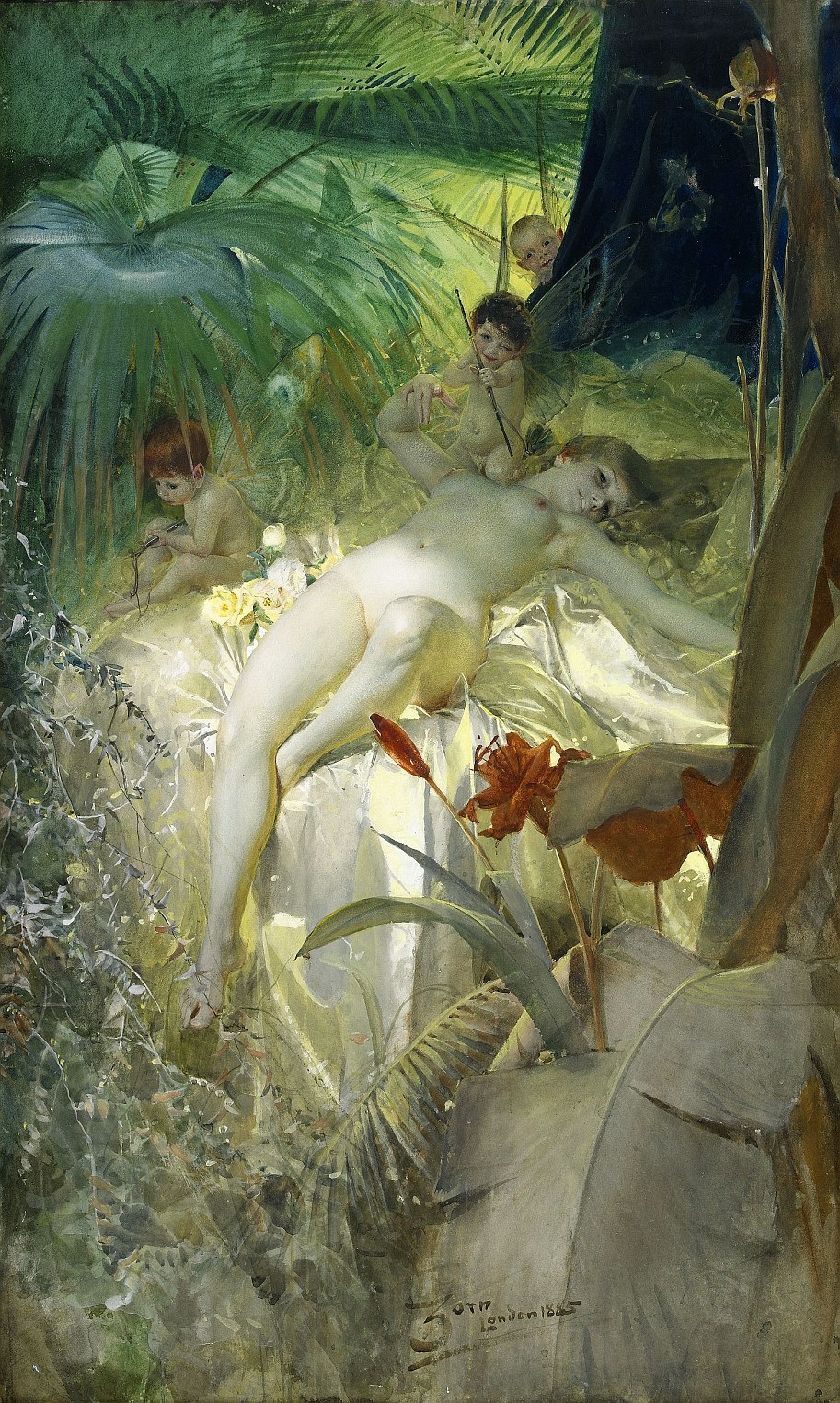
ABOVE: Anders Zorn, The Love Nymph (1885), watercolour and gouache on paper, 64.5 x 106.5 cm. Via Wikimedia Commons.
I posted JPEGs of Milton Glaser’s Angel Alley cover, poster, and artwork, back on 29 January 2013, and now, more than a year later, I have noticed a familiar figure in the foreground of Giulio Aristide Sartorio’s Diana of Ephesus and the Slaves (1895-1899):
[CLICK IMAGES TO ENLARGE]
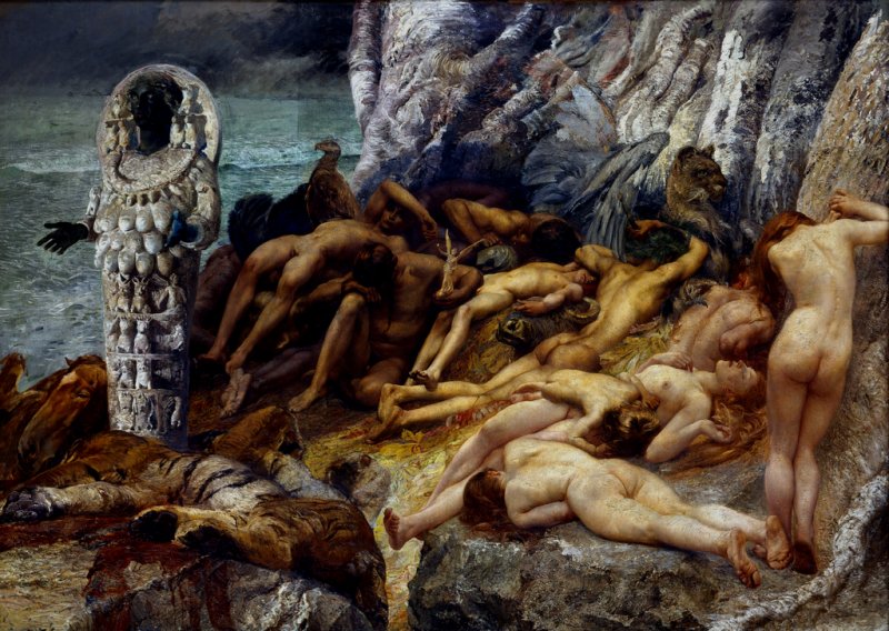
ABOVE: Giulio Aristide Sartorio, Diana of Ephesus and the Slaves (1895-1899), oil on canvas, 421 x 304 cm. Collection of Galleria Nazionale d’Arte Moderna, Rome, Italy. Via TRANSISTORADIO.

ABOVE: Milton Glaser, original art for the cover of the LP Angel Alley (1978) by Linda Cohen.
From the portfolio “Les 7 Périls Spectraux” (Paris: Galerie Les Pas Perdus, 1950), here are scans of seven colour lithographs by the under-appreciated American surrealist painter, printmaker, sculptor, and writer, Dorothea Tanning (1910-2012); the lithographs themselves are tucked safely away in the collection of the Smithsonian American Art Museum in Washington, DC:
[CLICK IMAGES TO ENLARGE]

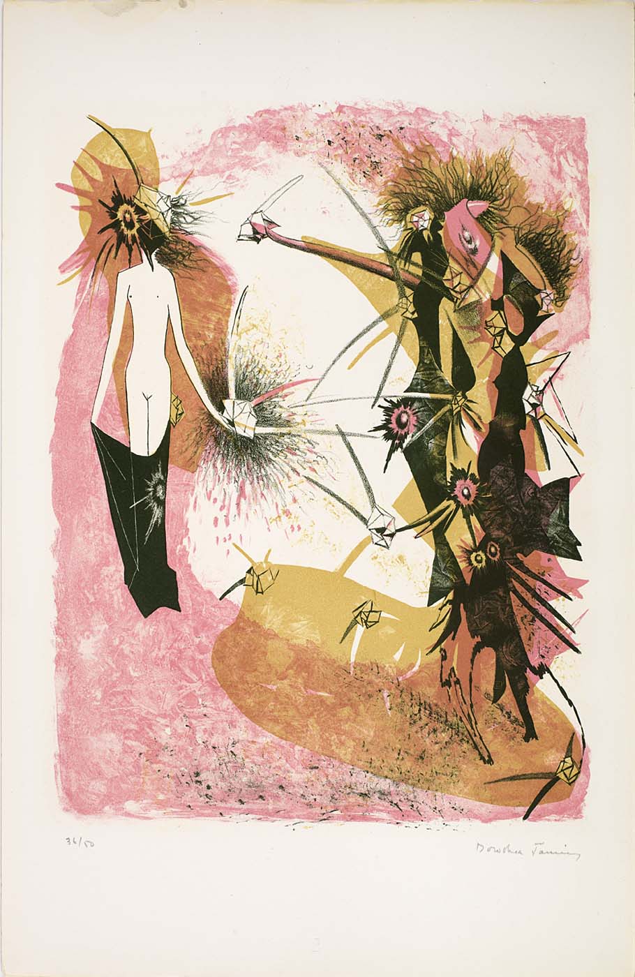
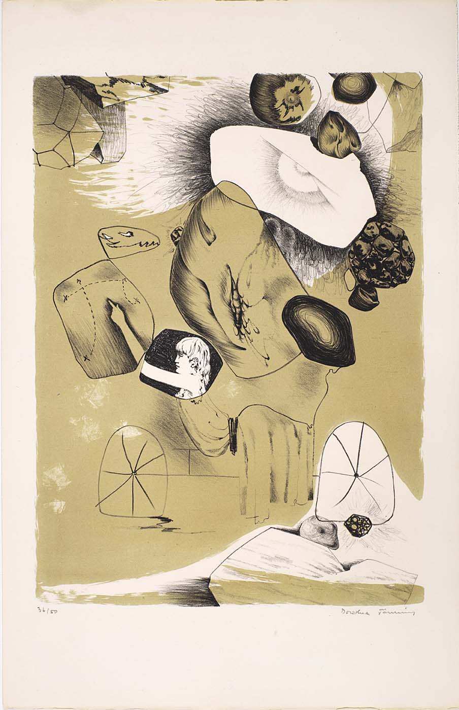
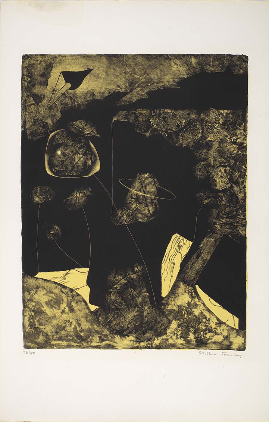
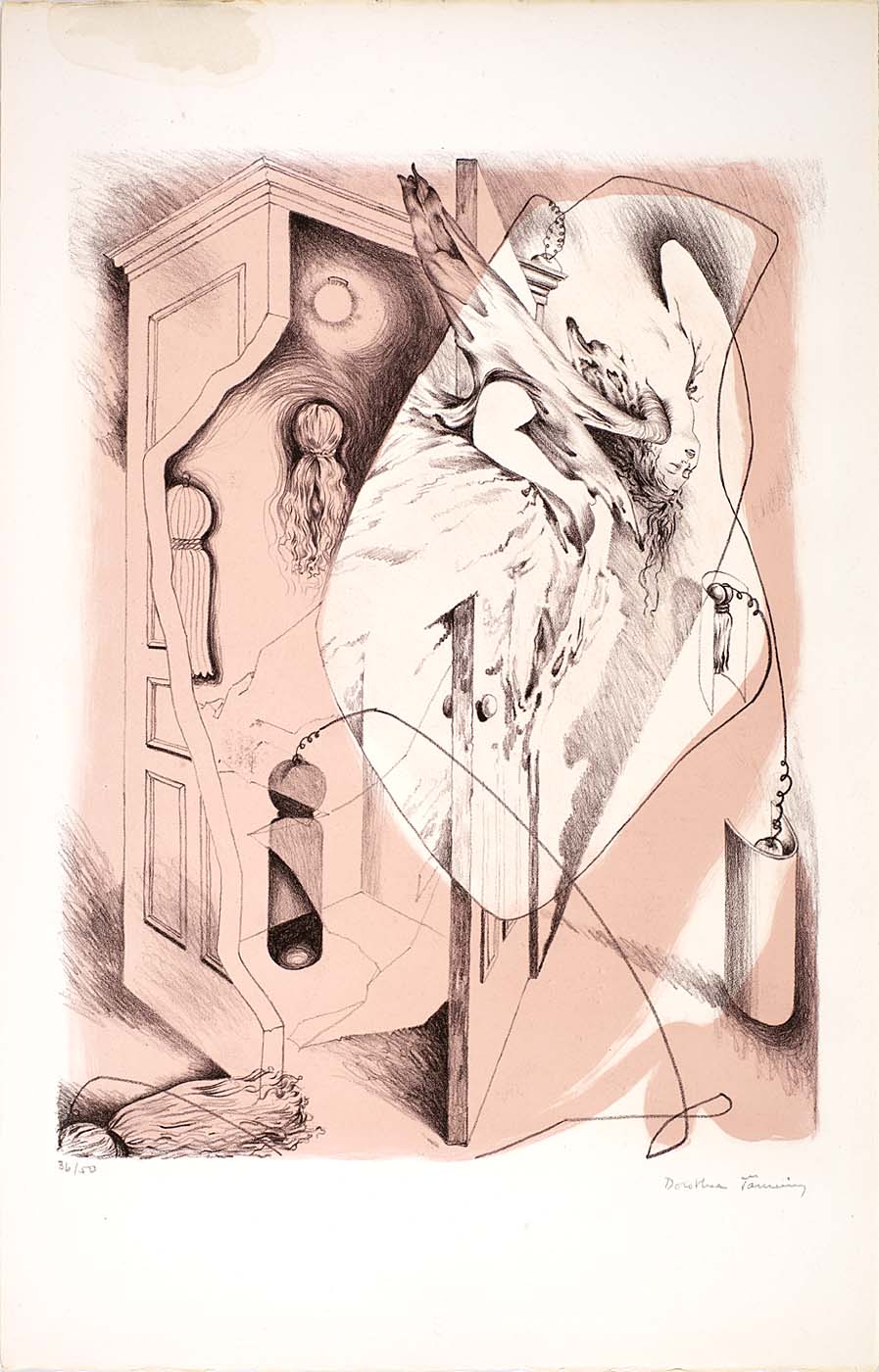
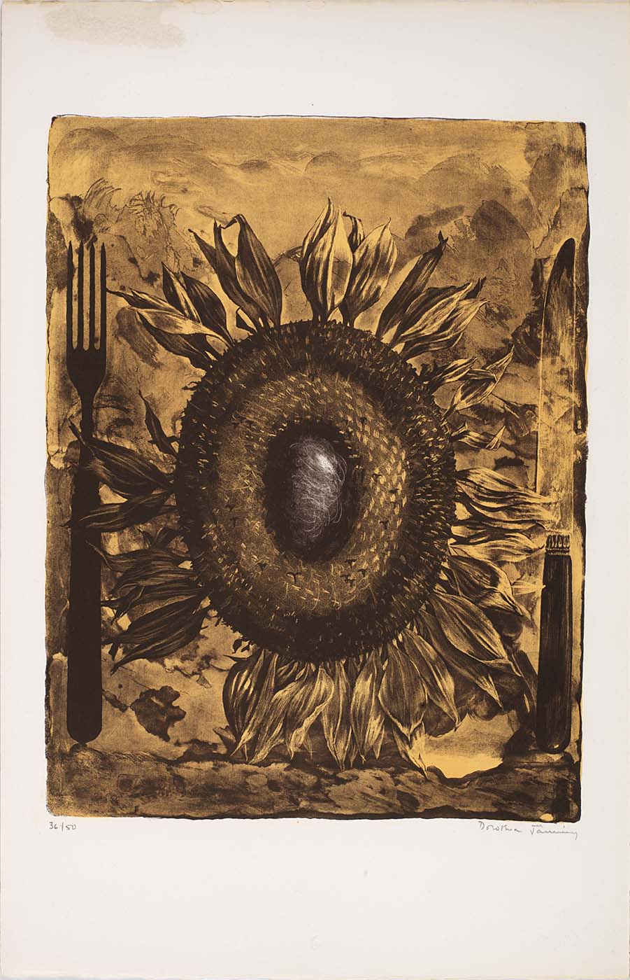
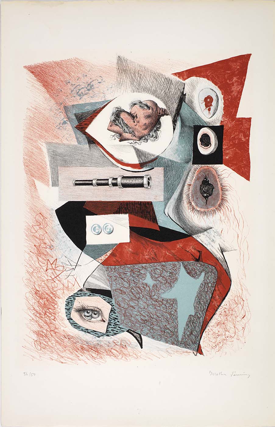
To learn more about Dorothea Tanning, who died in New York City on 31 January 2012 at the age of 101, you would do well to begin with a visit to the artist’s website, which is maintained by The Dorothea Tanning Foundation “as an introduction and tribute to Dorothea Tanning’s extraordinary life and work as both a visual artist and a poet.”
[CLICK IMAGES TO ENLARGE]


I’m not going to put forth any arguments here regarding a possible chain of influence from Wyeth to Fischl to Frazetta (because I don’t think there is one), the relative quality of the three paintings pictured below (because none of them is truly first rate), the relative merits of “fine art” versus “illustration art” (because I don’t care about the issue), etc. I just have a hankering to see these three paintings mashed together in one post:
[CLICK IMAGES TO ENLARGE]
BONUS IMAGES:

I posted the following three images one after the other on TRANSISTORADIO earlier today, but I have since had the thought that perhaps a few folks who don’t follow my tumblr but do follow this blog will appreciate the juxtaposition, too, so here the images are, together again for the first time in a single post:
[CLICK IMAGES TO ENLARGE]
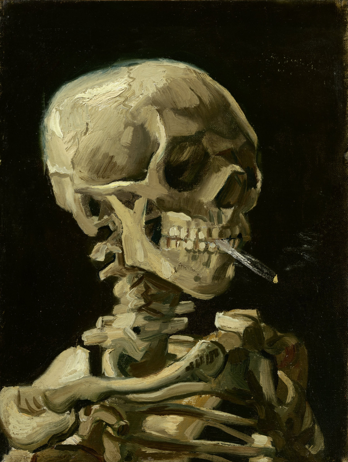
ABOVE: Vincent van Gogh, Head of a Skeleton with Burning Cigarette (1885 – 1886), oil on canvas, 24.5 x 32 cm. Collection of Van Gogh Museum, Amsterdam. Via Wikimedia Commons.
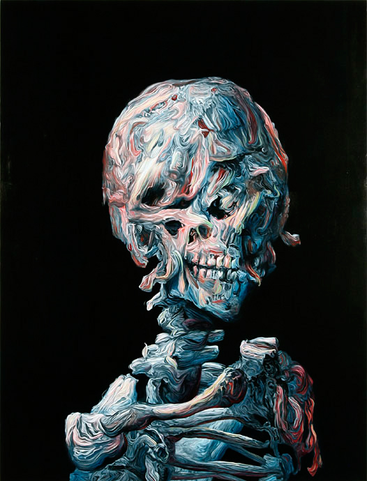
ABOVE: Glenn Brown, Theatre (2006), oil on wood, 93 x 122 cm. Via Galerie Max Hetzler.

ABOVE: Vincent van Gogh, Self-Portrait (1889), oil on canvas, 54 x 65 cm. Collection of Musée d’Orsay, Paris, France. Via Wikimedia Commons.
[CLICK IMAGES TO ENLARGE]

ABOVE: Théodore Rousseau, Lande de la Glandee, Forest of Fontainebleau,
oil on canvas, 66.04 x 43.18 cm. Via WikiPaintings.
I think what [the critic Gustave] Kahn says is quite true, that I haven’t paid enough attention to values, but it’ll be quite another thing they’ll say later — and no less true.
It’s not possible to do both values and colour.
Théodore Rousseau has done it better than anyone else, by mixing his colours [with bitumen] the darkness caused by time has increased, and now [some of] his paintings are hardly recognizable.
You can’t be at the pole and the equator at the same time. You have to choose. And I have high hopes of doing that, too, and it will probably be colour.
[SOURCE: Vincent van Gogh, Letter 594, addressed to Theo van Gogh, from Arles, Monday, 9 April 1888. Via vangoghletters.org.]

ABOVE: Vincent Van Gogh, View Of Arles with Irises in the Foreground (1888),
oil on canvas, 65 x 54 cm. Via National Gallery of Canada.


