
When I win, you win:
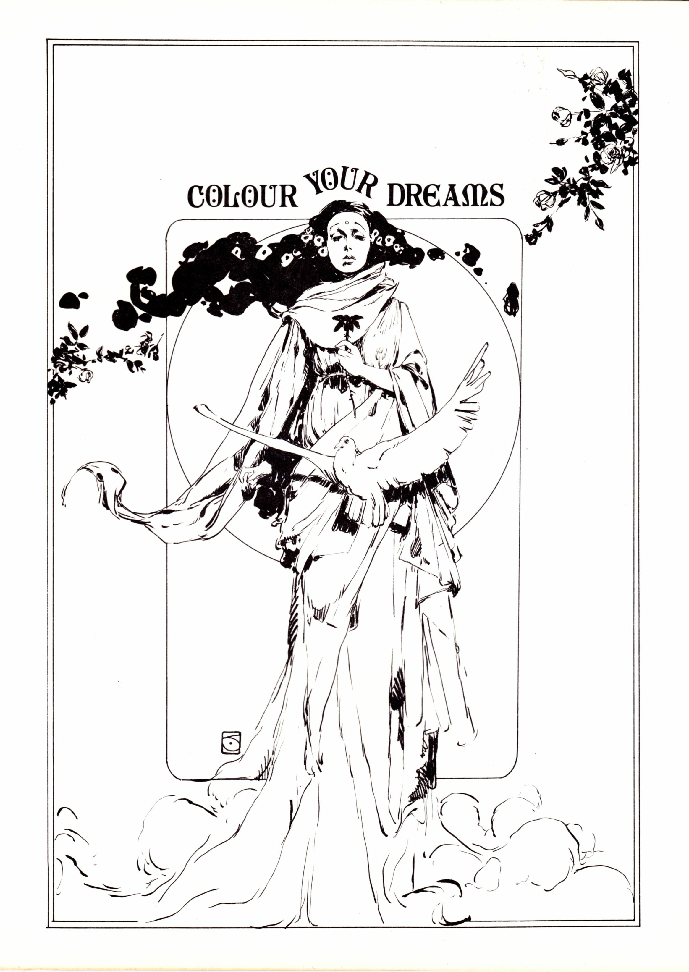
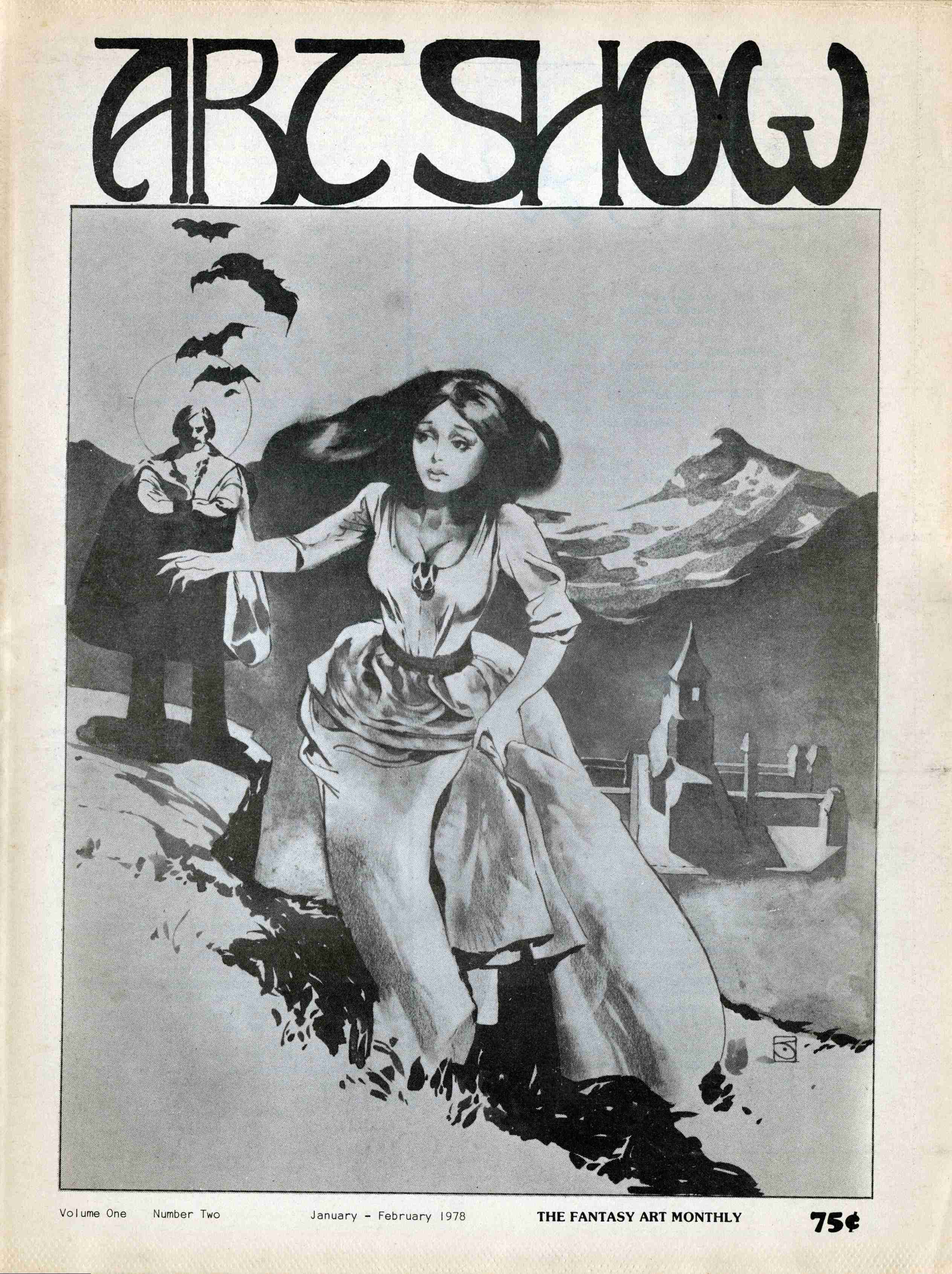
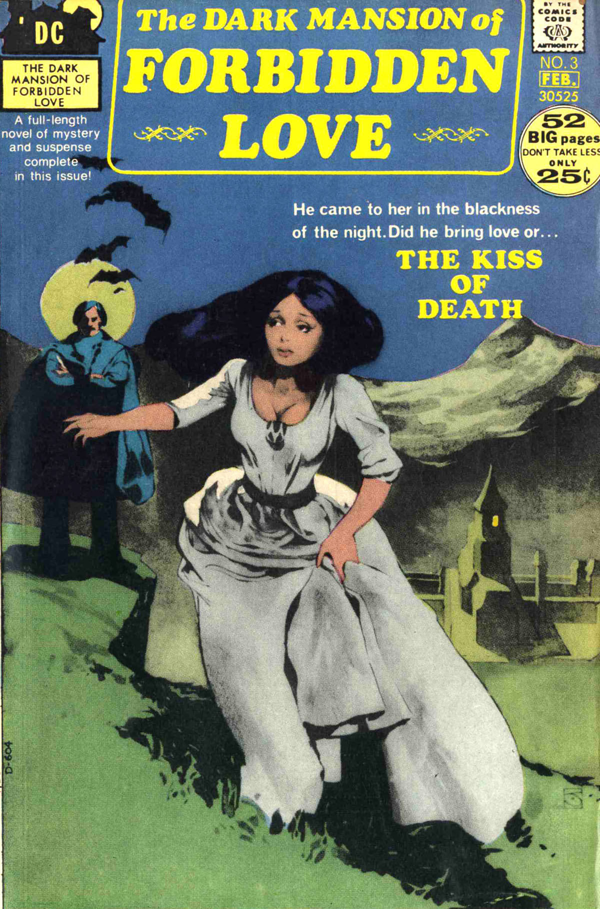
No, I didn’t win that copy of Dark Mansion of Forbidden Love from an ebay auction, but I thought you might appreciate having a scan readily available to compare with the black-and-white original art that appeared on the cover of Art Show. As you can see, it was the fact that Jones’s original black-and-white artwork was mostly continuous tone that gave the Dark Mansions cover its striking appearance, which I’d characterize as somewhere between a typical comic book cover and a hand-coloured photograph.

Jeff Jones’ cover for DARK MANSION OF FORBIDDEN LOVE was done in ink wash (diluted india ink with areas of solid black ink and the white of the page), whereas most comics are drawn in just black ink with no mid-tones.
In the early to mid-’60s Russ Heath did a number of OUR ARMY AT WAR covers in that vein which, with flat colours on top, gave them a pulpy look. I suppose the same effect was desired to make some of DC’s early ’70s horror comics look more like their gothic novel paperback counterparts. Here’s HOUSE OF SECRETS #94 by Berni Wrightson, for example:
LikeLike
Hm… well… it’s not clear to me how your description of the technique by which the DARK MANSION cover was created differs from what I already posted.
I wrote: “As you can see, it was the fact that Jones’s original black-and-white artwork was mostly continuous tone that gave the Dark Mansions cover its striking appearance, which I’d characterize as somewhere between a typical comic book cover and a hand-coloured photograph” (bold added).
“mostly” — “Mainly or chiefly; for the most part; usually, generally, on the whole.” Source: Wiktionary.
“continuous-tone” — “Continuous-tone art is art, such as photographs [or wash drawings, or watercolours, or oil paintings, etc., etc.], that consists of shades of gray and color gradations. It’s distinguished from line art, such as line drawing, which has no tonal variation. If you look closely at continuous tone art, you can see that shades of gray or color blend smoothly without breaking into dots or other patterns.” Source: Prepress Terms (PDF) at Adobe.com.
Why “mostly continuous tone“? Because it’s plain to see that Jones did some outlining and laid in some shadows with a brush and full-strength black ink, and as the Adobe glossary confirms, black ink “which has no tonal variations” is considered line art, not continuous tone art.
Anyway…
One of Jones’s two Wonder Woman covers — #199, to be exact — has a similar look to the Dark Mansion cover, and again, it’s because Jones provided DC with continuous tone black-and-white original art that had to be converted to halftone and combined with screens of colour overlaid in prepress; the other — #200 — is just a regular comic-book cover created from a line-art original. I’ve had scans of both covers, ready to post, for some time now. Perhaps this weekend would be a good time to post them.
LikeLike
Just wanted to clarify, as continuous tone could be achieved in, say, a pencil drawing, whereas “ink wash” is a clearer term about what medium he worked in.
Regardless, I’m on your side in this matter—not trying to fight with you!
LikeLike
Trouble is, I’m not entirely convinced that the continuous tone was achieved exclusively with ink wash. When I examine the tones in the dress on the actual Art Show cover (or in the large scan), for example, they look much too granular to be ink wash alone. It might be an illusion created by the iffy newsprint reproduction, but it appears to me that the dress was modelled partly in a dry medium like black Prismacolor pencil or some such, unless it’s just the grain of the (watercolour?) paper that caught the light when the piece was photographed (although it doesn’t really look like that to me — it looks like black pencil or conté or something). Of course, if you’ve seen the original, you have a leg up on me. If not, then the visual evidence from the reproduction is pretty much all we’ve got to go on. By her own admission, Jones has always been very lax about recording the details of date, medium, size, etc., when it came to her art.
LikeLike
I haven’t seen the original art of this one, but I’d love to!
It’s possible there are other media at work in this piece, but it appears to be just three to my eye: sold black india ink, ink wash, and a bit of dry brush (that may be what you were questioning). A lot of Jones’ original art turns up on the Comic Art Fans website, but not (yet) this one.
LikeLike
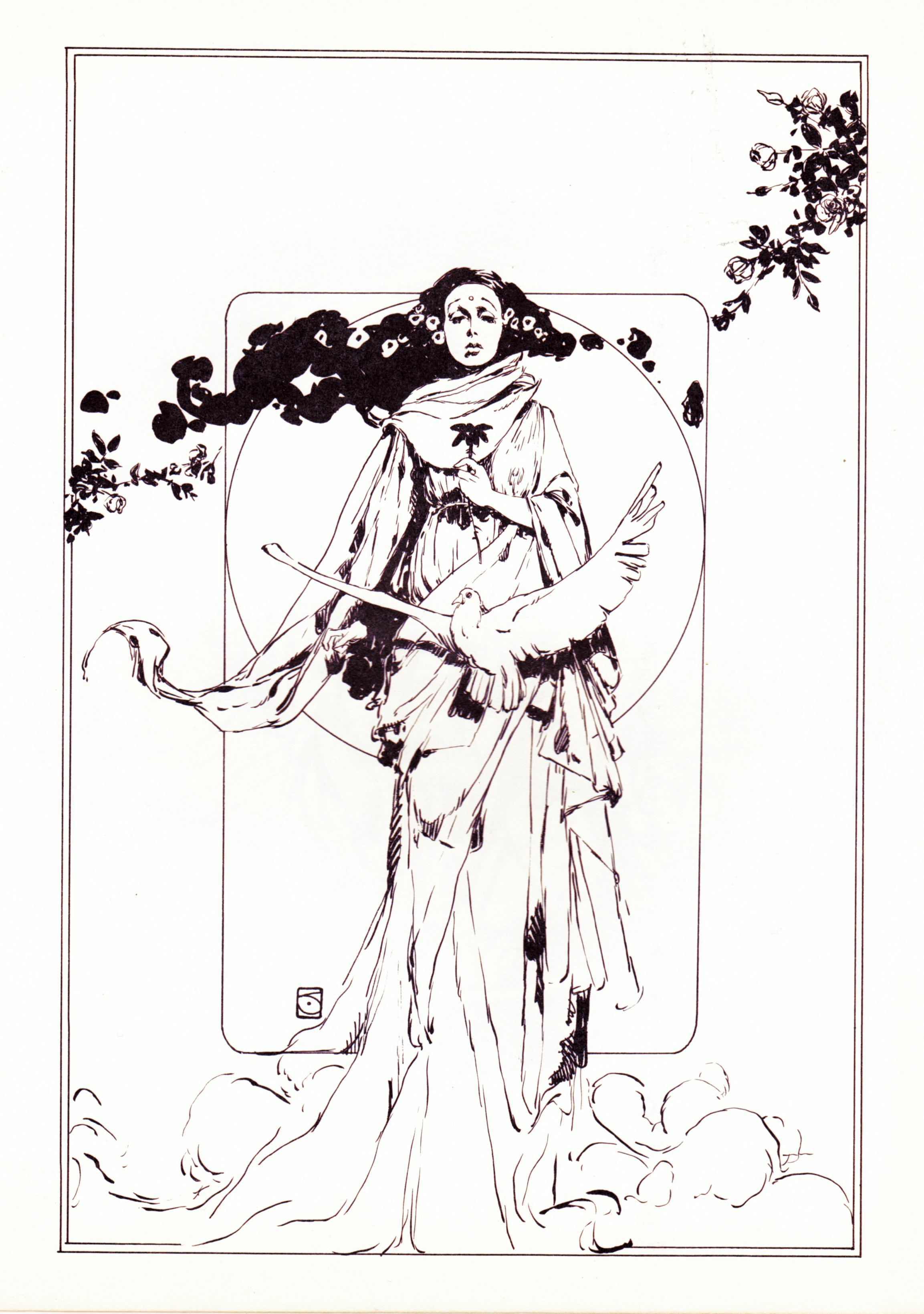
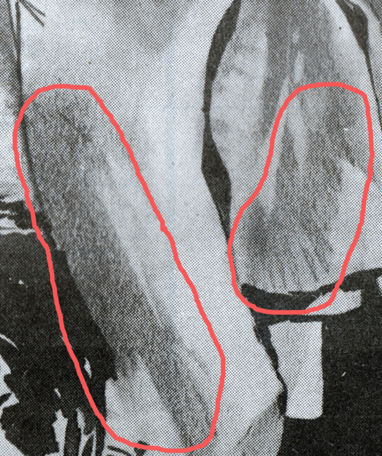
I don’t think we’re looking at the same section of Jones’s cover, or if we are, we’re not seeing the same thing. I don’t see “stipple” in Jones’s cover. If the original artwork had been shot through a filter, one would see a consistent “mechanical” pattern, but what I see is not a regular pattern. It’s more organic than that. I’ll post a close up, and perhaps you’ll change your mind.
LikeLike
Done. Notice, in particular, the marks near the bottom of the smaller circled area. Looks like the strokes of a dry medium like black Prismacolor pencil, pastel, conté crayon, or some such, to me. Also look at the left side of the large fold in the larger circled area. Again, it looks to me like the ink wash was darkened with some sort of dry medium. I see no similar areas in the Wrightson drawing. I do, however, see what might actually be a bit of dry brushing used to suggest the wood grain on side of the wooden dresser and perhaps a bit of opaque white used to pick out stray strands of Abigail’s hair (might be some opaque white in the moon, too). Pity the scan of Wrightson’s drawing isn’t as large as the scan of the Art Show cover that I posted, but as we’ve discovered, even with a larger scan, it can be tough to agree on the details.
Perhaps at this point we should just agree to disagree — though our disagreement is not really such a big deal. We agree that the primary medium is ink wash. I’m just not a certain as you are that it’s ink wash, pure and simple, end of story. I mean, I’ve tried to look at the evidence from your point of view, and I honestly don’t see what you see. So let’s move on, shall we? I will be happy to revisit the issue if and when the original art shows up in a collector’s online gallery. And I promise very graciously to concede that you were right all along, if better evidence than we have right now confirms that you were, in fact, right all along.
Until that day, comments closed.
LikeLike