"This day's experience, set in order, none of it left ragged or lying about, all of it gathered in like treasure and finished with, set aside." –Alice Munro, "What is Remembered"
Here are three more covers with art by Jeffrey Jones, scanned from the copies I have on hand at RCN headquarters here in the Queen City and posted below in order of publication:
[CLICK IMAGES TO ENLARGE]
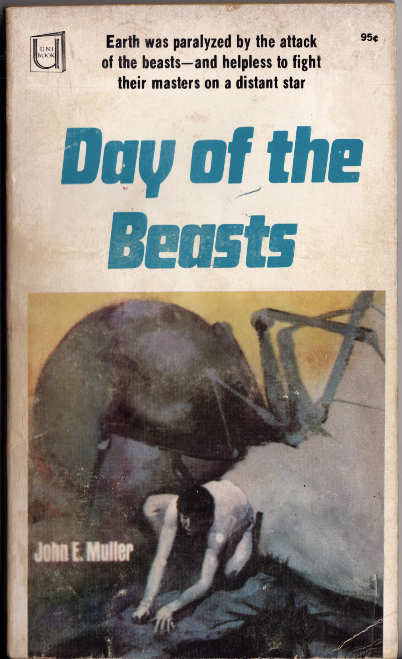
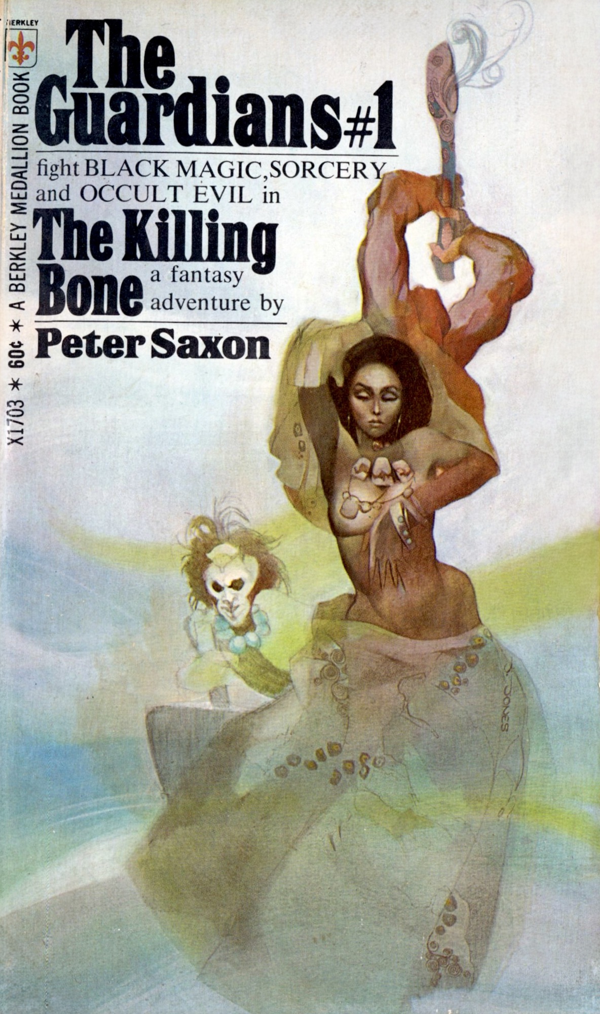
ABOVE: John E. Muller, Day of the Beasts (New York: Modern Promitions, n.d.), with cover art by Jeffrey Jones.
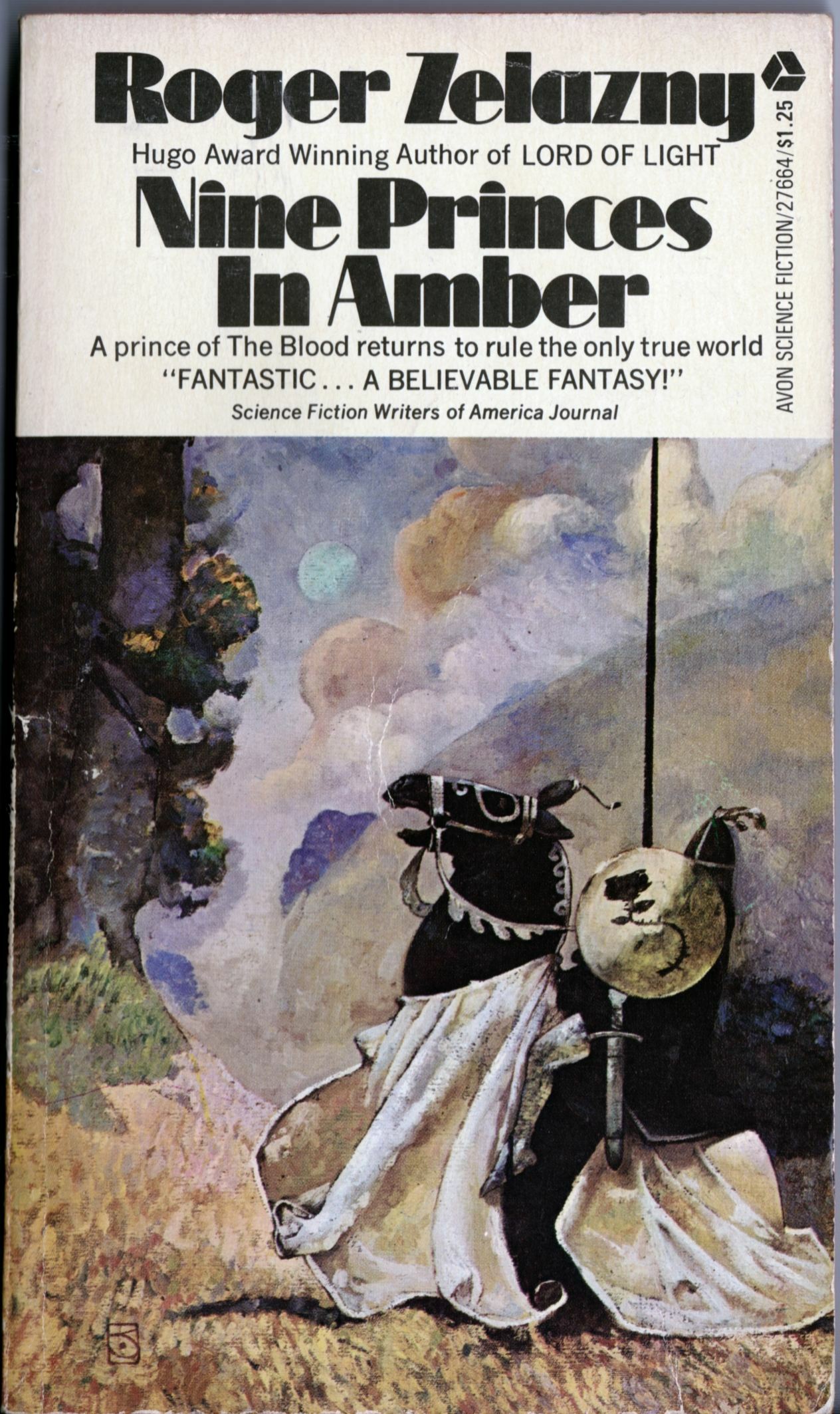
ABOVE: Roger Zelazny, Nine Princes in Amber (New York: Avon, 1972), with cover art by Jeffrey Jones.
You can see the photo reference for the first cover — which, in terms of draughtsmanship and painting technique, I would describe as the weakest of the three, though I do find the composition interesting — on Jeffrey Jones’s official Web site. It’s the first image on this page, right beside the figure reference for the painting Age of Innocence.
The N. C. Wyeth influence is pretty obvious in Jones’s Nine Princes cover — see, for instance, Wyeth’s paintings for Robin Hood, etc. Years later, Jones revisited the idea of the knight on horseback in his Game of Thrones painting. Notice how the Wyeth influence is no longer right on the surface in the later painting but has been absorbed and transformed into a style that is less about trying on techniques and motifs like pieces of clothing and more about the pleasure of manipulating and thinking in paint.
Keywords:Day of the Beasts, The Dirdir, Nine Princes in Amber.
“After a few years in NYC a friend of mine, a great artist, much older than me, the late Roy G. Krenkel, told me that I was the Master of the Meaningless Gesture. Well, I do this in my art because I don’t want to tell anyone anything. Also in my words, like my poem. I want the people to bring themselves to the work, based on their own experience.” — Jeffrey Jones, autobiography
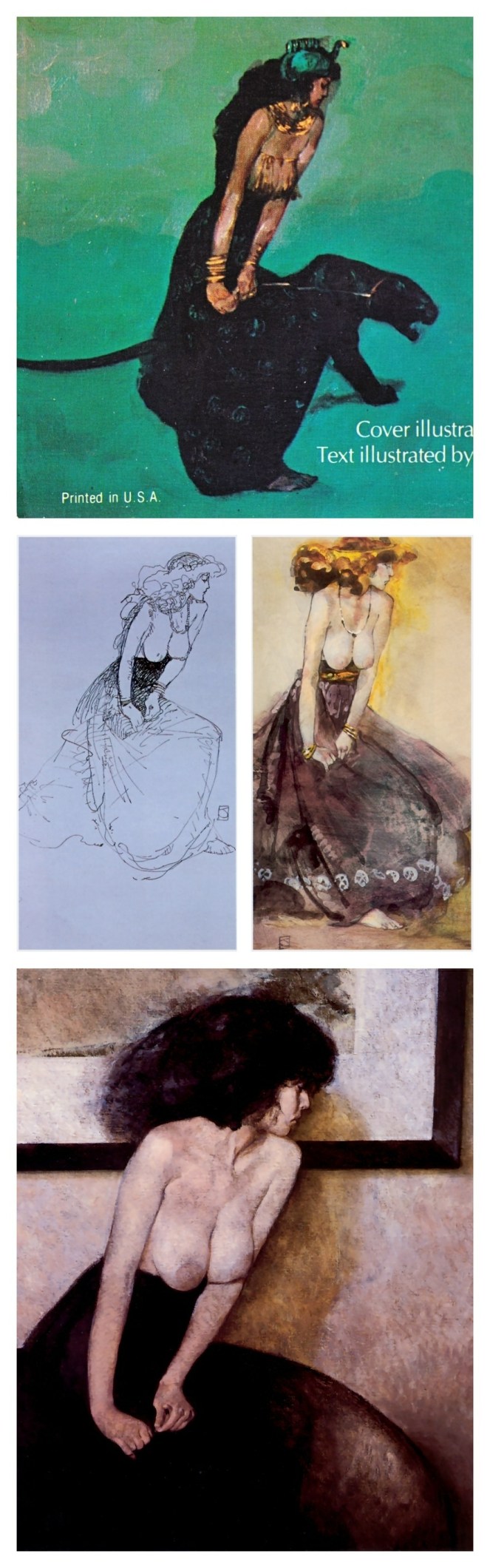
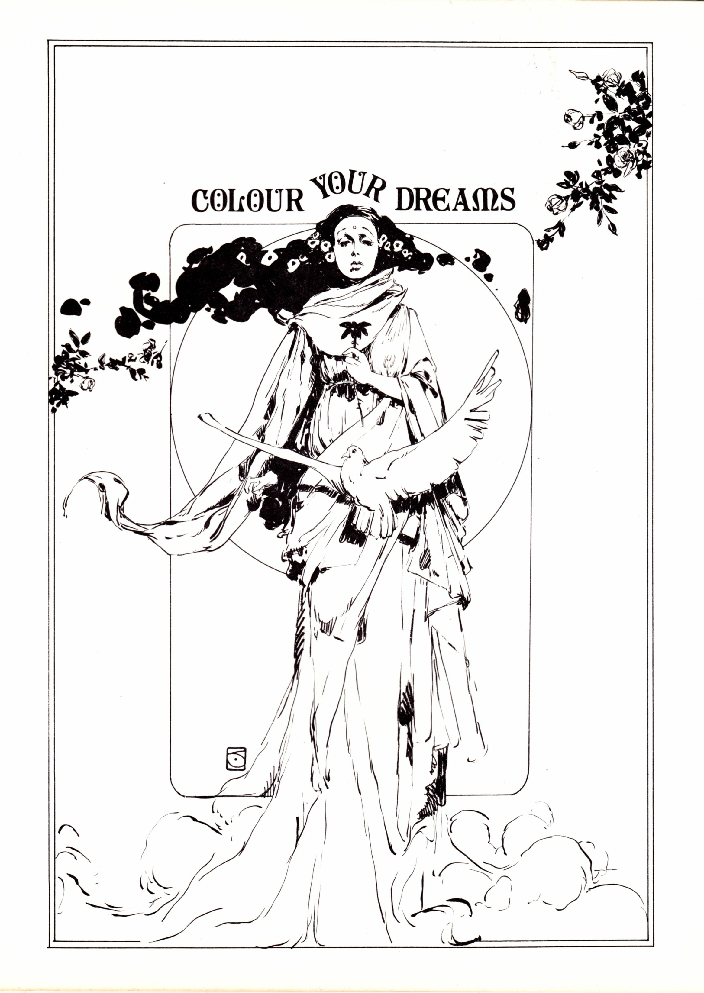
ABOVE:Colour Your Dreams (Springfield, Virginia: Capitol City Comics, 1972), front cover, by Jeffrey Jones.
ABOVE:Colour Your Dreams (Springfield, Virginia: Capitol City Comics, 1972), back cover, by Jeffrey Jones.
ABOVE: Jeffrey Jones, blue postcard, 5 x 8 inches.
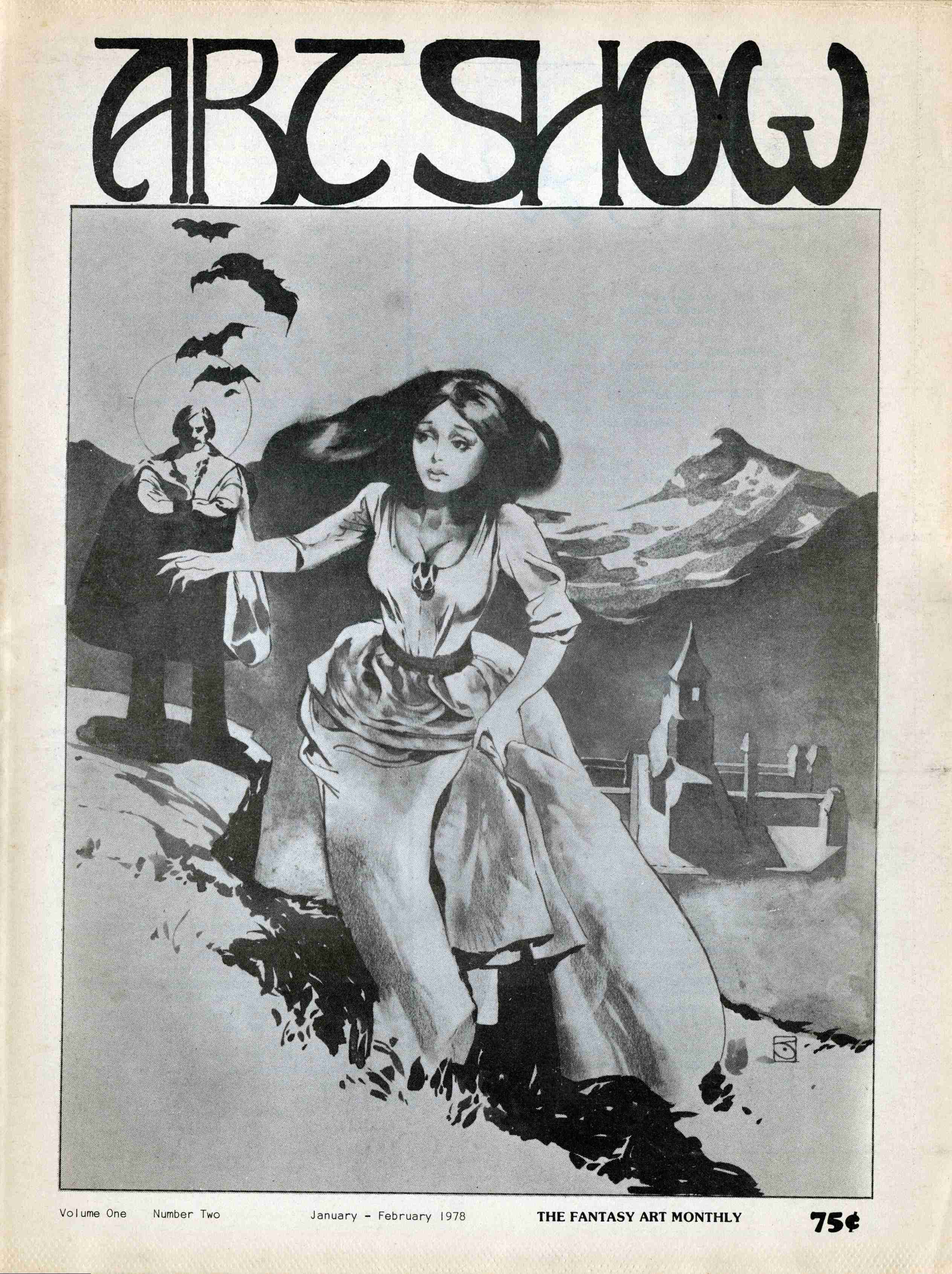
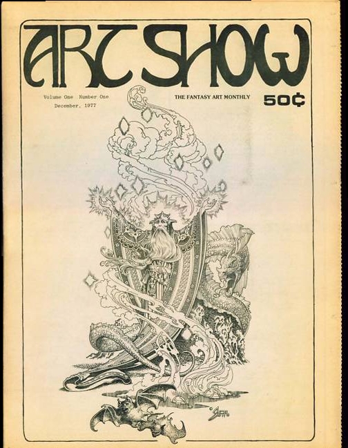
ABOVE:Art Show: The Fantasy Art Monthly volume 1, number 2 (January-February 1978), with cover art by Jeffrey Jones.
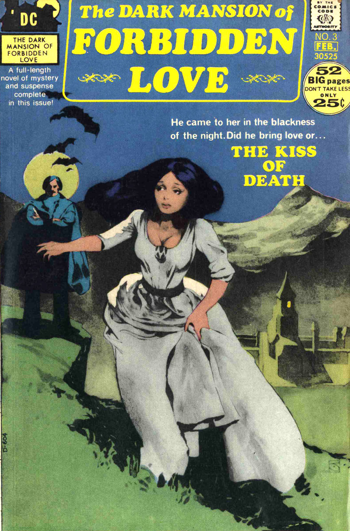
ABOVE:The Dark Mansion of Forbidden Love volume 2, number 3 (Jan.-Feb. 1972), with cover art by Jeffrey Jones.
No, I didn’t win that copy of Dark Mansion of Forbidden Love from an ebay auction, but I thought you might appreciate having a scan readily available to compare with the black-and-white original art that appeared on the cover of Art Show. As you can see, it was the fact that Jones’s original black-and-white artwork was mostly continuous tone that gave the Dark Mansions cover its striking appearance, which I’d characterize as somewhere between a typical comic book cover and a hand-coloured photograph.
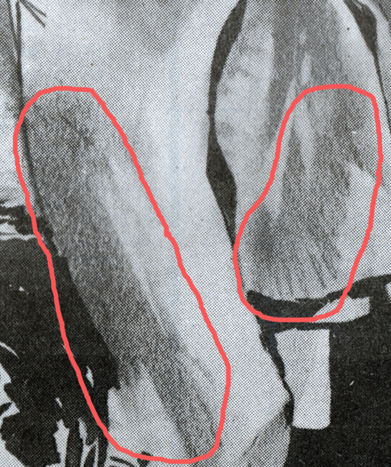
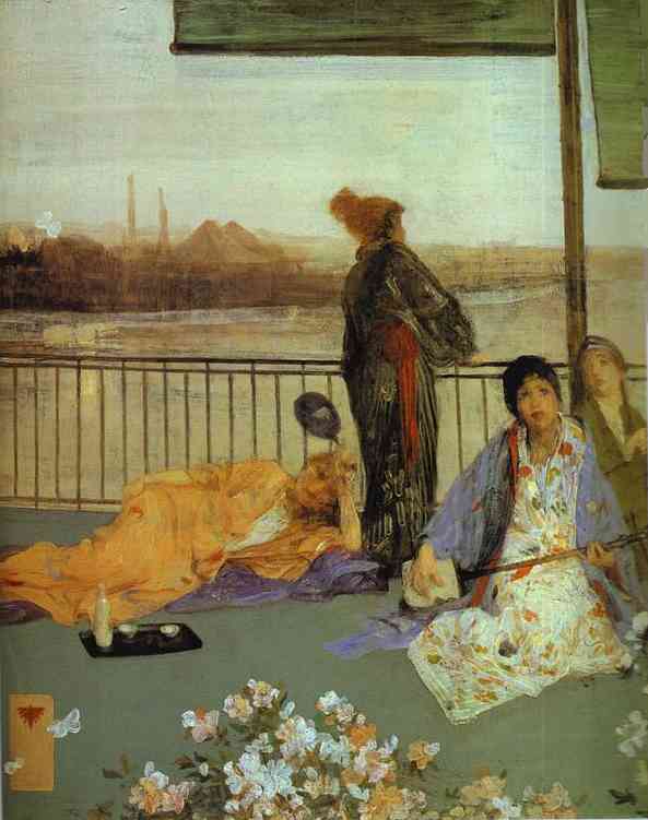
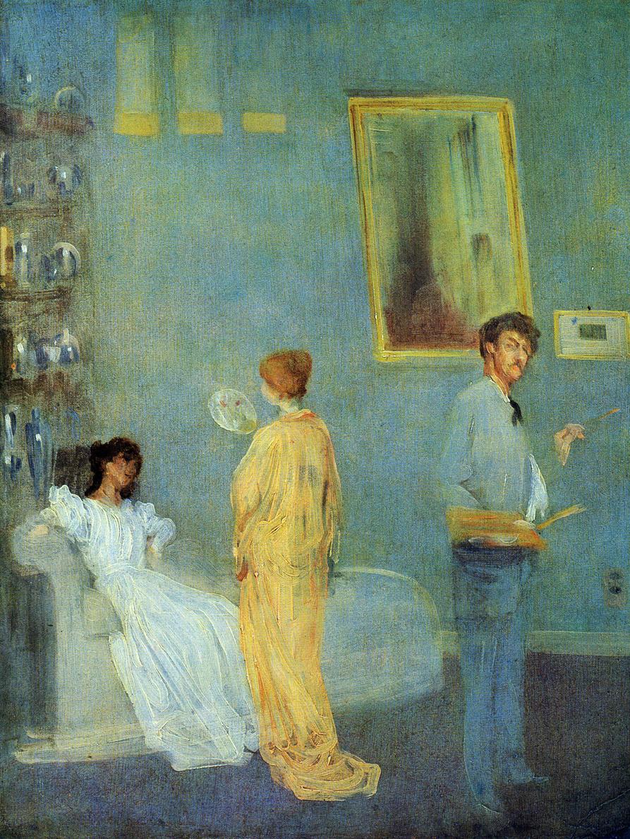
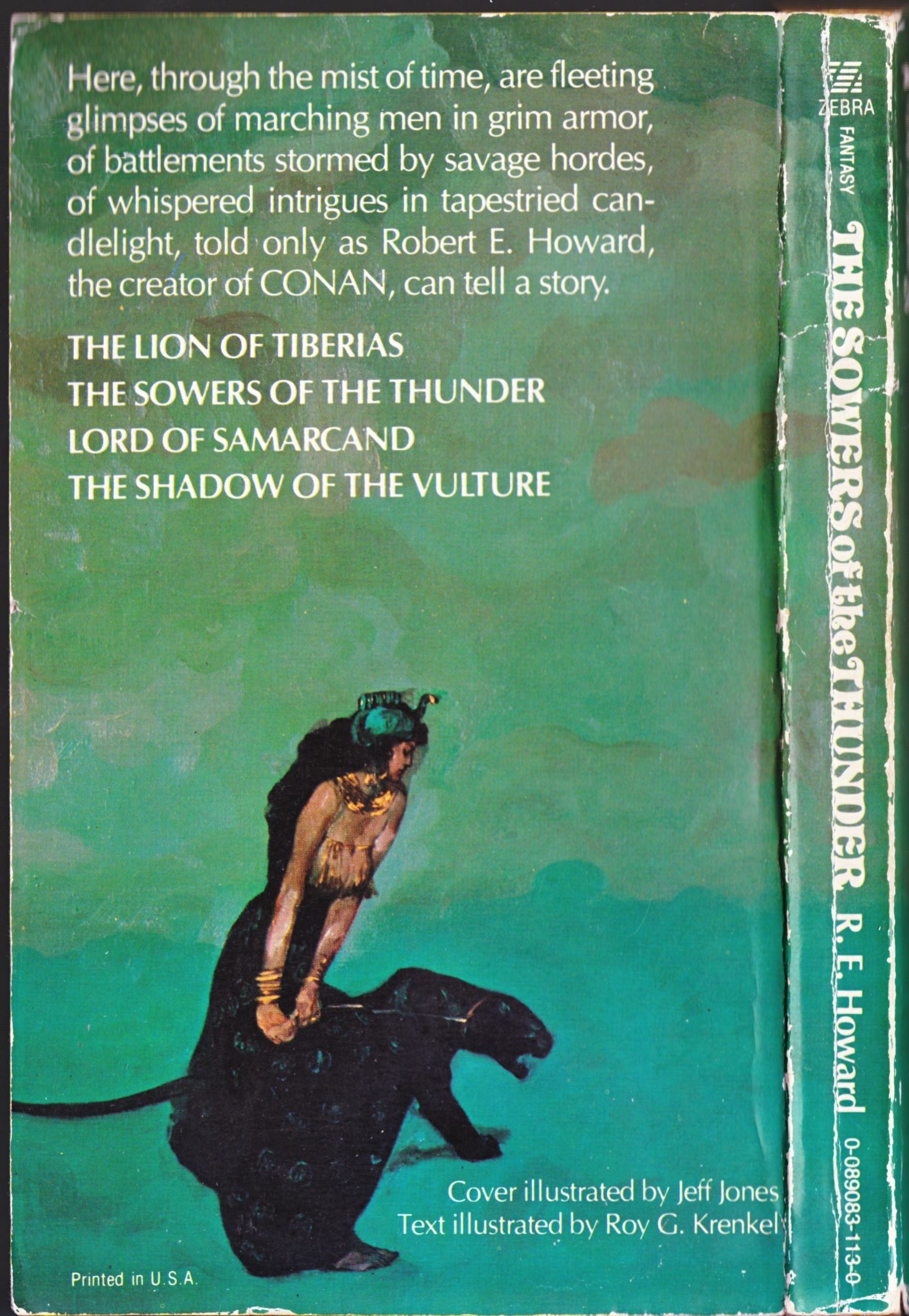
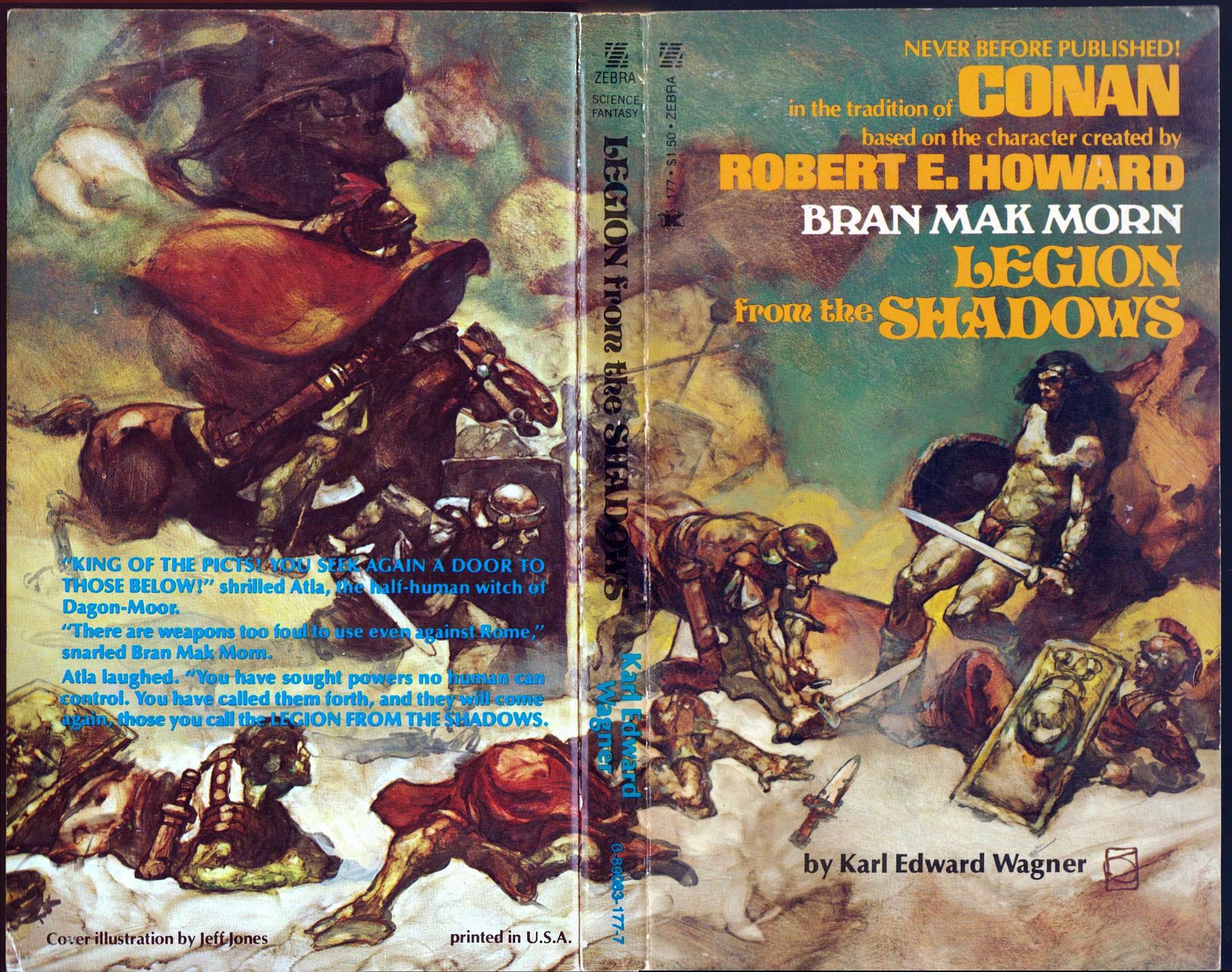
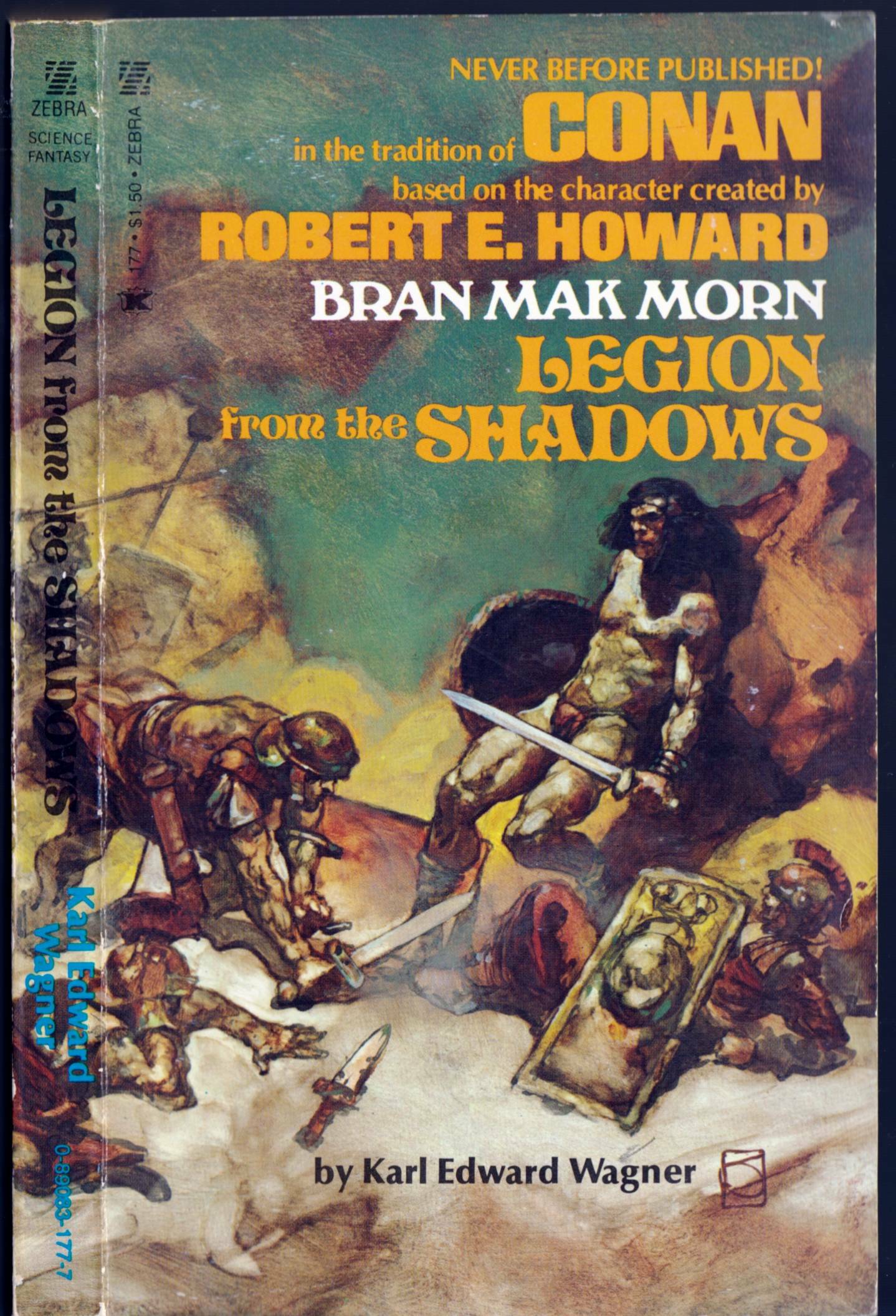
As I noted on this blog a long time ago, Jones’s paintings for Zebra Books/Kensington Publishing Corporation were one of the high points of the artist’s career as a cover artist. What I find interesting when I compare the two covers posted below, though, is the difference in Jones’s imagery and technique from one to the other. Whereas Legion from the Shadows features a rather abstractly composed fantasy battle scene delineated in thin washes of oil paint with relatively little opaque overpainting — some of the lightest lights in the painting have been created simply by wiping out the paint to expose the white ground — The Sowers of the Thunder explicitly hearkens back to the imagery and technique of James McNeill Whistler as evidenced in works such as Variations in Flesh Colour and Green: The Balcony and The Artist’s Studio, both of which I’ve included below for the sake of easy comparison. Whistler and Robert E. Howard — an odd couple if ever there was one!
[CLICK IMAGES TO ENLARGE]
The final two images above provide a comparison between the figure in the right foreground of The Sowers of the Thunder and the original art for one of the plates in Jones’s As a Child portfolio (Colchester, CT: Black Lotus, 1980).
Keywords: Bran Mak MOrn, The Sowers of the Thunder, Legion from the Shadows.
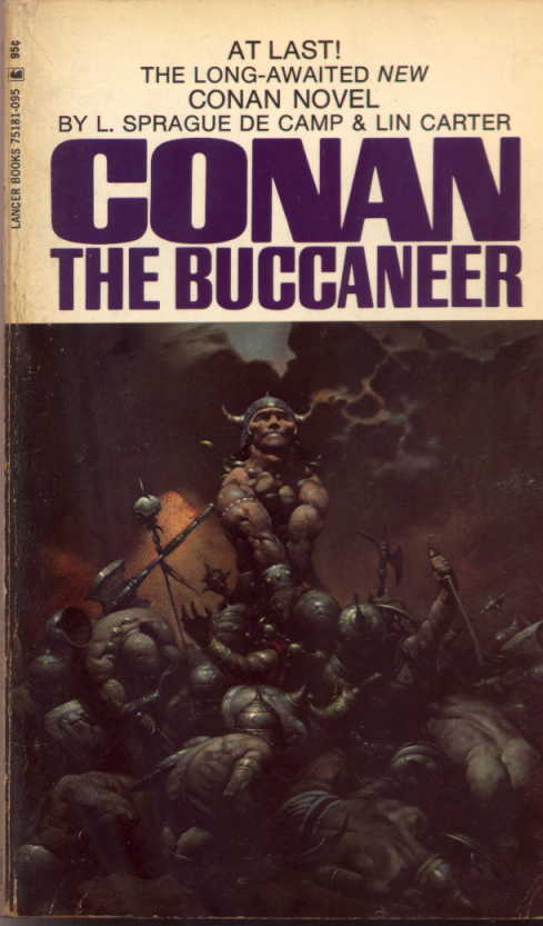
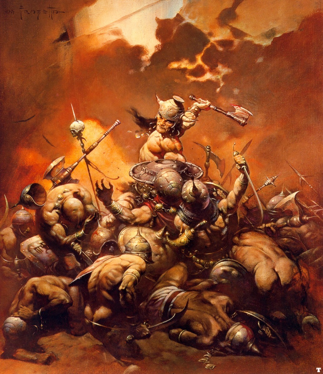
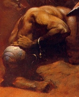
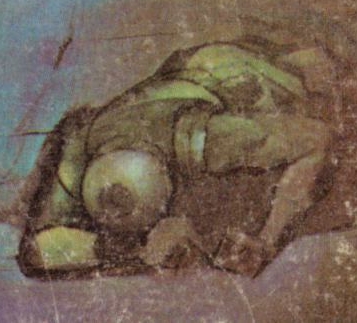
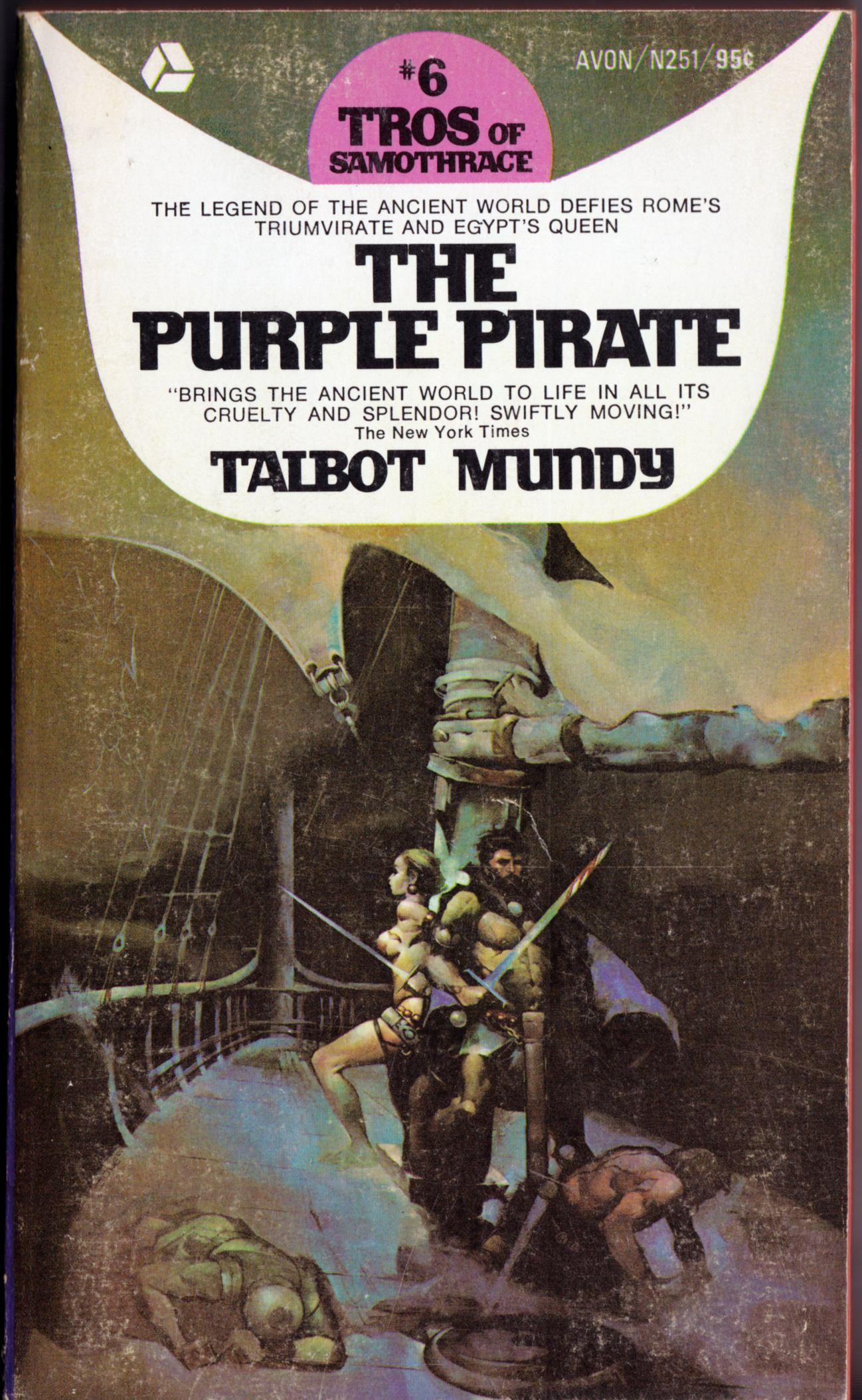
The helmeted, injured soldier in the lower left quadrant of Frank Frazetta’s Buccaneer/Destroyer painting and the helmeted, injured soldier/sailor in the lower left quadrant of Jeffrey Jones’s painting for Talbot Mundy’s The Purple Pirate are not exact copies of each other, as you can plainly see above, and yet, they do seem to share a certain family resemblance. So much so, that one might venture to guess that one of the painters has been “inspired by” the other in this detail… however, it’s not at all clear to me who was inspired by whom. Near as I can tell, the Jones cover was published first, in 1970; the Frazetta, second, in 1971. So make of that what you will…
Keywords:The Buccaneer, The Purple Pirate Talbot Mundy, L. Sprague de Camp, Lin Carter.
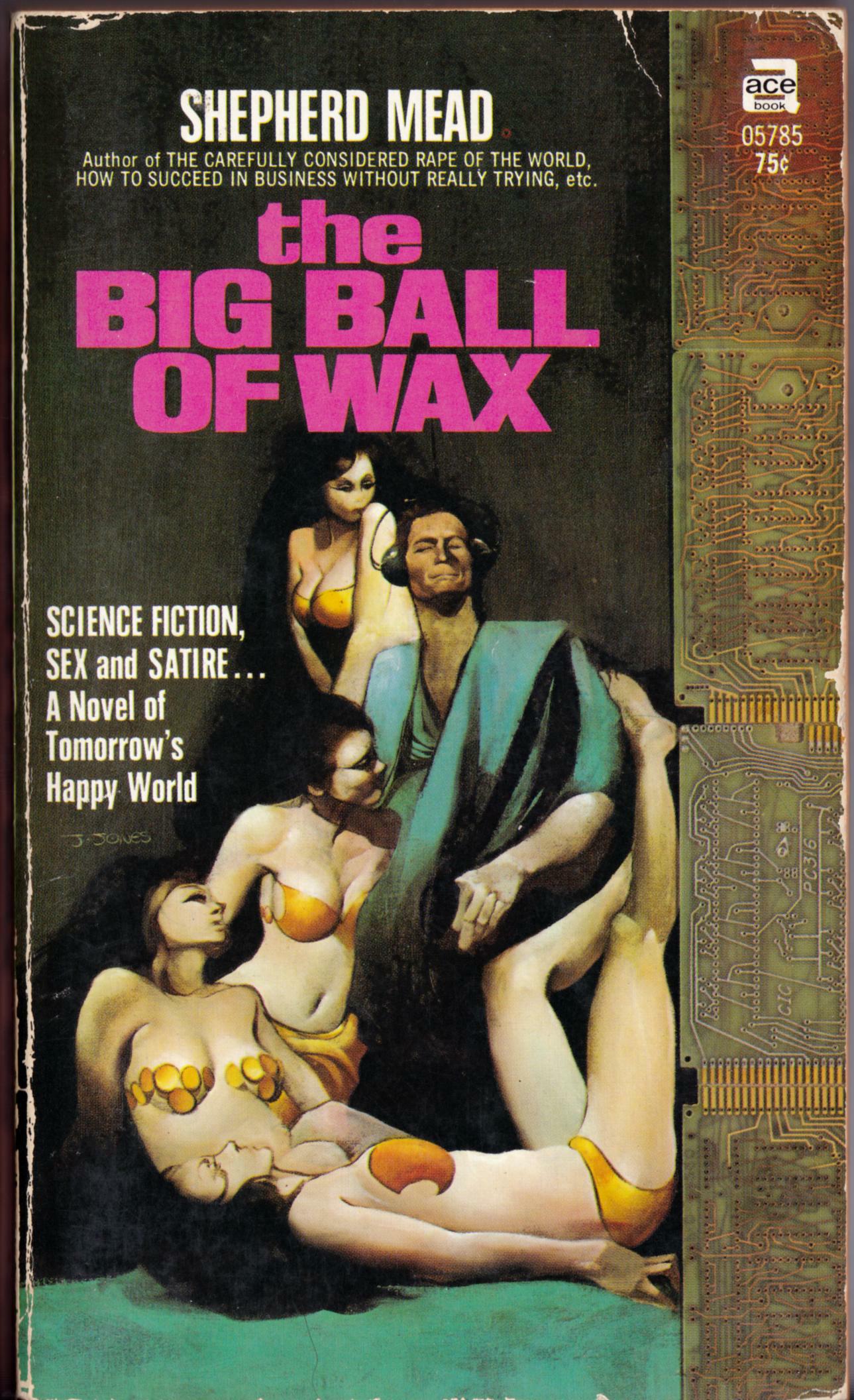
ABOVE: Shepherd Mead, The Big Ball of Wax (New York: Ace, n.d.), with cover art by Jeffrey Jones.
ABOVE: Talbot Mundy, The Purple Pirate (New York: Avon, 1970), with cover art by Jeffrey Jones.
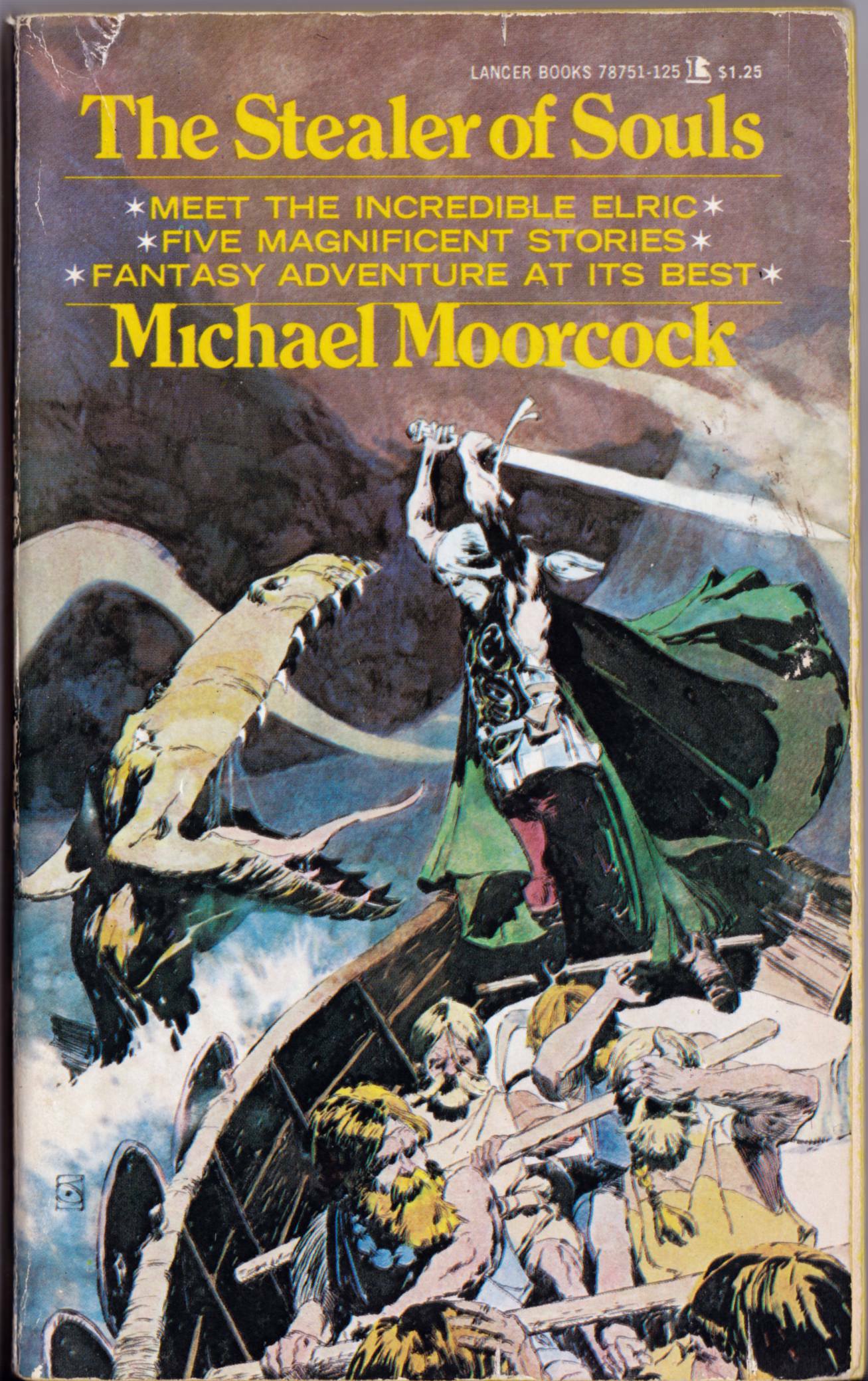
ABOVE: Michael Moorcock, The Stealer of Souls (New York: Lancer, 1973), with cover art by Jeffrey Jones.
I’ve looked at a lot of art by Jeffrey Jones over the years, and I have a pretty good memory for images, so I’m always surprised when I come across a Jones cover that I’ve never seen before. That’s the case with The Purple Pirate by Talbot Mundy, which just yesterday I stumbled upon among the used paperbacks at the local Value Village store. It’s unfortunate the book isn’t in better condition, but it was so cheap, and so rare, that I couldn’t pass it up in the hope of finding a better copy at some later date. There’s a sort-of Frazetta swipe on that cover, too; or maybe Frazetta sort-of swiped from Jones. (Anyone know which painting came first?) It’s the fallen soldier in the lower left of the painting. In my next post, I’ll provide a side-by-side comparison so you can see what I mean.
Keywords:The Big Ball of Wax, The Purple Pirate, The Stealer of Souls.
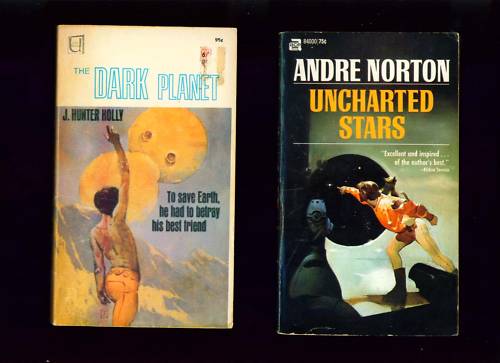
Yesterday, I won an ebay auction for 12 items with art by Jeffrey Jones, some of which I already own, but the majority of which I don’t. Here’s the list that was provided by the seller, followed by the auction images (although, of course, I intend to post better scans once I have the items in hand):
8 paperback books with Jeffrey Jones cover paintings
The Planet Wizard by John Jakes
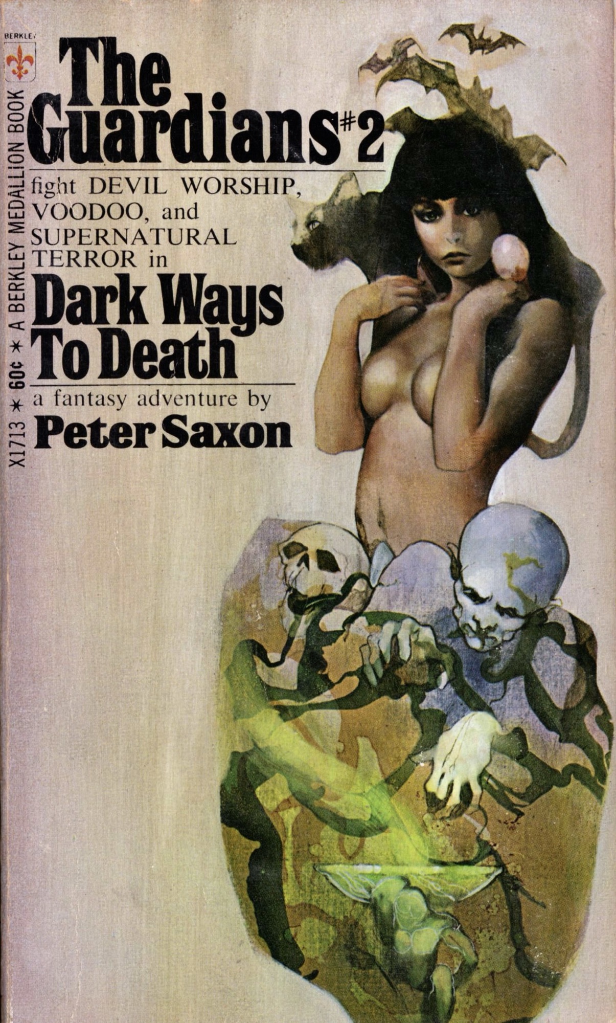
Day of Beasts by John Muller
The Dirdir by Jack Vance
Swords in the Mist by Fritz Leiber
Dark Planet by Hunter
Uncharted Stars by Andre Norton
Sargasso of Space by Andre Norton
Nine Princes in Amber by Roger Zelazny
The paperbacks vary in condition. Most are decent. Some have surface wear, and corner bumps. [….]
The two tabloid issues of ART SHOW from 1977 and 1978. #1 has Jones art inside and #2 has the DARK MANSION OF FORBIDDEN LOVE cover printed from the original art. This is what the painting actually looks like. The color was added photographically for the printed comic book.
Jeff Jones postcard from a privately printed set from around 1974 which included Frank Frazetta, STEVE HARPER, Mike Nally, and Norman Lindsay.
COLOUR YOUR DREAMS — with Jones covers and one image inside. Also inside are drawings by Kaluta, Wrightson (a very early Frankenstein piece), Barry Smith, Fujitake, Dave Cochrum, Roy Krenkel, and others. Nice portfolio — 32 pages. Published in 1972.
YOU NEED NOT BOTHER CLICKING THE IMAGES BELOW; THEY’RE ALREADY DISPLAYED AT FULL SIZE. WHAT YOU SEE IS WHAT YOU GET.
Regular visitors to RCN may recall that I already own and have posted scans of four out of eight of the paperbacks pictured above; the other four, however, will be new to this site, assuming they are in good enough condition to produce a decent scan. But that being said, the main reason I bid on the lot is to get the postcard, the two issues of Art Show, and the Colour Your Dreams portfolio publication.
All of which is to say: Jones fans, you have something to look forward to here at RCN in a couple of weeks!
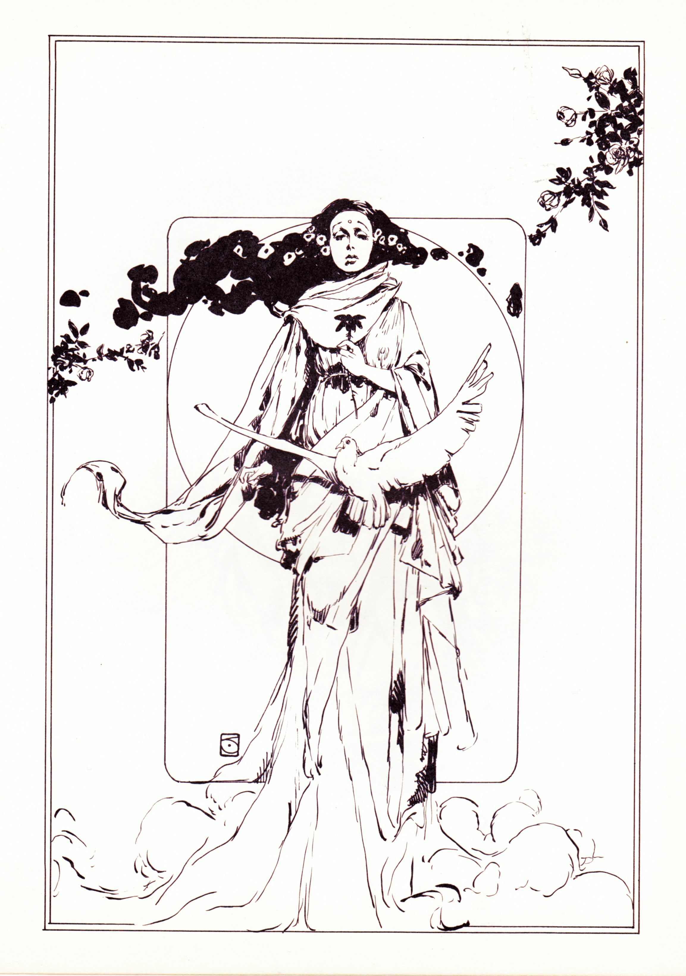
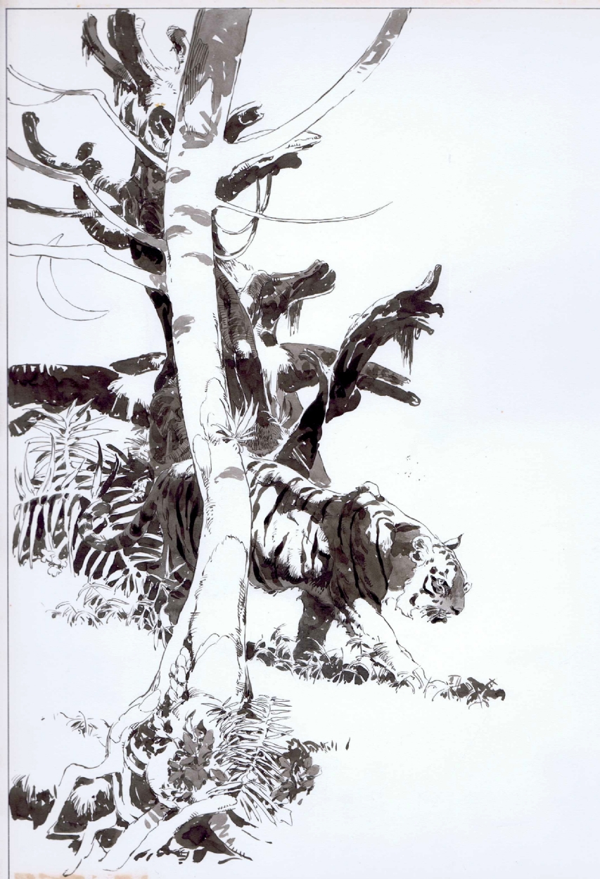
ABOVE: Jeffrey Jones, original art for “Extraordinary Verse: ‘The Tiger’ by William Blake,” Vampirella #34 (June 1974). From the collection of Rob Pistella.
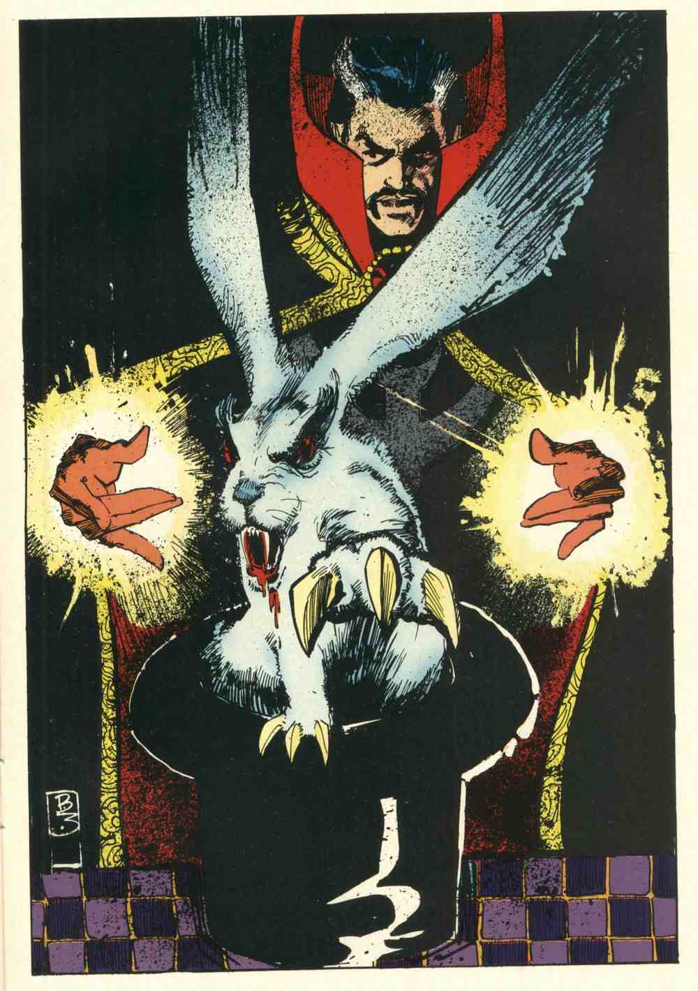
From Marvel Fanfare #8 (May 1983), “The Bill Sienkiewicz Portfolio,” coloured by Christie Scheele:
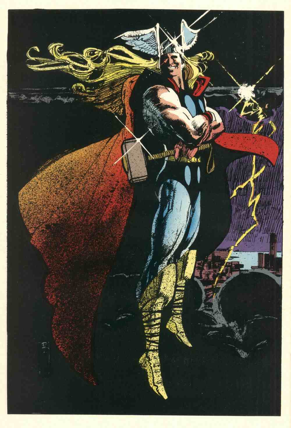
Notice Sienkiewicz’s Jeffrey Jones-inspired signature. Not really any evidence of Jones’s influence in the drawing, however. Ralph Steadman, maybe. Bob Peak, definitely — especially in the Thor image, but in some of the others as well. Neal Adams, definitely — all over the place. Jones, not so much.
To my eye, at least.
For one thing, Sienkiewicz’s figures are just not specific enough. They’re not carefully observed. There are no details that make you think, yes, that’s how a body really looks, and yes, that’s how it moves! Jones’s best drawings are filled with such details.
ABOVE: First Jones, then Sienkiewicz.
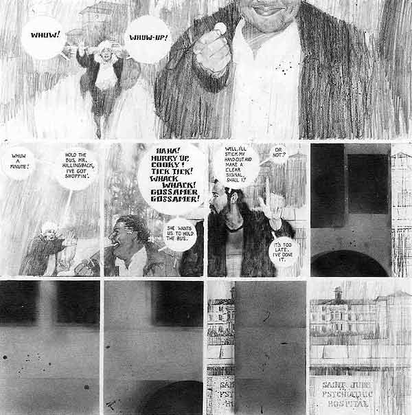
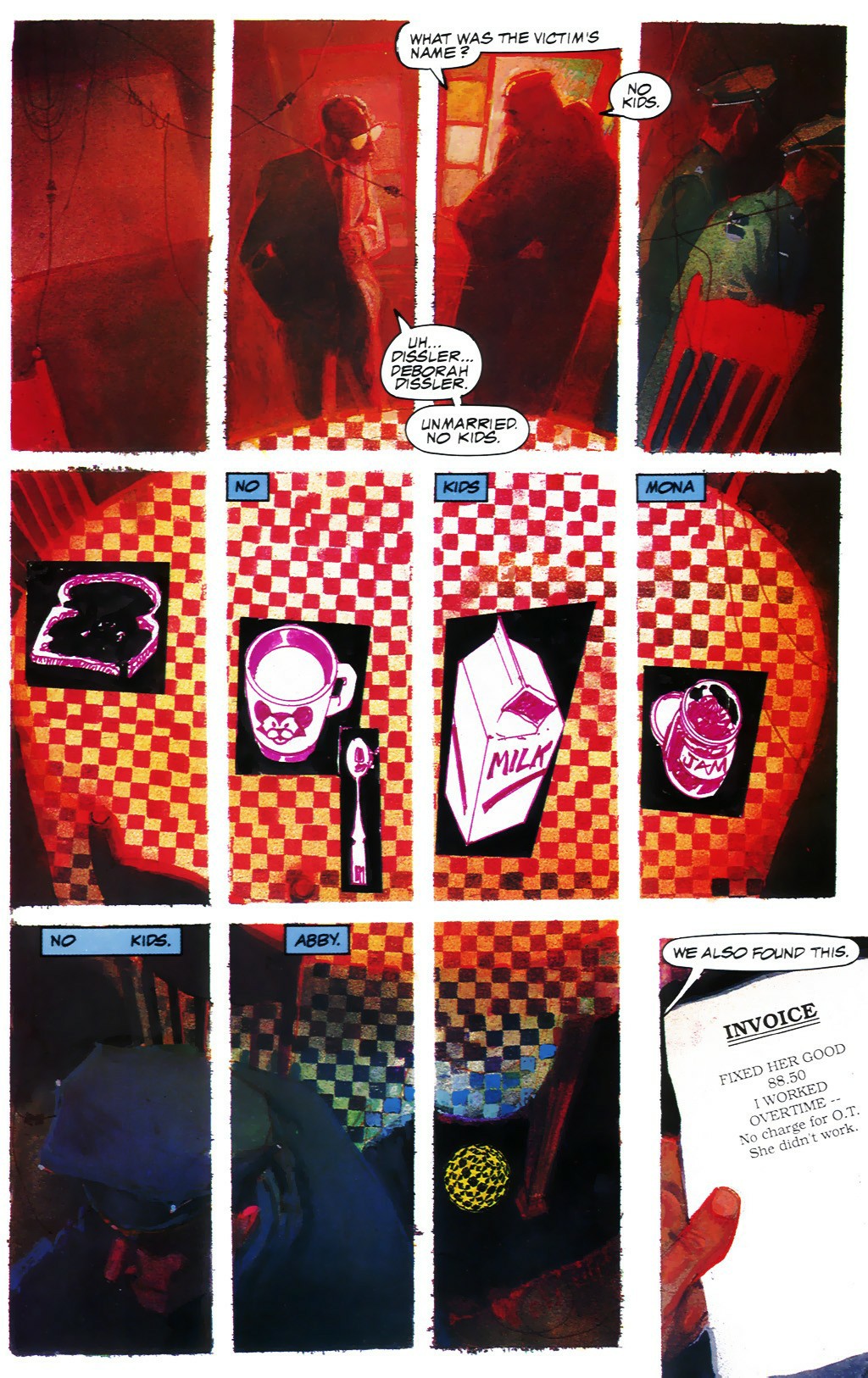
Seven years later, Sienkiewicz was hard at work on the artwork for Big Numbers, where he combined a loose mixed-media illustrative technique with extensive photo reference. Here’s a random sample from issue #1, as featured on Bill Sienkiewicz’s official Web site (where the style is explicitly identified as “photo-realistic”):
And here’s another:
It was a relatively original synthesis of the influences that Sienkiewicz had formerly worn on his sleeve, but still — to my eye — Sienkiewicz’s Big Numbers style owed more to work such as Richard Diebenkorn’s mixed-media figure drawings (see, for instance, Diebenkorn’s Seated Woman No. 44 [1966] posted below) — along with a certain highly influential school of heavily photo-referenced but painterly illustration art that emerged in the 1960s and steamrolled into the 1970s and beyond (Bernie Fuchs comes to mind here, and Robert Heindel, and the various Spanish illustrators whose photo-based work in ink, pencil, charcoal, oil, etc., came to dominate the Warren comics magazines, especially Vampirella) — than it ever did to Jones’s Idyl or I’m Age strips.
Nor did Sienkiewicz’s work have to resemble Jones’s, for Sienkiewicz to claim Jones as an influence.
Because the simple fact is, one can be influenced by a fellow artist’s example of artistic independence, integrity, and experimentation without latching on to specific aspects of his or her style…