"This day's experience, set in order, none of it left ragged or lying about, all of it gathered in like treasure and finished with, set aside." –Alice Munro, "What is Remembered"
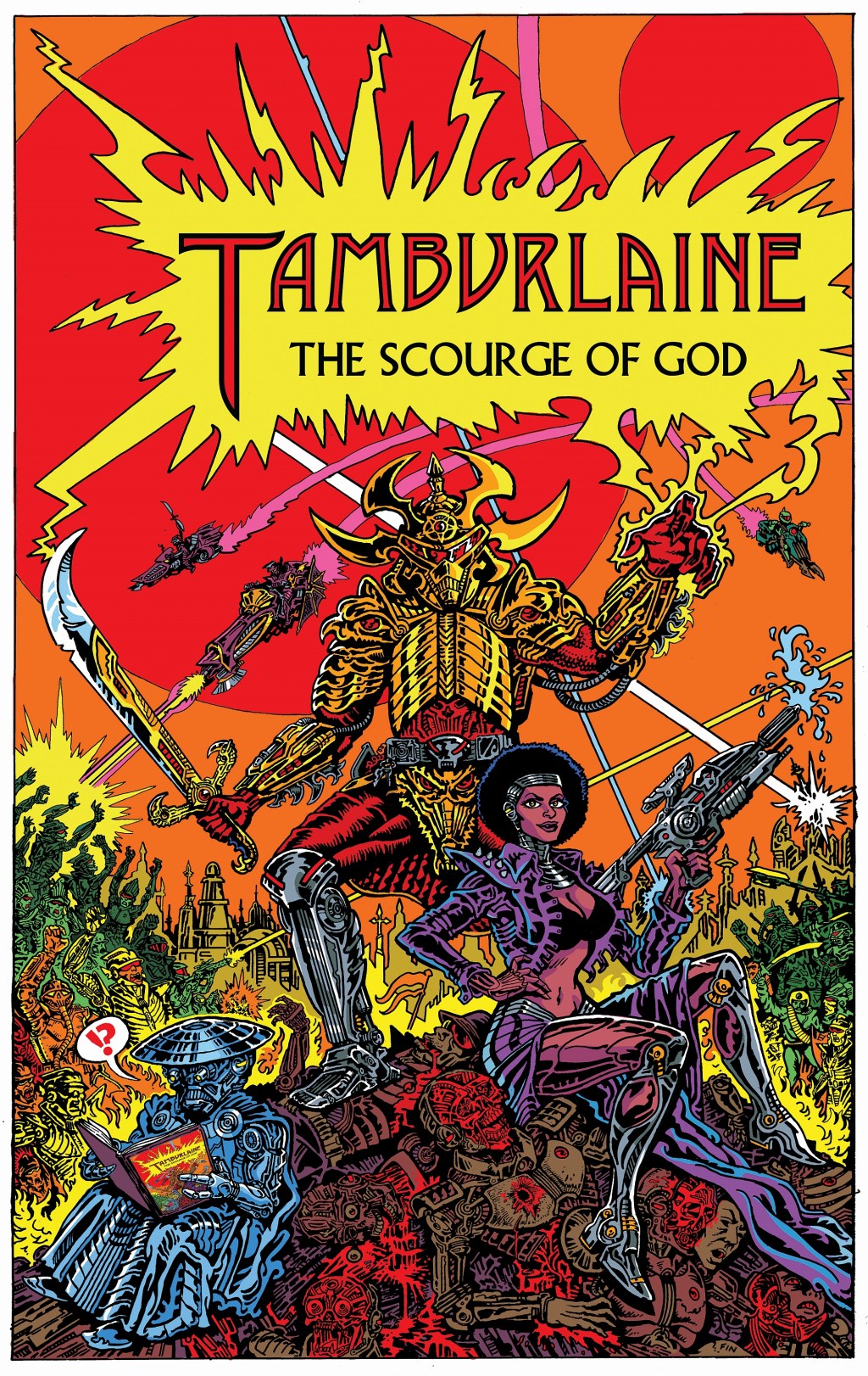
In early May of this year, I approached Canadian illustrator Finn Matthews with an idea for a commission. Finn is currently working with writer Mahendra Singh, who is an excellent illustrator in his own right, on an ambitious graphic novel, Tamburlaine: The Scourge of God, that seeks to transmute Christopher Marlowe’s Tamburlaine the Great (Part I & Part II) into Space Opera. My idea was to have Finn draw a scene from Tamburlaine that he had not yet tackled, but to do so in a way that would combine his love of Marlowe’s play and his existing Druillet-inspired designs with ideas and motifs from works by Gustave Moreau, Barry Windsor-Smith, and others — some old favourites of mine, basically — and on Friday of last week, I received via Canada Post the completed page, which is absolutely stunning. I think it’s fair to say that Finn and I both had a blast working together to shape the final art, and I thought it might be fun and instructive to display it here at RCN along with some of the images that the page references.
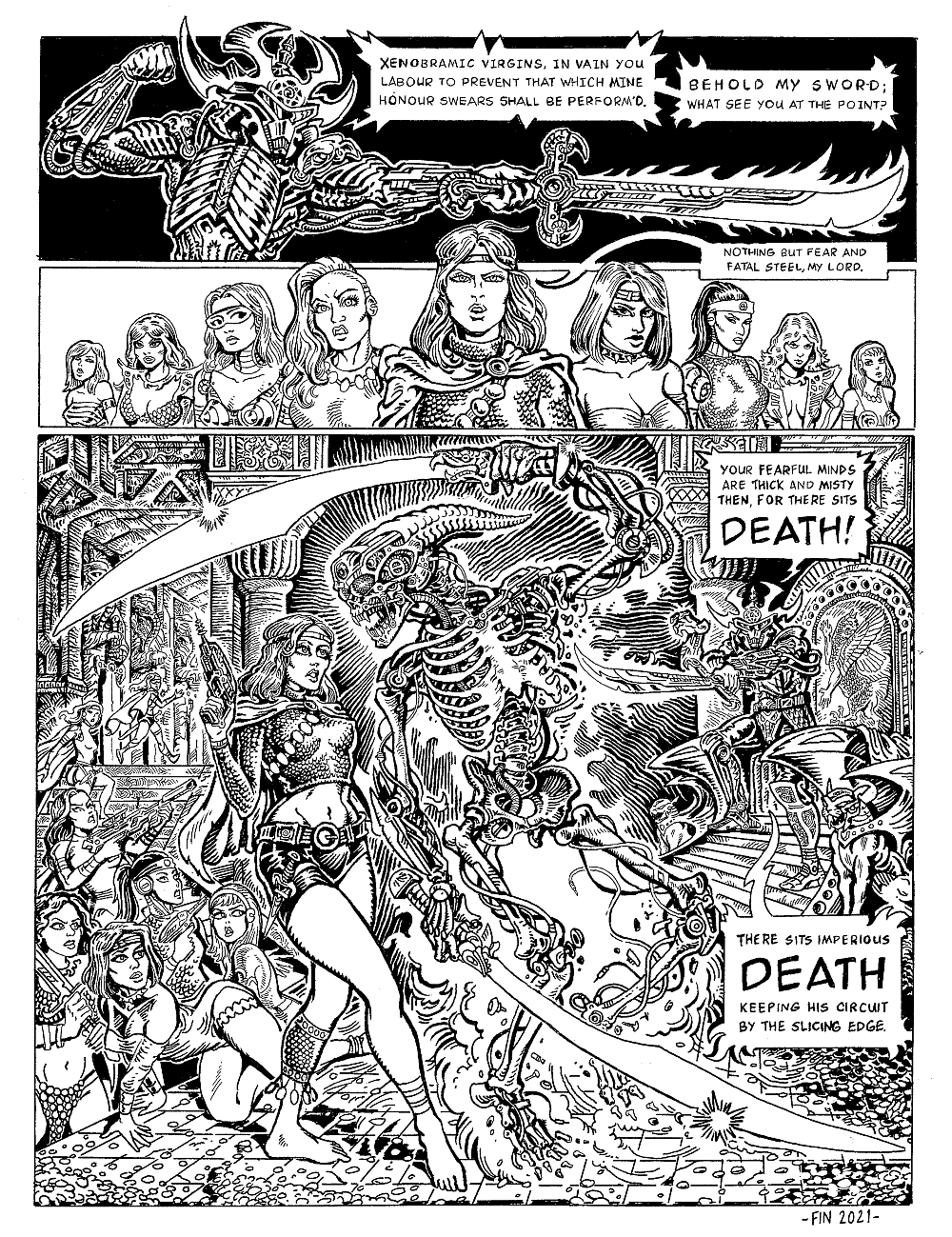
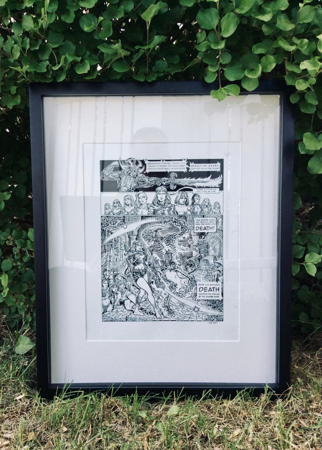
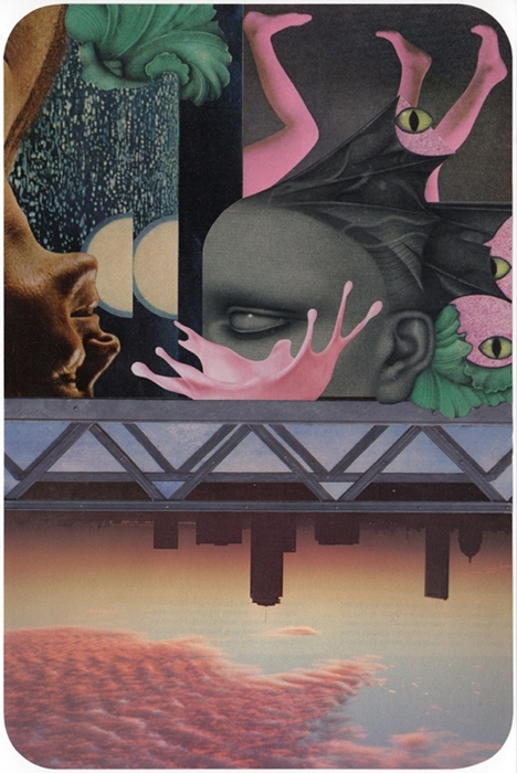
ABOVE: The completed page on 11 x 14 inch Strathmore 500 Series plate-finish bristol.
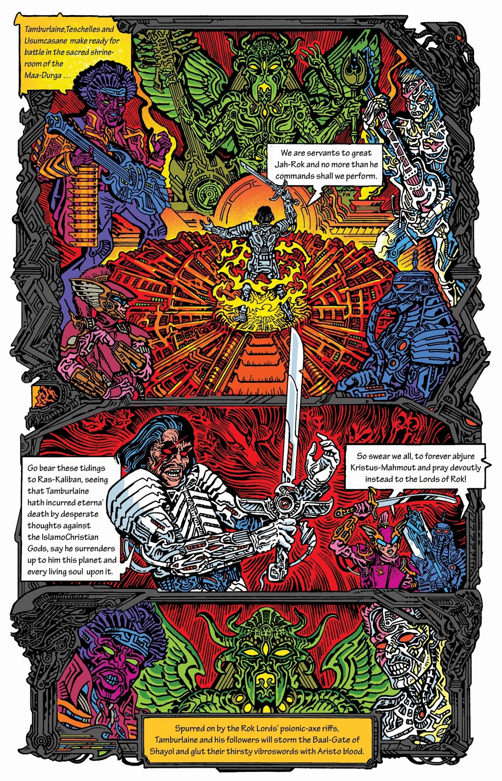
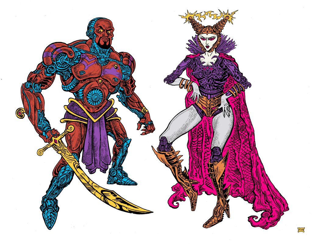
ABOVE: Proposed cover for Tamburlaine: The Scourge of God, with art by Finn Matthews. ABOVE: Page (in progress) from Tamburlaine: The Scourge of God by Mahendra Singh and Finn Matthews. ABOVE: Character designs by Finn Matthews for Tamburlaine: The Scourge of God.
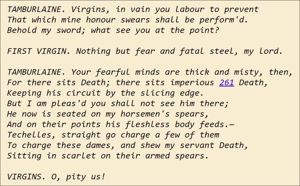
ABOVE: Here’s the relevant excerpt from Marlowe’s Tamburlaine. Finn was delighted with my choice, although I did express a preference for a shortened exchange, and that’s what made it into the commission (see original art).
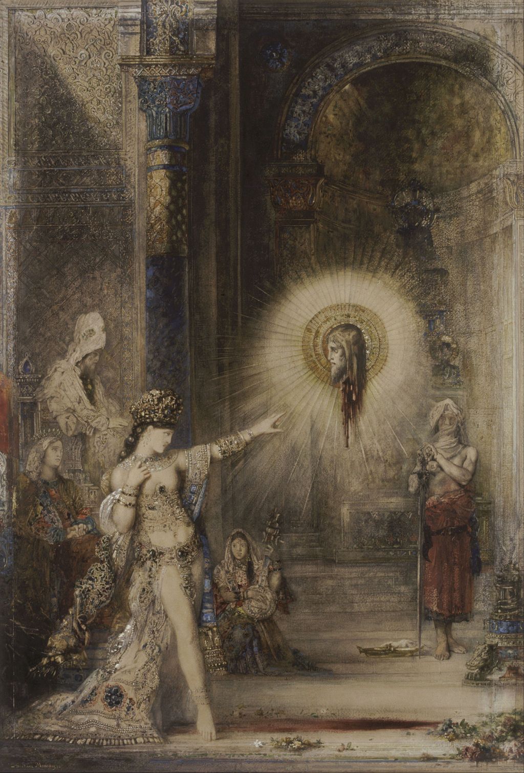
ABOVE: Watercolour version of “The Apparition” by Gustave Moreau.
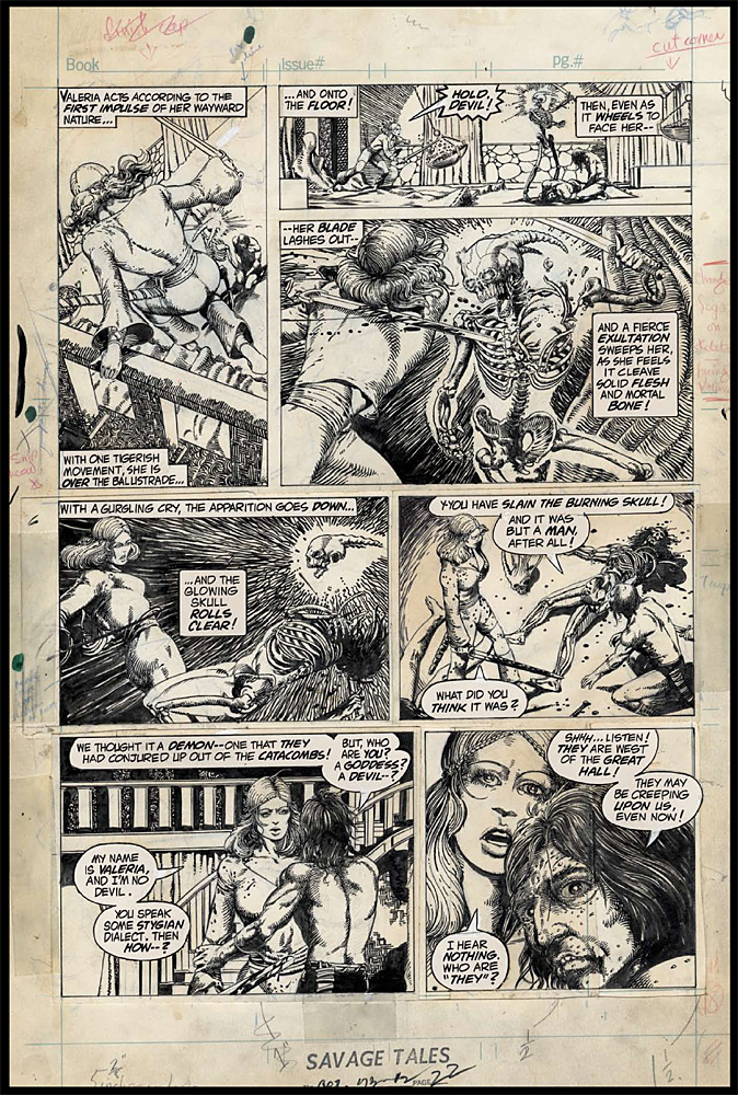
ABOVE: Page of original art by Barry Windsor-Smith from the Marvel comics adaptation of Robert E. Howard’s “Red Nails.”
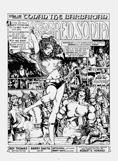
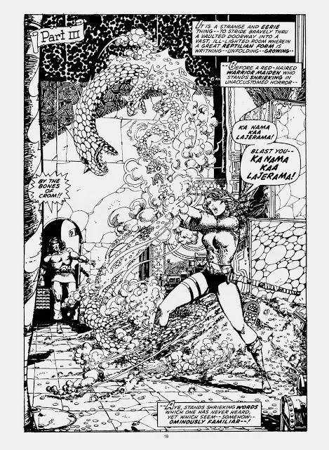
ABOVE: The opening page from Roy Thomas and Barry Windsor-Smith’s “The Song of Red Sonja.”
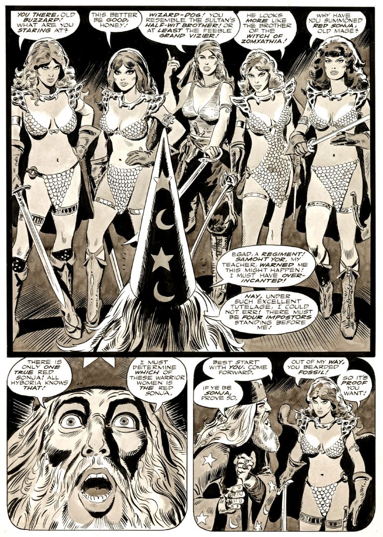
ABOVE: Another page from “The Song of Red Sonja.”
ABOVE: Page from a story by Frank Thorne that features multiple Red Sonjas.
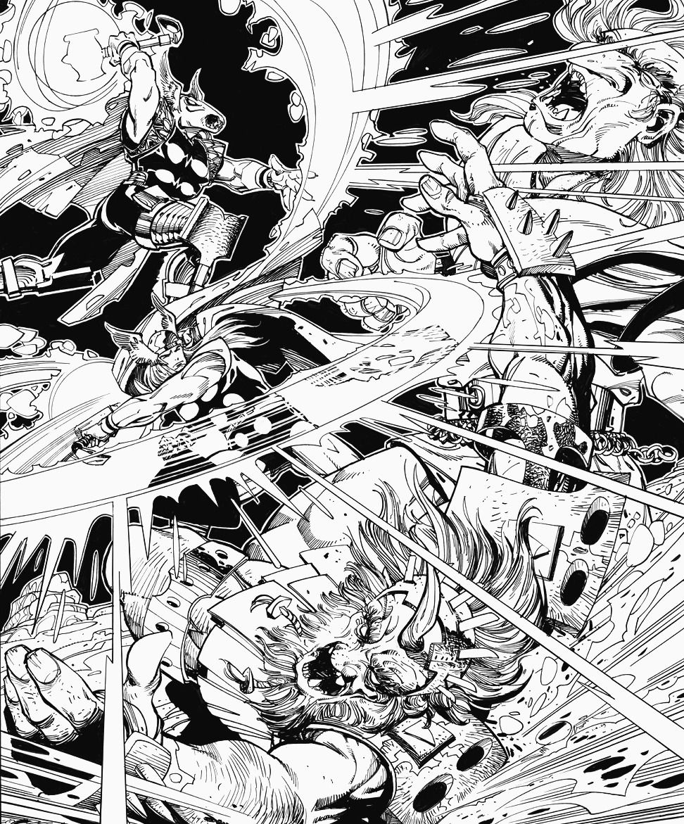
ABOVE: Thor page by Walt Simonson that displays his characteristic inking strategy of leaving a white border around figures when the background is black.
ABOVE: The framed commission.
While the choice of scene was mine, it was entirely Finn’s idea to break it down into a three-panel sequence, complete with balloons featuring the precise subsection of the dialogue between the First Virgin and Tamburlaine that I had mentioned in conversation that I like best, which was a cool surprise. (When I first contacted Finn, I had thought that I was commissioning an inked drawing, not a fully formed comics page, which I think anyone would view as a significant upgrade, but let’s just say that, as the process unfolded, we both got a bit carried away.) The term “XenoBramic” in the opening word balloon is an addition to Marlowe that may or may not appear in Tamburlaine: The Scourge of God, which, when it is published, will be Finn’s first professional credit in comics. Follow Finn on Twitter and/or Instagram for updates on the progress of his and Mahendra’s graphic novel. And publishers: there are still opportunities for a few brave souls worldwide to join the crew of Tamburlaine’s corsair, the Maa-Durga, which is already prowling the space lanes for plunder and booty, so hup to it!
Back in the summer of 2012, I became a backer of “John K’s ‘Cans Without Labels'” on Kickstarter. I pledged at the $30 level, which entitled me to receive two “rewards”: 1) “an original, possibly food stained, hand-drawn doodle signed by John K. on 8.5″ x 11 paper” (for which I happily paid an extra $5.00 to cover shipping), and 2) a digital copy of the animated short, “Cans without Labels,” which is what the Kickstarter was originally created to finance. The estimated delivery date for both “rewards” was February 2013.
Last week, I received my doodle. Here’s a scan:
Seeing that it includes lively, loopy drawings of the artist’s most well-known characters, Ren and Stimpy, the song lyric/catchphrase “Happy Happy Joy Joy,” sketches of two of the stars of the forthcoming “Cans without Labels” cartoon — George Liquor, top left, and one of his nephews, middle right — and John K.’s signature, rabid fans of John Kricfalusi would undoubtedly consider the above doodle to be pretty much ideal.
But as the women used to say in the Irish Spring commercials, I like it, too.
When will “Cans without Labels” be completed? Nobody knows…
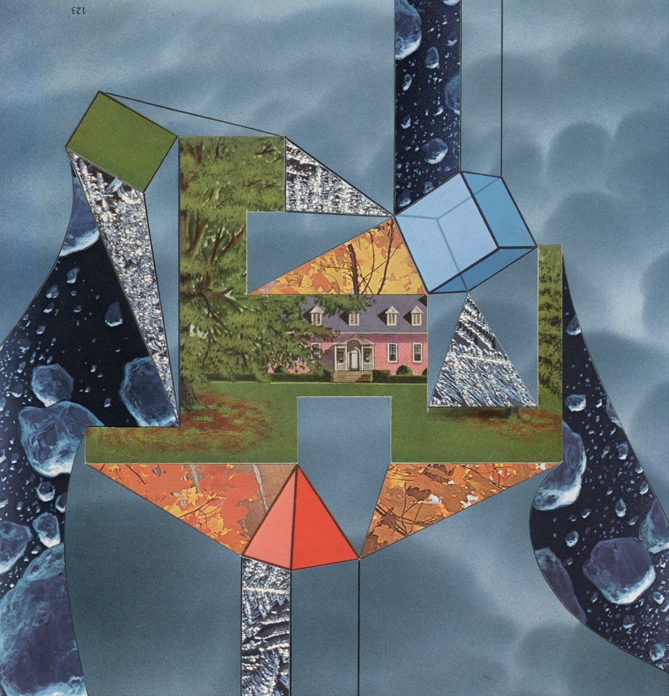
ABOVE: Jeffrey Meyer, Joke’s on You, Media Whores (2014), paper collage, 6 x 8 inches. Via AxJM:TE.
ABOVE: Jeffrey Meyer, Career Trajectory (2014), paper collage, 8 x 8 inches. Via AxJM:TE.
ABOVE: Jeffrey Meyer, Ectoplasmic Playpen (2014), paper collage, 9 x 9 inches. Via AxJM:TE.
ABOVE: Jeffrey Meyer, Bushmeat Delight (2014), paper collage, 7 x 11 inches. Via AxJM:TE.
ABOVE: Jeffrey Meyer, Metabolizing Hydra (2014), paper collage, 9 x 13 inches. Via AxJM:TE.
ABOVE: Jeffrey Meyer, Lab Assistant (2014), paper collage, 8 x 11 inches. Via AxJM:TE.
ABOVE: Jeffrey Meyer, Rarebit Drip (2014), paper collage, 8 x 10 inches. Private collection. Via AxJM:TE.
ABOVE: Jeffrey Meyer, Hopscotch Circuit (2014), paper collage, 7 x 12 inches. Via AxJM:TE.
To view more new collages by Jeffrey Meyer, click here, but please do keep in mind that the revised price schedule applies not just to the new work but to ALL of the collages at artbyjeffreymeyer.com that are not already in private hands. Contact Jeffrey Meyer for availability.
“If you’ve ever thought about buying any of my work, this will probably be your best opportunity.” — Jeffrey Meyer
P.S. Of course, as an unabashed devotee of collage art, and an inveterate bargain hunter, I couldn’t resist adding several price-reduced pieces by Mr. Meyer, including “Rarebit Drip” (see above), to my wife’s and my art collection — which, by the way, already includes a largish number of collages by Mr. Meyer and others. Not sure whether that makes me an astute collector or a brazen opportunist, but in any case, I’ll save the rest of my crowing about our new acquisitions for another post.
As I have mentioned in the past, I have often bought pages of original comic art based not on the name(s) of the artist(s) or on the title of the book or on the characters in the scene but on my positive reaction to and assessment of the page itself, in isolation from its proper context. What follows is one of those pages:
[CLICK IMAGES TO ENLARGE]
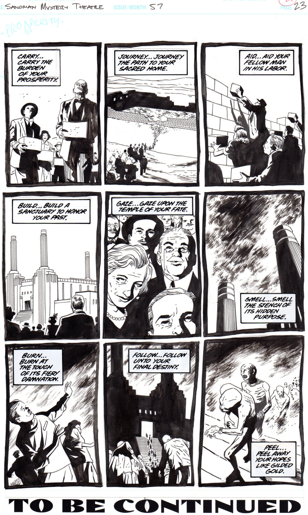
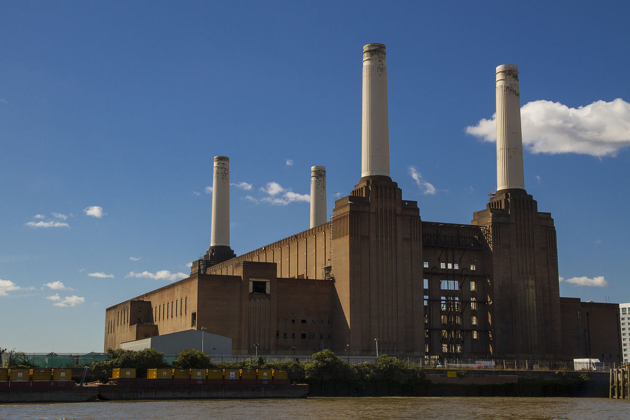
The script here is by Steven T. Seagle, from a story idea by Matt Wagner, the penciller is Michael Lark, the inker is Richard Case, and the letterer is John Costanza. The page was published in Sandman Mystery Theatre #57 (December 1997). The magnificent edifice that the people construct and then are consumed by is a doppelganger of the Battersea Power Station, which was constructed in two stages beginning in 1929 and decommissioned in two stages in the mid 1970s and early 1980s:
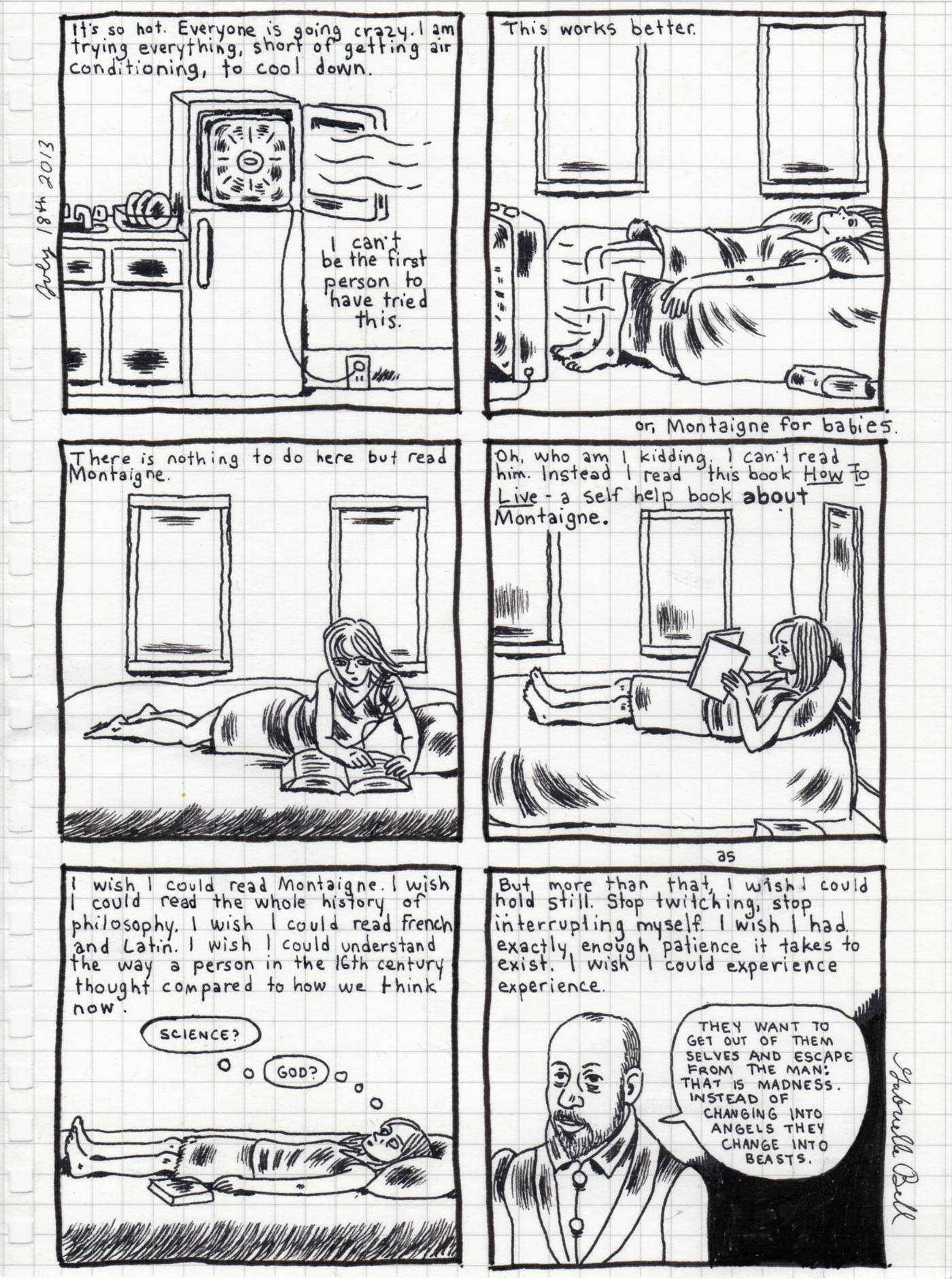
Two and a half months ago, more or less, my wife and I purchased a page of original art by Gabrielle Bell, author of When I’m Old And Other Stories (Alternative Comics, 2003), Lucky (D&Q, 2006), Cecil and Jordan in New York (D&Q, 2008), The Voyeurs (Uncivilized Books, 2012), and the forthcoming Travelogues (Uncivilized Books, 2014). How did this happen?
Each July for the past three years, Bell has set herself the task to produce a comics page a day, and has funded the project by selling the original art immediately after she has scanned it for book publication at a later date and posted a copy on her blog to enable her fans to follow her progress. As someone who follows Gabrielle Bell on Twitter, I, along with more than three thousand other people, had advance word that “July Diary 2013” was all systems go, and Bell’s daily tweet notifications enabled me to check out each new page very soon after it was posted — so long as I was at my computer at the right time, that is. And since the price per page this year was very reasonable — one hundred dollars, plus shipping and handling — I thought vaguely, pretty much right from the start, that I might attempt to buy one; however, as I watched the first several pages get snapped up by Bell’s fans, I realized I would have to pay attention and act quickly if I was going to be the first to complete the PayPal cart and secure my choice, if the right page should appear…
Well, fortunately for me, everything went just as I (sort of) planned it. I knew the page that I wanted as soon as I saw it on 18 July 2013, I didn’t let second thoughts hold me back, I just laid my money down. And here’s what I have to show for my “effort”:
[CLICK IMAGE TO ENLARGE]
Yes, the page is tiny, a mere six inches wide by eight inches tall, and the paper is thin, but according to Bell’s website, the materials are of reasonably good quality — acid-free graph paper and permanent black ink — so I would venture to guess that as long as the artwork is protected from the elements, it will probably disintegrate far more slowly and more gracefully than I will, even if I should live to a grand old age and keep all of the teeth and the lion’s share of the mane that I have left right now.
As you can see, the page is also signed and dated. I don’t know if Bell is in the habit of signing every page before it leaves her hands, but in this instance, I do know that I specifically requested that she sign it, and it arrived with her signature.
As for the content of the piece, well, let’s just say that the theme of ambition waylaid by self-doubt and wishful thinking speaks to me…
You can view a version of the 7-18-13 diary page that Bell has cleaned up with Photoshop on her blog. And if you want to read “July Diary 2013” from the beginning, click here and then simply follow the links just before the comments to browse forward in time.
Finally, Bell yesterday posted page one of her “Columbia Comicumentary” and is (again) selling the original art as she posts each page. The new pages are slightly more expensive than the “July Diary 2013” pages were, but even so, they are probably still under-valued when one considers Gabrielle Bell’s past accomplishments and growing stature in the world of comics.
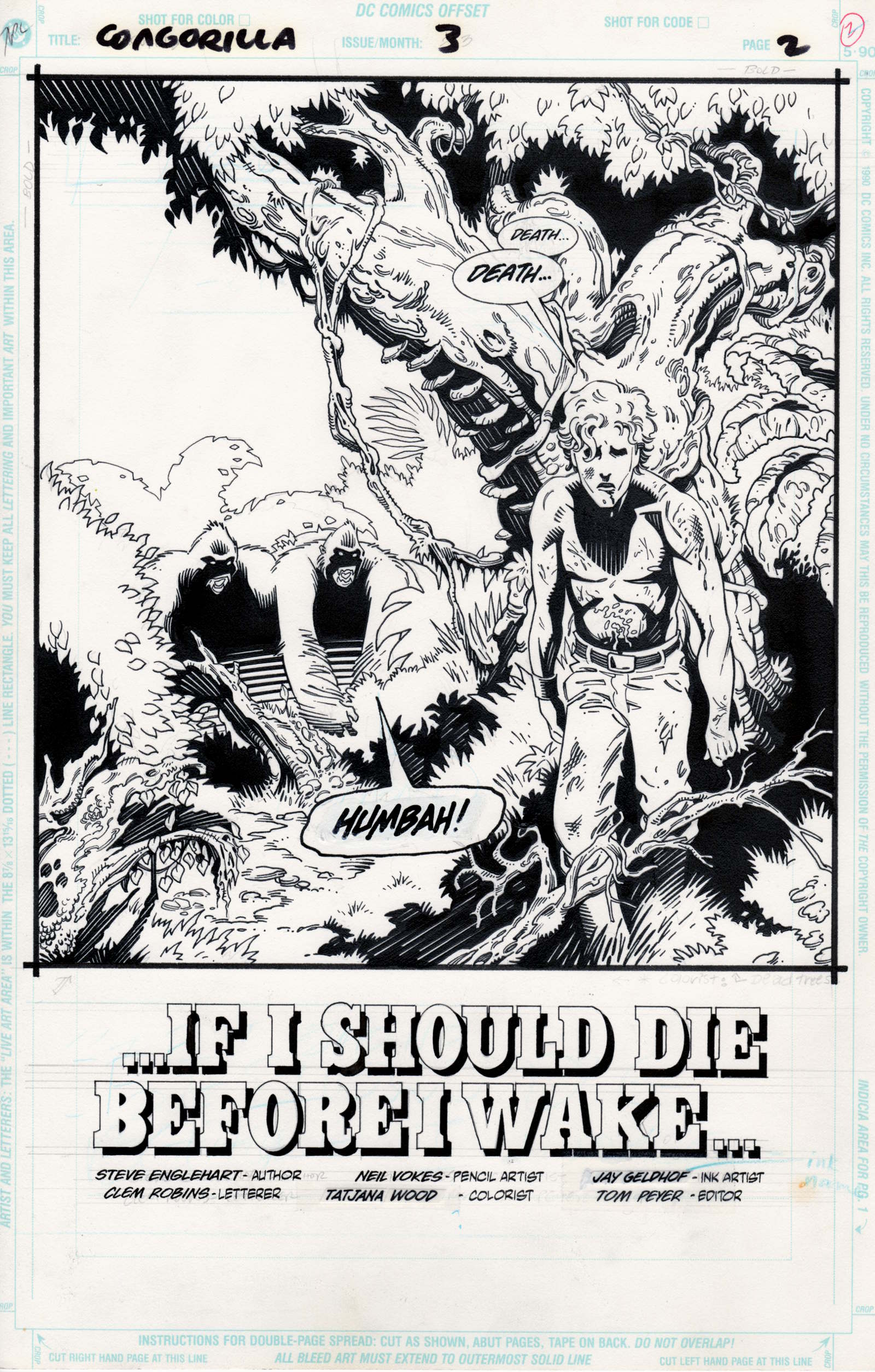
This morning, I’m going to dip into our collection of original art, and… picking at random… sort of… I’ve got… the opening splash/credit page from Congorilla #3 (January 1993), with pencils by Neil Vokes and inks by Jay Geldhof:
[CLICK IMAGE TO ENLARGE]
The way that this page came into our possession is not at all interesting, but I’m going to tell you about it anyway. Back in about 2001, we were looking to buy some original comics art to frame and display in our son’s room, and as I perused the listings on ebay, I noticed that one seller with the screen name “artguy” always seemed to have an interesting selection of all-ages work for sale with very low starting bids. So I found a page I liked, placed several bids, won the auction, and discovered, through experience, that artguy was a very friendly, very reliable seller who didn’t overcharge for shipping! And I guess I got caught up in the process, because I ended up buying quite a few pieces from artguy, including — if memory serves — the Buscema page that I posted earlier.
Anyway, the Congorilla page that you see above was one of FIVE pages that I bought (all for our son’s room, of course!) with pencils or pencils and inks by Neil Vokes. I was not a fan, or even simply a reader, of Congorilla before or after I bought the page, nor was I particularly a fan of Neil Vokes and/or Jay Geldhof. Rather, I bought the page entirely on its own merits, i.e., because I was impressed by the overall design of the image and by the extensive, attractive use of counterchange throughout, because I was amused by contrast between the man’s words — “Death… Death…” — and the deflating exclamation — “HUMBAH!” — from the gorilla (?) in the background, because I thought the boldly lettered headline quotation from the classic children’s bedtime prayer, “Now I lay me down to sleep,” gave the tableau a sort of weird edginess that would irritate my in-laws, because I thought that the drawing and text together made a bold statement that would read even from all the way across the room, and, of course, because the price was right!
Unfortunately, I have yet to frame any of the pages that I bought from artguy. But our son will inherit the lot of them… eventually…
And who knows? Maybe… eventually… there will be a grandkid’s room to decorate, although the picture is probably inappropriate for a nursery.
I recently built a plywood cabinet that is two-feet deep by three-feet wide by four-feet high, with five adjustable middle shelves and one non-adjustable bottom shelf, as a central location to store original artwork, limited-edition portfolios, a couple of massive art books, full sheets of watercolour paper, etc., which means I am now able easily to shuffle through our collection for items to scan and display here at RCN.
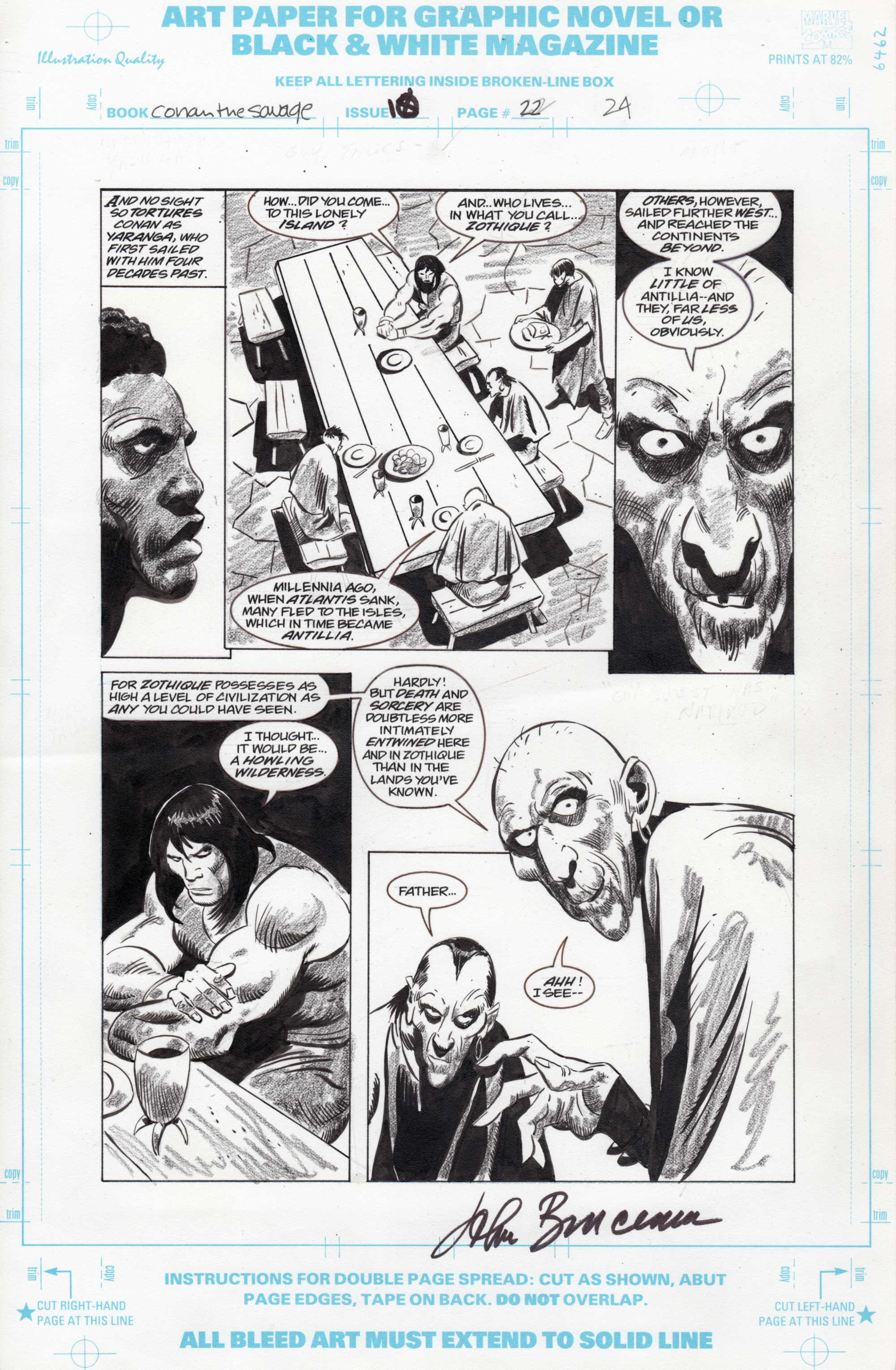
First up is a page of original art by John Buscema from issue #10 of Conan the Savage, a short-lived, black-and-white Conan spin-off series from the mid-1990s; the story is titled “The Necromancers of Na’at.” I bought the page for three main reasons: 1) I had long coveted a page with BOTH pencils and inks by John Buscema; 2) the pencils, inks, and China Marker tones here are ALL by John Buscema, and 3) the price was right. The fact that the page is signed by Buscema didn’t really enter into the equation, but it’s a nice bonus, I think.
Here, take a look:
[CLICK IMAGES TO ENLARGE]
To be perfectly frank, if I had had unlimited funds, this is not the page I would have selected. Instead, I would have snapped up a Conan the Barbarian page or three from one of those issues where Big John inked his own pencils without the additional China Marker shading. Unfortunately, such pages are prohibitively expensive for low-level collectors like me. So long ago I made up my mind to be happy with the best of what I could and can afford!
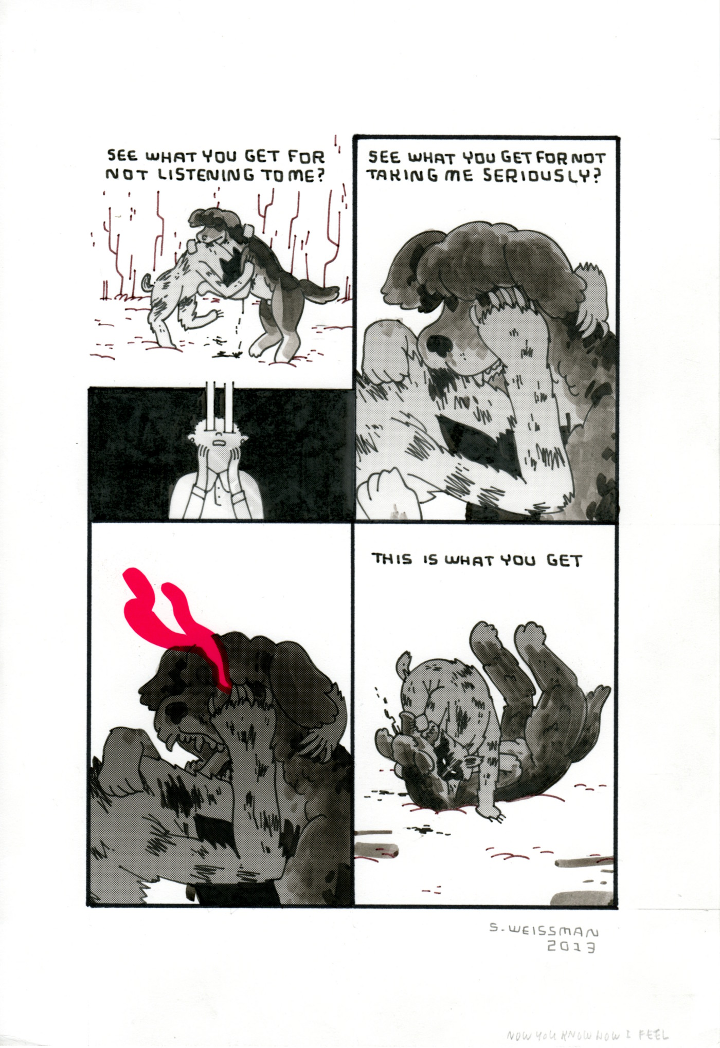
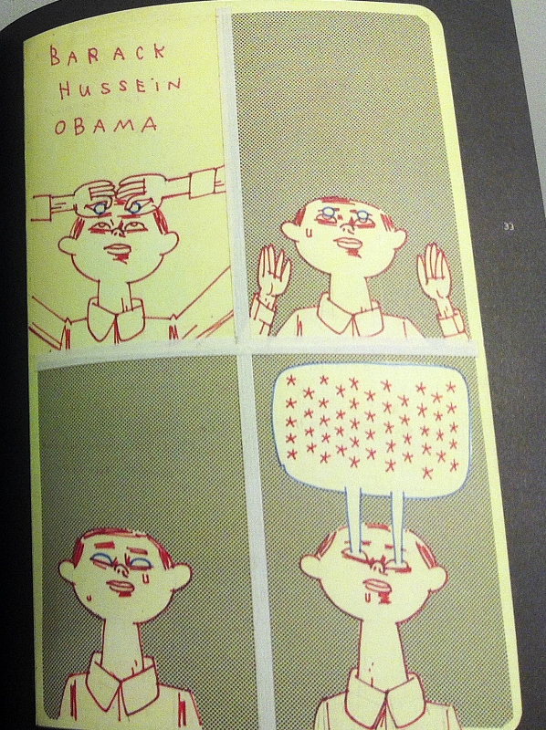
This summer, my wife and I bought a page of original art from the online comic strip, “Barack Hussein Obama,” by Steven Weissman; the page, which is signed by the artist, is from an ongoing sequence that Steven began posting online in the spring of 2013 entitled “Looking for America’s Dog.” Here’s a scan:
[CLICK IMAGES TO ENLARGE]
If I had to break it down, I would say that the first element that drew me to the above page was the opening panel with Barack Hussein Obama’s daughter Sasha in what has become an iconic pose/situation in the strip. Second was the beautiful use of blood-red design tone in the third panel. And third, the overall excellence of the timing of the words and pictures in the fight sequence.
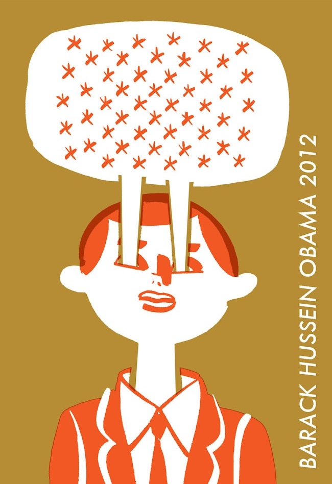
A hardcover collection of Weissman’s “Barack Hussein Obama” was published by Fantagraphics in 2012, and I thought it was one of the best “graphic novels” of the year. If the “real” Barack Hussein Obama had lost the election in November of last year, the strip probably would have ended then and there. But Obama won, and Weissman has been posting new instalments ever since, with a view, I suppose, to a second collection — or perhaps simply a complete collection — at some point in the future.
ABOVE: Jeffrey Meyer, Toggle (2012), paper collage, 8 x 10 inches. Private collection.
“My interest in collage stems from a dissatisfaction with existing visual culture (advertising, propaganda, technical literature, even other art). I prefer ambiguity, humour, sublimity, or solace where before there was only crassness, pandering, offence, or mundanity. I have no preconceptions in mind when I sit down to work; I do have favorite themes and imagery, but I allow myself the freedom to make as many mistakes or false starts as I need to arrive at a finished image I find compelling. I hope others find the work interesting as well.”
I’ve been an admirer of the collage art of Jeffrey Meyer for a couple of years now, so a few weeks after I received notice from him that his professional website/portfolio was back online, after an absence of some months, I “suddenly” had the idea that a brief conversation with Jeffrey, conducted via email and rearranged/edited for publication here, not only might be an appropriate way for RCN to help draw attention to the artist’s new domain, new website design, and new work, but also would give me an excellent excuse to show off the four collages — God Speaks in Riddles, Hot & Cold Fusion, Seasons, and Toggle — that my wife and I purchased from him last summer. Jeffrey gamely agreed to participate, and this is the result:
ABOVE: Jeffrey Meyer, God Speaks in Riddles (2010), paper collage, 9 x 8 inches. Private collection.
CONVO:
RAGGED CLAWS NETWORK: In a 2011 interview with the Notpaper blog, Jeffrey, you lamented the substantial amount of time — “25 (mostly thankless) hrs a week” — you were spending “obnoxiously ‘promoting’ myself via online submissions to blogs, magazines, galleries, etc.” Within the past year, however, you have shut down your Society6, Twitter, Flickr, and Tumblr accounts (and possibly others I’m unaware of), reducing your online presence to your Facebook account and your website/portfolio. How is the new arrangement working for you so far?
JEFFREY MEYER: I used to send my site to maybe 10 various art/design sites a week, for about two solid years, to whomever I thought might be interested, or sites I thought I’d benefit from appearing on. It was largely a waste of time. Lots of mentions on blogs and tumblrs — which I sincerely appreciated — but no real traction. I felt spread a little too thin… I sold maybe one piece a month, had maybe three commissions a year, despite however many thousands of “likes” on various 16-yr-olds’ tumblrs. Completely ignored by the most well-known and trafficked art sites; I guess they’d rather highlight another phony “street” artist or the 10,000th someone who paints deer or birds or takes limp pastel snapshots of hipsters camping in the nude. (Really, when will that shit end?) Absolutely zero response from any galleries I submitted to.
I realized I’d rather have my work seen by ten people with money and connections than 100,000 people who can’t be bothered to give me a single penny. So that’s why I shut down all the sites you mentioned. Been sending my new site out now… people seem even less interested than before. I can only presume the new work is worse than the old, in their opinion. I dunno. Maybe my stuff just doesn’t fit anywhere so easily. Maybe I just suck; I consider that possibility every single day.
RCN: But let’s assume that you don’t suck. Is there any viable alternative to the grind of endless, intensive online self-promotion? Is an agent, for instance, a possibility, or is representation of any sort a luxury of the fortunate few?
JEFFREY MEYER: I don’t know anything about agents… seems like the kind of situation where you have to be popular or successful to begin with to get an agent. I tried that when I was doing comics and illustration a decade ago, and received zero response of any kind.
Honestly, at the risk of sounding arrogant or whiny, when I look at my work — the range of it, and the technical and conceptual qualities, the quantity — and then look at other collagists’ work, and see, for example, the number of Facebook fans they have or whatever, it just depresses me. Maybe I’m deluding myself, I can’t be sure. I don’t expect to be in the Whitney Biennial, for god’s sake, but some nice gallery representation would be beneficial at the very least. All I need is 10 grand a year and I can quit my day job, you know? That’s, what, $800 a month? Still below poverty level, still on food stamps, still an amount most people — artists included — would scoff at.
I sound like a crank here, and maybe even petty, mentioning specific figures and circumstances like this, but I hate that artists don’t talk about this stuff forthrightly. It’s not embarrassing or a big mystery — it’s a matter of survival. No one seems to talk about how living costs are the most important thing for an artist to take care of. All the various grants I look into cover “project costs,” etc., but simple food and rent is never mentioned, or the use of the grant monies to pay basic costs of living is outright prohibited. I don’t get that. It’s anti-artist. I don’t want something called a “residency” — I want my food and housing covered so I don’t need a day job, so I then have time to do more of my work. A lot of this seems to stem from the idea of “arts” rather than artists; anytime I hear the word “art” with an “s” after it, I know it’s nothing more than a pointless bureaucracy of money gatherers with no interest in helping individuals. So the city ballet, city symphony, maybe summer programs for kids, get funded, but not individual artists with years of disciplined work behind them.
ABOVE: Jeffrey Meyer, Hot & Cold Fusion (2009), paper collage, 10 x 10 inches. Private collection.
RCN: A common criticism of a lot of contemporary collage is that it unthinkingly or joyfully or cynically trades in nostalgia, that too often artists and illustrators become enamoured with the imagery of certain historical time periods, or discover/notice that such imagery garners the most attention from casual admirers or art directors or design sites, and so end up producing a steady stream of pastiches, homages, and outright rip-offs for fun and/or profit. I don’t detect much of that sort of uncritical nostalgia in your work, Jeffrey, but what do you think? Is “the desire to return in thought or in fact to a former time” a particular problem for collage artists?
JEFFREY MEYER: I guess the medium does tend to lend itself to that approach, as it utilizes found, existing materials. Though most who use older imagery don’t really seem to develop any sort of thematically interesting ideas about aging or time, they just seem to like that look for its own sake. That approach bores me, no matter how decorative or lovely the imagery might be.
Then there’s work that uses older pictures in a condescending or ironic way, which is about 1% more thoughtful, but still very uninteresting to me — with the added bonus of being obnoxious. I’m guilty of this myself, more than I’d like to admit.
ABOVE: Jeffrey Meyer, Forever Minus a Day (2010), paper collage, 6 x 8 inches. Private collection.
I’m very much obsessed with nostalgia, but also very aware of the quandaries of its use in art. My “Nostalgia” series was a conscious attempt to deal with that in an abstract way, with as little traditional imagery or “things” in the final pieces as possible. I wanted the feel of nostalgia without the specifics. Of course the feelings — lights, colors, shapes, textures — are still specific to my memories of the era I came from, and the source material, so the stuff could just be flat and boring, or indulgent, to everyone else, I dunno.
Boards of Canada‘s music might be a good reference point here, though I don’t think my work is in any way the equivalent of theirs in terms of quality.
“My ‘Nostalgia’ series was a conscious attempt to deal with that in an abstract way, with as little traditional imagery or ‘things’ in the final pieces as possible. I wanted the feel of nostalgia without the specifics.”
This relates… somehow, I guess… to how I absorb art or literature or film. I try to find the valuable or peculiar qualities in “bad” or neglected work and see if it somehow becomes meaningful to me. I think that’s a more challenging and more rewarding approach than, say, the whole MST3000 bullshit mockery, which I’ve always hated. I mean, apparently they did an episode with Phase IV, which, to me, is one of the best SF films of the 1970s. (I didn’t actually see that episode — it’s possible they say good things about it, despite their formula otherwise, but I doubt it.)
It’s hard to say if collage or any visual art can deal with the complexities of real nostalgia, though. I think it will always be more fully explored and conveyed via literature (Proust, Bradbury, etc.).
ABOVE: Jeffrey Meyer, Seasons (2009), paper collage, 9 x 9 inches. Private collection.
RCN: In an interview that appeared in The Ballast in 2011, you mention that you are “not really a huge fan of collage that looks like… collage… with 20 kinds of paper slapped together” and that you prefer “the finished product to have a little mystery about how it was created, to make the viewer wonder when and where it came from, or if it’s even collage at all.” Can you talk a bit about the part mystery plays in your work? Is it simply about creating a “seamless” montage via careful source selection and meticulous assemblage, or is there more to it than that?
JEFFREY MEYER: I guess I’d say I was referring, in that quote, maybe more to the mystery of the overall form and meaning, rather than any particular techniques. It’s not so much a cleanness or invisibility of technique that I want, but a strong, decisive clarity of image. I do like harmonious elements as they tend to convince the viewer that the picture is “right” — but even when there’s an obvious, intended juxtaposition I try to make the whole look… whole.
I think the best surrealism has that “ease” of viewing; the picture looks normal, even innocuous, but something is off. Hopefully some of my stuff shares that quality and encourages viewers to linger and study the work more than once. On the other hand, I have almost zero interest in looking at visual art, and spend micro-seconds at best absorbing paintings, etc., so maybe I’ve got it all wrong.
“I think the best surrealism has that ‘ease’ of viewing; the picture looks normal, even innocuous, but something is off. Hopefully some of my stuff shares that quality and encourages viewers to linger and study the work more than once.”
A lot of the collage work I refer to as “20 kinds of paper slapped together” is fine, but there’s no mystery to me about the artists’ intentions, nor generally about the content of the work, either. I think it also speaks to the amount of time someone is willing to spend searching for and assembling source material into something that is a little more beguiling than just old soup ads randomly slapped on a landscape, or Victorian dress patterns on wallpaper, or whatever. I realize that effort doesn’t always equal quality, but…
ABOVE: Jeffrey Meyer, Kickstand (Nostalgia series, 2012), paper collage, 5 x 5 inches.
RCN: Given that pretty much all of your collage work is of the analog variety, where the tools are small utility knives, scissors, and glue sticks, and the source materials are images and shapes cut from old books and magazines, do you ever worry that your well-wrought compositions will lose the mystery of how they were created as the combination of the acid in the paper and environmental conditions cause your clippings to yellow at different rates and the glue to delaminate and bubble? Have you given any thought to the irony that the digital scans of the collages that you post online might become, sooner rather than later, a better representation of your intentions than the physical works themselves? Or to put it another way, why not just use digital imaging and editing from the get-go? Prints aren’t permanent either, but at least, with a print, the entire image ages at the same rate; and one can always produce new prints, of course.
JEFFREY MEYER: As for digital… I’m nearly inept with computers, more to the point I just fucking hate the things, though I have patched together a few collage illustrations in Photoshop. I like some digital collage, generally those that emphasize the tool (exaggerated pixels, etc. [which I realize kind of contradicts my own stated approach above]) but I think that device is most efficient and useful for commercial work, which usually doesn’t benefit from or encourage ambiguity.
I do worry about the archival qualities of my work. I’m sure the varied papers, cheap tape and glue, and exposure to light and environment won’t do the stuff any favors as it ages. But ultimately I couldn’t care less what happens to my work after I die, or even in a few decades (I doubt I have that many left); I want the goddamned money and attention now when it does me some good. If there’s a mob of disgruntled collectors (all six of them) who own work of mine which disassembles itself over time, I’ll deal with that then.
At any rate my “approach” isn’t a dogma or formula but just me trying to figure out the best way to “express myself” (ugh) and sort out the ideas in my eyes and head.
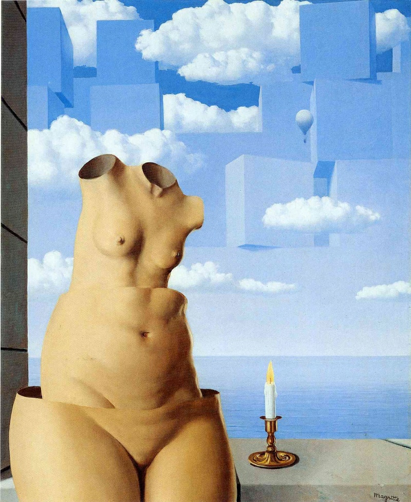
ABOVE: Rene Magritte, Delusions of Grandeur (1948), 81.5 x 99 cm.
RCN: Following up on your reference to “the best surrealism” a couple of answers ago, one could make the case, I think, that your commitment to the ideal of “a strong, decisive clarity of image,” your drive to exhaust the possibilities of your favourite motifs and themes in a systematic way, and your preference for “ambiguity, humour, sublimity, or solace where before there was only crassness, pandering, offence, or mundanity,” all situate you pretty firmly in the current of surrealism that originates in the work of Rene Magritte, who famously said:
My painting is visible images which conceal nothing; they evoke mystery and, indeed, when one sees one of my pictures, one asks oneself this simple question, “What does that mean?” It does not mean anything, because mystery means nothing either, it is unknowable.
Do you feel a special affinity for Magritte’s work or his ideas about art, or are there other surrealists who are more to your taste?
JEFFREY MEYER: Surrealism/collage mostly go hand in hand to my mind, though perhaps too obviously — which is why I’m working on more abstract imagery instead of odd juxtapositions.
ABOVE: Jeffrey Meyer, Split-Level Rambler Forever (2013), paper collage, 11 x 11 inches.
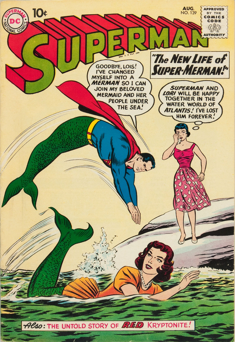
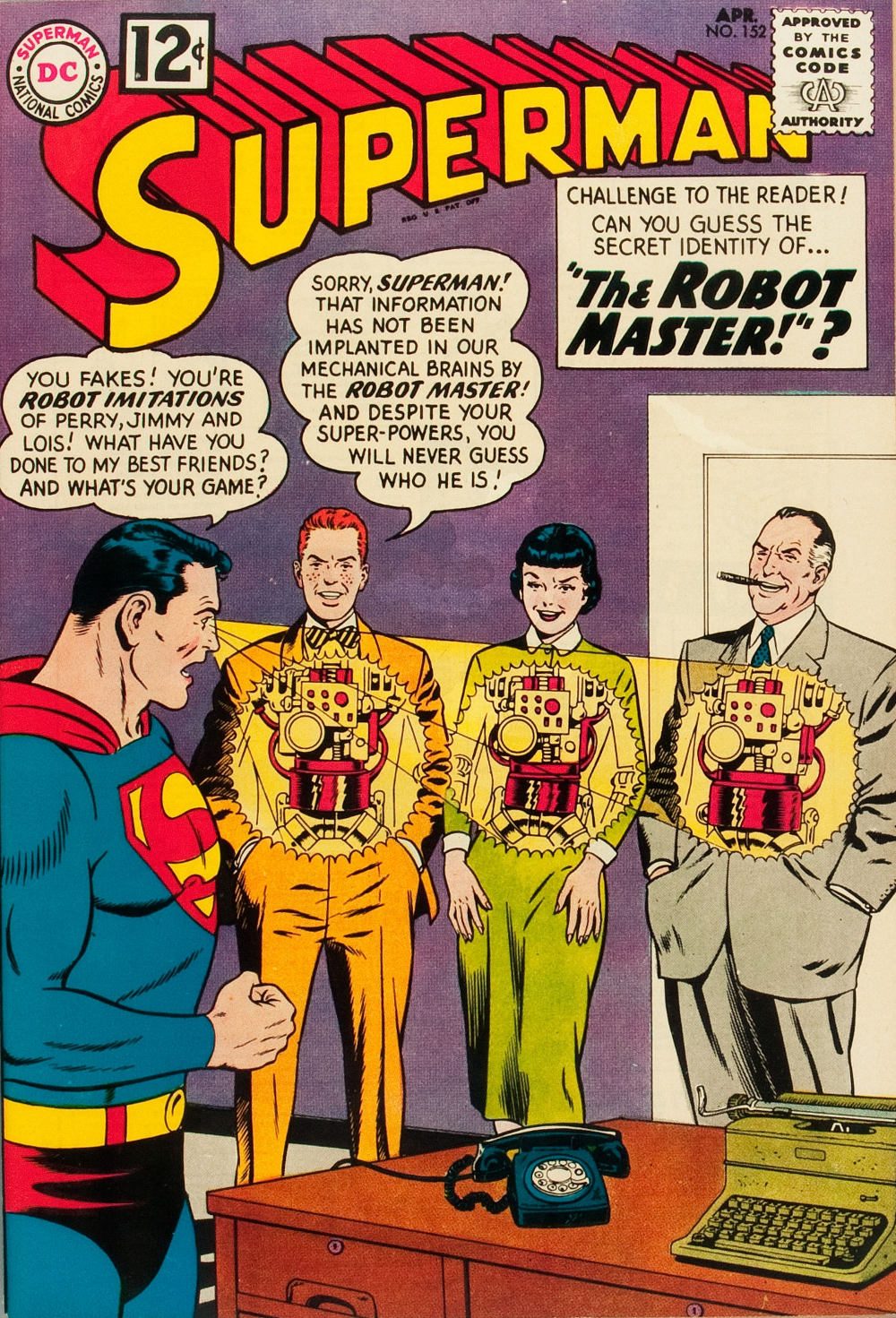
And yes, Magritte is more my flavour. When I was a kid I loved Dali, but now I can hardly look at him. De Chirico and Ernst are also huge favourites. But — what I find most inspiring is the “unintentional” surrealism of, say, Silver Age Superman comics, or SF paperback covers (though the latter artists were certainly aware of and utilizing surrealism as soon as Richard Powers‘ work was seen, there were still so many examples where there’s a sort of naive, sincere oddness, better than any “high” art).
ABOVE:Superman #130 (Aug. 1960), with cover art by Curt Swan and Stan Kaye.
ABOVE:Superman #152 (Apr. 1962), with cover art by Curt Swan and George Klein.
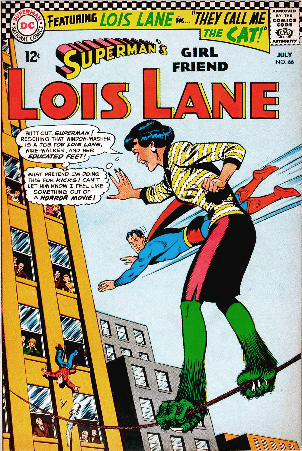
ABOVE:Superman’s Girl Friend, Lois Lane #66 (July 1966), with cover art by Kurt Schaffenberger.
RCN: I never cared much for Dali when I was younger, but I began to appreciate him more when I discovered his book illustrations, suites of prints, drawings, and so on, which display an inventiveness and looseness of attack that make his meticulously wrought easel paintings seem turgid by comparison — although, I must admit, most of Dali’s late paintings are turgid, period — and although I didn’t expect to, I actually enjoy Dali’s writing. Diary of a Genius, for instance, is a very funny book — and intentionally so, which makes it all the more impressive. And so sometimes I find myself thinking, almost in spite of myself, maybe Dali WAS a genius…
JEFFREY MEYER: I wholly respect his talent, certainly. He’s one of those guys who can draw or paint anything in any style… though that facility is probably what repels me, too. I like the guys who either have to struggle (Albert Pinkham Ryder) or maybe don’t have to struggle but develop a unique idiom in relative indifference to general art “advances” (Grant Wood, George Tooker, Balthus, Charles Sheeler, Charles Burchfield).
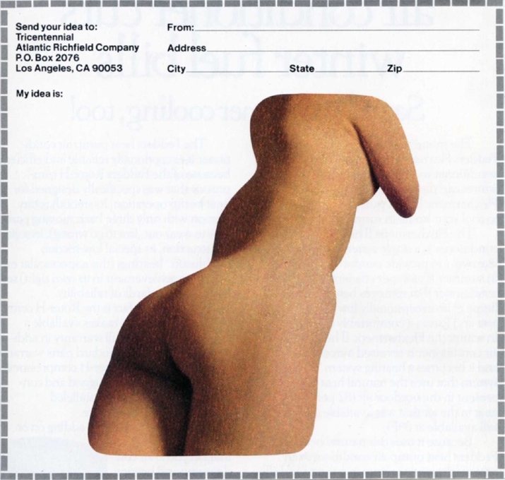
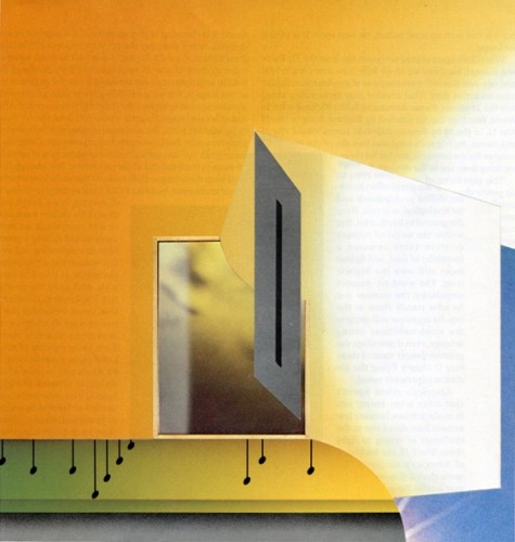
ABOVE: Jeffrey Meyer, My Idea Is (2007), paper collage, 5 x 5 inches.
RCN: You have produced a number of collages that incorporate images of naked women and — less often — men. Of course, it is easy enough to cut out images of beautiful bodies and place them in odd (or satirical) situations; however, in collages such as Black Genie, Deeper into Skin, Drapes, Escape Pod, Ghost Exit, Junkheap, Junk on a Tray, Landing the Sky, My Idea Is, Sleeping Angel, Space Ghost, Spinning Torso, Stretching, and Torque & Torso, you haven’t simply separated images of naked people from their original backgrounds with your knife and recontextualized them; rather, you have defamiliarized the bodies themselves — and sometimes desexualized them, although that turns out to be tough to do — by carving your source images into unusual shapes that have the effect of making human flesh appear as malleable as modelling clay.
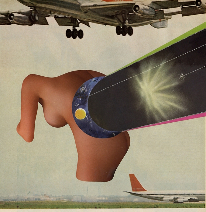
ABOVE: Jeffrey Meyer, Landing the Sky (2007), paper collage, 10 x 10 inches.
ABOVE: Jeffrey Meyer, Black Genie (2007), paper collage, 8 x 8 inches.
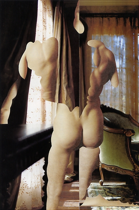
ABOVE: Jeffrey Meyer, Drapes (2007), paper collage, 7 x 10 inches. Private collection.
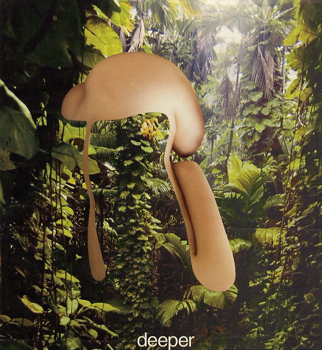
ABOVE: Jeffrey Meyer, Deeper into Skin (2007), paper collage, 7 x 8 inches.
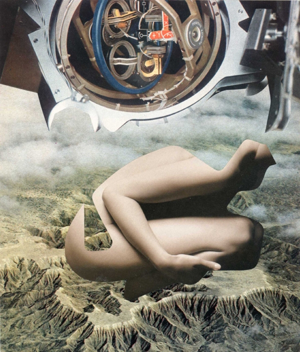
ABOVE: Jeffrey Meyer, Escape Pod (2007), paper collage, 7 x 9 inches. Private collection.
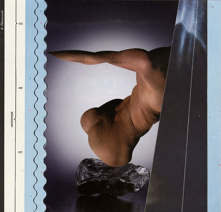
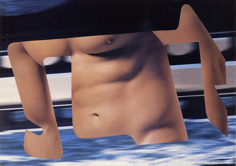
ABOVE: Jeffrey Meyer, Torque & Torso (2007), paper collage, 8 x 5 inches.
What is your assessment of your work with the naked human figure, Jeffrey? Are any of the approaches that you have taken to the figure thus far novel or interesting enough in your own eyes to merit further exploration?
JEFFREY MEYER: You’ll note that almost none of those particular pieces are on my new site, as I felt they were all unsuccessful. I think I had the right idea there, but not the talent or patience to make it work. I have a huge pile of source material for similarly-minded collages which I’ll be trying to get to soon.
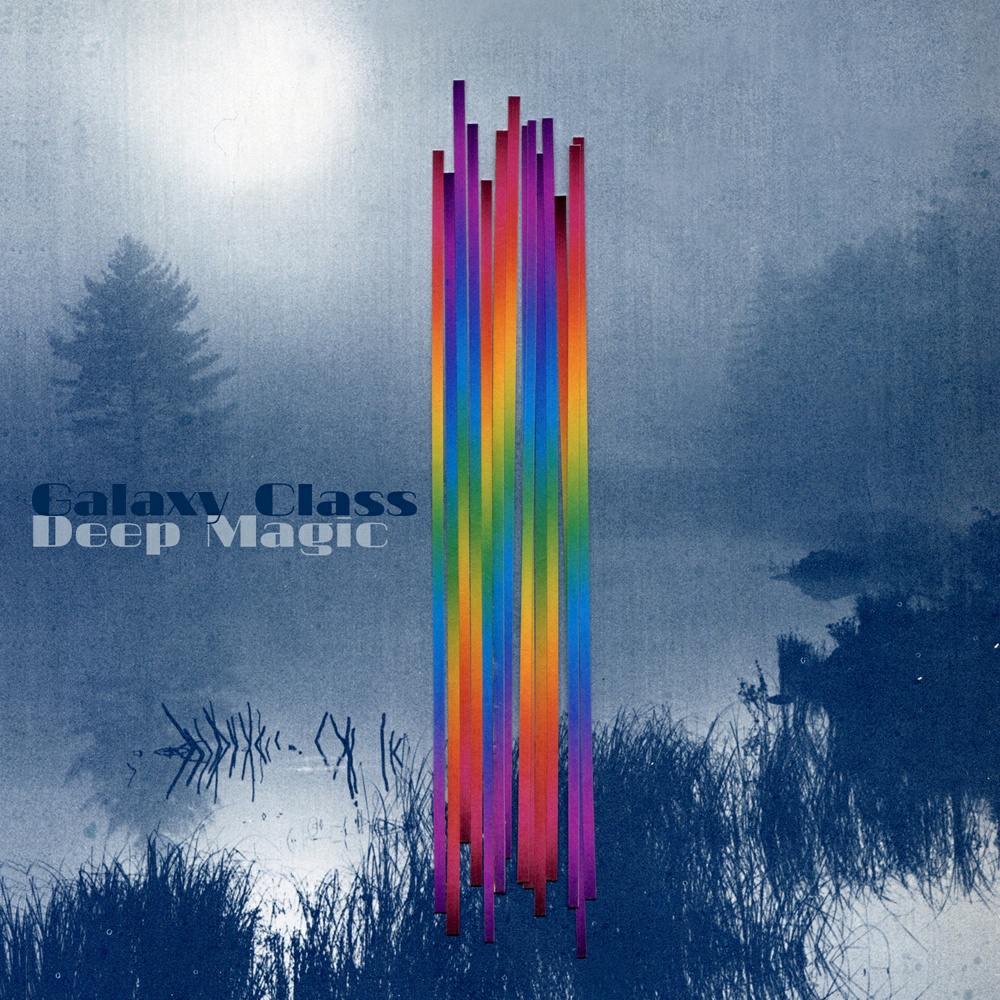
ABOVE:Deep Magic by Galaxy Class, with art by Jeffrey Meyer.
RCN: As a music fan, I feel I would be remiss if I did not ask you about your album-cover art, which has generally been quite strong, and at times — Deep Magic! — simply stunning. In 2011, your collages were featured on the covers of two albums, and in 2012, five more. Do you generally create the cover art for albums based on commissions from bands and/or record labels, or do those folks more often that not simply want to use images of yours that they have seen online or in print? Also, what is the relationship between your self-directed work and work you are commissioned to create?
JEFFREY MEYER: Most of the album covers have used existing images, which I prefer because I get paid for work already done, and the musicians know what they’re getting. I’ve done two or three covers (yet to appear) as assignments, which means I prepare about two-dozen Photoshop “sketches” from collage source material, from which the band then chooses a piece one or two they want me to make as finished pieces. That is an incredibly inefficient way to do illustration work, as far as time, resources, quality, and my payment are concerned, so I’ve been “discouraging” commissions of new work for album covers by either suggesting the use of an existing image or, if they insist on a new piece, requiring time and quantity limits, as well as a percentage of payment up front and then a kill fee once the sketches are done, should they decide not to utilize my services.
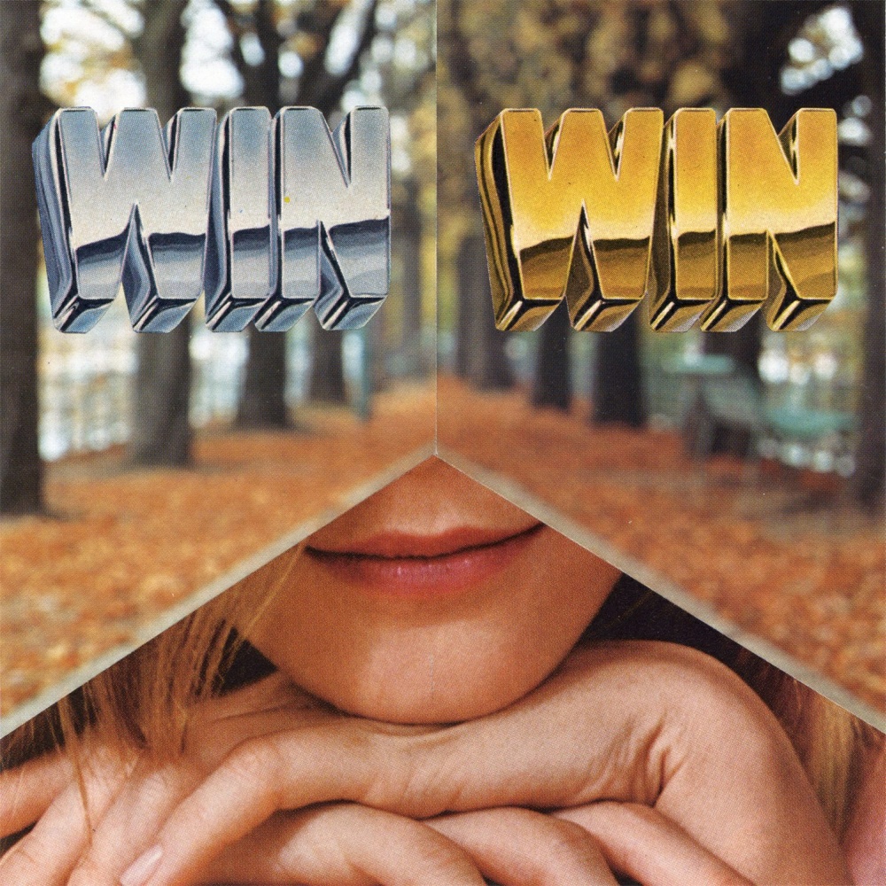
ABOVE:Win Win by Win Win, with collage cover art by Jeffrey Meyer.
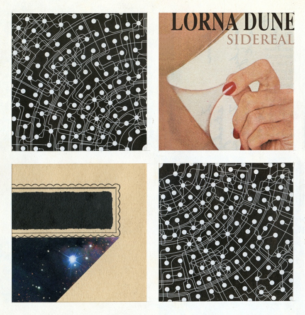
ABOVE:Sidereal by Lorna Dune, with collage cover art by Jeffrey Meyer.
ABOVE:Decimal Point Valentino by Need for Mirrors, with collage cover art by Jeffrey Meyer.
This is the sort of project where a more supple use of digital compositing would benefit me, no doubt, but I really have no interest in pursuing an illustration career. For the more high-profile of my recent assignments, I actually provided four images assembled entirely via Photoshop; I cut all the source material as if I was making a paper collage, but due to size and proportion discrepancies, etc. I had to make a bunch of adjustments digitally, which I was more or less happy with. They are mostly of-a-piece with my stuff, though a little “stabler” I guess, a bit less inspired.
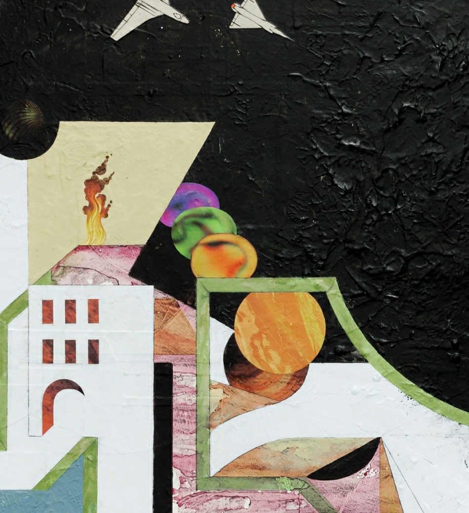
ABOVE: Jeffrey Meyer, The Orrery on Fire (2012), paper collage and acrylic on masonite, 22 x 16 inches.
RCN: Recently, in addition to paper collages, you have begun producing larger “mixed-media” pieces that, as you have written on Facebook, are “made with layers of collage, paint, grime, etc.” and take “several months to finish.” I haven’t seen any of the new work in person, but from what I can tell by the images on your website, it would seem that the difficulty of painting over slick magazine paper has caused you to embrace a rougher aesthetic than we’ve seen from you in the past. But how would you describe the difference between your collages — which have sometimes included pen lines and marks made with other materials, I know — and your new mixed-media experiments?
JEFFREY MEYER: The larger mixed-media stuff is deliberately rougher, yes, but I’m not a facile painter anyway, so… One reason the surfaces are rougher is that, working on board, I can’t as easily change the size of the overall piece. On the smaller paper work, I often have a completed section I like, cut it out, then I just tape it to a new section or a totally different background. With the mixed-media I end up having to simply cover over anything I dislike, so: board, paint, paper, gel medium, more paper, more paint, varnish, etc. until I call it done.
It’s a surprisingly different thought process for each approach. I feel more accomplished and fluid with the paper stuff. The mixed-media is a constant “starting over” as the layers of imagery and paint accumulate … though with each piece so far I always reach a tipping point when I can imagine the completed image and realize if it’s going to work or not.
ABOVE: Jeffrey Meyer, Slot Machine (Nostalgia series, 2012), paper collage, 7 x 7 inches. Private collection.
I think the new abstract pieces — on paper — are my best work; try as I might I simply can’t do something like that in larger, mixed-media form. I suppose I could consider the paper pieces “sketches” and simply copy them as is, in larger paintings, but what’s the point of that? Maybe if I were guaranteed sales, but until then, no.
RCN: You’ve participated in a number of group shows in galleries, Jeffrey, and I assume one of your long-term goals is to have solo-shows of your work, so tell me, what have you learned from your experience so far? Does analog collage as a medium seem to you to have the respect of contemporary curators, dealers, and collectors? How difficult is it for collage artists who produce handmade work on an intimate scale to command attention in the massive white-walled arena of “fine art”?
JEFFREY MEYER: I wish I knew the answers here… Aside from being in a few group shows — maybe half of which were devoted exclusively to collage — I’m completely divorced from gallery art. I go to galleries when I can, more often museums, but I’d much rather read novels or watch film. I get the impression there’s a significant gap between the type of collage so prevalent online and the type of collage I see represented (infrequently) by serious galleries. That’s among the reasons I deleted so much of my online presence and redid my site in as professional a manner as I could manage (short of writing an atrocious “artist’s statement” with faux or contrived terminology and useless jargon) and why I chose which pieces I did to display online. It may not help, but I’d like to think my work benefits from the new presentation, without necessarily kowtowing to the obvious trends or unhealthy tendencies of the fine art world.
I am working with a curator on a solo show and representation in NYC, tentatively planned for this fall. He’s not a gallerist per se but a very well-known (and superb) architect/designer who has curated before and whose judgment I trust… and of course it’s a wonderful opportunity to get my work in front of people with money, frankly. But I’m very interested to see what — if any — response the work/venue will get from the fine art press/web, considering he’s not necessarily in the thick of that. I actually think it may work very much in my favour not just financially but also as regards reputation — I think it could potentially be more interesting and beneficial not to follow a well-trod path. I dunno, I know nothing about art!
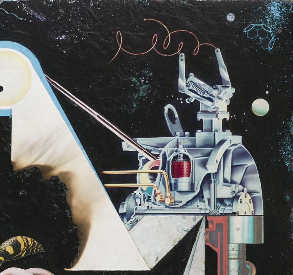
ABOVE: Jeffrey Meyer, Alien Landscape with Atmosphere (2009), paper collage, 17 x 13 inches. Private collection.
OUTRO:
Here’s a wry slice of autobiography from an interview with Jeffrey conducted by Brian Vu and originally published 04 October 2011 on the now defunct website of Rebel Magazine:
I grew up in Indiana in the 1970s, having what I imagine was a pretty typical American working class semi-suburban childhood: Star Wars, Estes model rockets, banana set bicycles, metal roller skates, Rubik’s Cubes, summer camp, weekly trips to the library and zoo, five TV channels, AM radio, car sickness, drinking beer at family picnics, boners in Math class, ritual Satanic sexual abuse, etc. Quite frankly I never wanted to be an adult; I knew then, with total conviction and understanding, that the first ten years of my life would be the best. Nothing since has changed my mind.
[….]
I used to draw — I wanted to be a cartoonist — but after a while the act began to feel like having your nervous system unspooled through your fingernails, boiled like spaghetti, and then fed to hyenas. I found the results were too wound up with my emotions, what I ate that day, how much sleep I had, which way the wind was blowing, etc. I think I draw pretty well, actually, but I still feel I have no conscious, consistent control over what my hands are doing when I’m drawing, which is a problem when you have to draw the same characters over and over, in the same style, for hundreds of pages. I think my rendering (particularly brush and pen work: line weights, textures, modelling, etc.) reached a professional level, but ultimately I never got past a sort of stiff uncomfortableness that was too discouraging and crippling for me to ignore. My cartooning just didn’t have the sort of “handwriting” personality that the best cartoonists display. And the stories I wanted to tell — and the affect I wanted them to have — were just too complex for me to draw with such limited skills.
I had always made collage on the side, so I shifted my focus to that. What a relief — I mean a palpable, physical, and psychological relief — not to have unmet expectations every time I sat down to work. With collage I could allow myself to add to, subtract from, or destroy any image I found or made; I could make many images into one, or many from one.
I have no real attachment to the medium itself. I look at collage a lot less than painting or cartooning, and I watch more movies and read more books more than I look at any visual art. Collage just happens to be the most immediately satisfying way for me to work right now.
ABOVE: Jeffrey Meyer, Architecture of Disguise (2009), paper collage, 5 x 6 inches.
Jeffrey Meyer | Notpaper — another interview, posted 01 June 2011
“Jeffrey Meyer,” Cutting Edges: Contemporary Collage, edited by Robert Klanten, Hendrik Hellige, and James Gallagher (Berlin: Gestalten, 2011), pp. 70-71 — two-page spread of five paper collages by Jeffrey from 2010 (Gray Penumbra, L’, The Language of Babies, Broken Dome, and Orthodoxic Art.
Heads Up: “Art” by Jeffrey Meyer | Ragged Claws Network — image gallery posted 12 July 2013 includes eight collages that the artist identified “successful, even pleasing,” back in 2011, along with three from 2013.
#jeffrey meyer | Tumblr — Jeffrey’s Tumblr account may be closed, but the reblogged images live on.
UNAUTHORIZED BONUS IMAGE:
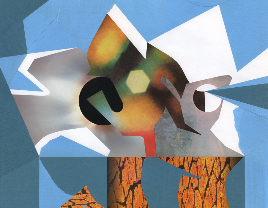
I selected the first three of the four collages that my wife and I purchased from Jeffrey in 2012 not only because I thought they were strong as individual works of art but also because I imagined they would hang together beautifully as a kind of triptych. I was so taken with this idea at the time that, more than a month before I had the works in hand, I used the small JPEGS from Jeffrey’s site to create six different horizontal combinations of the collages in an attempt to determine the order in which we might hang them. And so it was that images began to take on an enigmatic but suggestive narrative quality for me, like a creation/destruction myth consisting of three key moments that could recur in any sequence: first Hot & Cold Fusion, then God Speaks in Riddles, then Seasons, or first God Speaks in Riddles, then Seasons, then Hot & Cold Fusion, or… well, you get the idea. Then I combined all of the three-panel sequences into an eighteen panel JPEG, so I could more easily compare them, one with another, while my wife and I waited for the real things to arrive… and my conclusion was… I’d definitely buy comics with imagery like this… and… I’m damn delighted to own these collages!
NOTA BENE:
All of the images, links, and pull-quotes incorporated into the text posted above were selected and added by yours truly. Although Jeffrey did have an opportunity to review the entire layout before it was posted, he declined to exercise control over anything but his own words, thereby leaving RCN, for better or for worse, solely responsible for everything else, including, I might add, the final order of the questions and answers, which I have shuffled around several times over the past week or so in an attempt to turn the more than three dozen email messages that we sent back and forth into a coherent conversation.
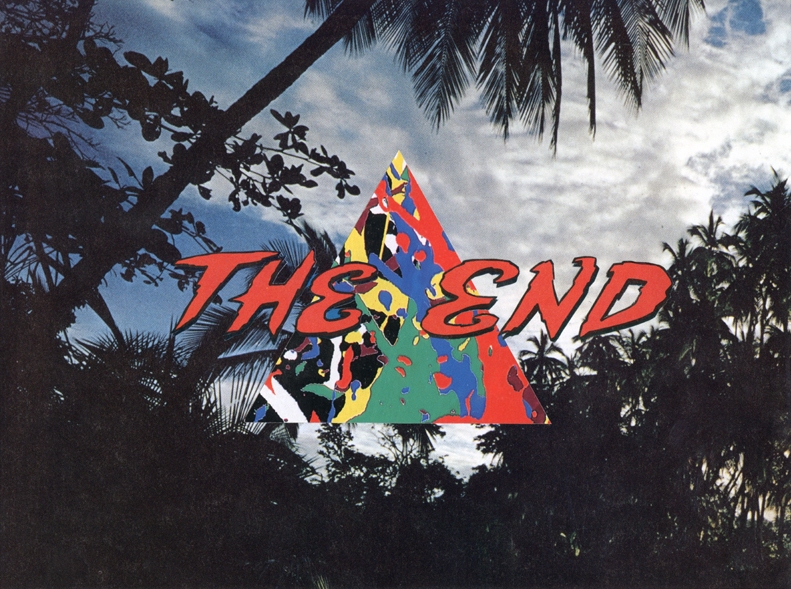
ABOVE: Jeffrey Meyer, The End (2012), paper collage.
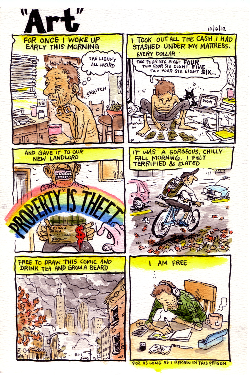
I thought I had posted this already, but yesterday, as I was clicking through the pages in the “Art Collection” category here at RCN, I suddenly realized that I hadn’t. So here, for your viewing and reading enjoyment, is “Art” by Ken “Gabby Schulz” Dahl:
[CLICK IMAGE TO ENLARGE]
I purchased the above page of original art from the store at Gabby Schulz’s Playhouse back in November of 2012. The email receipt read, in part, as follows:
Thank you for your matronage/patronage! You’ve just helped a cartoonist stave off indigence for another day, and beautified your own life in the process.
Which, instead of making me feel proud to be a matron/patron of the arts, actually made me feel a bit guilty that I had paid so little for the work… but… hey, check it out! There’s another new full-colour strip — “Profiles in Bureaucracy” — on sale right now! Get ’em while they’re a bargain…
And don’t worry if everything is sold out by the time you visit the Playhouse store, because soon enough there will be another page… and another… and another… until inspiration fails… or Gabby calls a halt to the madness…
BONUS BLATHER:
Here’s the tweet I posted right after I purchased the art:
I just bought "Art" by Gabby Schulz @mrfaulty: http://t.co/M140ZIHc … I'm tempted to buy more. Perhaps in the new year…
Unfortunately, I haven’t been in a position to purchase more from Gabby Schulz yet. But I am in the process of buying a Barack Hussain Obama original from Steven Weissman, who has a new store up right here!


