Comics · Here, Read · Hilda Terry · Look Here

Look Here, Read: Four “Teena” Sunday strips by Hilda Terry

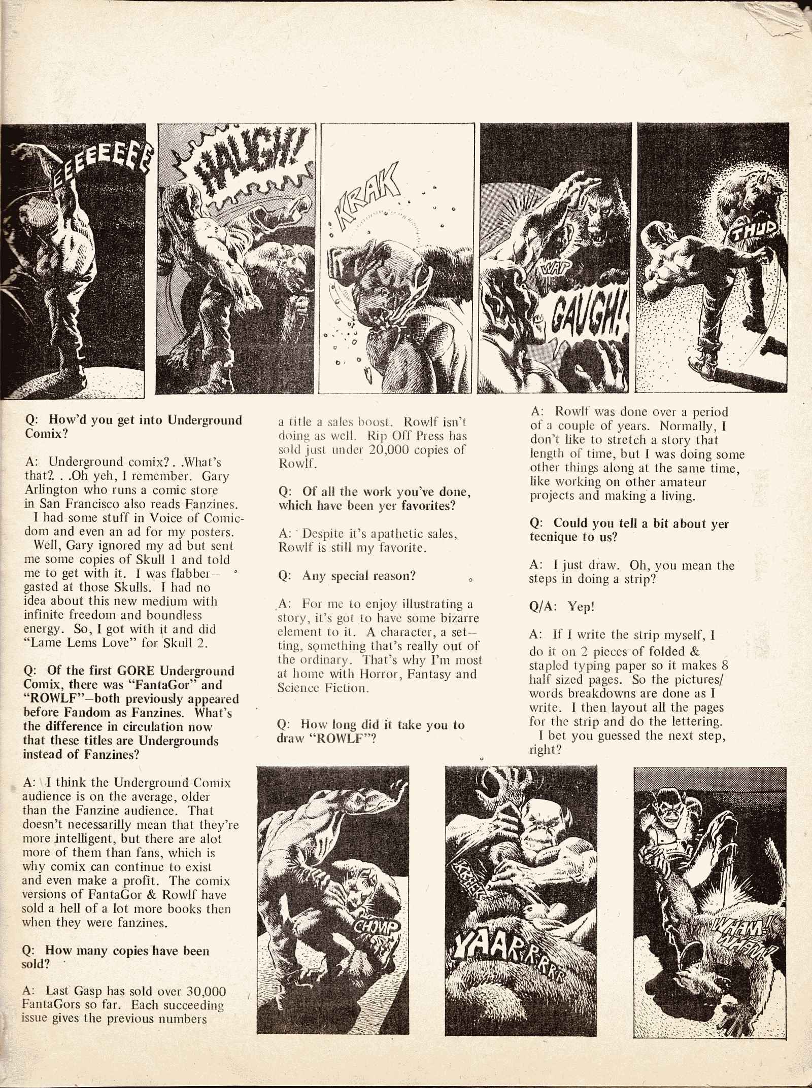
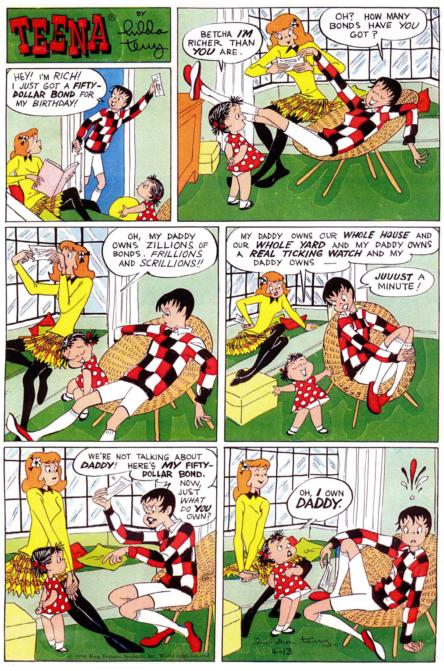
Although it ran in newspapers for twenty years, 1944 to 1964, “Teena” is one of the forgotten comic strips of the 20th century, but thanks to Hilda Terry’s light touch and her understanding of how teenagers exist in the world — her lanky young characters, even when seated, are constantly changing positions, twisting, stretching their legs, putting their feet up, gesturing, and so on — it still has a freshness that some other, more celebrated strips, do not. Yes, Terry’s visual style in these early “Teena” Sundays is strongly reminiscent of the work of Gluyas Williams, but it wasn’t long before she developed a much looser style that was all her own. What follows is a sequence of strips that ran on four consecutive weekends in April 1949; the strips were scanned, by me, from Terry’s self-published autobiography, Strange Bod Fellows, so the repro quality is not the best:

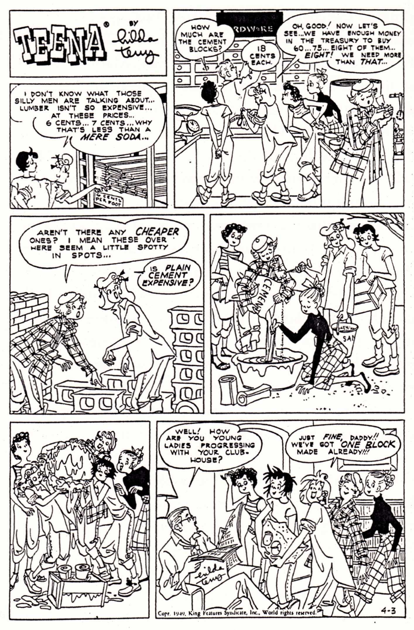
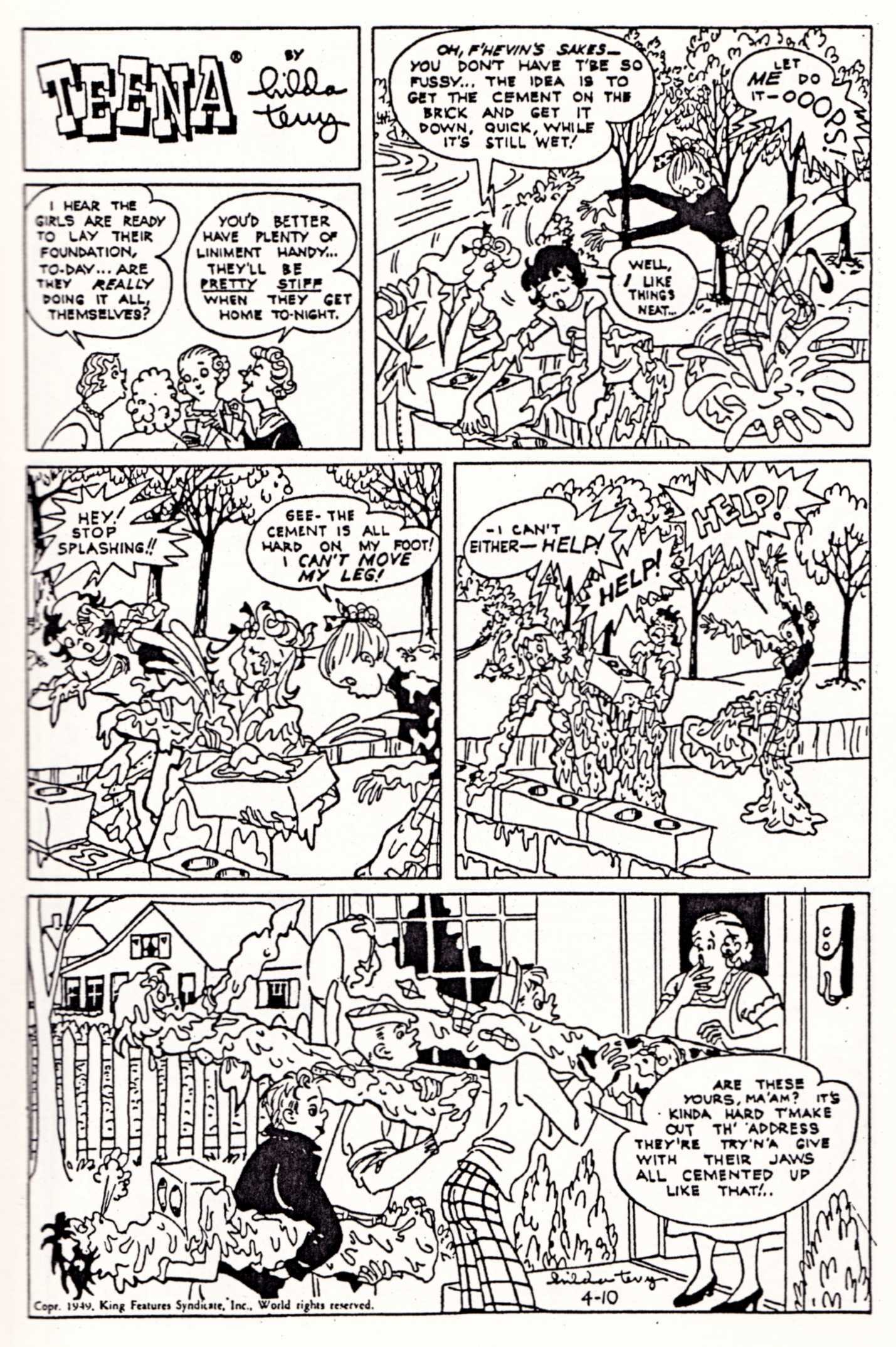
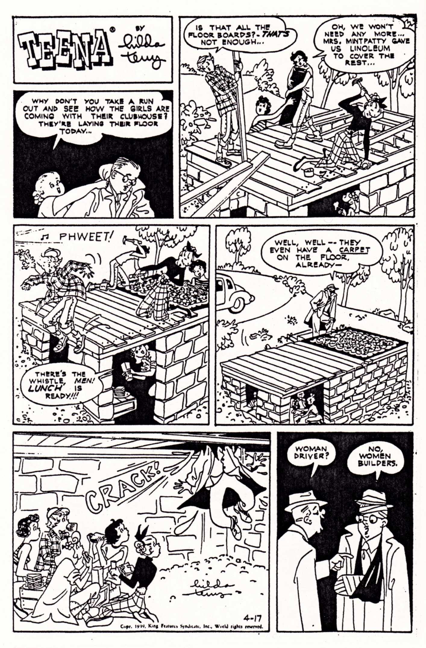
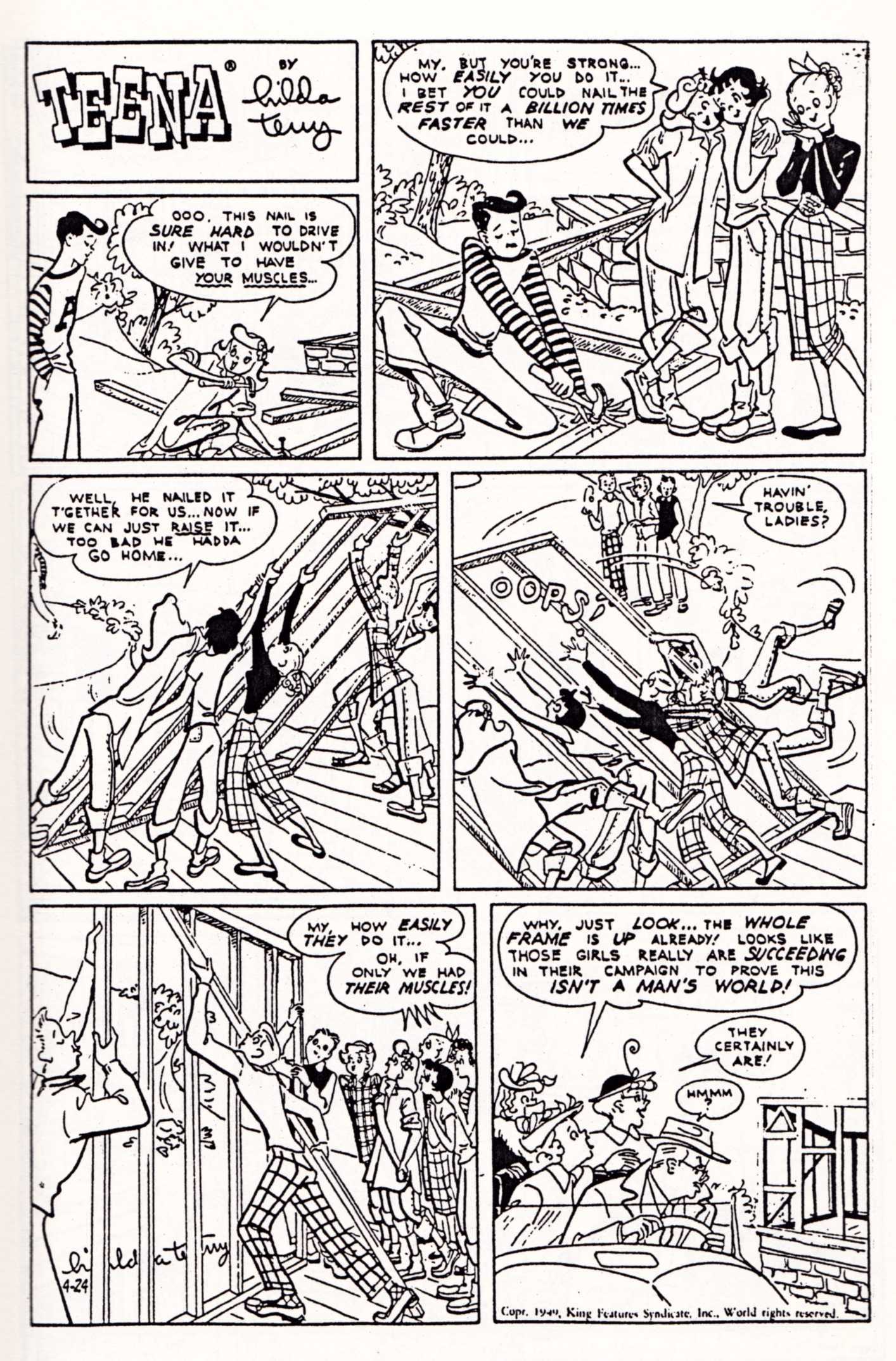
It’s amazing to me that such charming, attractive, readable work is not available in affordable reprint editions. Yes, the gender divisions light-heartedly depicted in these particular examples are a little out of date; nonetheless, it seems to me that “Teena” would have tremendous appeal to fans of Little Lulu, Archie Comics, Harvey Comics, Nipper, Blondie, etc. — all of which have experienced a recent resurgence of interest and are in the process being systematically reprinted for new generations of readers.

For those unfamiliar with Hilda Terry’s career, here it is in a nutshell:

Hilda Terry was born on 15 June 1914. In addition to drawing “Teena” for twenty years, Terry sold numerous single-panel cartoons to The Saturday Evening Post, The New Yorker, and other coveted markets. In 1950, she became the first woman allowed to join the National Cartoonists Society, which up until that point had only allowed male cartoonists to join, and she became a vocal advocate for other women to follow in her footsteps. She was a pioneer of early computer animation. She received the Animation Award from the National Cartoonists Society in 1979. She taught at the Art Students League well past usual the age of retirement. She was elected to the Friends of Lulu Women Cartoonists Hall of Fame in 2001. She died 13 October 2006, at the age of 92.

“If you do a comic strip, you don’t want it to be forgotten.” — Hilda Terry, MoCCA 2006, as reported by The Beat.


SEE ALSO:

Ragged Claws Network > Look Here, Read: Four more “Teena” Sunday strips by Hilda Terry

Bill Sienkiewicz · Illustration Art · Jeffrey "Jeff" Catherine Jones · Look Here

Look Here: “The Bill Sienkiewicz Portfolio”

From Marvel Fanfare #8 (May 1983), “The Bill Sienkiewicz Portfolio,” coloured by Christie Scheele:

Notice Sienkiewicz’s Jeffrey Jones-inspired signature. Not really any evidence of Jones’s influence in the drawing, however. Ralph Steadman, maybe. Bob Peak, definitely — especially in the Thor image, but in some of the others as well. Neal Adams, definitely — all over the place. Jones, not so much.

To my eye, at least.

For one thing, Sienkiewicz’s figures are just not specific enough. They’re not carefully observed. There are no details that make you think, yes, that’s how a body really looks, and yes, that’s how it moves! Jones’s best drawings are filled with such details.

Seven years later, Sienkiewicz was hard at work on the artwork for Big Numbers, where he combined a loose mixed-media illustrative technique with extensive photo reference. Here’s a random sample from issue #1, as featured on Bill Sienkiewicz’s official Web site (where the style is explicitly identified as “photo-realistic”):

And here’s another:

It was a relatively original synthesis of the influences that Sienkiewicz had formerly worn on his sleeve, but still — to my eye — Sienkiewicz’s Big Numbers style owed more to work such as Richard Diebenkorn’s mixed-media figure drawings (see, for instance, Diebenkorn’s Seated Woman No. 44 [1966] posted below) — along with a certain highly influential school of heavily photo-referenced but painterly illustration art that emerged in the 1960s and steamrolled into the 1970s and beyond (Bernie Fuchs comes to mind here, and Robert Heindel, and the various Spanish illustrators whose photo-based work in ink, pencil, charcoal, oil, etc., came to dominate the Warren comics magazines, especially Vampirella) — than it ever did to Jones’s Idyl or I’m Age strips.

Nor did Sienkiewicz’s work have to resemble Jones’s, for Sienkiewicz to claim Jones as an influence.

Because the simple fact is, one can be influenced by a fellow artist’s example of artistic independence, integrity, and experimentation without latching on to specific aspects of his or her style…

BONUS IMAGE:

From 1988, a page from Stray Toasters, to compare with the illustration by Robert Heindel that I linked to earlier:

Book/Magazine Covers (All) · Connections · Frank Frazetta · Illustration Art · Look Here

Connections: Frazetta and Meseldžija

The Bud’s Art Books catalogue arrived today, and as I was flipping idly through the pages, I noticed something that seemed familiar in a tiny thumbnail image of a book cover (issue 1010F, page 67, item E). Here, take a look at the much larger images below, and see if you notice it, too.

Is this mere happenstance? Maybe, maybe not. You decide.

Barron Storey · Bill Sienkiewicz · Book/Magazine Covers (All) · Illustration Art · Look Here · Richard Powers

Look Here: Two SF covers, with art by Richard Powers

[CLICK IMAGES TO ENLARGE]

When I saw that second cover with the raggedly applied paint, the swooping linear accents, and the colourful little shapes fluttering along the edges of the forms, I immediately was reminded of certain works by Bill Sienkiewicz and by his teacher/mentor, Barron Storey. Like this well-known cover, for instance:

But would either Sienkiewicz or Storey recognize Powers as an influence? I have no idea…

BONUS LINK:

The Powers Compendium — the images are tiny, but there sure are a lot of them! I see that the Compendium site also includes that same little scan of the wraparound Brain Wave cover.

Keywords: Brain Wave, The Planet of the Blind, Stray Toasters.

Book/Magazine Covers (All) · Frank Frazetta · Illustration Art · Look Here · Richard Corben

Look Here: Two “Thongor” covers, with art by Frazetta

The painting on the cover of Thongor in the City of Magicians also appeared on the cover and foil-embossed slipcase of Night Images, a limited-edition collection of Robert E. Howard’s fantasy verse published by The Morning Star Press in 1976, with interior illustrations by Richard Corben. That same year, the Morning Star Press also published the hardcover black-and-white, first-edition of Corben’s Bloodstar, which was an adaptation of Robert E. Howard’s “Valley of the Worm.”

Now, did you know, dear reader, that a few years earlier, writers Roy Thomas and Gerry Conway, along with artist Gil Kane and inker Ernie Chua (Chan), had produced a comics adaptation of “Valley of the Worm” for the third issue (April 1973) of the Marvel series, Supernatural Thrillers?

And did you also know that Gil Kane was co-editor at The Morning Star Press, along with Armand Eisen, of Corben’s Bloodstar, and that Kane himself was the one who suggested the hero’s name be changed from “Niord” to “Bloodstar” and designed the distinctive star mark on Bloodstar’s forehead?

Well, even if you didn’t know before, you do now!

Small world, eh?

Keywords: Thongor Against the Gods, Thongor in the City of Magicians.

P.S. I not only own several copies of the signed and limited first edition of Bloodstar but I actually have in my collection a beautiful copy of the slipcased, limited edition of Night Images. Lucky me!

Here, Read · Interviews · Richard Corben

Here, Read: An interview with Richard Corben from 1973

From The Mirk-Wood Times #4 and #5 (1973), here are the first two parts of an obscure interview with Richard Corben, who was then only 32 years old:

[CLICK EACH IMAGE TO ENLARGE, or RIGHT CLICK > SAVE LINK AS… TO READ OFFLINE]

Some interesting tidbits of information in there… if you’re a Corben fan… too bad I don’t own the issue with part three… it would help if I could find any evidence that part three was ever published…

Richard Corben turned 70 on 01 October 2010.

Where has the time gone?

Comics · Here, Read · Look Here · Mirko Ilic

Look Here, Read: “Du Même Côté” by Mirko Ilić

“Du Même Côté” (“On the Same Side”) by Mirko Ilić was published in Métal Hurlant #57 (November 1980), pp. 81-82, with the two pages that comprise the story printed back-to-back on the same leaf. Here’s what you would have seen if you had read the story thinking it was the usual comics fare:

[CLICK EACH IMAGE TO ENLARGE, or RIGHT CLICK > SAVE LINK AS…]

But “Du Même Côté” was not exactly the usual fare. Here, more or less, is what you would have seen if you had held the pages up to the light:

[AGAIN, CLICK EACH IMAGE TO ENLARGE, or RIGHT CLICK > SAVE LINK AS…]

My apologies to everyone, including the author, for any and all deficiencies in the above presentation, but I think — I hope! — my crudely photoshopped images are clear enough to give you the flavour, at least, of Mr Ilić’s formal experimentation.

However, if you’re still unsure what, exactly, is going on in the story, you could do no better than to read the description of “Du Même Côté” that Mr Ilić himself posted here at RCN on 21 September 2010 at 10:08 am:

At that time, I was into playing with comics as a media, and the idea of the comics was to be printed on both sides of the page. Because characters are two dimensional, they don’t have a sense of third dimension. When they are standing against a white wall / magazine sheet, and hearing voices on the other side, they don’t know that they’re actually hearing themselves on the reverse side of the page. When they are shooting / stabbing into the wall, they don’t understand that they are actually killing themselves as the knife comes through to them on the other side of the paper. Only when you hold the page up to the light, do you understand the full picture.

Not surprisingly, it was the above description that prompted me to hunt down a copy of Métal Hurlant #57 so I could present “Du Même Côté” here for your, and my, reading enjoyment. And though it cost me a few bucks — 8.25 EUR, to be exact — I think it was worth it. But then again, I have a real soft spot for black humour and bleak endings.


BONUS LINK (added 23 August 2012):

Mirko Ilić Blog > Metal Hurlant – as of today, 23 August 2012, you can now read “The Same Side” in English on Mr Ilić’s own blog. I am delighted to see that he used the same technique that I used above to simulate the process of holding the physical pages up to the light. Simple but effective.

Connections · Dave Cooper · Look There · William Blake

Look There: Selections from Dave Cooper’s “Bent” at wired.com

Underwire: Dave Cooper’s Comics Grotesquerie Gets Bent (With a Nod From Del Toro)

[CLICK IMAGE TO VISIT THE RECOMMENDED SITE]

When I first saw the above image, I was immediately reminded of William Blake’s The Whirlwind of Lovers:

william-blake_the-whirlwind-of-lovers_1824-1826

A frivolous comparison? Perhaps…

Dave Cooper’s Bent is published by Fantagraphics Books. To get Bent directly from the publisher, click here.

Also, Dave Cooper is on tour to promote his book. Visit the Fantagraphics FLOG! blog for details and updates.