"This day's experience, set in order, none of it left ragged or lying about, all of it gathered in like treasure and finished with, set aside." –Alice Munro, "What is Remembered"
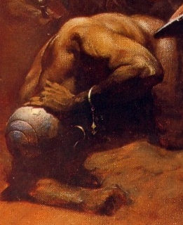
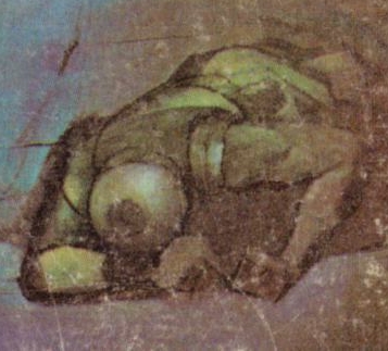
The helmeted, injured soldier in the lower left quadrant of Frank Frazetta’s Buccaneer/Destroyer painting and the helmeted, injured soldier/sailor in the lower left quadrant of Jeffrey Jones’s painting for Talbot Mundy’s The Purple Pirate are not exact copies of each other, as you can plainly see above, and yet, they do seem to share a certain family resemblance. So much so, that one might venture to guess that one of the painters has been “inspired by” the other in this detail… however, it’s not at all clear to me who was inspired by whom. Near as I can tell, the Jones cover was published first, in 1970; the Frazetta, second, in 1971. So make of that what you will…
Keywords:The Buccaneer, The Purple Pirate Talbot Mundy, L. Sprague de Camp, Lin Carter.
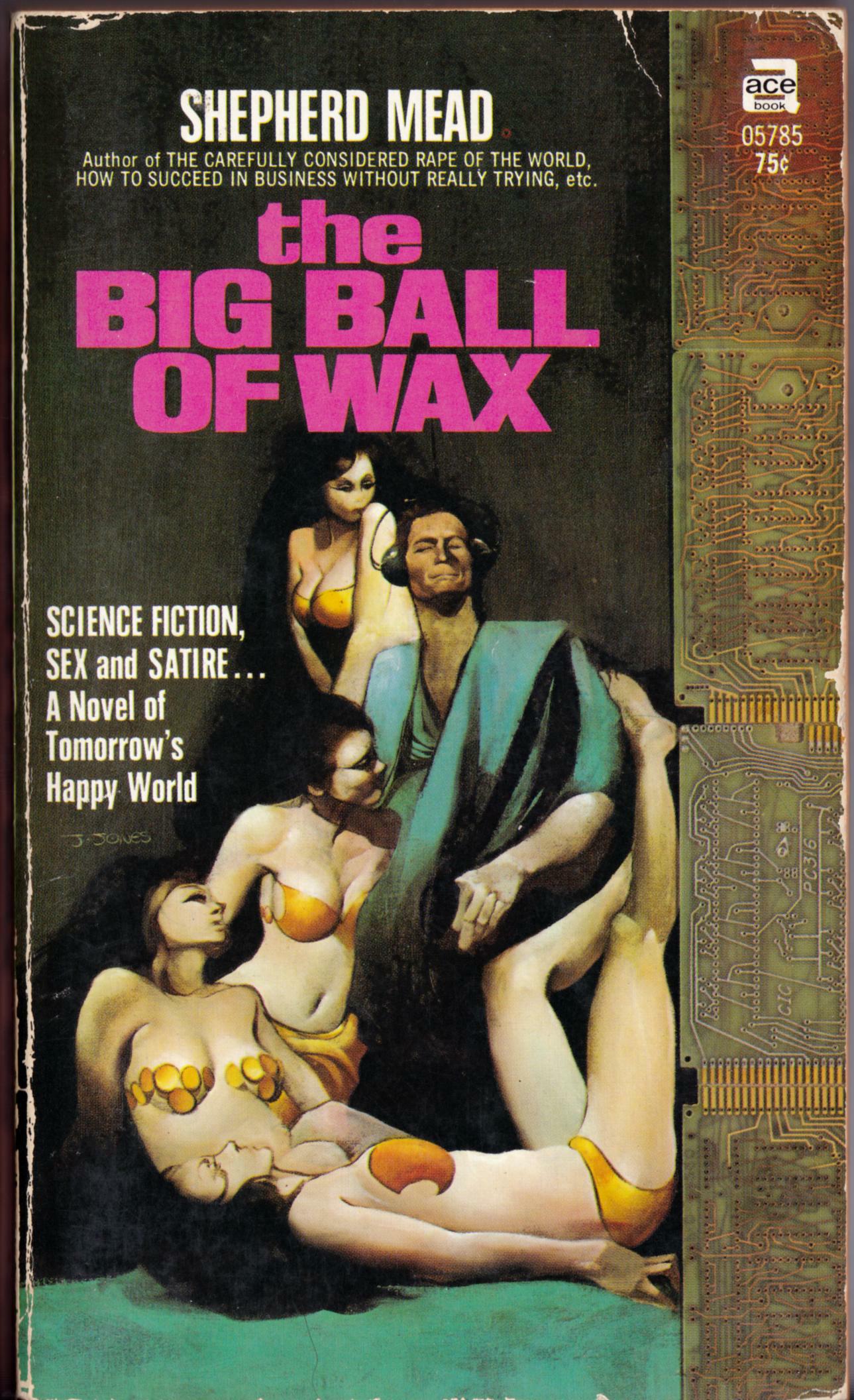
ABOVE: Shepherd Mead, The Big Ball of Wax (New York: Ace, n.d.), with cover art by Jeffrey Jones.
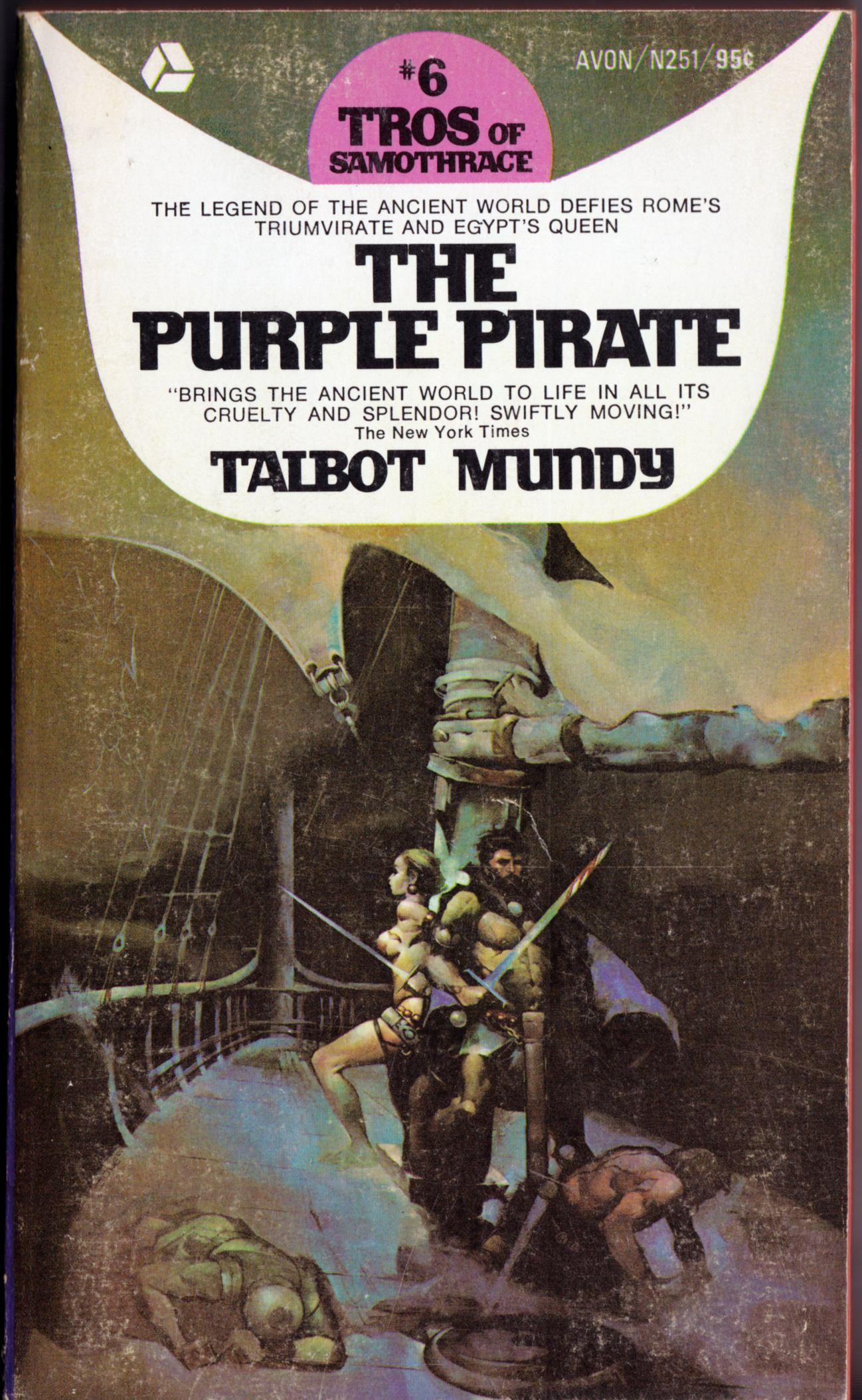
ABOVE: Talbot Mundy, The Purple Pirate (New York: Avon, 1970), with cover art by Jeffrey Jones.
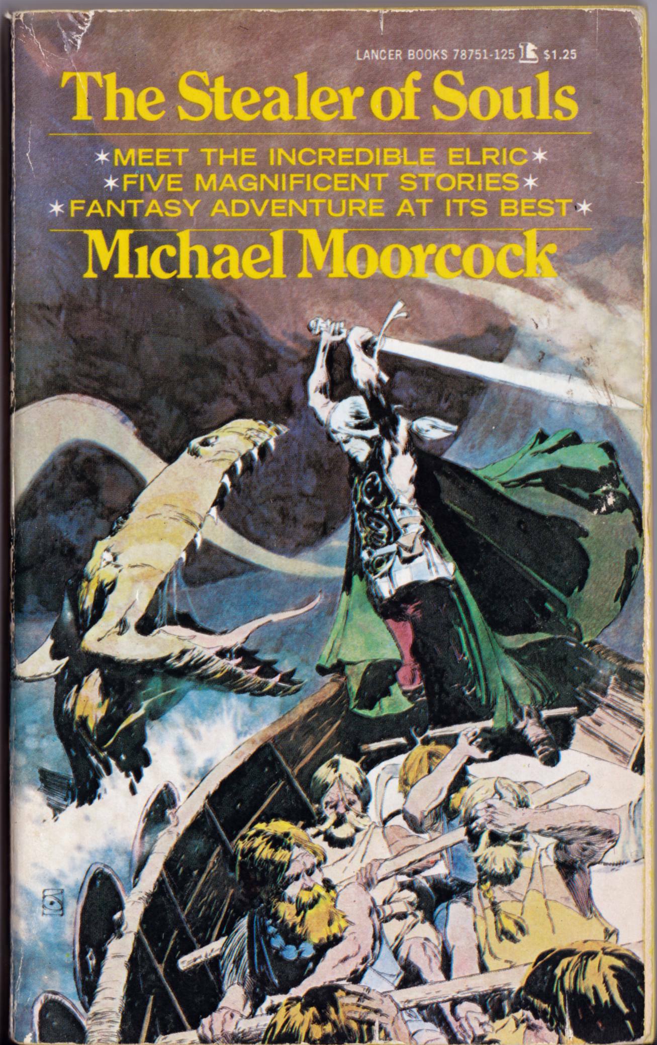
ABOVE: Michael Moorcock, The Stealer of Souls (New York: Lancer, 1973), with cover art by Jeffrey Jones.
I’ve looked at a lot of art by Jeffrey Jones over the years, and I have a pretty good memory for images, so I’m always surprised when I come across a Jones cover that I’ve never seen before. That’s the case with The Purple Pirate by Talbot Mundy, which just yesterday I stumbled upon among the used paperbacks at the local Value Village store. It’s unfortunate the book isn’t in better condition, but it was so cheap, and so rare, that I couldn’t pass it up in the hope of finding a better copy at some later date. There’s a sort-of Frazetta swipe on that cover, too; or maybe Frazetta sort-of swiped from Jones. (Anyone know which painting came first?) It’s the fallen soldier in the lower left of the painting. In my next post, I’ll provide a side-by-side comparison so you can see what I mean.
Keywords:The Big Ball of Wax, The Purple Pirate, The Stealer of Souls.
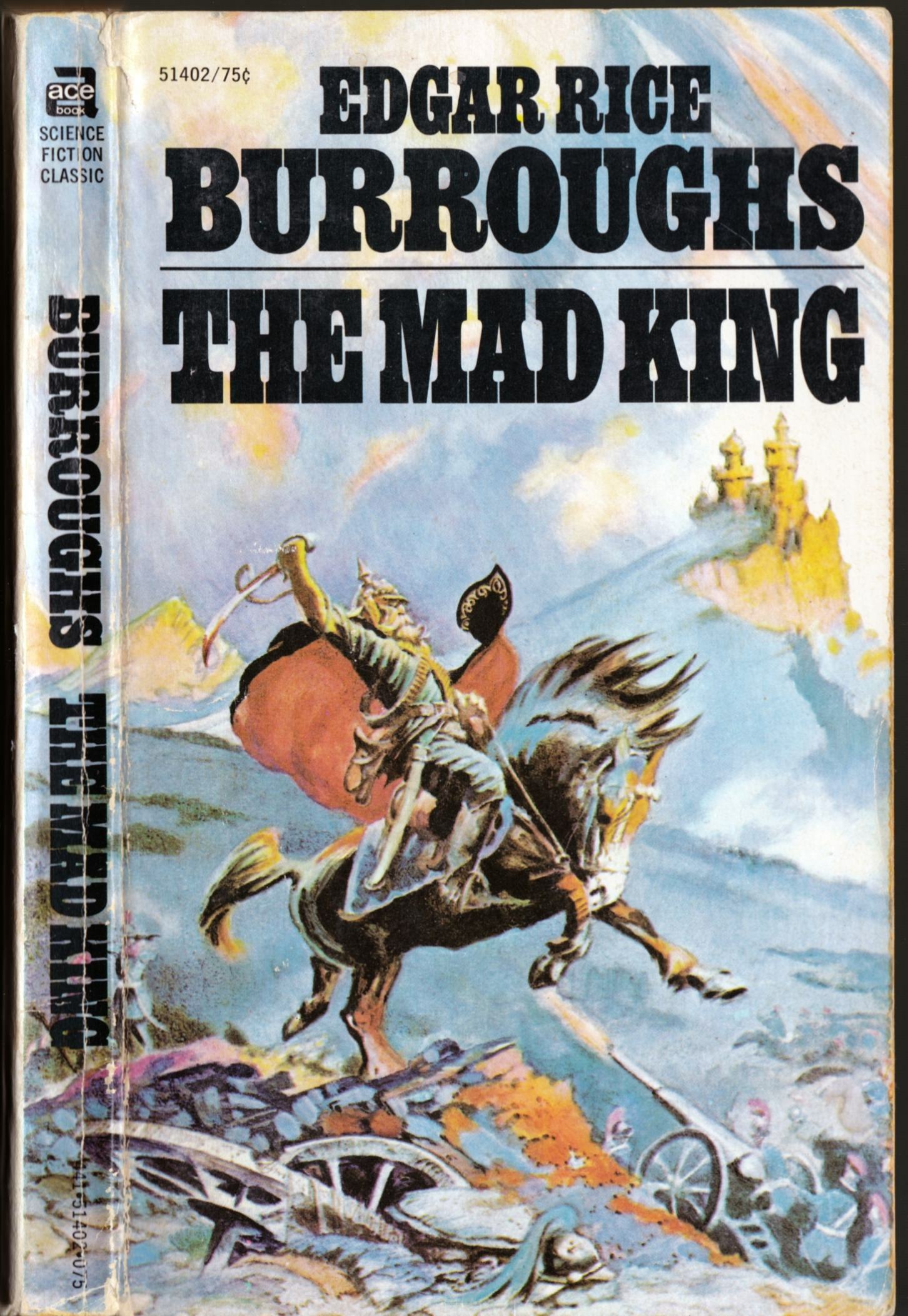
ABOVE: Edgar Rice Burroughs, The Mad King (New York: Ace, n.d.), with cover art by Frank Frazetta.
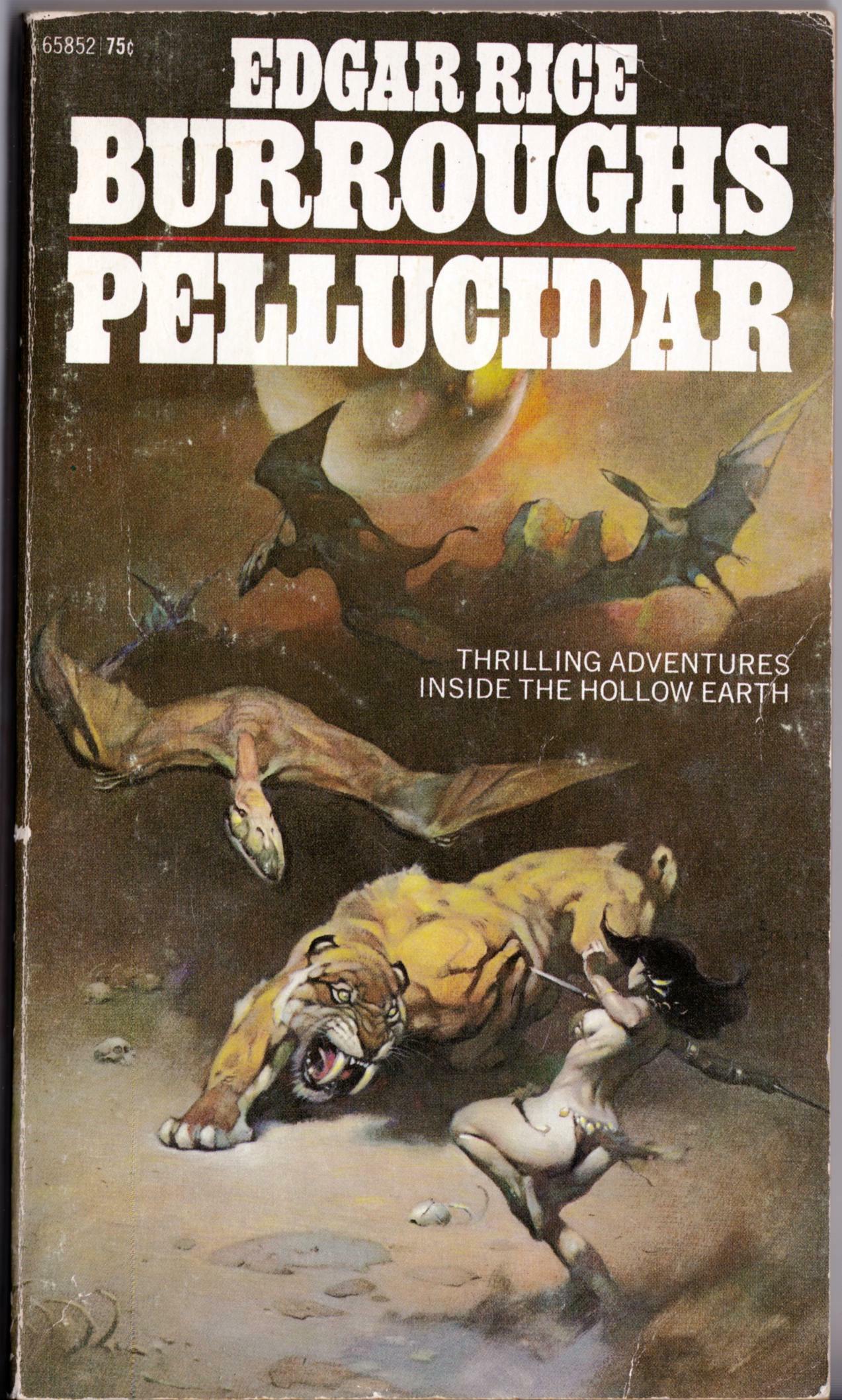
ABOVE: Edgar Rice Burroughs, Pellucidar (New York: Ace, 1972), with cover art by Frank Frazetta.
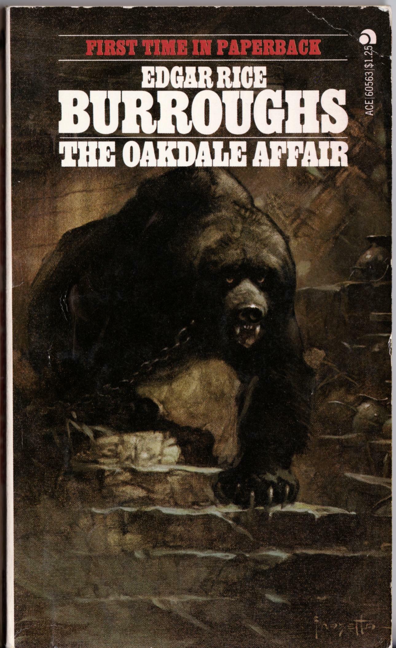
ABOVE: Edgar Rice Burroughs, The Oakdale Affair (New York: Ace, n.d.), with cover art by Frank Frazetta.
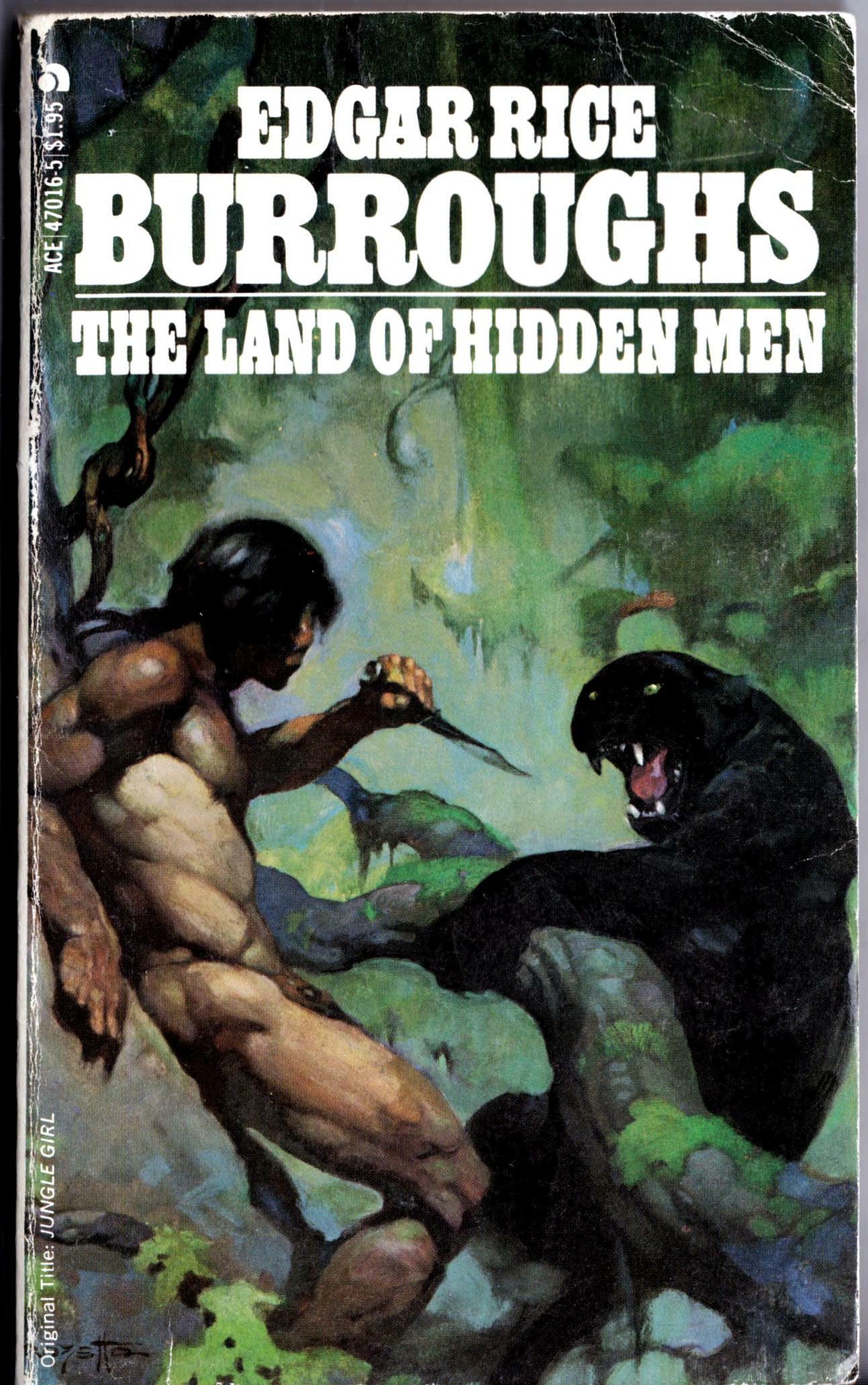
ABOVE: Edgar Rice Burroughs, The Land of Hidden Men (New York: Ace, 1978), with cover art by Frank Frazetta.
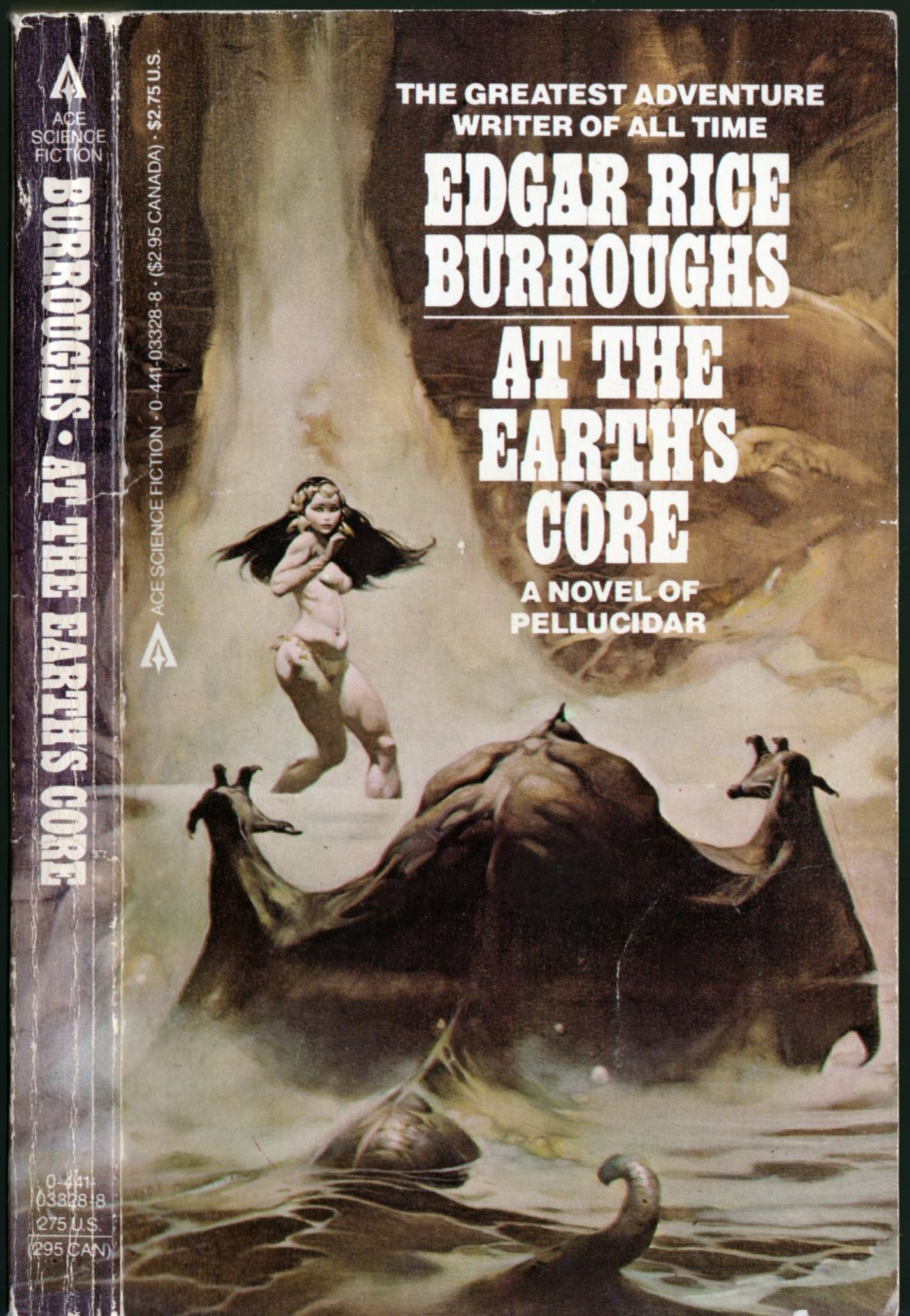
ABOVE: Edgar Rice Burroughs, At the Earth’s Core (New York: Ace, n.d.), with cover art by Frank Frazetta.
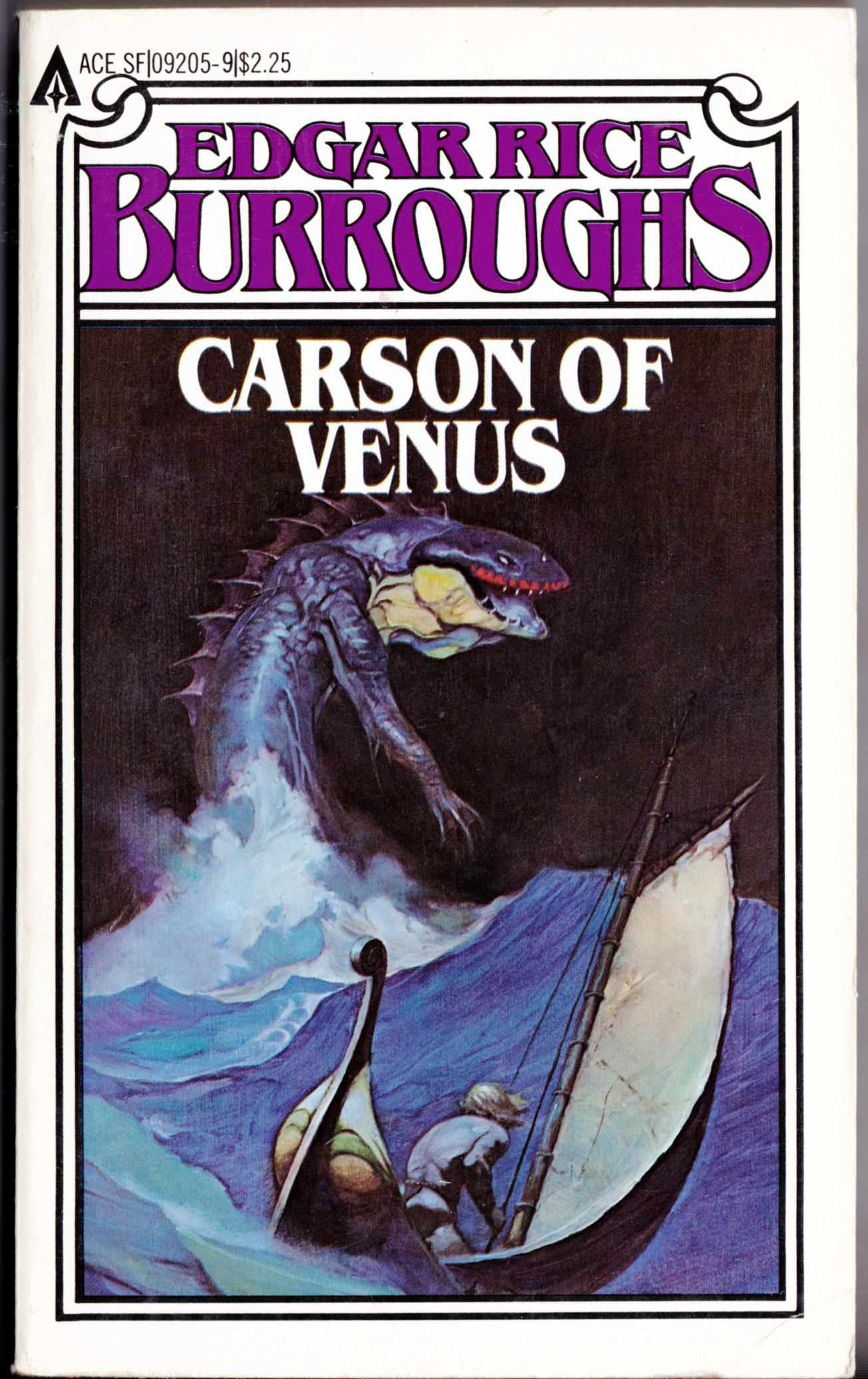
ABOVE: Edgar Rice Burroughs, Carson of Venus (New York: Ace, n.d.), with cover art by Frank Frazetta.
Seems the designers at Ace couldn’t decide whether Ace’s 1970s reprint series of Edgar Rice Burroughs novels looked better with the art wrapped around to decorate the spine (as pictured above) or with coloured type on a white background (not pictured). No doubt, there was a lot of annoying input from marketing about which design would be more attractive on the store shelves and ultimately produce better sales…
The more elaborate Carson of Venus design is the odd man out here, I know, but since it is the last Edgar Rice Burroughs paperback with cover art by Frazetta that I have on hand, I thought I might as well throw it in as a bonus!
Keywords:The Mad King, Pellucidar, The Oakdale Affair, The Land of Hidden Men, At the Earth’s Core, Carson of Venus.
My apologies in advance to a certain frequent visitor to this blog who is tired of my ongoing series of posts featuring the art of Jeffrey Jones, but I rescued these zine cover scans from three auctions that ended yesterday, and just had to share them:
In a promotional clip for the forthcoming documentary, Better Things: Life + Choices of Jeffrey Jones, that used to be available for viewing on the documentary’s official Web site, Michael Kaluta talked about the galvanizing impact the painting that appeared on the cover for Trumpet #8 had on him and his friends, but it looks like a fairly routine student effort to me. I guess you had to be there…
Well… in all fairness, the two paintings posted below are different enough that I probably should have tossed this post into the “Connections” category. And you know what? I think I might have done so, if only Boas’s style here weren’t every bit as derivative as his concept…
[CLICK IMAGES TO ENLARGE]
ABOVE: Frank Frazetta, The Dark Kingdom, Creepy, vol. 1, no. 9 (June 1966).
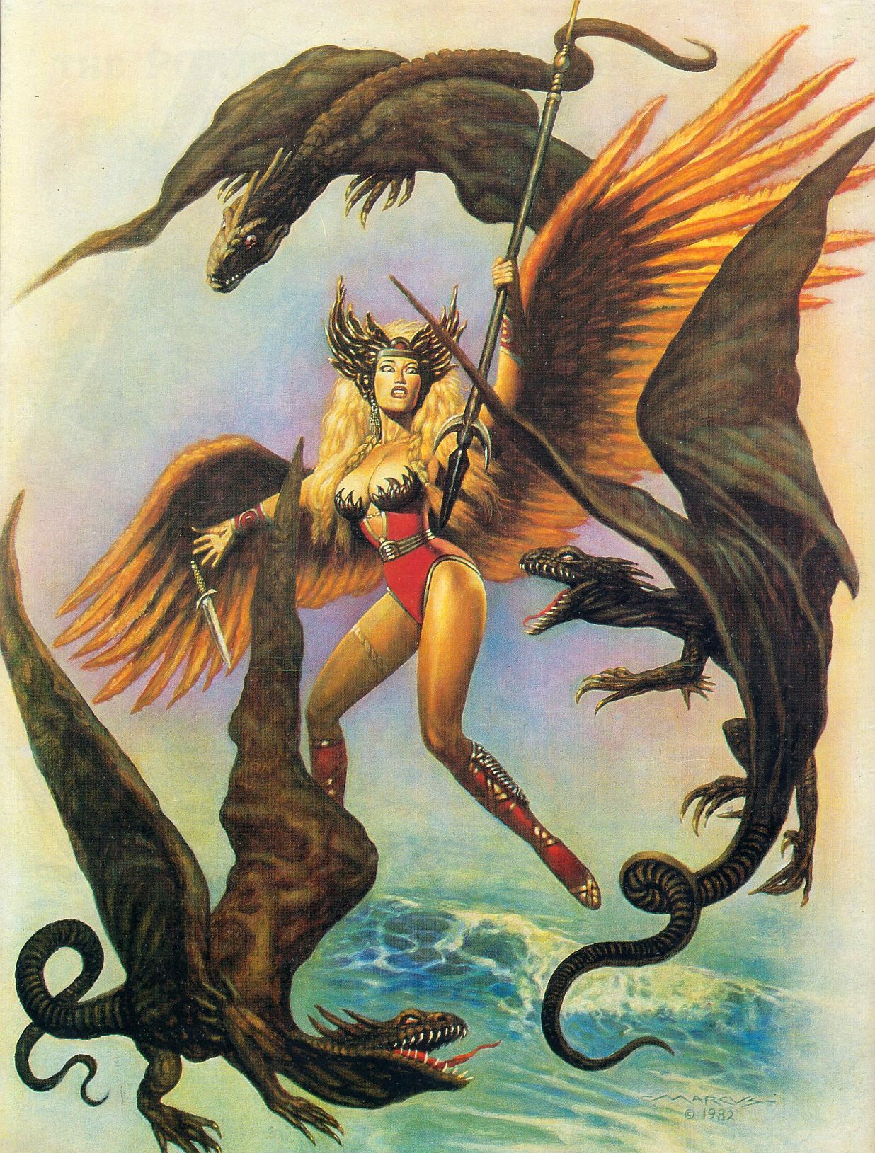
ABOVE: Marcus Boas, untitled illustration, signed and dated 1982, back cover, Heroic Fantasy, vol. 1, no. 1 (February 1984).
Marcus Boas’s debt to Frazetta in the above painting is clear enough, I think; however, in terms of painting technique, colour sense, and model types, Boas owes an even bigger debt to Boris Vallejo circa 1980. Because the fact is, Boas’s Heroic Fantasy painting is pure pastiche. It has nothing original about it other than the poorly designed creatures whose misshapen wings are attached to their bodies by wishful thinking rather than by anatomy and the inevitable awkwardness that seems to emerge whenever a mediocre illustrator attempts to make changes to a composition he has cribbed from an acknowledged master.
BONUS IMAGES:
Two covers by Boris Vallejo, scanned from the paperback library of yours truly:
ABOVE: Donald J. Pfeil, Through the Reality Warp (New York: Ballantine, 1976), with cover art by Boris Vallejo.
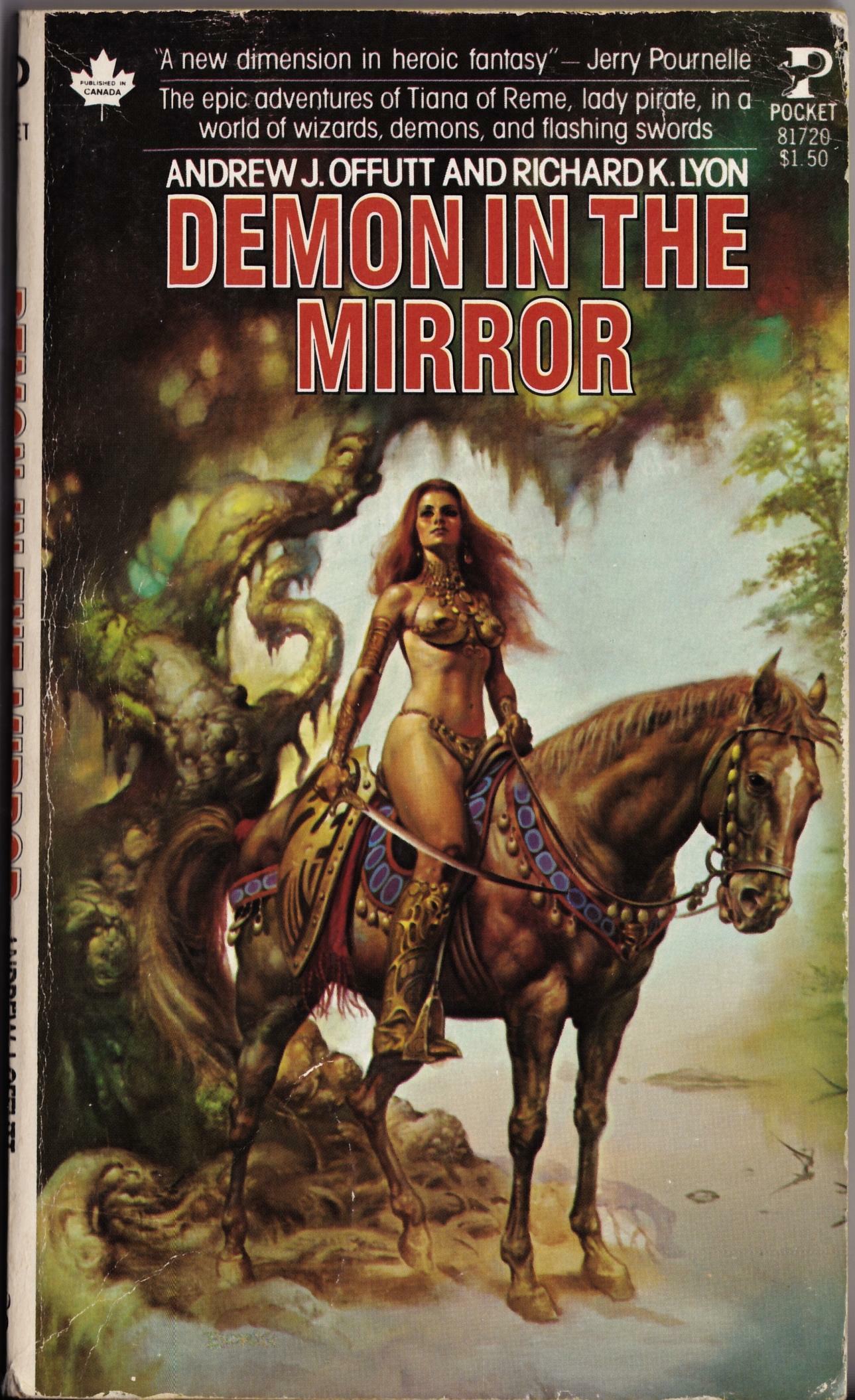
ABOVE: Andrew J. Offutt and Richard K. Lyon, Demon in the Mirror (New York: Pocket Books, 1978), with cover art by Boris Vallejo.
As I recall, Boris’s un-Frazetta-like cover for Demon in the Mirror made a big impression on me as a teenager, and truth be told, it remains one of a handful of Boris’s covers that I quite like. In recent years, Boris has unfortunately transformed his fantasy art into a platform to indulge what can only be described as a personal fetish for the bodybuilder physique, both male and female. Notice, however, that no bodybuilders were recruited to pose and flex for either of the above covers — thank god!
Keywords:Through the Reality Warp, Demon in the Mirror.
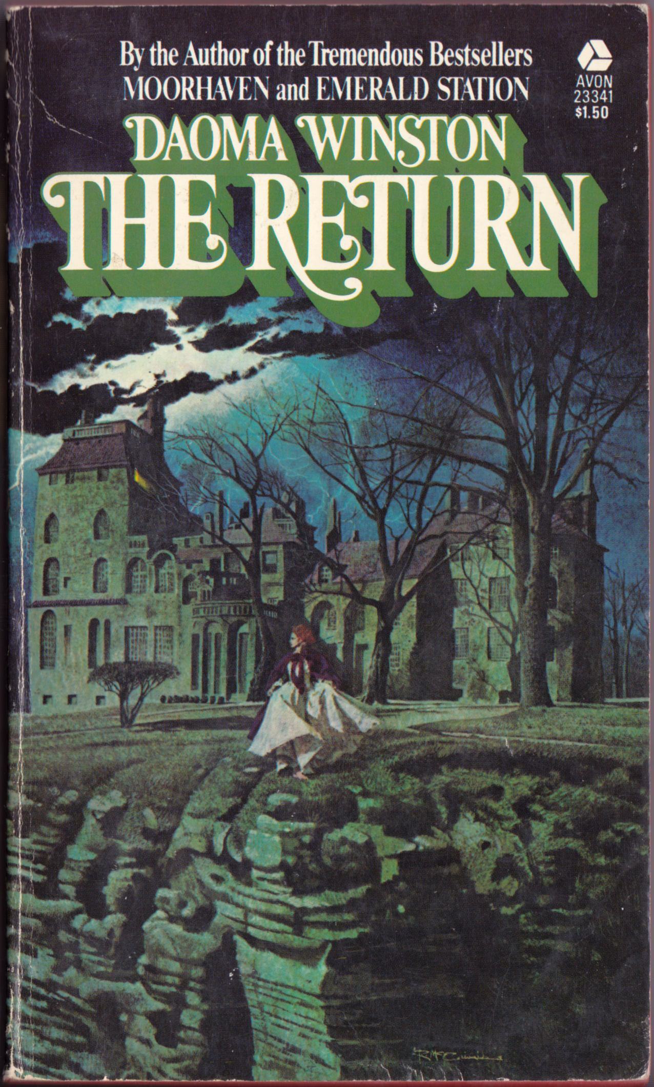
ABOVE: Daoma Winston, The Return (New York: Avon, 1972), with cover art by Robert McGinnis.
ABOVE: John D. MacDonald, The Crossroads (New York: Fawcett, n.d.), with cover art by Robert McGinnis.
ABOVE: Barbara Michaels, Wait for What Will Come (New York: Fawcett, 1978), with cover art by Robert McGinnis.
The lesson here: if you’re fleeing from danger, or just out taking the air, alone, on the verge of a dangerous precipice, and you’re wearing a dress, you’re going to have to hike it up in front with your hands to avoid tripping headlong into the clutches of an insistent lover or over the brink. Women already know this; men, not so much.
Keywords:The Return, The Crossroads, Wait for What Will Come.
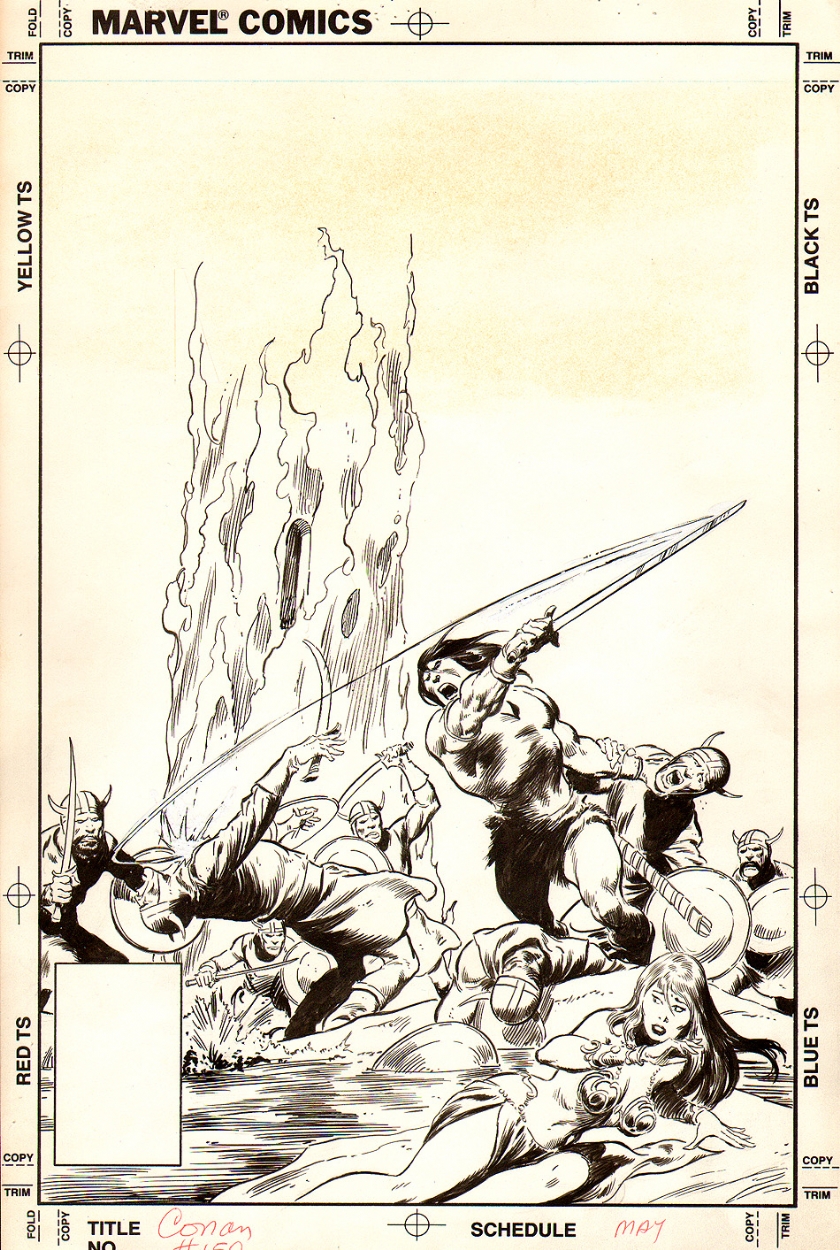
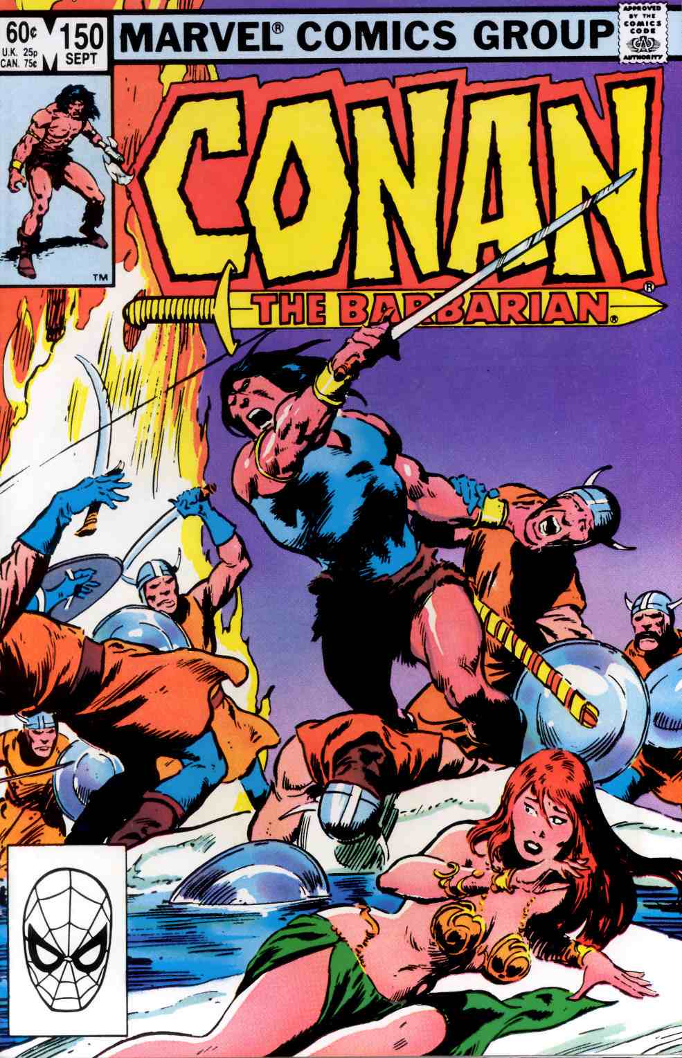
What’s interesting to me about the above comparison is how much of John Buscema’s original composition for the cover of Conan the Barbarian #150 was cropped out of the printed version, presumably either by editor Larry Hama or by editor-in-chief Jim Shooter. Maybe if Buscema hadn’t shown Conan chopping a guy through the throat with his sword, the editors would have published it uncut. Maybe.
The only issues of Conan that I have ever searched through dusty back-issue boxes to find and add to my collection were issues in which Barry Smith inked Barry Smith, John Buscema inked John Buscema or Gil Kane inked Gil Kane. The unpublished cover of Conan the Barbarian #150 looks like pure John Buscema to me.
Bonus Video:
Here’s a youtube video that includes footage of John Buscema pencilling and then inking a pin-up of Captain America along with footage of Bill Sienkiewicz creating a quick portrait Electra with marker, brush and ink, and white-out:
The Bud’s Art Books catalogue arrived today, and as I was flipping idly through the pages, I noticed something that seemed familiar in a tiny thumbnail image of a book cover (issue 1010F, page 67, item E). Here, take a look at the much larger images below, and see if you notice it, too.
Is this mere happenstance? Maybe, maybe not. You decide.