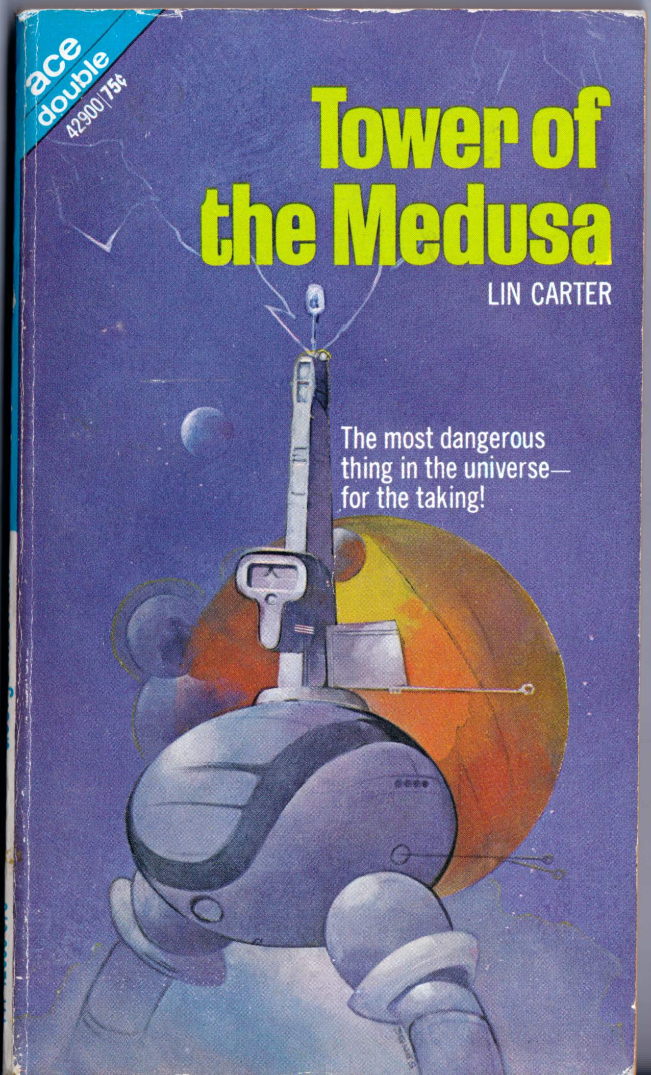
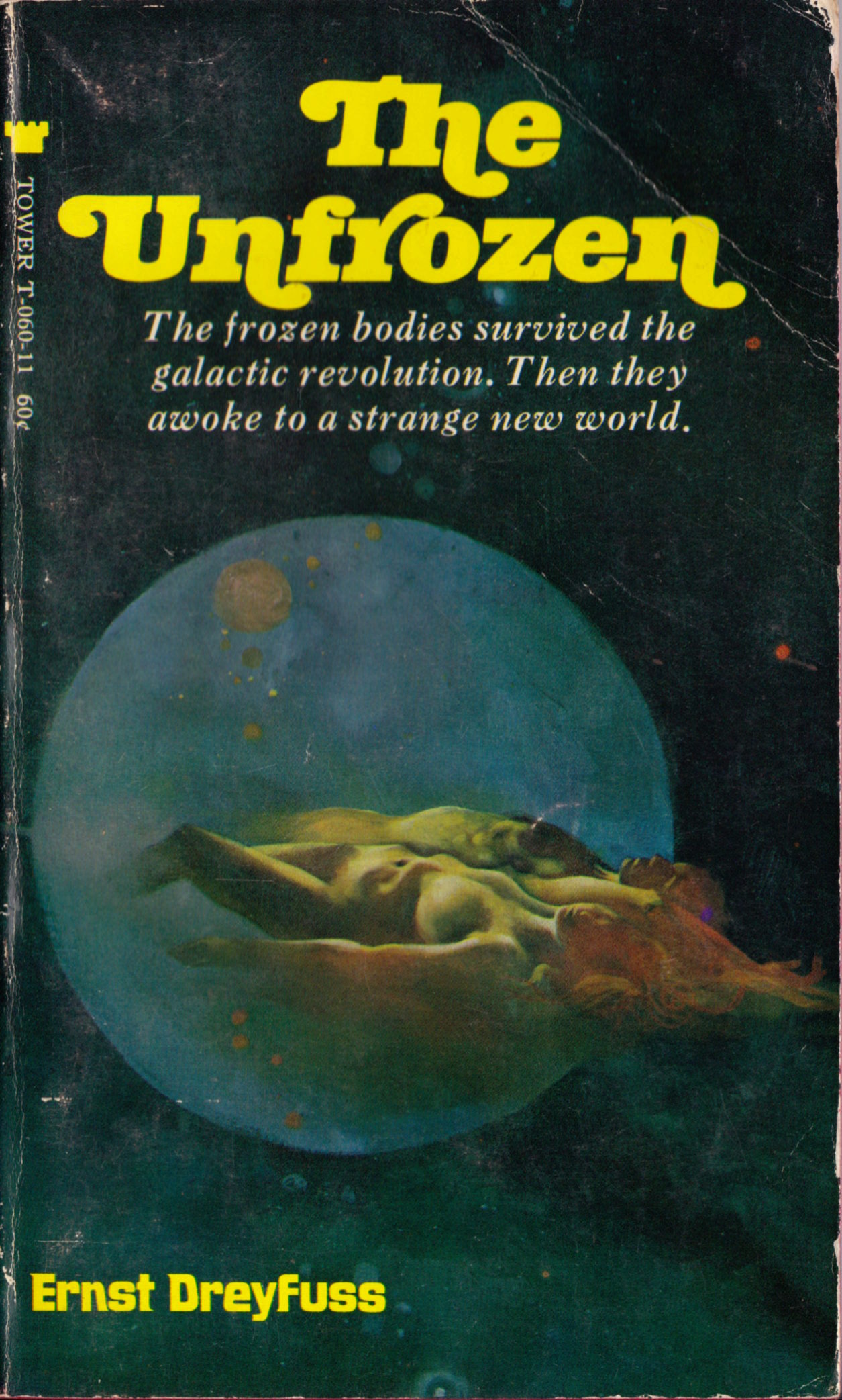
Here’s another justly forgotten Lin Carter novel, half of an “Ace Double,” with cover art mistakenly credited on the verso of the title page to Kelly Freas even though the art is clearly signed “Jones”:
[CLICK IMAGE TO ENLARGE]

"This day's experience, set in order, none of it left ragged or lying about, all of it gathered in like treasure and finished with, set aside." –Alice Munro, "What is Remembered"

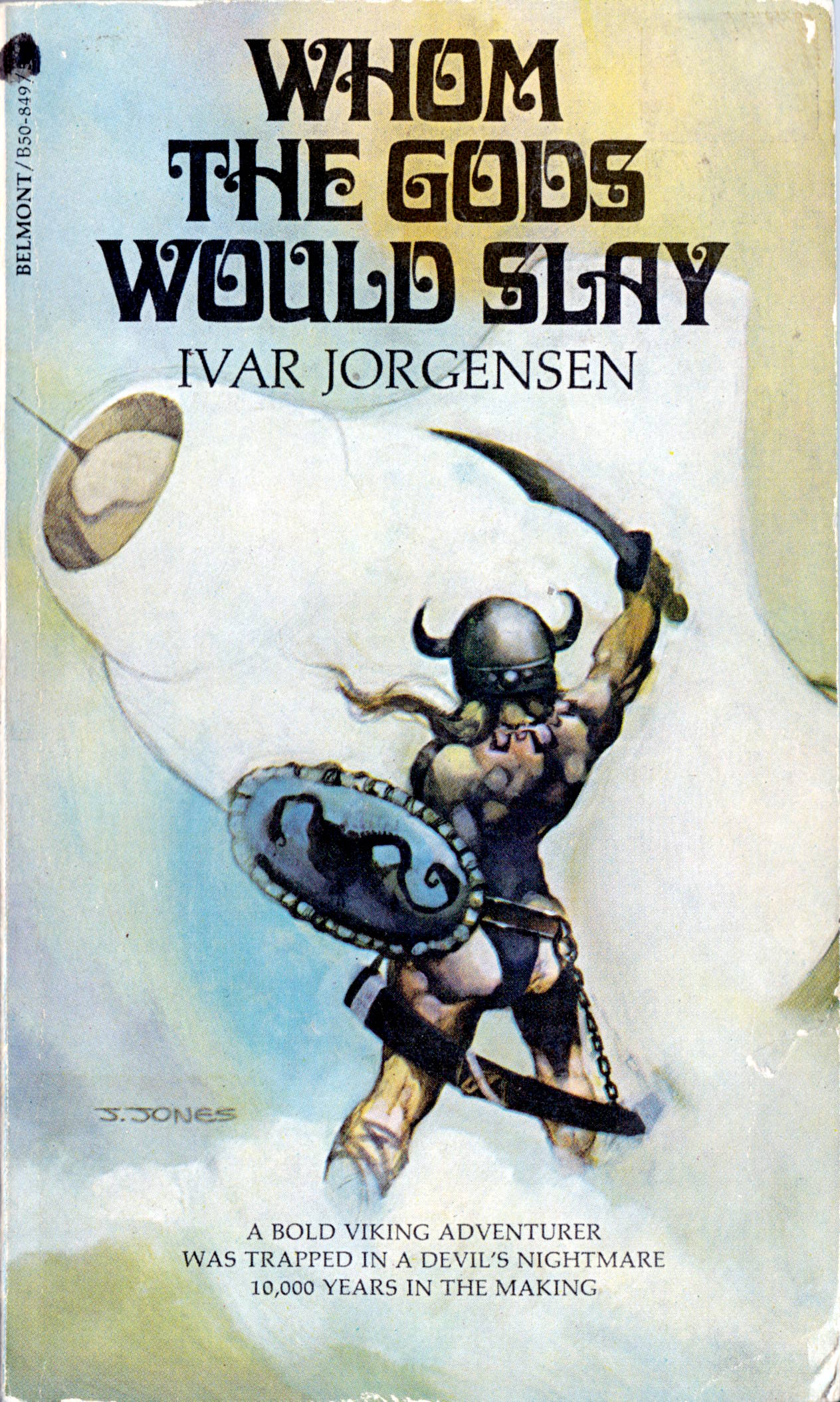
Here’s another justly forgotten Lin Carter novel, half of an “Ace Double,” with cover art mistakenly credited on the verso of the title page to Kelly Freas even though the art is clearly signed “Jones”:
[CLICK IMAGE TO ENLARGE]

New from Todd Adams and Glimmer Graphics: a beautiful signed-and-numbered Giclée print of a shimmering seascape by Jeffrey Jones entitled The Great Cloud. The print is strictly limited to 75 copies and is available now!

JEFFREY JONES
71 WITTENBERG RD.
BEARSVILLE, NY 12409Dear Mr. Weaver,
I’m sorry this took so long.
You asked about the proudest moments of my career. I don’t think I sit around and think about the past. There are artists who like to paint and those who like to have painted. I like to paint. I love to paint. The drawing, the way colors leap to life next to each other. I had a teacher once who said “There’s no such thing as an ugly color, it depends on what it’s next to.”
Good luck.
Sincerely,
Jeff Jones
Here’s some more early work by Jeffrey Jones, scanned from my personal library, and I have a strong suspicion, dear reader, that at least one of these covers will be new to you:
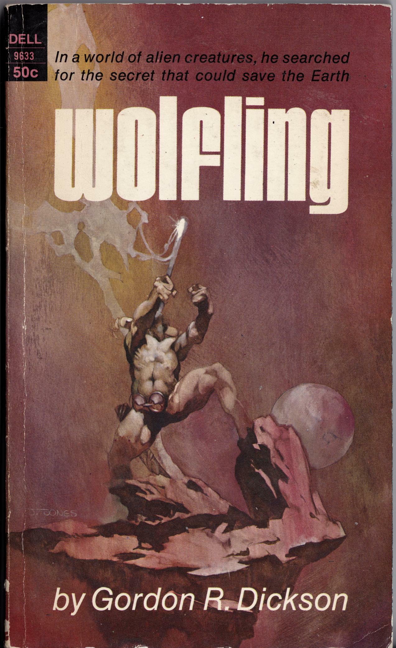
This past weekend, I finally located (and purchased) a copy of Gordon R. Dickson’s Wolfling, with cover by Jeffrey Jones, so now, at last, I can post this comparison of two very similar images by Jones executed in two different mediums, oil vs. ink:
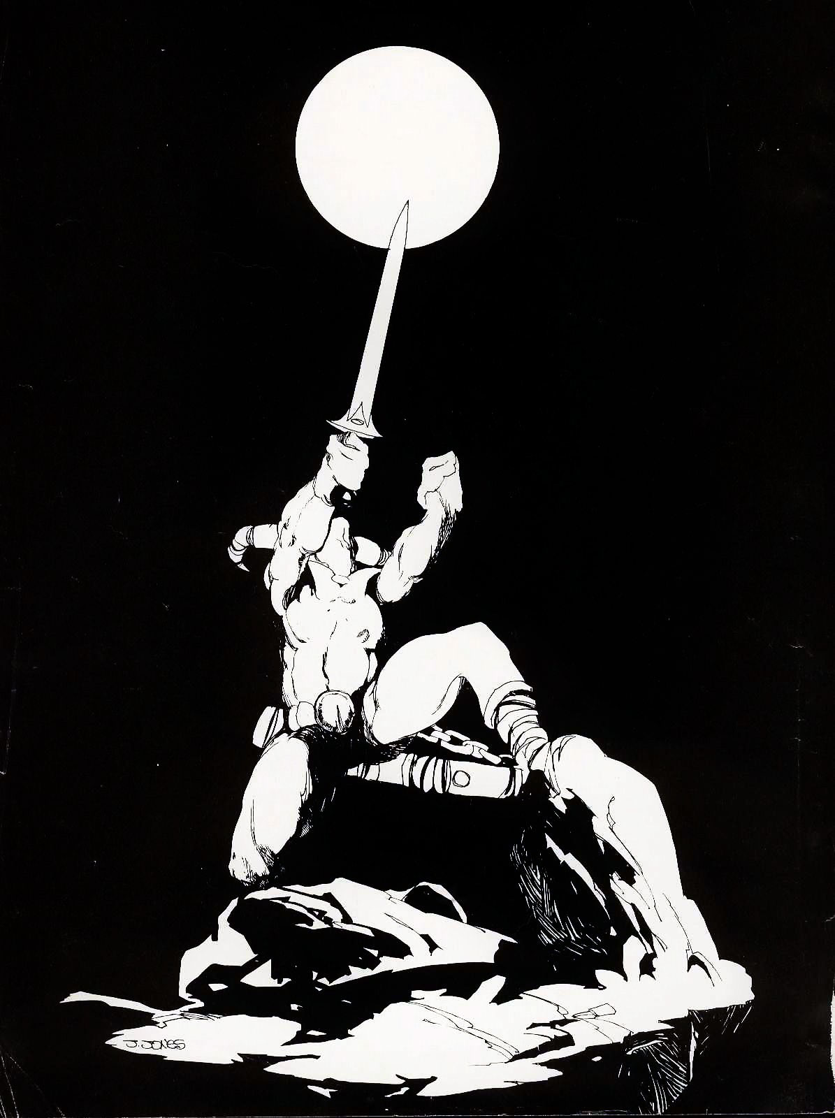
The “Conan” frontispiece was published in Savage Sword of Conan in 1975, but the style and the signature suggest to me that it was created around the time of the 1969 Wolfling cover. Anyone know if the “Conan” frontispiece was published anywhere else prior to its appearance in Savage Sword?
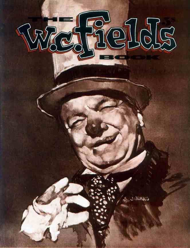
The W. C. Fields Book (Brooklyn: Wonderful Publishing Company, 1973) is identified in the indicia as a “special issue of Witzend (No. 9).” Witzend was an underground comics magazine launched in 1966 by E.C. legend Wallace Wood and published and edited by him until 1968, when he sold the magazine, for a buck, to Bill Pearson/Wonderful Publishing Company. Here’s the cover with Jones’s painting of W. C. Fields, which, by the way, is reprinted at a small size but sans text and in full colour on page 64 of Jones’s first solo art book, Yesterday’s Lily (Dragon’s Dream, 1980):
And here — SURPRISE! — is an extremely obscure illustration by Jeffrey Jones, published in black-and-white in National Lampoon, vol. 1, no. 23 (February 1972), along with an article entitled “The Thoughts of Chairman Fu-Manchu”; the painting has never, to my knowledge, been reprinted:

The washy, rub-out style of the “Fu-Manchu” painting, which can be accomplished most easily with oil paints but is also possible in watercolour/gouache, was state-of-the-art in the late 1960s and early 1970s. Three of the best known practitioners were Society of Illustrators Hall of Fame inductees Bernie Fuchs, Burton Silverman, and David Levine, but many others tried their hands at it, too — including Jones, apparently. To learn how to do it in watercolour, all you need is a copy of Silverman’s Breaking the Rules of Watercolor, a selection of watercolour paints and brushes, a few rolls of good-quality paper towels, a large tube of white gouache, a stack of the heaviest weight Strathmore plate bristol you can find, AND THE PATIENCE OF JOB!
BONUS CONTENT:
Here’s an album cover, not by Jeffrey Jones, with a portrait of W. C. Fields that appears likely to have been based on the same photo reference of Fields as Jones used for his painting; the accoutrements are slightly different in the two portraits, but the face, I think, is a dead giveaway:

I suppose it’s also possible that one portrait was based on the other (though it seems to me unlikely). Either way, however, Jones’s W. C. Fields genuinely looks like the kind of man who keeps a supply of stimulant handy in case he sees a snake, which he also keeps handy, while the other Fields looks like he has been living for days on nothing but food and water. Can you guess which one I like best? Wrong again. I prefer Jones’s version.
Here’s Jeffrey Jones on Michael Wm. Kaluta, from Comic Book Profiles #7: Michael William Kaluta (Summer 1999), pages 28 – 29:
How did you first meet Michael?
If memory serves, I met Michael and Bernie Wrightson at a New York City convention in the fall of 1968. Michael may dispute this because he is the “memory giant.” But I remember this as being so. We were there to show our fledgling work. I had arrived in New York about a year earlier and had a couple of jobs done. My memory is sketchy as to details but Bernie had a bunch of $5 and $10 ballpoint pen drawings piled on a table in the art show for sale. Michael was more of the portfolio type. I mention Bernie in the Michael question because he was the one who introduced us.
What do you feel is his strength as an artist?
Michael’s greatest strength as an artist has always been his ability to remind us to stay alive. His art is moral in the sense that it, as the best art, has absolutely no function except to exist. It has the promise of function and will remain where that beauty lives. I speak of the human spirit and its passion to rise above everything, except that which we all already know. Michael reminds us of that connection between all lives and all that makes us human. This takes a true artist.
You and Michael worked on projects together, both formally and informally. Does any one project stand out as particularly memorable?
The thing that jumps to mind is a period of time during The Studio days, if you will, when we were trying to decide what to call our upcoming book (The Studio). Michael taped long rolls of brown kraft paper to one wall where each of us, usually clandestinely, would write our suggestions. Well, this certainly started out seriously but quickly degenerated into a list of some of the most preposterous titles imagined by the minds of the deranged. I believe that even though most of these would appear in the dark of night, it was pretty easy to tell who wrote what. We laughed for what seemed months. Definitely a great achievement in the art of cooperation.
Now, it seems to me that what Jones viewed as the “greatest strength” in Kaluta’s work back in 1999 is precisely what Jones has always pursued in her own work.
And I have little doubt that Kaluta was, at the time, flattered by Jones’s praise; I mean, who wouldn’t be?
And yet, based on the very plain-spoken, practical analysis that Kaluta offers up in an early promotional trailer for Better Things: Life + Choices of Jeffrey Jones of the difference between his own unabashedly functional, commercial body of work, and the sometimes obliquely functional but always deeply felt and humanely expressive work of Jones, I’m not entirely sure that Kaluta actually would have agreed with Jones’s contention that his (Kaluta’s) artwork “has absolutely no function except to exist.”
Here is a partial, lightly edited transcript of the trailer, which features a rough-cut interview with Kaluta:
Artistically, [says Kaluta] one works for oneself. You have to. To get anything good, you kind of have to work for the person that’s inside of you; however, to be able to live, you have to work for companies. I had to work for companies; other artists, perhaps, can work for galleries, or posterity. An illustrator is someone who draws for money. I don’t do what some of my friends are able to do, which is paint their souls, their dreams, their nightmares for themselves, and that’s art — and it is. I am happiest when I am reading someone else’s material and crafting it into a picture that will reflect to my best efforts what I think the writer was trying to say, trying to visualize. I would say that Jeffrey Jones is both an illustrator and an artist, using the descriptions we have just talked about. He covers a wide range of self-motivating imagery. It comes through him, and every once in a while he’ll apply that specific power that comes through him to an illustration job, or he’ll use the characters that have been written by other people as a vehicle for his own talents. I wouldn’t say he’s as much of an illustrator as I am. I think that he’s more of a personal storyteller who now and then might come close to illustrating something [laughs], on purpose.
In the portion of the trailer I haven’t transcribed, Kaluta goes on to describe his first meeting with Jones, which Kaluta says occurred at “a World Science Fiction Convention here in New York City in 1967.” LOL!
Coming this October from IDW, in both a regular hardcover and a signed and numbered limited edition:

Jeffrey Jones: A Life in Art
PRODUCT DETAILS:
* Hardcover: 256 pages
* Publisher: IDW Publishing (Oct 5 2010)
* Language: English
* ISBN-10: 1600107370
* ISBN-13: 978-1600107375PRODUCT DESCRIPTION:
Over the past 40 years, there have been few artists who have received as much acclaim and garnered as much attention as Jeffrey Jones. From his early comic book work for Heavy Metal and National Lampoon to his popular book covers for such authors as Dean Koontz and Andre Norton to his move into fine art, Jones has inspired generations of painters and artists. This beautiful volume of his personal favorites will only enhance his reputation and cement his standing as one of America’s greatest living artists.
The cover design of the new volume is very similar to the design of the Jeffrey Jones Sketchbook, which was published by Vanguard and has now gone out-of-print:

Need I add that the new collection is very exciting news!? In fact, I’ve already placed my order for the limited signed and numbered edition. Hope I get one.
BONUS “HEADS UP”:
The hardcover edition of The Art of Jeffrey Jones (Underwood, 2002) is currently on sale at Budsartbooks.com for US$14.95, while supplies last. The deluxe, slipcased edition was also on sale a short time ago — I know because I bought one, even though I already had the regular hardcover, which I purchased at full cover price — but it’s now sold out. Sorry I forgot to mention…
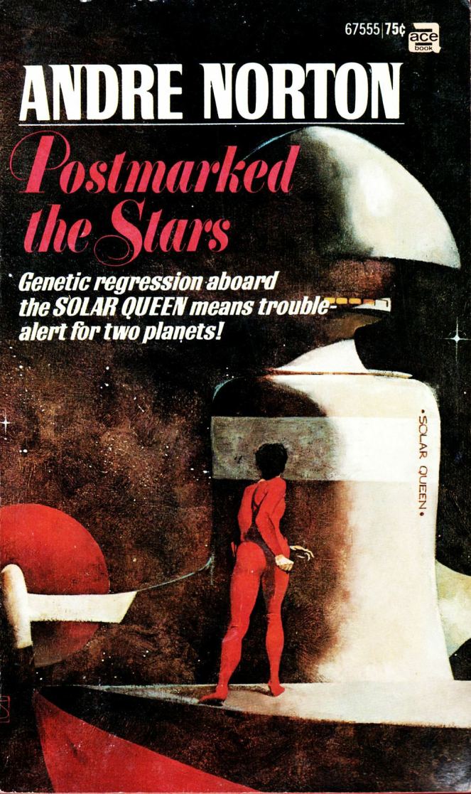
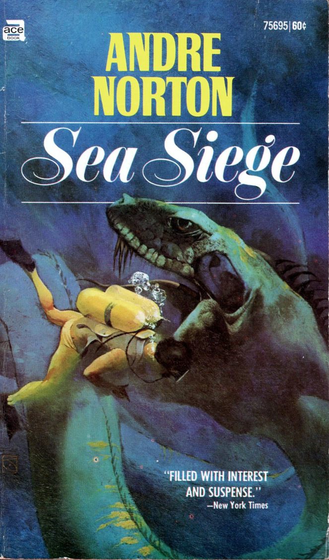
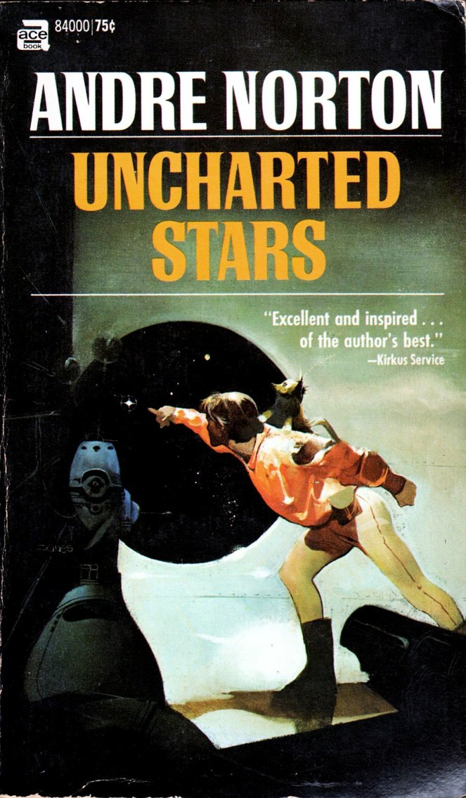
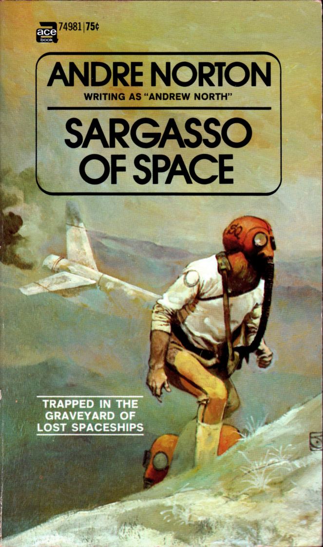
I purchased the following Andre Norton paperbacks with covers by Jeffrey Jones on Monday from a small shop in Yorkton, Saskatchewan. I found the shop totally by accident. My wife, our son, and I were en route to Dauphin, Manitoba, but since we were ahead of schedule and had some time to kill before lunch in Yorkton, we decided to drive around a bit and see what stores were open in the downtown area. We went up and down a couple of streets, and then we noticed a shop called “Thrifty Mama’s” that had a display of books in the window. Being a trio of bibliophiles, we couldn’t resist checking it out — and discovered that at least half of the floorspace in “Thrifty Mama’s” is dedicated to used books, mostly paperbacks. Score!
Now, I know I’ve posted the cover of Uncharted Stars before, but the book this time around is in much better condition. In fact, all four are really glossy and tight. And they all sport excellent Jones covers. Enjoy!
BONUS IMAGE (added 04 October 2013):
A more recent acquisition:
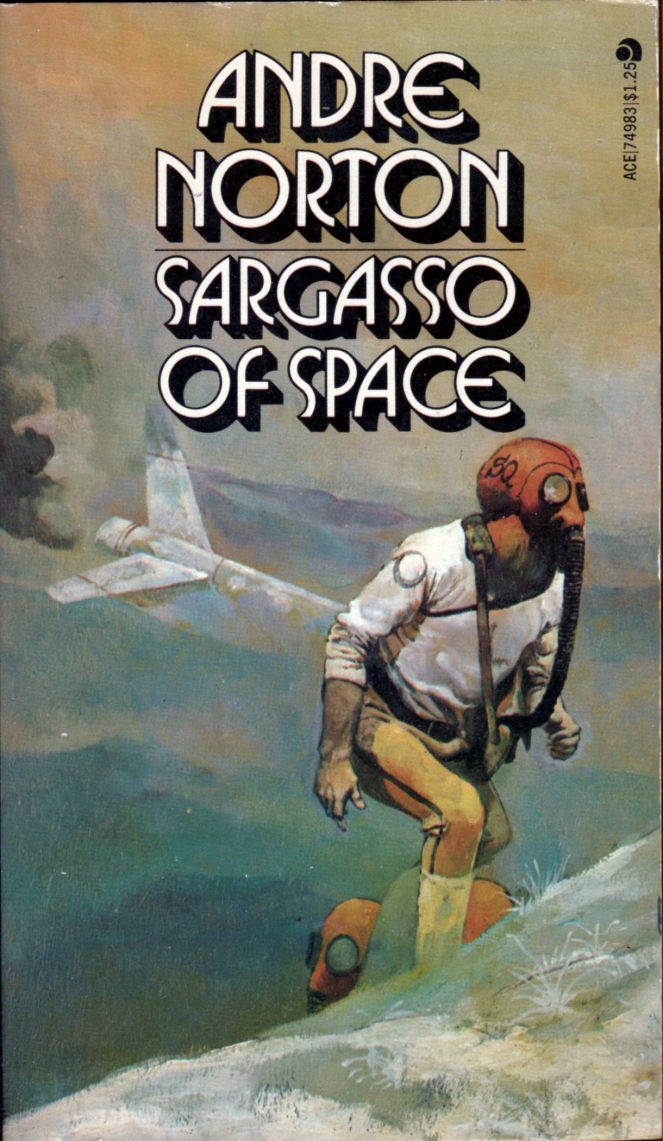
Keywords: Postmarked to the Stars, Sea Siege, Uncharted Stars, Sargasso of Space.
The cover of The Three Faces of Time, which I bought yesterday at a used book store in Moose Jaw, Saskatchewan, is uncredited, and no signature is visible, but it sure looks like the work of Jeffrey Jones, circa 1968-69, to me.


UPDATE (24 July 2010):
This just in: reader Patrick Hill points out in the comments section of this post that Jones informed him ten years ago that he (Jones) swiped the pose of the main figure in Seetee Shock and The Three Faces of Time from “H2O World,” with story by Larry Ivie and art by Al Williamson and Roy Krenkel. Here’s the ocular proof:


If nothing else, the above news should make Maroto fans smile.
