
[CLICK IMAGE TO ENLARGE]
Tag: Jeffrey “Jeff” Catherine Jones
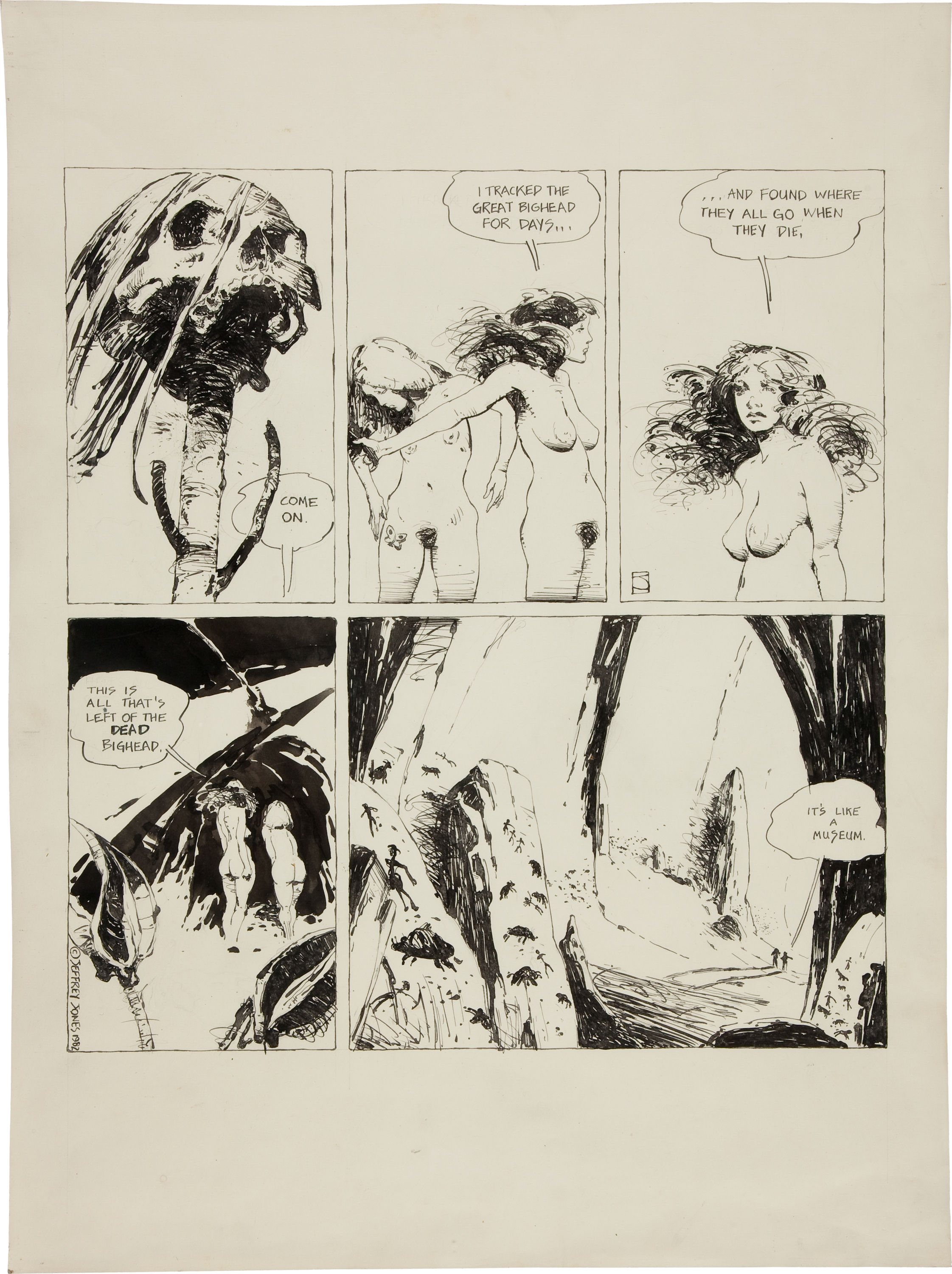
Look Here: Original art for an “I’m Age” strip by Jeffrey Jones
Here’s a scan of the original art for the installment of “I’m Age” by Jeffrey Jones that appeared in Heavy Metal, vol. 5, no. 11 (February 1982):
[CLICK IMAGES TO ENLARGE]
And here’s the strip as it appeared in print:
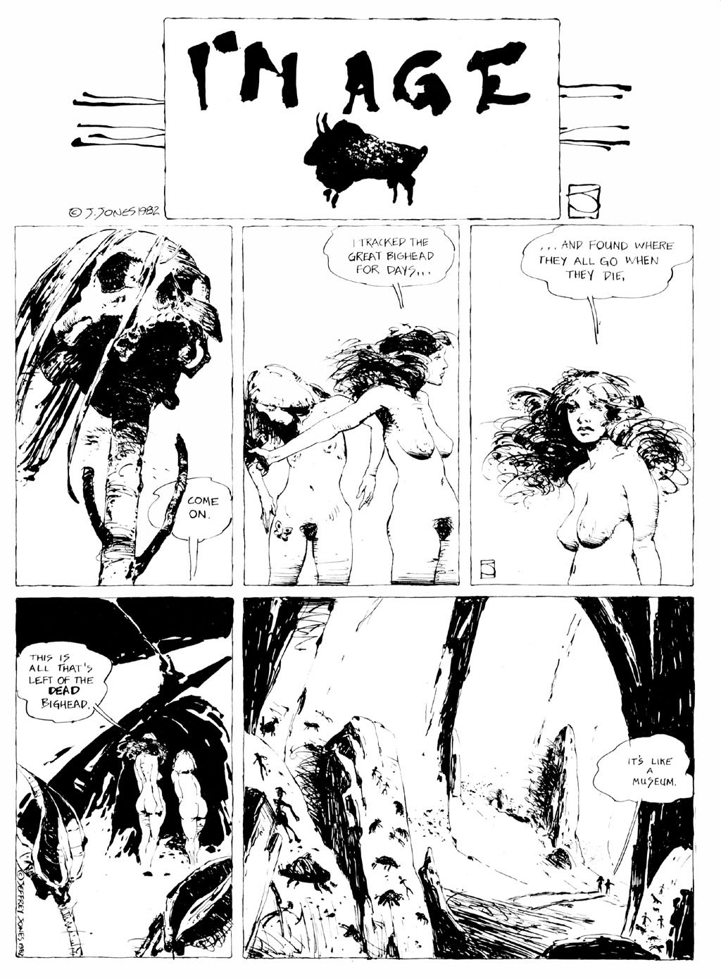
If you’d like to read more “I’m Age” strips, click here.
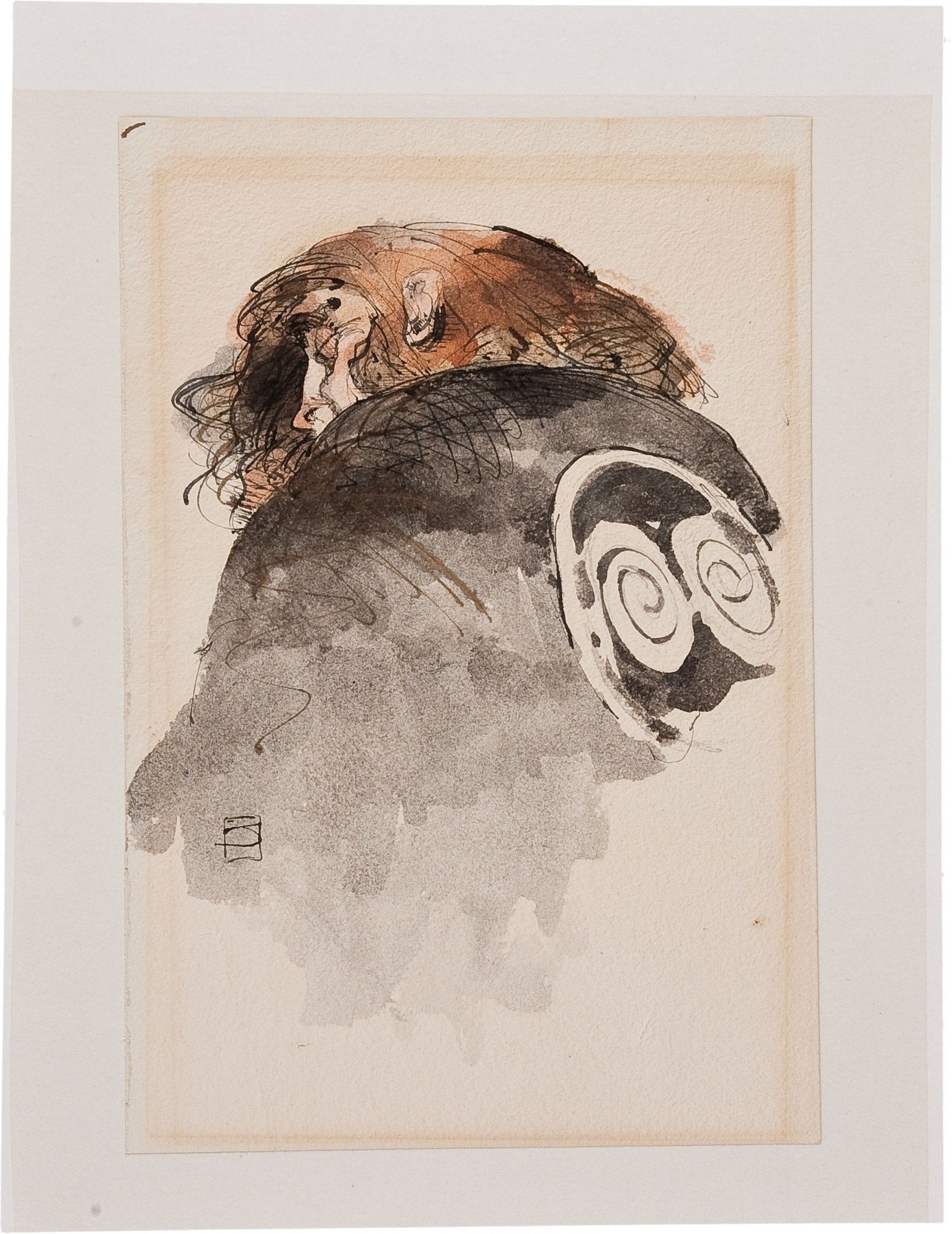
Look Here: LORD GREYSTOKE print by Jeffrey Jones
[CLICK IMAGE TO ENLARGE]

UPDATE (12 February 2013):
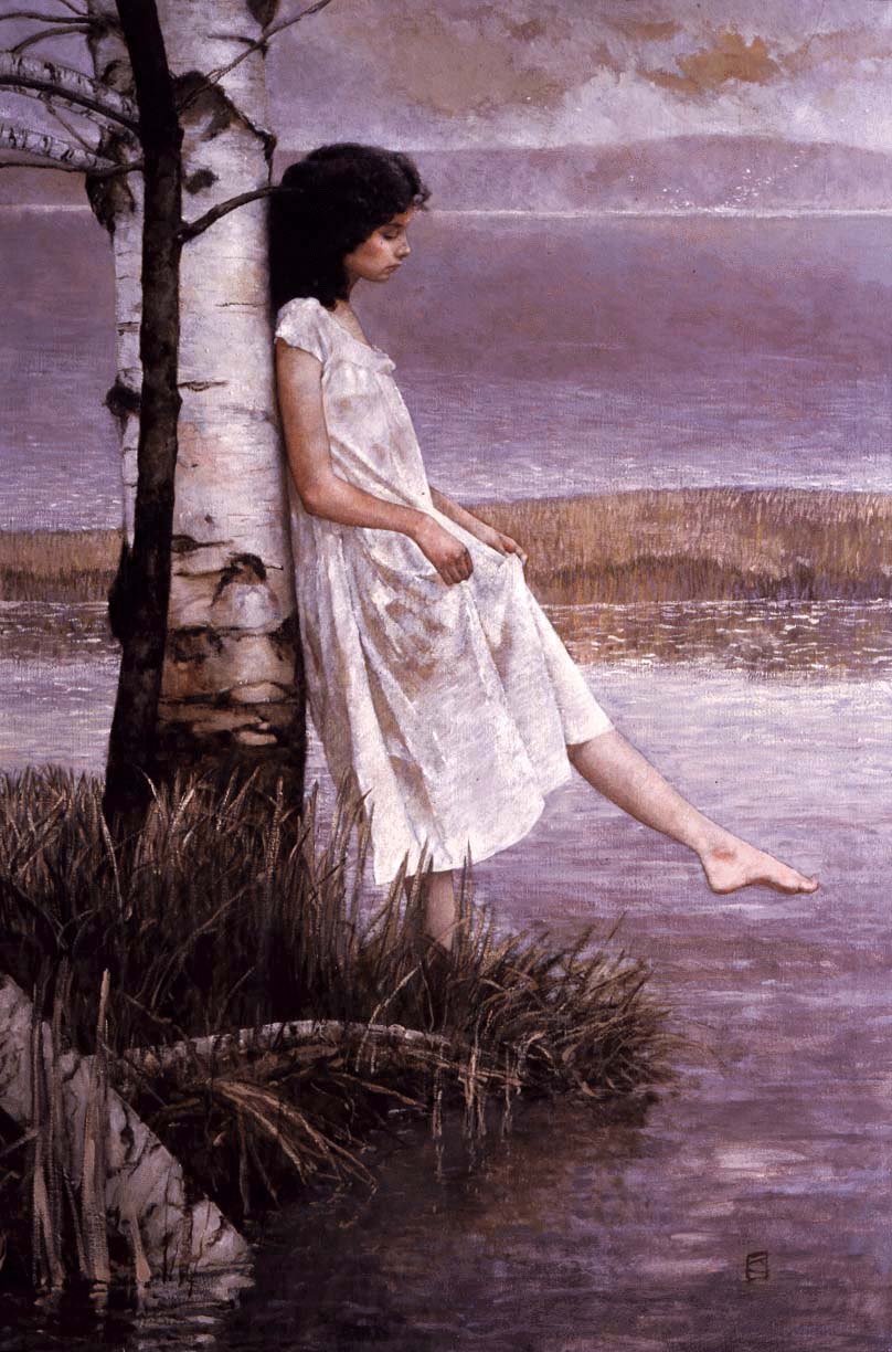
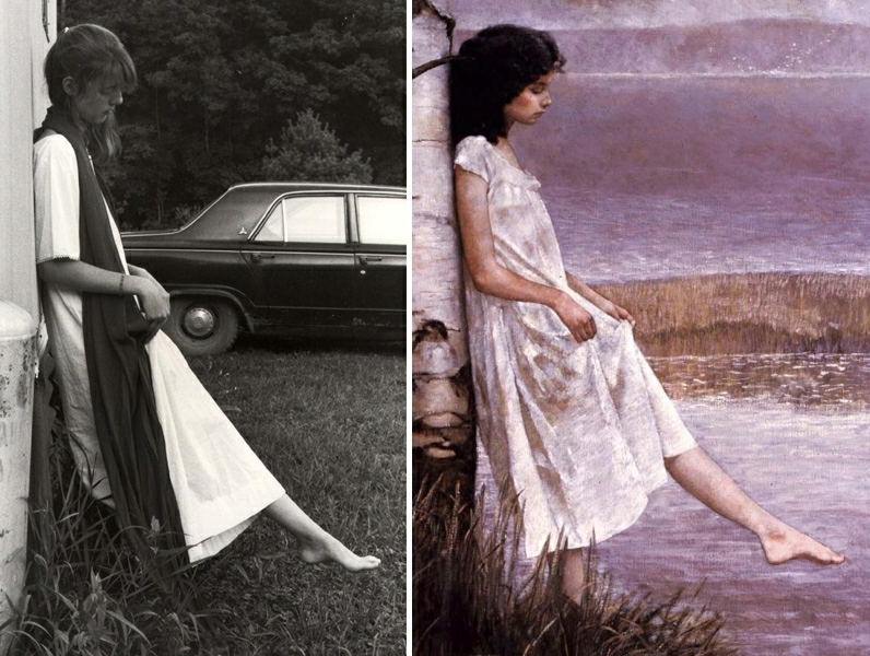
Earlier today, the producer/director/writer of Better Things: The Life and Choices of Jeffrey Catherine Jones, Maria Cabardo, posted the following picture of Gray Morrow to her Facebook photo album:
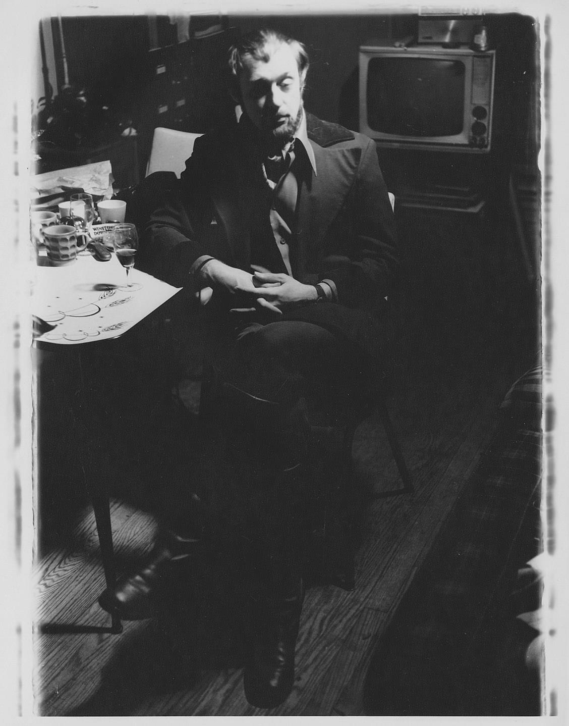
The photo was taken by Jeffrey Jones, and I recognized the pose and lighting immediately! Very cool to see! To his credit, and to the great benefit of his painting, Jones didn’t succumb to the desire to spell everything out, to invent all of the forms that he couldn’t make out in his reference photo, but instead simply embraced the idea of lost edges.
If you are able, please contribute to Maria’s Indiegogo fundraiser for Better Things. Documentary films about illustrators and comics artists are few and far between, but if you want more, you need to step up and support the intrepid filmmakers who are willing to stride out on a limb and make it happen. The perks/rewards are cool, and because Maria has chosen to run a “Flexible Funding campaign,” all of the perks will be delivered even if the total money raised does not match the stated goal. In other words, if you contribute at the level to get the art book (for instance), you WILL receive the art book.
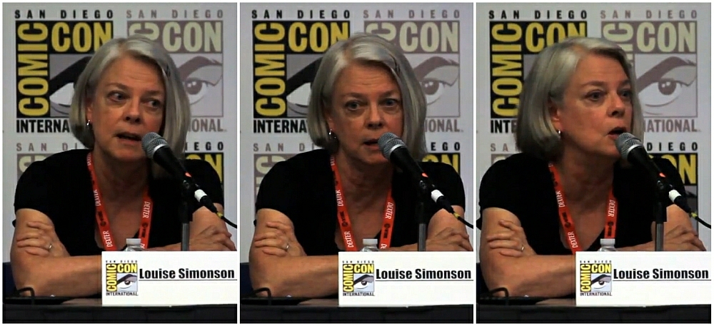
Louise Simonson on Frank Frazetta, Jeffrey Jones, and photo reference…
Below is a partial transcript of the above clip, with bold added for emphasis:
“Well, when Jeff did work for Warren, I wasn’t there [working for Warren] yet. I was, uhm, working in advertising promotion and, for another publisher, a magazine publisher in the city [New York]. Uhm, I think during this time Jeff may have discovered using reference? And it made a huge difference in his work. I remember at one point he, he, it suddenly occurred to him… okay, all right, back in the olden days there was a story that Frank Frazetta said that he never used reference and anybody who used reference was cheating. So a generation of young artists grew up thinking using reference is bad and cheating and this is, I don’t know, I don’t know why Frank did that because I know he used reference, I know he did. [Laughter.] Uhm, anyway, so I guess at one point Jeff just cracked and started using reference and his work got, it took a huge leap forward, so I do remember that, and I believe that was, maybe some of that might have been during the Warren period. Uhm, he just did a few things for Warren. He didn’t do that much.”
— Louise Simonson, Better Things Panel, San Diego Comic Con 2011
“My work looks the way it looks because I shoot reference.
I need that information, then I can play with it.” — Jeffrey Jones, in conversation with George Pratt
RELATED COMMENT:
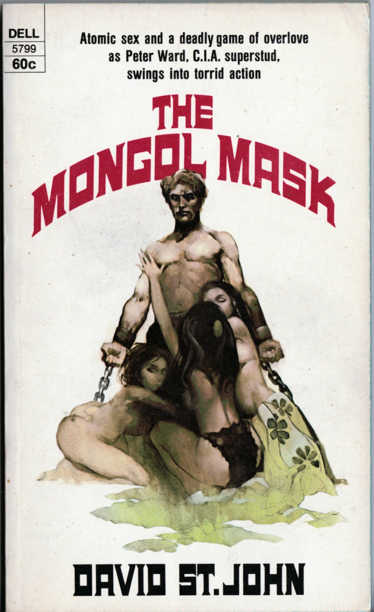
BONUS SCAN:
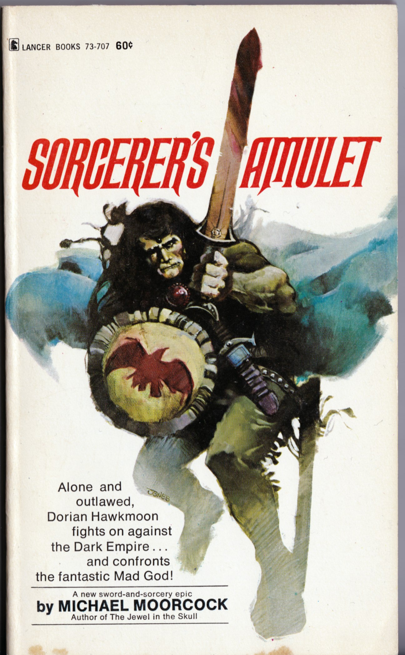
From my very own library of brittle old paperbacks:
[CLICK IMAGES TO ENLARGE]

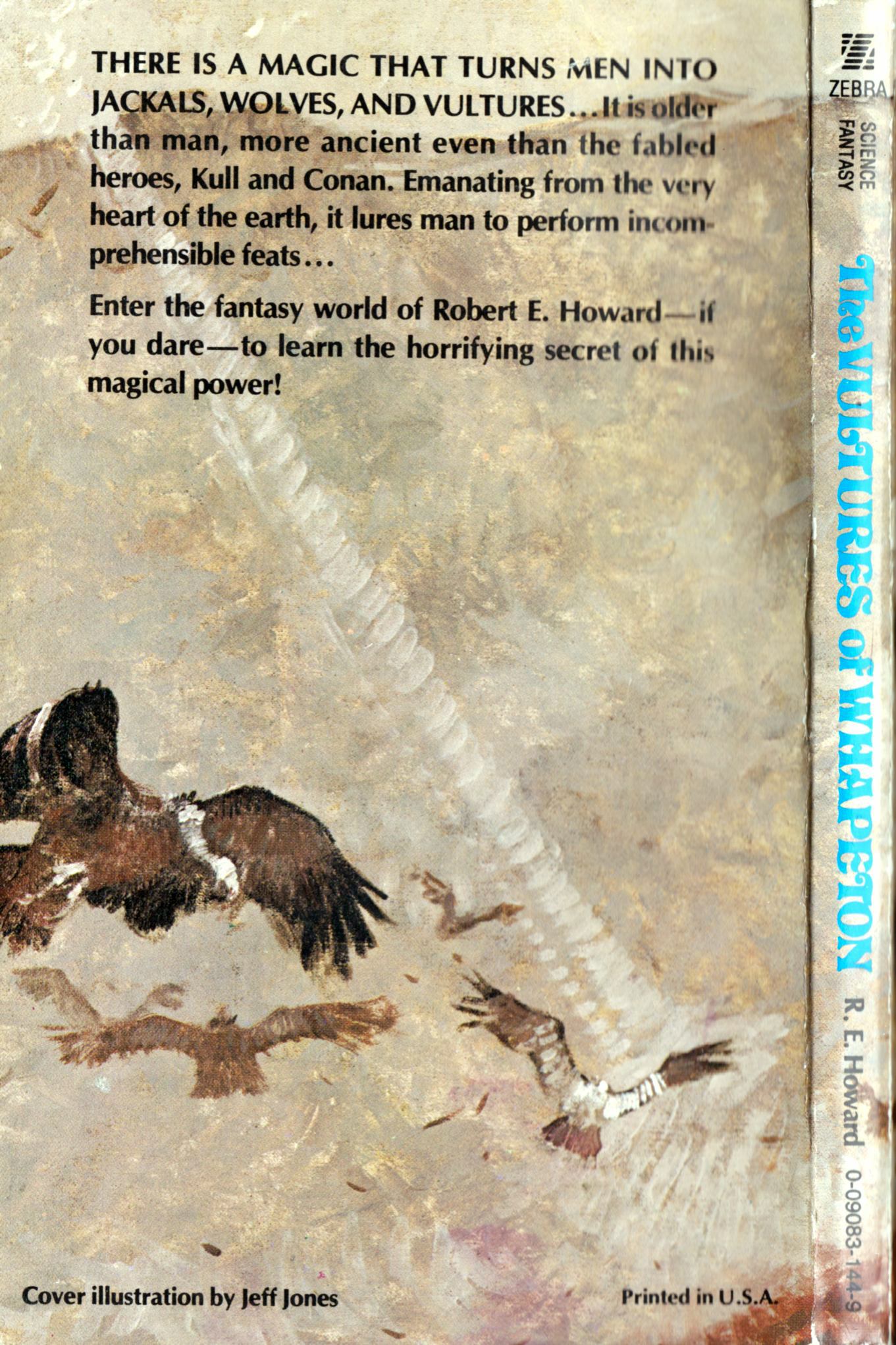
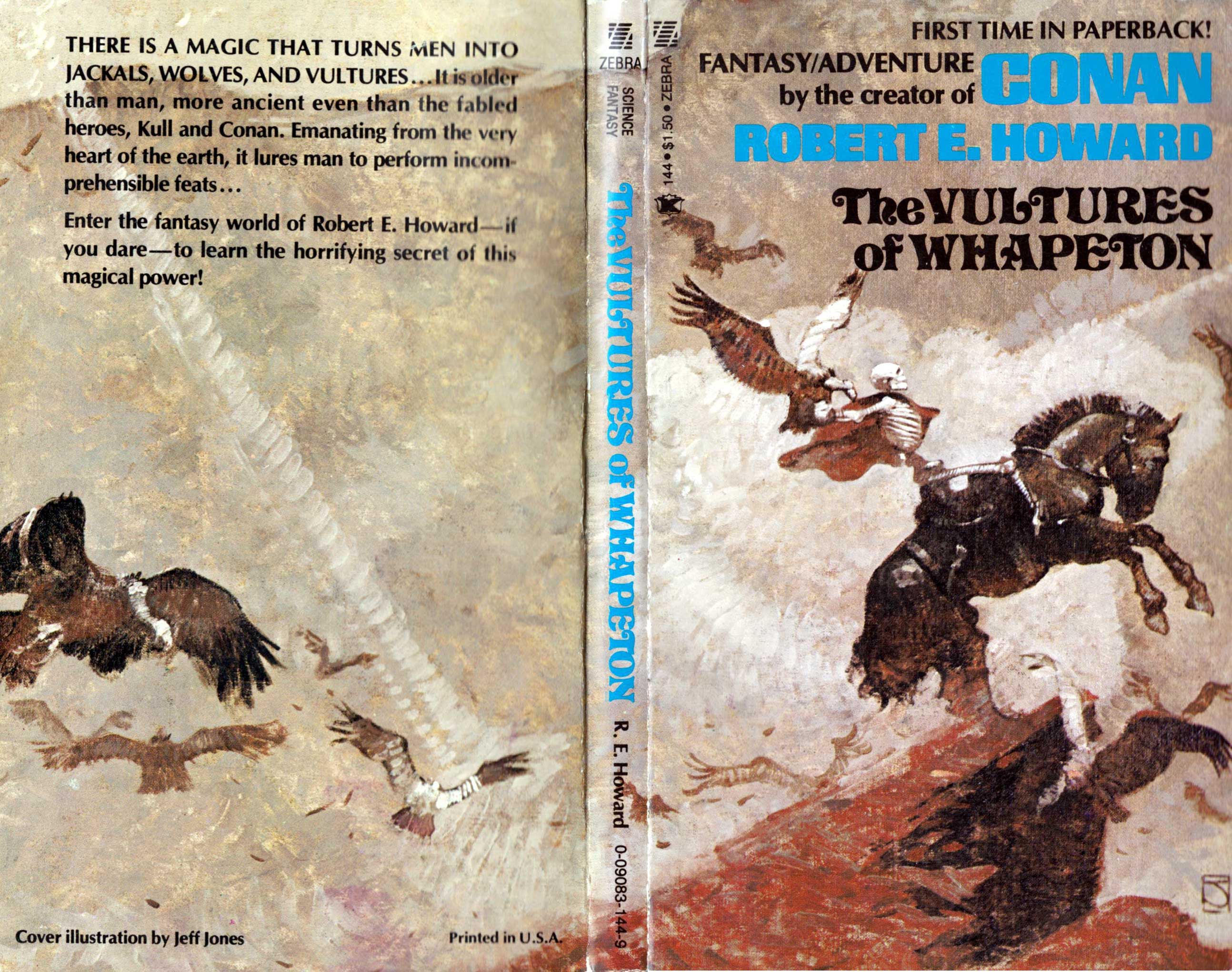
To view all of the Zebra/Kensington editions of Robert E. Howard’s books with Jones covers that I’ve posted so far, click here.
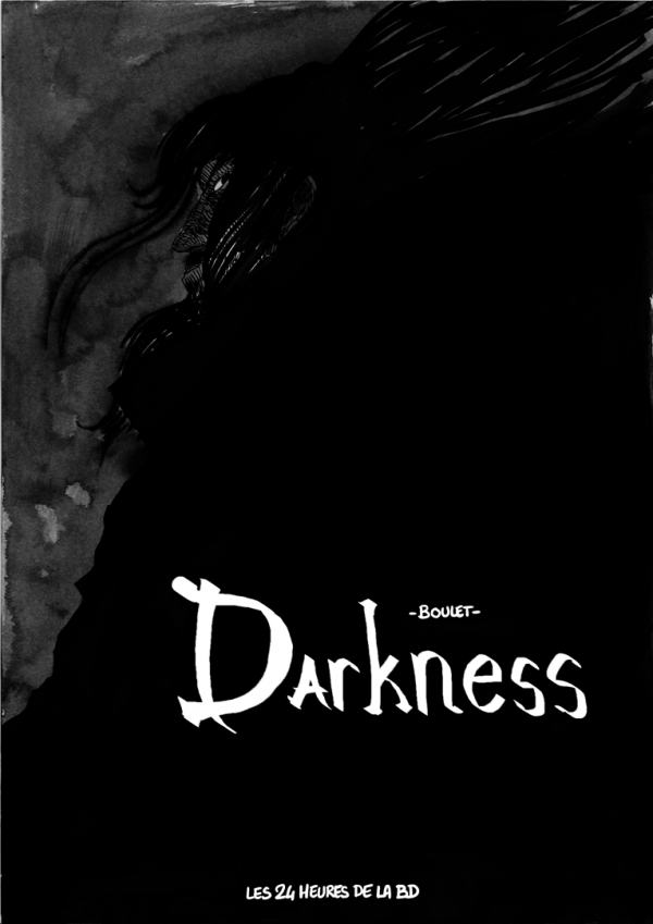
Connections: Jones and Boulet
[CLICK IMAGES TO ENLARGE]

Look Here: WORLD WITHOUT END by Jeffrey Jones
Jeffrey Jones’s “four seasons” portfolio, World without End, was published by S.Q. Productions in 1980 in a signed-and-numbered limited edition of 1000. The choppy but controlled hatching style here — the antithesis of conventional comic-book rendering/feathering — was typical of Jones’s work at the time; for more examples, see “I’m Age,” the wonderful one-page strip by Jones that appeared in Heavy Metal from 1981 to 1984.
[CLICK IMAGES TO ENLARGE]


A cheaper, “unlimited,” unsigned edition of World without End was also published, but that one did not include the black-and-white plate displayed above.
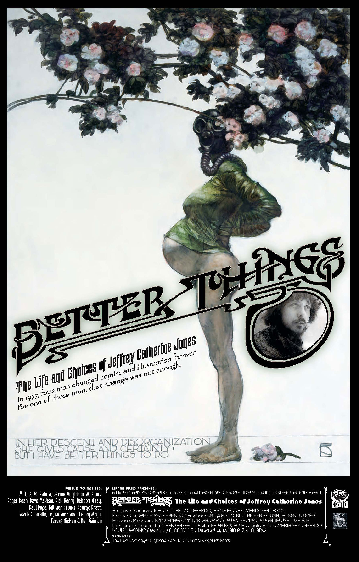
Buy a limited-edition poster and support BETTER THINGS!
Maria Cabardo is still hard at work on her documentary film, Better Things: The Life and Choices of Jeffrey Catherine Jones, but in order to complete the editing, additional money is needed. To that end, designer Mark Winn from BSSP, an ad agency based in Sausalito, CA, has created a lovely limited-edition 27 x 38 inch poster (see below), proceeds from the sale of which will be donated to the production budget of the film. Click here for details on how to order; and yes, PayPal is accepted.
UPDATE (19 September 2011):
Well, I don’t know what happened, but it appears that the page to order the limited-edition poster has disappeared from the MaCab Films site. My apologies to everyone who clicked the link above, expecting to be able to buy a poster and support Better Things. Maybe the order information will reappear at a later date; maybe not. One would have thought that if the poster had sold out, or has been delayed, or the deal fell through, or whatever, there would have been some explanation posted on the official website. But it’s their call on how to handle fund-raising and promotion for their documentary, not mine. Different strokes for different folks.
Look Here: Three more paperbacks with cover art by Jeffrey Jones
[CLICK IMAGES TO ENLARGE]
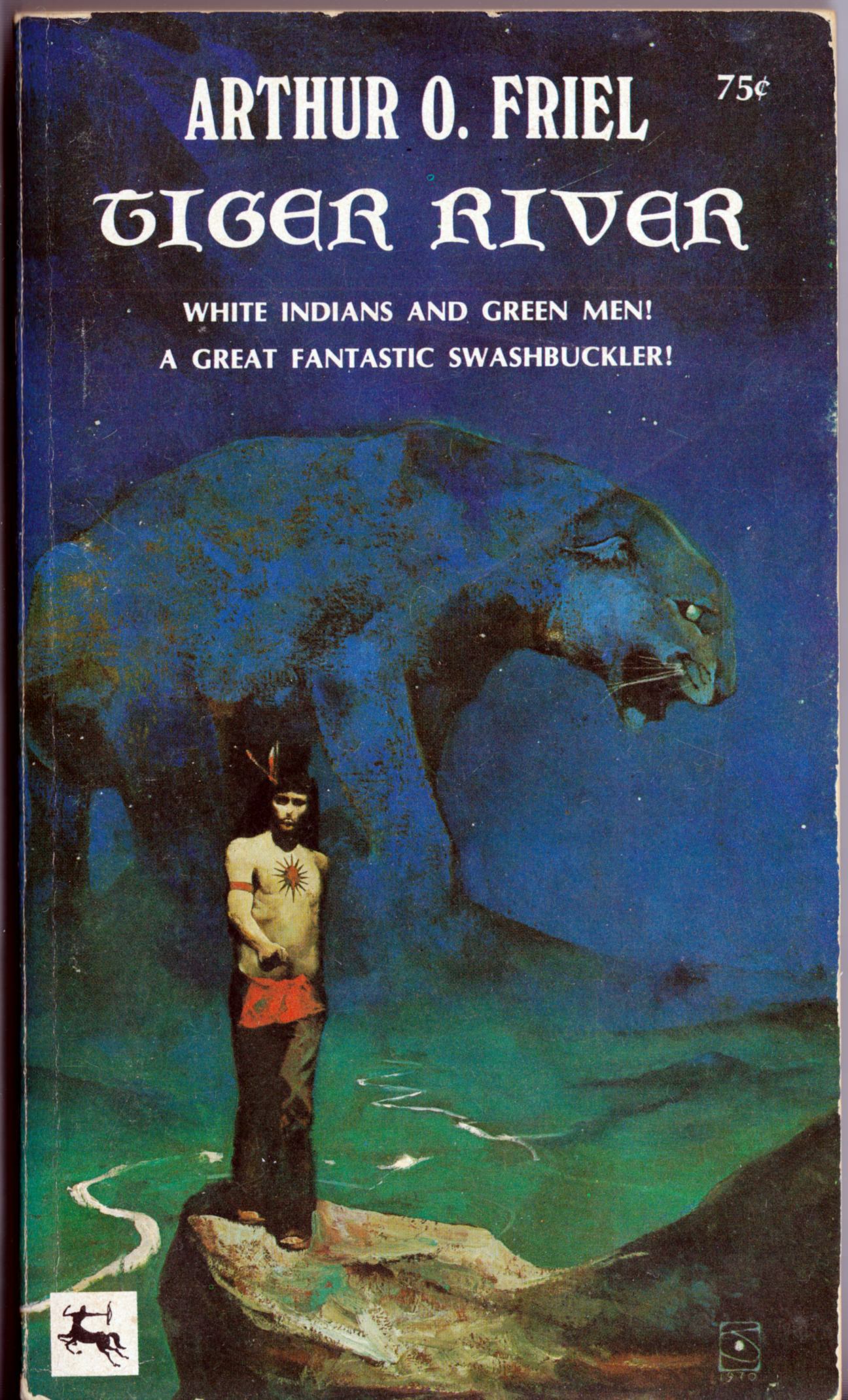
To view all of the books and magazines with cover art by Jeffrey Jones that I’ve posted so far, click here.
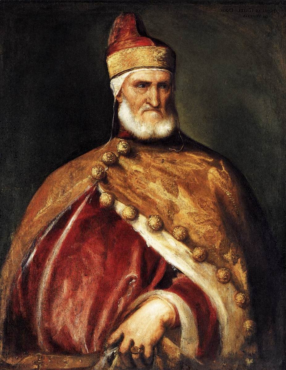
Connections: Titian and Jones
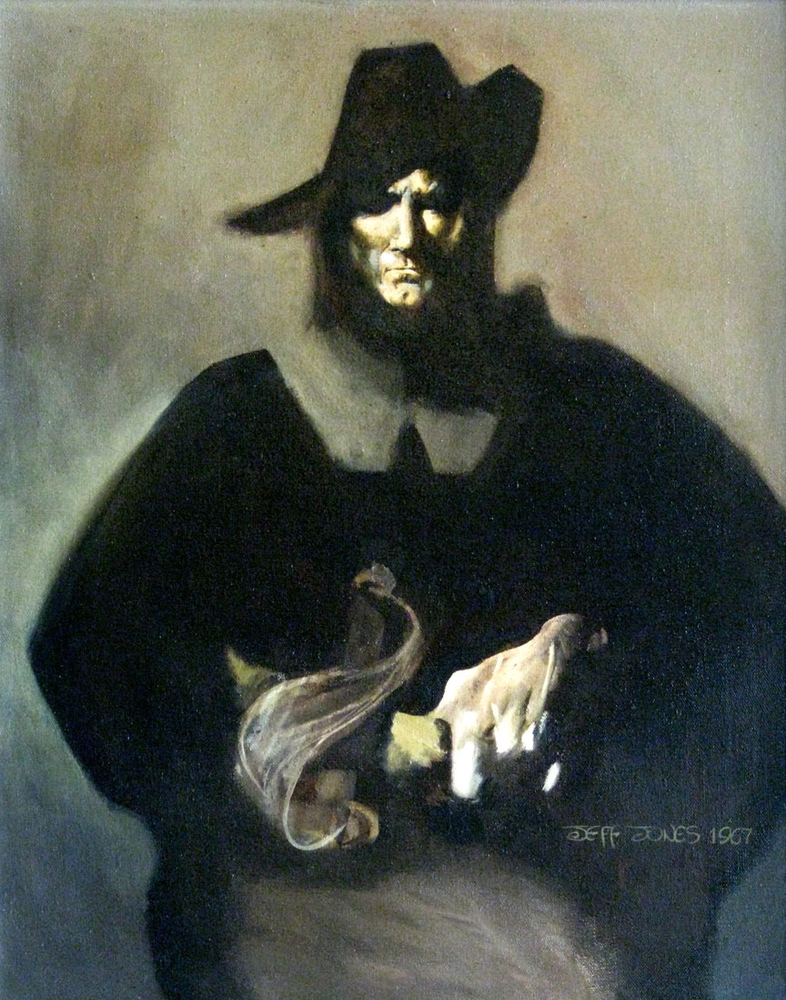
Yesterday afternoon, I spent a little time reading at random in Painting Techniques of the Masters: Painting Lessons from the Great Masters (revised and enlarged edition) by Hereward Lester Cooke, and came across a famous portrait by Titian that, to my eye and mind, could easily have been one of the inspirations for Jeffrey Jones’s oddly proportioned but striking portrait of Robert E. Howard’s Solomon Kane, created for the first edition of a collection of Solomon Kane short stories, Red Shadows, published by Donald M. Grant in 1968:


As the night wind said to the little lamb: Do you see what I see?
POSTSCRIPT:
I wonder, does anyone else think that Jones’s portrait of Solomon Kane is basically a self-portrait? Because I sure do.

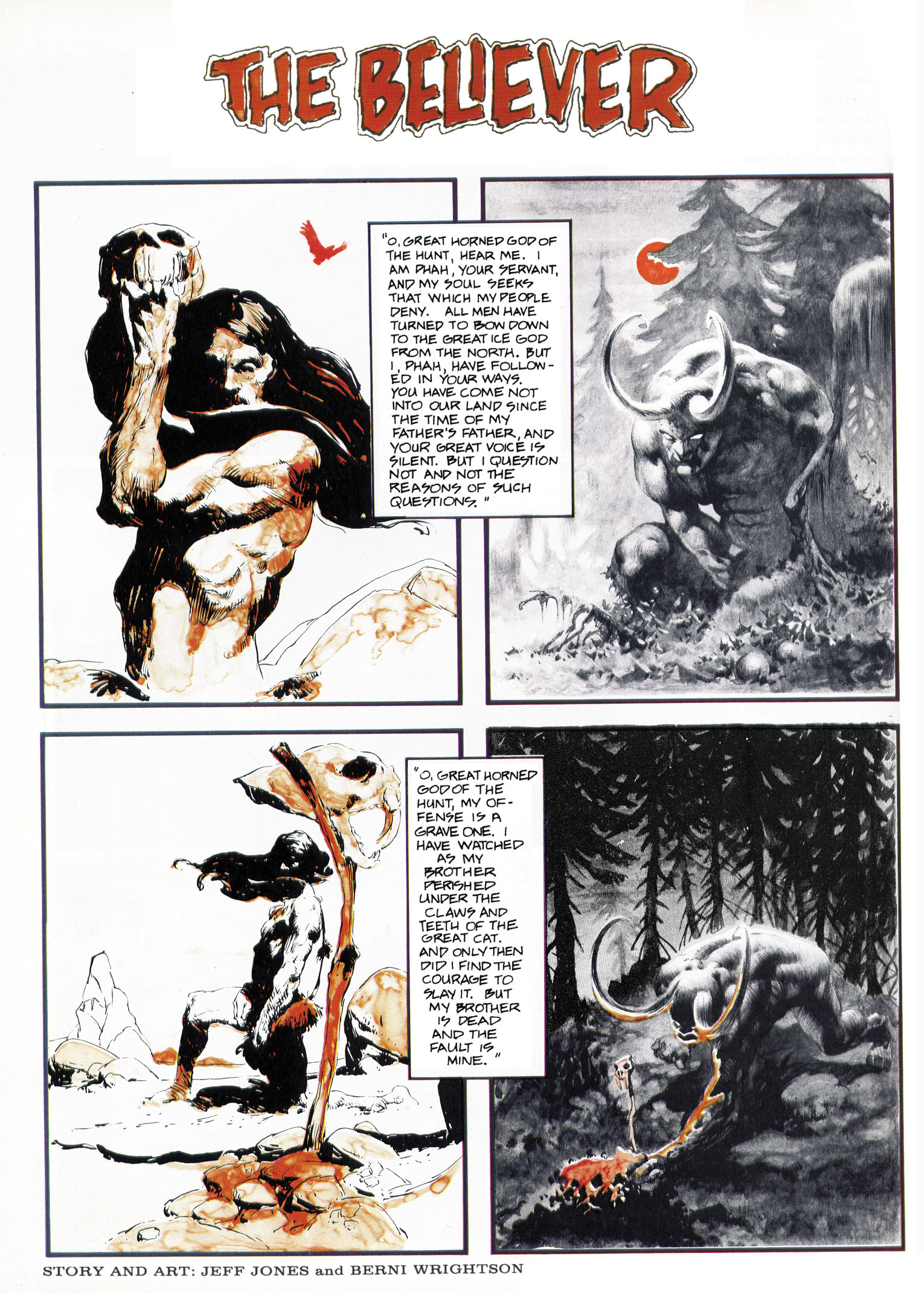
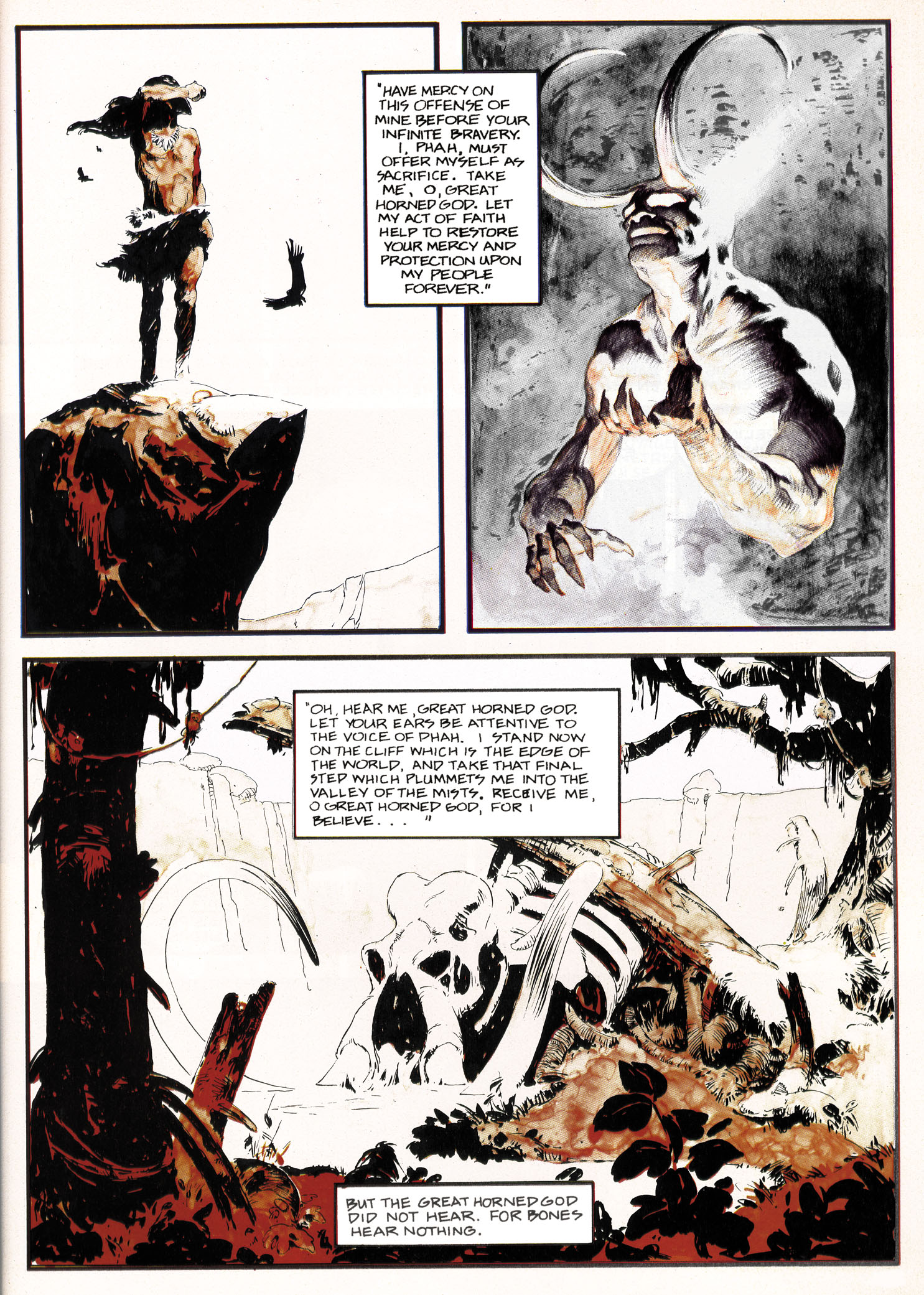
Look Here, Read: “The Believer,” reconstructed by Rotomago
On 30 May 2011, I received a private message from Rotomago — co-creator, with the Serb artist Vuyacha, of a forthcoming graphic novel inspired by the pied piper of Hamelin, creator and maintainer of the Alberto Breccia Bibliografía, and a sometimes visitor to Ragged Claws Network — who made me an offer I couldn’t refuse. After confiding to me, in very personal and moving terms, his thoughts on the recent death of Jeffrey Catherine Jones, Rotomago wrote:
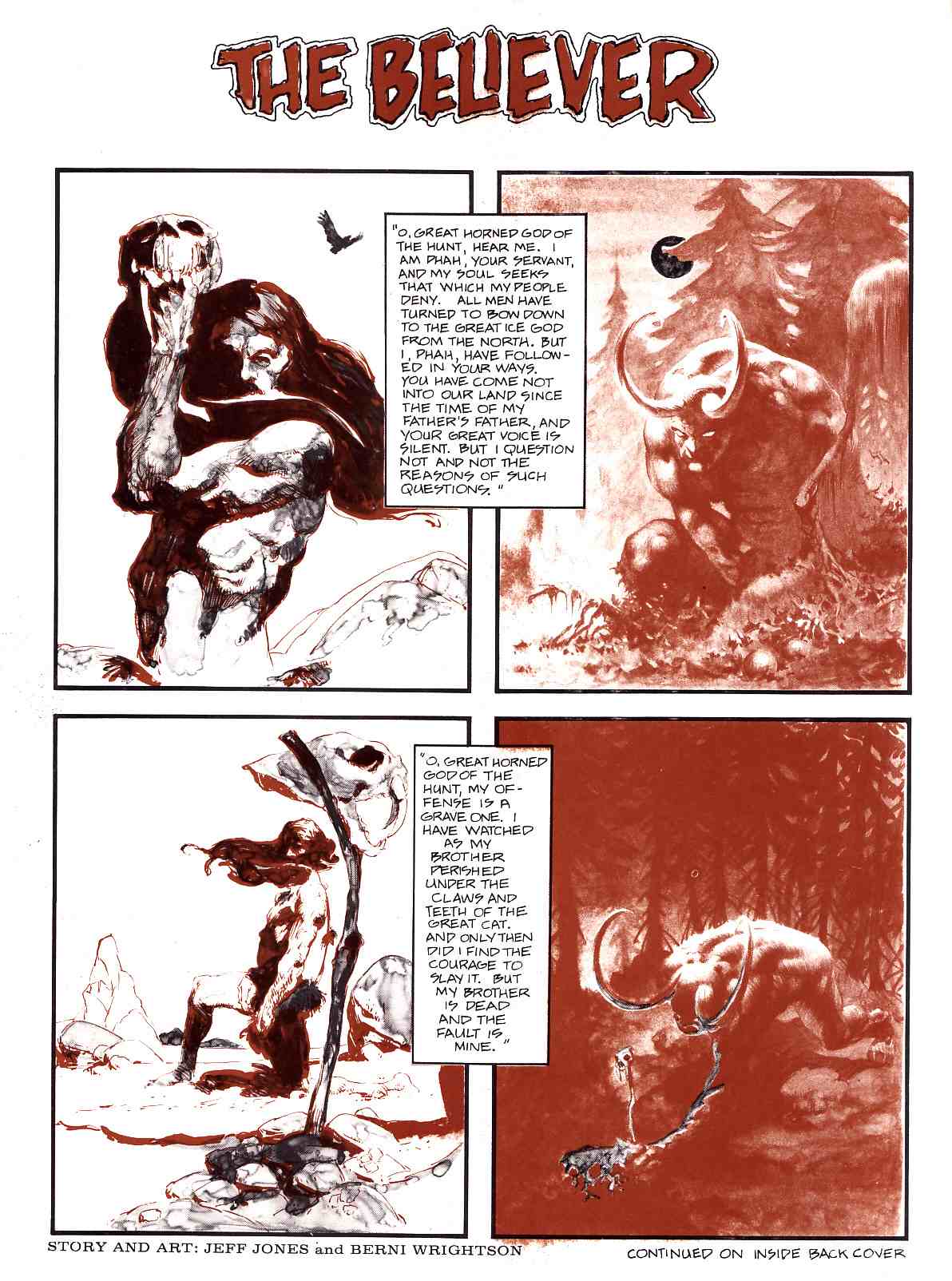
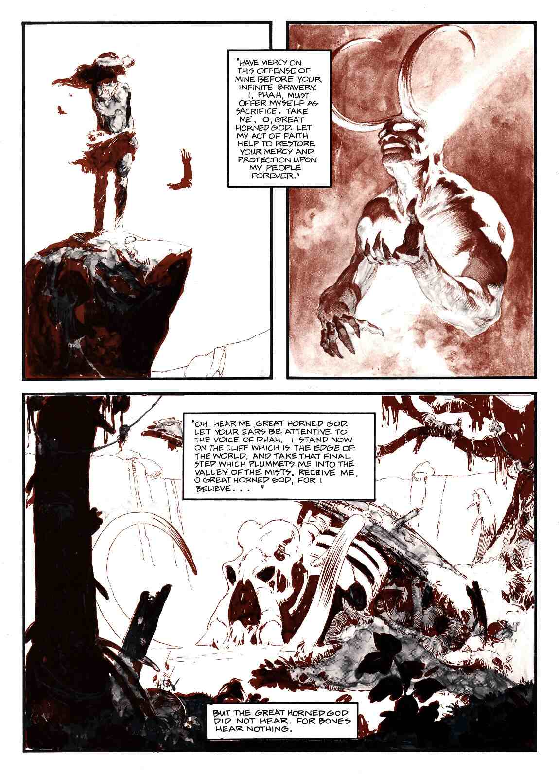
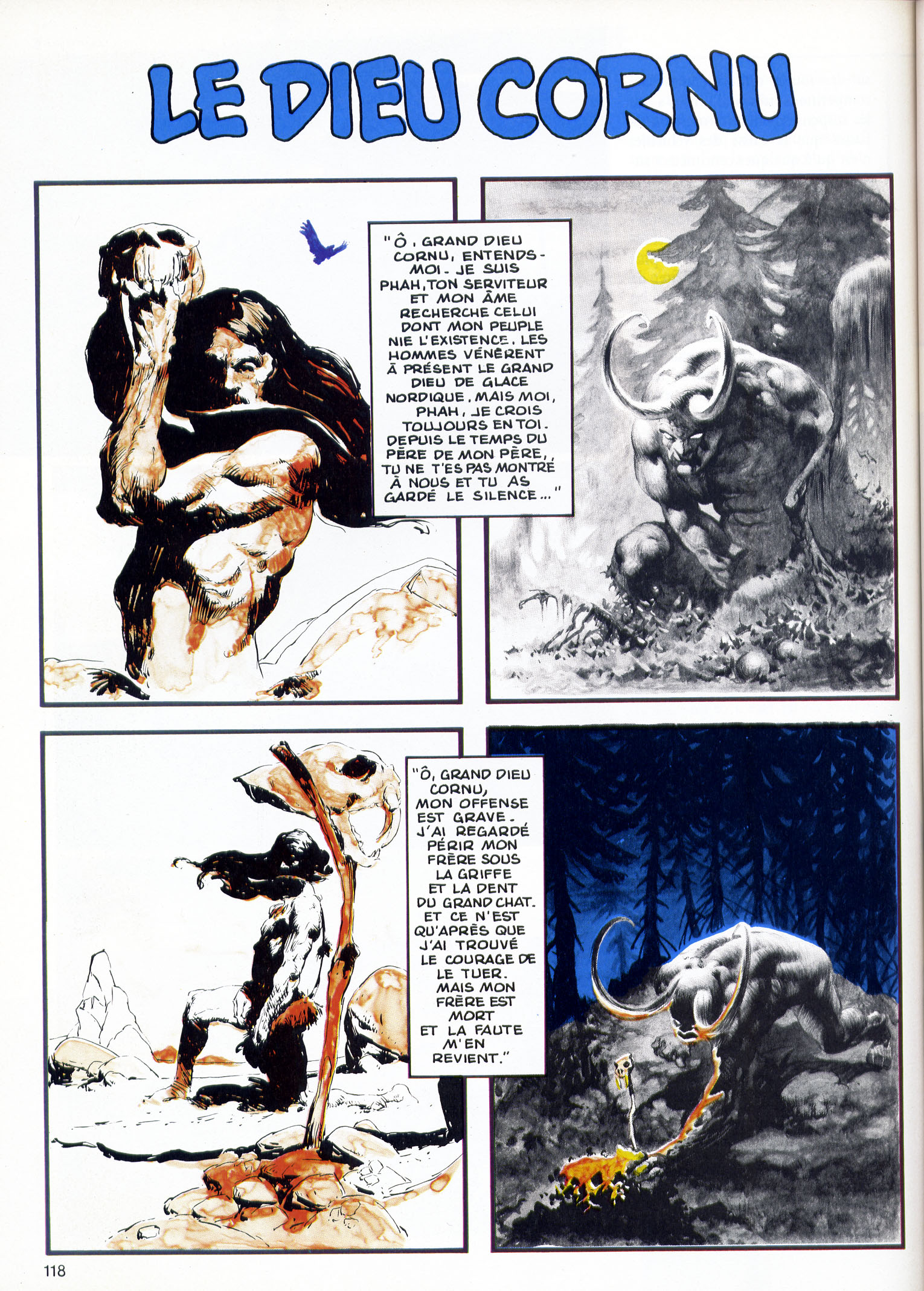
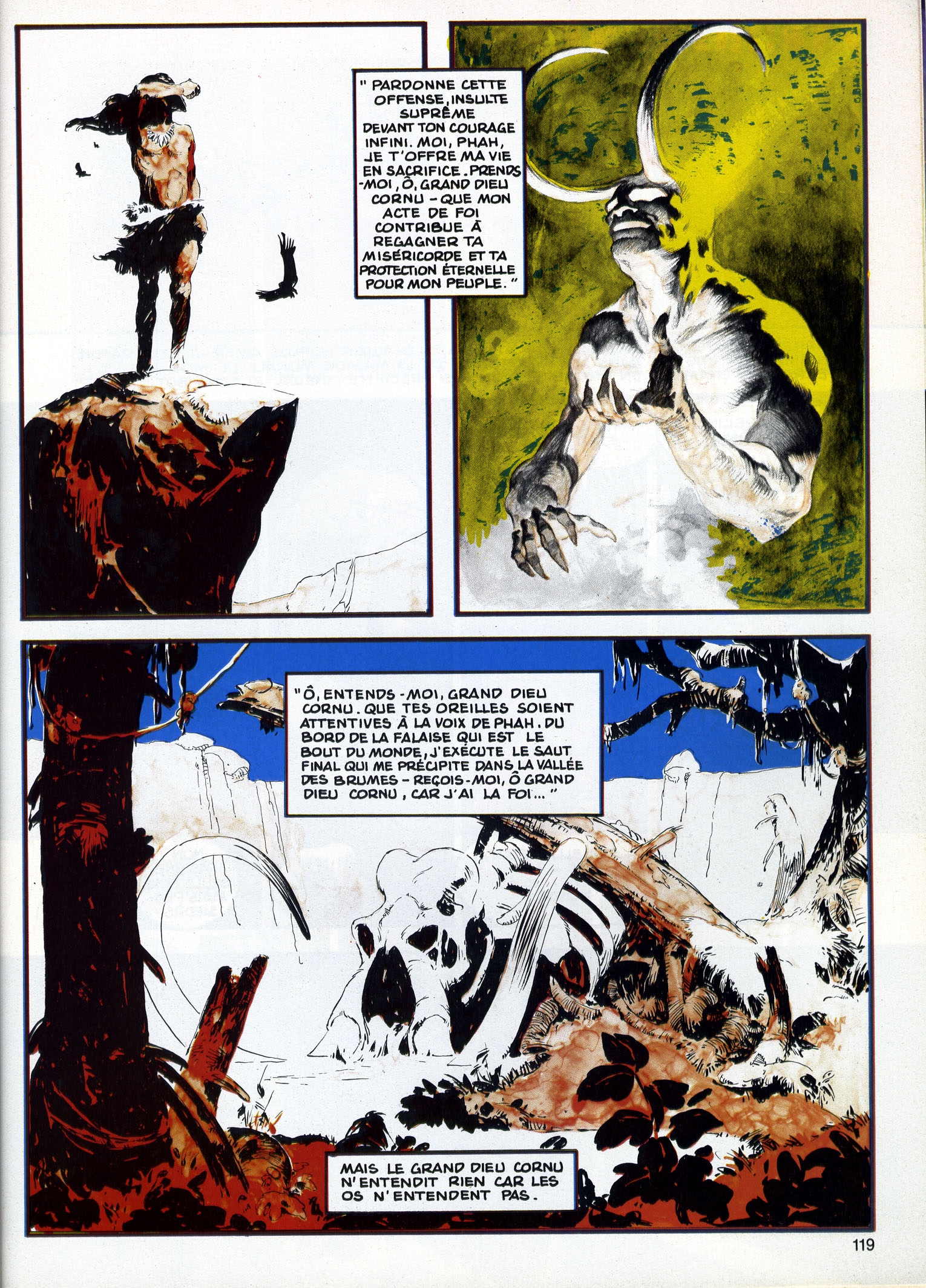
As a way to bring my little rock to the cenotaph, I have a curiosity you may like to put on your website. In the Jeff Jones site, the story THE BELIEVER by Jones and Wrightson is featured. It is mentioned that: «unfortunately the two colors were printed in reverse». The same version is reproduced in the recent book on Jones but it was published in an other way in France, in a four color process printing, in the magazine Special USA n°14/15 in June 1985.
So there it was, out of the blue: in tribute to Jeffrey Jones, a fellow I didn’t know and who didn’t know me wanted provide my blog with scans of “The Believer,” by Jeffrey Jones and Bernie Wrightson, as it was published in a French magazine in 1985, with the colours printed in a way that brought the piece more into line with the intentions of the artists.
I immediately accepted the offer. But it didn’t stop there. The next day, Rotomago emailed me another note, which read, in part, as follows:
Please wait one more day for the Believer. Since both versions are flawed, the original with reversed duotone, the French in four colors with an addition of blue and yellow, I’m actually building a third “virtual” one.
Since I hadn’t yet seen the French version, I had to take Rotomago’s word that it was flawed in some way, but I definitely was intrigued by the promise of a “virtual” version of the story. I did, however, email Rotomago to ask him, please, if he would, to send me the flawed French version as well as his new and improved version. I explained that my plan, hatched at that very moment, was to display the two versions that he would have in hand once he was done together with the original version, which I already had on display here at RCN, in a single post. I said I thought it would be instructive.
This morning, I received the files, and now here I am, ready to share them with you.
But please note: if you wish to share the “virtual” version of “The Believer” with others — I know I can’t stop you — I hope that you will acknowledge Rotomago as the wizard who has brought the story as close as it has ever been to the original intentions of Jones and Wrightson and perhaps even give credit to RCN as the source of the files. Or better yet, don’t just take the files and re-post them but instead simply link to this post.
Anyway, that being said, let’s take (another) look at “The Believer” as it originally appeared on the inside-front and inside-back covers of Vampirella #33, way back in 1974; notice that, although most of the panels look okay despite the printing error, one panel in particular, the last panel on the first page, is extremely difficult to decipher:
Next up is the version of “The Believer” that appeared, in French, in Special USA #14/15 in June 1985, just over ten years after the story’s original publication; notice that, with four colours at their disposal rather than two, the powers that be at Special USA took it upon themselves to tart up the art with obtrusive swatches of deep cerulean blue and acid yellow:
And now, at last, here’s Rotomago’s reconstruction of “The Believer,” with the colours as they ought to have been printed way back in 1974:
In the message that accompanied the files, Rotomago shared the following observations, which I will now share with you:
It surely would be feasible to make a decent reconstructed version fitted for publication. It would require multiple high-quality scans of both versions, a subtle balance of the colors layers, some alteration in the place of colors layers as the overlapping of colors is not always correct in the French version, a very long pixel by pixel cleansing (especially to remove the green stains [probably added by the French color engraver] in the background of Wrightson’s Page2 Panel2), as well as a slight increase in the size of pages to avoid blurring.
But for the web view, I hope that this far from perfect version, will do the job.
Note that after having spent some time studying these two pages on my screen, my fancy for them has even more increased! Such delicate and subtle pictures!
Although I, for one, sort of miss the fiery red-orange cast of Wrightson’s horned-god panels as they appeared in the original printing, I’m sure that fans of Jeffrey Jones and Bernie Wrightson will want to thank Rotomago for the terrific work he has done to reconstruct “The Believer” that should have been but wasn’t. But even if they don’t, I know that I personally want to thank him, again, for his surprising, unsolicited contribution to this site and for going the extra mile to enhance our appreciation of a story that many have admired over the years but none have seen reproduced in exactly this way before, ever.
Finally, one more time, here are the links to Rotomago’s blogs:
