Always on the online lookout for interesting but reasonably priced original art to add to our art collection and contemplate on our walls, I recently stumbled upon the etsy shop of self-taught artist Matt Kish, and noticed a handmade collage that seemed to be calling my name:
[CLICK IMAGE TO ENLARGE]
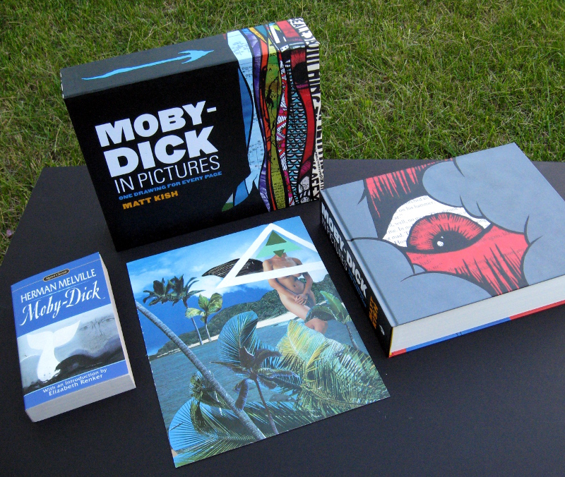
The collage is one of a series of works inspired by Herman Melville’s Moby Dick that Kish produced from August 2009 to January 2011. The task Kish set for himself in the summer of 2009 was to produce one illustration for every page of the Signet Classic edition of Melville’s novel — 552 pages, 552 illustrations — and to share each one online as it was completed. Kish worked at the punishing rate of one illustration per day, and when he was done, all of the pages were assembled into a lavish slip-cased hardcover book, Moby-Dick in Pictures: One Drawing for Every Page, published by Tin House Books in late 2011.
“The artist has to be something like a whale swimming with his mouth wide open, absorbing everything until he has what he really needs.”
— Romare Bearden
A seminal inspiration for Moby-Dick in Pictures was “Zak Smith’s Illustrations for Each Page of Gravity’s Rainbow” (2006). Casting around in the summer of 2009 for a project to focus his creative energies, Kish was greatly inspired by the fact that Smith began illustrating Thomas Pynchon’s acclaimed novel as a personal project, without any plans for publication or much else beyond a quixotic desire to test his limits by challenging himself to run a crazy creative marathon from start to finish. It took Smith nine months of obsessive work — he produced at least three pictures a day, most days, and oftentimes more — but when he was done, he had about 760 images in hand, and online, and was ready to make the most of the public attention his visual aubade to Pynchon’s masterpiece had begun to attract. And lo, less than a year later, it came to pass that all of the artwork Smith had produced was exhibited, as a group, at the Whitney Museum’s 2004 Biennial Exhibition of Contemporary Art and about a year and a half after that, the images were assembled into a fat art book entitled Pictures Showing What Happens on Each Page of Thomas Pynchon’s Novel Gravity’s Rainbow. And what’s more, the entire series was purchased by the Walker Art Center in Minneapolis and currently resides in the Center’s permanent collection. But whereas Smith had attended art school and was already a working artist before he began his series, Kish was actually a librarian by vocation and an artist only by avocation — which is to say, he had a day job! So naturally, when he began his project to illustrate each page of Moby Dick, working at odd hours in the cramped confines of his closet studio, Kish hardly even dared to dream that eventually he and Smith would share the same publisher!
“I have never considered myself an artist. My undergraduate degree is in secondary education with a focus on English, and my master’s degree, earned over a decade later, is in library and information science. I have no MFA, or even a BFA, to bolster my credibility or lend authenticity to any ‘artist’s statements’ I might hope to one day display on a placard pasted to a wall next to where one of my illustrations hangs. And yet, in spite of this, I have been making pictures for my entire life.”
— Matt Kish, “About this project, #1”
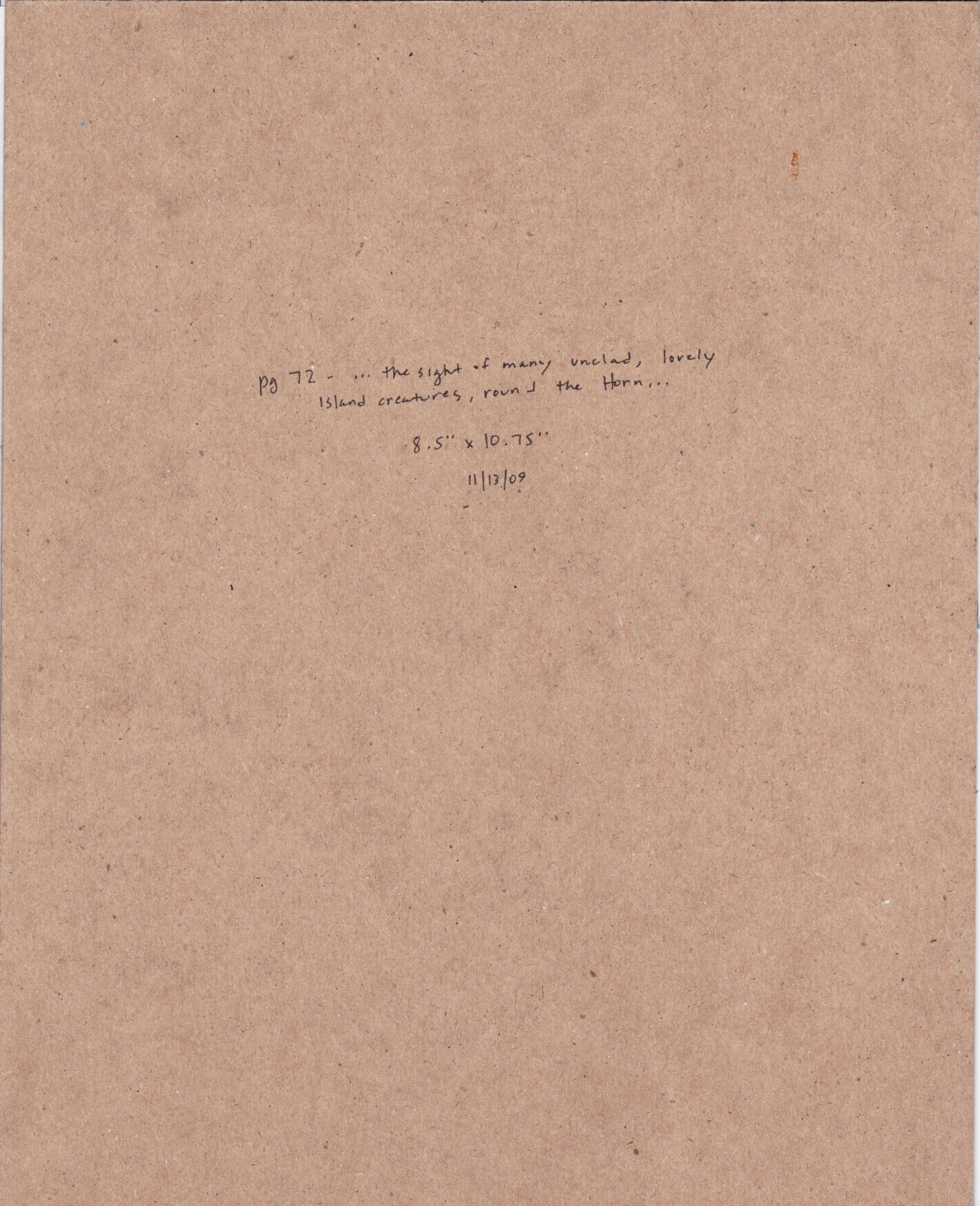
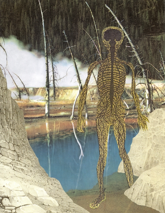
Completed on 13 November 2009, the collage from Moby-Dick in Pictures that my wife and I now own is the illustration for page 72 of the novel and is entitled “… the sight of many unclad, lovely island creatures, round the Horn….” The full paragraph of which the title is an excerpt reads as follows:
Like Captain Peleg, Captain Bildad was a well-to-do, retired whaleman. But unlike Captain Peleg — who cared not a rush for what are called serious things, and indeed deemed those selfsame serious things the veriest of all trifles — Captain Bildad had not only been originally educated according to the strictest sect of Nantucket Quakerism, but all his subsequent ocean life, and the sight of many unclad, lovely island creatures, round the Horn [emphasis added] — all that had not moved this native born Quaker one single jot, had not so much as altered one angle of his vest. Still, for all this immutableness, was there some lack of common consistency about worthy Captain Bildad. Though refusing, from conscientious scruples, to bear arms against land invaders, yet himself had illimitably invaded the Atlantic and Pacific; and though a sworn foe to human bloodshed, yet had he in his straight-bodied coat, spilled tuns upon tuns of leviathan gore. How now in the contemplative evening of his days, the pious Bildad reconciled these things in the reminiscence, I do not know; but it did not seem to concern him much, and very probably he had long since come to the sage and sensible conclusion that a man’s religion is one thing, and this practical world quite another. This world pays dividends. Rising from a little cabin-boy in short clothes of the drabbest drab, to a harpooneer in a broad shad-bellied waistcoat; from that becoming boat-header, chief-mate, and captain, and finally a ship owner; Bildad, as I hinted before, had concluded his adventurous career by wholly retiring from active life at the goodly age of sixty, and dedicating his remaining days to the quiet receiving of his well-earned income. [Herman Melville, Moby Dick (Signet Classics, 1998), p. 72.]
(The irony has not escaped me that, while Captain Bildad could effortlessly resist “the sight of many unclad, lovely island creatures, round the Horn,” I could not resist the mere image of one unclad, lovely island creature, posted online — although I would argue that there’s much more to Matt’s collage than that! But to offer further justification for my purchase would be to protest too much, right? Just you wait and see!)
The collage is 8.5 inches wide by 10.75 inches high, and the materials are listed on Kish’s website as “acrylic paint and collage on chip board.” Truth be told, I was initially confused by the term “chip board,” which here in Canada is used to refer to a type of engineered wood product that was developed years ago as a relatively inexpensive alternative to plywood. Which is to say, when I bought the collage, I actually thought it would arrive glued down to a piece of wood, but no, it turns out that chip board is simply an American term for a type of paperboard generally made from reclaimed paper stock. I’m not sure what the Canadian term is for American “chip board,” but…
… be that as it may, the day after I purchased Kish’s collage, I happened to find myself at the local Value Village, thumbing through the old record albums, of which there were many on display that day, when I noticed the following album, which I purchased post-haste so that I could scan the cover and share it with you, right here, right now:
[CLICK IMAGE TO ENLARGE]
Of course, the similarity of the above album cover for Hawaii by “Johnny Pineapple and his Islanders” to Matt Kish’s collage is pure concidence, but the elements are all there — the intense blue background, the leaning/swaying palm trees, the naked woman, the strategically placed palm fronds — all, that is, except for the triangular symbolic mask (or surface pattern, if you prefer, or target… perhaps it’s an elaborate reticle in the eyepiece of a sighting device used by one of the sailors) that Kish has painted over the face and chest of the woman in his version of the scene (not to mention the angel/devil wing that juts from her back, somewhere behind her right shoulder). The album cover is mundane, an okay photograph of what is obviously a studio set-up of a subject intended to catch your eye in the record bin and let you know instantly that THIS is an LP of “Hawaiian” music, and nothing more. The collage, however, is something more, and it is the mask/pattern/target/reticle, combined with the collage technique itself, which possesses an intrinsic disruptive power, that makes it something more: something more provocative, something more mysterious, something more poetic.
And then — this post seems to be all about connections — a few weeks later, I happened to be browsing through an online gallery of collages by Jeffrey Meyer, when I noticed an image that I immediately thought would be the perfect companion for Matt Kish’s piece:
[CLICK IMAGE TO ENLARGE]
For obvious reasons — at least, I think they’re obvious… opposites attract… for every yin, a yang — I really wanted to see Jeffrey Meyer‘s Fly in the Primordial Soup hanging on the wall in our home alongside Matt Kish’s “…the sight of many unclad, lovely island creatures, round the Horn….” But alas and alack, ’twas not to be. The collage had been sold. I was out of luck.
Well, not quite out of luck, because I have since made arrangements to buy three other collages from Jeffrey, and I have to say, even though I don’t have them in hand yet, I’m already having a lot of fun imagining how they will look, properly framed and sensitively displayed, as an informal triptych, in various sequences, in various locations, in our house. And yet I also feel confident that their incandescent reality will, in the fullness of time, effortlessly outshine my foolish flickering daydreams.
But that’s a show-and-tell for another day.
BONUS IMAGES & LINKS:
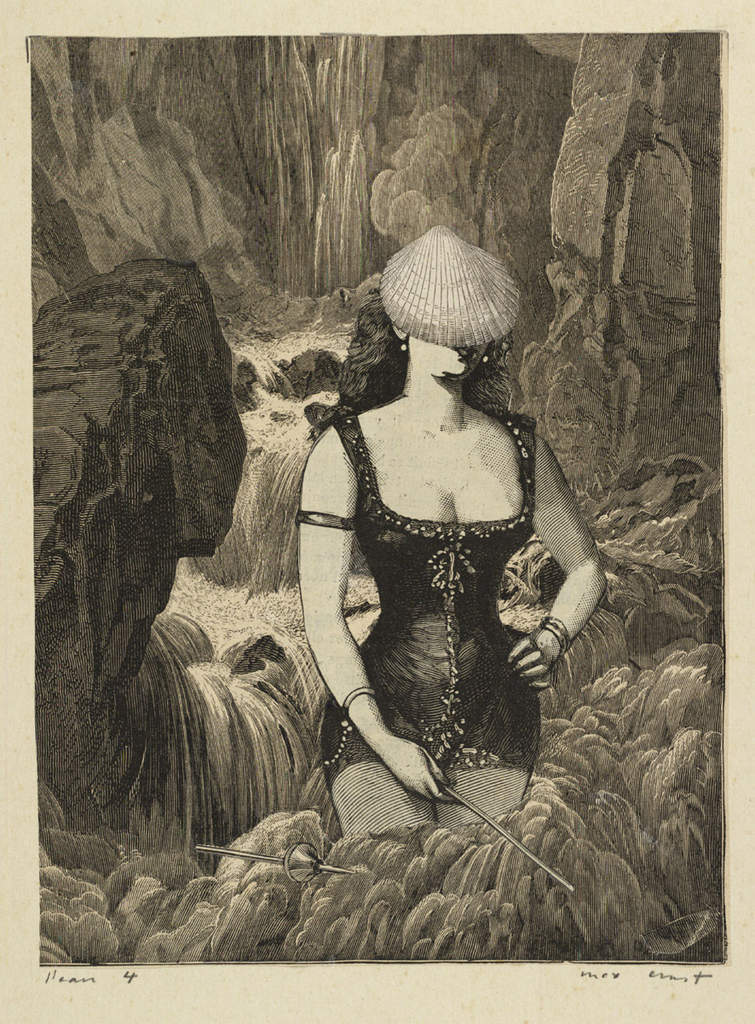
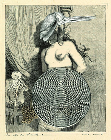
Since damn near every collage artist owes a debt to Max Ernst, here are a couple of (non-randomly selected) collages by the great man himself:
You will find the above images and more if you click this link and this one.
“Again, of all the things that come to us by nature we first acquire the potentiality and later exhibit the activity (this is plain in the case of the senses; for it was not by often seeing or often hearing that we got these senses, but on the contrary we had them before we used them, and did not come to have them by using them); but the virtues we get by first exercising them, as also happens in the case of the arts as well. For the things we have to learn before we can do them, we learn by doing them, e.g. men become builders by building and lyreplayers by playing the lyre; so too we become just by doing just acts, temperate by doing temperate acts, brave by doing brave acts.”
— Aristotle, Chapter I, Book II, The Nicomachean Ethics
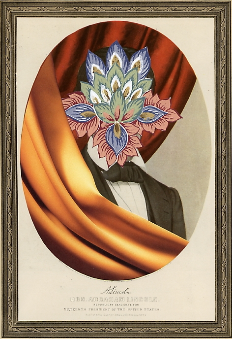
And finally, here’s another collage by Jeffrey Meyer, whose work Kish has repeatedly praised on his blog, and whose advice was invaluable to Kish when he began to create his own collages; this one’s entitled Assassination (9 x 12 in.):