Book/Magazine Covers (All) · Illustration Art · Look Here · Milton Glaser

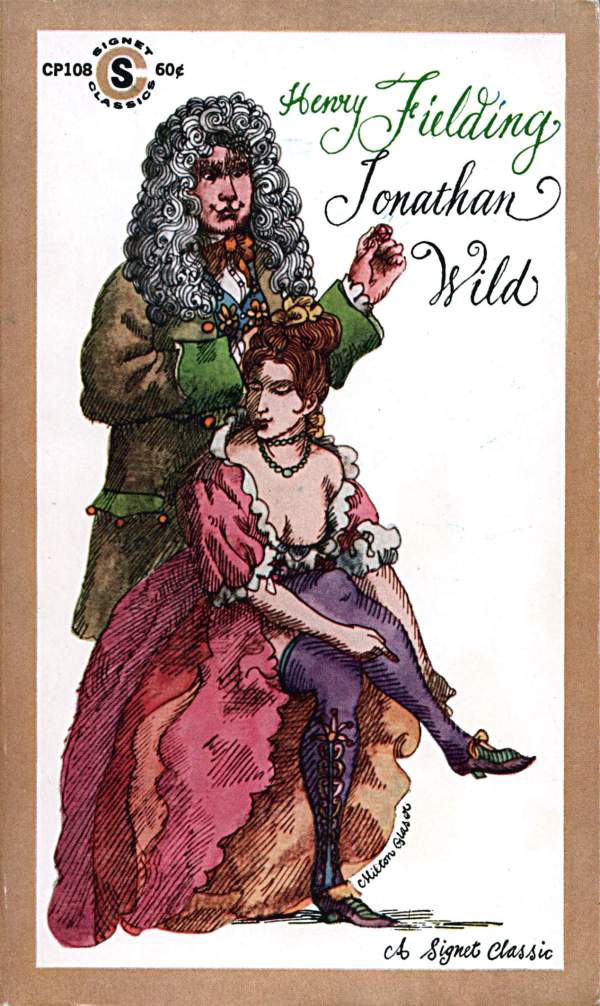
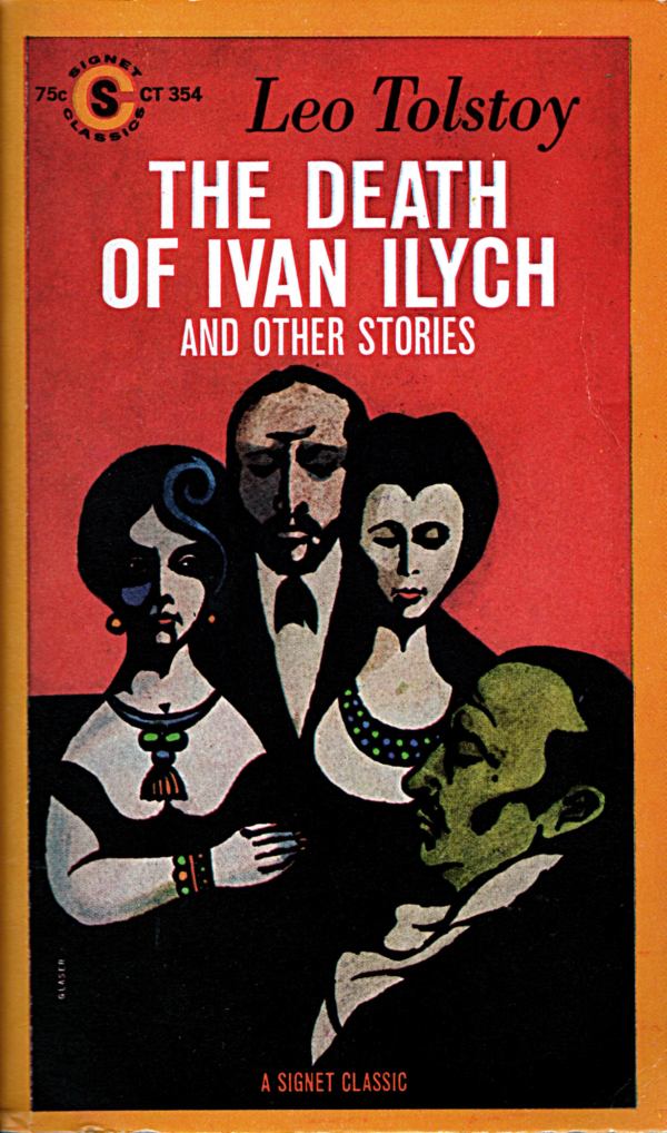
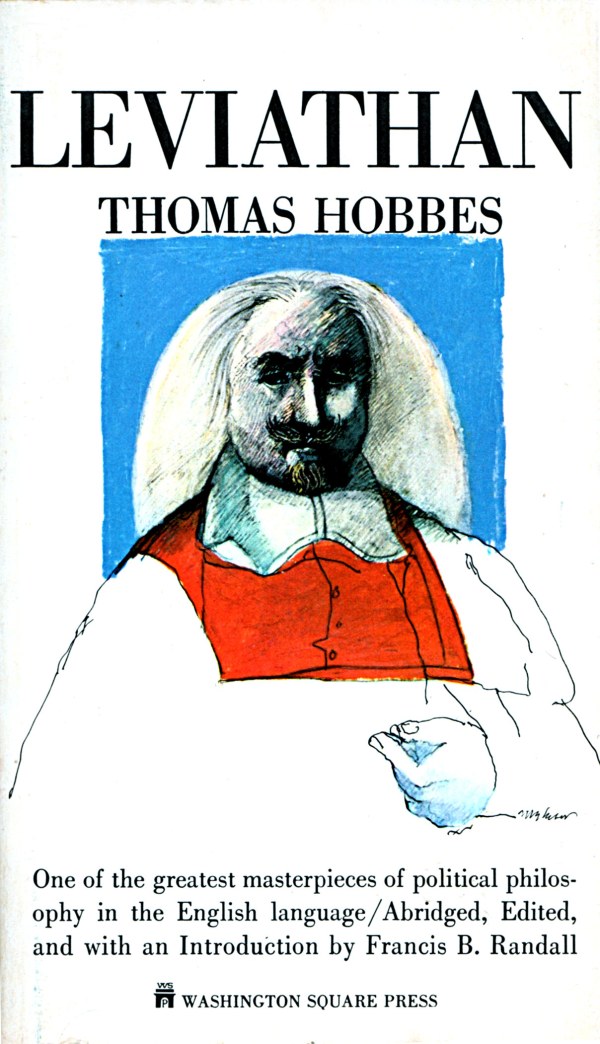
Look Here: Three classics with cover art by Milton Glaser

More cover scans, from the library of yours truly:

[CLICK IMAGES TO ENLARGE]

Keywords: Leviathan by Thomas Hobbes, The Death of Ivan Ilych by Leo Tolstoy, Jonathan Wild by Henry Fielding.


BONUS IMAGE:

Abram Games · Illustration Art · Look Here

Look Here: One powerful paperback cover with art by Abram Games

As a young man with a budding career as a freelance poster artist, Abram Games (1914-1996) first rose to prominence as Britain’s Official War Artist for posters during World War II, and parlayed his success in that effort into an award-winning post-War freelance career in advertising, corporate branding, book design, and more. His bold, seductive, innovative combinations of image and text attracted clients such Shell, Financial Times, Guinness, British European Airways, the Royal Shakespeare Company, London Transport, El Al, and the United Nations. He designed stamps for Britain, Ireland, Israel, Jersey and Portugal. He designed logos for the 1951 Festival of Britain (winning the 1948 competition), BBC Television (1953), JFS (a Jewish secondary school in Kenton, north London), and the 1965 Queen’s Award to Industry. He produced murals. He invented a vacuum coffee maker — the Cona Coffee Machine — that is still in production today as well as a circular vacuum cleaner and a portable hand-held duplicating machine. And he designed and illustrated book jackets for the legendary British publisher, Penguin Books, among others.

Why am I telling you all this? Because earlier today I happily paid a buck for a beat up copy of the 1958 Penguin paperback edition of Flames in the Sky, a “History of the War in the Air” by a military insider, the French flying ace Pierre Clostermann. Although the cover art is uncredited, it is clearly signed “A. Games.” But that meant nothing to me until after I got home with my purchase and looked up A. Games via Google and found articles about his career on the Wikipedia and Design Museum sites. I just bought the book because I thought the cover was first rate! Here’s a scan of my find:

[CLICK IMAGES TO ENLARGE]

Gertrude A. Kay · Howard Pyle · Illustration Art · Look Here

Look Here: Four sumptuous colour illustrations by Gertrude A. Kay

Seems like I’m constantly flipping through dusty, inexpensive old books searching for hidden gems of illustration, and more often than not, coming up empty. Yesterday, however, I finally, after a bit of a drought, came across a book with pictures that I thought would make a lovely addition to the archive here at RCN.

[CLICK IMAGES TO ENLARGE]

The interior images are a little soft, but that’s due more to certain technical shortcomings of the reproduction than to my obdurate incompetence as a scanner.

What I didn’t realize when I purchased The Little Lame Prince and Other Stories (Philadelphia: David McKay Company, 1927) by Dinah Maria Mulock, is that the illustrator, Gertrude A. Kay, was a student of Howard Pyle at the Drexel Institute in Philadelphia! You can read a short profile of Gertrude A. Kay, who was successful both as a illustrator for women’s magazines and as a writer and illustrator of children’s books, over at a site called Illustration Art Solutions.

Artist Self-Portraits · Connections · Fine Art · Look Here · Vincent van Gogh

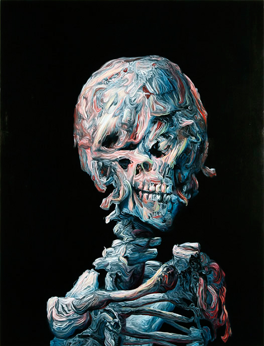
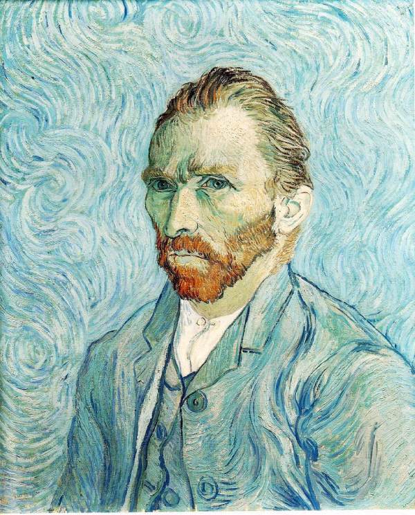
Connections: Vincent van Gogh and Glenn Brown

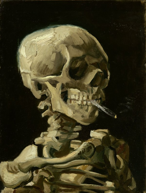
I posted the following three images one after the other on TRANSISTORADIO earlier today, but I have since had the thought that perhaps a few folks who don’t follow my tumblr but do follow this blog will appreciate the juxtaposition, too, so here the images are, together again for the first time in a single post:

[CLICK IMAGES TO ENLARGE]
Art Collection · Illustration Art · John Buscema · Look Here

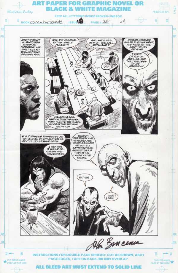
Look Here: A Conan page with pencils, inks, and tones by John Buscema

I recently built a plywood cabinet that is two-feet deep by three-feet wide by four-feet high, with five adjustable middle shelves and one non-adjustable bottom shelf, as a central location to store original artwork, limited-edition portfolios, a couple of massive art books, full sheets of watercolour paper, etc., which means I am now able easily to shuffle through our collection for items to scan and display here at RCN.

First up is a page of original art by John Buscema from issue #10 of Conan the Savage, a short-lived, black-and-white Conan spin-off series from the mid-1990s; the story is titled “The Necromancers of Na’at.” I bought the page for three main reasons: 1) I had long coveted a page with BOTH pencils and inks by John Buscema; 2) the pencils, inks, and China Marker tones here are ALL by John Buscema, and 3) the price was right. The fact that the page is signed by Buscema didn’t really enter into the equation, but it’s a nice bonus, I think.

Here, take a look:

[CLICK IMAGES TO ENLARGE]
To be perfectly frank, if I had had unlimited funds, this is not the page I would have selected. Instead, I would have snapped up a Conan the Barbarian page or three from one of those issues where Big John inked his own pencils without the additional China Marker shading. Unfortunately, such pages are prohibitively expensive for low-level collectors like me. So long ago I made up my mind to be happy with the best of what I could and can afford!

Book/Magazine Covers (All) · Illustration Art · Kelly Freas · Look Here

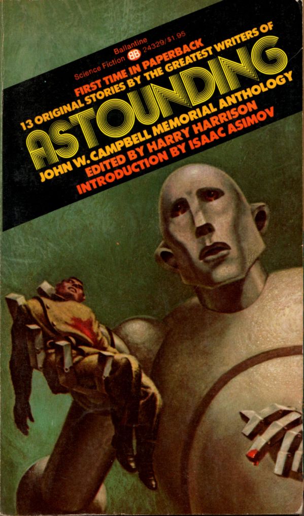
Look Here: Four more splendid SF covers with art by Kelly Freas

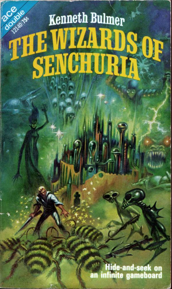
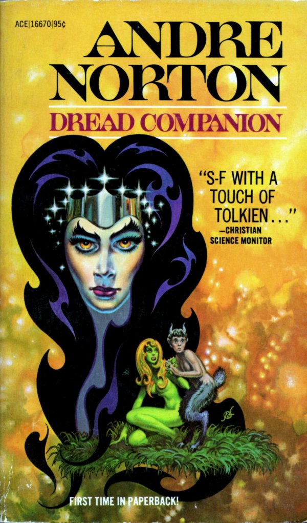
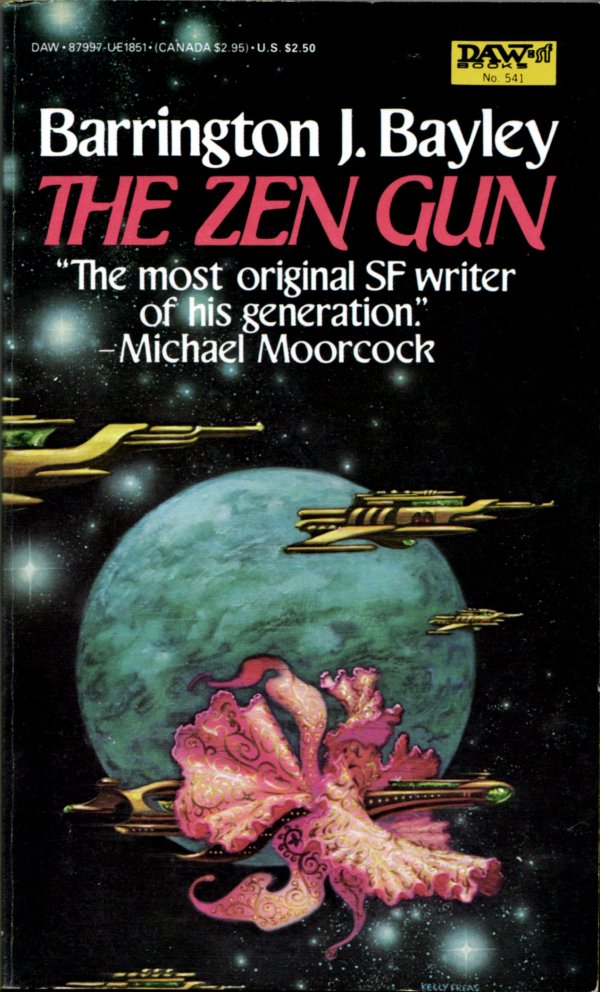
As promised almost two weeks ago, here are four more covers with art by Kelly Freas, freshly scanned from the collection of yours truly:

[CLICK IMAGES TO ENLARGE]
Older SF fans will no doubt recognize the illustration on the cover of Astounding: John W. Campbell Memorial Anthology as a reprint of the famous cover of the October 1953 issue of Astounding Science Fiction, which, apparently, was Kelly Freas’s debut as an SF illustrator. Campbell commissioned the cover from Freas as an accompaniment to Tom Godwin’s short story “The Gulf Between” — not included in the memorial anthology — and twenty-four years later, the rock band, Queen, commissioned Freas to created a pastiche of the image for their 1977 album, News of the World.

Keywords: Frank Kelly Freas; Astounding, edited by Harry Harrison; Dread Companion by Andre Norton; The Zen Gun by Barrington J. Bayley; The Wizards of Senchuria by Kenneth Bulmer.

Illustration Art · John Schoenherr · Look Here

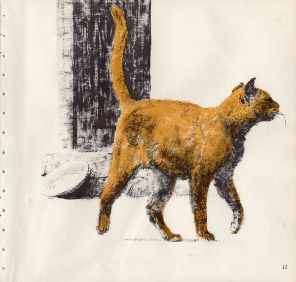
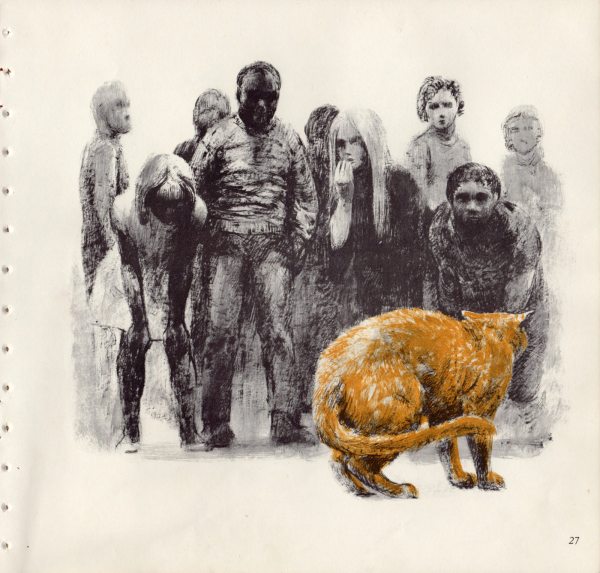
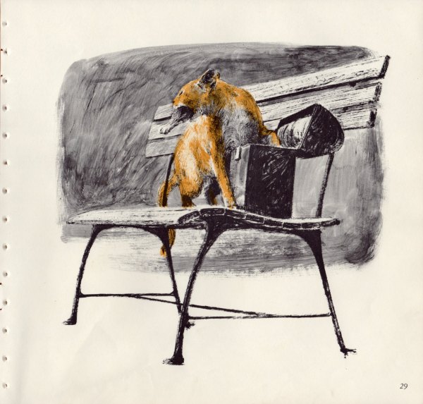
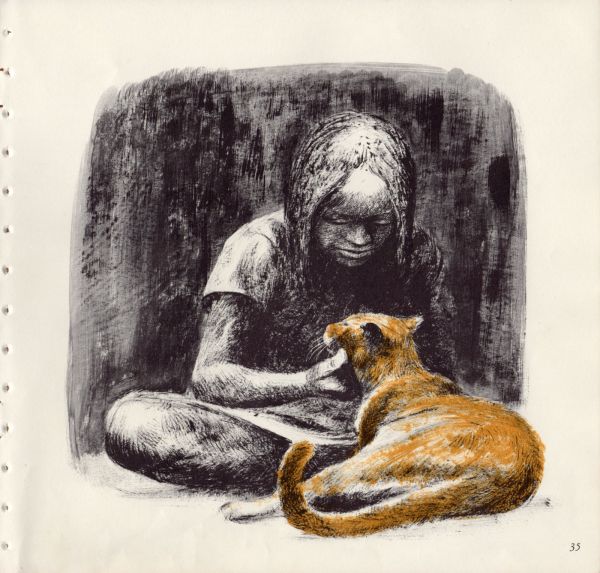
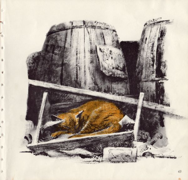
Look Here: Selections from NOBODY’S CAT, illustrated by John Schoenherr

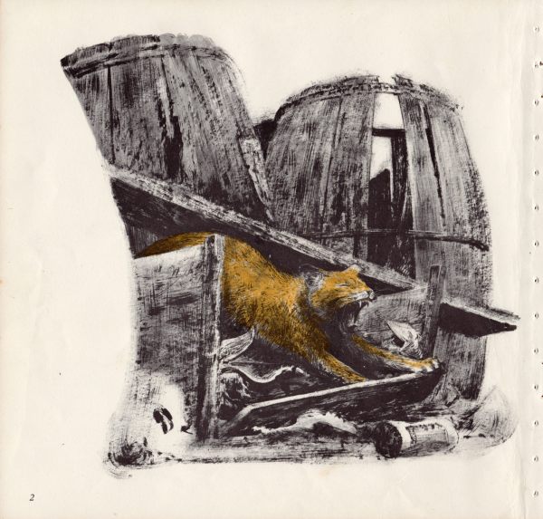
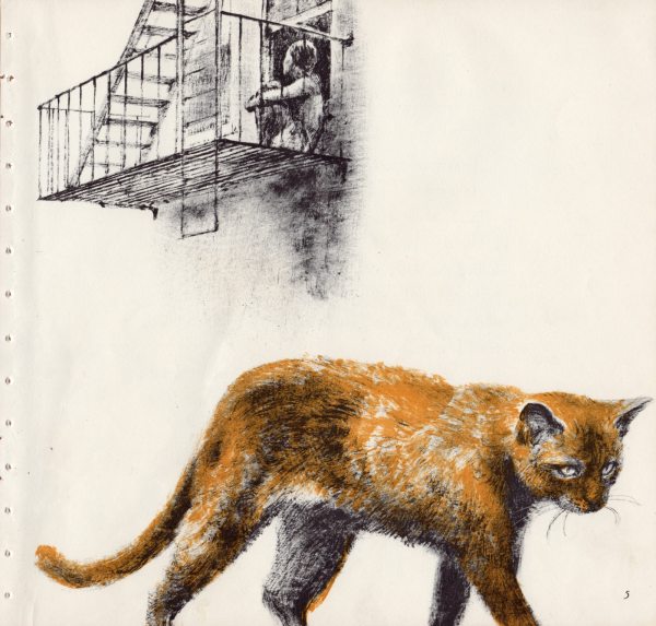
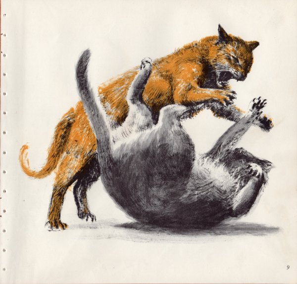
John Schoenherr (1935-2010) is perhaps best known for his covers and spot illustrations for Frank Herbert’s Dune series. Herbert himself is purported to have said that Schoenherr is “the only man who has ever visited Dune,” and you’d be hard pressed, I think, to find any hardcore fans of those books who would disagree with the author’s assessment. So when I came across a battered old copy of Nobody’s Cat by Miska Miles, illustrated by John Schoenherr, I was, first, delighted to discover another side to the artist’s career, and second, impressed by the stark, uncompromising ferocity of his vision of a day in the life of a “wild cat” in the inner city. So even though the book was a library discard, the cover was barely attached, and several pages were stained beyond repair, I bought it anyway — it was only a quarter — sliced the pages completely loose with a scalpel and a straight-edge, and scanned the following images for your enjoyment:

[CLICK IMAGES TO ENLARGE]
Keywords: Nobody’s Cat (Toronto: Little, Brown, & Co., 1969) by Miska Miles; John Schoenherr.

Connections · Fine Art · Look Here · Vincent van Gogh

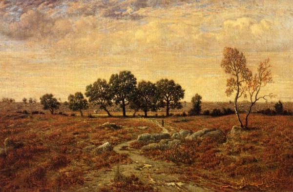
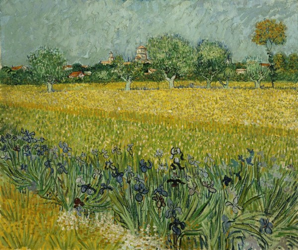
Connections: Theodore Rousseau and Vincent van Gogh

[CLICK IMAGES TO ENLARGE]

I think what [the critic Gustave] Kahn says is quite true, that I haven’t paid enough attention to values, but it’ll be quite another thing they’ll say later — and no less true.

It’s not possible to do both values and colour.

Théodore Rousseau has done it better than anyone else, by mixing his colours [with bitumen] the darkness caused by time has increased, and now [some of] his paintings are hardly recognizable.

You can’t be at the pole and the equator at the same time. You have to choose. And I have high hopes of doing that, too, and it will probably be colour.

[SOURCE: Vincent van Gogh, Letter 594, addressed to Theo van Gogh, from Arles, Monday, 9 April 1888. Via vangoghletters.org.]