Book/Magazine Covers (All) · Illustration Art · Look Here · Robert McGinnis

Look Here: Five vignette-style covers with art by Robert McGinnis

In my growing collection of vintage books, I have quite a few paperbacks with Robert McGinnis art. I posted a few last time; now, here are five more, in no particular order:

I usually prefer to display paperback covers in order of publication, but these Fawcett paperbacks mostly don’t include the year(s) of publication, only the year the book was copyright.

Keywords: Area of Suspicion, Assignment: White Rajah, The Damned, The Dragon’s Eye, The Price of Murder.

Book/Magazine Covers (All) · Illustration Art · Look Here · Robert McGinnis

Look Here: Four “Carter Brown” covers by Robert McGinnis

Scanned from the mouldering vintage-paperback library of yours truly, here are four “Carter Brown” covers by Society of Illustrators Hall of Fame inductee Robert McGinnis (1926 – ), everyman’s favourite pulp-paperback cover artist:

First interesting fact about McGinnis: his preferred medium for his cover paintings wasn’t oil, or watercolour, or gouache; rather, it was, and still is, egg tempera. Second interesting fact: McGinnis seldom drew from life but instead took photographs of models (etc.), projected them onto the painting surface, and traced the resulting images, clarifying the forms where necessary, and elongating and adjusting the limbs and features according to his distinctive sense of proportion and beauty. McGinnis very briefly demonstrates his working methods in a DVD entitled Robert McGinnis: Painting the Last Rose of Summer, which is not a painting video at all but rather a documentary overview of McGinnis’s career as a commercial artist and painter.

Keywords: The Wind-up Doll, Had I But Groaned, Blonde on a Broomstick, Blonde on the Rocks.

Book/Magazine Covers (Jones) · Connections · Jeffrey "Jeff" Catherine Jones · Look Here

Look Here: “The W. C. Fields Book” cover by Jeffrey Jones

The W. C. Fields Book (Brooklyn: Wonderful Publishing Company, 1973) is identified in the indicia as a “special issue of Witzend (No. 9).” Witzend was an underground comics magazine launched in 1966 by E.C. legend Wallace Wood and published and edited by him until 1968, when he sold the magazine, for a buck, to Bill Pearson/Wonderful Publishing Company. Here’s the cover with Jones’s painting of W. C. Fields, which, by the way, is reprinted at a small size but sans text and in full colour on page 64 of Jones’s first solo art book, Yesterday’s Lily (Dragon’s Dream, 1980):

jeffrey-jones_cover_witzend-09

And here — SURPRISE! — is an extremely obscure illustration by Jeffrey Jones, published in black-and-white in National Lampoon, vol. 1, no. 23 (February 1972), along with an article entitled “The Thoughts of Chairman Fu-Manchu”; the painting has never, to my knowledge, been reprinted:

jeffrey-jones_the-thoughts-of-chairman-fu-manchu_national-lampoon-v1n23-feb1972_p66

The washy, rub-out style of the “Fu-Manchu” painting, which can be accomplished most easily with oil paints but is also possible in watercolour/gouache, was state-of-the-art in the late 1960s and early 1970s. Three of the best known practitioners were Society of Illustrators Hall of Fame inductees Bernie Fuchs, Burton Silverman, and David Levine, but many others tried their hands at it, too — including Jones, apparently. To learn how to do it in watercolour, all you need is a copy of Silverman’s Breaking the Rules of Watercolor, a selection of watercolour paints and brushes, a few rolls of good-quality paper towels, a large tube of white gouache, a stack of the heaviest weight Strathmore plate bristol you can find, AND THE PATIENCE OF JOB!

BONUS CONTENT:

Here’s an album cover, not by Jeffrey Jones, with a portrait of W. C. Fields that appears likely to have been based on the same photo reference of Fields as Jones used for his painting; the accoutrements are slightly different in the two portraits, but the face, I think, is a dead giveaway:

w-c-fields-his-only-recording

I suppose it’s also possible that one portrait was based on the other (though it seems to me unlikely). Either way, however, Jones’s W. C. Fields genuinely looks like the kind of man who keeps a supply of stimulant handy in case he sees a snake, which he also keeps handy, while the other Fields looks like he has been living for days on nothing but food and water. Can you guess which one I like best? Wrong again. I prefer Jones’s version.

Art Collection · Comics · Ebay Win · Look Here · Rod Ruth

Look Here: Two more “Toodles” strips, with art by Rod Ruth

Here are two more strips by Rod Ruth, from our slowly expanding collection of original art; the first is from 2-20-58, and the second, from 3-12-58:

[CLICK IMAGES TO ENLARGE]

Rod Ruth is by no means a well-known figure in the history of comic strips, but I, for one, find his work terrifically appealing. Ruth’s character designs are distinctive, and the expressions always appropriate to the action: look, for instance, at the way Ann’s expression changes from panel to panel in the first strip as she struggles to stand up for the man she loves in the face of her parents’ stern expressions of disapproval, and then retreats into sullen silence as her mother pointedly puts her father in his place. Ruth’s staging of the action is also first rate: in the first strip, notice how he changes from a three shot in the first panel, with the father on the left, facing right, to a closer two shot of mother and daughter, back out to a three-shot, with the father close on the right, facing left — which, taken together with the first two panels, I read as a sign that the father has been pacing back and forth while the women have been talking — and then ends with a lovely low reverse angle that not only maintains spacial continuity between the three but also places the now visibly weary Ann, both compositionally and symbolically, right in the line of fire between her domineering mother and her stuffed-shirt father; and I especially like the bits of business the artist gives to Ann in the second strip — panel one, she files her nails; panel two, she pumps a bit of moisturizer into her palm; and panel three, she absently rubs the moisturizer into her hands as she wistfully contemplates lost love. Finally, Ruth’s handling of clothing, furniture, props, etc., is always economical and convincing: notice, for instance, the way he uses little dabs and checkmarks of ink to give dimension to the quilting on Ann’s jacket in the second strip, or the way he suggests the folds on the nurse’s overcoat with a few deft strokes of the brush.

To see all three of the “Toodles” strips I’ve posted so far, click here.

BONUS LINKS:

The Haunted Closet: Baleful Beasts and Eerie Creatures (illustrated by Rod Ruth), posted by Brother Bill

The Haunted Closet: Baleful Beasts and Eerie Creatures: The Patchwork Monkey (illustrated by Rod Ruth), posted by Brother Bill

The Haunted Closet: Baleful Beasts and Eerie Creatures: Nightmare in a Box (illustrated by Rod Ruth), posted by Brother Bill

The Haunted Closet: The Rest of Baleful Beasts and Eerie Creatures (illustrated by Rod Ruth), posted by Brother Bill

The Haunted Closet: Album of Dinosaurs (Tod McGowen, Rod Ruth, 1972), posted by Brother Bill

Connections · Frank Frazetta · Heads Up!

Heads Up: Frank Frazetta’s “White Indian”

Both Vanguard Productions and Dark Horse have announced a reprint of White Indian. One will almost certainly see the light of day; the other may not.

From Dark Horse’s October solicitations:

frazetta_white-indian_v1

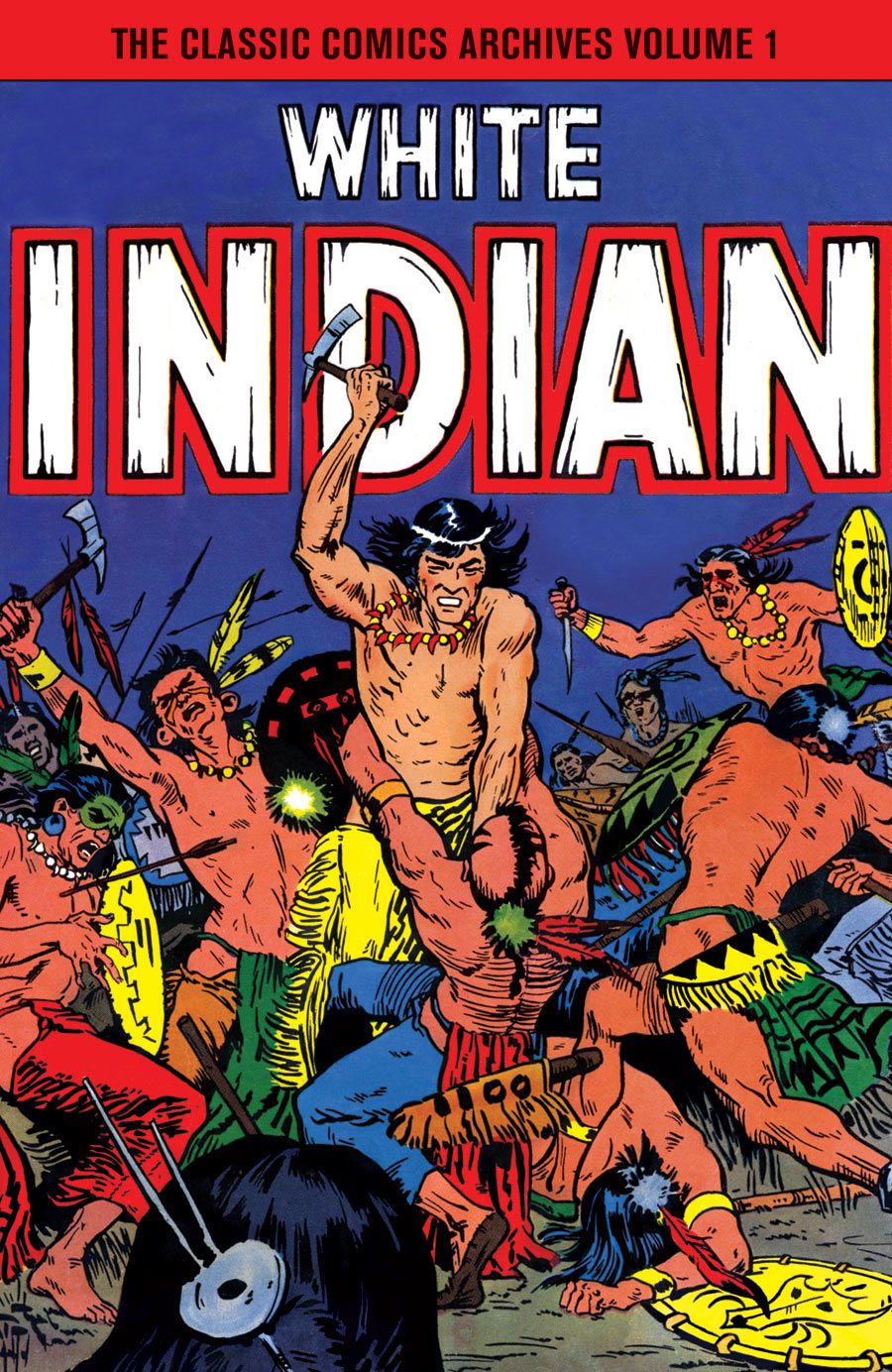
THE CLASSIC COMICS ARCHIVES VOLUME 1: WHITE INDIAN
Frank Frazetta (A)
On sale Dec 1
FC, 200 pages
$49.99
HC, 7″ x 10″

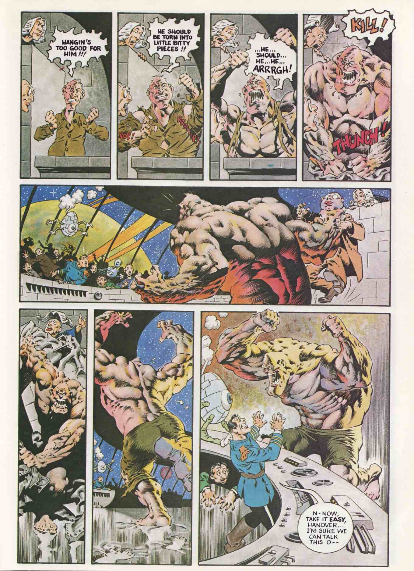
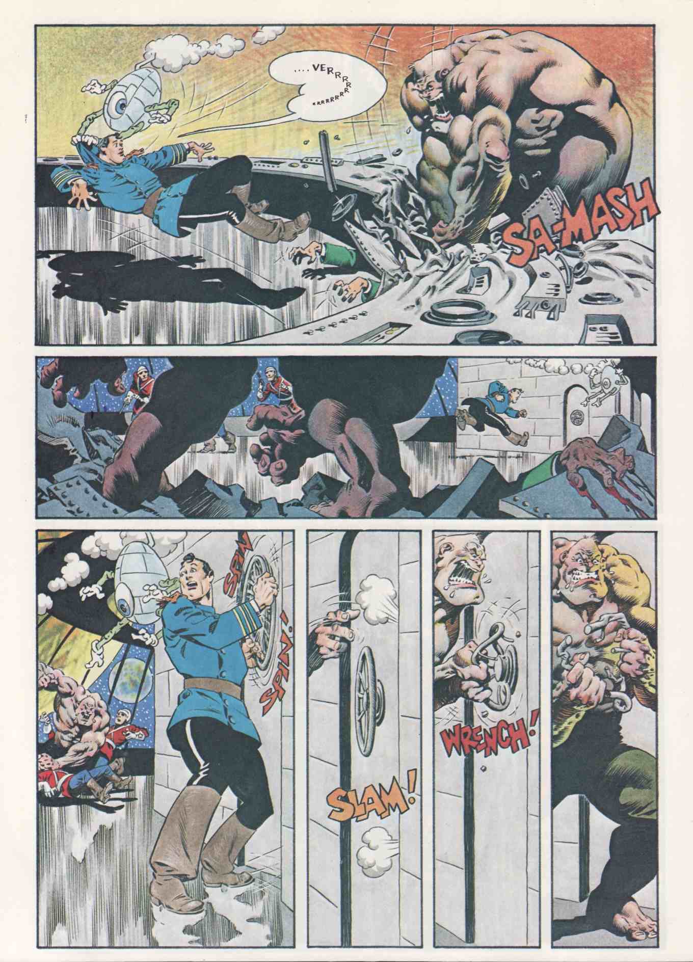
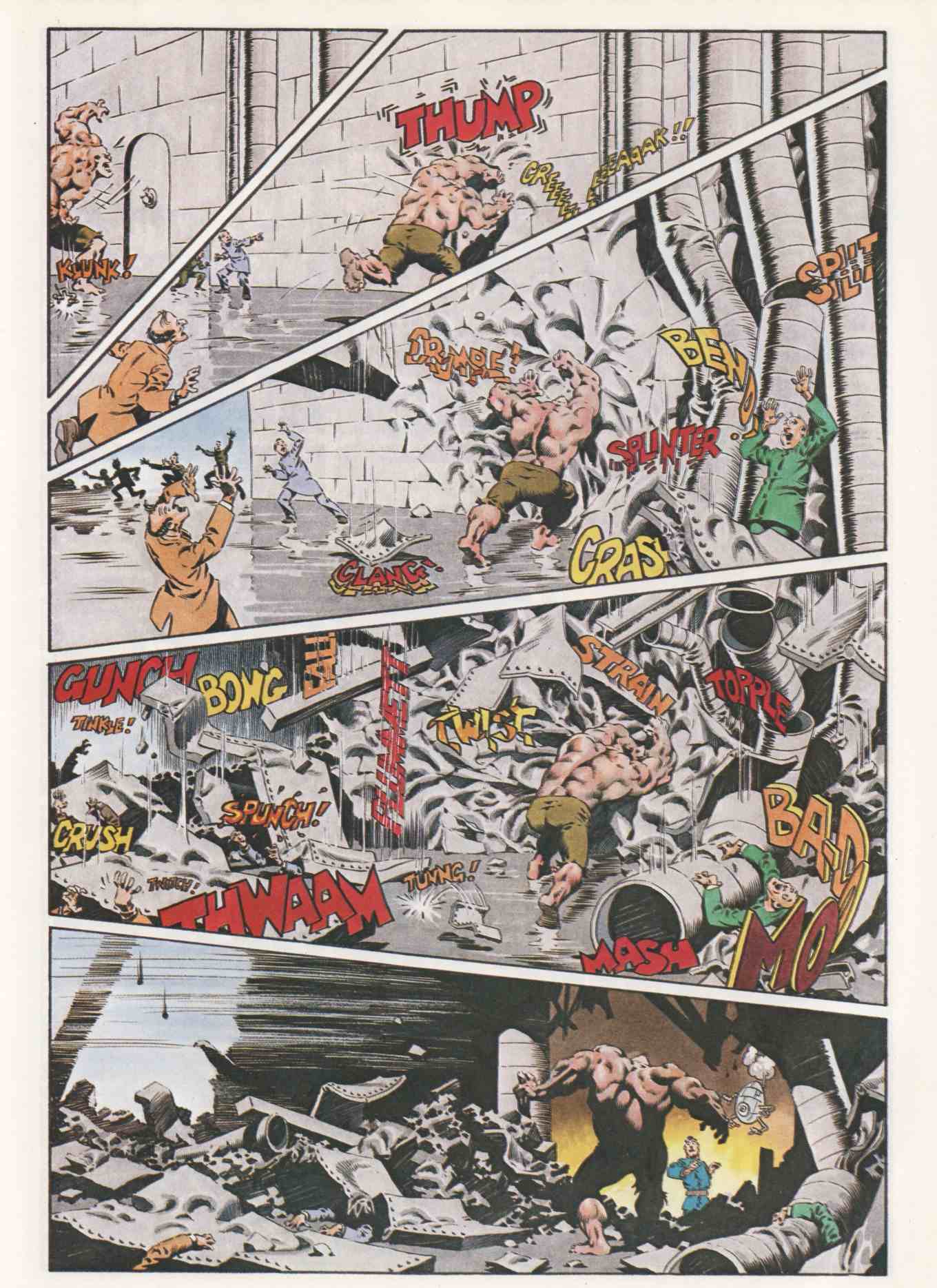
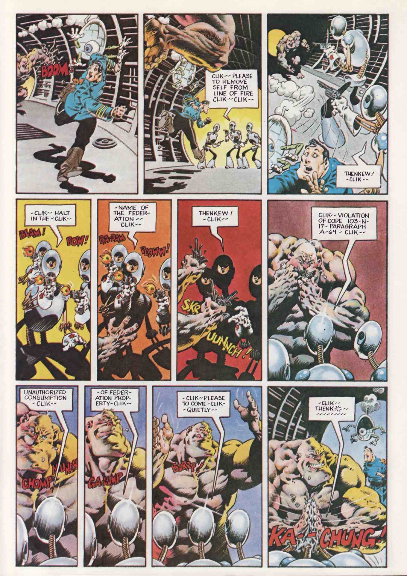
The longest comic-book run of Frank Frazetta’s career! First appearing as a backup feature in Durango Kid in 1949, Dan Brand–known as the “White Indian”–is a colonial-era city boy whose life is marred by tragedy. When the death of his fiancée sends Brand through the wilderness on a trek to kill her murderer, he also begins a journey that will transform him into a hardened pioneer survivalist. The powerful sequential work of Frank Frazetta is in the spotlight in this collection, with all interior pages scanned from original comic-book issues and digitally cleaned.

• This collection reprints all of Frank Frazetta’s White Indian work in an affordable hardcover format!

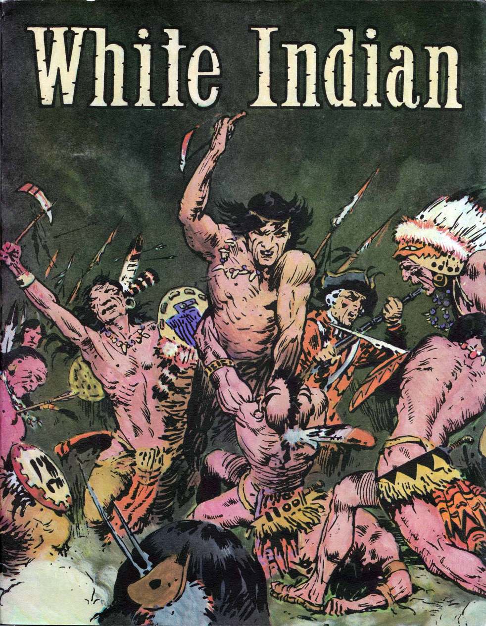
Here’s a tiny JPEG of the Vanguard cover:

Notice how Frazetta’s name is absent from the Dark Horse cover and prominently displayed at the top of the Vanguard cover: I doubt that was simply an oversight on Dark Horse’s part… Frazetta’s name is also absent from the cover of the Dark Horse Thun’da reprint, which, btw, is available in stores now.

Anyway, here’s the news about the Vanguard Productions reprint, as reported at ICv2:

Vanguard to Release Frazetta’s ‘White Indian’
Complete Collection

Published: 07/12/2010, Last Updated: 07/13/2010 05:30am

Frazetta Management and Vanguard Productions announced that Vanguard will be releasing all of the Dan Brand/White Indian material, originally published in the 1950’s by Magazine Enterprises, as part of its new Vanguard Frazetta Classics line. White Indian represents Frazetta’s longest artistic run on a single comic feature.

The Complete White Indian Collection is Volume 2 of the Frazetta Classics line. Volume 1 will be The Complete Johnny Comet which will feature dailies reproduced from Frazetta’s own personal proofs and Sunday pages collected in color for the first time as well as a new essay by William Stout (see “Vanguard Plans Adams, Frazetta Books”). Vanguard Publisher J. David Spurlock said, “Both volumes are well into production now with more Vanguard volumes to come.”

Seems straightforward enough — except that, according to Rich Johnston at Bleeding Cool, Vanguard publisher David Spurlock has made a statement, on the record, that appears to assert Vanguard’s exclusive right to the Frazetta material:

Vanguard [writes Spurlock] will release WHITE INDIAN Vol 1 by Frazetta, and Dark Horse will do WHITE INDIAN ARCHIVES Vol 2 of all all the other White Indian material.

[More details about Spurlock’s statement here from Chris Marshall, who, it turns out, is the intrepid blogger who “got it from the horse’s mouth.”]

Now, as far as I am aware, Dark Horse has not yet confirmed (or denied) the arrangement, though, of course, if Frazetta’s White Indian material has dropped into the public domain, it won’t matter what sort of exclusive contract Vanguard signed with Frazetta before he died, Dark Horse will be free do as they please. Truth be told, however, I really don’t know what’s going on between Vanguard and Dark Horse.

(Why Dark Horse would want to publish a Frazetta-less hardcover sequel to another publisher’s Frazetta reprint is beyond me!)

What I do know for sure, however, is that Frazetta fans will soon have at least one, and possibly two, hardcover reprints of White Indian to add to their collections within a few months. So, hooray for that!

UPDATE (added 11 August 2010):

Wherein I answer the question, “Where have I seen those covers before?”

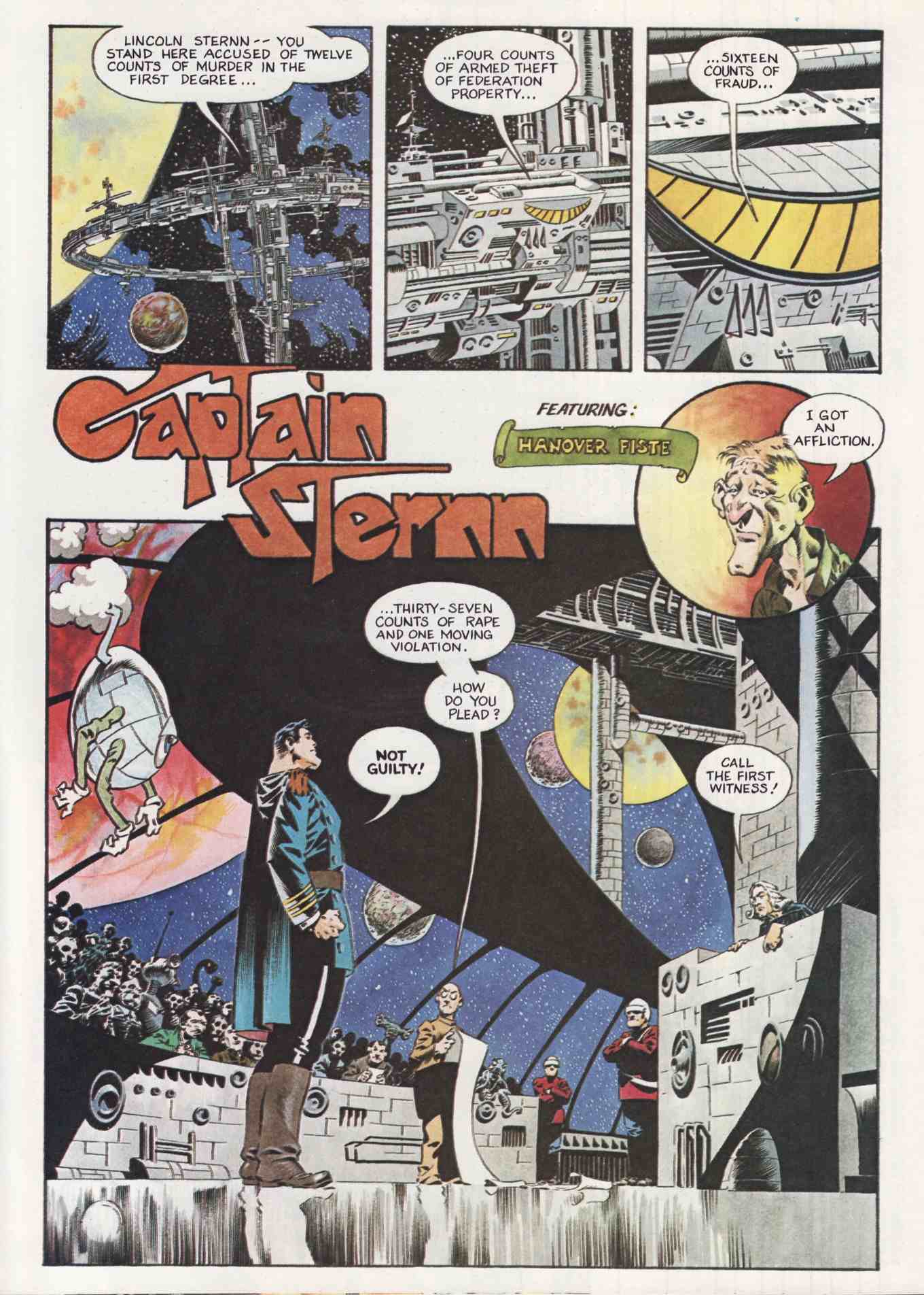
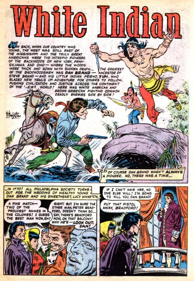
The Dark Horse White Indian cover was the cover of White Indian #11, published in 1953:

frank-frazetta_white-indian-n11-1953

The Vanguard was the cover of the White Indian reprint published by Pure Imagination in 1981. Here’s a scan of the copy that usually sits on a shelf, along with a lot of other books, mostly by Corben, about a metre and a half from my keyboard:

frank-frazetta_white-indian_pure-imagination-1981

Looks like Vanguard had the drawing recoloured for the new reprint. Big mistake, IMHO. (Anyone know why they changed the redcoat into a bluecoat?)

ANOTHER UPDATE:

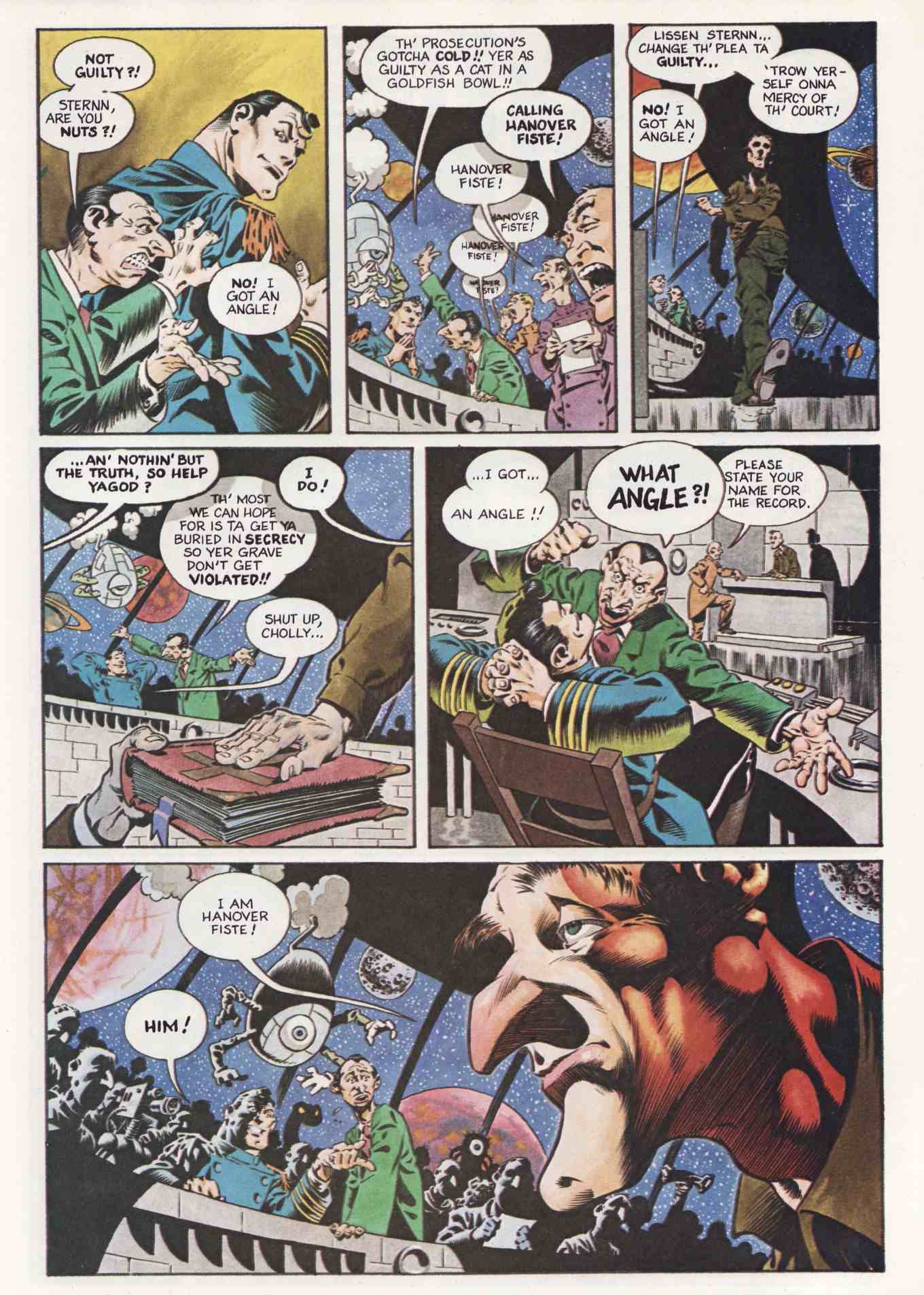
You’ll have to read the discussion in the comments section of this post to find out why the following is important. The full page is page one of White Indian #11:

frank-frazetta_white-indian-n11 p01

frazetta-vs-bolle-or-powell

What fun! Now I get to file this post under “Connections“!

Here, Read · Interviews · Jeffrey "Jeff" Catherine Jones · Michael Wm. Kaluta

Here, Read: Jones on Kaluta, Kaluta on Kaluta vs. Jones

Here’s Jeffrey Jones on Michael Wm. Kaluta, from Comic Book Profiles #7: Michael William Kaluta (Summer 1999), pages 28 – 29:

How did you first meet Michael?

If memory serves, I met Michael and Bernie Wrightson at a New York City convention in the fall of 1968. Michael may dispute this because he is the “memory giant.” But I remember this as being so. We were there to show our fledgling work. I had arrived in New York about a year earlier and had a couple of jobs done. My memory is sketchy as to details but Bernie had a bunch of $5 and $10 ballpoint pen drawings piled on a table in the art show for sale. Michael was more of the portfolio type. I mention Bernie in the Michael question because he was the one who introduced us.

What do you feel is his strength as an artist?

Michael’s greatest strength as an artist has always been his ability to remind us to stay alive. His art is moral in the sense that it, as the best art, has absolutely no function except to exist. It has the promise of function and will remain where that beauty lives. I speak of the human spirit and its passion to rise above everything, except that which we all already know. Michael reminds us of that connection between all lives and all that makes us human. This takes a true artist.

You and Michael worked on projects together, both formally and informally. Does any one project stand out as particularly memorable?

The thing that jumps to mind is a period of time during The Studio days, if you will, when we were trying to decide what to call our upcoming book (The Studio). Michael taped long rolls of brown kraft paper to one wall where each of us, usually clandestinely, would write our suggestions. Well, this certainly started out seriously but quickly degenerated into a list of some of the most preposterous titles imagined by the minds of the deranged. I believe that even though most of these would appear in the dark of night, it was pretty easy to tell who wrote what. We laughed for what seemed months. Definitely a great achievement in the art of cooperation.

Now, it seems to me that what Jones viewed as the “greatest strength” in Kaluta’s work back in 1999 is precisely what Jones has always pursued in her own work.

And I have little doubt that Kaluta was, at the time, flattered by Jones’s praise; I mean, who wouldn’t be?

And yet, based on the very plain-spoken, practical analysis that Kaluta offers up in an early promotional trailer for Better Things: Life + Choices of Jeffrey Jones of the difference between his own unabashedly functional, commercial body of work, and the sometimes obliquely functional but always deeply felt and humanely expressive work of Jones, I’m not entirely sure that Kaluta actually would have agreed with Jones’s contention that his (Kaluta’s) artwork “has absolutely no function except to exist.”

Here is a partial, lightly edited transcript of the trailer, which features a rough-cut interview with Kaluta:

Artistically, [says Kaluta] one works for oneself. You have to. To get anything good, you kind of have to work for the person that’s inside of you; however, to be able to live, you have to work for companies. I had to work for companies; other artists, perhaps, can work for galleries, or posterity. An illustrator is someone who draws for money. I don’t do what some of my friends are able to do, which is paint their souls, their dreams, their nightmares for themselves, and that’s art — and it is. I am happiest when I am reading someone else’s material and crafting it into a picture that will reflect to my best efforts what I think the writer was trying to say, trying to visualize. I would say that Jeffrey Jones is both an illustrator and an artist, using the descriptions we have just talked about. He covers a wide range of self-motivating imagery. It comes through him, and every once in a while he’ll apply that specific power that comes through him to an illustration job, or he’ll use the characters that have been written by other people as a vehicle for his own talents. I wouldn’t say he’s as much of an illustrator as I am. I think that he’s more of a personal storyteller who now and then might come close to illustrating something [laughs], on purpose.

In the portion of the trailer I haven’t transcribed, Kaluta goes on to describe his first meeting with Jones, which Kaluta says occurred at “a World Science Fiction Convention here in New York City in 1967.” LOL!

Bernie Wrightson · Comics · Here, Read · Look Here · Separated at Birth?

Separated at Birth? James Garner and Captain Sternn

Okay, I admit it. This one isn’t an original.

From page 13 of Comic Book Profiles #2 (Spring 1998), here’s Bernie Wrightson’s answer to the question “How did Captain Sternn come about?”: “I realized when I was working on Running Out of Time for Kitchen Sink that Captain Sternn came out of my teenage years, from the movie, The Great Escape. It was always one of my favorite movies. When I was a kid, all my friends identified with the Steve McQueen character, but I was fascinated with the James Garner character, who played a con man. He was a really smooth liar, just this side of being oily. I realized that Captain Sternn looks like James Garner from the Great Escape. So I guess that’s where it came from.”

BONUS CONTENT (added 07 August 2010):

Here’s Wrightson’s first “Captain Sternn” story, as it appeared in Heavy Metal, vol. 3, no. 3 (June 1980):

[CLICK IMAGES TO ENLARGE]

Frank Frazetta · Separated at Birth?

Separated at Birth? Jackie Gleason, Frank Frazetta’s Monster Out of Time, and Jim Henson’s Earl Sinclair

“AND AWAY WE GO…!!!”

Turn Frazetta’s “monster” design into an animatronic muppet, and he’d be right at home in the world of the “Dinosaurs” sitcom.

But seriously, folks, this post is mostly just my silly way of saying that I think Frazetta’s “monster” looks remarkably, even comically, animated — and certainly appears more vividly alive than his human attacker!

Frank Frazetta · Obituaries

The Slow Death of the Frazetta Museum Collection

14 November 2009: the Spectrum Web site reports that “Grand Master Frank Frazetta’s cover painting for the Lancer paperback, Conan the Conqueror by Robert E. Howard, sold this week to a private collector for a reported $1,000,000.”

08 June 2010: Heritage Auctions issues a press release bragging that “Frank Frazetta’s original 1955 artwork for Weird Science-Fantasy #29, considered by many comic art fans to be the finest comic book cover of all time, has been sold in a private treaty sale for $380,000 – almost certainly the most ever paid for a single piece of original American comic book art – to Heritage Co-Chairman and Co-Founder Jim Halperin, a collector known to own one of the finest comic book and original comic art collections in the world. It was an outright purchase for immediate payment, with no trade-ins involved.”

22 July 2010: the Pocono Record reports that “Frank Frazetta’s ‘Conan the Destroyer’ painting has been sold to a private collector for $1.5 million.” The seller is identified as “a family trust.”

Heads Up! · Jeffrey "Jeff" Catherine Jones

Heads Up: JEFFREY JONES: A LIFE IN ART

Coming this October from IDW, in both a regular hardcover and a signed and numbered limited edition:

Jeffrey Jones: A Life in Art

PRODUCT DETAILS:

* Hardcover: 256 pages
* Publisher: IDW Publishing (Oct 5 2010)
* Language: English
* ISBN-10: 1600107370
* ISBN-13: 978-1600107375

PRODUCT DESCRIPTION:

Over the past 40 years, there have been few artists who have received as much acclaim and garnered as much attention as Jeffrey Jones. From his early comic book work for Heavy Metal and National Lampoon to his popular book covers for such authors as Dean Koontz and Andre Norton to his move into fine art, Jones has inspired generations of painters and artists. This beautiful volume of his personal favorites will only enhance his reputation and cement his standing as one of America’s greatest living artists.

The cover design of the new volume is very similar to the design of the Jeffrey Jones Sketchbook, which was published by Vanguard and has now gone out-of-print:

Need I add that the new collection is very exciting news!? In fact, I’ve already placed my order for the limited signed and numbered edition. Hope I get one.

BONUS “HEADS UP”:

The hardcover edition of The Art of Jeffrey Jones (Underwood, 2002) is currently on sale at Budsartbooks.com for US$14.95, while supplies last. The deluxe, slipcased edition was also on sale a short time ago — I know because I bought one, even though I already had the regular hardcover, which I purchased at full cover price — but it’s now sold out. Sorry I forgot to mention…