Book/Magazine Covers (All) · Chris Foss · Illustration Art · Look Here

Look Here: Three SF covers with atmospheric art by Chris Foss

Time for some more cover scans from the library of yours truly! This time around, I’ve got three SF paperbacks with art by British illustrator Chris Foss, whose airbrushed visions of massive starships, architecture, and hardware spawned a legion of imitators back in the 1970s (and beyond):

[CLICK IMAGES TO ENLARGE]

Keywords: The Reality Trip and Other Implausibilities by Robert Silverberg, The Caves of Steel by Isaac Asimov, Midsummer Century by James Blish, Chris Foss.

Book/Magazine Covers (All) · Illustration Art · Look Here · Robert Foster

Look Here: Four more SF covers with art by Robert Foster

Here are four novels with cover art by Robert Foster that I acquired this spring:

[CLICK IMAGES TO ENLARGE]

Unfortunately, the edition of Davy that you see above is not the one I would prefer to own. The edition that I would prefer to own is the one that shows more of Robert Foster’s artwork and thus doesn’t drain all of the surrealism out of it:

You can view a snapshot of Foster’s painting, framed and hanging on somebody’s wall, over on the Illustration Exchange site, where you’ll find the following particulars: 19 x 25 inches, acrylic, 1964.

Keywords: The Masks of Time by Robert Silverberg, Davy by Edgar Pangborn, Light a Last Candle by Vincent King, The Burning by James E. Gunn, Robert Foster.

Bill Sienkiewicz · Heads Up! · Ian Miller · Illustration Art · Look Here

Heads Up: BETTER THINGS art sale

An all-star roster of artists has contributed prints and original art — see gallery page one and page two — to Macab Films to support the documentary, Better Things: The Life and Choices of Jeffrey Catherine Jones, and Bill Cox, a “premium gallery owner” at ComicArtFans.com, has stepped up to assist with the sale of the works.

At the moment, twelve prints are available for purchase, including these three:

And thirty-three (!) original drawings and paintings are available, including these five:

If you have the money to spend, your support will be greatly appreciated, I have no doubt, so act now to reserve your favourites. Those links again: prints, original art page one, original art page two.


BONUS NONSENSE:

I wonder… do you suppose it is possible that Bill Sienkiewicz based the composition of the painting he donated to Better Things on the following illustration by Jones himself:

Just for fun, here’s a side-by-side:

You know what? I think it’s possible… or maybe it’s just a lovely coincidence…

Book/Magazine Covers (All) · Illustration Art · Look Here · Paul Lehr

Look Here: One lovely cover with art by Paul Lehr

Freshly scanned from the collection of yours truly, here’s one of Paul Lehr’s best covers with a close-up shot of a human being, which may seem like I’m damning it with faint praise, since most of Lehr’s classic covers are populated with tiny figures dwarfed by technological wonders, strange lands, alien life forms, the cosmos itself, but that is simply not the case. So let me say it plainly: Crompton Divided is one of Lehr’s best covers, period:

[CLICK IMAGES TO ENLARGE]

To view all of the covers with art by Paul Lehr that I’ve posted over the years, start here and click back through the (p)ages. I think you’ll like what you find there.


BONUS IMAGE:

Nice colour here; subject matter is a bit underdeveloped, like concept art for an animated movie, but it’s evocative enough, I guess:

Keywords: Crompton Divided by Robert Sheckley, And No Birds Sang by Farley Mowat, Paul Lehr.

Book/Magazine Covers (All) · Illustration Art · Look Here

Look Here: Three LOIS LANE covers with art by Swan and Kaye

I recently spent a few minutes over at the Grand Comics Database flipping through the database entries for the first hundred issues of Superman’s Girl Friend Lois Lane, looking for covers that might provide context for a comment regarding “the ‘unintentional’ surrealism of […] Silver Age Superman comics.” I rather hastily decided upon one cover from the Lois Lane series, and posted it along with two covers, which I had found by other means, from the run of Superman that began in 1939:

[CLICK IMAGES TO ENLARGE]

However, truth be told, the Lois Lane covers that really stood out for me in those first hundred issues were these three, with pencils by Curt Swan and inks by Stan Kaye (according to GCD):

They aren’t the most amusing or surreal or just plain odd Lois Lane covers, and they’re not the best drawn or the most flashy, but they have specific conceptual, emotional, and even aesthetic qualities — simplicity and restraint, for instance — that I appreciate. Thirteen casts Lois Lane as the woman in the lead mask — but unlike Dumas’ man in the iron mask, Lois’s imprisonment, which is both heartbreaking and ridiculously over the top, is not imposed on her but is her own self-punishment! I also find it amusing that, in the same way that she has already packed up her head in a grey box, Lois is packing a grey suitcase to leave Metropolis “for good” as she rebuffs Superman’s question, “What secret are you hiding from me?” Sixteen combines the notion that the beloved has a sort of hypnotic attraction for the one who loves him or her — “You’re just too good to be true/Can’t take my eyes off of you.” — with the old idea that “you always hurt the one you love.” And although Superman’s situation is desperate, I can’t help but laugh when he says, “Lois… take your eyes off me… go far away… you’ve become a menace to my life.” And finally, twenty eight, the most conventionally exciting of the three, nicely conveys the simultaneous feelings of horror, expectation, and even enchantment, that accompany any human journey into the unknown, and it does so through the contrast, intentional or not, between Lois’s frenzied exclamations — “Superman — Save me! I’m going too fast. I can’t stop! I’ll go to the end of space!” — and the frozen, wide-eyed intensity of the expression on her face! And again, Superman provides a bit of deadpan comic commentary: “Why did you follow me, when you didn’t know how to brake your super-speed?”

Even the “large” images at GCD are small — which is the main reason why the images posted above are not from GCD — but if you start here, you can easily flip through all 137 issues of Superman’s Girl Friend Lois Lane and choose your own favourites. For your browsing convenience, each page includes “Next Issue” and “Previous Issue” links, where applicable. Enjoy!

Book/Magazine Covers (All) · Illustration Art · Look Here · Tom Adams

Look Here: Another Chandler novel (plus one other) with cover art by Tom Adams

[CLICK IMAGES TO ENLARGE]

To view all of the paperback covers with art by Tom Adams that I’ve scanned and uploaded for display so far, start here. To view only the other Chandlers, click here.

Keywords: Killer in the Rain by Raymond Chandler, A Holiday for Murder by Agatha Christie, Tom Adams.

Book/Magazine Covers (All) · Illustration Art · Jeffrey Meyer · Leo and Diane Dillon · Look Here

Look Here: BAREFOOT IN THE HEAD with James McMullan, the Dillons, and the geat unknown

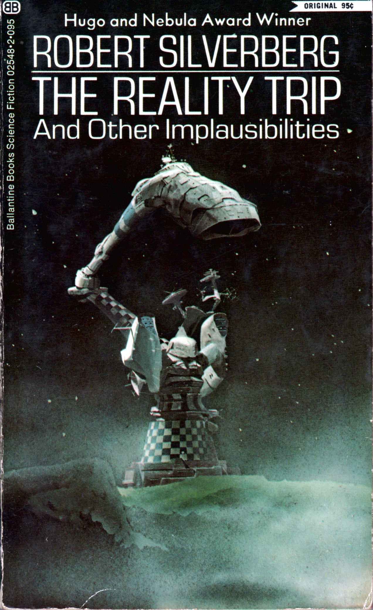
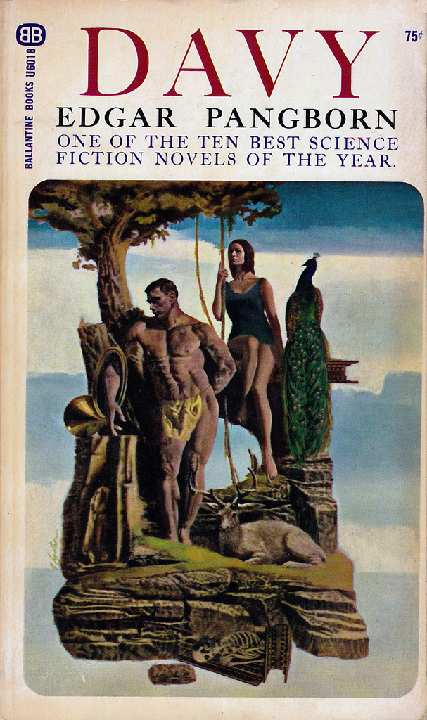
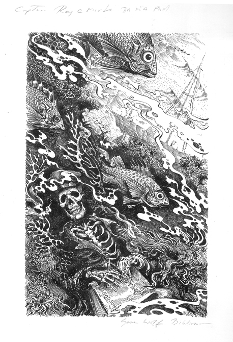
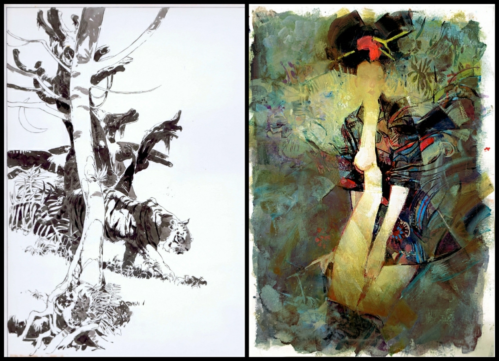
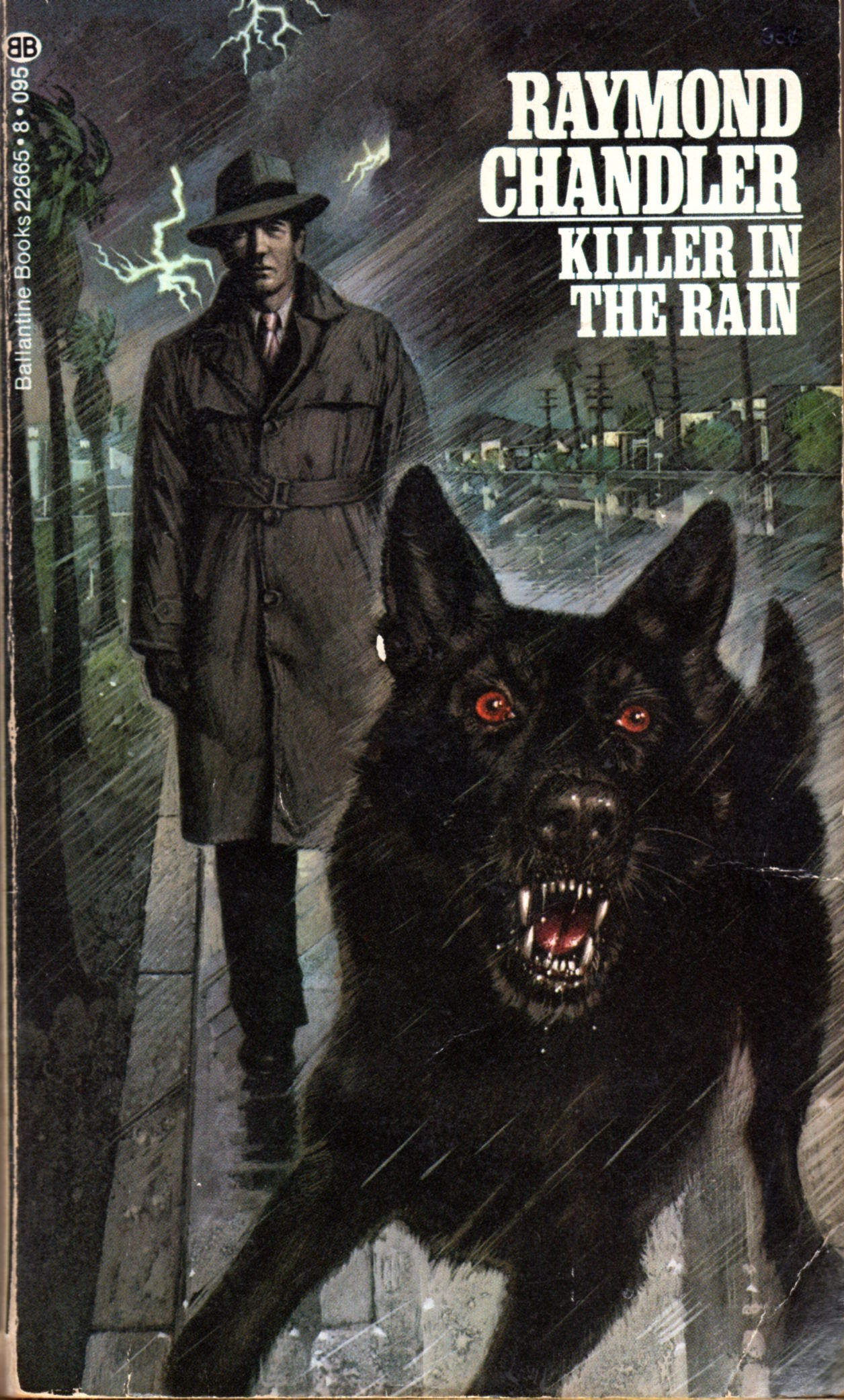
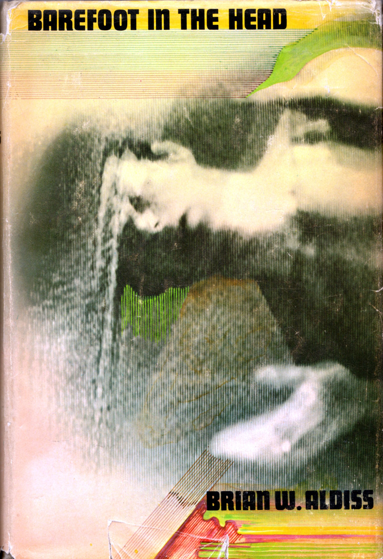
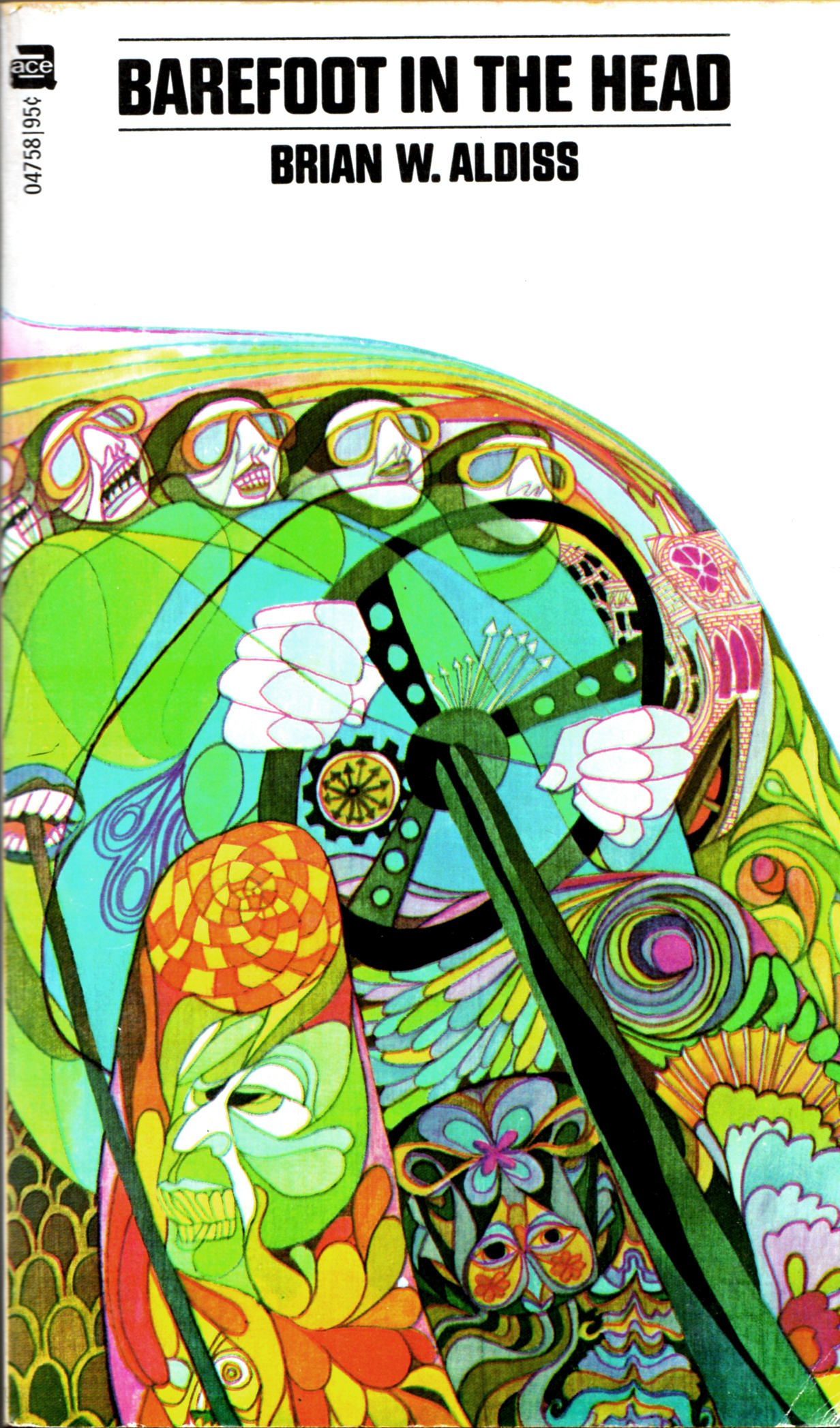
In my recent conversation with Jeffrey Meyer, which I hope you have read and enjoyed, the artist tentatively but astutely suggests that Boards of Canada’s music “might be a good reference point” for understanding the conceptual basis of his own “Nostalgia” series of collages, which he described to me as “a conscious attempt to deal with that [nostalgia] in an abstract way, with as little traditional imagery or ‘things’ in the final pieces as possible.” Practically speaking, however, one might ask: what, specifically, are Meyer and Boards of Canada nostalgic for? What are the visual and auditory sources that each is re- and dis- and re-membering? An integrated and compelling answer to such questions is beyond the scope of this blog post, and perhaps even beyond my ability to formulate, but the covers of these three editions of Brian Aldiss’s Barefoot in the Head — especially the first American hardcover edition (Garden City, NY: Doubleday, 1970), with photo-based art by acclaimed illustrator and educator James McMullan, who was only 35 or 36 years old at the time — suddenly seem to me, as I sit here at the keyboard this morning typing these words, like they might be portals to the inner sanctum, keys to the heart’s desire…

[CLICK IMAGES TO ENLARGE]

How did I end up with three different editions of Brian Aldiss’s Barefoot in the Head in my book collection? And will I buy more if I stumble across other editions in the future? You don’t wanna know, not because the answers are so outlandish, but because they’re so mundane.

P.S. Okay, okay… I’m done promoting RCN talks with collage artist Jeffrey Meyer now. In my next post, RCN will return to its regular programming.


LESSON OF THE WEEK THAT IS:

My most popular tweet to date isn’t about art or music or bacon or anything else that really matters to me; it’s a throwaway line about 3D printers. Here’s a screen shot:

rcn-on-3d-printers

I’m so proud.


P.S. I have a habit, on this blog, of referring to any illustrator (or writer) whose work I have decided to highlight who has not received formal credit for his or her work, and whose identity I have been unable to determine or guess, as “the great unknown.” Just so you know…

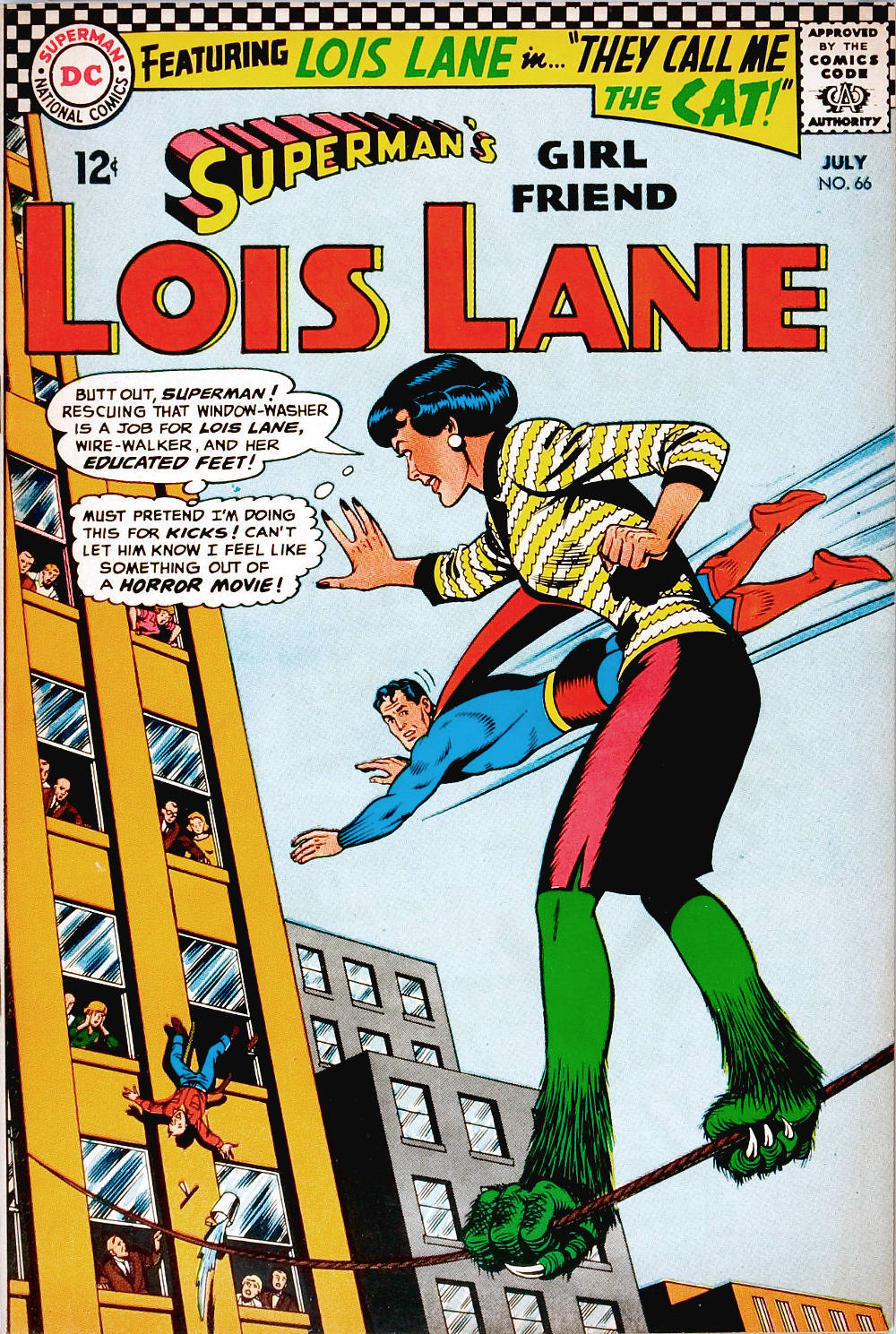
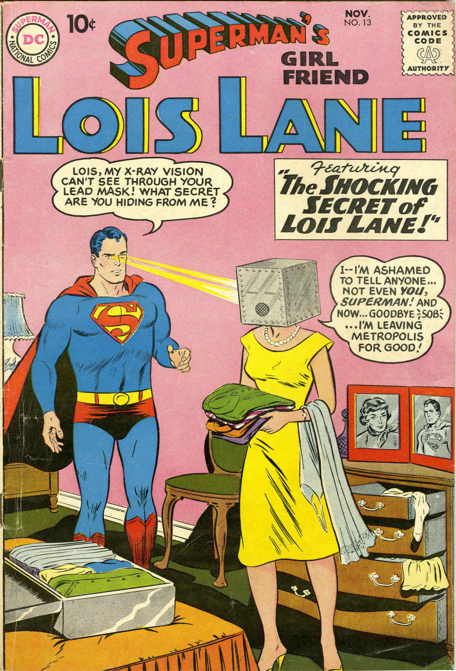
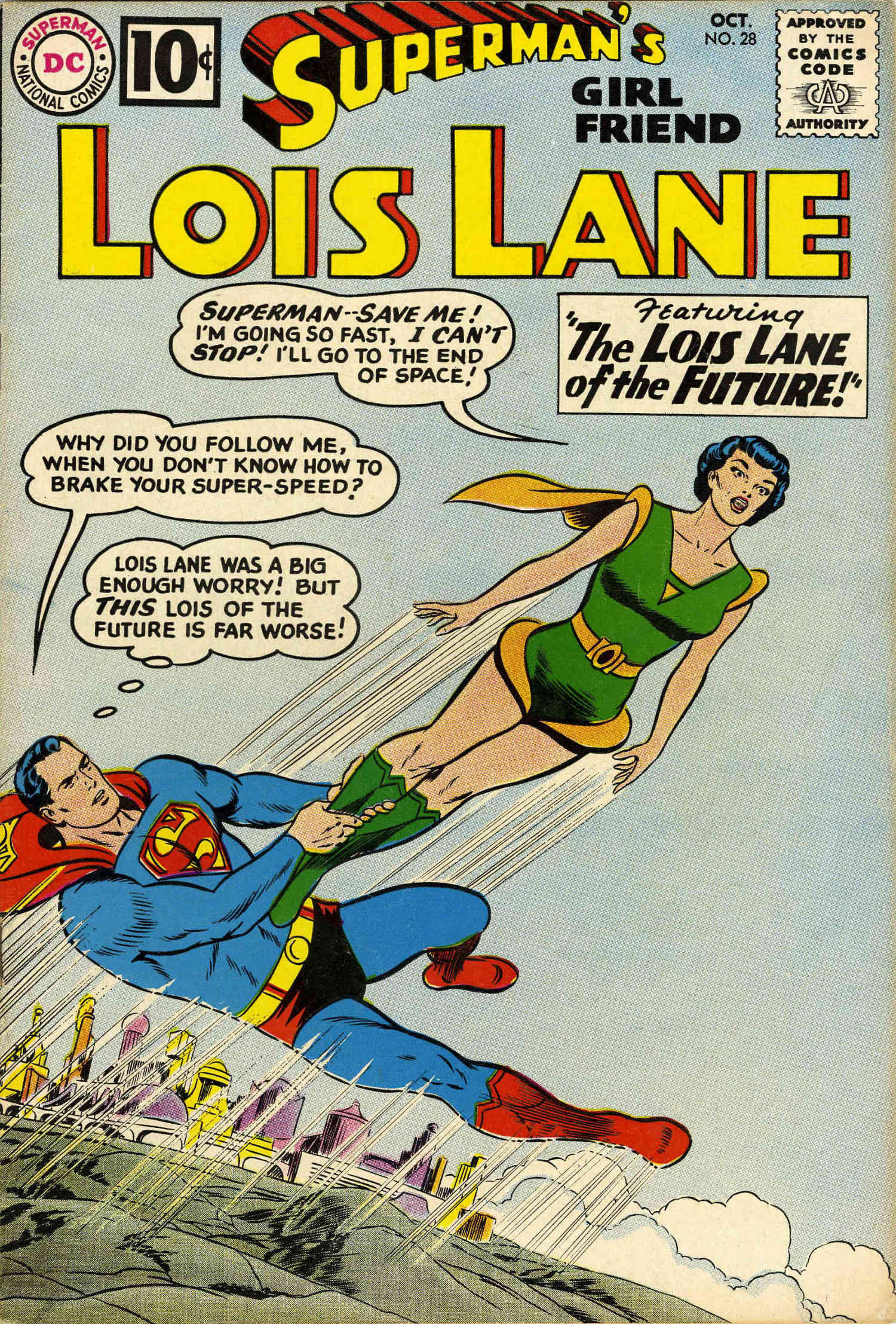
Keywords: Barefoot in the Head by Brian Aldiss, Leo and Diane Dillon, James McMullan, and @RaggedClawsNet says, “I look forward to the day when I can print a free 3D printer for myself with my friend’s 3D printer.”