"This day's experience, set in order, none of it left ragged or lying about, all of it gathered in like treasure and finished with, set aside." –Alice Munro, "What is Remembered"
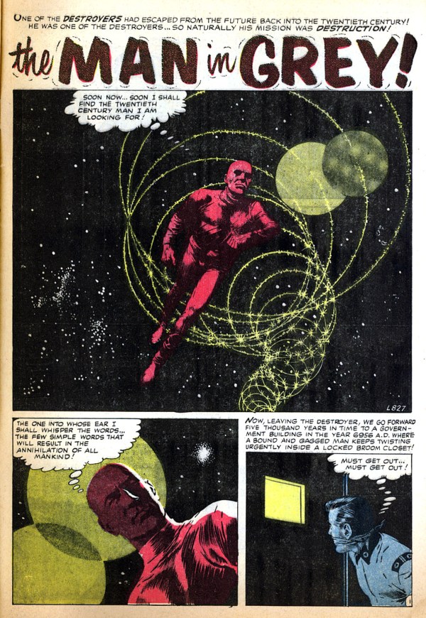
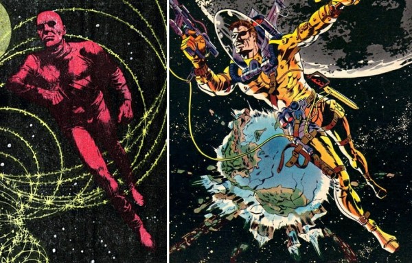
The famous cover of Nick Fury, Agent of S.H.I.E.L.D #6 (November 1968) is commonly referred to as Steranko’s “homage to Wally Wood” — that spacesuit! — although many have noted that the cover could almost as easily be seen as an homage to Famous Funnies #214, with art by Frazetta. I don’t, however, recall anyone mentioning what I believe is a swipe by Steranko from the opening panel of “The Man in Grey,” World of Fantasy #7 (May 1957), with art by Gray Morrow. Or maybe I’m just seeing things. Take a look and decide for yourself…
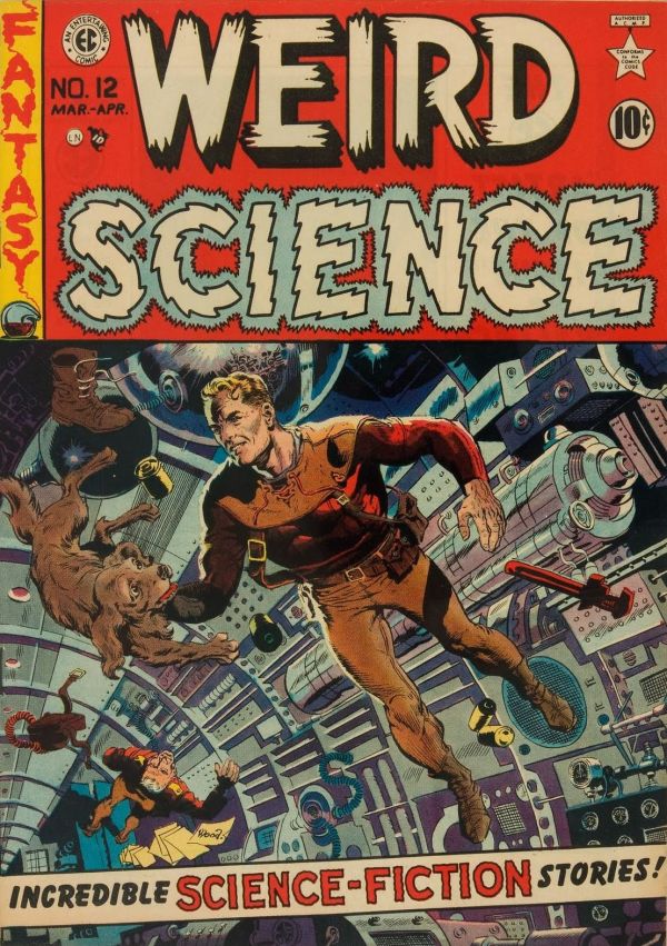
Yes, the yellow-and-orange-suited figure on the 1952 cover of Weird Science #15 (art by Wally Wood; see above) is in the ballpark — it may, in fact, have been an influence on both Morrow and Steranko — but there’s something about that Morrow panel…
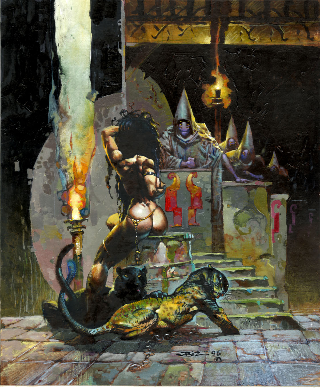
IMHO, all signs point to Frank Frazetta’s seductive Egyptian Queen (1969) as the “inspiration” for Simon Bisley’s comparatively coarse FAKK 2 illustration (1996):
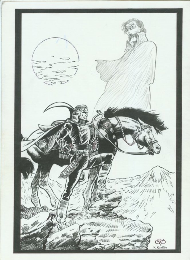
ABOVE: Neil Vokes (penciller) and R. Rankin (inker), unpublished cover for Primer #9, 12 x 17 inches; artwork dated 1984.
Look at the bridle on Vokes’s version of Frazetta’s horse. Now you tell me: what’s missing from the design that renders it useless as a device one might use to control a real horse? (I see several problems with it.)
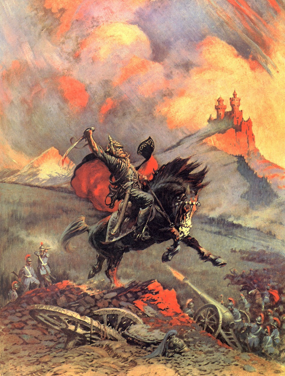
Of course, Frazetta’s Kubla Khan on horseback is itself little more than a variation on the longstanding Western theme of the weary Indian warrior on an exhausted horse, a.k.a. End of the Trail, which dates back to the 1915 sculpture by James Earle Fraser.
UPDATE:
In the world of functional bit-bridles, the country bridle and the western split-ear are about as minimalist as it gets:
Notice that the crucial elements in both cases are 1) a strap that attaches to one side of the bit, runs up the cheek of the horse, over the head behind the ears, down the other cheek, and attaches to the other side of the bit, and 2) an ear or brow band to prevent the bridle from sliding either down the neck towards the rider or around the head in a circle, which would pull the bit out of the mouth and onto the cheek. Seeing what a minimalist bridle looks like makes it easy to see what’s wrong with Vokes’s version, which consists of a combination browband/throat latch and an entirely separate noseband, with no cheek pieces or headpiece at all.
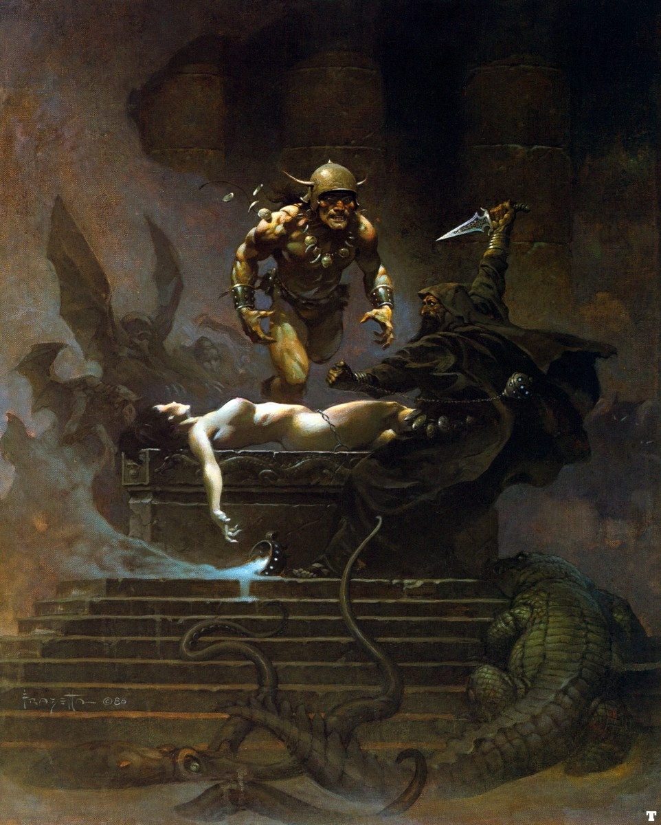
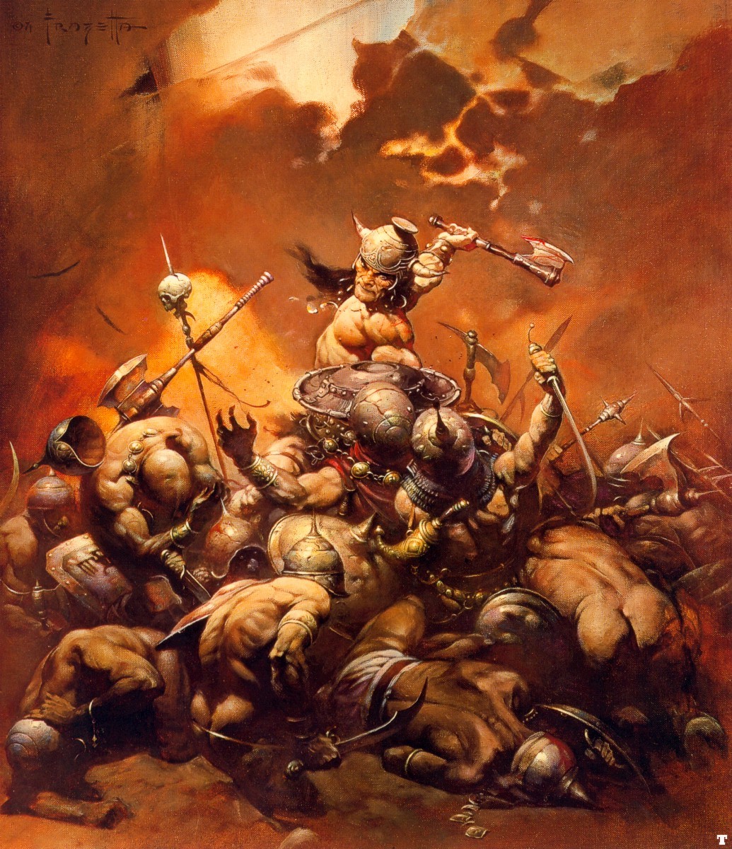
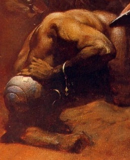
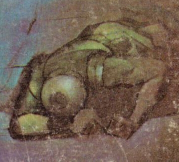
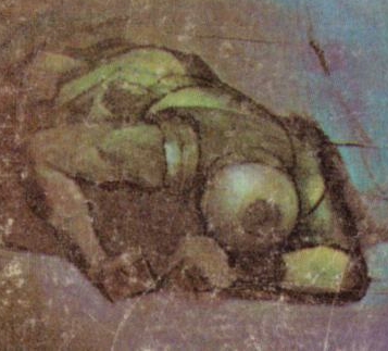
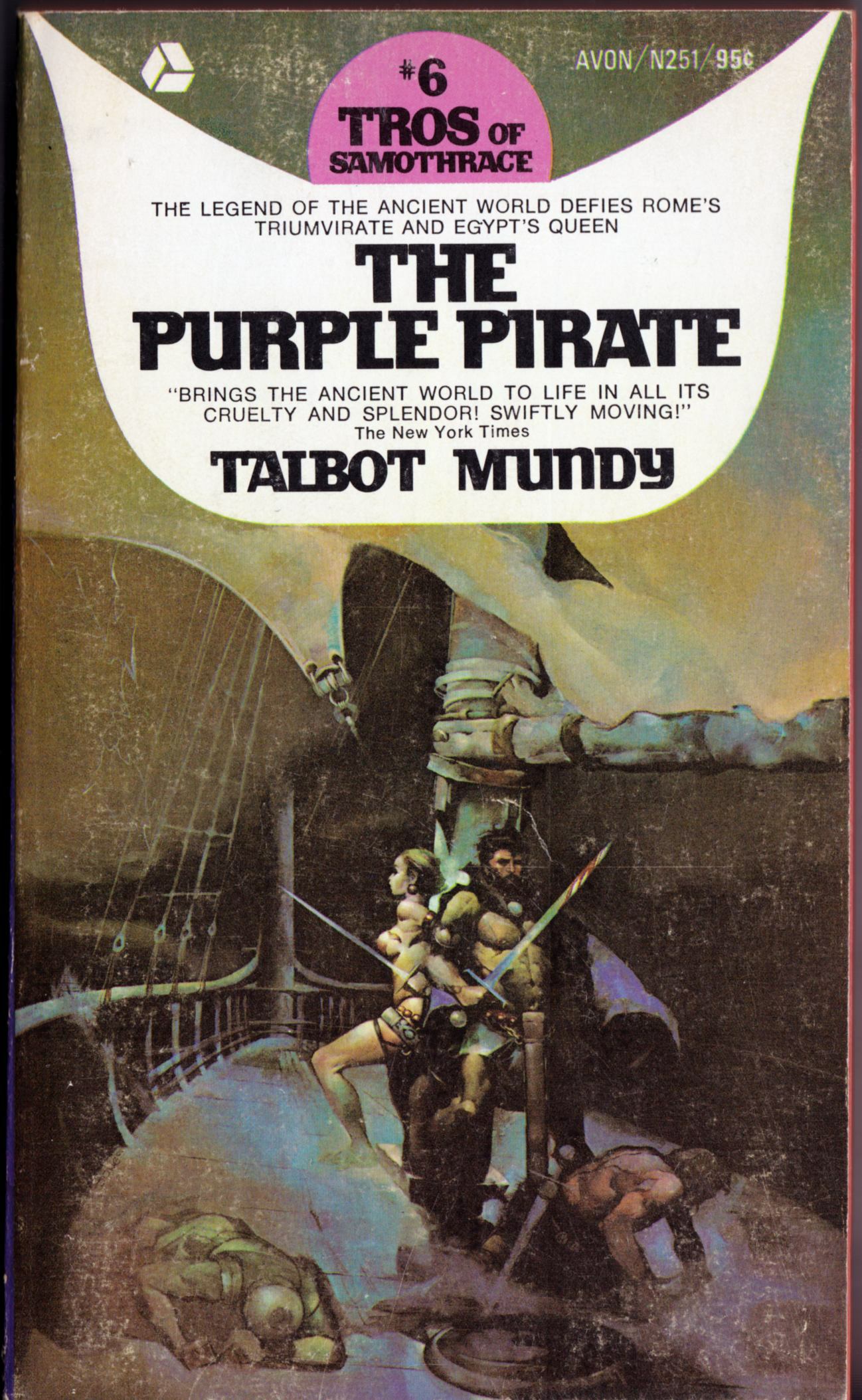
The helmeted, injured soldier in the lower left quadrant of Frank Frazetta’s Buccaneer/Destroyer painting and the helmeted, injured soldier/sailor in the lower left quadrant of Jeffrey Jones’s painting for Talbot Mundy’s The Purple Pirate are not exact copies of each other, as you can plainly see above, and yet, they do seem to share a certain family resemblance. So much so, that one might venture to guess that one of the painters has been “inspired by” the other in this detail… however, it’s not at all clear to me who was inspired by whom. Near as I can tell, the Jones cover was published first, in 1970; the Frazetta, second, in 1971. So make of that what you will…
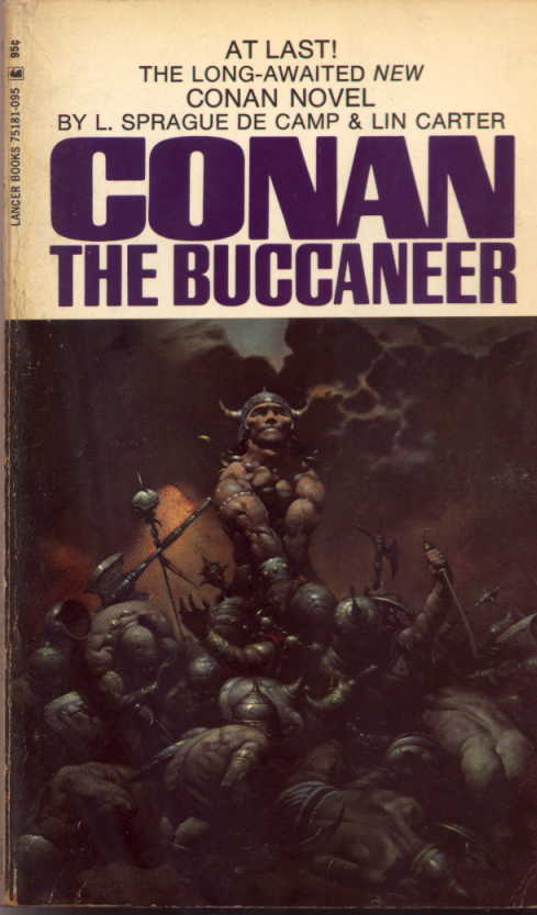
Keywords:The Buccaneer, The Purple Pirate Talbot Mundy, L. Sprague de Camp, Lin Carter.
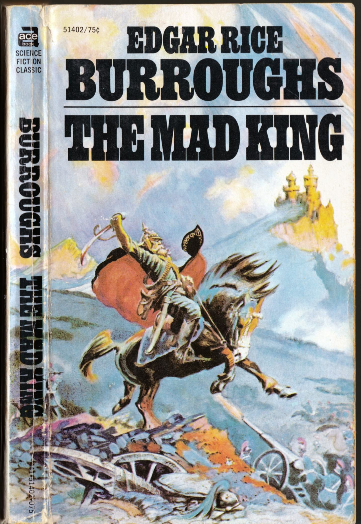
ABOVE: Edgar Rice Burroughs, The Mad King (New York: Ace, n.d.), with cover art by Frank Frazetta.
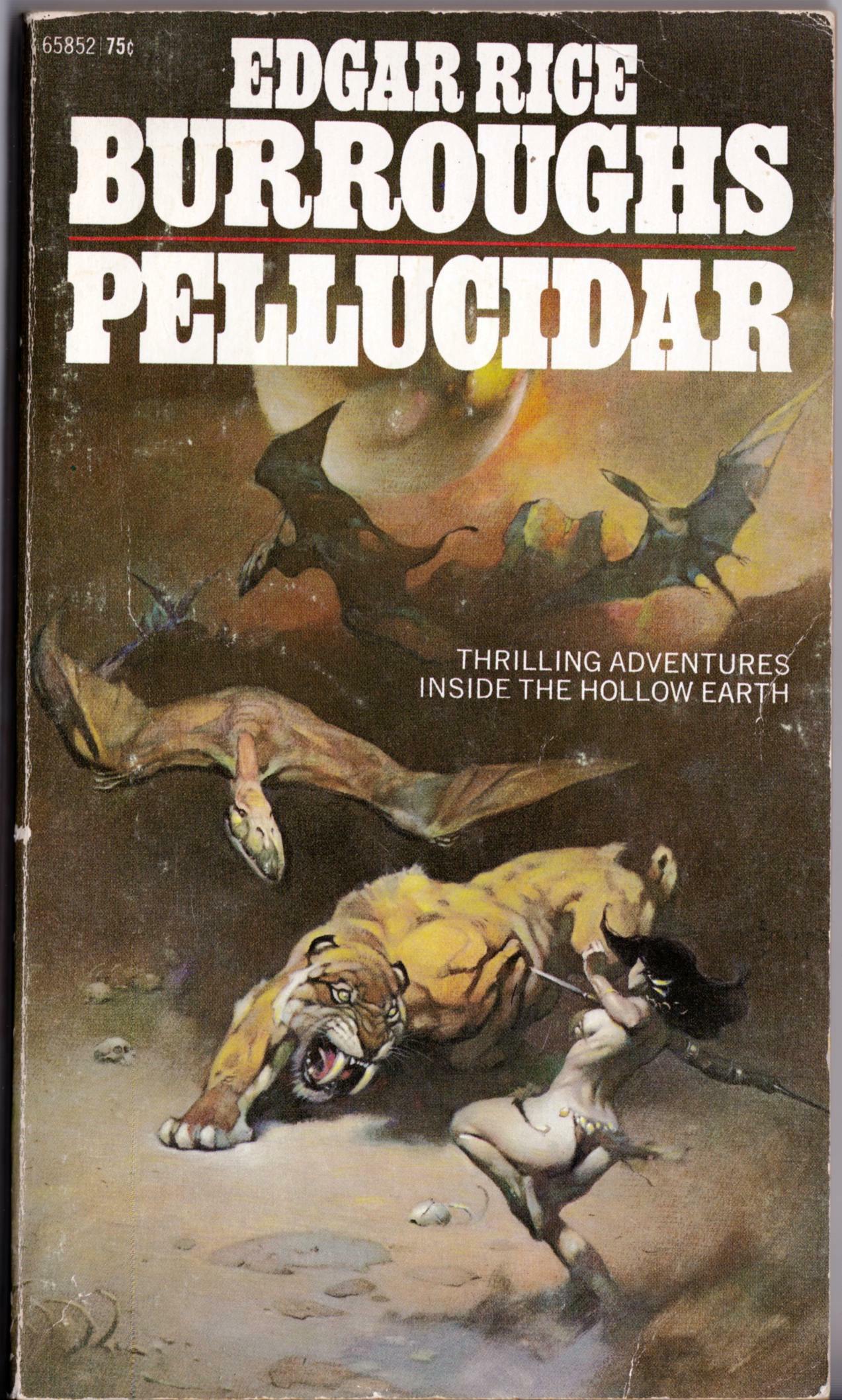
ABOVE: Edgar Rice Burroughs, Pellucidar (New York: Ace, 1972), with cover art by Frank Frazetta.
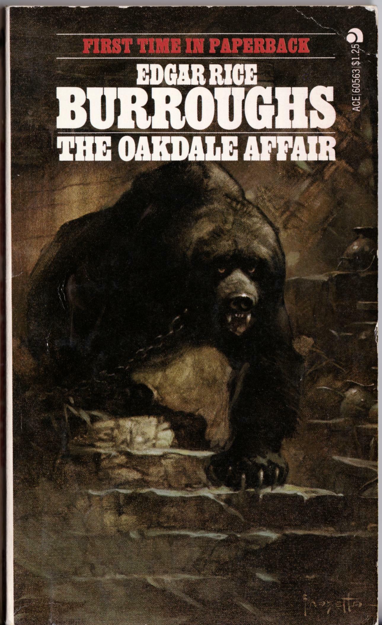
ABOVE: Edgar Rice Burroughs, The Oakdale Affair (New York: Ace, n.d.), with cover art by Frank Frazetta.
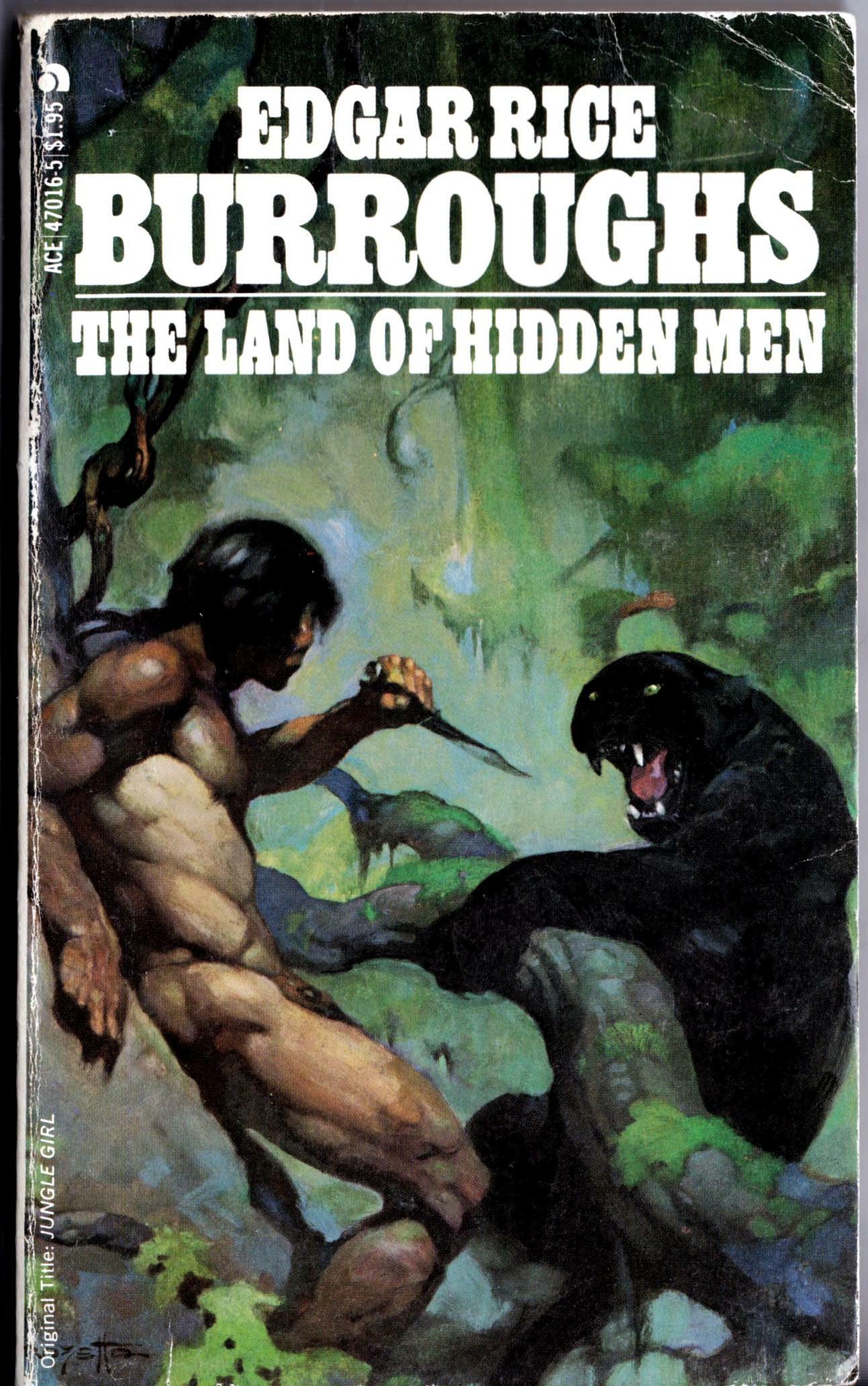
ABOVE: Edgar Rice Burroughs, The Land of Hidden Men (New York: Ace, 1978), with cover art by Frank Frazetta.
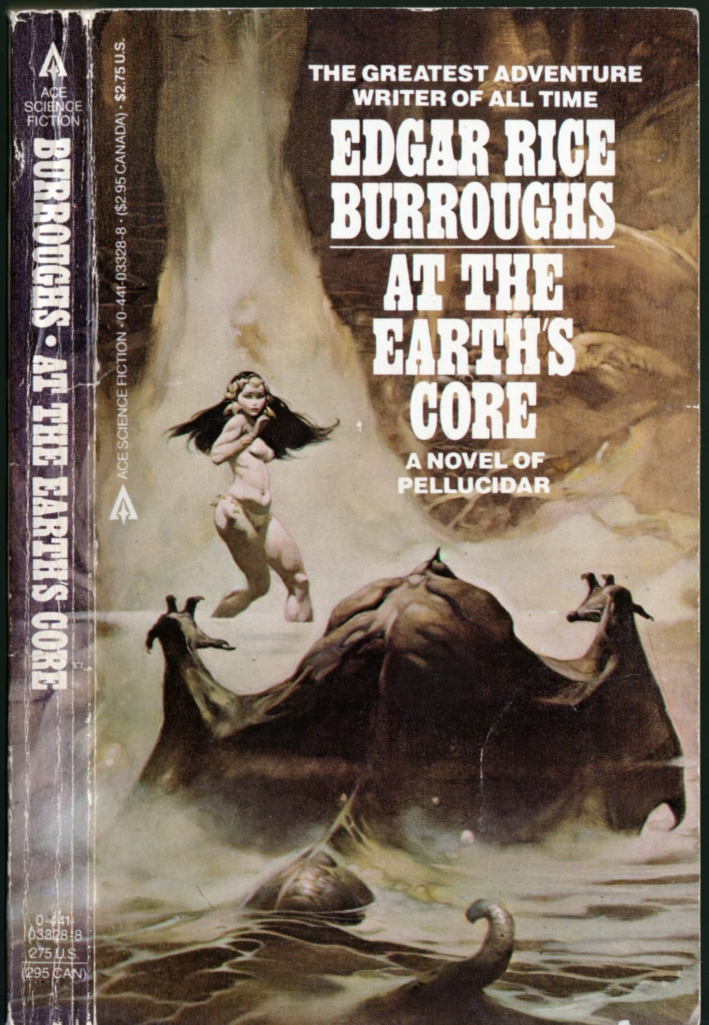
ABOVE: Edgar Rice Burroughs, At the Earth’s Core (New York: Ace, n.d.), with cover art by Frank Frazetta.
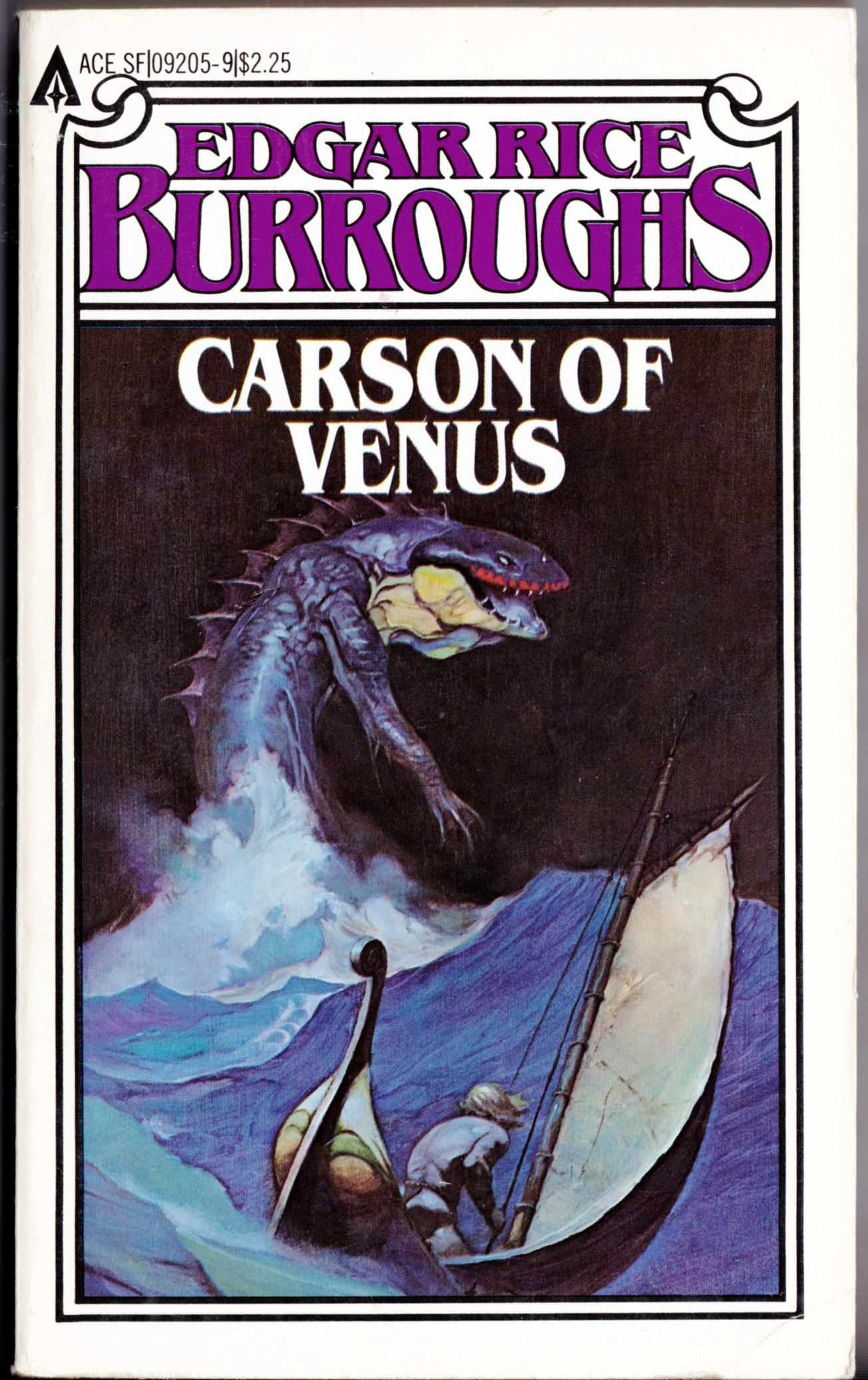
ABOVE: Edgar Rice Burroughs, Carson of Venus (New York: Ace, n.d.), with cover art by Frank Frazetta.
Seems the designers at Ace couldn’t decide whether Ace’s 1970s reprint series of Edgar Rice Burroughs novels looked better with the art wrapped around to decorate the spine (as pictured above) or with coloured type on a white background (not pictured). No doubt, there was a lot of annoying input from marketing about which design would be more attractive on the store shelves and ultimately produce better sales…
The more elaborate Carson of Venus design is the odd man out here, I know, but since it is the last Edgar Rice Burroughs paperback with cover art by Frazetta that I have on hand, I thought I might as well throw it in as a bonus!
Keywords:The Mad King, Pellucidar, The Oakdale Affair, The Land of Hidden Men, At the Earth’s Core, Carson of Venus.
Well… in all fairness, the two paintings posted below are different enough that I probably should have tossed this post into the “Connections” category. And you know what? I think I might have done so, if only Boas’s style here weren’t every bit as derivative as his concept…
[CLICK IMAGES TO ENLARGE]
ABOVE: Frank Frazetta, The Dark Kingdom, Creepy, vol. 1, no. 9 (June 1966).
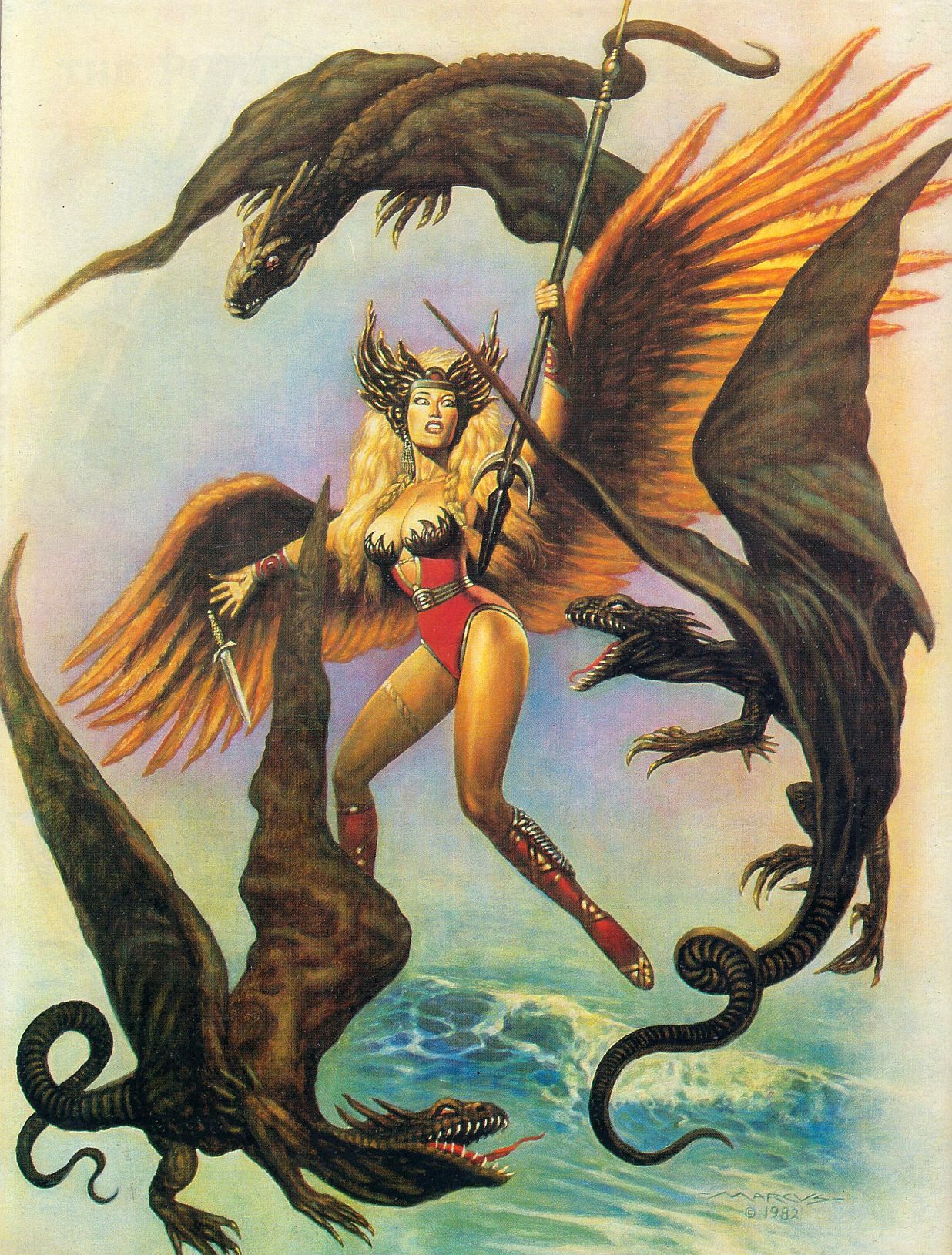
ABOVE: Marcus Boas, untitled illustration, signed and dated 1982, back cover, Heroic Fantasy, vol. 1, no. 1 (February 1984).
Marcus Boas’s debt to Frazetta in the above painting is clear enough, I think; however, in terms of painting technique, colour sense, and model types, Boas owes an even bigger debt to Boris Vallejo circa 1980. Because the fact is, Boas’s Heroic Fantasy painting is pure pastiche. It has nothing original about it other than the poorly designed creatures whose misshapen wings are attached to their bodies by wishful thinking rather than by anatomy and the inevitable awkwardness that seems to emerge whenever a mediocre illustrator attempts to make changes to a composition he has cribbed from an acknowledged master.
BONUS IMAGES:
Two covers by Boris Vallejo, scanned from the paperback library of yours truly:
ABOVE: Donald J. Pfeil, Through the Reality Warp (New York: Ballantine, 1976), with cover art by Boris Vallejo.
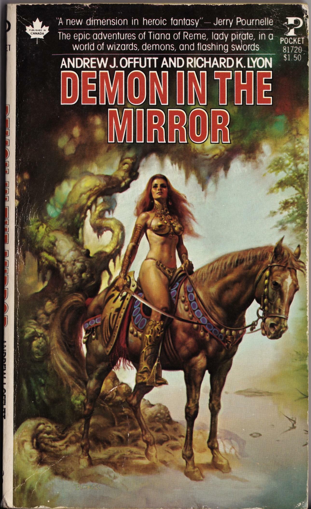
ABOVE: Andrew J. Offutt and Richard K. Lyon, Demon in the Mirror (New York: Pocket Books, 1978), with cover art by Boris Vallejo.
As I recall, Boris’s un-Frazetta-like cover for Demon in the Mirror made a big impression on me as a teenager, and truth be told, it remains one of a handful of Boris’s covers that I quite like. In recent years, Boris has unfortunately transformed his fantasy art into a platform to indulge what can only be described as a personal fetish for the bodybuilder physique, both male and female. Notice, however, that no bodybuilders were recruited to pose and flex for either of the above covers — thank god!
Keywords:Through the Reality Warp, Demon in the Mirror.
Look closely and you just might see the tell-tale signs that Big John Buscema had Frazetta’s lion in mind, and perhaps even on his desk, when he drew the cover of Conan the Barbarian #96:
The face of Frazetta’s lion is so lively and expressive that it makes Buscema’s more symmetrical version seem flat and mask-like in comparison.
The Bud’s Art Books catalogue arrived today, and as I was flipping idly through the pages, I noticed something that seemed familiar in a tiny thumbnail image of a book cover (issue 1010F, page 67, item E). Here, take a look at the much larger images below, and see if you notice it, too.
Is this mere happenstance? Maybe, maybe not. You decide.


