[CLICK IMAGE TO ENLARGE]
"This day's experience, set in order, none of it left ragged or lying about, all of it gathered in like treasure and finished with, set aside." –Alice Munro, "What is Remembered"

[CLICK IMAGE TO ENLARGE]

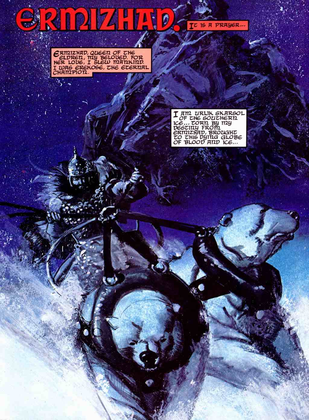
Notice how Frazetta hasn’t bothered to construct any kind of a harness for the Silver Warrior’s polar bear sleigh team and how Chaykin’s attempt to supply Urlik Skarsol’s polar bear team with a semi-plausible harness — with collars that look as though they might be made out of big, black inner tubes recycled from old truck tires — actually diminishes rather than enhances Frazetta’s gloriously silly original concept by drawing undue attention to the mundane question of how, exactly, the fantasy hero’s cool mode of transportation could be made to work in the real world and whether Chaykin’s design is, in fact, a viable solution.
BONUS IMAGE (Added 27 December 2013):


The Frazetta cover was published in September 1954; the artwork by Val Mayerik is from a story called “Domain,” with script by Bruce Jones, that appeared in Alien Worlds #1 in December 1982.
Flipping through the second issue of the E.C. fanzine, Squa Tront, I came across a profile of Bernie Wrightson that made me chuckle. Published in September 1968 — the same year that, according to his official Web site, Wrightson “turned pro” — the profile includes a short biographical and artistic statement as well as three full-page reproductions of Wrightson’s work. In the statement, the man formerly known as “Bernard Albert Wrightson” explains why he has decided to go by the name “Berni” instead of “Bernie” (a decision he later reversed); he forthrightly acknowledges his longstanding fascination with and admiration for the work of Frank Frazetta; and he vigorously defends himself from the charge that his own work is overly indebted to that same artist: “He’s [Frazetta has] probably inspired me more than anyone else and to this day, I hear so much about my copying or ‘swiping’ from him. Well, I have never had a piece of Frazettart [sic] on the board while working. This is just my natural way of drawing, as I was drawing like this long before I ever laid eyes on his work. It’s just my misfortune (?) that our work appears similar.” Trouble is, Wrightson, who was only about 20 years old at the time, says right in his statement that he “became interested in art at about age twelve and when I was fifteen, ‘discovered Frazetta.'” Now, I don’t know what kind of prodigy Wrightson was, but if he was drawing like Frazetta long before he ever laid eyes on Frazetta’s work, then clearly he would have had to have been doing so between the ages of 12 and 15… which, to my mind, definitely does not pass the… uhm… uh… anyway, from Squa Tront #2 (September 1968), here’s “Profile: Bernie Wrightson,” along with an illustration by Frazetta, originally published in the Canaveral Press edition of E.R.B.’s Tarzan and the Castaways (1965), that did NOT appear in Squa Tront but, in light of Wrightson’s statement, holds a certain interest, I think.
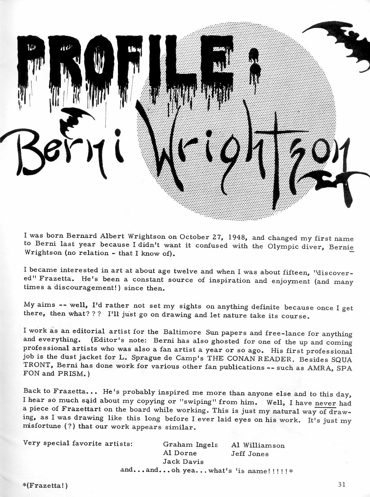
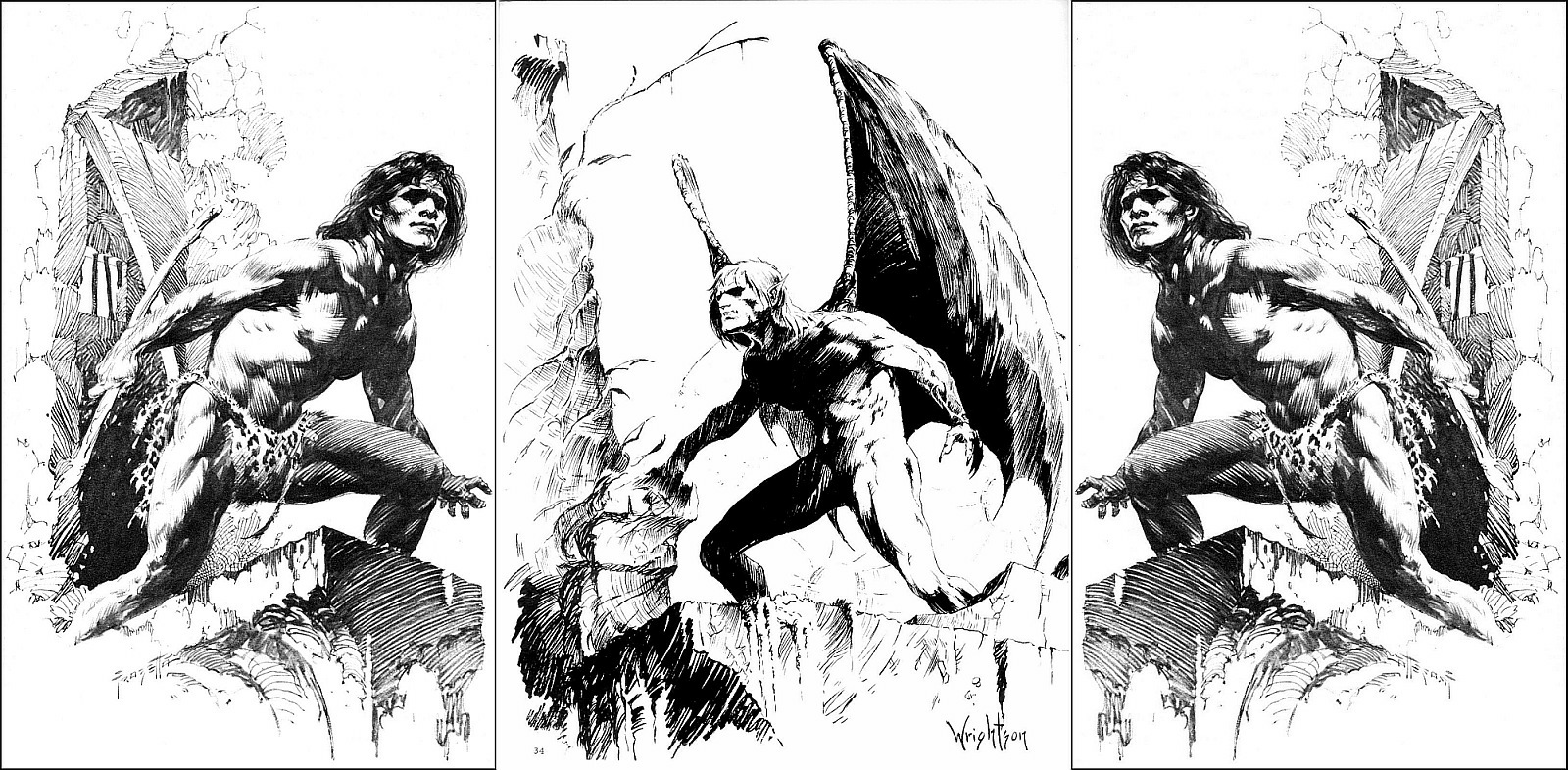
Do you see now why “Profile: Berni Wrightson” made me chuckle? Ah, the impetuousness of youth!
Of course, Wrightson would eventually synthesize his influences to produce some of the best horror comics and illustrations of the 1970s and beyond. But he clearly hadn’t done so in 1968. And from all the work I’ve seen, I’d argue that he didn’t do so for a few more years after that. Which, btw, is a perfectly normal path of development for an artist, right down to the denials…
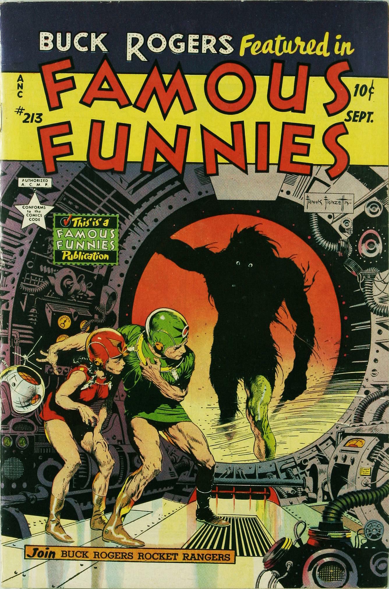
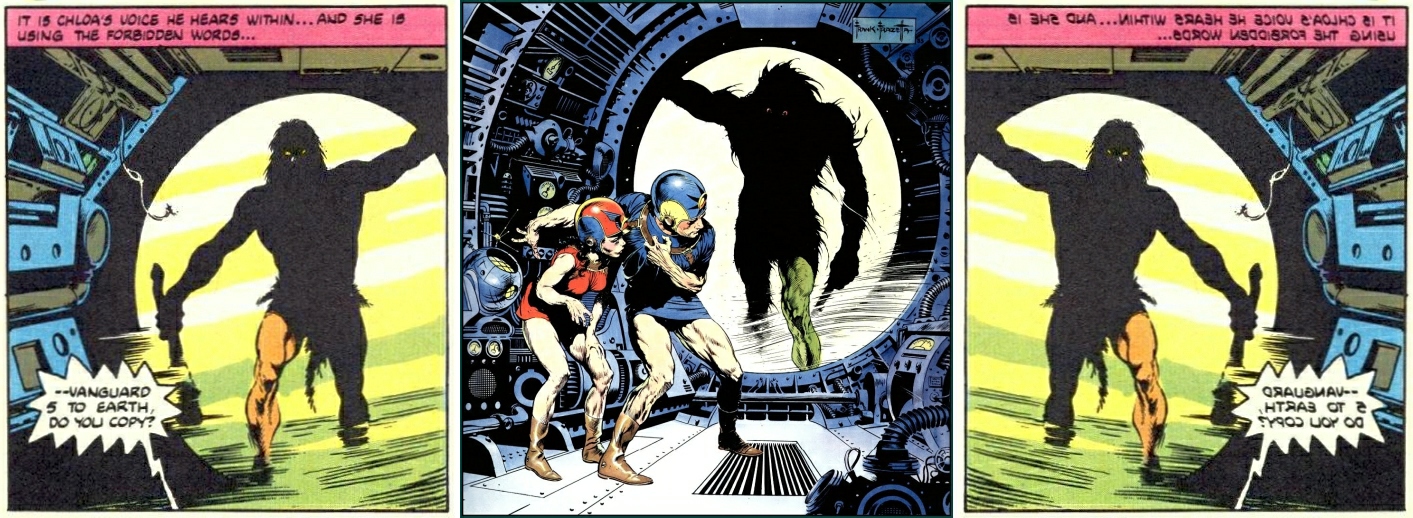
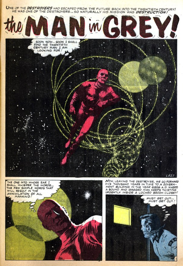
The famous cover of Nick Fury, Agent of S.H.I.E.L.D #6 (November 1968) is commonly referred to as Steranko’s “homage to Wally Wood” — that spacesuit! — although many have noted that the cover could almost as easily be seen as an homage to Famous Funnies #214, with art by Frazetta. I don’t, however, recall anyone mentioning what I believe is a swipe by Steranko from the opening panel of “The Man in Grey,” World of Fantasy #7 (May 1957), with art by Gray Morrow. Or maybe I’m just seeing things. Take a look and decide for yourself…

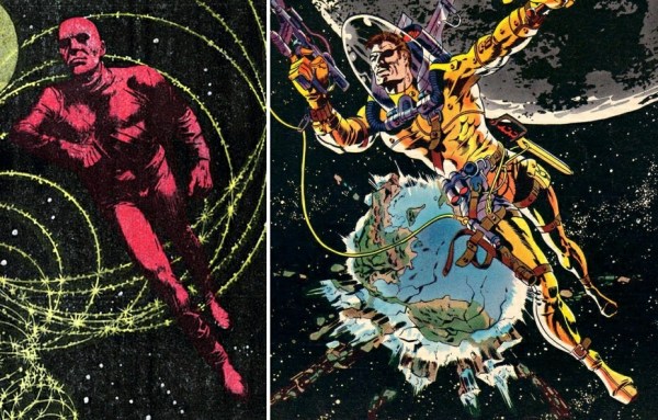

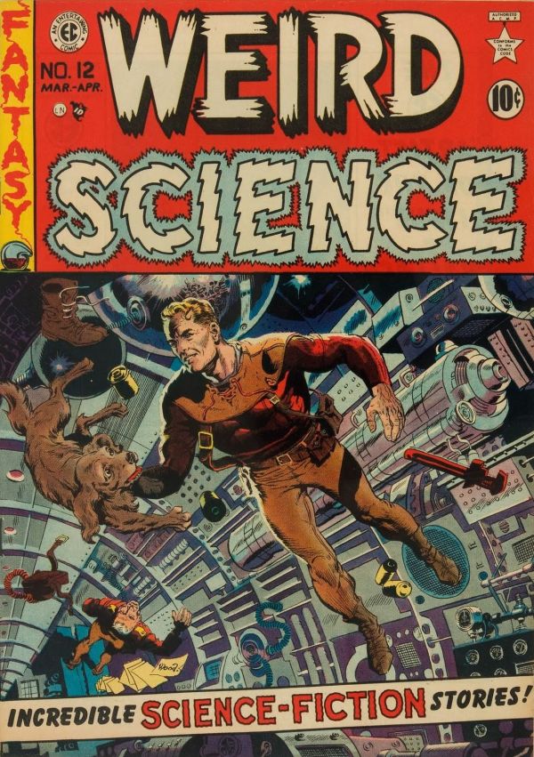
Yes, the yellow-and-orange-suited figure on the 1952 cover of Weird Science #15 (art by Wally Wood; see above) is in the ballpark — it may, in fact, have been an influence on both Morrow and Steranko — but there’s something about that Morrow panel…
Mix ingredients. Bake until stiff. Stick it in a cool window. Call it a Day.
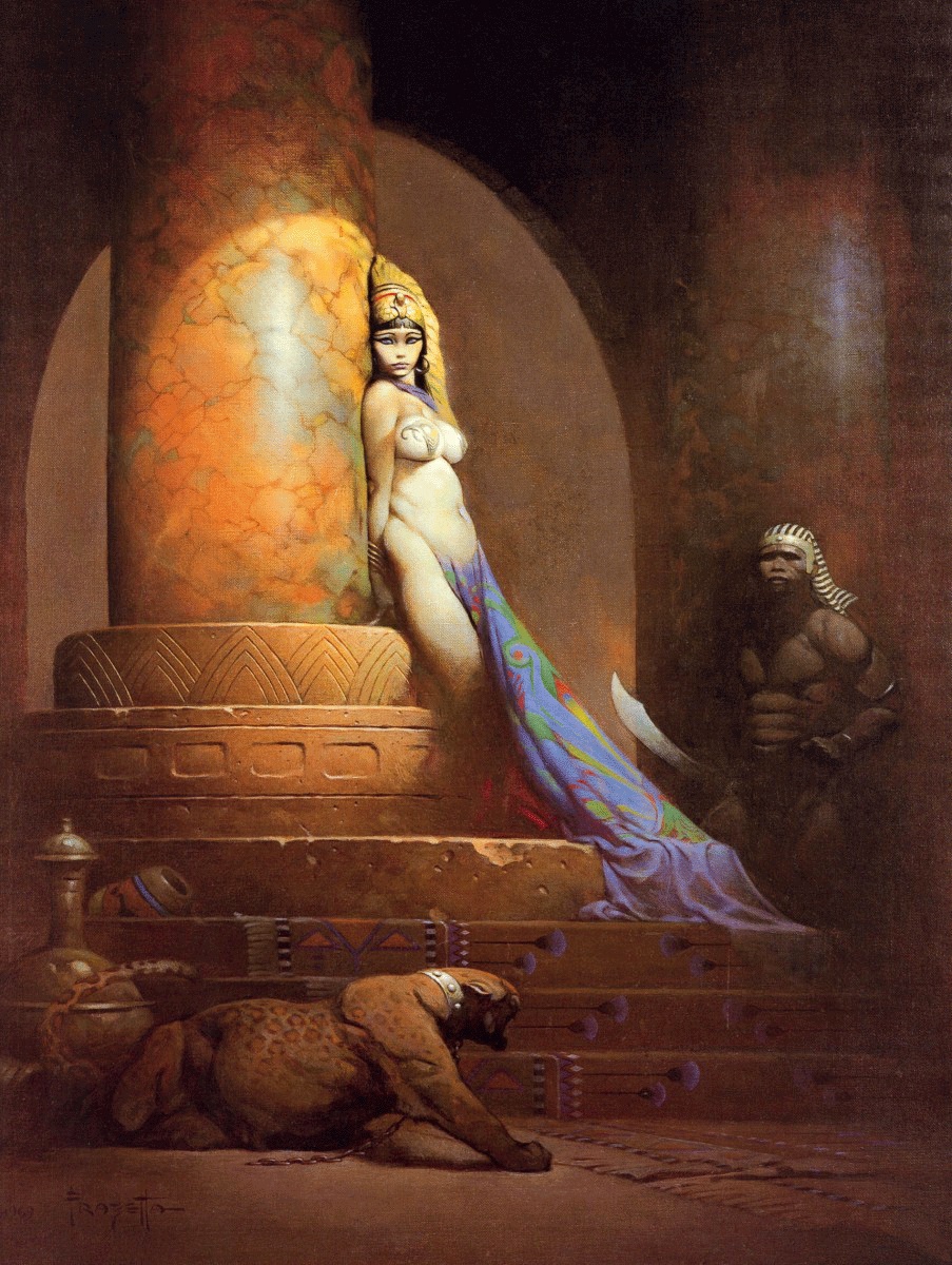
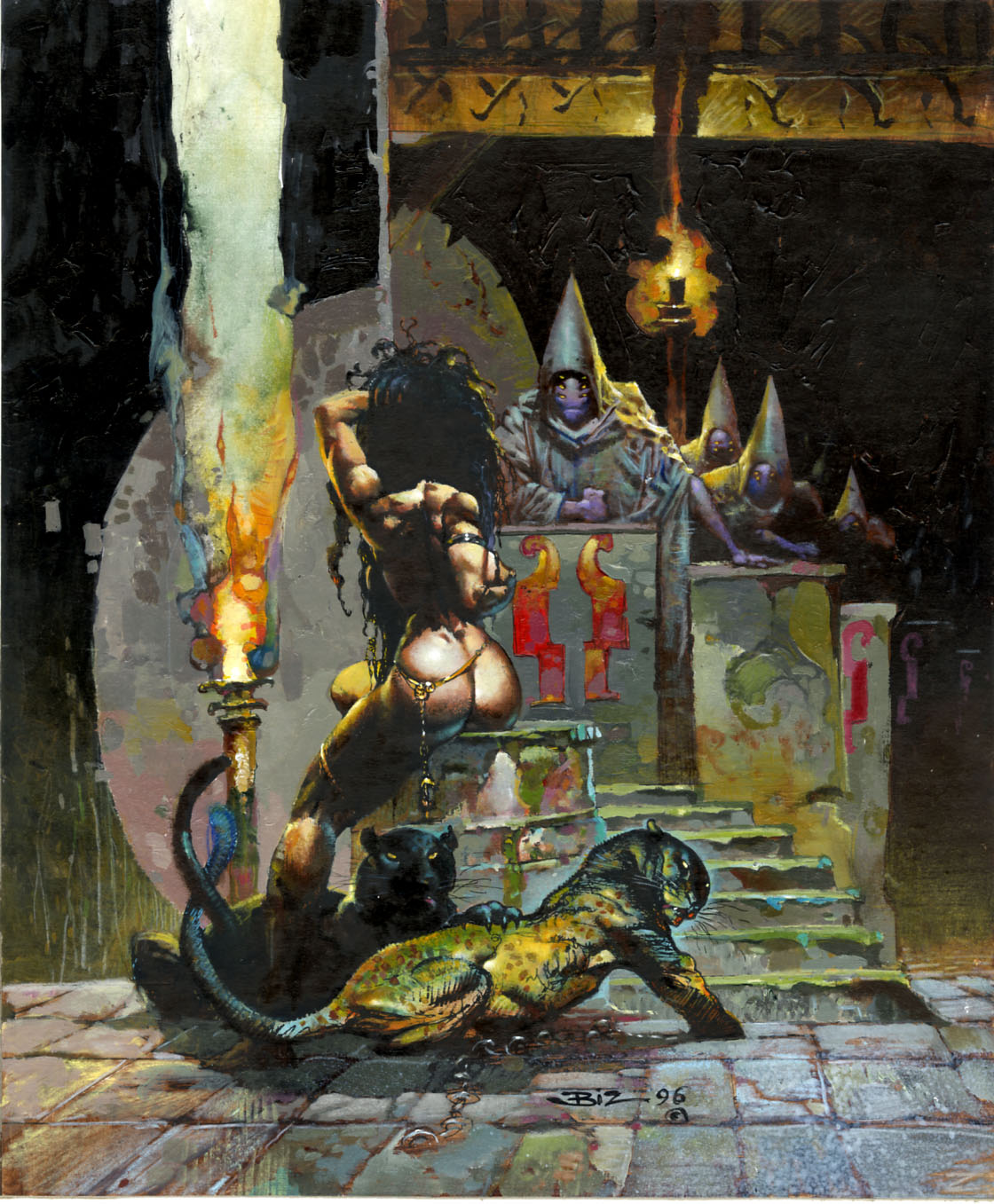
IMHO, all signs point to Frank Frazetta’s seductive Egyptian Queen (1969) as the “inspiration” for Simon Bisley’s comparatively coarse FAKK 2 illustration (1996):

Look at the bridle on Vokes’s version of Frazetta’s horse. Now you tell me: what’s missing from the design that renders it useless as a device one might use to control a real horse? (I see several problems with it.)
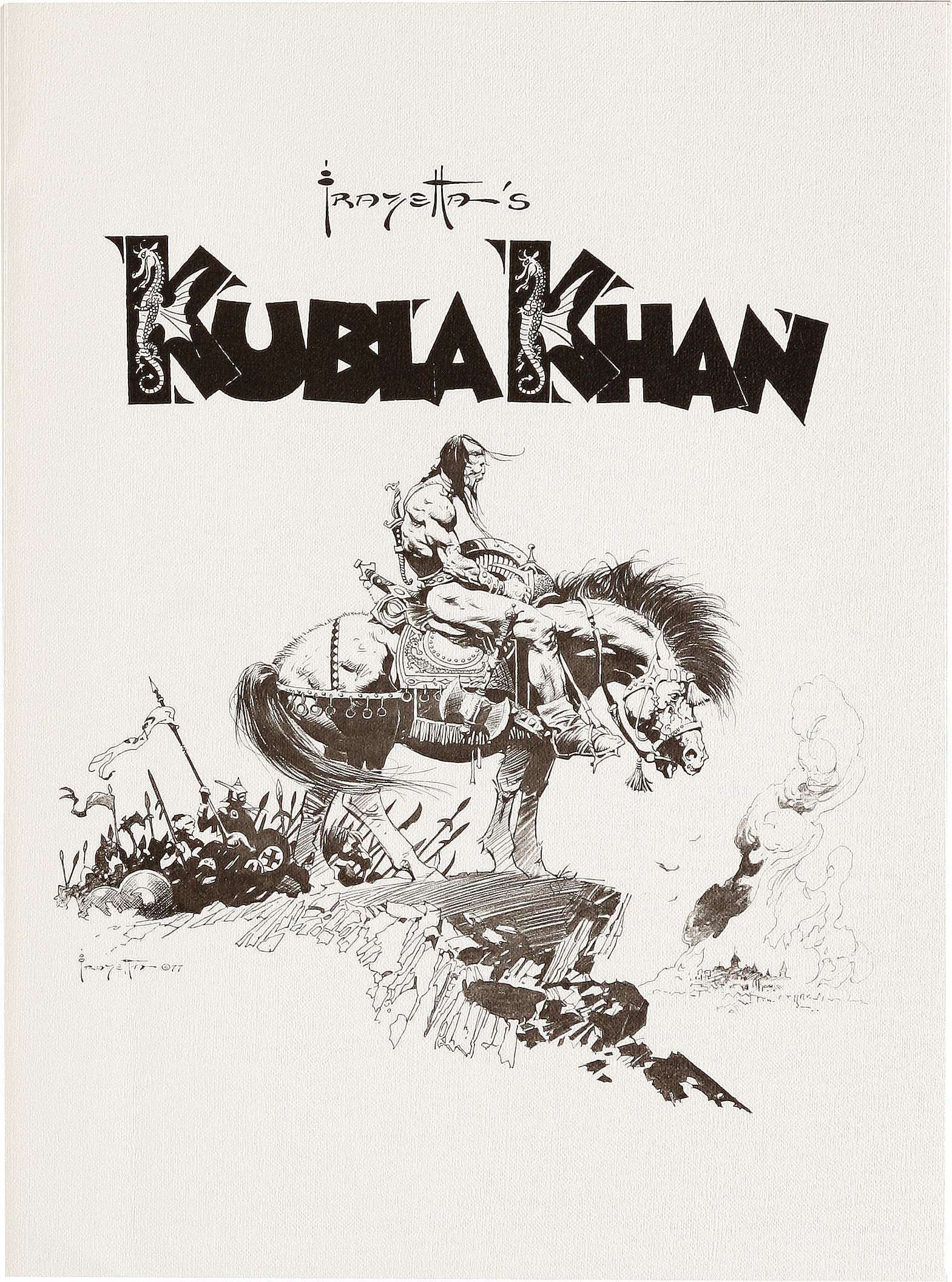
Of course, Frazetta’s Kubla Khan on horseback is itself little more than a variation on the longstanding Western theme of the weary Indian warrior on an exhausted horse, a.k.a. End of the Trail, which dates back to the 1915 sculpture by James Earle Fraser.
UPDATE:
In the world of functional bit-bridles, the country bridle and the western split-ear are about as minimalist as it gets:


Notice that the crucial elements in both cases are 1) a strap that attaches to one side of the bit, runs up the cheek of the horse, over the head behind the ears, down the other cheek, and attaches to the other side of the bit, and 2) an ear or brow band to prevent the bridle from sliding either down the neck towards the rider or around the head in a circle, which would pull the bit out of the mouth and onto the cheek. Seeing what a minimalist bridle looks like makes it easy to see what’s wrong with Vokes’s version, which consists of a combination browband/throat latch and an entirely separate noseband, with no cheek pieces or headpiece at all.
[CLICK IMAGES TO ENLARGE]
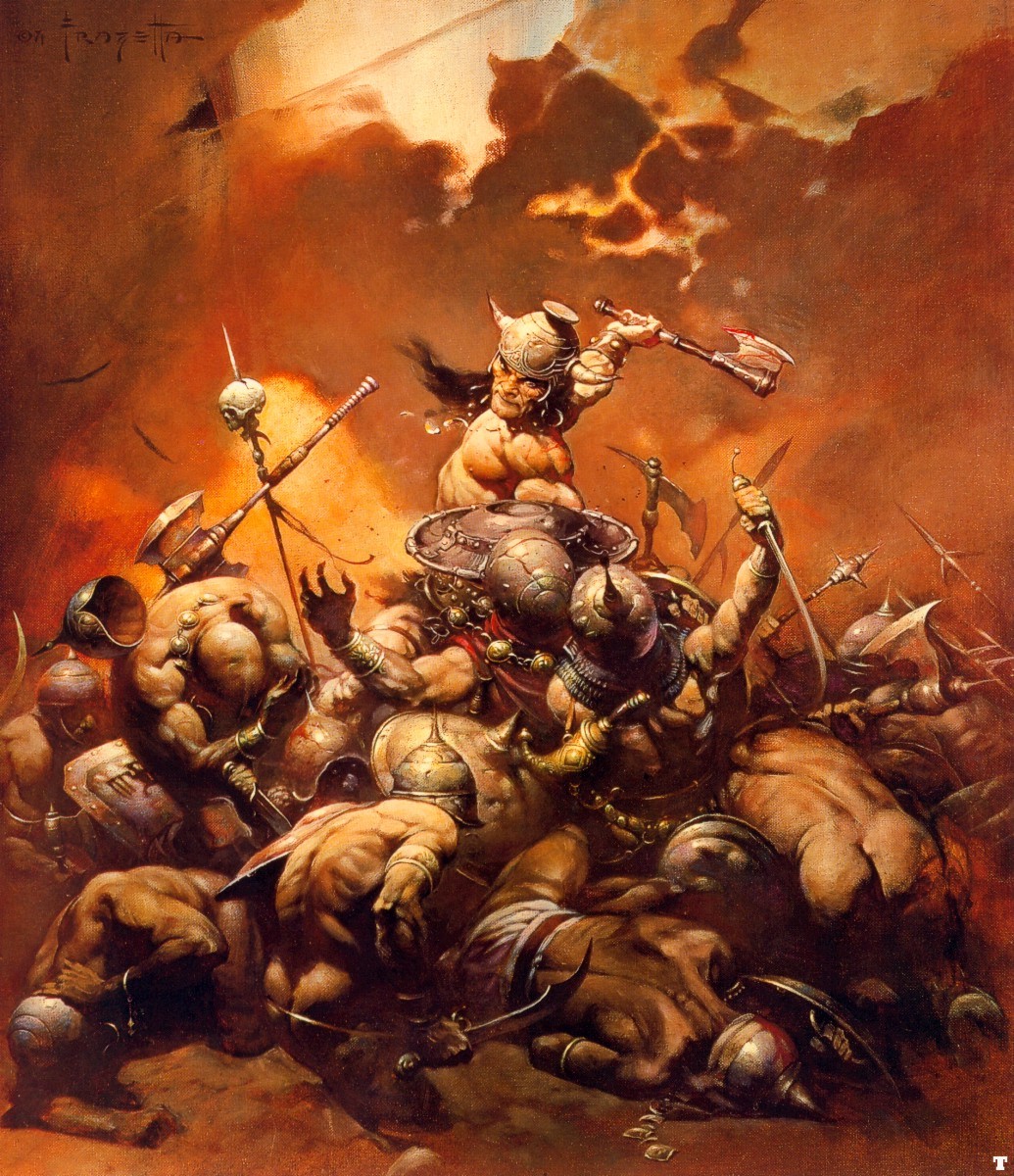
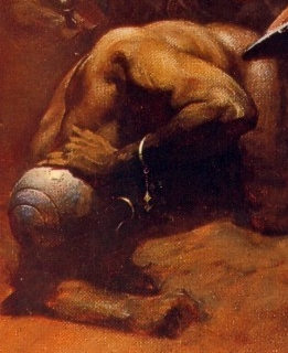
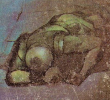
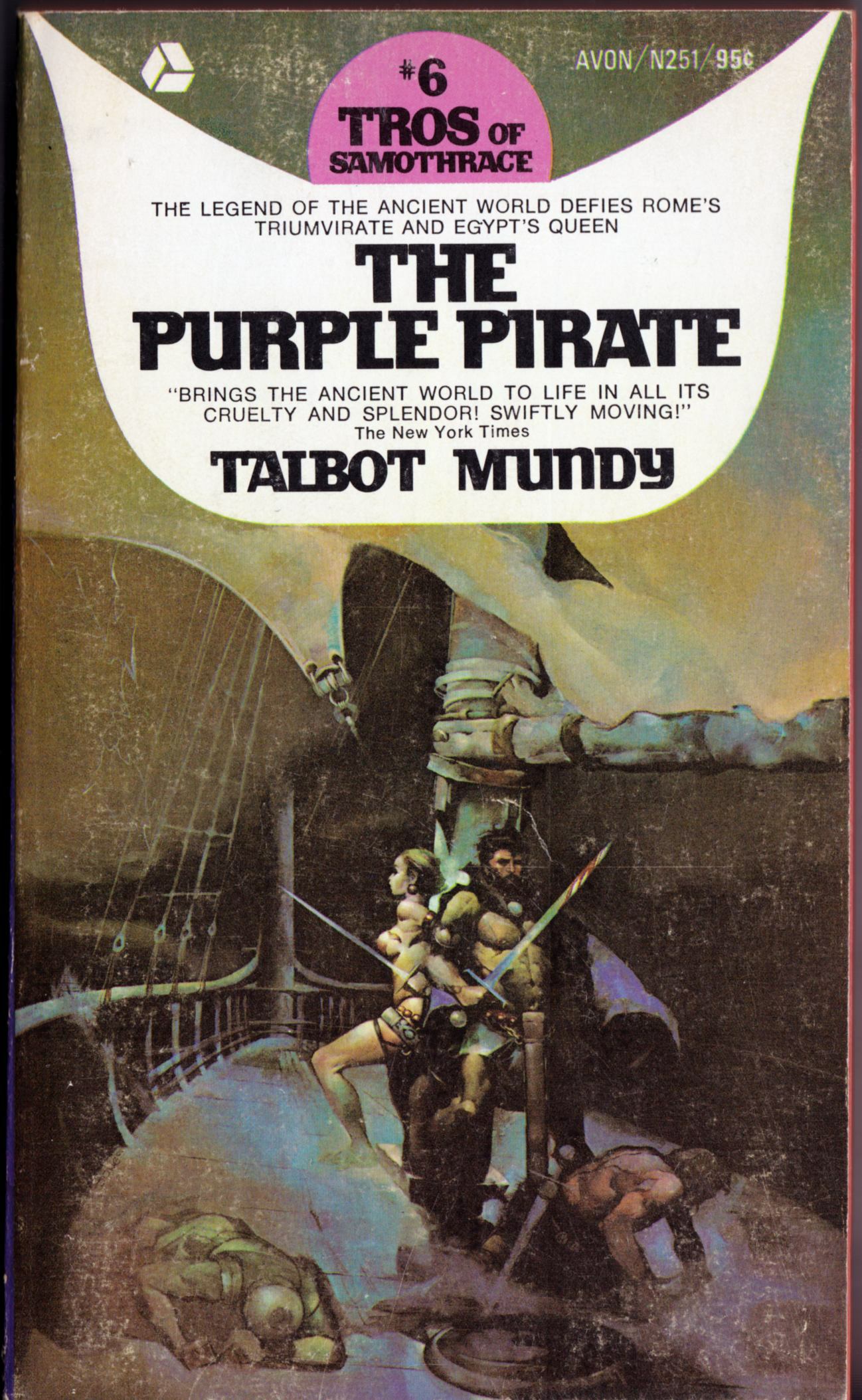
The helmeted, injured soldier in the lower left quadrant of Frank Frazetta’s Buccaneer/Destroyer painting and the helmeted, injured soldier/sailor in the lower left quadrant of Jeffrey Jones’s painting for Talbot Mundy’s The Purple Pirate are not exact copies of each other, as you can plainly see above, and yet, they do seem to share a certain family resemblance. So much so, that one might venture to guess that one of the painters has been “inspired by” the other in this detail… however, it’s not at all clear to me who was inspired by whom. Near as I can tell, the Jones cover was published first, in 1970; the Frazetta, second, in 1971. So make of that what you will…
