Book/Magazine Covers (All) · Comics · Here, Read · Illustration Art · Look Here · Rebecca Dart

Look Here, Read: “Depression” by Rebecca Dart

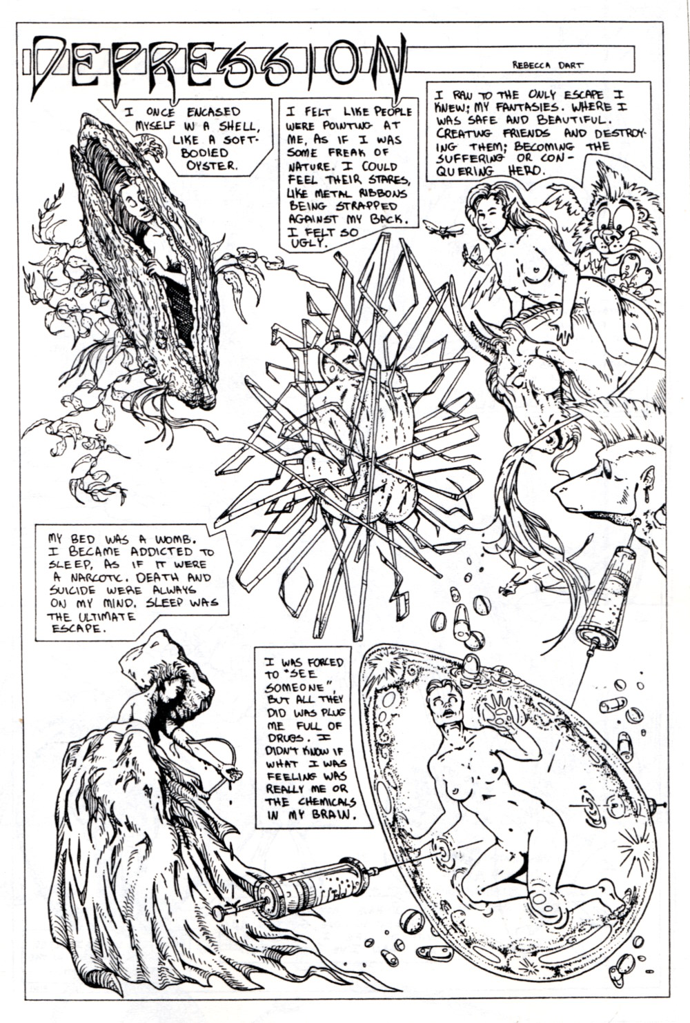
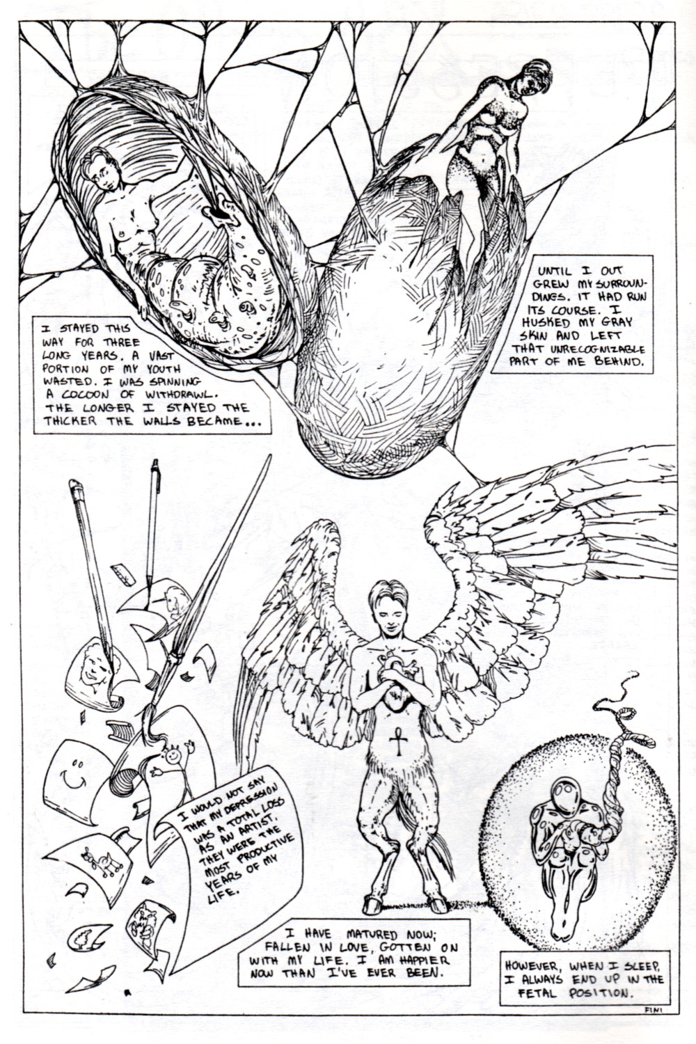
From the mini-comic The Other 88% #1, published way back in November 1993, here’s “Depression,” a heartfelt two-page story by Rebecca “Battle Kittens” Dart, who had just turned twenty in April of that year:

[CLICK IMAGES TO ENLARGE]


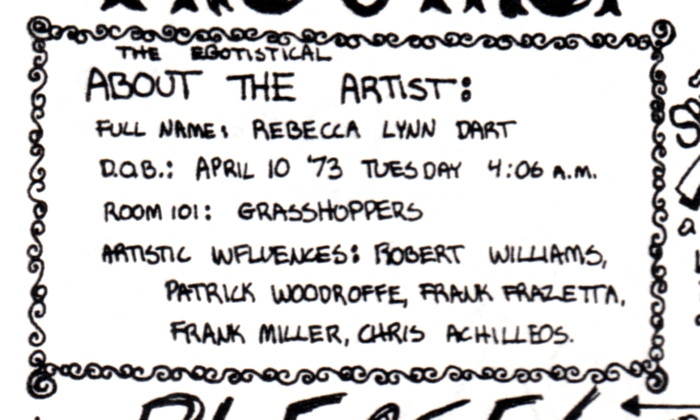
BONUS SCANS: COVER and ABOUT THE ARTIST


REBECCA DART ON THE WEB:


INTERVIEWS:

Book/Magazine Covers (All) · Illustration Art · Look Here

Look Here: Three sexy, fun, odd, nsfw photo covers

As I’ve mentioned once or twice on this blog in the past, I don’t often buy paperbacks with photo covers, but when I came across a copy of The Secret Sex Curse of Bertha T. — dig that groovy lettering, dig that papier-mâché demon mask, dig the sleek Ms. Bertha Turtle, her upper body bathed in a golden glow, her lower body not merely exposed but over-exposed! — after I came across that book, I say, at a local Salvation Army Thrift Store, I started to watch for a couple of others that I could scan with it to produce a post here at RCN. And, well, it’s not much, but here’s what I’ve got:

[CLICK IMAGES TO ENLARGE]

Does it make any sense to you that the woman on the front of Blondes Don’t Have All the Fun is wearing sheer pantyhose? Because it makes no sense to me… though I am certainly familiar with the theory that being not quite naked is sexier than being totally naked… I just don’t see that it makes much difference here, except that waistband is an unattractive distraction…

Keywords: Juliet of the Spirits, Blondes Don’t Have All the Fun, The Secret Sex Curse of Bertha T.

Art Instruction · Commonplace Book · Here, Read

So you want to learn to draw human figures from your imagination?

If you want to learn to draw human figures from your imagination, here’s what I recommend…

  • Stay as far away from Burne Hogarth’s books as possible. Hogarth has absolutely NO IDEA how the human body really moves, and the simplified forms that he draws are only tenuously connected to real human anatomy. Everything of value that is in Hogarth’s books is in Loomis’s Figure Drawing for All It’s Worth, which is available for free as a PDF download from various sites and in a gorgeous facsimile edition from Titan Books. Loomis’s human beings are idealized, yes, but Hogarth’s are monstrosities. Stick with Loomis.
  • In opening section of Figure Drawing for All It’s Worth, “An Approach to Figure Drawing,” Loomis emphasizes the importance of the “mannikin figure” or “mannikin frame,” by which he means not merely the wooden figures that one can buy at an art supply store, which have somewhat limited usefulness, but lively three-dimensional, repeatable graphic visual simplifications of both male and female human bodies that one has practiced drawing from many angles and in a variety of poses until the process of construction has become second nature. “I am of the opinion,” writes Loomis, ” that to teach anatomy before proportion — before bulk and mass and action — is to put the cart before the horse.”  Loomis offers his own version of a skeletal mannikin figure, and demonstrates how to manipulate and flesh it out in a generalized way, but the point here is not that you must slavishly copy Loomis. Rather, the point is simply that if you are to reach your goal of drawing human figures from your imagination, you must endeavour to develop a conceptual mannikin figure of your own that you can use to lay out your compositions and that can serve as a solid basis for the more “realistic” figures that you will produce once you have increased, via intensive study and practice, your mental store of information about appearances, anatomy, movement, and so on (see below).
  • Always try to keep in mind (until it becomes second nature) Loomis’s BIG IDEA, which is that perspective applies to human bodies as much as it applies to buildings.
  • George Bridgman’s books are held in high esteem by experienced artists, but Bridgman’s drawings can be very difficult to decipher if you don’t already know what you’re looking at, so the books are not very good for beginners. IMHO, of course.
  • Buy the Vilppu Drawing Manual and follow Glenn Vilppu’s course of instruction. Vilppu sells the book via his website. His videos are also helpful because they enable you to watch him put theory into practice. A couple of Vilppu’s students have figure-drawing books out right now that are basically just the Vilppu method condensed and repackaged in a glossy format. Don’t buy those books. Buy Vilppu’s coil-bound original.
  • Buy a good anatomy book written for artists and USE IT. My top two recommendations from among the big “artistic anatomy” books that are currently in print and easily obtainable are Classic Human Anatomy: The Artist’s Guide to Form, Function, and Movement by Valerie L. Winslow and Atlas of Human Anatomy for the Artist by Stephen Rogers Peck. I also really like Anatomy: A Complete Guide for Artists by Joseph Sheppard, whose old-master influenced drawings are not only admirably clear but also aesthetically pleasing and inspiring in a way that drawings in modern anatomy books seldom are. And last but definitely not least, I like The Human Figure: An Anatomy for Artists by David K. Rubins, which is short, inexpensive, and has some of the clearest drawings of musculature of any artistic anatomy book I’ve seen. In fact, I like Rubins’s book so much that I cut the spine off of my copy and replaced it with a cerlox or “comb” binding, using a heavy-duty machine that I purchased for cheap at the local Habitat for Humanity Re-Store, so that I could lay book flat on my work surface for easy reference. But YMMV, as the kids used to say.
  • Sign up for a weekly class that offers the opportunity to draw from live nude models without instruction. Attend the class, and during the longer poses, attempt to draw exactly what you see. As you work your way through the Vilppu Drawing Manual, you will naturally begin to analyze the model in terms of simple volumes and anatomical landmarks; you will also learn about the importance of gesture. Vilppu doesn’t place much stock in contour drawing, but practice contour drawing anyway and work to incorporate specific details of what you have observed into the drawings that you make when you are not sitting in front of the model.
  • Don’t hesitate to use photo-reference that you’ve paid for or shot yourself to supplement your memory/imagination. Photographs can be misleading, sure, but treated as a source of telling details rather than as the last word on appearances, they can also help you breathe life into your constructions.
  • Keep a mirror close by, the larger the better, and use it, and your own body, to identify and solve problems in your figure drawings.
  • You’re allowed to erase. And you’ll be able to erase more easily if you keep a light touch in the early stages of your drawing. Sometimes, when you’ve made a serious blunder, like placing an arm in a position that is physically impossible for a real human being, you will want to erase completely and get back to white paper; at other times, however, you will want to leave the ghost of a good but not great form as a guideline for a smoother, more precise attack. Yes, you could place your incorrect drawing on a light box with a new sheet of paper over it and redraw it, or you could work on successive overlays of tracing paper. But keep in mind: erasing all but a ghost of the image is just as effective as those other methods, and it’s cheaper, too.
  • If you have the money and the time, sign up for a class in figure drawing with a good instructor. (Here’s a rule of thumb: if you can help it, don’t sign up for a class with an instructor who refuses to draw in front of the class.) Also, diligently attempt to do ALL of the assignments that the instructor asks you to do and work to incorporate his or her advice into your drawings. If you don’t want to do any assignments and you don’t want any advice, don’t sign up for a class in figure drawing that includes any instruction, period. You’ll only be wasting your money, your time, your instructor’s time, and, worst of all, your classmates’ time and money.
  • Jack Hamm’s Drawing the Head and Figure is an inexpensive book that is packed with interesting and useful tidbits of information. Definitely not essential, but I daresay that no other book on figure drawing delivers as much value for money.
  • Draw, draw, draw, draw, draw, draw, draw.

… or go your own way, and let your freak flag fly, because drawing naturalistic human figures in a convincing manner from your imagination is by no means the be-all and end-all of art.

[DRAFT 03 May 2013 11 May 2013]


RELATED POSTS HERE AT RCN:

Book/Magazine Covers (All) · Illustration Art · Look Here · The Brothers Hildebrandt

Look Here: The “Fall of the Towers” trilogy times two

More paperback covers, scanned by yours truly…

First up, here are the covers that the folks at Ace Books designed for their 1970s reprint of Samuel R. Delany’s “Fall of the Towers” trilogy, which was first published in the early 1960s; the pretty, staid cover art is by the Brothers Hildebrandt, who at the time were generally fairly adept at colour mixing for various lighting conditions but not especially good at designing futuristic or alien cities that didn’t look like conglomerations chess pieces (or monsters that didn’t look like slightly modified versions of plastic toys; see, for instance, the cover of Epic Illustrated #5):

[CLICK IMAGES TO ENLARGE]

In contrast, in the UK in the late 1960s, the “Fall of the Towers” trilogy was published by Sphere with relatively adventurous cover art by Russell FitzGerald, although I must say, the artist’s ambition here seems to me to have been tightly hobbled by his weak draftsmanship and indifferent painting technique:

FitzGerald’s work was later featured in and on the cover of the inaugural issue of the SF paperback quarterly Quark (1970), which was edited by Delany and Marilyn Hacker. I know I have a copy of Quark #1 somewhere around here, but damned if I know where it is at the moment… not that it matters, because the cover of Quark #1 is terrible…

Keywords: The Fall of the Towers, Out of the Dead City, The Towers of Toron, City of a Thousand Suns.

Barye Phillips · Book/Magazine Covers (All) · Illustration Art · Look Here

Look Here: Three pulp covers with art by Barye

I might have even more paperbacks with cover art by Barye Phillips on a shelf somewhere… or I might not… I’m not sure…

[CLICK IMAGES TO ENLARGE]

To view all of the paperback covers with Barye art that I’ve posted so far (along with a cover by an artist I’ve been unable to identify), click here.

Keywords: Always Leave ‘Em Dying, Arrowsmith, Brides in Bedlam.

Barry N. Malzberg · Book/Magazine Covers (All) · Davis Meltzer · Illustration Art · Look Here · Samuel R. Delany

Look Here: Two more novels with bold cover art by Davis Meltzer

[CLICK IMAGES TO ENLARGE]

Isn’t it interesting that the art director at Ace put the blurb on The Falling Astronauts cover directly over Meltzer’s signature. No art credit inside the book, either. But Meltzer was probably paid a lot for his work, right? Yeah, right…

Book/Magazine Covers (All) · Fine Art · Francis Bacon · Look Here

Look Here: DARKNESS AT NOON, with cover art by Francis Bacon

How many times has a painting by Francis Bacon appeared on the cover of a book that is not about the life and/or art of Francis Bacon? I’m no expert, but I can only think of one instance — you are welcome to post a comment if you know of more! — and here it is, scanned from my personal library, along with a small, low-quality JPEG of Bacon’s original painting, Man in Blue V:

[CLICK IMAGES TO ENLARGE]

Now, although Bacon’s painting itself is simply composed and nearly monochromatic in colour, the contrasty, cropped, colour-reduced version on display on the cover of Darkness at Noon reads to me as little more than a shadow of The Man.


Francis Bacon was born 28 October 1909 and died on this day, 28 April, back in 1992. In other words, today is the twenty-first anniversary of the death of Francis Bacon.


BONUS IMAGE:

A reader delurked today to bring to my attention another book cover with art by Bacon: Hadrianus VII by Fr. Rolfe (Baron Corvo), with the Fr. being short for “Frederick”. Here’s what it looks like:

The tiny image posted above — the only one I could find on short notice — is from the catalogue of an online bookseller.

Thanks, Arthur!

Keywords: Darkness at Noon.

Connections

Connections: John Gannam and Al Hartley

Back on 01 January 2012, I posted a lovely “Out of Context” image that seemed appropriate for the morning after New Year’s Eve. The story from which I clipped the panel does not include an artist credit, but the Grand Comics Database attributes the artwork in “Menace to Our Marriage,” All Romances #2 (October 1949) to Al Hartley.

Almost sixteen months later, i.e., yesterday, on his blog Illustration Art, David Apatoff posted three paintings by John Gannam in the context of a discussion of the perennial commercial appeal of artistic depictions of female ecstasy over products. And one of Gannam’s “legendary” 1940s watercolours for Pacific Sheets leaped off the (Web) page at me! Scroll down and you’ll see why…

[CLICK IMAGES TO ENLARGE]