Book/Magazine Covers (All) · Don Ivan Punchatz · Illustration Art · Look Here

Look Here: A trio of FOUNDATION covers with art by Don Ivan Punchatz

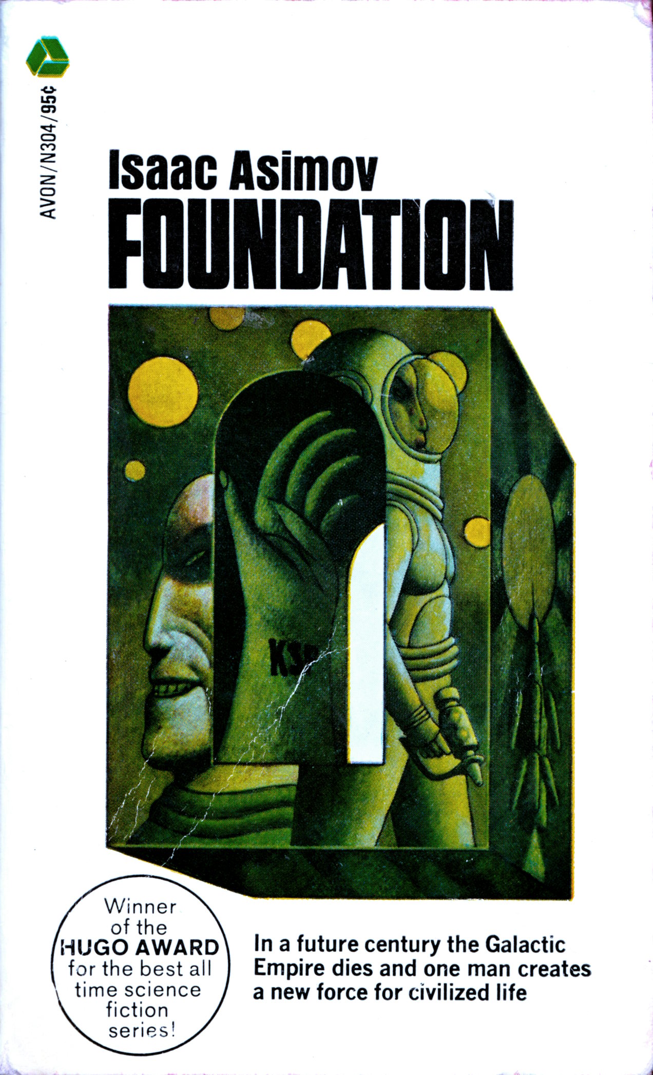
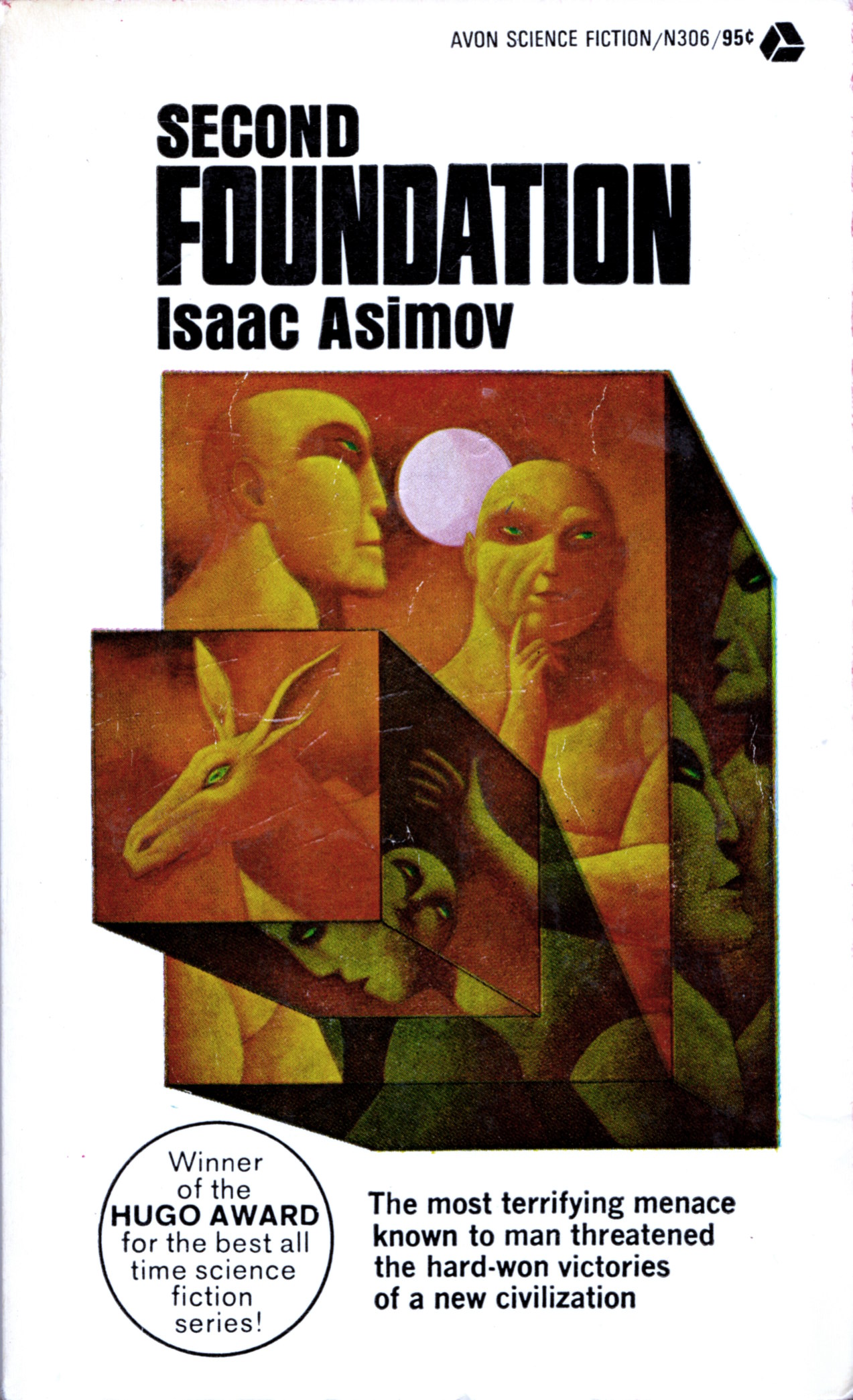
When I posted “Look Here: Three paperback covers plus with art by Don Ivan Punchatz” back in mid-May, I included a small “bonus” JPEG, reposted from another site, that displays all three of Punchatz’s iconic covers for Avon Science Fiction paperback edition of Isaac Asimov’s classic “Foundation Trilogy.” I would have posted my own scans, except that, at the time, I was missing the first book in the trilogy. Earlier today, however, I found, and purchased, a slightly beat-up copy of the Avon edition of Foundation at a local bookstore that perfectly matches the slightly beat-up copies of Foundation and Empire and Second Foundation that I already have in my collection. So now, as is my wont, I’m here to share my good fortune with the rag-tag fugitive followers of Ragged Claws Network:

[CLICK IMAGES TO ENLARGE]

Keywords: Foundation, Foundation and Empire, Second Foundation, Isaac Asimov, Don Ivan Punchatz.

Illustration Art · Look Here · Michael Leonard

Look Here: Illustrations by Michael Leonard for a story about Marie Antoinette

In recent months, I’ve begun looking through volumes of Reader’s Digest Condensed Books at church and garage sales in the hope of finding some long-forgotten images worthy of online preservation and contemplation here at RCN, and today, I am delighted to report that I have finally uncovered a series of illustrations that I think stands head and shoulders above the usual good-but-not-great, able-but-uninspired Reader’s Digest fare. The illustrations I am referring to were created by Michael Leonard for The Queen’s Confession, a “condensation” of English novelist Victoria Holt’s first-person narrative of the rise and fall of Marie Antoinette, and the complete package, story and pictures together, was first printed in Reader’s Digest Condensed Books, Vol. III, 1968, Summer Selections. Here are my scans:

[CLICK IMAGES TO ENLARGE]

Because Reader’s Digest Condensed Books were generally printed on highly absorbent, low-quality paper to keep the cover price within reach of the average middle-class consumer, the full-colour, painted illustrations reproduced therein always tend to look a little soft. And yet, I think the excellence of Michael Leonard’s work shines through the sub-optimal reproduction.

I’d love to see Leonard’s Marie Antoinette illustrations in person.


POSTSCRIPT:

I just did a bit of Google research, and it appears to me from this online (auto)biography that the Michael Leonard who produced the above illustrations for Reader’s Digest is the same Michael Leonard (b. 1933) who has long been known in fine-art circles as one of Britain’s leading photo-realist painters. You can view examples of Michael Leonard’s paintings and drawings online here and here.

Link Roundup · Look There · Richard Corben

Link Roundup: Comics stories with art by Richard Corben

Prompted by a question posed to me on Twitter, I’ve taken a few moments to compile the following roundup of stories with art (or art and script) by Richard Corben that are freely available to read on the Web; the stories are listed in order of first publication, more or less:

I’ll add more to the list later… perhaps…

Book/Magazine Covers (All) · Illustration Art · Look Here

Look Here: Three “Bob Morane” covers with art by Henri Lievens

I did not know the name Henri Lievens until a long-time follower of Ragged Claws Network, Steed Colliss, contacted me by email to recommend Lievens’s work. A short time later, Steed sent me scans of three of his favourite covers from the “Bob Morane” series of novels by Henri Vernes, all with cover art by — who else? — Henri Lievens. So now here I am with three new scans of three old covers to share with you all. Enjoy!

[CLICK IMAGES TO ENLARGE]

Thanks, Steed, for your contribution to RCN. It is much appreciated.

Keywords: Les murailles d’Ananké, Les périls d’Ananké, La malle è malices, by Henri Vernes, Henri Lievens.

Book/Magazine Covers (All) · Illustration Art · Look Here · Richard Powers

Look Here: To infinity and beyond with Richard Powers

Although I’ve already scanned and posted quite a few SF covers with art by the great Richard Powers, I’m not done yet. Look here:

[CLICK IMAGES TO ENLARGE]

Nice, eh?

Keywords: Three Times Infinity, edited by Leo Margulies; First Contact, edited by Damon Knight; Seven Come Infinity, edited by Groff Conklin; The Day of the Triffids by John Wyndham; Richard Powers.

Book/Magazine Covers (All) · Enrich · Illustration Art · Look Here

Look Here: Two covers with art by Enrich

If you are or were a fan of the Warren magazines Creepy, Eerie, and Vampirella, you will have seen many covers with art by Spanish illustrator Enrich Torres. What you may not know, however, is that Enrich also produced cover art for U.S. fiction houses such as Ace and Dell. Here are two examples:

[CLICK IMAGES TO ENLARGE]

As you can see, my copy of Hasan is a bit scuffed up. The book looks that way because 1) I have had it in my collection since I was a teenager, 2) I have always transported all of my books to wherever I have lived and unpacked them onto shelves, i.e., I never leave books in storage if I can help it, so they are definitely subject to shelf wear, and 3) I’ve never been obsessive about keeping my books in perfect condition, mainly because I don’t care about their re-sale value. I try not to do foolish things, like break the spines by opening them too flat, or turn down the corners of pages in lieu of a bookmark, but I don’t have anything in bags that I didn’t buy in a bag. I do, however, like to put clear archival covers over the dust jackets of reference books and books that I definitely want to preserve and hand down to my son, and yet, I have many, many hardcovers that have no extra protection at all. And if I get tired of owning a book, or I’m unhappy with the condition, I either throw it out or give it away. I don’t sell books, ever. It’s way, way, way too much of a hassle for me.

Keywords: Hasan by Piers Anthony, The Jewels of Aptor by Samuel R. Delany.

Book/Magazine Covers (All) · Connections · Dean Ellis · Illustration Art · Look Here · Thomas Pynchon

Connections: Deskey, Getter, Ellis, McCarthy

Donald Deskey designed the original Tide bullseye logo. Marc Getter designed the cover of the first American edition of Thomas Pynchon’s Gravity’s Rainbow, published in 1973. Dean Ellis illustrated the cover of the first edition of Samuel R. Delany’s Dhalgren, published in 1975. Paul McCarthy designed the case for his 2010 exhibition catalogue, Low Life Slow Life, to look like a Tide box, circa 1973.

[CLICK IMAGES TO ENLARGE]

Fun Fact: Delany wrote his first pornographic novel, The Tides of Lust, in the time and space between his SF novels Nova (1968) and Dhalgren (1975). Now that is a book that some publisher or other ought to offer in a Tide-box slipcased edition.