"This day's experience, set in order, none of it left ragged or lying about, all of it gathered in like treasure and finished with, set aside." –Alice Munro, "What is Remembered"
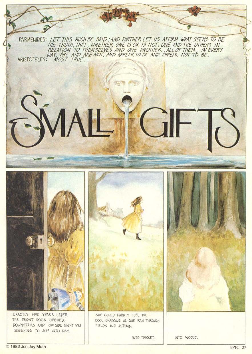
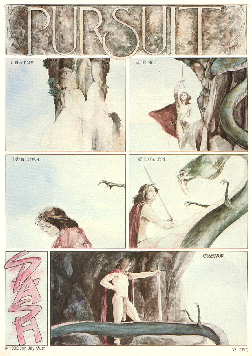
ABOVE: Jon Jay Muth, "Pursuit," Epic Illustrated #12 (June 1982), page 32.
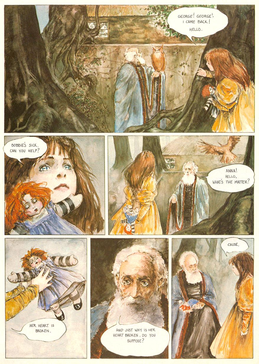
ABOVE: Jon Jay Muth, "Pursuit," Epic Illustrated #12 (June 1982), page 33.
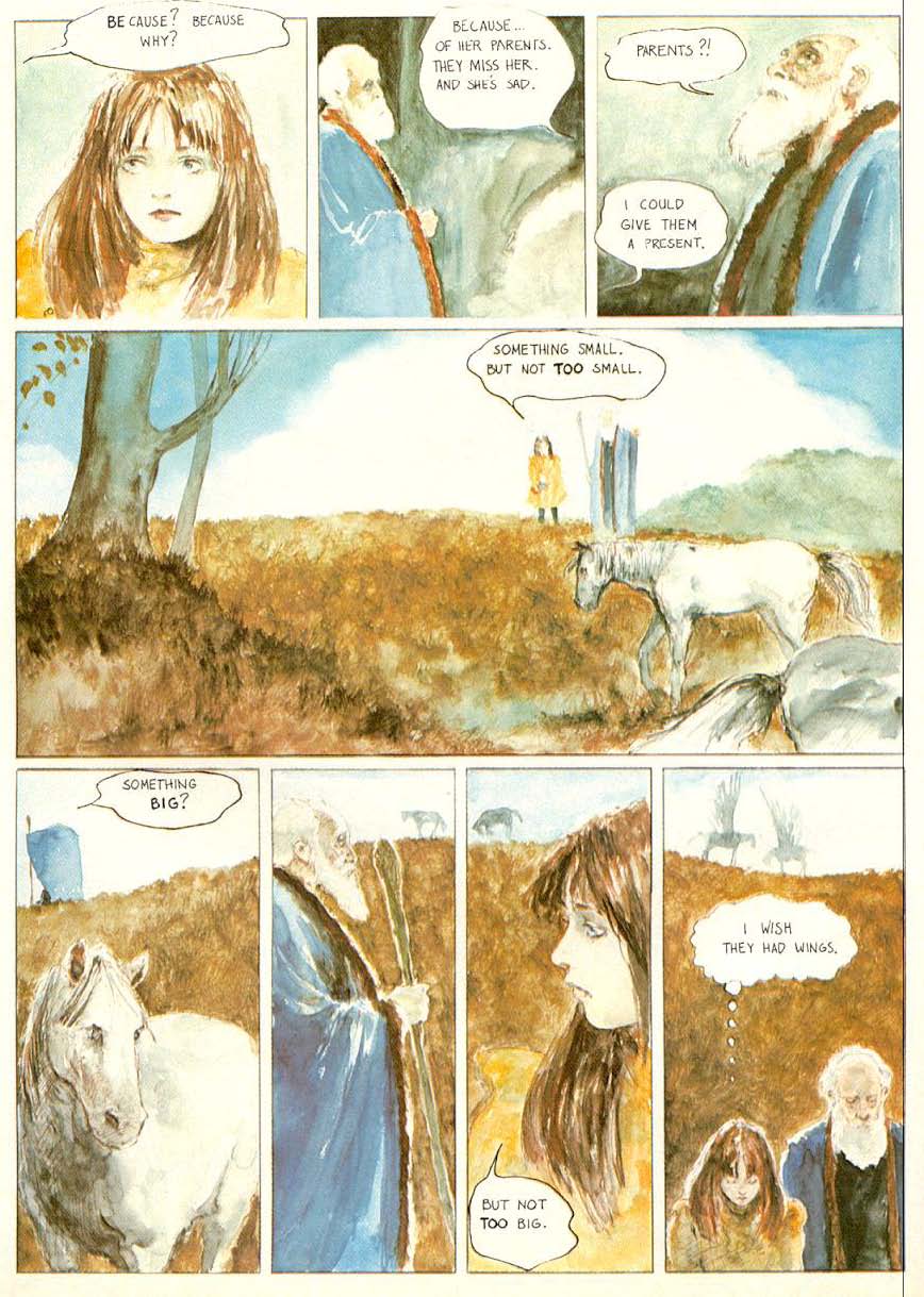
ABOVE: Jon Jay Muth, "Pursuit," Epic Illustrated #12 (June 1982), page 34.
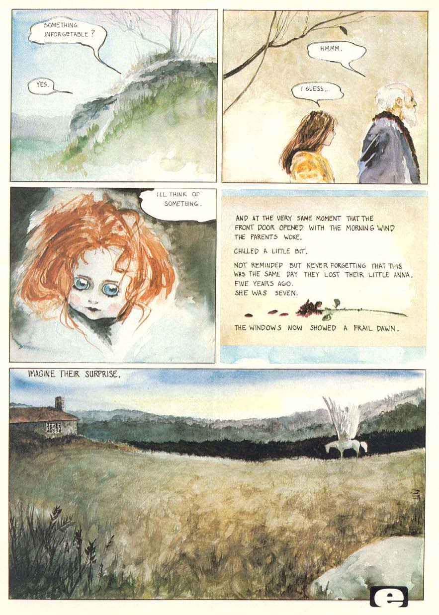
Rightly or wrongly, I have long thought of Muth’s style at the beginning his career, when he drew the above stories, as “School of Jeffrey Jones.” There are, however, definite similarities between Muth’s painting style and palette and Alan Lee’s watercolour illustrations of the late 1970s* and beyond; so much so that it wouldn’t surprise me if Lee’s work was also, as much as Jeffrey Jones’s, an influence on the “look” of “Small Gifts” and, especially, “Pursuit.”
—
* The first edition of Faeries by Lee, Froud, et al., appeared in 1978.
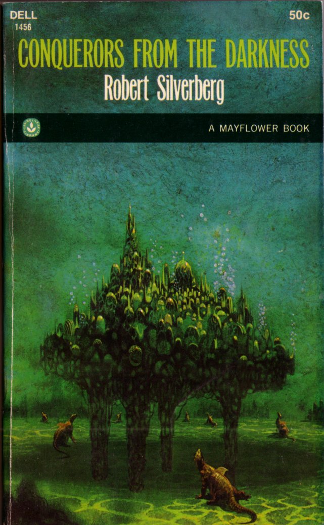
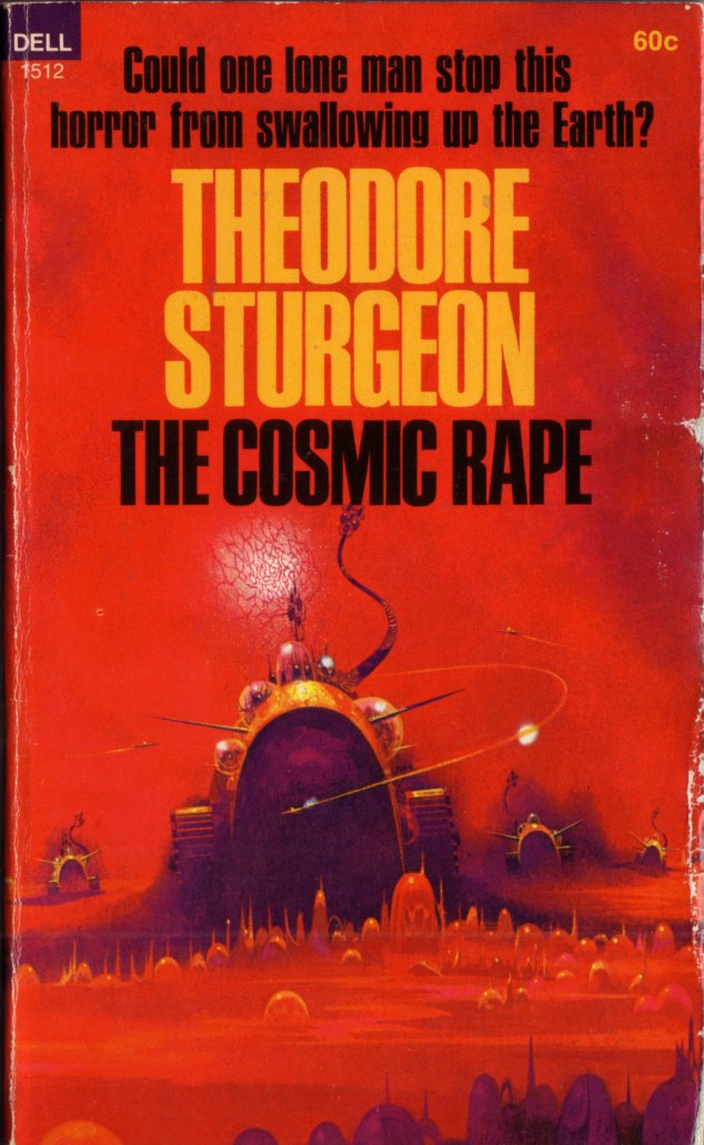
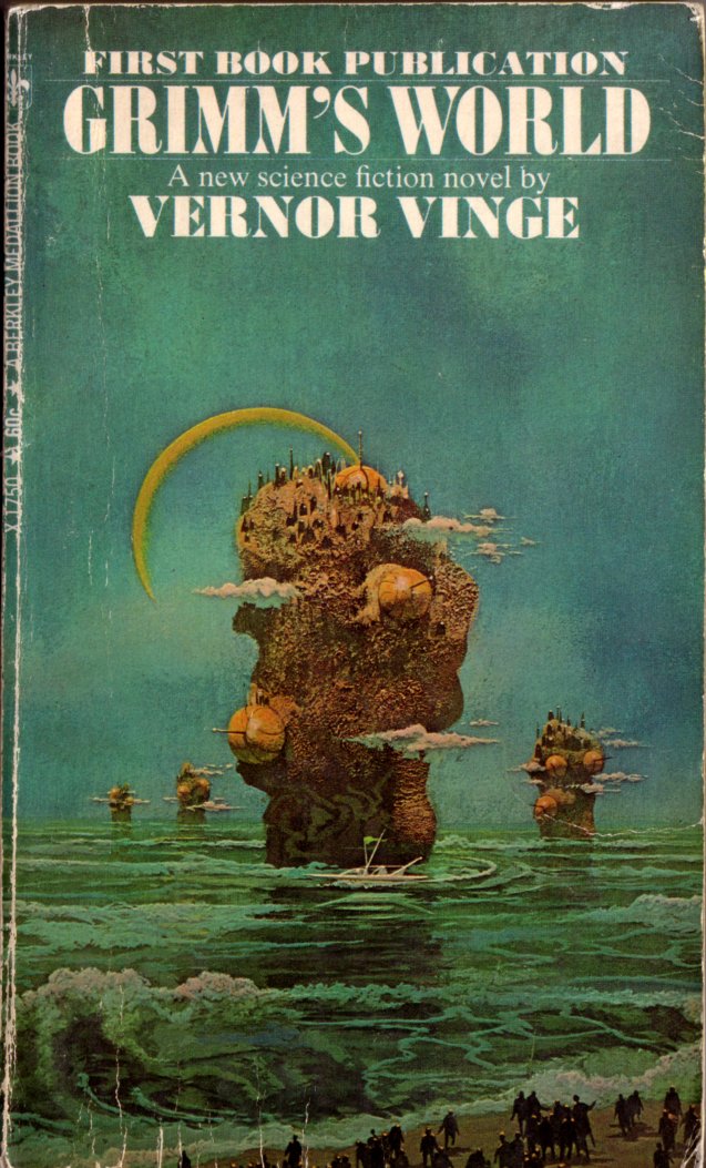
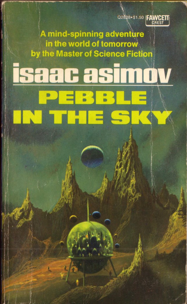
Whenever I see SF paperback covers by Paul Lehr like the nine I posted yesterday, and the many others he created in a similar vein, I immediately think of Arnold Böcklin’s “Isle of the Dead” paintings and, to a lesser extent, “The Sacred Wood”:
ABOVE: Arnold Böcklin, The Isle of the Dead (1880).
ABOVE: Arnold Böcklin, The Isle of the Dead (1883).
ABOVE: Arnold Böcklin, The Isle of the Dead (1886).
ABOVE: Arnold Böcklin, The Sacred Wood (1882).
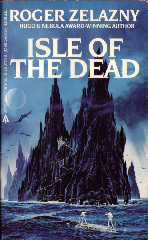
I was tempted to file the comparison between Böcklin and Lehr under “Connections,” but I guess I am just not quite convinced myself that there’s any direct influence from one to the other — although the impossibly jagged cliffs in Lehr’s cover for Zelazny’s Isle of the Dead (strange coincidence!) are tantalizingly similar, visually, to the trees in Böcklin’s “Isle of the Dead” variations. Or maybe I’m just seeing things!
BONUS IMAGE (added 29 July 2013):
ABOVE: Max Ernst, Max Ernst montrant à une jeune fille la tête de son père (Max Ernst Showing a Young Girl the Head of his Father, 1926-27), oil on canvas, 114.3 x 146.8 cm. National Galleries of Scotland. — VIA —
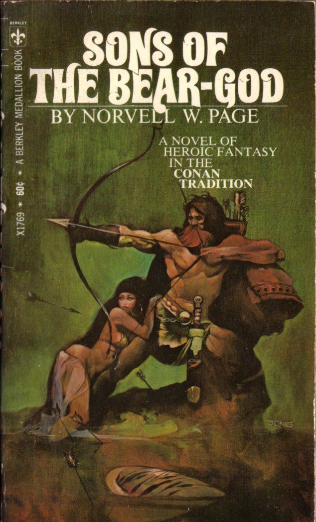
From the bookshelves of yours truly, here are nine paperback covers (ten, actually; a bonus image was added at a later date) by Paul Lehr, along with one Lehr-ish cover by another hand:
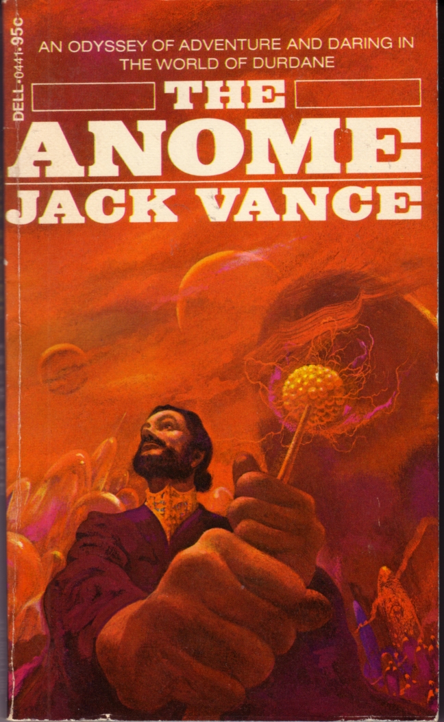
ABOVE: Jack Vance, The Anome (Dell, 1973), with cover by Paul Lehr.
ABOVE: Robert Silverberg, Conquerors from the Darkness (Dell, 1968), with cover by Paul Lehr.
ABOVE: Theodore Sturgeon, The Cosmic Rape (Dell, 1968), with cover by Paul Lehr.
ABOVE: Vernor Vinge, Grimm’s World (Berkley, 1969), with cover by Paul Lehr.
ABOVE: Alfred Bester, The Stars My Destination (Bantam, 1970), with cover by Paul Lehr.
ABOVE: Isaac Asimov, Pebble in the Sky (Fawcett, 1971), with cover by Paul Lehr.
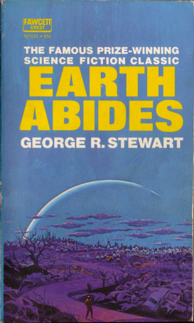
ABOVE: George R. Stewart, Earth Abides (Fawcett, 1971), with cover by Paul Lehr.
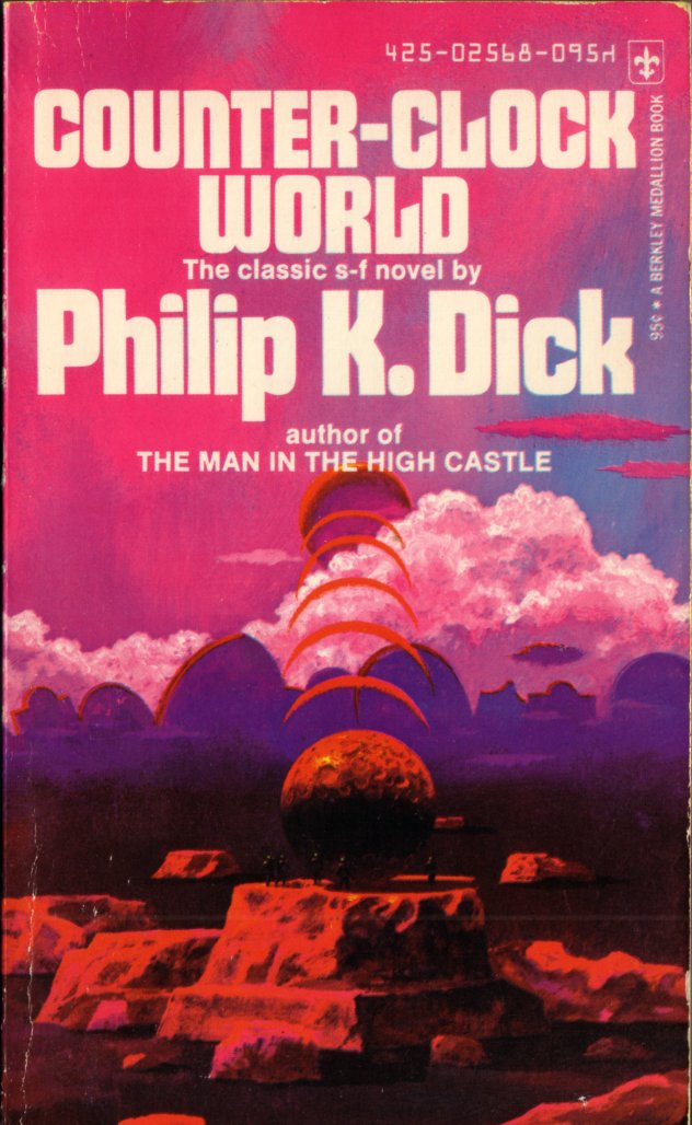
ABOVE: Philip K. Dick, Counter-Clock World (Berkley, 1974), with cover by Paul Lehr.
ABOVE: Roger Zelazny, Isle of the Dead (Ace, 1985), with cover by Paul Lehr.
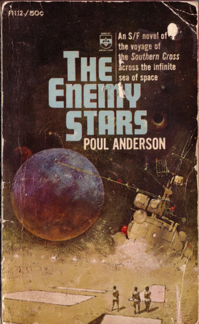
ABOVE: Poul Anderson, The Enemy Stars (Berkley, 1965), with cover by Jerome Podwil.
Keywords:The Anome, The Enemy Stars, Andromeda Gun, Isle of the Dead, Counter-Clock World, Earth Abides, Pebble in the Sky, The Stars My Destination, Grimm’s World, The Cosmic Rape, Conquerors from the Darkness.
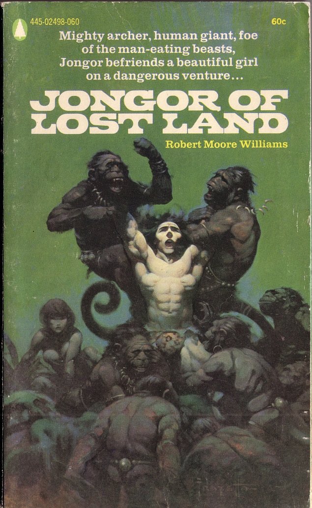
ABOVE: Robert Moore Williams, Jongor of Lost Land (1940; New York: Popular Library, 1970), with cover by Frank Frazetta.
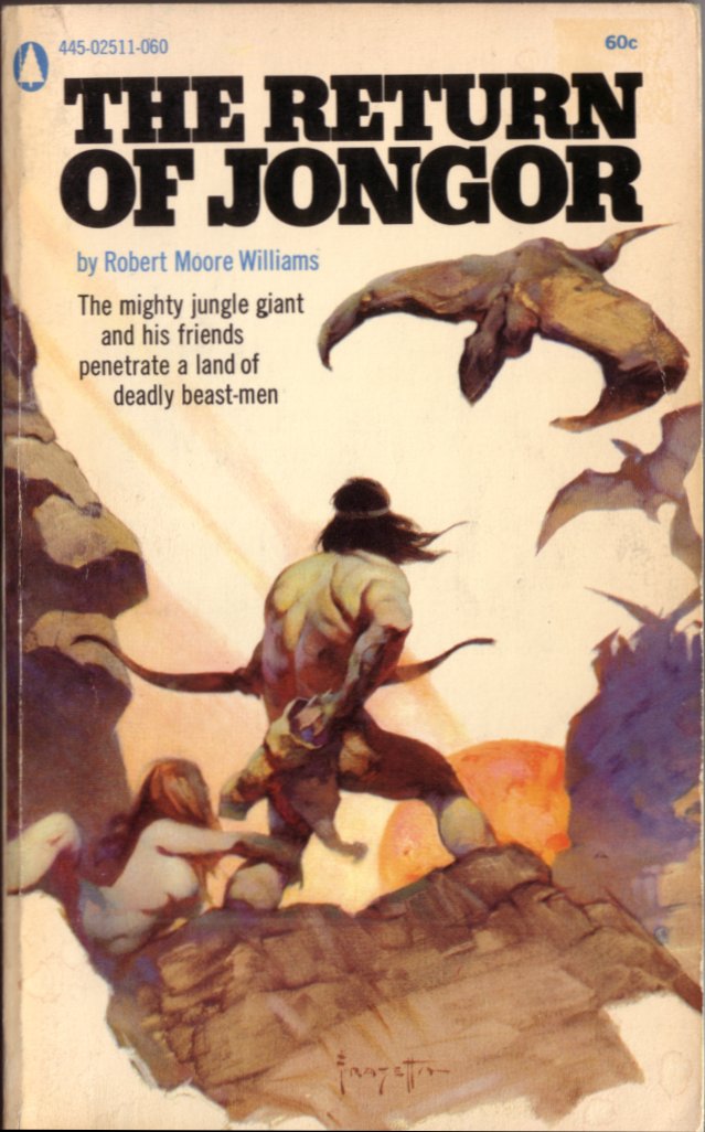
ABOVE: Robert Moore Williams, The Return of Jongor (1944; New York: Popular Library, 1970), with cover by Frank Frazetta.
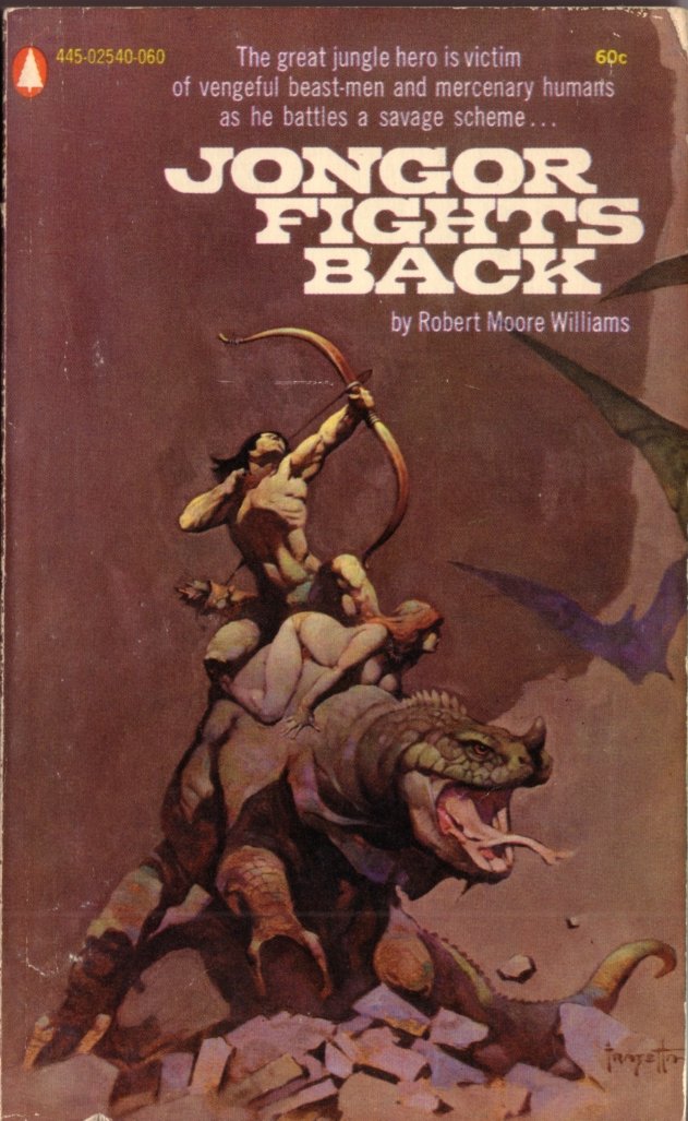
ABOVE: Robert Moore Williams, Jongor Fights Back (1951; New York: Popular Library, 1970), with cover by Frank Frazetta.
The sequence, Jongor of Lost Land (1940; repr. 1970), The Return of Jongor (1944; repr. 1970), and Jongor Fights Back (1951; repr. 1970), reminds me of the first Star Wars trilogy: Star Wars (1977), The Empire Strikes Back (1980), and Return of the Jedi (1983). Purely coincidence, I’m sure. LOL!
Here is the second in what is turning out to be a series of posts here at RCN featuring obscure SF book covers by Frank Frazetta. The first “obscure SF book cover” is over here.
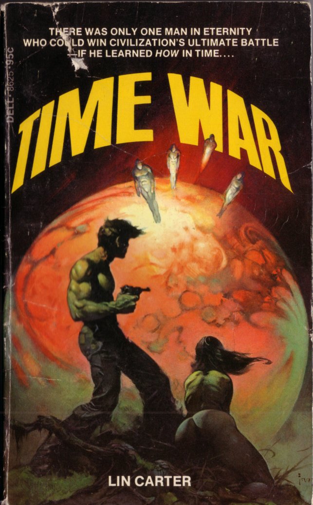
ABOVE: Lin Carter, Time War (Dell, 1974), with cover by Frank Frazetta.
Although Frazetta has plenty of classic covers to his credit, the cover for Time War is not one of them; this, despite the fact that Frazetta was, I think most fans of fantasy illustration would agree, at the height of his powers as a draftsman and cover artist around the time he painted it. Simply put, Time War is the epitome of an inadequately developed, compositional cliché wedded to flashy but underdeveloped, even desultory, technique.
Go in with me, and I will tell you my drift.
The controlling compositional idea here, bog-standard in illustration art, is to use something or someone in the foreground, often in shadow or silhouette, to frame and direct attention to something or someone of interest in the more brightly illuminated middle distance. In Frazetta’s uninspired variation on this idea, the main figures, which dominate the foreground, are turned away from the viewer and are looking off into the distance at a glowing planet from which several figures are emerging. Never mind the problem of where the foreground figures are standing, exactly, to give them such a view, the real difficulty here — the two-pronged problem that prompts me to label the painting “uninspired” — is that what they (and we) are given to look at and react to in the distance is neither in their direct line of sight — the foreground figures, the man and the woman, appear quite clearly to be looking at a spot below and to the right of the distant, stiff, faceless background figures — nor is the presumed threat, i.e., those distant, stiff, faceless background figures, anywhere near as visually compelling, beyond the lurid colours of the planet from which the threat is emerging, as the hero’s shirtless torso and heavily muscled arm and the woman’s shapely rear.
Aye, there’s the rub: as many of his fans have become aware over the years, when left to his own devices, Frazetta will seize any excuse, no matter how flimsy, to feature bare buttocks in a painting! Not that there’s anything wrong with bare buttocks (or gestural, flowing hair, or gnarled roots, or moss-covered deadfall, or any of the other elements that have become clichés of the Frazetta style), but the plain truth is that 1) nudity is neither necessary nor sufficient to create a first-rate paperback cover (and especially not an SF cover!), 2) nudity can very easily be fallen back upon as a titillating, eye-hooking substitute for real engagement and effort on the part of the artist, and 3) the nude figures here have been left mostly underpainted, with little of the impasto overpainting in the areas where the light is strongest that ordinarily gives Frazetta’s painted figures their variety, their three-dimensional solidity, and their overall liveliness. Yes, the figures are sort of in shadow, which accounts for the lack of detail, but in my view, they take up far too much of the composition to be left so under-developed.
That Frazetta himself recognized the inadequacy of his own work here is perhaps reflected in the following trio of facts: 1) Frazetta revised the painting after he got it back from the publisher; 2) the revised version has only been reproduced in one of the books on his art produced with his participation and blessing (see Arnie Fenner and Cathy Fenner, eds., Legacy: Selected Drawings & Paintings by Frank Frazetta [Underwood Books, 1999], p. 167); and 3) the original version has been reproduced, well, never. And although in the revised version both figures are completely nude, and their naked flesh has been brought to a level of finish it previously lacked, and the man is now brandishing a non-existant gun (seriously!), and the man’s right foot has morphed into a curious form that is neither foot nor boot, and the man’s genitalia, which common sense says should be clearly visible from this angle, is some strange configuration that is neither penis nor codpiece, and the woman’s hair is even more insistently Frazetta-like, and her backside is even larger and more moon-like, I say, even though Frazetta has made all these changes, the composition remains egregiously under-motivated, uninspired, and unconvincing.
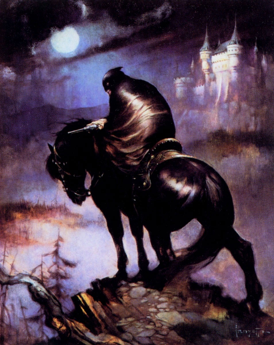
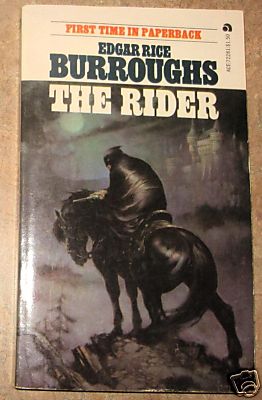
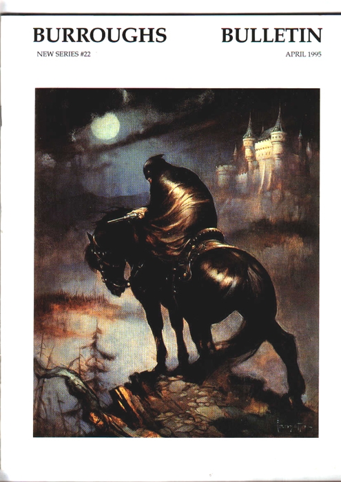
Some might call this a swipe; others, an homage. But would anybody in their right mind dare to claim that the following two paintings are similar by mere happenstance? I sure hope not…
ABOVE: Frank Frazetta (1928- ), The Rider (1960-69), oil on board, 20 x 16 in.
ABOVE: Edgar Rice Burroughs, The Rider (Ace, 1974), with cover by Frank Frazetta.
ABOVE:Burroughs Bulletin #22 (April 1995), with cover by Frank Frazetta.
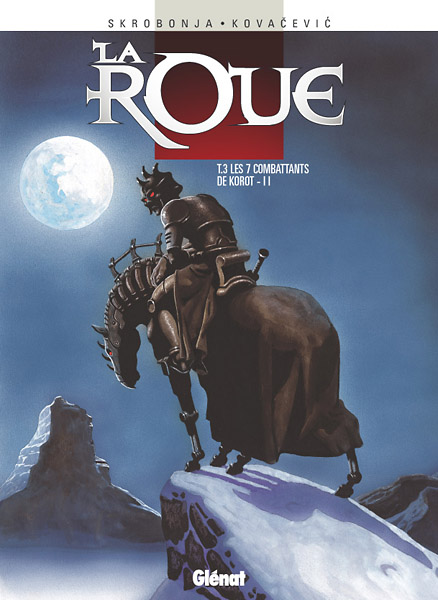
ABOVE: Drazen Kovacevic (1974- ), cover of La roue, T.3 Les 7 combattants de Korrot – II (Glénat, 2003).
Either way, swipe or homage, Frazetta’s virtuoso draftsmanship, effortless skill at composition, and expressive paint handling make Kovacevic’s anemic cover-version look like the work of a rank amateur. Or, to put it another way, every change Kovacevic makes to Frazetta’s original is for the worse.