"This day's experience, set in order, none of it left ragged or lying about, all of it gathered in like treasure and finished with, set aside." –Alice Munro, "What is Remembered"
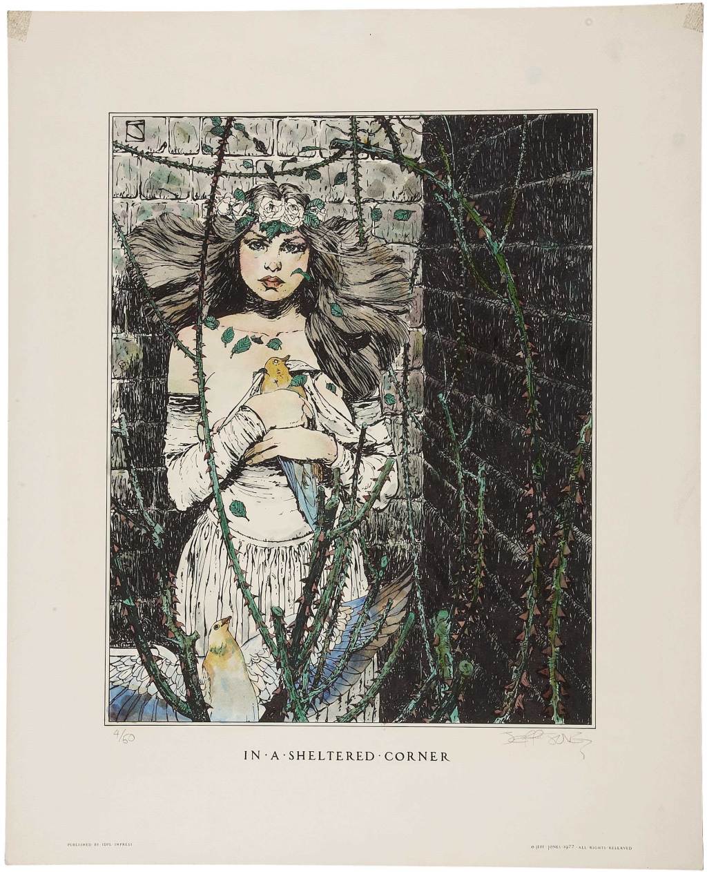
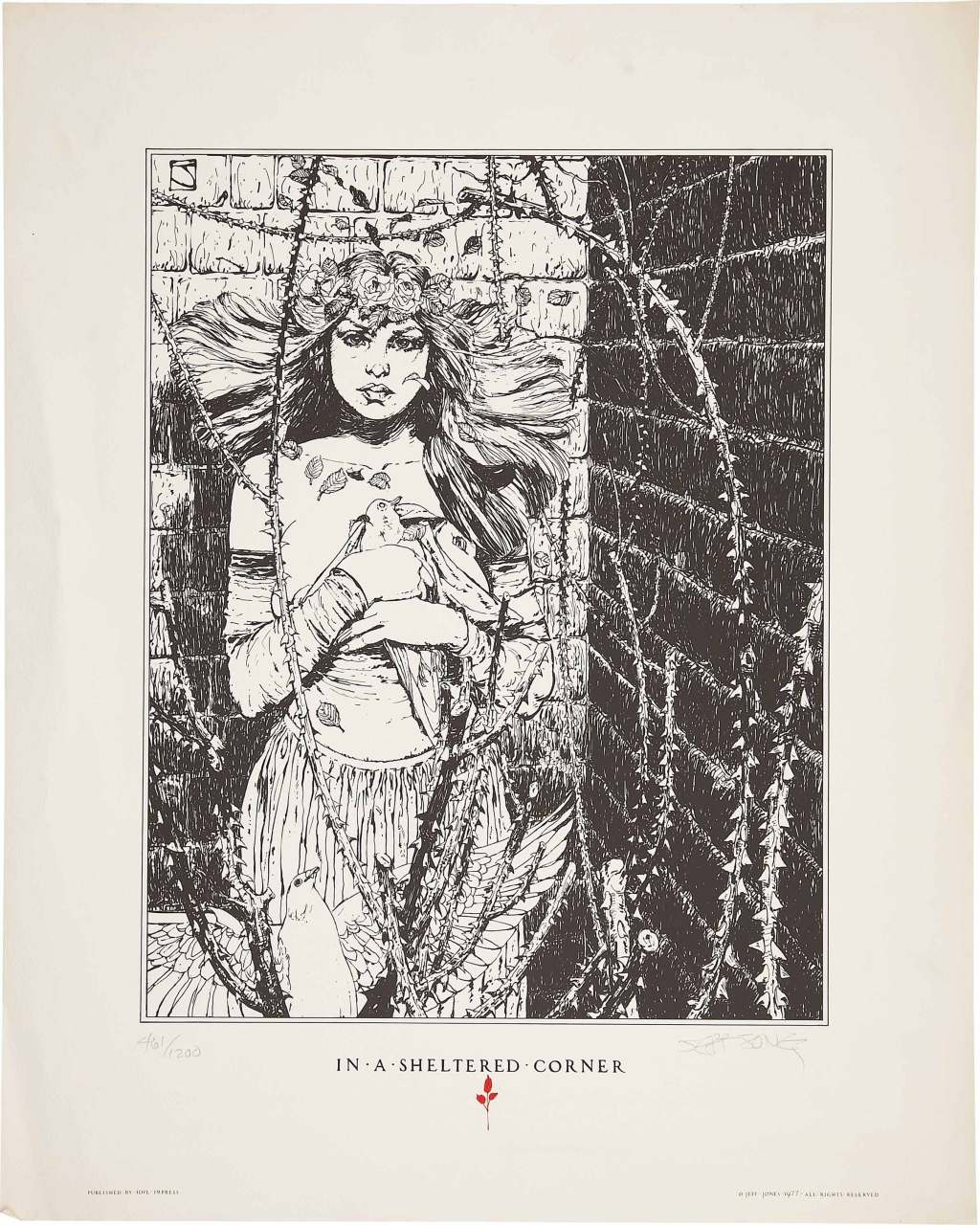
Here’s one of a signed-and-numbered edition of fifty prints, published by Idyl Impress in 1977, that were hand-coloured with watercolour by Jeffrey Jones. It is followed by the uncoloured version, which was published the same year by Idyl Impress in a signed-and-numbered edition of 1200:
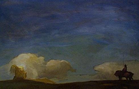
ABOVE: Jeffrey Jones, In a Sheltered Corner (Idyl Impress, 1977), hand-coloured, limited-edition lithograph, 17 x 21 inches.ABOVE: Jeffrey Jones, In a Sheltered Corner (Idyl Impress, 1977), limited-edition print, 17 x 21 inches.
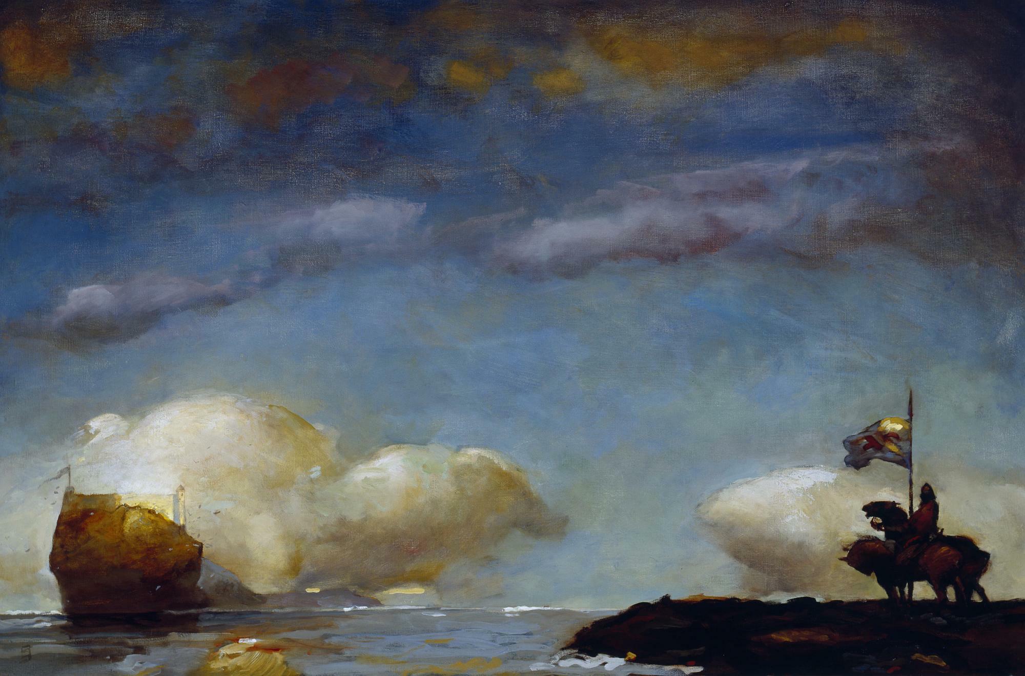
Todd Adams of Glimmer Graphics has a beautiful new limited edition print by Jeffrey Jones available for purchase on his company’s Web site. “I have published over 50 fine art prints through the years,” writes Todd, “and this is the finest print quality I have seen to date.” Here’s a link to the order page. And here’s a copy of the image Todd sent out to promote the print:
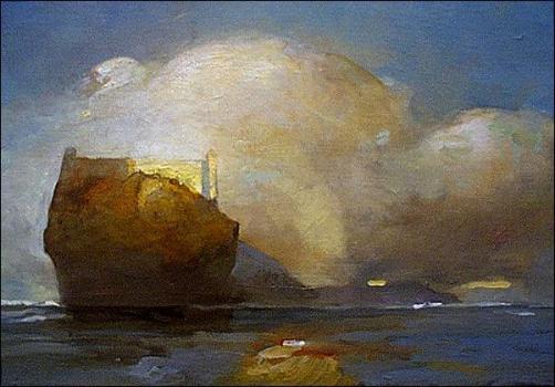
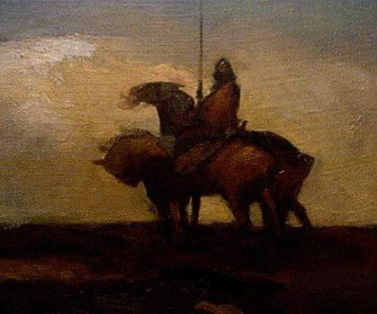
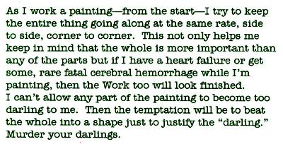
ABOVE: Jeffrey Jones, A Game of Thrones (c. 2000), oil on canvas.
Jones created the above painting for Meisha Merlin Publishing’s deluxe limited edition of the first book in George R. R. Martin’s “A Song of Fire & Ice” epic. The new Glimmer Graphics print is comprised of 375 signed and numbered copies, as well as 25 artist proof copies, all on 500 g/m² acid-free, ultra-smooth paper. Sheet size is 22 x 16 inches, with an image size of 19 x 12.5 inches.
BONUS CONTENT (added 13 December 2011):
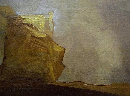
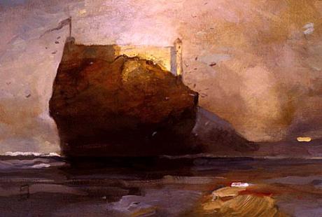
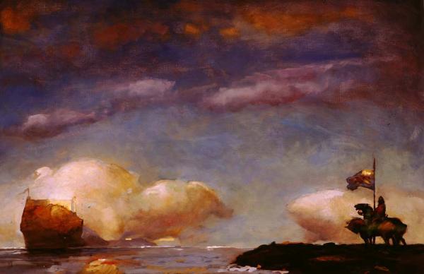
What follows are all of the images from a “work in progress” page that appeared on Jeffrey Jones’s official website, which since Jones’s death has disappeared from the Web; the images are presented in the same order that Jones presented them on the original page:
On a separate page entitled “Painting Methods,” Jones wrote:
I stretch my own canvases and prefer linen, unprimed. Two coats of gesso with sanding on each dry coat. Bristle brushes, filberts give me the texture and quality of surface I like. I use no mediums, just turpentine. My palette consists of three yellows, yellow ochre pale, raw sienna and chrome yellow. The reds I use are venetian, burnt umber, burnt sienna and cadmium. I like oxide of chromium for green, all other greens are mixed. Ultramarine is the only blue I use. When painting I consider complements and mix them together on the palette, using a bit of a complement in each mixture. For example, I might make a purple using ultramarine and venetian red and add a bit of ochre to temper it. If I use a yellow I add a little purple to temper that color. I never use black but mix it using several dark colors together. I like to paint wet in wet to keep the painting “soupy”.
I usually start a painting with a house painting brush, covering up the white of the canvas and laying in dark and light shapes. Then come some middle tones. I think in tone at first and color later. I do a lot of scraping and wiping in the beginning-at this point it’s all rather abstract.
I don’t know how many ways there are of working but what I’ve found, and it took some time, is perhaps peculiar to me. The most exciting thing is a blank white canvas or piece of paper–anything can happen. This is why I’ve long ago gotten away from scripts and manuscripts. I’m not really an illustrator. It’s probably my education in German Abstract Expressionism where whatever happens on a piece of art happens all the time. There is no real beginning and no end, there is just a time to abandon. I honestly never know what the “finish” will look like. I’ve said this before so bear with me here. The work and I have a “conversation”. There are times it listens to me and times I must listen to it. As long as it’s a “we” process there are no dull bits. There are impasses where I have to put it aside for a while but that’s not boredom. Boredom can just be another word for anger. For almost 30 years I have written my own comics, and the writing is done along with the drawing, not beforehand. It’s the same with painting. The narrative, which is often ambiguous, evolves with time. If it does indeed ever get dull then it is finished.
I always use titanium white because of it’s opaqueness and covering ability. It doesn’t matter which white you use, mixing white with any primary color will give you a pasty pastel. You have to mix the colors before adding white. Also lack of pastiness depends on which colors are next to each other.
…Howard Pyle advised his students, “Put light colors next to light colors and dark colors next to darks, then where you want the viewer to descend, put dark next to light.” This is a good rule of thumb.
Please note that the above description of Jones’s material preferences and process in oil has been cut and pasted, without alteration, from the original “Painting Methods” page on Jones’s official website.
BONUS CONNECTION (added 24 February 2014):
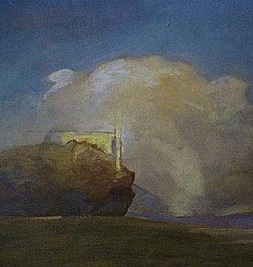
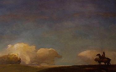
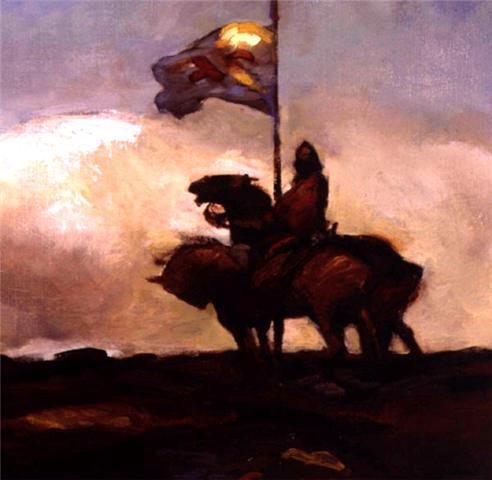
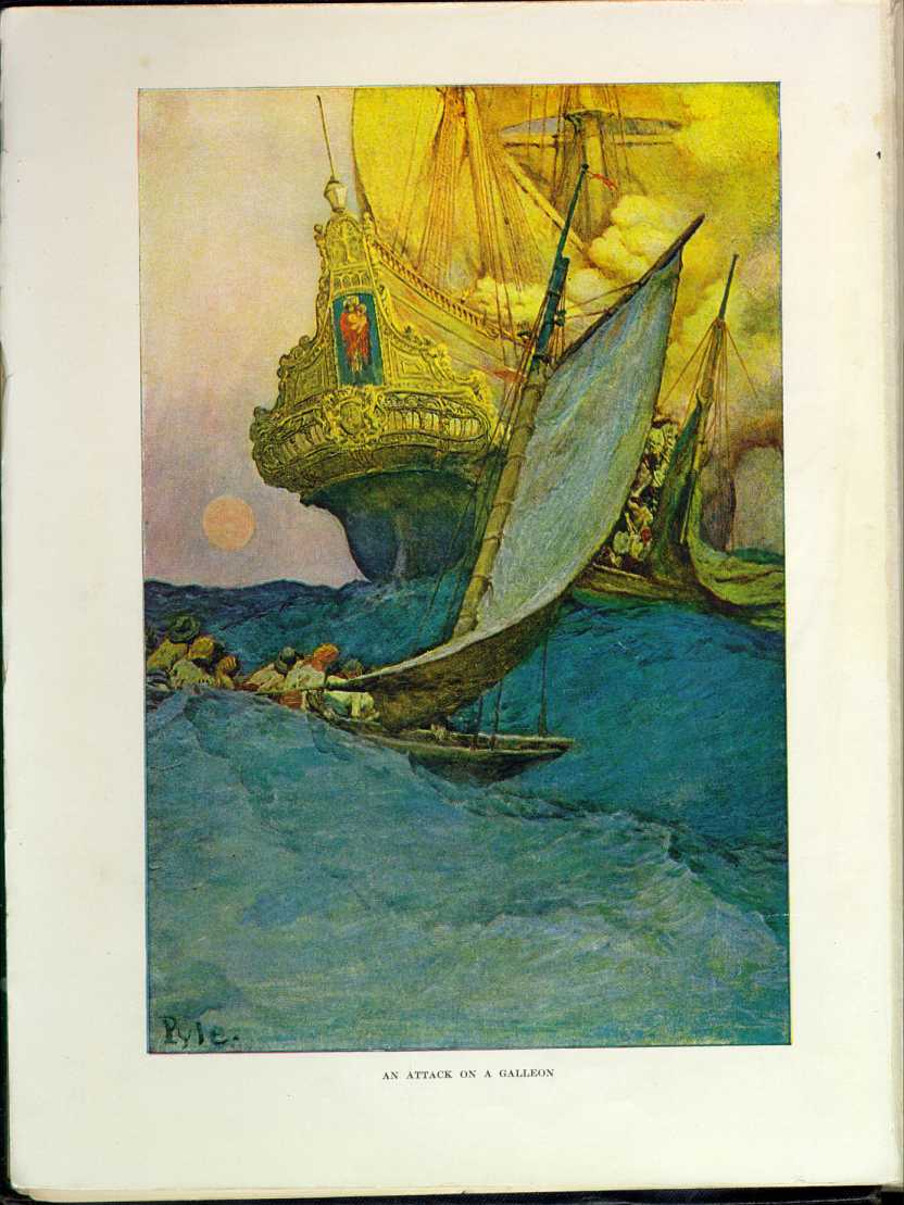
ABOVE: Joseph Mallord William Turner, Wreckers, Coast of Northumberland (c. 1834), oil on canvas, 125.9 x 90.5 cm. Collection of Yale Center for British Art, New Haven, Connecticut, USA. Via Wikimedia Commons.
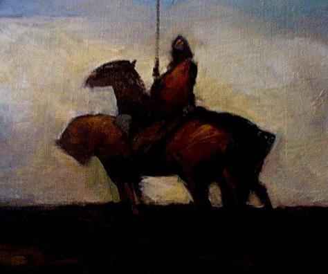
ABOVE: Jeffrey Jones, A Game of Thrones (c. 2000), oil on canvas.
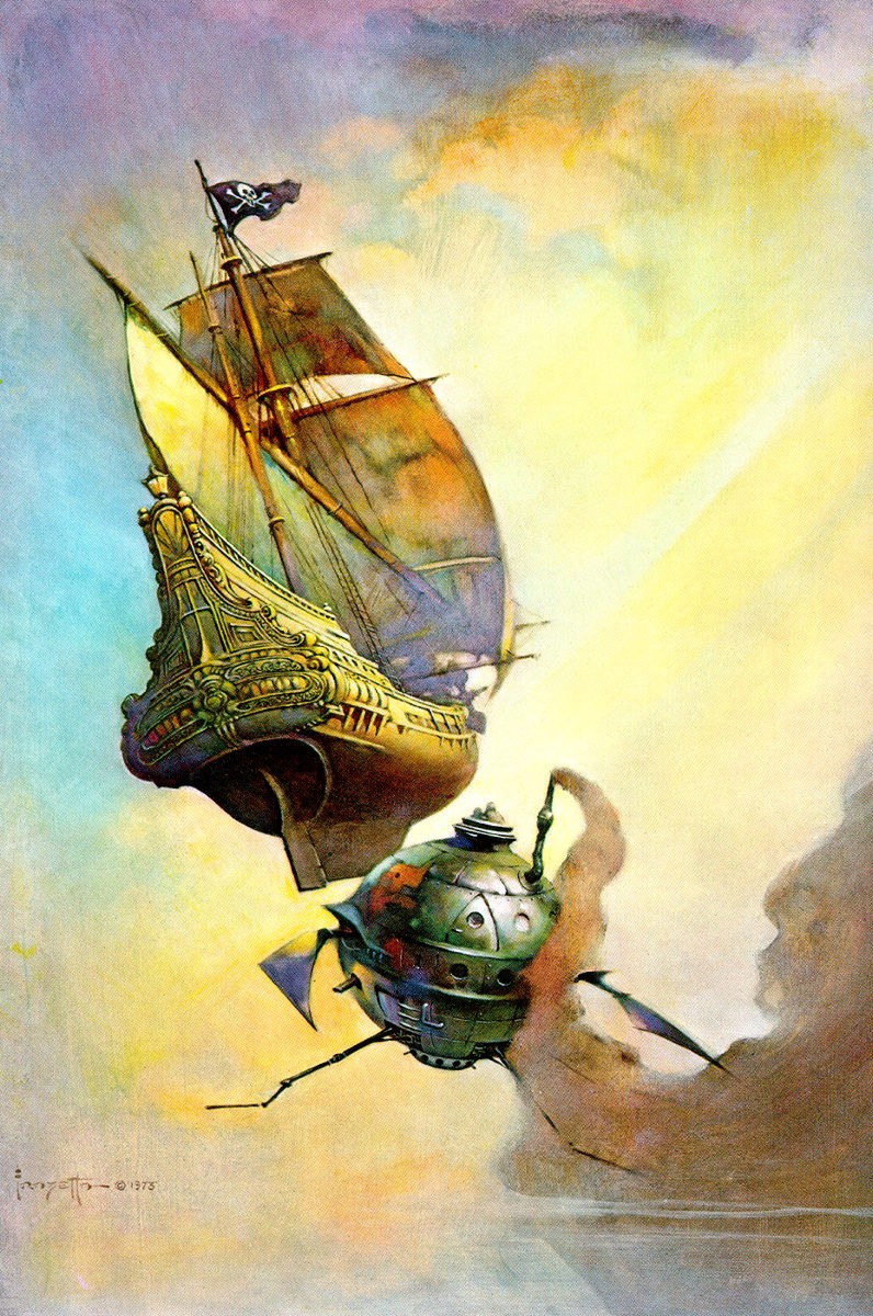
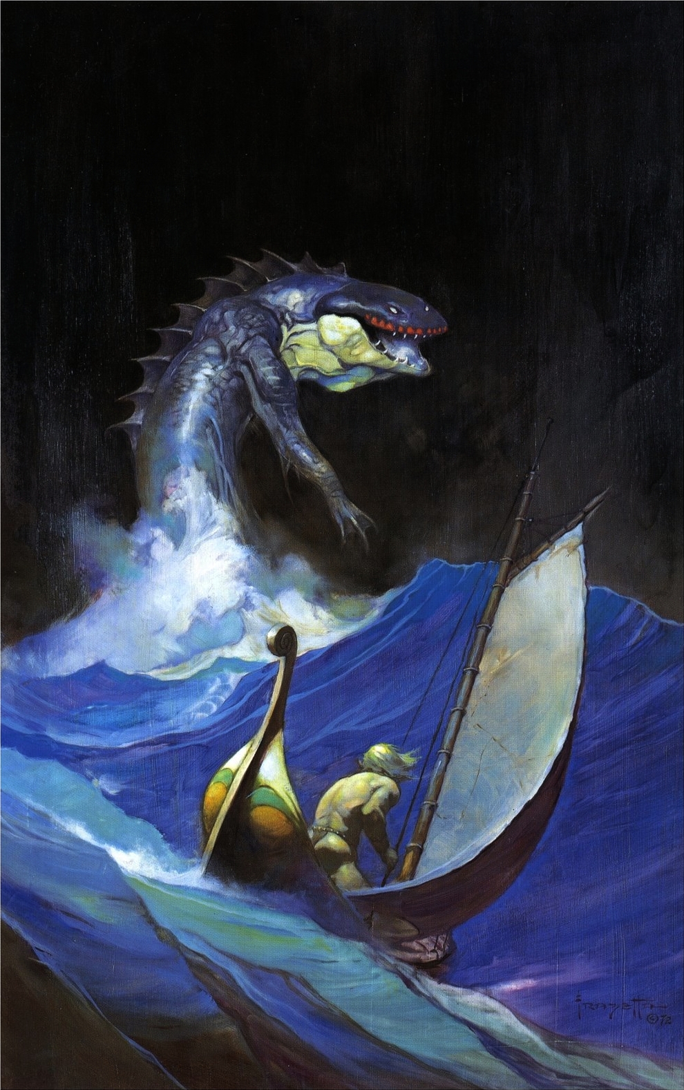
ABOVE: Frank Frazetta, Sea Serpent (1972), oil on canvas. Here’s a bonus: another painting by Frazetta inspired by An Attack on a Galleon by Howard Pyle.
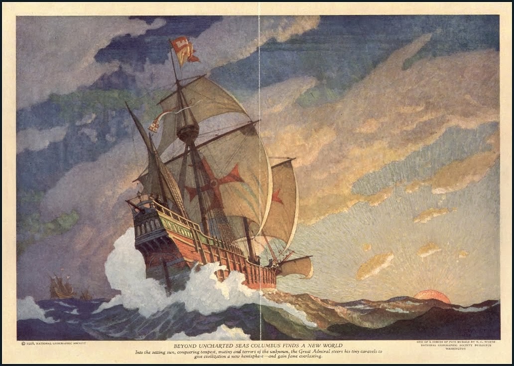
Frazetta’s obvious borrowing from Pyle has been pointed out many times in the past; however, I’ve never seen anyone add Wyeth’s painting to the mix (although surely someone has, the line of influence being so clear). Now, of the three galleon paintings, it seems obvious to me that Pyle’s original effort is not only the first but also the best of the three. It’s the best composed; it’s the most expressively painted; it’s the most dramatic. No wonder Wyeth and Frazetta (who seems to me to have borrowed as much from Wyeth’s galleon as from Pyle’s) were enthralled by Pyle’s Attack on a Galleon. It’s a masterpiece. And which of the remaining two galleon paintings is the weakest, Wyeth’s picturesque, chocolate-box cliché or Frazetta’s virtuosic but underdeveloped pastiche? You decide…
I mentioned a couple of messages ago that my wife and I own a piece of original art by American watercolourist DeWitt Hardy; however, since I doubt many people (especially here in Canada) know the name, I thought that today, for your (and my!) enjoyment, I would post an image of our purchase:
ABOVE: DeWitt Hardy, untitled watercolour painting, 28 x 27 centimetres (approx. 11 x 10.6 inches).
Sorry the image is a bit soft, but the painting was too big for our scanner. Also, our digital camera is not the best.
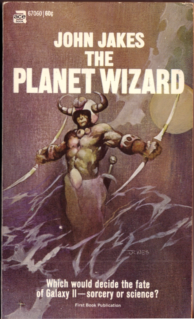
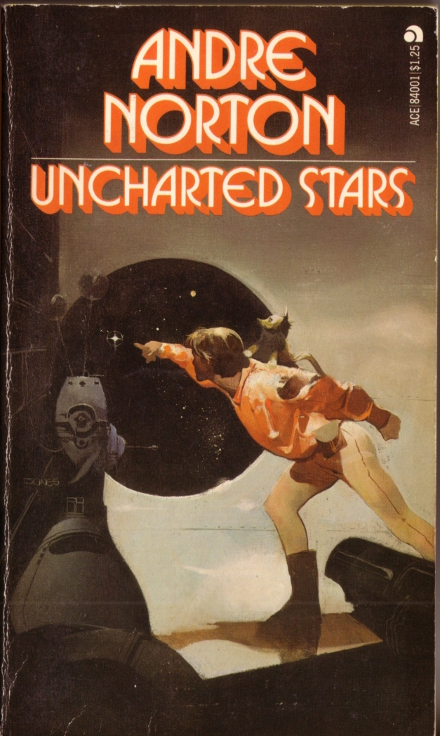
Yes, there are some serious creases and wear marks on some of the covers, but it is difficult to find pristine copies of thirty-nine-year-old-plus paperbacks, especially when one limits one’s search to local bookstores:
ABOVE: Andre Norton, Star Hunter And Voodoo Planet (New York: Ace, n.d.), with cover by Jeffrey Jones.
ABOVE: Andre Norton, Sorceress of the Witch World (New York: Ace, 1968/1978), with cover by Jeffrey Jones (mis-credited to John Pound).
ABOVE: John Jakes, The Planet Wizard (New York: Ace, 1969), with cover by Jeffrey Jones.
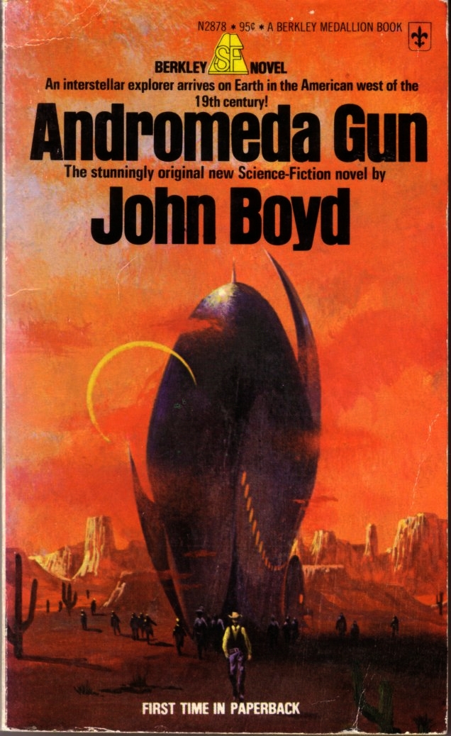
ABOVE: Lin Carter, Thongor Fights The Pirates Of Tarakus (N.p.: Berkley Medallion, 1970), with cover by Jeffrey Jones.
ABOVE: Andre Norton, The Zero Stone (New York: Ace, n.d.), with cover by Jeffrey Jones.
ABOVE: Andre Norton, Uncharted Stars (New York: Ace, n.d.), with cover by Jeffrey Jones.
I don’t really like any of the above covers, with the exception, perhaps, of the Uncharted Stars cover, which I feel is a step up from the others in terms of draftsmanship, composition, technique, originality, and wit.
Keywords:Star Hunter And Voodoo Planet, Sorceress of the Witch World, The Planet Wizard, Thongor Fights The Pirates of Tarakus, The Zero Stone, Uncharted Stars.
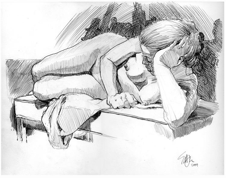
Yesterday evening, I won an ebay auction for a lovely original life drawing of a female model, Jessica, by an award-winning American editorial cartoonist named Ed Hall. The drawing, which is 14 inches wide and 11 inches high, is in graphite and ink on a medium weight paper and is signed and dated by the artist in the bottom right. Here is the scan from the drawing’s ebay auction page:
ABOVE: Ed Hall, Jessica Resting on Couch (2009), life drawing in graphite and ink, 14 x 11 inches.
Now, truth be told, before I decided to bid on the above drawing, I not only had never, to the best of my recollection, seen any editorial cartoons by Ed Hall, I had never even heard of Ed Hall. This has happened to me before. Many times over the years, I have bid on or purchased outright a drawing or a small painting not because I was already a fan of the artist and wanted a representative sample of his or her work but because I am an admirer of fine draftsmanship (with a special emphasis on figure drawing) wherever I find it and a collector of the same on those infrequent days when the opportunity to buy a work that has caught my attention arises at the same time as my extremely modest budget for original art allows for a purchase.
And yesterday, well… yesterday was just one of those days…
I might post a few specific observations about the drawing itself after it arrives and I have had a chance to peruse it in person, but I am happy to report here and now that my winning bid for Jessica Resting on Couch was US$21.97 (approximately CDN$23.05) and I paid US$10.00 for the drawing to be shipped from Florida, U.S.A., to Saskatchewan, Canada, via USPS First Class Mail International, for a grand total of US$31.97.
Who says one has to be wealthy to have nice things!
Fact is, most of the works in our collection of original art were purchased for less than CDN$100 a piece, and we have some terrific pieces — spot illustrations, comics pages, sketches, etc. — by artists such as John Buscema, Dave Cooper, Jordan Crane, DeWitt Hardy, Rudy Nebres (the all-Nebres “Rook” page I bought from a dealer for a very reasonable US$125.00 plus shipping is the exception that gently mocks the rule), Dave Sim (I bought an all-Sim Cerebus “High Society” page for CDN$50.00 directly from the artist in my first or second year of university), George Woodbridge, Chinese watercolourist Youqiang Zhang, and others.
So, if you would like to own a drawing of similar quality to the one I just bought, and you have a few bucks to spend on original art, you might want to bookmark the ebay auction page of seller halltoons2qr3 or keep an eye on the Halltoons Weblog, where the artist promotes his work and gives advance warning of upcoming ebay auctions. See, for instance, Ed’s blog post about his drawing of Jessica, My Sunday Best, or browse through today’s Sunday sketch results, at least one of which, I am told, will be up for auction this coming weekend.
But should you decide to bid, please be forewarned: if the drawing is first rate, and the price is right, you might have a little competition from me!
ABOVE: Frank Frazetta, Sea Serpent (1972), oil on canvas. Here’s a bonus: another painting by Frazetta inspired by An Attack on a Galleon by Howard Pyle.
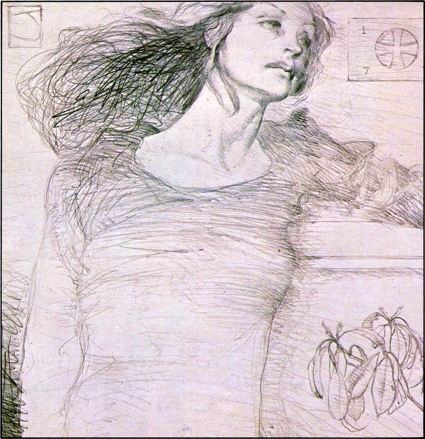
ABOVE: Jeffrey Jones, study for Chastity (1978), pencil on paper.


