Frank Frazetta · Look Here · Woody Allen

Look Here: “Make Beautiful Hair Blecch”

The “Make Beautiful Hair Blecch” ad parody, which featured Frank Frazetta’s classic portrait of Ringo Starr, was the back cover of issue #90 (October 1964) of Mad Magazine:

frank-frazetta_back-cover_mad-magazine-n90-oct1964

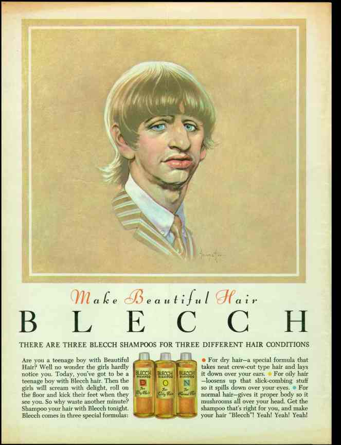
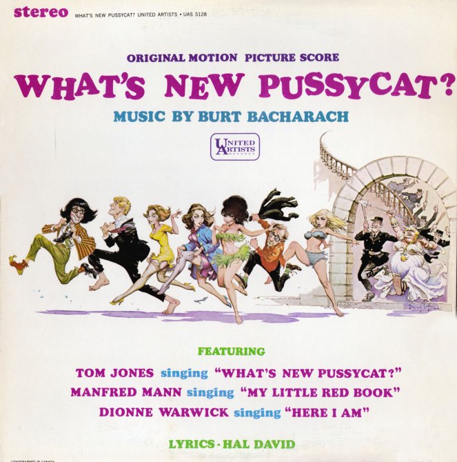
The story is, Frazetta’s “Ringo Starr” portrait caught the eye of United Artists films, which then commissioned Frazetta to do his first poster art for a movie, What’s New Pussycat?, a 1965 comedy written by Woody Allen. I don’t have a copy of that poster, but I did purchase an LP, in very good condition, of the What’s New Pussycat? Original Motion Picture Score, with music by Burt Bacharach, last month from a local Value Village store, and have been waiting for the right moment to post it. Now might be the time:

frank-frazetta_lp-cover_whats-new-pussycat

frank-frazetta_detail_whats-new-pussycat_lp
ABOVE: Although this scan appears to be the same width as the previous one, if you click through to the file, you will find that it is actually a bit larger/wider.

Guess it’s lucky for fans of Frazetta’s movie posters that the “Ringo Starr” portrait appeared in a beautifully designed fake advertisement on the magazine’s back cover, where it could be reproduced in “glorious technicolor,” because buried inside the magazine, where it would have had to appear in black and white, the portrait probably would not have attracted the attention from Hollywood that it did, and Frazetta’s lively and lucrative side-career as a movie poster artist would not have gotten off the ground.

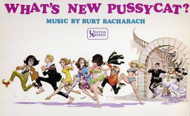
BTW, sorry about the lousy image quality: the album wouldn’t fit on the scanner bed, so I had to scan in pieces, stitch together the panoramas, and touch up (very roughly) around the edges. The results aren’t the best, but I’m not scanning (or photographing) for print reproduction, only appreciation.

Book/Magazine Covers (All) · Frank Frazetta · Illustration Art · Look Here

Look Here: Five random covers, with art by Frank Frazetta

I don’t have a lot of paperbacks with cover art by Frank Frazetta, but here are a few I do have…

Rogue Roman is an early cover painting by Frazetta that someone out there might enjoy seeing in its original format. The painting sans text appears in the Frazetta art book, Icon (Grass Valley, CA: Underwood Books, 1998), page 126. Looks a lot different there, too: the overall tone is much, much warmer. But I can’t decide if Rogue Roman is one of those pieces that was altered at a later date by Frazetta or not. And since there’s no mention of alterations in the discussion that accompanies the painting in Icon, it might just be a case of inaccurate reproduction on the paperback. Wouldn’t be the first time.

Of course, most Frazetta fans know that what makes the artist’s Moon Maid cover more than just a visually arresting illustration is that the original painting was substantially altered (though not, IMHO, improved) by Frazetta when he got it back from the publisher; which is to say, the painting as you see it here no longer exists.

The male model for The Mucker could easily have been Frazetta himself.

And finally, the central figure in Frazetta’s Tanar of Pellucidar was clearly swiped by Arthur Suydam for the painting that appears on the cover of his The Art of the Barbarian (Special Edition): Conan, Tarzan, Death Dealer. Look it up and you’ll see!

Keywords: Rogue Roman, The Book of Paradox, The Moon Maid, The Mucker, Tanar of Pellucidar.

Book/Magazine Covers (All) · Illustration Art · Look Here · Robert Foster · Robert McGinnis

Look Here: Two “Ben Gates Mystery” novels, with covers by McGinnis

One bare foot… hm… perhaps it’s a sign… a symbol of some sort… if only I could think what it means…

[CLICK IMAGES TO ENLARGE]


Sorry about the iffy scan on the second one. The book is a little bit warped, so the scanner created and caught a bit of glare.


BONUS COVER SCAN (added 14 August 2010):

This evening, as I was absent-mindedly browsing the paperback shelves in our basement, I came across a cover by an uncredited artist that had something about it that made me want to include it here…

[CLICK IMAGES TO ENLARGE]


BONUS LINK:

Flickr > Kyle Katz > Robert Foster Covers

Keywords: Kill Now, Pay Later, Some Like It Cool, In Pursuit of the English.

Book/Magazine Covers (All) · Illustration Art · Look Here · Robert McGinnis

Look Here: Five vignette-style covers with art by Robert McGinnis

In my growing collection of vintage books, I have quite a few paperbacks with Robert McGinnis art. I posted a few last time; now, here are five more, in no particular order:

I usually prefer to display paperback covers in order of publication, but these Fawcett paperbacks mostly don’t include the year(s) of publication, only the year the book was copyright.

Keywords: Area of Suspicion, Assignment: White Rajah, The Damned, The Dragon’s Eye, The Price of Murder.

Book/Magazine Covers (All) · Illustration Art · Look Here · Robert McGinnis

Look Here: Four “Carter Brown” covers by Robert McGinnis

Scanned from the mouldering vintage-paperback library of yours truly, here are four “Carter Brown” covers by Society of Illustrators Hall of Fame inductee Robert McGinnis (1926 – ), everyman’s favourite pulp-paperback cover artist:

First interesting fact about McGinnis: his preferred medium for his cover paintings wasn’t oil, or watercolour, or gouache; rather, it was, and still is, egg tempera. Second interesting fact: McGinnis seldom drew from life but instead took photographs of models (etc.), projected them onto the painting surface, and traced the resulting images, clarifying the forms where necessary, and elongating and adjusting the limbs and features according to his distinctive sense of proportion and beauty. McGinnis very briefly demonstrates his working methods in a DVD entitled Robert McGinnis: Painting the Last Rose of Summer, which is not a painting video at all but rather a documentary overview of McGinnis’s career as a commercial artist and painter.

Keywords: The Wind-up Doll, Had I But Groaned, Blonde on a Broomstick, Blonde on the Rocks.

Book/Magazine Covers (Jones) · Connections · Jeffrey "Jeff" Catherine Jones · Look Here

Look Here: “The W. C. Fields Book” cover by Jeffrey Jones

The W. C. Fields Book (Brooklyn: Wonderful Publishing Company, 1973) is identified in the indicia as a “special issue of Witzend (No. 9).” Witzend was an underground comics magazine launched in 1966 by E.C. legend Wallace Wood and published and edited by him until 1968, when he sold the magazine, for a buck, to Bill Pearson/Wonderful Publishing Company. Here’s the cover with Jones’s painting of W. C. Fields, which, by the way, is reprinted at a small size but sans text and in full colour on page 64 of Jones’s first solo art book, Yesterday’s Lily (Dragon’s Dream, 1980):

jeffrey-jones_cover_witzend-09

And here — SURPRISE! — is an extremely obscure illustration by Jeffrey Jones, published in black-and-white in National Lampoon, vol. 1, no. 23 (February 1972), along with an article entitled “The Thoughts of Chairman Fu-Manchu”; the painting has never, to my knowledge, been reprinted:

jeffrey-jones_the-thoughts-of-chairman-fu-manchu_national-lampoon-v1n23-feb1972_p66

The washy, rub-out style of the “Fu-Manchu” painting, which can be accomplished most easily with oil paints but is also possible in watercolour/gouache, was state-of-the-art in the late 1960s and early 1970s. Three of the best known practitioners were Society of Illustrators Hall of Fame inductees Bernie Fuchs, Burton Silverman, and David Levine, but many others tried their hands at it, too — including Jones, apparently. To learn how to do it in watercolour, all you need is a copy of Silverman’s Breaking the Rules of Watercolor, a selection of watercolour paints and brushes, a few rolls of good-quality paper towels, a large tube of white gouache, a stack of the heaviest weight Strathmore plate bristol you can find, AND THE PATIENCE OF JOB!

BONUS CONTENT:

Here’s an album cover, not by Jeffrey Jones, with a portrait of W. C. Fields that appears likely to have been based on the same photo reference of Fields as Jones used for his painting; the accoutrements are slightly different in the two portraits, but the face, I think, is a dead giveaway:

w-c-fields-his-only-recording

I suppose it’s also possible that one portrait was based on the other (though it seems to me unlikely). Either way, however, Jones’s W. C. Fields genuinely looks like the kind of man who keeps a supply of stimulant handy in case he sees a snake, which he also keeps handy, while the other Fields looks like he has been living for days on nothing but food and water. Can you guess which one I like best? Wrong again. I prefer Jones’s version.

Art Collection · Comics · Ebay Win · Look Here · Rod Ruth

Look Here: Two more “Toodles” strips, with art by Rod Ruth

Here are two more strips by Rod Ruth, from our slowly expanding collection of original art; the first is from 2-20-58, and the second, from 3-12-58:

[CLICK IMAGES TO ENLARGE]

Rod Ruth is by no means a well-known figure in the history of comic strips, but I, for one, find his work terrifically appealing. Ruth’s character designs are distinctive, and the expressions always appropriate to the action: look, for instance, at the way Ann’s expression changes from panel to panel in the first strip as she struggles to stand up for the man she loves in the face of her parents’ stern expressions of disapproval, and then retreats into sullen silence as her mother pointedly puts her father in his place. Ruth’s staging of the action is also first rate: in the first strip, notice how he changes from a three shot in the first panel, with the father on the left, facing right, to a closer two shot of mother and daughter, back out to a three-shot, with the father close on the right, facing left — which, taken together with the first two panels, I read as a sign that the father has been pacing back and forth while the women have been talking — and then ends with a lovely low reverse angle that not only maintains spacial continuity between the three but also places the now visibly weary Ann, both compositionally and symbolically, right in the line of fire between her domineering mother and her stuffed-shirt father; and I especially like the bits of business the artist gives to Ann in the second strip — panel one, she files her nails; panel two, she pumps a bit of moisturizer into her palm; and panel three, she absently rubs the moisturizer into her hands as she wistfully contemplates lost love. Finally, Ruth’s handling of clothing, furniture, props, etc., is always economical and convincing: notice, for instance, the way he uses little dabs and checkmarks of ink to give dimension to the quilting on Ann’s jacket in the second strip, or the way he suggests the folds on the nurse’s overcoat with a few deft strokes of the brush.

To see all three of the “Toodles” strips I’ve posted so far, click here.

BONUS LINKS:

The Haunted Closet: Baleful Beasts and Eerie Creatures (illustrated by Rod Ruth), posted by Brother Bill

The Haunted Closet: Baleful Beasts and Eerie Creatures: The Patchwork Monkey (illustrated by Rod Ruth), posted by Brother Bill

The Haunted Closet: Baleful Beasts and Eerie Creatures: Nightmare in a Box (illustrated by Rod Ruth), posted by Brother Bill

The Haunted Closet: The Rest of Baleful Beasts and Eerie Creatures (illustrated by Rod Ruth), posted by Brother Bill

The Haunted Closet: Album of Dinosaurs (Tod McGowen, Rod Ruth, 1972), posted by Brother Bill

Bernie Wrightson · Comics · Here, Read · Look Here · Separated at Birth?

Separated at Birth? James Garner and Captain Sternn

Okay, I admit it. This one isn’t an original.

From page 13 of Comic Book Profiles #2 (Spring 1998), here’s Bernie Wrightson’s answer to the question “How did Captain Sternn come about?”: “I realized when I was working on Running Out of Time for Kitchen Sink that Captain Sternn came out of my teenage years, from the movie, The Great Escape. It was always one of my favorite movies. When I was a kid, all my friends identified with the Steve McQueen character, but I was fascinated with the James Garner character, who played a con man. He was a really smooth liar, just this side of being oily. I realized that Captain Sternn looks like James Garner from the Great Escape. So I guess that’s where it came from.”

BONUS CONTENT (added 07 August 2010):

Here’s Wrightson’s first “Captain Sternn” story, as it appeared in Heavy Metal, vol. 3, no. 3 (June 1980):

[CLICK IMAGES TO ENLARGE]

Angelo Torres · Comics · Frank Frazetta · Here, Read · Look Here

Look Here, Read: “The Blank!” with art by Angelo Torres

From the pages of Strange Stories of Suspense #12 (December 1956), here’s a four-page story with a banal script that is partially redeemed by the vivacious Frazetta-influenced art of Angelo Torres:

The lowest point in the story has to be when Lee says to Dora, “Besides, you’re much too lovely a girl to be so brilliant and absorbed in your work!” That’s casual sexism offered up as a compliment, Holmes. Apparently, whether they’re from the past, the present, or the future, men will be men will be men, all mentally mired in the 1950s.

But wait! Did Lee just say future human civilization has “scanners, to look back into time and send men like me, trouble-shooters of the future, back to the past to take care of things like this”? Hm… now that’s interesting… I wonder who was the first to use the term scanners in SF in connection with time travel and surveillance… and I also wonder if Philip K. Dick ever read this story… LOL!