
To view all of the covers with art by Paul Lehr that I’ve posted so far, click here.
"This day's experience, set in order, none of it left ragged or lying about, all of it gathered in like treasure and finished with, set aside." –Alice Munro, "What is Remembered"

To view all of the covers with art by Paul Lehr that I’ve posted so far, click here.
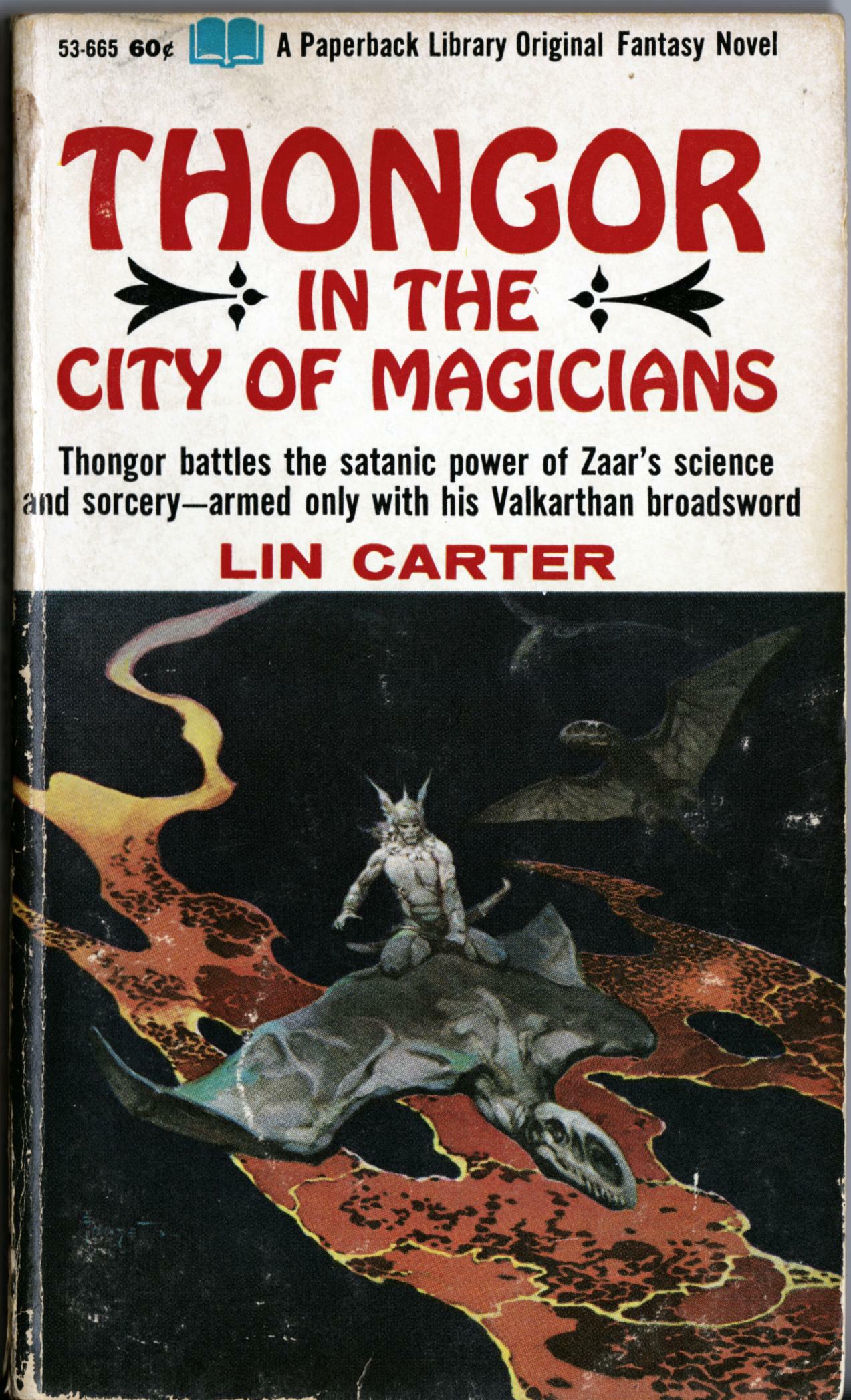
The painting on the cover of Thongor in the City of Magicians also appeared on the cover and foil-embossed slipcase of Night Images, a limited-edition collection of Robert E. Howard’s fantasy verse published by The Morning Star Press in 1976, with interior illustrations by Richard Corben. That same year, the Morning Star Press also published the hardcover black-and-white, first-edition of Corben’s Bloodstar, which was an adaptation of Robert E. Howard’s “Valley of the Worm.”
Now, did you know, dear reader, that a few years earlier, writers Roy Thomas and Gerry Conway, along with artist Gil Kane and inker Ernie Chua (Chan), had produced a comics adaptation of “Valley of the Worm” for the third issue (April 1973) of the Marvel series, Supernatural Thrillers?
And did you also know that Gil Kane was co-editor at The Morning Star Press, along with Armand Eisen, of Corben’s Bloodstar, and that Kane himself was the one who suggested the hero’s name be changed from “Niord” to “Bloodstar” and designed the distinctive star mark on Bloodstar’s forehead?
Well, even if you didn’t know before, you do now!
Small world, eh?
P.S. I not only own several copies of the signed and limited first edition of Bloodstar but I actually have in my collection a beautiful copy of the slipcased, limited edition of Night Images. Lucky me!
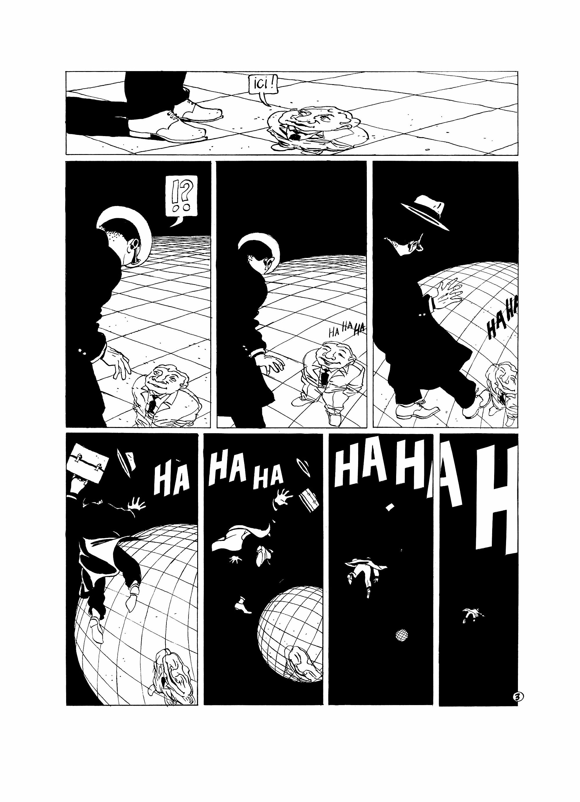
“Du Même Côté” (“On the Same Side”) by Mirko Ilić was published in Métal Hurlant #57 (November 1980), pp. 81-82, with the two pages that comprise the story printed back-to-back on the same leaf. Here’s what you would have seen if you had read the story thinking it was the usual comics fare:
[CLICK EACH IMAGE TO ENLARGE, or RIGHT CLICK > SAVE LINK AS…]


But “Du Même Côté” was not exactly the usual fare. Here, more or less, is what you would have seen if you had held the pages up to the light:
[AGAIN, CLICK EACH IMAGE TO ENLARGE, or RIGHT CLICK > SAVE LINK AS…]
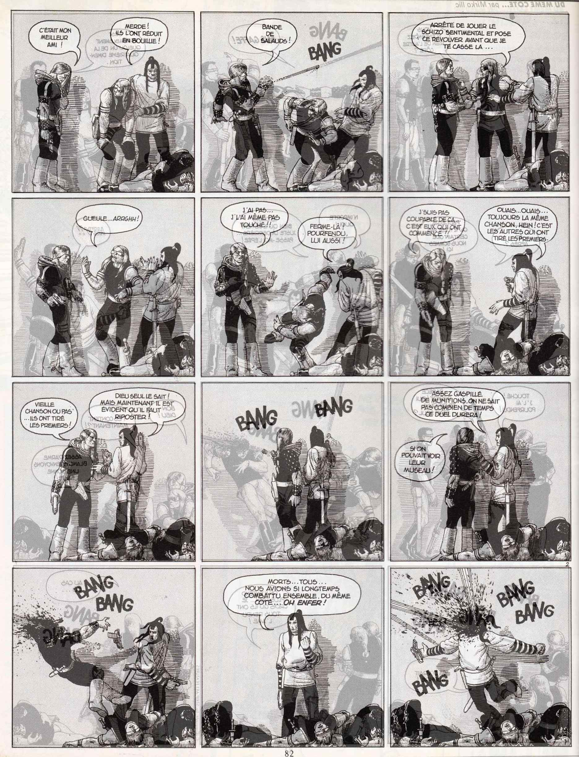
My apologies to everyone, including the author, for any and all deficiencies in the above presentation, but I think — I hope! — my crudely photoshopped images are clear enough to give you the flavour, at least, of Mr Ilić’s formal experimentation.
However, if you’re still unsure what, exactly, is going on in the story, you could do no better than to read the description of “Du Même Côté” that Mr Ilić himself posted here at RCN on 21 September 2010 at 10:08 am:
At that time, I was into playing with comics as a media, and the idea of the comics was to be printed on both sides of the page. Because characters are two dimensional, they don’t have a sense of third dimension. When they are standing against a white wall / magazine sheet, and hearing voices on the other side, they don’t know that they’re actually hearing themselves on the reverse side of the page. When they are shooting / stabbing into the wall, they don’t understand that they are actually killing themselves as the knife comes through to them on the other side of the paper. Only when you hold the page up to the light, do you understand the full picture.
Not surprisingly, it was the above description that prompted me to hunt down a copy of Métal Hurlant #57 so I could present “Du Même Côté” here for your, and my, reading enjoyment. And though it cost me a few bucks — 8.25 EUR, to be exact — I think it was worth it. But then again, I have a real soft spot for black humour and bleak endings.
BONUS LINK (added 23 August 2012):
Mirko Ilić Blog > Metal Hurlant – as of today, 23 August 2012, you can now read “The Same Side” in English on Mr Ilić’s own blog. I am delighted to see that he used the same technique that I used above to simulate the process of holding the physical pages up to the light. Simple but effective.
Here’s a recent addition to our little library of vintage SF paperbacks, along with a bonus image taken from a profile of Leo and Diane Dillon published in Heavy Metal:
[CLICK IMAGES TO ENLARGE]

To view the other ACE Science Fiction Specials with cover art by Leo & Diane Dillon that I’ve scanned and posted, click here.
To view ALL of the covers with art by Leo & Diane Dillon that have been featured on RCN, click here.
The first illustration posted below appeared on the inside back cover of Barbarian Comics #2 (1972) and the second appeared in Barbarian Comics #3 (1974):
[CLICK IMAGES TO ENLARGE]
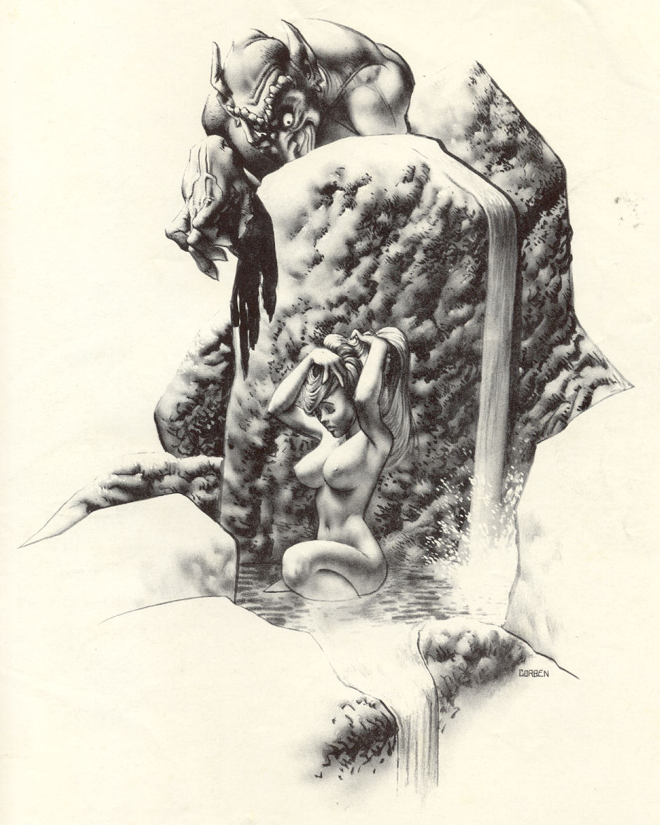

I wonder if the illustration from 1972 was one of the inspirations for the opening scene of Corben and Strnad’s New Tales of the Arabian Nights (New York: HM Communications, 1979), in which two brothers, Shahryar and Shahzaman, are blackmailed by a woman who was snatched on her wedding night by a giant jinni named Ifrit so that none might lay with her but him, and who takes her revenge on the beast by cuckolding him, whenever he sleeps, with whatever men happen to be available: “My lovers have numbered five hundred and seventy,” she tells the brothers with a leer, “and now I would count two more.” And since refusal means certain death at the hands of the jealous jinni, whom the woman has threatened to awaken from his sleep should she not get her way, the pragmatic brothers do what must be done to save their lives.
From Star*Reach #7 (1977):


Please don’t try to order anything from that old GbP address. I have no idea if GbP is still a going concern, but BWS has a lovely Web site, so it’s easy enough to contact him about his current offerings, such as his new print, Poetry, published by Glimmer Graphics.
From Heavy Metal, volume III, number 6 (October 1979), here is Alberto Breccia’s adaptation of H.P. Lovecraft’s “The Dunwich Horror”:
[UPDATE: The version published in Heavy Metal is now followed by a scan of the Spanish-language original, which provides the ocular proof of HM’s legendary translation and relettering butchery — not to mention HM’s failure to give credit to Breccia collaborator Norberto Buscaglia!]
[CLICK EACH IMAGE TO ENLARGE, or RIGHT CLICK > SAVE LINK AS…]


Alberto Breccia (1919–1993) was a 2009 Will Eisner Comic Industry Hall of Fame nominee. That Breccia was passed over for the award says considerably more about the shameful lack of availability of English translations of Breccia’s comics than it does about the quality of the work, which was first-rate.
The artists who were named to the Will Eisner Comic Industry Hall of Fame for 2009: Harold Gray, Graham Ingalls, Matt Baker, Reed Crandall, and Russ Heath. Ah nostalgia… there’s no soporific like it…
Here’s a relatively new addition to our collection of comic art; it’s page 4 of a 5-page story entitled “In the Swim,” with art by Samm Schwartz, which appeared in Archie’s Pal Jughead #103 (December 1963):
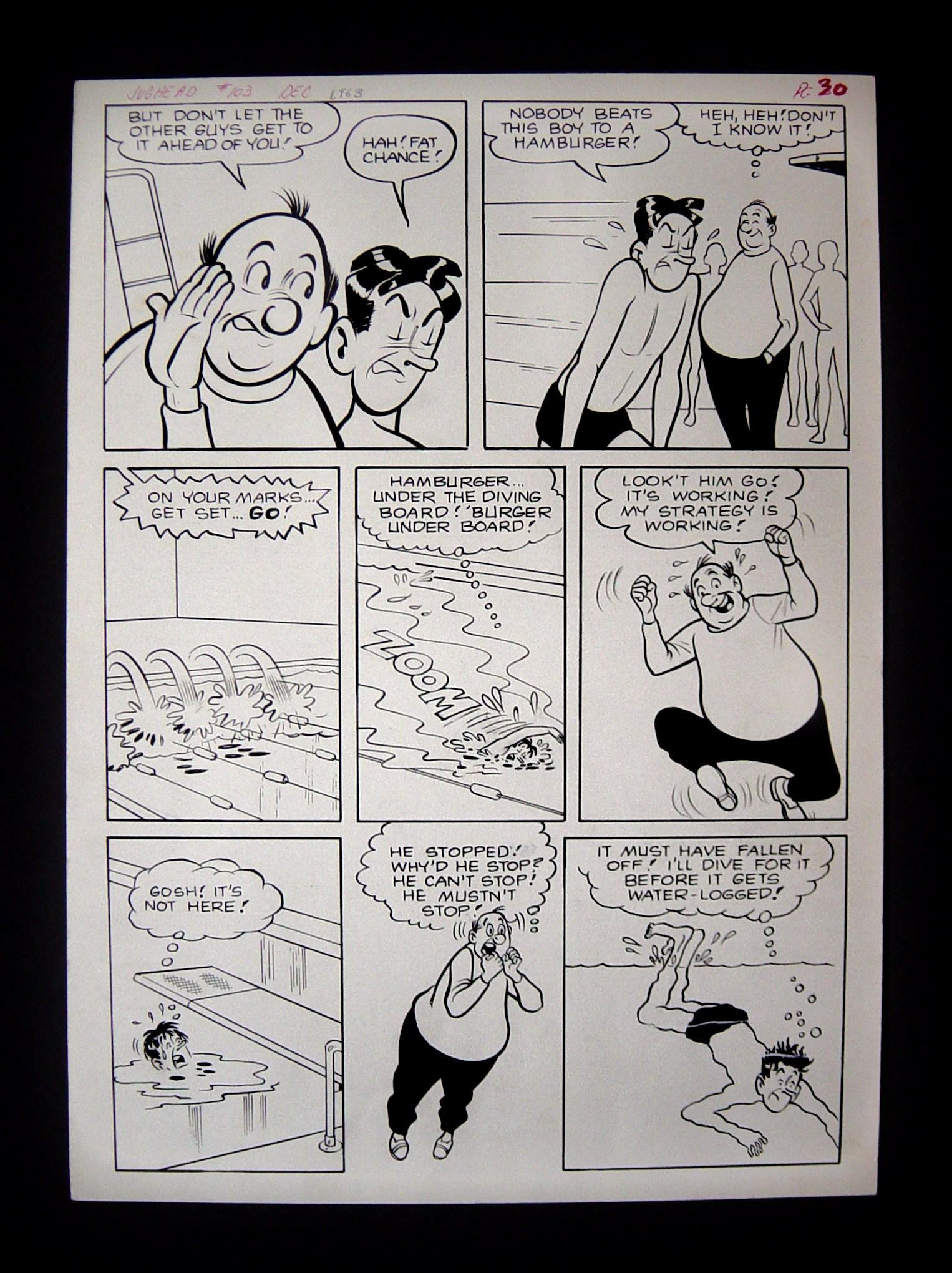
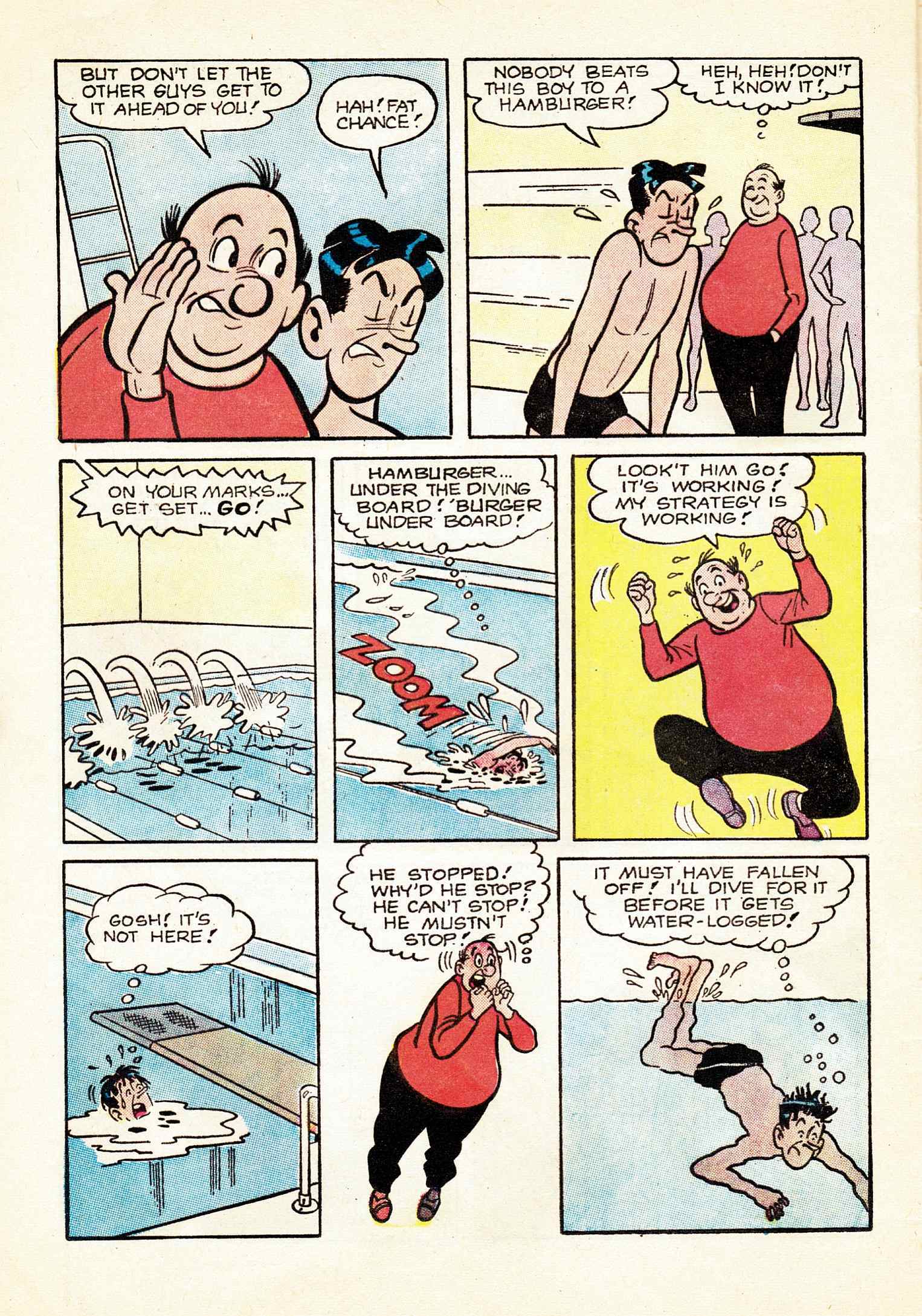
I posted the cover of Archie’s Pal Jughead #103 six days ago in a post entitled “Ebay Wins: Schwartz, Marek, Bacon,” at which time I wrote, “it’s not the oddly composed cover of Archie’s Pal Jughead #103 that caused me to buy it — nose meet pocket; pocket, nose — but the interior art. Can you guess why?” Well, the reason is that I think it’s always cool, when one owns a piece of original comic art, to own a copy of a comic in which the page was printed. Also, by having the comic at hand, I am able to post a decent scan of the printed page along with a digital photo of the art on this blog.
Along with the above page, my wife and I also own the original art of a complete story drawn by Samm Schwartz, “Color Me True Love,” Jughead #321 (February 1982), created about 19 years after “In the Swim,” but still clearly by the same hand, guided by the same minimalist artistic sensibility.
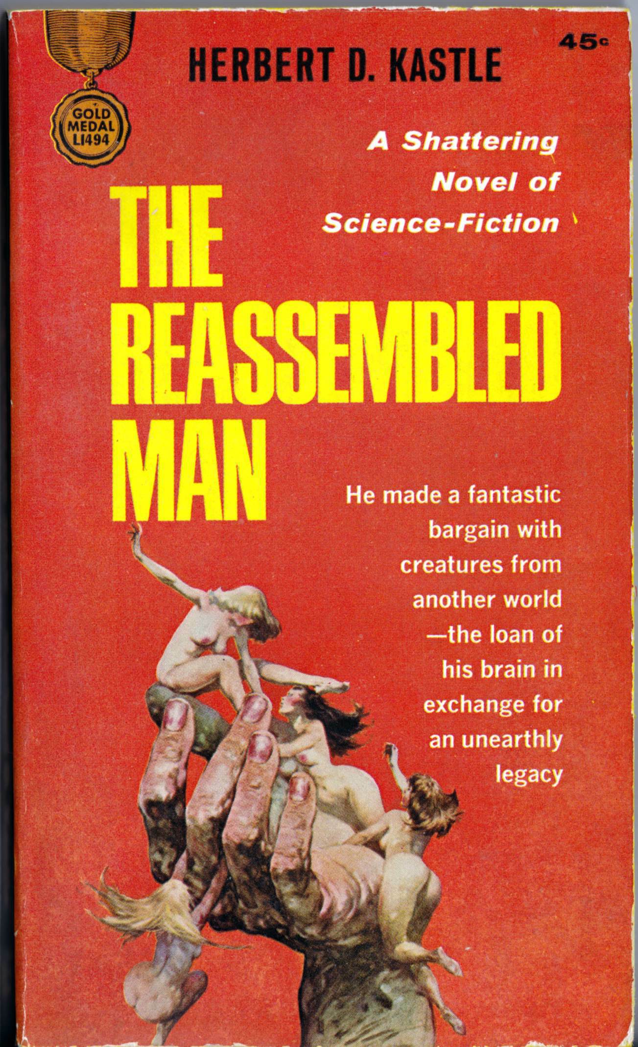
Here, for your viewing pleasure, is the cover of the first edition of Herbert D. Kastle’s paperback original, The Reassembled Man, which I purchased for the princely sum of four bucks in a used bookstore here in the Queen City earlier today:
[CLICK IMAGE TO ENLARGE]

Enjoy!
