Book/Magazine Covers (All) · Book/Magazine Covers (Jones) · Illustration Art · Jeffrey "Jeff" Catherine Jones · Look Here

Look Here: One fantasy and two occult paperbacks, with cover art by Jeffrey Jones

From my own collection, presented in order of publication:

[CLICK IMAGES TO ENLARGE]

To view three other “Guardians” paperbacks with cover art by Jeffrey Jones, click here, here, and here.

To view a couple more “Kothar” paperback with cover art by Jones, click here and here.

And finally, to view all of the paperbacks with cover art by Jeffrey Jones that I’ve posted so far, click here.

Keywords: Satan’s Child, Kothar Barbarian Swordsman, The Vampires of Finistere

Bernie Wrightson · Connections · Frank Frazetta · Illustration Art · Look Here

Connections: Frazetta and Wrightson

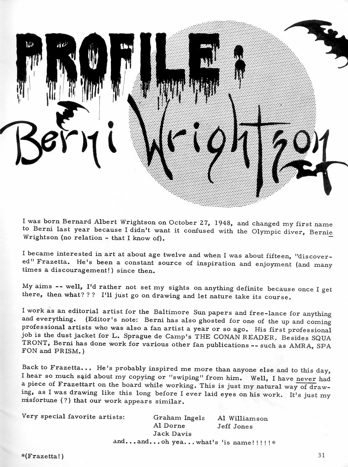
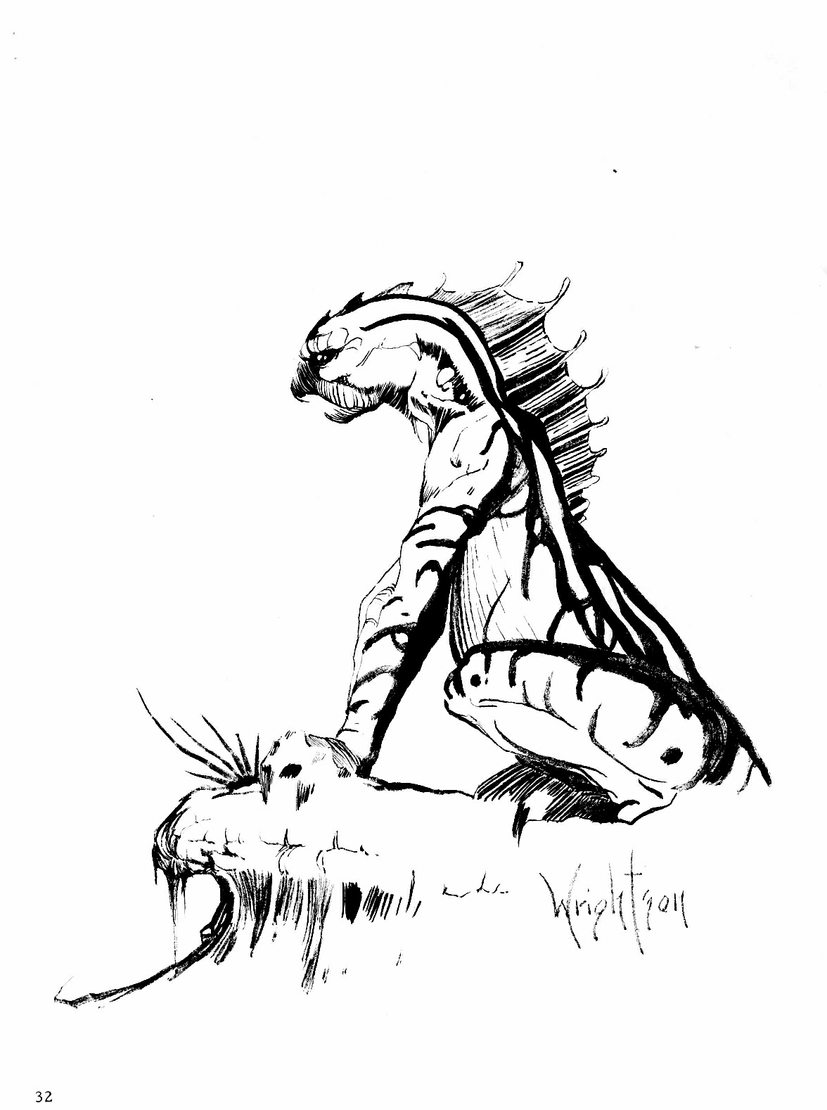
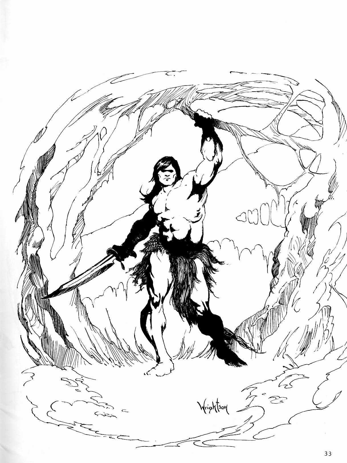
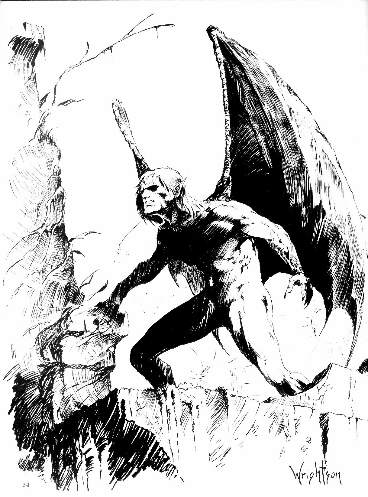
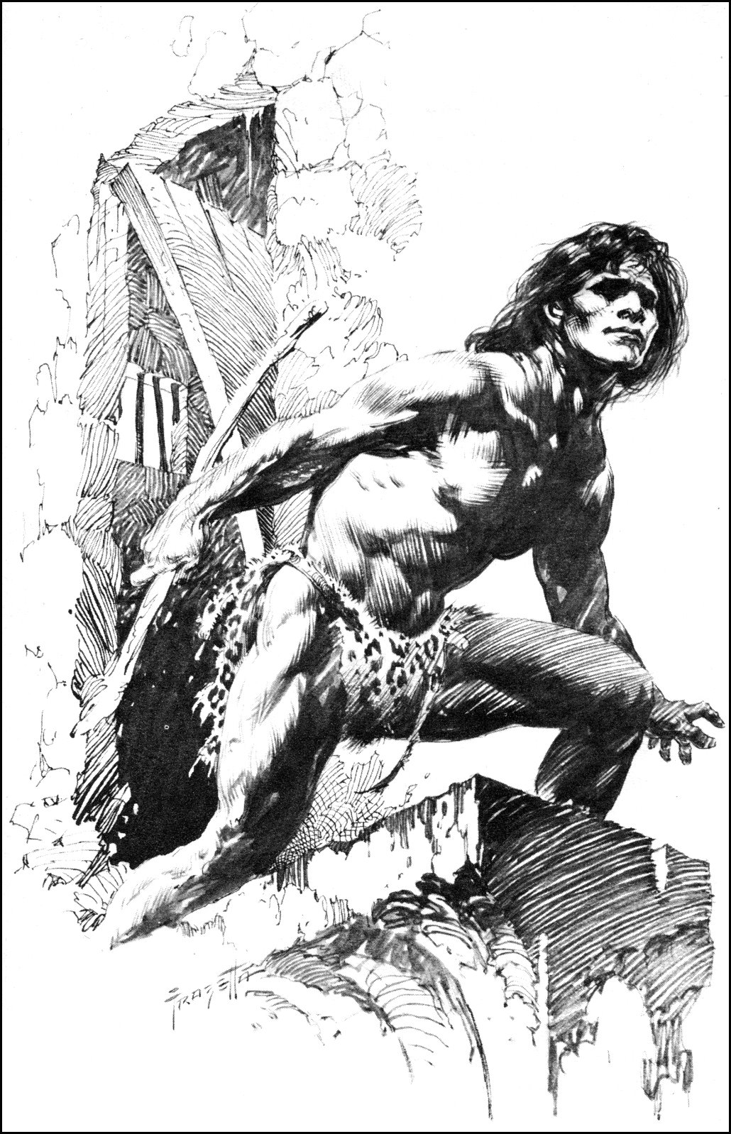
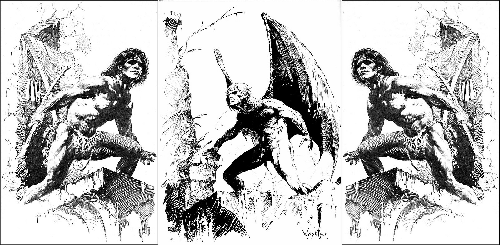
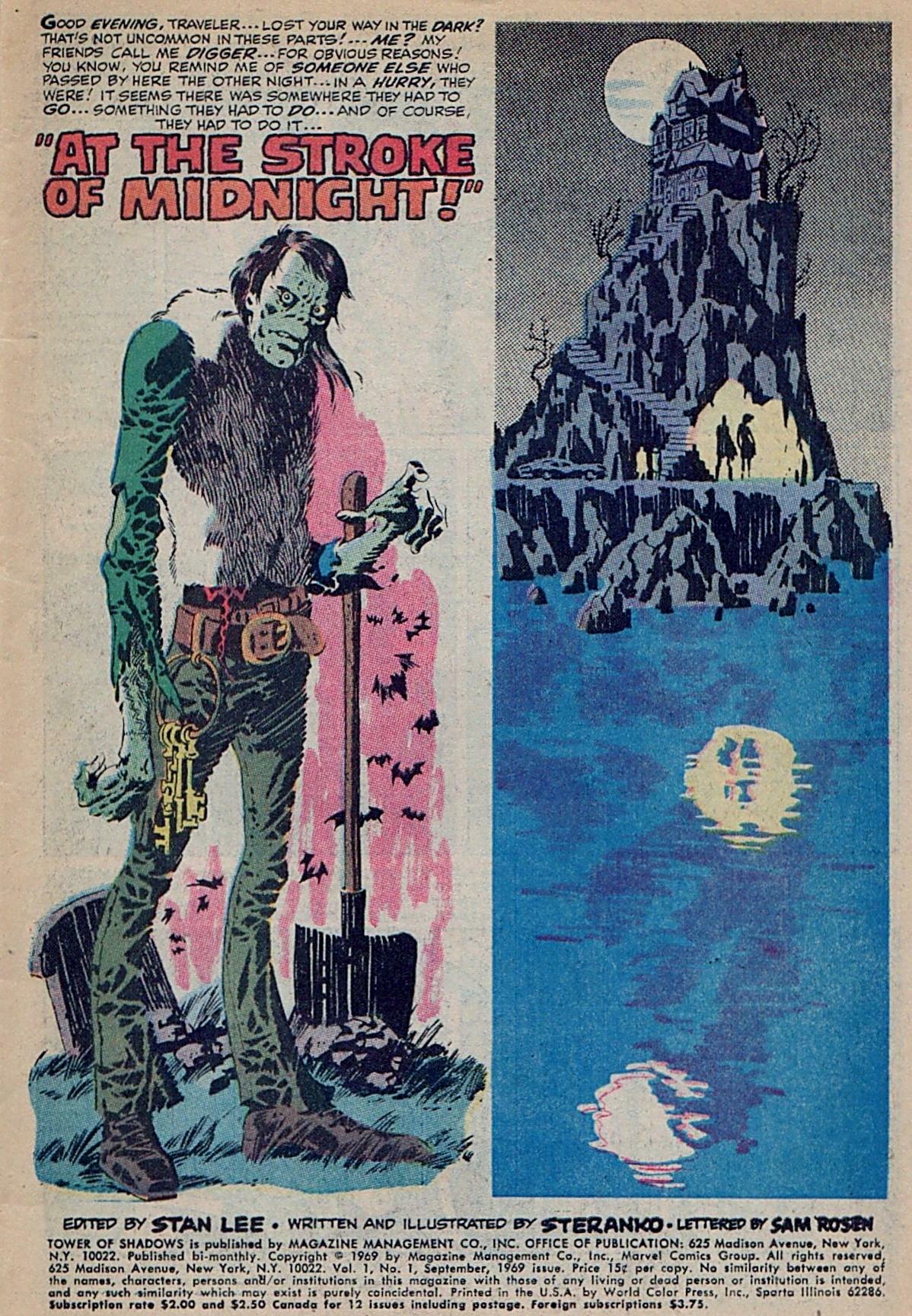
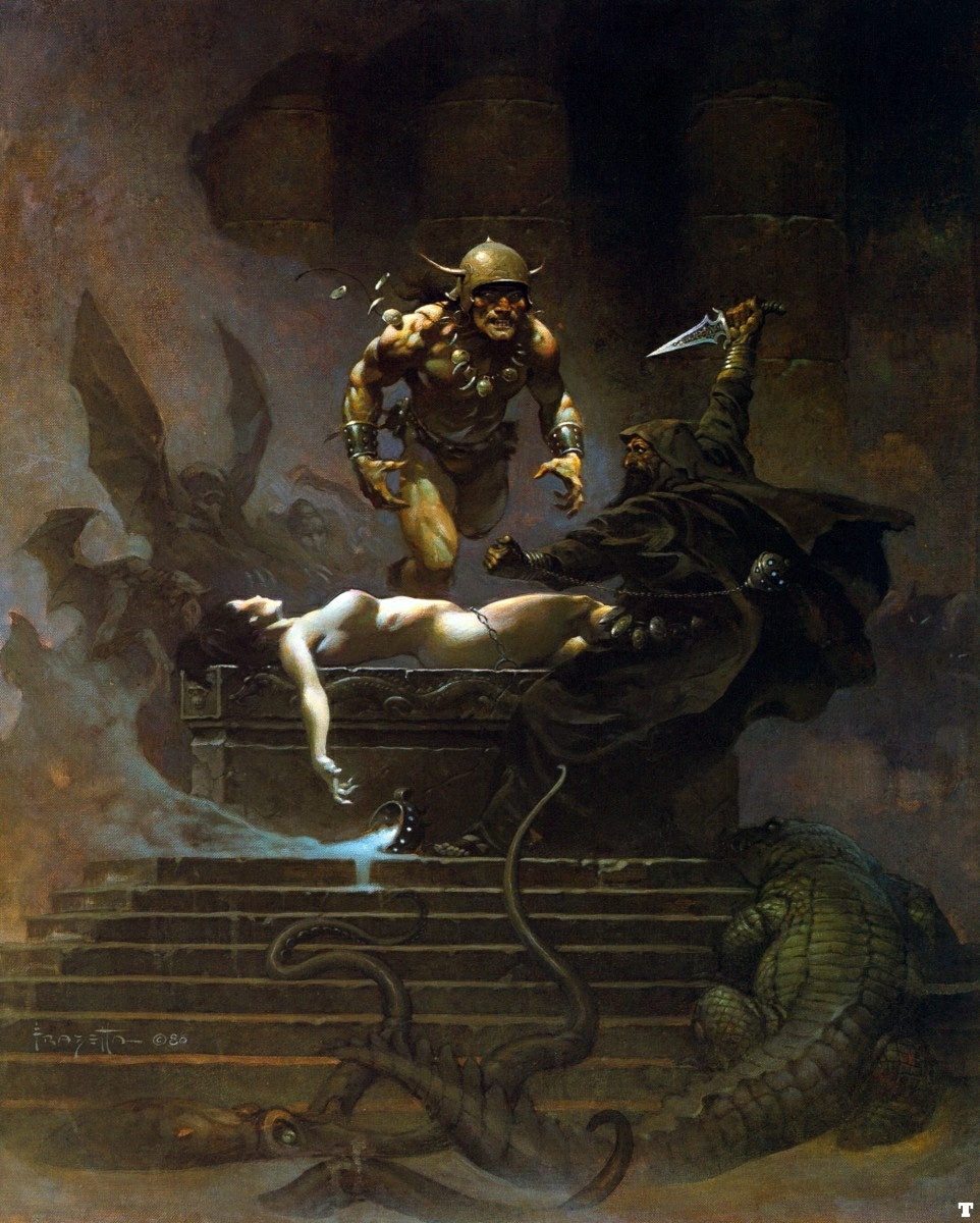
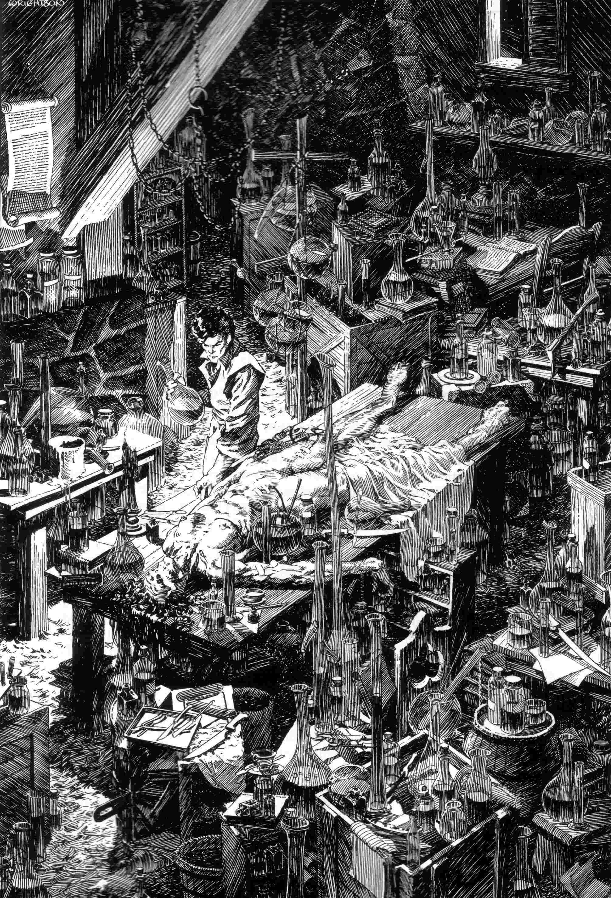
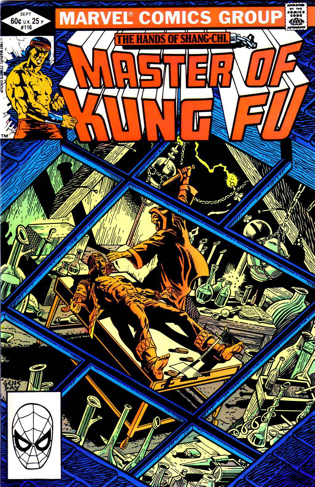
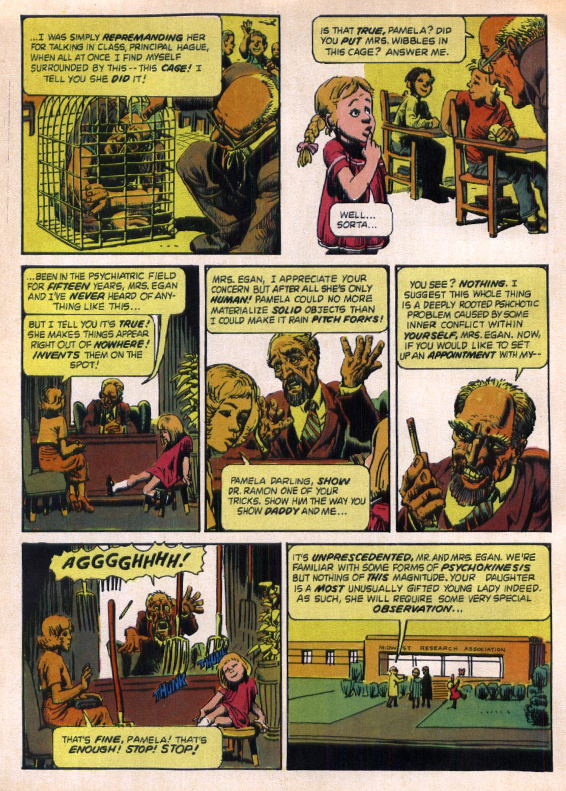
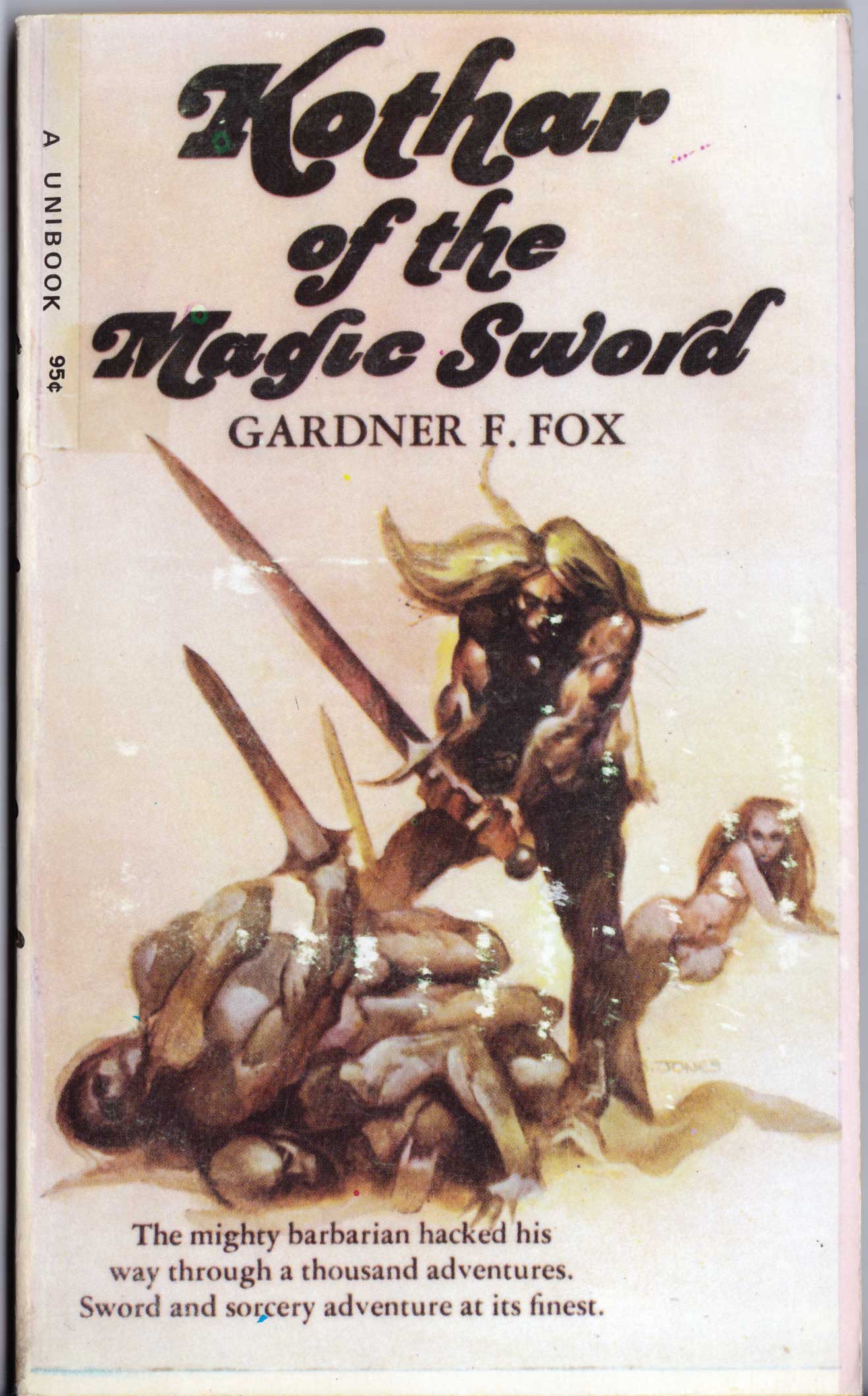
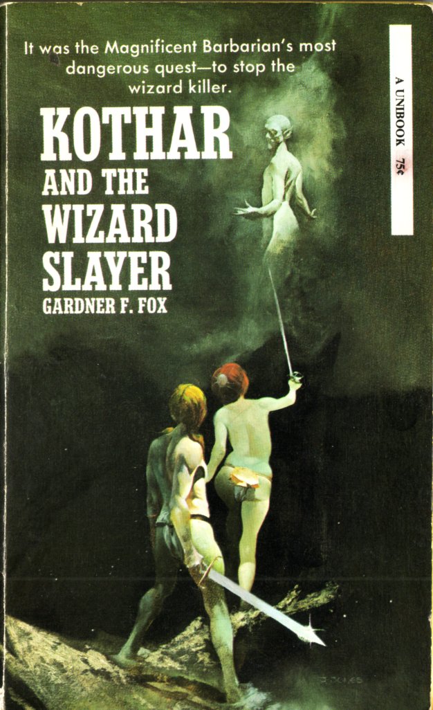
Flipping through the second issue of the E.C. fanzine, Squa Tront, I came across a profile of Bernie Wrightson that made me chuckle. Published in September 1968 — the same year that, according to his official Web site, Wrightson “turned pro” — the profile includes a short biographical and artistic statement as well as three full-page reproductions of Wrightson’s work. In the statement, the man formerly known as “Bernard Albert Wrightson” explains why he has decided to go by the name “Berni” instead of “Bernie” (a decision he later reversed); he forthrightly acknowledges his longstanding fascination with and admiration for the work of Frank Frazetta; and he vigorously defends himself from the charge that his own work is overly indebted to that same artist: “He’s [Frazetta has] probably inspired me more than anyone else and to this day, I hear so much about my copying or ‘swiping’ from him. Well, I have never had a piece of Frazettart [sic] on the board while working. This is just my natural way of drawing, as I was drawing like this long before I ever laid eyes on his work. It’s just my misfortune (?) that our work appears similar.” Trouble is, Wrightson, who was only about 20 years old at the time, says right in his statement that he “became interested in art at about age twelve and when I was fifteen, ‘discovered Frazetta.'” Now, I don’t know what kind of prodigy Wrightson was, but if he was drawing like Frazetta long before he ever laid eyes on Frazetta’s work, then clearly he would have had to have been doing so between the ages of 12 and 15… which, to my mind, definitely does not pass the… uhm… uh… anyway, from Squa Tront #2 (September 1968), here’s “Profile: Bernie Wrightson,” along with an illustration by Frazetta, originally published in the Canaveral Press edition of E.R.B.’s Tarzan and the Castaways (1965), that did NOT appear in Squa Tront but, in light of Wrightson’s statement, holds a certain interest, I think.

Do you see now why “Profile: Berni Wrightson” made me chuckle? Ah, the impetuousness of youth!

Of course, Wrightson would eventually synthesize his influences to produce some of the best horror comics and illustrations of the 1970s and beyond. But he clearly hadn’t done so in 1968. And from all the work I’ve seen, I’d argue that he didn’t do so for a few more years after that. Which, btw, is a perfectly normal path of development for an artist, right down to the denials…

Here, Read · Look Here

Look Here, Read: “A Kiss to Remember,” with art by Garcia-Lopez

From the Charlton romance comic, Time for Love #18 (September 1970), here’s “A Kiss to Remember” with uncredited but signed comic art by Spanish artist, José Luis García-López, who was only about 22 years old at the time but was undoubtedly already turning the heads of American comics editors and readers alike with an attractive, naturalistic fine-line style that aficionados would immediately have recognized as falling squarely within the Alex Raymond/Leonard Starr/Stan Drake school of comics photorealism:

[CLICK IMAGES TO ENLARGE]

I’m not a big fan of comics photorealism, but when I accidentally come across accomplished but uncredited artwork like the above in an otherwise lacklustre Charlton romance comic, I am compelled to find out who the artist is, though in this instance, it was easy: I recognized the signature!

Book/Magazine Covers (All) · Book/Magazine Covers (Jones) · Illustration Art · Jeffrey "Jeff" Catherine Jones · Look Here · Zebra/Kensington Covers (Jones)

Look Here: Three more R.E.H. covers, with wrap-around art by Jones

From my very own collection of crispy-crunchy sf-and-f paperbacks, here are three more classic Zebra/Kensington covers, with wrap-around art by Jeffrey Jones, whose new book, Jeffrey Jones: A Life in Art (IDW), is available in stores now, in both regular and signed/numbered editions:

To view a pair of Zebra/Kensington Robert E. Howard paperbacks with cover art by Jeffrey Jones that I posted earlier, click here.

Keywords: Worms of the Earth, Sword of the Gael, The Book of Robert E. Howard, Bran Mac Morn, Cormac Mac Art.

Connections · Frank Frazetta · Jim Steranko · Look Here

Connections: Wood, Frazetta, Morrow, Steranko

The famous cover of Nick Fury, Agent of S.H.I.E.L.D #6 (November 1968) is commonly referred to as Steranko’s “homage to Wally Wood” — that spacesuit! — although many have noted that the cover could almost as easily be seen as an homage to Famous Funnies #214, with art by Frazetta. I don’t, however, recall anyone mentioning what I believe is a swipe by Steranko from the opening panel of “The Man in Grey,” World of Fantasy #7 (May 1957), with art by Gray Morrow. Or maybe I’m just seeing things. Take a look and decide for yourself…

Yes, the yellow-and-orange-suited figure on the 1952 cover of Weird Science #15 (art by Wally Wood; see above) is in the ballpark — it may, in fact, have been an influence on both Morrow and Steranko — but there’s something about that Morrow panel…

Comics · Jack Davis · Look Here · Original art vs. printed page

Look Here: “Cigar Store Indian, 1957,” by Jack Davis

Here’s a JPEG of Jack Davis’s original artwork for “Cigar Store Indian, 1957” (with the note “HUMBUG #3” at the top), along with a scan of the piece as it was printed in Humbug #4:

[CLICK IMAGES TO ENLARGE]

What is immediately evident when one compares the two images above is how much detail was “lost in translation” from the original artwork to the printed page. In the original, Davis’s precisely crosshatched shadows are alive with atmosphere and reflected light. In the reproduction, however, the ink has sunk into the cheap paper to such an extent that Davis’s linework is made to appear a lot more heavy handed that it really is, with carefully designed tonal values congealing at the darker end of the scale into unintended masses of inky blackness. The loss of crucial detail is nowhere more obvious than on the plinth of the statue, which actually contains a lot more text — text that is integral to the joke that the drawing is intended to convey — than was visible to the readers of Humbug (see above), or even to the readers of the two-volume, slip-cased Humbug reconstruction that was published by Fantagraphics Books in 2009. However, unlike the fine folks at Fantagraphics, who clearly didn’t have the original artwork for “Cigar Store Indian, 1957,” on hand when they produced their magnificent tribute to the genius of Harvey Kurtzman and his co-conspirators at Humbug, Kurtzman and Davis would have been painfully aware what sort of damage the dodgy reproduction of Humbug #4 had inflicted on the gag on page three.

UPDATE (16 March 2011):

In an interview with Jeffrey H. Wasserman published in the fanzine Inside Comics #2 (Summer 1974), Kurtzman explained how Humbug came into being and why, in his view, the project was fatally flawed from the first:

KURTZMAN: HUMBUG was a very sentimental undertaking. We all sat around the day after TRUMP was dropped… wondering whether to slash our wrists. Arnold Roth was the only one who kept his head about him. I was sitting with Jack Davis and Al Jaffee and Harry Chester and Arnold was the only one who could think constructively. He went down and got some booze. And in our subsequent drunken state, we decided to carry on and we came out with HUMBUG.

WASSERMAN: TRUMP was a super-slick effort, obviously intended to be well-financed. But HUMBUG was different. It retailed for 15 cents and…

KURTZMAN: HUMBUG was an attempt to work with 15 cents and publish a sensitive cartoon satire magazine. It was a disaster because it wasn’t a realistic effort at all. It totally ignored fundamental business sense. We were carried away by our talent and camaraderie and went ahead with HUMBUG anyway. But I think we turned out some of the most charming stuff that’s ever been done. The format was just so bad. It was like a fart in the wind.

It was a teeny-tiny book in black and white. It had nothing going for it except talent — at least that’s what we told ourselves. We were satisfied with that, but it wasn’t nearly enough.

You can read the entire interview here.

Book/Magazine Covers (All) · Illustration Art · Look Here · Richard Powers

Look Here: Three early 1970s SF paperbacks, with cover art by Richard Powers

From my personal collection of crumbling mass-market paperbacks:

[CLICK IMAGES TO ENLARGE]

Click here to view all of the covers with art by Richard Powers that I’ve posted so far.

Keywords: The High Destiny, Inside, The Mountains of the Sun.