"This day's experience, set in order, none of it left ragged or lying about, all of it gathered in like treasure and finished with, set aside." –Alice Munro, "What is Remembered"
Back in August, I bought a small stack of gothic paperbacks with covers that depict women fleeing from castles, houses, men, etc., that I thought I might scan and post in the run up to Halloween this year, but now it looks like that is not going to happen.
(What can I say? I simply lost interest.)
A few minutes ago, however, I did manage to scan the cover of Daniel P. Mannix’s The History of Torture (London: New English Library, 1970), with art by Victor Kalin:
[CLICK IMAGE TO ENLARGE]
ABOVE: Daniel P. Mannix, The History of Torture (London: NEL, 1970), with cover art by Victor Kalin.
Kalin’s work was not produced specifically for Mannix’s book but rather was repurposed from an earlier publication, Peter Saxon’s The Torturer (NY: Paperback Library, 1967). Although both covers are dominated by Kalin’s painting, the NEL version stands out as the better of the two due to the designer’s selection of a title font that echoes the gothic details of the artwork.
The novel is from my collection, the title is No Blade of Grass, the author is John Christopher, the cover artist is Michael Presley, and the cover scan is right here:
[CLICK IMAGE TO ENLARGE]
ABOVE: John Christopher, No Blade of Grass (New York: Avon, 1980), with cover art by Michael Presley.
Not by Dean Ellis, and not by Paul Lehr, though vaguely reminiscent of both, the illustration on the cover of Robert Silverberg’s Tower of Glass is complemented rather than overwhelmed by a big block of bold, compressed, sans-serif type:
[CLICK IMAGES TO ENLARGE]
Robert Silverberg, Tower of Glass (NY: Bantam, 1971), with cover art by David Blossom.
The artist here is David Blossom, but who the heck is David Blossom? The following summary of the artist’s career appears on various sites round the Web; my source is New Britain Museum of American Art (NBMAA):
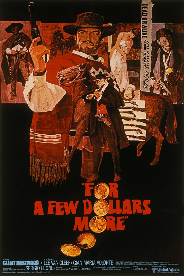
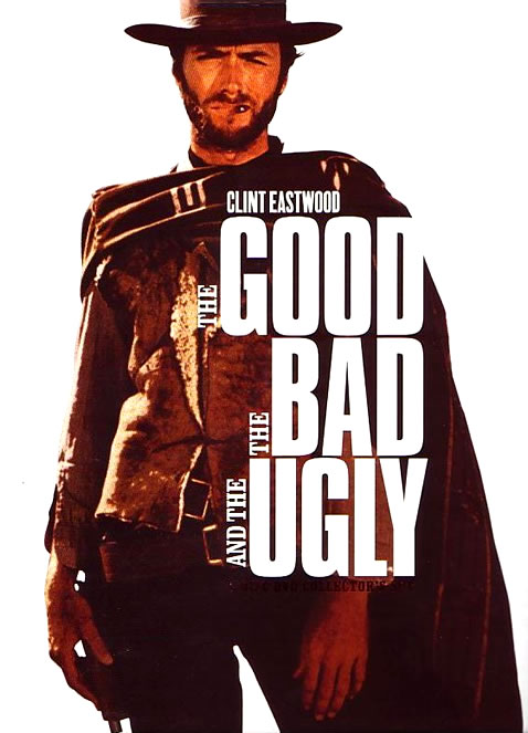
Though born in Chicago, Illinois, Blossom lived most of his life on the East Coast. Growing up in Rye, New York, he later moved with his family to Westport, Connecticut in 1963, where he lived until his death. Early in his career, he worked as an art director at Young & Rubicam, a communications company, where he specialized in advertising for the Ford Motor Company and Pan American Airways. His work in illustration included covers for romance novels and popular magazines such as Outdoor Life and Reader’s Digest. Blossom is also known for creating movie posters for such Clint Eastwood westerns as The Good, The Bad, and The Ugly, A Fistful of Dollars, and A Few Dollars More. In its annual awards for excellence to deserving artists, the Society of Illustrators awarded the Hamilton King award to Blossom for best illustration of the year in 1973.
I’ve done a bit of searching, and I can’t find any information about which Clint Eastwood movie posters, exactly, featured art by Blossom, but possibly/maybe it was the ones that looked like this:
Here’s an example of Blossom’s non-SF illustration work, copied from the NBMAA blog, for comparison:
ABOVE: David Blossom, Benedict Arnold (n.d.), acrylic polymer on board, 29 x 22 inches.
Oddly enough, a later, photo-based design for The Good, The Bad, and The Ugly is build around more or less the same typographical idea as the design for Silverberg’s Tower of Glass, with art by Blossom:
The final phase of the Indiegogo fundraiser for the documentary Better Things: The Life and Choices of Jeffrey Catherine Jones — the distribution of the donation perks/rewards — is underway right now, and today, I am happy to report that I have received a package from producer/director Maria Cabardo that includes a DVD of the film, the Jones-tribute art book, six postcards, and two neatly folded copies of the film’s huge poster.
The art book, which bears the title, Jeffrey Catherine Jones and Better Things, is graced with a wistful cover designed by John Pinsky. Here’s a scan:
[CLICK IMAGES TO ENLARGE]
Jeffrey Catherine Jones and Better Things also comes with a paper band designed by Christina Graf. Here’s scan of the book with the band in place:
And here’s a rough-and-ready scan of the six postcards, arranged in two rows of three on the surface of my flatbed scanner:
Please note that all of the images on the postcards are also reproduced in the art book, so if you like what you see here, you’ll like what you’ll find there.
Although I myself am happy to have the art book in my collection, I have no plans to review it for this or any other site. Just so you know.
Also, I do not plan to post a formal review of the documentary here at RCN. In case anyone is wondering.
I am pleased to note, however, that both my name and the name of this website are preserved for posterity in the acknowledgements on the inside back cover — which makes the book a doubly lovely souvenir for me.
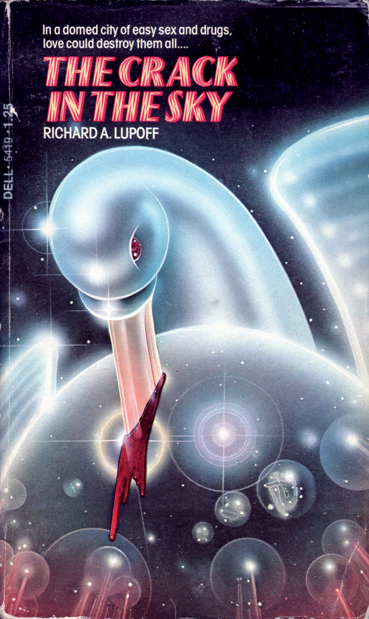
Last time I scanned and posted two covers with uncredited, unsigned art in a style that precisely matches what we see on the cover of Richard A. Lupoff’s The Crack in the Sky, a reader more knowledgeable than I am kindly delurked to suggest that the artist might be Peter Lloyd, and since I agreed with the attribution then, I’m going to go out on a limb now and claim that the uncredited creator of the unsigned cover art here is also Peter Lloyd:
[CLICK IMAGE TO ENLARGE]
But whether by Peter Lloyd or not, it’s lovely work, don’t you think? Slightly menacing, too, like a glittering shard of glass grasped by the hand of a child.
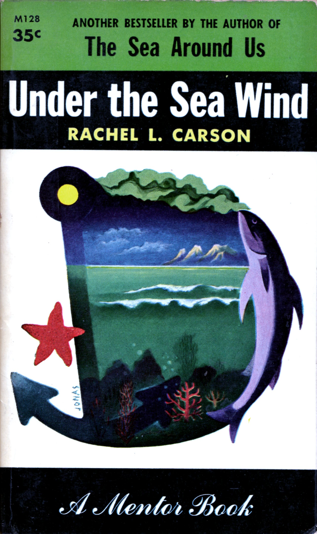
ABOVE: Rachel L. Carson, Under the Sea Wind (NY: Mentor, 1955), with cover art by Robert Jonas.
Unfortunately, I have only the one paperback with cover art by American illustrator Robert Jonas (1907-1997) in my collection, but the Set of Robert Jonas over at Flickr includes almost two hundred!