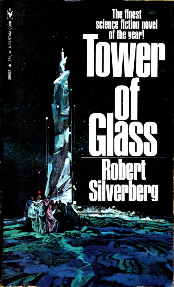
Not by Dean Ellis, and not by Paul Lehr, though vaguely reminiscent of both, the illustration on the cover of Robert Silverberg’s Tower of Glass is complemented rather than overwhelmed by a big block of bold, compressed, sans-serif type:
[CLICK IMAGES TO ENLARGE]
The artist here is David Blossom, but who the heck is David Blossom? The following summary of the artist’s career appears on various sites round the Web; my source is New Britain Museum of American Art (NBMAA):
Though born in Chicago, Illinois, Blossom lived most of his life on the East Coast. Growing up in Rye, New York, he later moved with his family to Westport, Connecticut in 1963, where he lived until his death. Early in his career, he worked as an art director at Young & Rubicam, a communications company, where he specialized in advertising for the Ford Motor Company and Pan American Airways. His work in illustration included covers for romance novels and popular magazines such as Outdoor Life and Reader’s Digest. Blossom is also known for creating movie posters for such Clint Eastwood westerns as The Good, The Bad, and The Ugly, A Fistful of Dollars, and A Few Dollars More. In its annual awards for excellence to deserving artists, the Society of Illustrators awarded the Hamilton King award to Blossom for best illustration of the year in 1973.
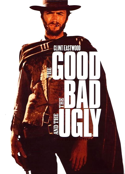
I’ve done a bit of searching, and I can’t find any information about which Clint Eastwood movie posters, exactly, featured art by Blossom, but possibly/maybe it was the ones that looked like this:
Here’s an example of Blossom’s non-SF illustration work, copied from the NBMAA blog, for comparison:
ABOVE: David Blossom, Benedict Arnold (n.d.), acrylic polymer on board, 29 x 22 inches.
Oddly enough, a later, photo-based design for The Good, The Bad, and The Ugly is build around more or less the same typographical idea as the design for Silverberg’s Tower of Glass, with art by Blossom:
And thus the serpent eats its tail… sort of…


I believe that this is the poster my father did for The Good, The Bad, and the Ugly.
I was 8 years old at the time, but I distinctly remember the cannon—and the stack of b&w stills that he worked from.
I think you’re right about the art on A Few Dollars More. He also did A Fist Full of Dollars as well as many others like The Great Santini:
That’s me, facing Robert Duvall, holding the basketball. He used me and my brothers as models.
HE did this one, too: http://media-cache-ec0.pinimg.com/736x/47/ff/7a/47ff7abbef4a0b6c3e59a109d22cd42e.jpg
LikeLike