Alex Nino · Comics · Here, Read · Look Here

Look Here, Read: “Neely’s Scarecrow,” with art by Alex Nino

Scanned within the past hour by yours truly from a worn copy of Weird Mystery Tales #16 (Feb.-Mar. 1975), and posted here at RCN a few of days too late to celebrate Halloween, “Neely’s Scarecrow” features a “story” by David Michelinie and art by the great Alex Nino:

[CLICK IMAGES TO ENLARGE]

It’s the art that’s the sole attraction here. Nino’s visual storytelling is impeccable.

Comics · Comics (Jones) · Here, Read · Jeffrey "Jeff" Catherine Jones · Look Here

Look Here, Read: “The Screaming Skull,” with art by Jeffrey Jones

From Boris Karloff: Tales of Mystery #21, here — more for the sake of historical interest than for its intrinsic merit, which is slight — is “The Screaming Skull,” with art by Jeffrey Jones:

Published in March 1968, “The Screaming Skull” must have been among the first freelance jobs that Jeffrey Jones landed after he moved, with his wife and daughter, to New York in the winter of 1967 to look for work as an artist, and frankly, Jones’s inexperience shows. But keep in mind…

“Beginnings are always messy” — John Galsworthy

“There are two mistakes one can make along the road to truth — not going all the way, and not starting.” — Gautama Buddha

Bill Sienkiewicz · Book/Magazine Covers (All) · Comics · Illustration Art · John Buscema · Look Here · Original art vs. printed page

Look Here: Finished art vs. printed cover, by John Buscema

What’s interesting to me about the above comparison is how much of John Buscema’s original composition for the cover of Conan the Barbarian #150 was cropped out of the printed version, presumably either by editor Larry Hama or by editor-in-chief Jim Shooter. Maybe if Buscema hadn’t shown Conan chopping a guy through the throat with his sword, the editors would have published it uncut. Maybe.

The only issues of Conan that I have ever searched through dusty back-issue boxes to find and add to my collection were issues in which Barry Smith inked Barry Smith, John Buscema inked John Buscema or Gil Kane inked Gil Kane. The unpublished cover of Conan the Barbarian #150 looks like pure John Buscema to me.

Bonus Video:

Here’s a youtube video that includes footage of John Buscema pencilling and then inking a pin-up of Captain America along with footage of Bill Sienkiewicz creating a quick portrait Electra with marker, brush and ink, and white-out:

Comics · Here, Read · Howard Chaykin · Link Roundup · Look Here · Look There · Samuel R. Delany

Look There, and Here: A whole lotta Chaykin goin’ on…

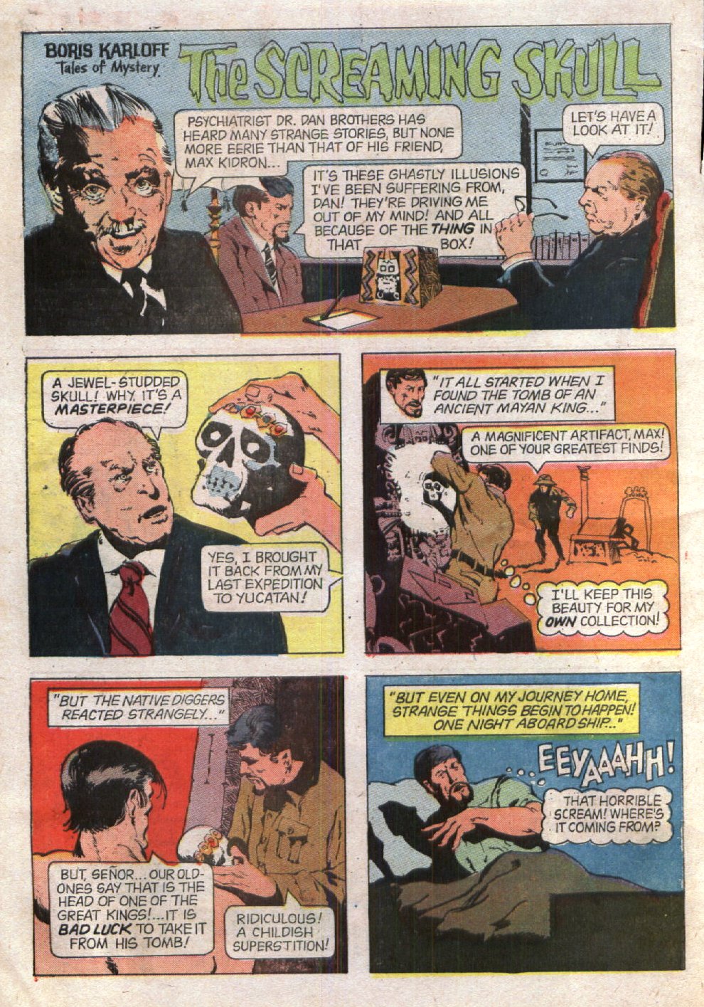
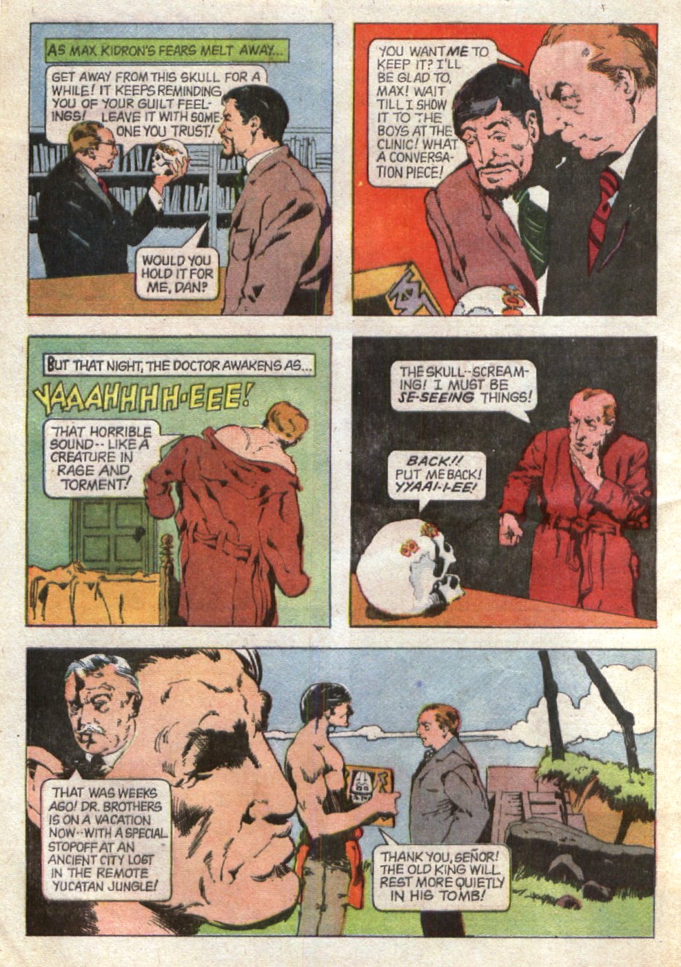
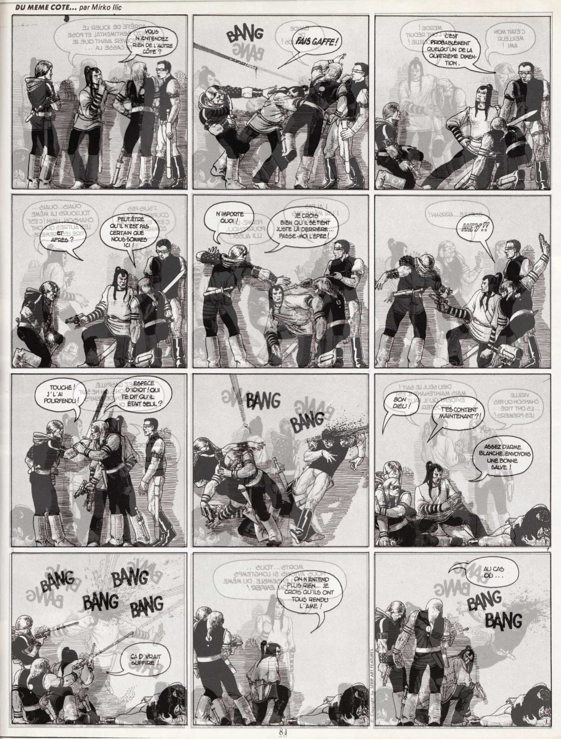
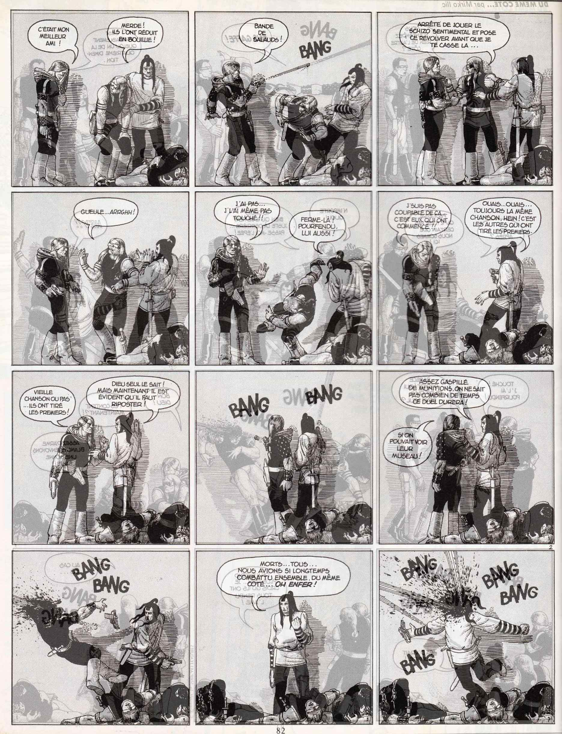
Since August 2008, Joe Bloke over at the “Grantbridge Street” blog has posted a dozen stories with art by Howard Chaykin:


UPDATE (28 November 2014):

Earlier today, I noticed that all of the stories with art by Chaykin that were posted at “Grantbridge Steet” have been deleted, but I see now that all but three of the old stories — the first three in my list below — have since been re-posted on Joe Bloke’s BIFF! blog, along with three new ones. Therefore, in order to preserve the utility of this post, I have taken the time this afternoon to update the links below to reflect the new locations of the old stories and have added links to the three new stories.


  • “The Mark of Kane” (part 1 of 2) by Roy Thomas and Howard Chaykin, from Marvel Premiere #33
  • “The Mark of Kane: Fangs of the Gorilla God” (part 2 of 2) by Roy Thomas and Howard Chaykin, from Marvel Premiere #34
  • “Red Sonja: Day of the Red Judgment” by Roy Thomas, Christy Marx, and Howard Chaykin, from Marvel Comics Super Special #9
  • Return to the Stars” by Wyatt Gwyon and Howard Chaykin, from DC’s Time Warp #2
  • Judgement Day” by Archie Goodwin and Howard Chaykin, from Detective Comics #441
  • The Grubbers” by Roger McKenzie and Howard Chaykin, from Weird War Tales #62
  • The Death’s Gemini Commission” by Howard Chaykin, from The Scorpion #1
  • Mind War” by Roger McKenzie and Howard Chaykin, from Weird War Tales #61
  • Gideon Faust, Warlock at Large” by Howard Chaykin, from Star*Reach Classics #5
  • Cody Starbuck” by Howard Chaykin, from Star*Reach #1
  • Horrors!” by Howard Chaykin, from Solo #4
  • Gideon Faust, Warlock at Large: Lotus” by Len Wein and Howard Chaykin, from Heavy Metal, vol. 2, #12
  • Starbuck” (1976) by Howard Chaykin, from Star*Reach #4
  • The Demon from Beyond!” by Gardner Fox and Howard Chaykin, from Chamber of Chills #4
  • The Fire Bug” by Paul Kupperberg and Howard Chaykin, from Weird War Tales #76
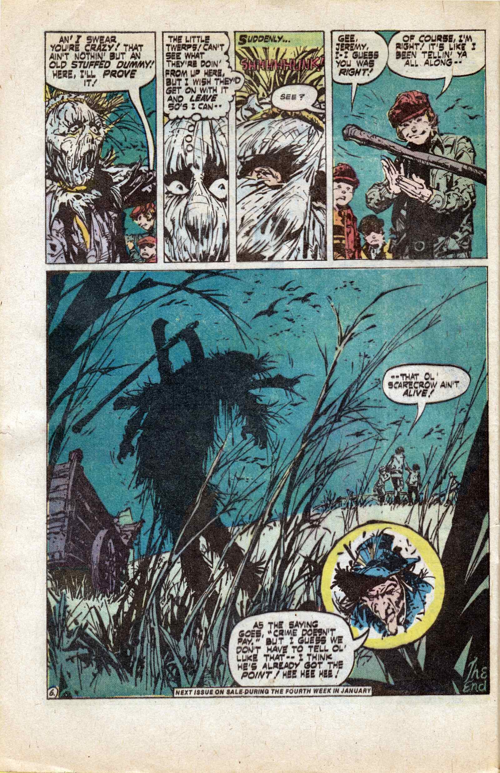
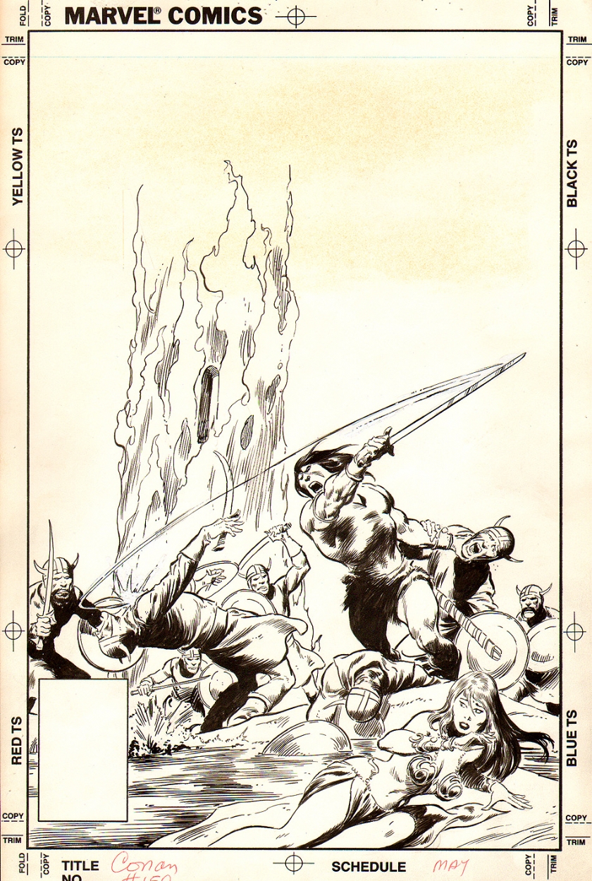
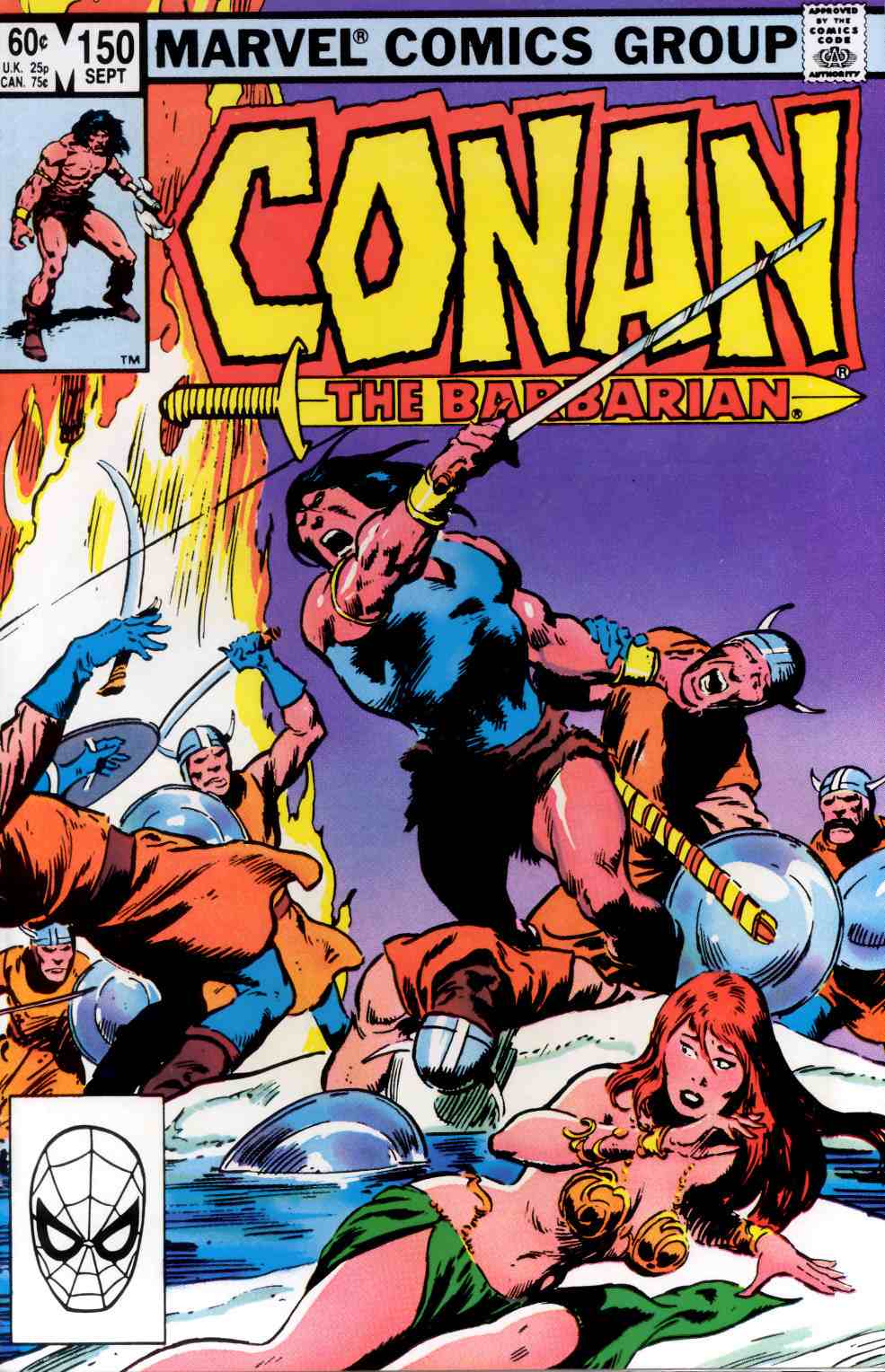
  • Rattle of Bones” by Roy Thomas and Howard Chaykin, from Savage Sword of Conan #18

BONUS STORY:

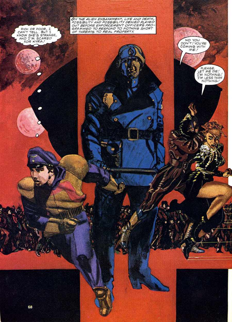
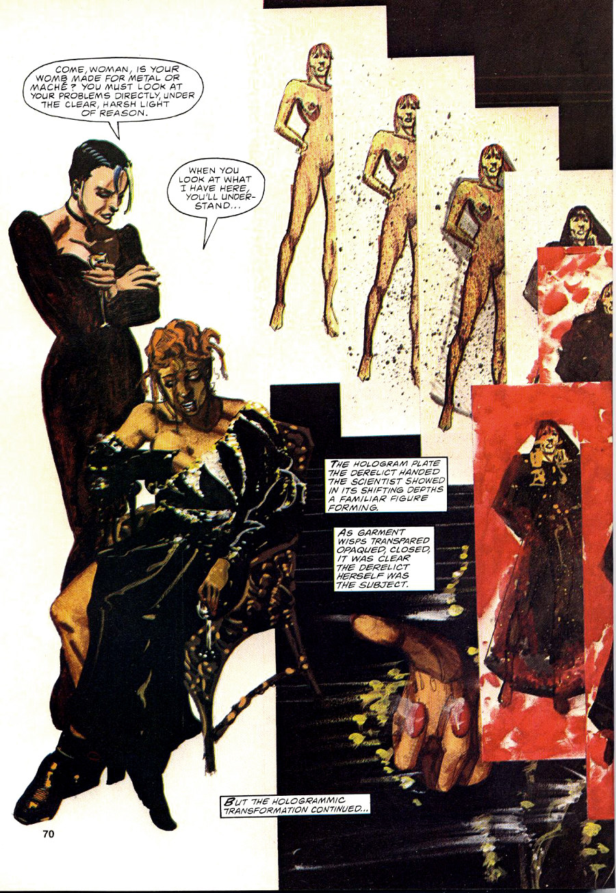
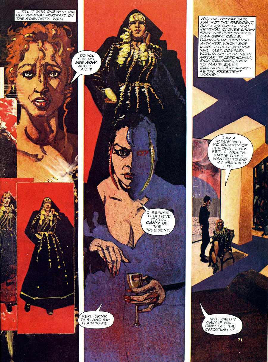
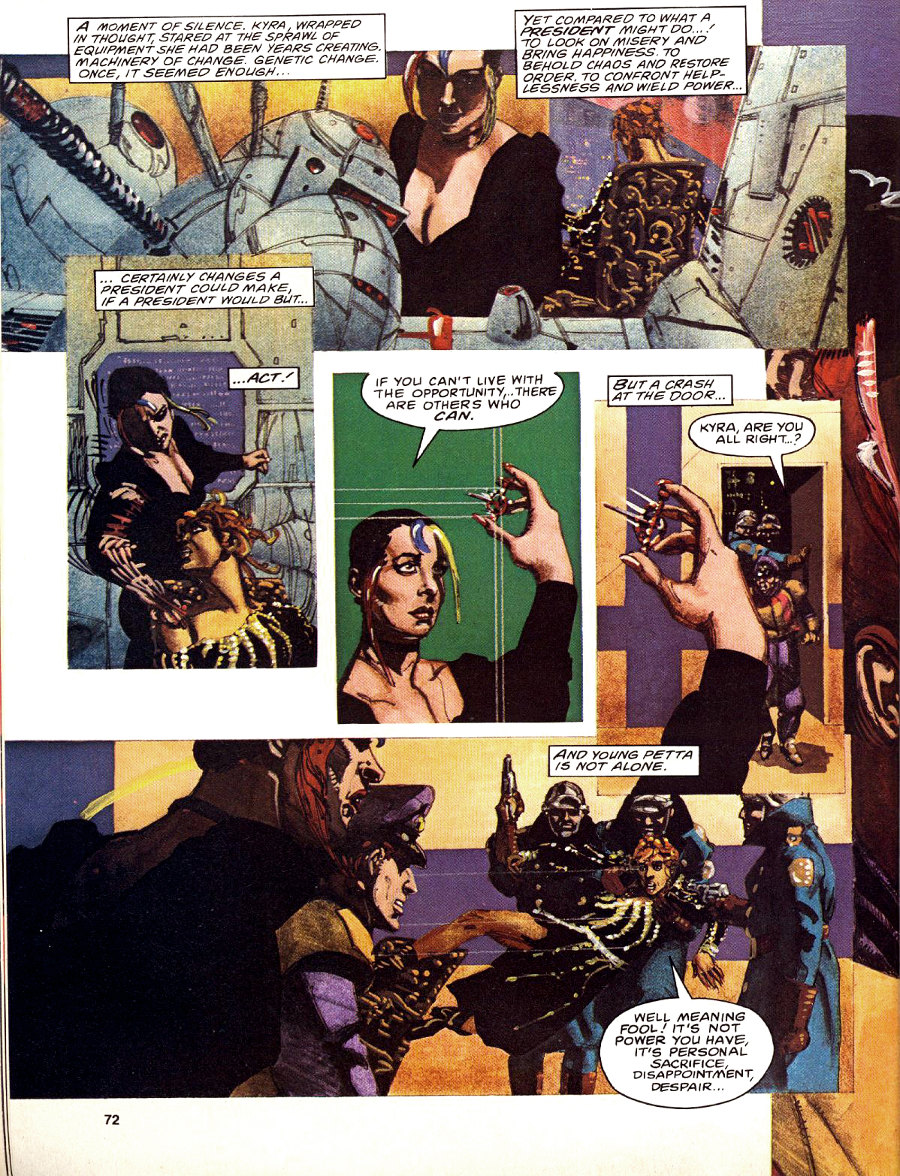
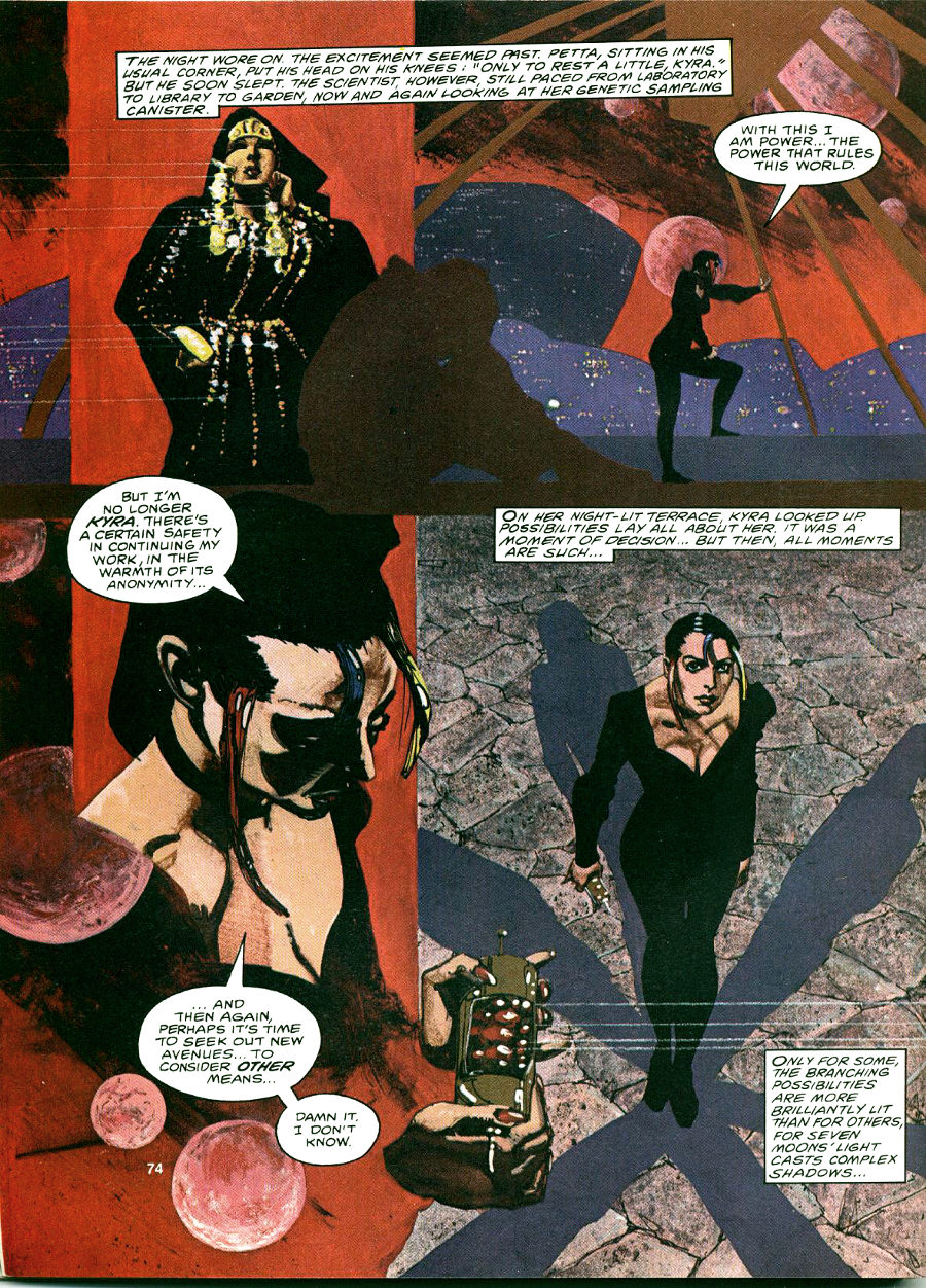
“Seven Moons’ Light Casts Complex Shadows” by Samuel R. Delany and Howard Chaykin, from Epic Illustrated #2 (June 1980):

I remember thinking when I first read “Seven Moons’ Light Casts Complex Shadows” back in 1980, when I was still in high school: “Samuel Delany is my favourite writer, and Howard Chaykin is one of my favourite artists, so why is their work together merely okay, I mean, why is it not great?” Though I didn’t know it at the time, the answer, in the case of Chaykin and Delany’s 1978 “visual novel,” Empire, was, essentially, editorial interference from the project’s “producer” Byron Preiss (see “Appendix” below); with “Seven Moons’ Light,” however, I just don’t know…

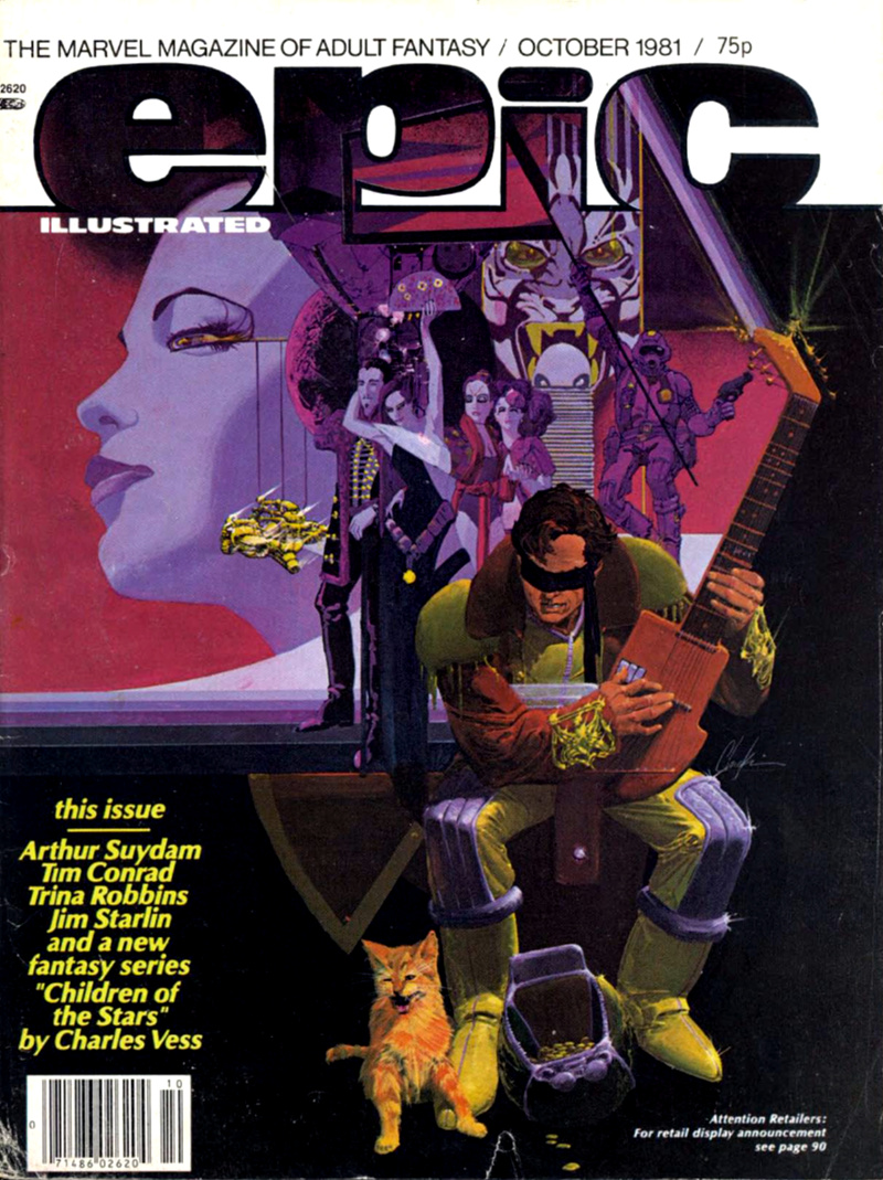
Six issues later, in October 1981, a painting by Howard Chaykin was featured on the cover of Epic Illustrated #8. Now that was killer!


RELATED LINKS HERE AT RCN:


APPENDIX:

“To develop a visual novel, we wanted a design system, a framework in which the entire story could be told. I developed a horizontal/vertical axis spread design which could be consistently varied over every two pages of the book.” — Byron Preiss, from his “Foreword” to Empire: A Visual Novel

Was Preiss’s “design system,” which not only placed arbitrary formal constraints on the layout of the pages but also incorporated an unusual format for the captions and dialogue, really the ideal framework for a long-form comic, or was it a procrustean bed? As much as I admire Chaykin’s work in Empire, I would argue that the storytelling — especially the visual storytelling — was often hamstrung by Preiss’s system, which, among other things, made it more difficult than it needed to be for Chaykin and Delany to control the focus, rhythm, and pace of the action.

“When I did Empire with Howard Chaykin, which was 1980 or 1982, Byron Preiss was the packager, and that was a strangely ill-fated project. After we did it, I was very happy with what we did, and Byron was very unhappy with the ending, and just took it upon himself to completely rewrite it, and cut up the art, so that there’s no way to put it back in its original shape. It just doesn’t exist any more, and he’s dead now of course. So nobody will ever see the way it was originally supposed to end. I’ve written about it in at least one interview. I think it’s [in] my book Silent Interviews.” — Samuel R. Delany, in answer to a question from a fan

Here, Read · Interviews · Look Here · Richard Corben

Look Here, Read: Another interview with Corben from 1973

[CLICK EACH IMAGE TO ENLARGE, or RIGHT CLICK > SAVE LINK AS… TO READ OFFLINE]

Corben has always had a knack for small-scale figurative sculpture, but in the thirty-seven years since the above interview, he has stayed true to his original impulse to use sculpture mainly as a means to an end, namely, the precise delineation of form in his comics, and has never seriously pursued sculpture as an independent art.

Comics · Here, Read · Hilda Terry · Look Here

Look Here, Read: Four more “Teena” Sunday strips by Hilda Terry

This time around, having just posted four “Teena” Sundays from early in the strip’s run, I thought I’d post four “Teena” Sunday strips, in colour, from 7+ years later (two from 1957, and one each from 1958 and 1959), when Hilda Terry’s warm, energetic, appealing style was not only fully formed but fully her own:

Do you see now what I meant when I said that Terry’s young people are always in motion?

Comics · Here, Read · Hilda Terry · Look Here

Look Here, Read: Four “Teena” Sunday strips by Hilda Terry

Although it ran in newspapers for twenty years, 1944 to 1964, “Teena” is one of the forgotten comic strips of the 20th century, but thanks to Hilda Terry’s light touch and her understanding of how teenagers exist in the world — her lanky young characters, even when seated, are constantly changing positions, twisting, stretching their legs, putting their feet up, gesturing, and so on — it still has a freshness that some other, more celebrated strips, do not. Yes, Terry’s visual style in these early “Teena” Sundays is strongly reminiscent of the work of Gluyas Williams, but it wasn’t long before she developed a much looser style that was all her own. What follows is a sequence of strips that ran on four consecutive weekends in April 1949; the strips were scanned, by me, from Terry’s self-published autobiography, Strange Bod Fellows, so the repro quality is not the best:

It’s amazing to me that such charming, attractive, readable work is not available in affordable reprint editions. Yes, the gender divisions light-heartedly depicted in these particular examples are a little out of date; nonetheless, it seems to me that “Teena” would have tremendous appeal to fans of Little Lulu, Archie Comics, Harvey Comics, Nipper, Blondie, etc. — all of which have experienced a recent resurgence of interest and are in the process being systematically reprinted for new generations of readers.

For those unfamiliar with Hilda Terry’s career, here it is in a nutshell:

Hilda Terry was born on 15 June 1914. In addition to drawing “Teena” for twenty years, Terry sold numerous single-panel cartoons to The Saturday Evening Post, The New Yorker, and other coveted markets. In 1950, she became the first woman allowed to join the National Cartoonists Society, which up until that point had only allowed male cartoonists to join, and she became a vocal advocate for other women to follow in her footsteps. She was a pioneer of early computer animation. She received the Animation Award from the National Cartoonists Society in 1979. She taught at the Art Students League well past usual the age of retirement. She was elected to the Friends of Lulu Women Cartoonists Hall of Fame in 2001. She died 13 October 2006, at the age of 92.

“If you do a comic strip, you don’t want it to be forgotten.” — Hilda Terry, MoCCA 2006, as reported by The Beat.


SEE ALSO:

Ragged Claws Network > Look Here, Read: Four more “Teena” Sunday strips by Hilda Terry

Here, Read · Interviews · Richard Corben

Here, Read: An interview with Richard Corben from 1973

From The Mirk-Wood Times #4 and #5 (1973), here are the first two parts of an obscure interview with Richard Corben, who was then only 32 years old:

[CLICK EACH IMAGE TO ENLARGE, or RIGHT CLICK > SAVE LINK AS… TO READ OFFLINE]

Some interesting tidbits of information in there… if you’re a Corben fan… too bad I don’t own the issue with part three… it would help if I could find any evidence that part three was ever published…

Richard Corben turned 70 on 01 October 2010.

Where has the time gone?

Comics · Here, Read · Look Here · Mirko Ilic

Look Here, Read: “Du Même Côté” by Mirko Ilić

“Du Même Côté” (“On the Same Side”) by Mirko Ilić was published in Métal Hurlant #57 (November 1980), pp. 81-82, with the two pages that comprise the story printed back-to-back on the same leaf. Here’s what you would have seen if you had read the story thinking it was the usual comics fare:

[CLICK EACH IMAGE TO ENLARGE, or RIGHT CLICK > SAVE LINK AS…]

But “Du Même Côté” was not exactly the usual fare. Here, more or less, is what you would have seen if you had held the pages up to the light:

[AGAIN, CLICK EACH IMAGE TO ENLARGE, or RIGHT CLICK > SAVE LINK AS…]

My apologies to everyone, including the author, for any and all deficiencies in the above presentation, but I think — I hope! — my crudely photoshopped images are clear enough to give you the flavour, at least, of Mr Ilić’s formal experimentation.

However, if you’re still unsure what, exactly, is going on in the story, you could do no better than to read the description of “Du Même Côté” that Mr Ilić himself posted here at RCN on 21 September 2010 at 10:08 am:

At that time, I was into playing with comics as a media, and the idea of the comics was to be printed on both sides of the page. Because characters are two dimensional, they don’t have a sense of third dimension. When they are standing against a white wall / magazine sheet, and hearing voices on the other side, they don’t know that they’re actually hearing themselves on the reverse side of the page. When they are shooting / stabbing into the wall, they don’t understand that they are actually killing themselves as the knife comes through to them on the other side of the paper. Only when you hold the page up to the light, do you understand the full picture.

Not surprisingly, it was the above description that prompted me to hunt down a copy of Métal Hurlant #57 so I could present “Du Même Côté” here for your, and my, reading enjoyment. And though it cost me a few bucks — 8.25 EUR, to be exact — I think it was worth it. But then again, I have a real soft spot for black humour and bleak endings.


BONUS LINK (added 23 August 2012):

Mirko Ilić Blog > Metal Hurlant – as of today, 23 August 2012, you can now read “The Same Side” in English on Mr Ilić’s own blog. I am delighted to see that he used the same technique that I used above to simulate the process of holding the physical pages up to the light. Simple but effective.