[CLICK IMAGES TO ENLARGE]
Category: Connections
Connections: Malcolm S. Kirk and Jeffrey Jones
Earlier this week, I purchased a random selection of nine National Geographic magazines from 1967 and 1969 from a local thrift store. A few days later, as I was flipping through volume 135, number 4, from April 1969, I noticed an image by writer/photographer Malcolm S. Kirk that I knew I’d seen, in part, before. Here’s the comparison:
[CLICK IMAGES TO ENLARGE]
Connections: Harry Lucey (1964) and Richard Corben (1978)
[CLICK IMAGES TO ENLARGE]
VERONICA: Ooh, Archie! Isn’t this the Wildest?
ARCHIE: Yeah! The artist even had to turn the page around to draw it!
Connections: Luis Ricardo Falero and Jeffrey Jones
I saw the painting Crescent Moon (a.k.a., Moon Nymph) by nineteenth-century Spanish painter and astronomy enthusiast Luis Ricardo Falero for the first time about an hour ago, when I read an article about Falero’s work that Ron Miller wrote for io9 and posted earlier today. And as is my wont, I immediately noticed a possible connection between one of Falero’s paintings and an SF illustration by one of my favourite artists, Jeffrey Jones, the promotion of whose work has been a frequent theme of my posts here at RCN (although not so much lately as it has been in the past):
[CLICK IMAGES TO ENLARGE]
BONUS IMAGE (added 27 December 2013):
Connections: Jack Kirby (1974) and Jean-Paul Goude (2006)
So I clicked a link, posted on Twitter, that led to an article entitled “Jean-Paul Goude’s legendary photographs inject a bit of humour into fashion,” and since I rather liked the image of fashion models sprinting down a track and crossing the finish line…
… I clicked through to the photographer’s website and began to browse through the images. And then I noticed the image of a woman, in parts, in a box, an image that bears the title Anatomically Incorrect:
Which, if you read comics, will no doubt instantly remind you, as it did me, of one of the most startling covers and opening sequences ever created by the great Jack Kirby, whose legendary body of work is packed to the rafters with startling, visionary imagery:
[CLICK IMAGES TO ENLARGE]
Connections: Zurbaran, Dali, Vallejo, Foster
At first, I just planned to post a couple of covers by Robert Foster, scanned by me from my personal collection of SF paperbacks, but I have since decided that it might be more interesting to trace one warm line up through the chain of influence that led to Foster’s arresting illustrations for the front and back covers of Michael Moorcock’s Behold the Man. So here goes:
[CLICK IMAGES TO ENLARGE]
The typography on the cover of Behold the Man perfectly complements Foster’s painting, don’t you think? The whole package, front and back, is a real stunner!
BONUS IMAGE:
Since I already scanned Foster’s collage-like Alternities cover, I suppose I might as well post that image, too:
[CLICK IMAGE TO ENLARGE]
Another strong image, I think.
Connections: Vallejo vs. the unknown
I’m not actually a fan of Boris Vallejo’s work, but when I came across the Monica Hughes novel, Sandwriter, on the shelf at a local thrift shop, I knew I’d seen a better version of the cover image before, and here’s the ocular proof:
Notice that the unknown artist not only swiped the creature, rider, and composition from Vallejo’s painting but also saw fit to turn the somewhat phallic head and neck of the creature into a raging vein-wrapped erection, with the hint of a scrotum and elements of bondage thrown in to up the sexual ante. Because that’s what passes for creativity in some circles, folks. It’s not about what marvels you can conjure in your imagination and capture with the tools of art but about what you can get away with on the cover of a novel written for teenagers…
P.S. I don’t own either of the above novels. The Boris cover scan is from McClaverty’s flickr stream, the Sandwriter scan is from the Amazon website.
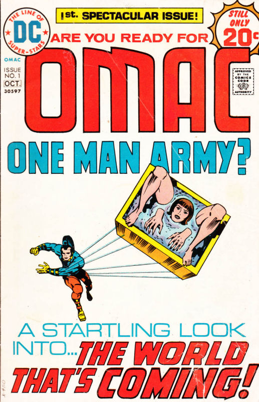
Connections: Bosch, Magritte, Holmes
[CLICK IMAGES TO ENLARGE]
BONUS IMAGES:
Here are three more variations on the same theme; the sequence concludes with an example of completely unnecessary “black bar” censorship from Spain (I think):
[CLICK IMAGES TO ENLARGE]
Artist/illustrator/design-firm credits are in the file names.
Connections: James Bama and Dean Ellis
The V. cover (1964) is by Bama; the Eleventh Commandment (1970) is by Ellis. Both are attractive and effective variations on a “surrealist” theme, and both were scanned earlier this morning by me from my personal library of folded, spindled, and mutilated paperback fiction.
[CLICK IMAGES TO ENLARGE]
Connections: The Iron Giant Special Edition DVD Cover (2004) vs. Pacific Rim Comic Con Poster (2012)
Not sure why I’m bothering to point this out, the design swipe is so blatant…
[CLICK IMAGES TO ENLARGE]