At first, I just planned to post a couple of covers by Robert Foster, scanned by me from my personal collection of SF paperbacks, but I have since decided that it might be more interesting to trace one warm line up through the chain of influence that led to Foster’s arresting illustrations for the front and back covers of Michael Moorcock’s Behold the Man. So here goes:
[CLICK IMAGES TO ENLARGE]
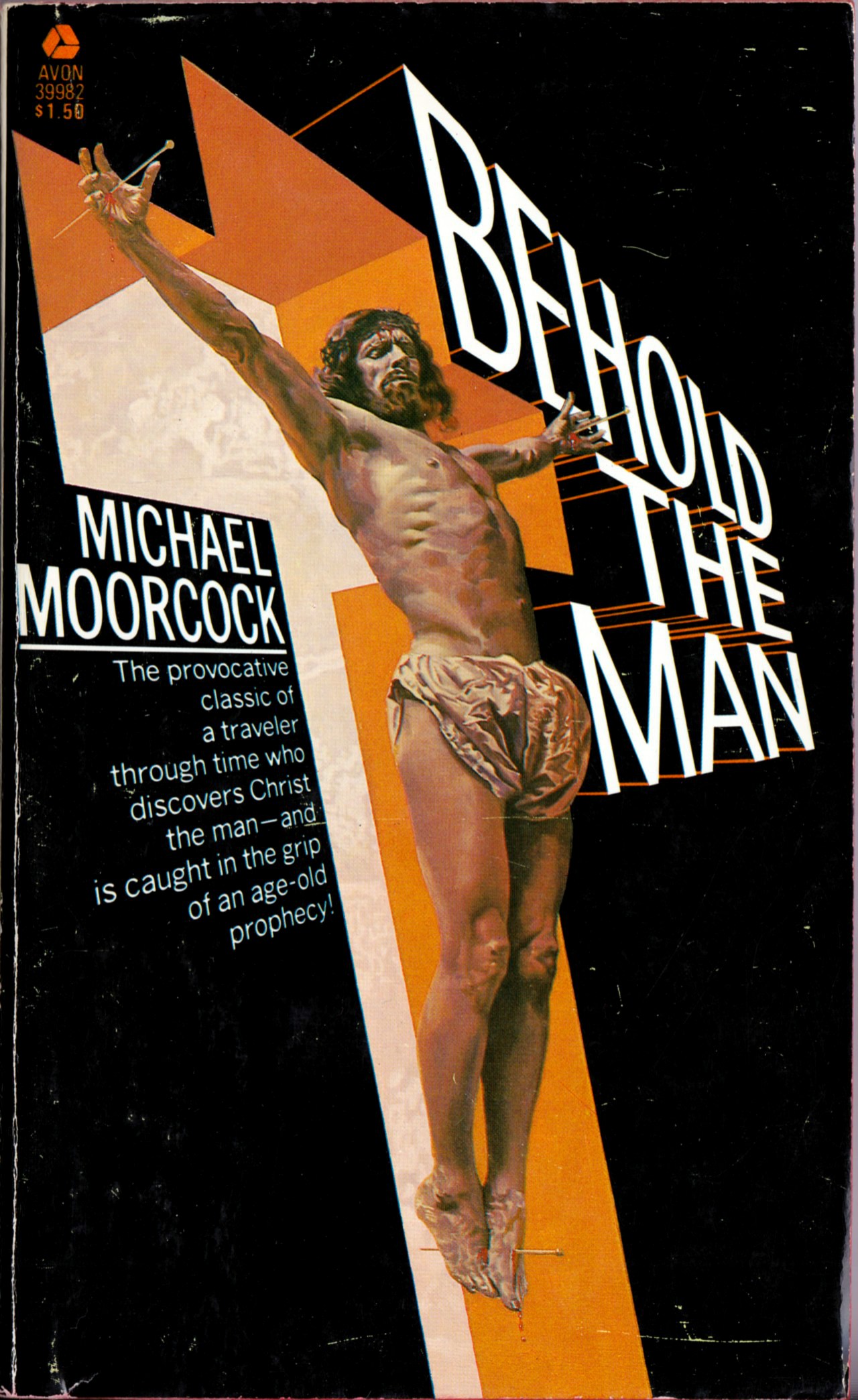
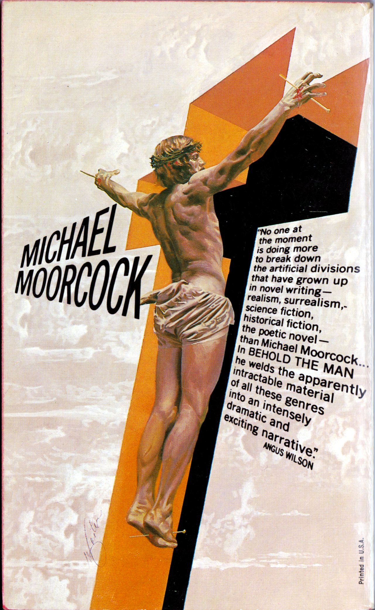
The typography on the cover of Behold the Man perfectly complements Foster’s painting, don’t you think? The whole package, front and back, is a real stunner!
BONUS IMAGE:
Since I already scanned Foster’s collage-like Alternities cover, I suppose I might as well post that image, too:
[CLICK IMAGE TO ENLARGE]
Another strong image, I think.
Thanks for posting these. I’ve always loved this cover and it’s not only a pair of amazing illustrations but also some excellent graphic design work. In the digital age we’re used to seeing body copy in perspective like this, but in the 70s this would have to have been done photographically by shooting the type at an angle to match the perspective of the illustration. No mean feat.
LikeLike
I appreciate the feedback, John. And I agree: Robert Foster’s cover really is an amazing piece of work. I hadn’t given any thought to how the folks at Avon managed to set the type in perspective, but of course, you are right. It would have had to have been done photographically. It could even have been done before the final art was produced. Seems to me it would have been easier for Foster to match his art to the type than for whoever it was who shot the type to match Foster’s art. But either way, it’s a terrific effect.
LikeLike