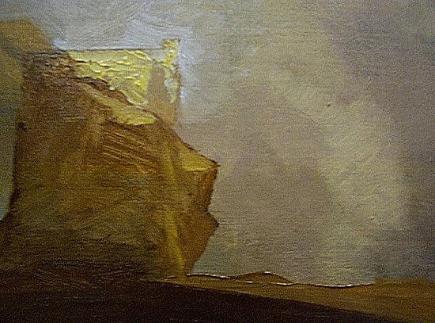
"This day's experience, set in order, none of it left ragged or lying about, all of it gathered in like treasure and finished with, set aside." –Alice Munro, "What is Remembered"
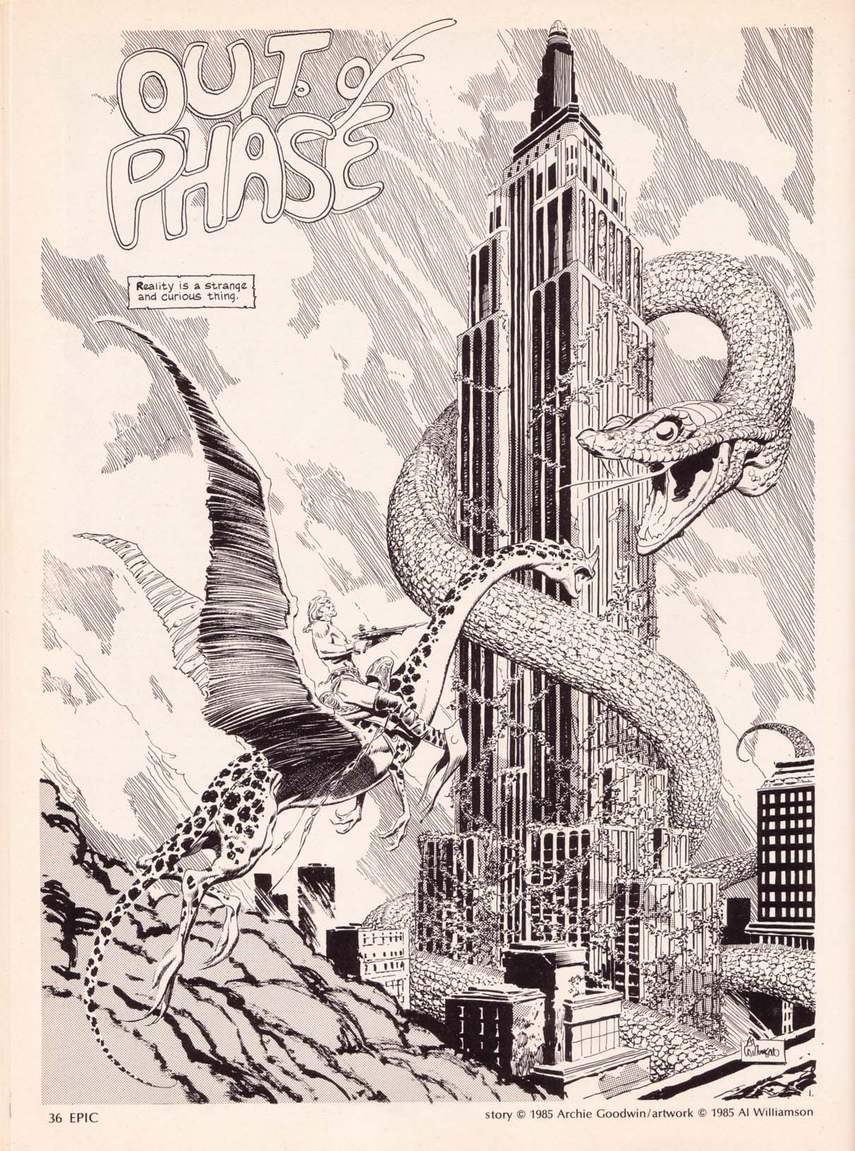
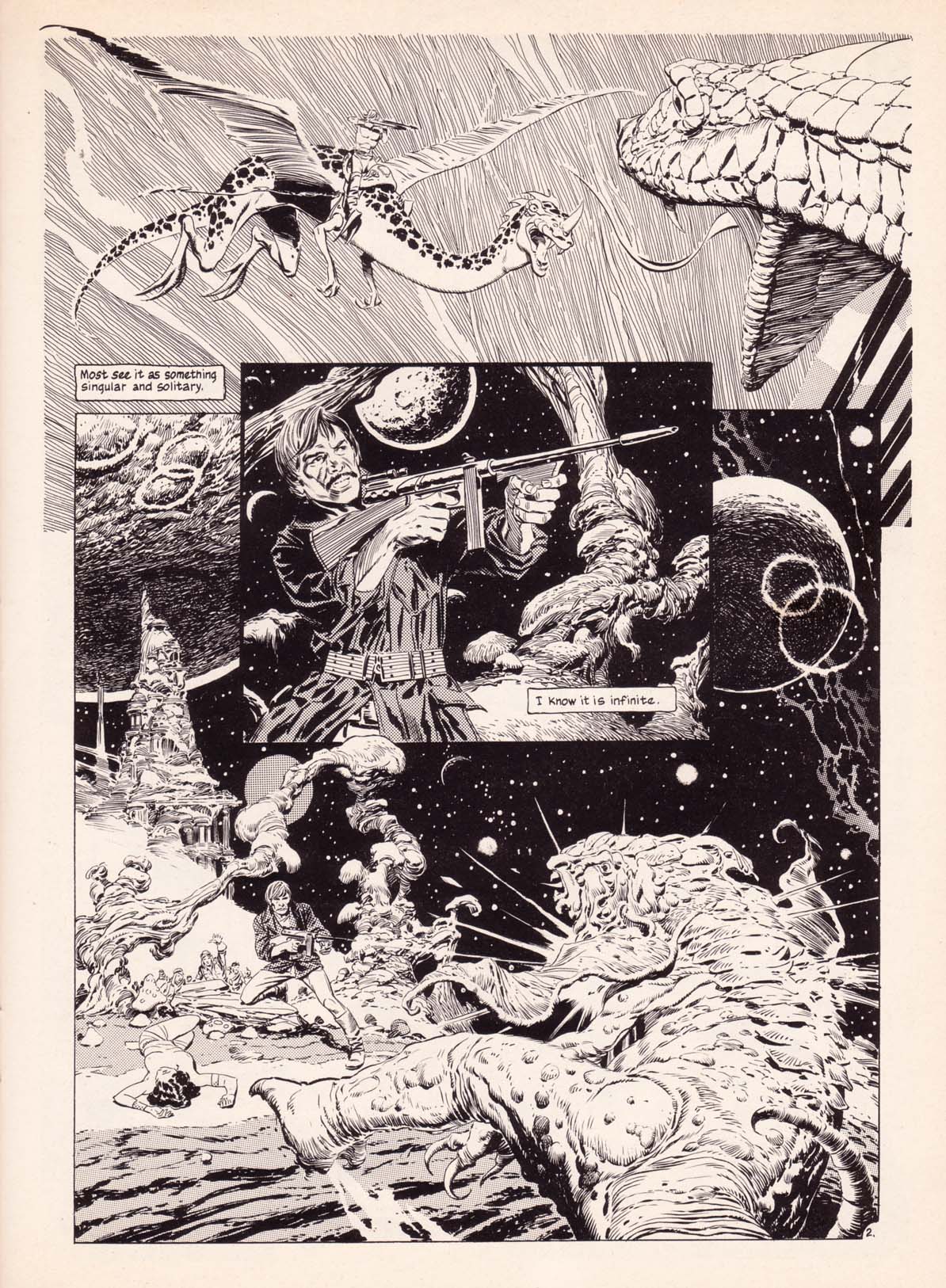
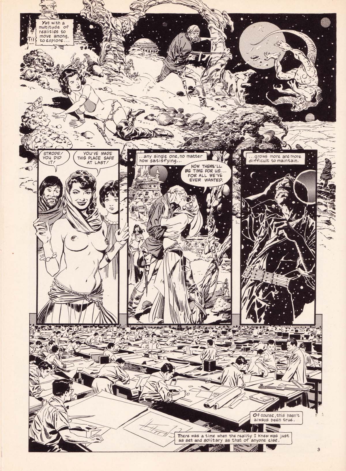
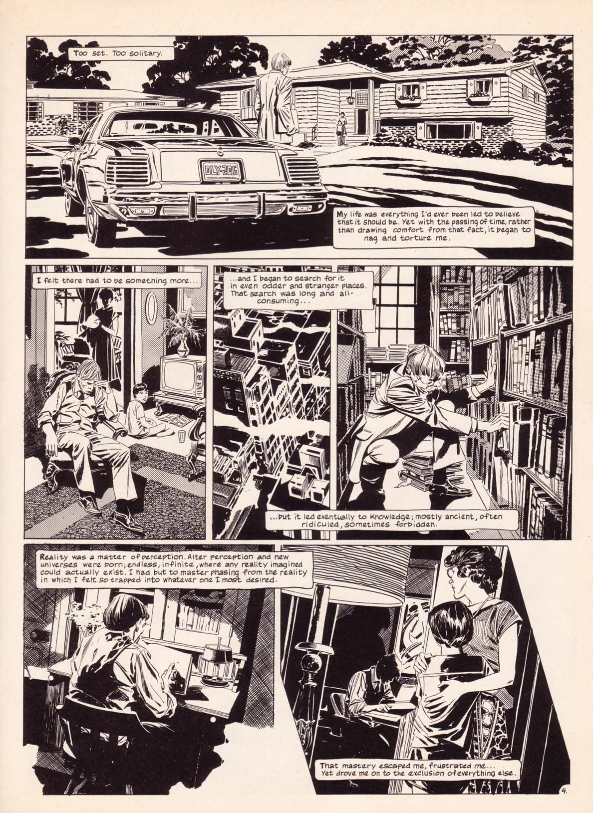
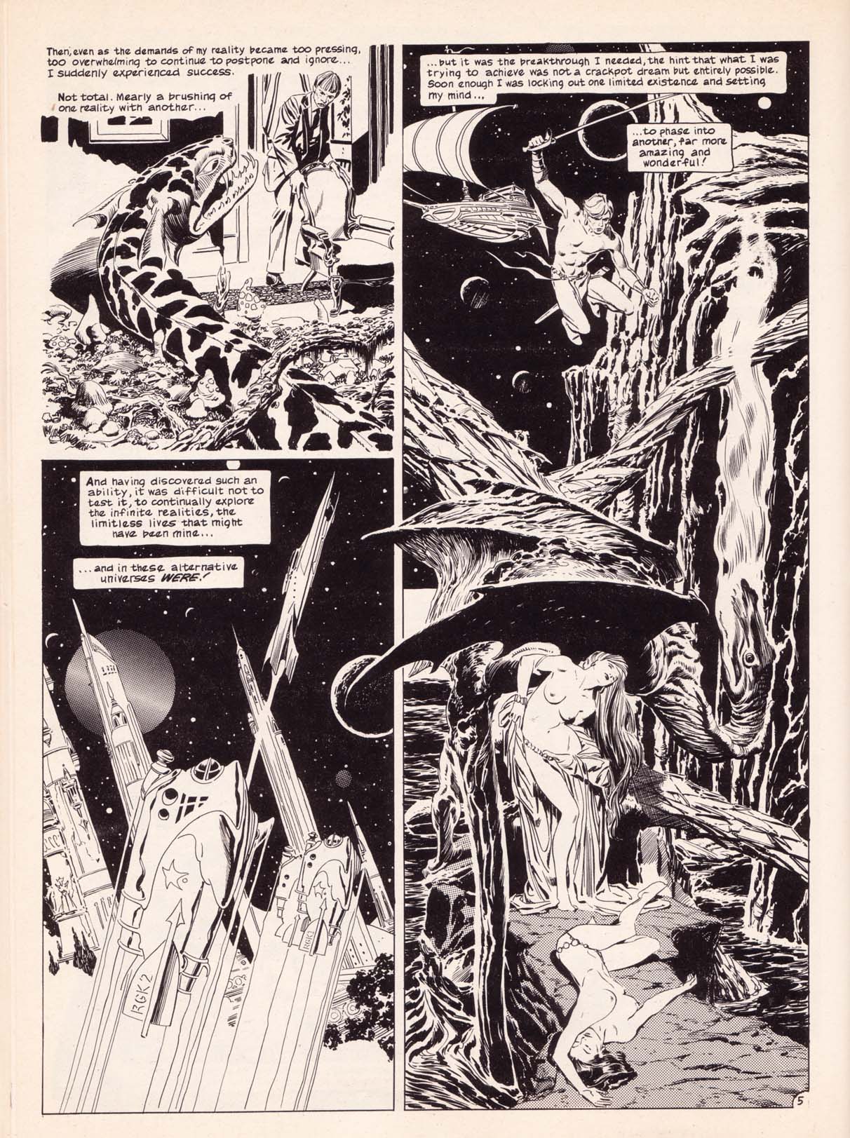
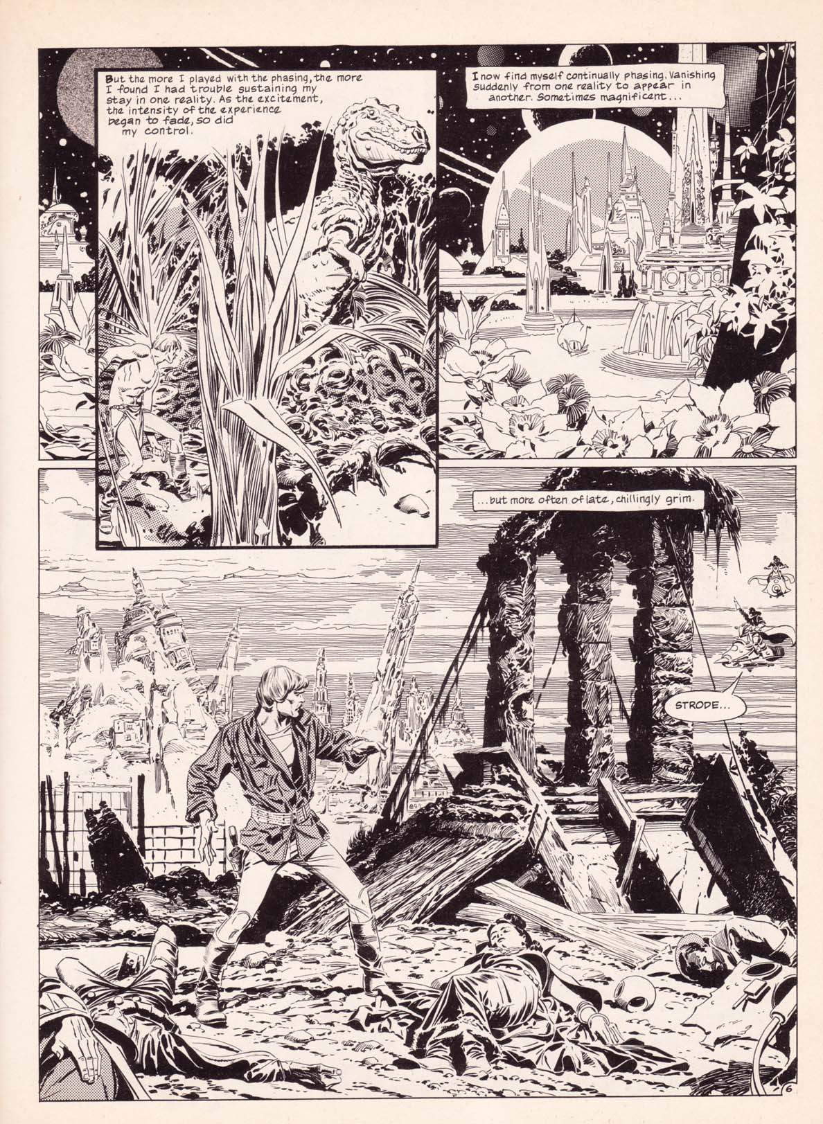
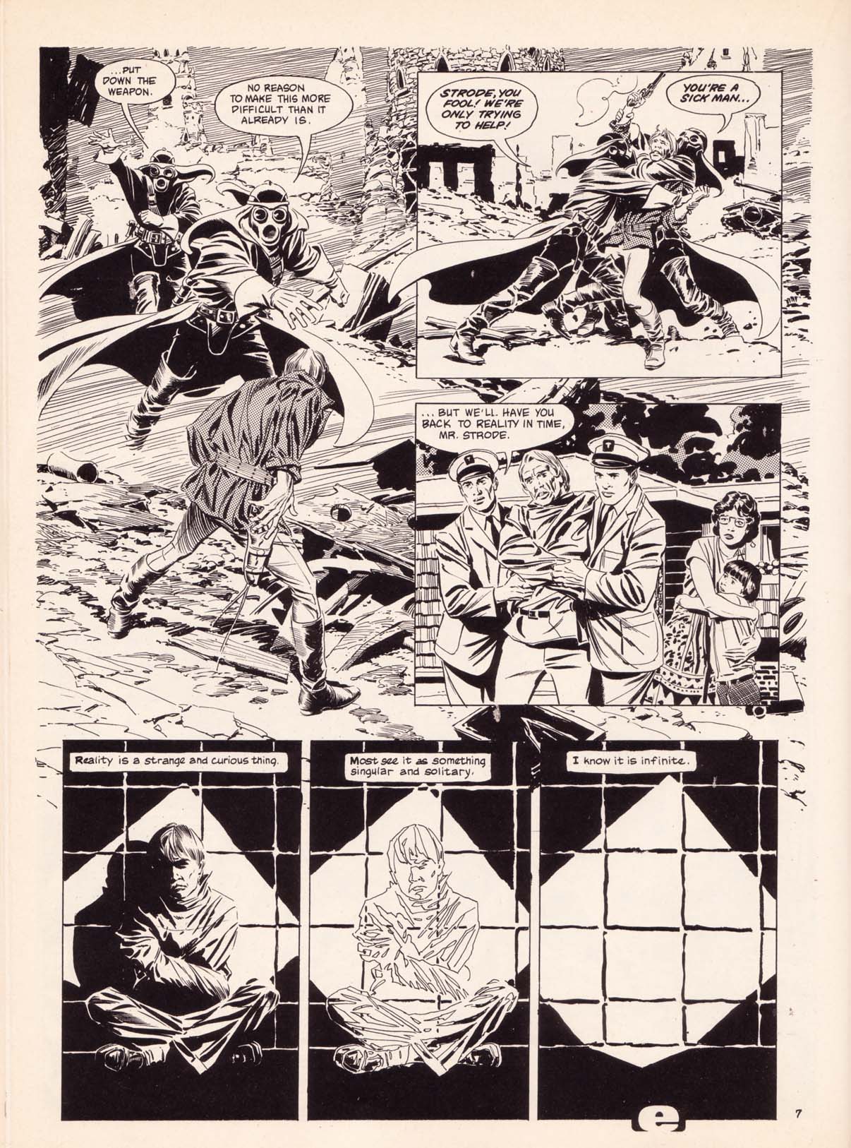
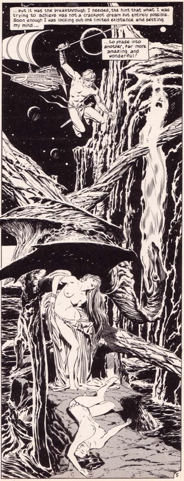
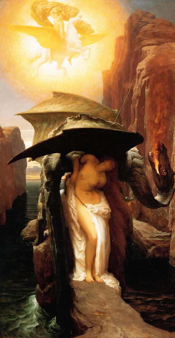
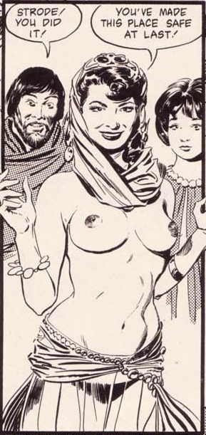
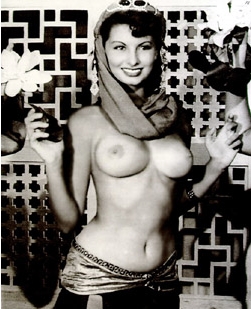
Continuing my little tribute to Al Williamson here at RCN, here is a story from the farewell issue (#34 [February 1986]) of Epic Illustrated, with story by Archie Goodwin and art by Al Williamson. The story includes a number of references to other artists and their work, including an homage to Frederic Leighton’s Perseus and Andromeda (1891) and a swipe from a publicity photo of Sophia Loren that was taken 35 years before “Out of Phase” was published! I’ve posted JPEGs of both of those swipes, dear reader, just because I think you might enjoy seeing them:
BONUS LINKS:
The Golden Age: Al Williamson: March 21, 1931 ~ June 12, 2010, posted by Mr. Door Tree — includes the story “Food for Thought” from Incredible Science Fiction #32 (Nov.-Dec. 1955), with suitably incredible art by Al Williamson and Roy Krenkel
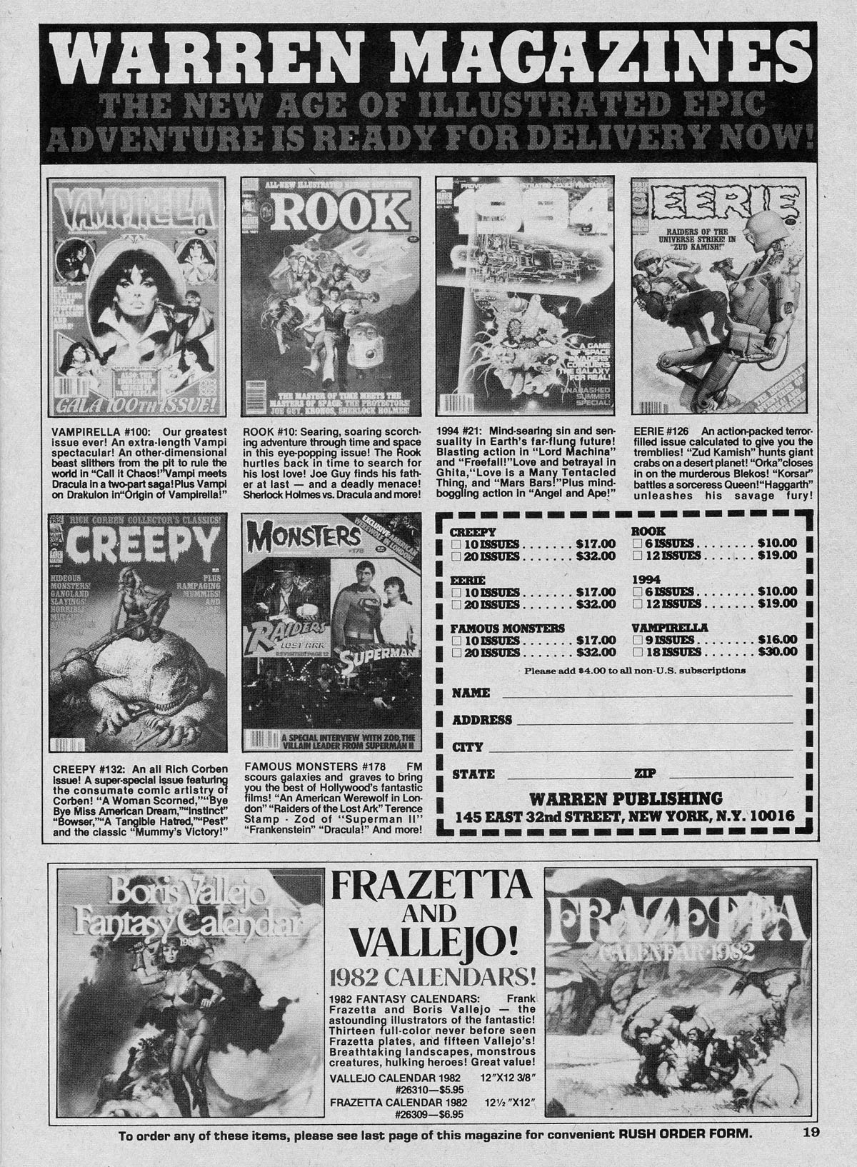
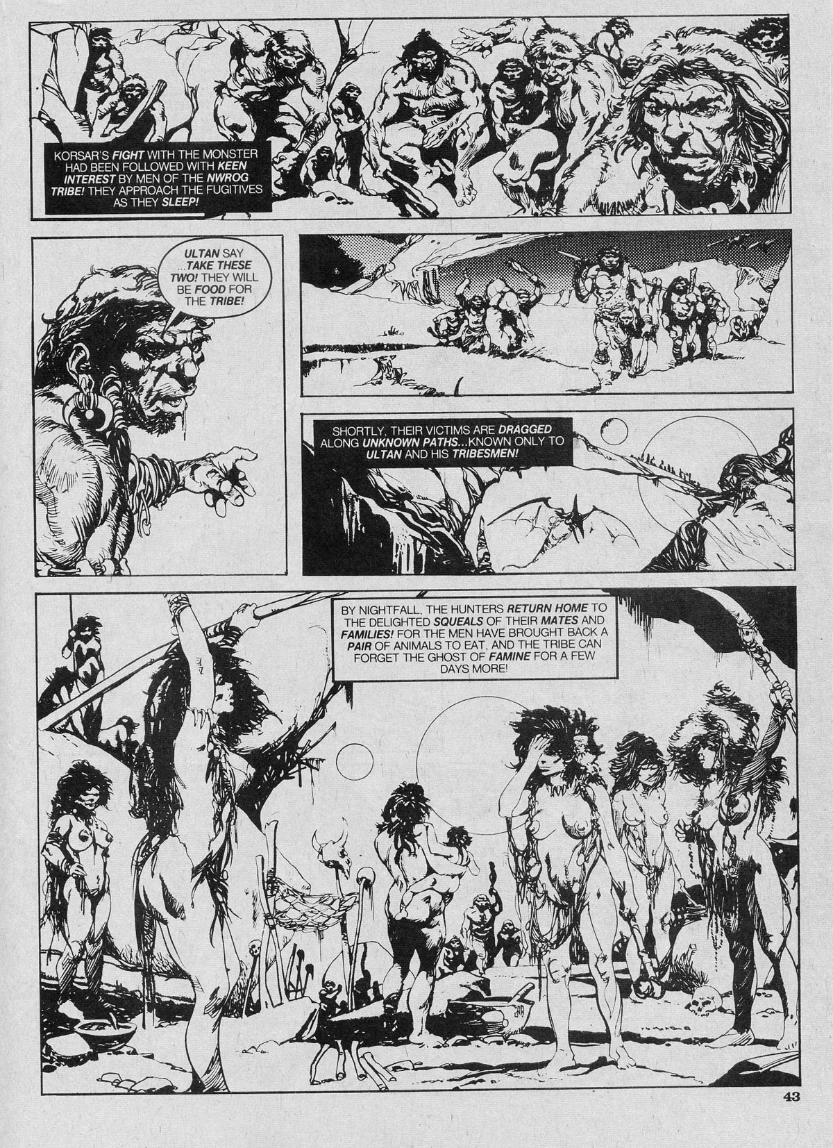
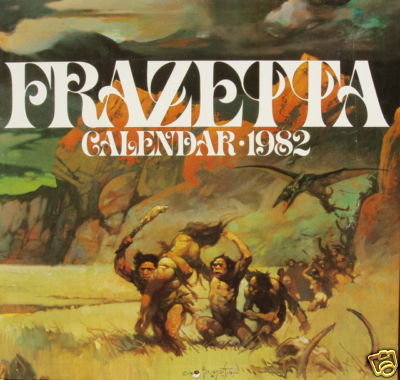
Here’s an old-fashioned swipe that’s rather funny — mainly due to the timing! In Eerie #126 (November 1981), on page 19, in the bottom right-hand corner, you’ll find an advertisement for the 1982 Frazetta Calendar. And, IN THE VERY SAME ISSUE, you’ll find a 12-page story called “Korsar,” with art by Esteban Maroto, which runs from page 35 to page 46. Now, take a look at page 9, panel 3 of the Maroto-illustrated story (Eerie page 43), paying special attention to the composition, the landscape, and the group of figures led by the fellow carrying the woman on his shoulder, on the left-hand side of the panel.
For your convenience, I’ve included both pages below, along with a slightly larger, colour version of the cover of the 1982 Frazetta Calendar:
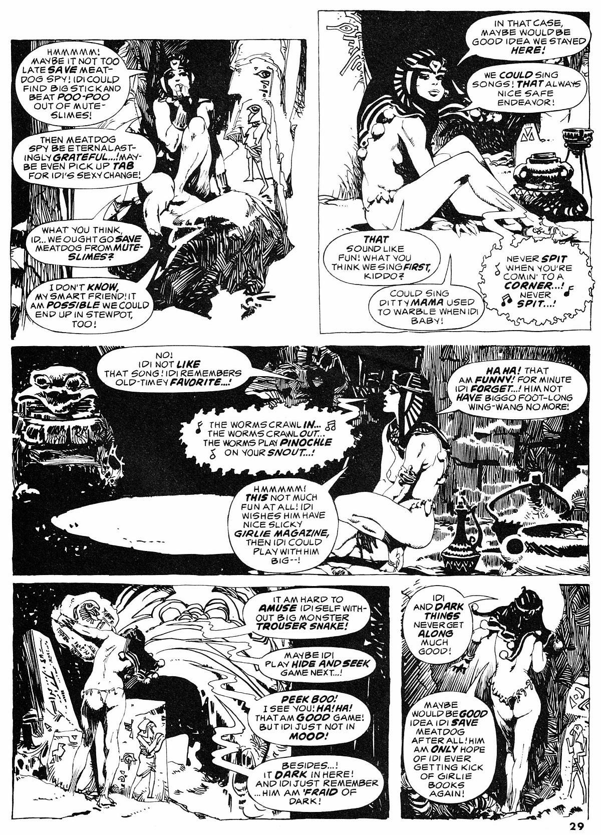
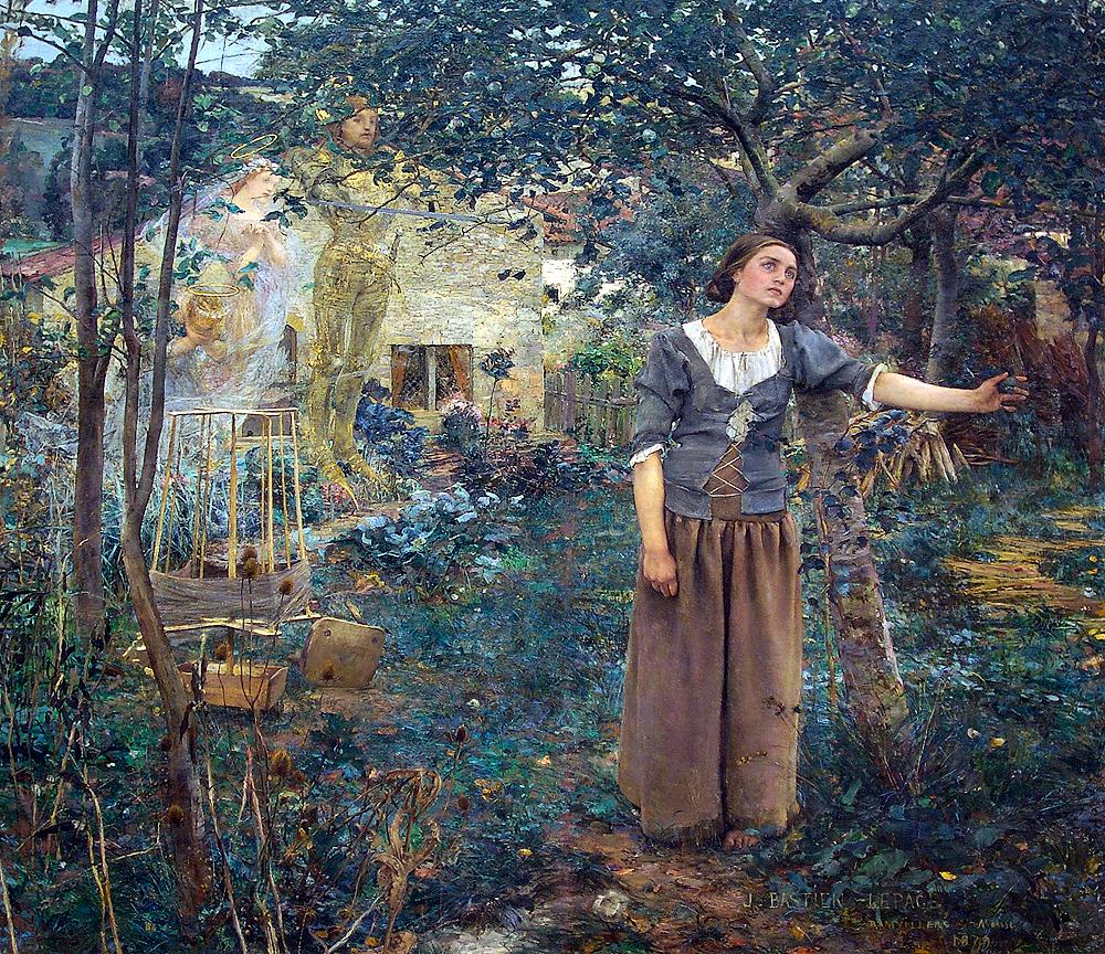
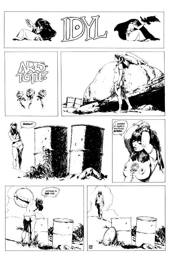
The first page here is by Esteban Maroto. It is from a story called “Idi and Me,” written by Bill DuBay, that first appeared in issue #4 of the Warren magazine, 1984, way back in 1978. And though the script is junk, it’s an attractive page. Only problem is, all of the female figures are very clearly swiped from Jeffrey Jones’s celebrated comic strip, Idyl, which ran in National Lampoon from 1972 to 1975. See below for the ocular proof:
For those who haven’t read 1984 #4, which would be almost everyone, the woman in the DuBay-penned “Idi and Me” is the brutal dictator, Idi Amin, whose chromosomes have been jumbled, just for laughs, by the American “Department of Dirty Tricks” (DDT), thereby turning “the former gorilla-faced leader of Uganda into this heavenly image of white Anglo-Saxon femininity,” Idi, who nonetheless retains a male psychology and sex drive and is thus seeking an operation to change back into a man. (And the final line/moral of the story? “I guess no matter what form you’re in… the world just isn’t ready for Idi Amin!”) All of which seems very odd, given Jeffrey Catherine Jones’s own difficult journey; however, the story did appear way back in 1978, as I noted above, which is about 20 years, more or less, before Jones decided to take definite steps become a woman. So what’s going on here? Seems most likely to me that it’s just a coincidence — though if it isn’t, if DuBay is taking a shot at Jones’s sexuality based on industry rumours, private confidences, or whatever, it’s an incredibly crude commentary! I mean, why would DuBay have done it, and why on earth would Maroto have participated? It doesn’t make sense to me, though, of course, even if the sex-change theme is a coincidence, it doesn’t mean that the story of Idi wasn’t intended, in part, as a parody of Jones’s Idyl. That would certainly explain the blatant swipes, except that Maroto has swiped from Jones (and others) before. So maybe the simple answer is that Jones’s work on Idyl was so skillful, so sensitive, so gorgeous, and — perhaps it seemed to Maroto — so obscure, that it was ripe for the swiping… or not… because the fact is, I’m not sure what to think…
Todd Adams of Glimmer Graphics has a beautiful new limited edition print by Jeffrey Jones available for purchase on his company’s Web site. “I have published over 50 fine art prints through the years,” writes Todd, “and this is the finest print quality I have seen to date.” Here’s a link to the order page. And here’s a copy of the image Todd sent out to promote the print:
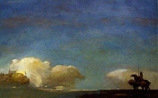
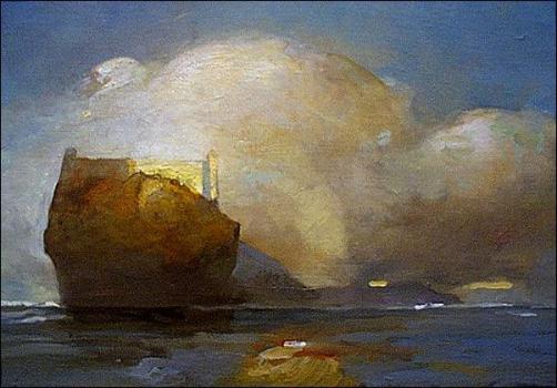
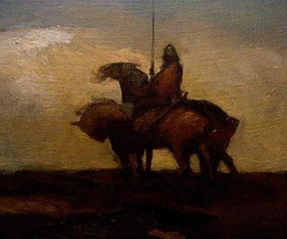
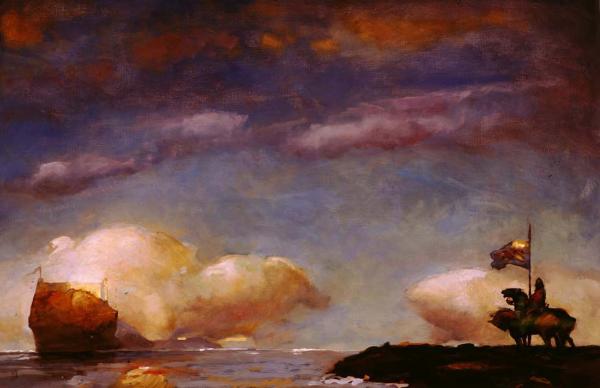
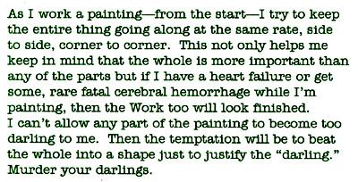
ABOVE: Jeffrey Jones, A Game of Thrones (c. 2000), oil on canvas.
Jones created the above painting for Meisha Merlin Publishing’s deluxe limited edition of the first book in George R. R. Martin’s “A Song of Fire & Ice” epic. The new Glimmer Graphics print is comprised of 375 signed and numbered copies, as well as 25 artist proof copies, all on 500 g/m² acid-free, ultra-smooth paper. Sheet size is 22 x 16 inches, with an image size of 19 x 12.5 inches.
BONUS CONTENT (added 13 December 2011):
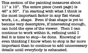
What follows are all of the images from a “work in progress” page that appeared on Jeffrey Jones’s official website, which since Jones’s death has disappeared from the Web; the images are presented in the same order that Jones presented them on the original page:
On a separate page entitled “Painting Methods,” Jones wrote:
I stretch my own canvases and prefer linen, unprimed. Two coats of gesso with sanding on each dry coat. Bristle brushes, filberts give me the texture and quality of surface I like. I use no mediums, just turpentine. My palette consists of three yellows, yellow ochre pale, raw sienna and chrome yellow. The reds I use are venetian, burnt umber, burnt sienna and cadmium. I like oxide of chromium for green, all other greens are mixed. Ultramarine is the only blue I use. When painting I consider complements and mix them together on the palette, using a bit of a complement in each mixture. For example, I might make a purple using ultramarine and venetian red and add a bit of ochre to temper it. If I use a yellow I add a little purple to temper that color. I never use black but mix it using several dark colors together. I like to paint wet in wet to keep the painting “soupy”.
I usually start a painting with a house painting brush, covering up the white of the canvas and laying in dark and light shapes. Then come some middle tones. I think in tone at first and color later. I do a lot of scraping and wiping in the beginning-at this point it’s all rather abstract.
I don’t know how many ways there are of working but what I’ve found, and it took some time, is perhaps peculiar to me. The most exciting thing is a blank white canvas or piece of paper–anything can happen. This is why I’ve long ago gotten away from scripts and manuscripts. I’m not really an illustrator. It’s probably my education in German Abstract Expressionism where whatever happens on a piece of art happens all the time. There is no real beginning and no end, there is just a time to abandon. I honestly never know what the “finish” will look like. I’ve said this before so bear with me here. The work and I have a “conversation”. There are times it listens to me and times I must listen to it. As long as it’s a “we” process there are no dull bits. There are impasses where I have to put it aside for a while but that’s not boredom. Boredom can just be another word for anger. For almost 30 years I have written my own comics, and the writing is done along with the drawing, not beforehand. It’s the same with painting. The narrative, which is often ambiguous, evolves with time. If it does indeed ever get dull then it is finished.
I always use titanium white because of it’s opaqueness and covering ability. It doesn’t matter which white you use, mixing white with any primary color will give you a pasty pastel. You have to mix the colors before adding white. Also lack of pastiness depends on which colors are next to each other.
…Howard Pyle advised his students, “Put light colors next to light colors and dark colors next to darks, then where you want the viewer to descend, put dark next to light.” This is a good rule of thumb.
Please note that the above description of Jones’s material preferences and process in oil has been cut and pasted, without alteration, from the original “Painting Methods” page on Jones’s official website.
BONUS CONNECTION (added 24 February 2014):
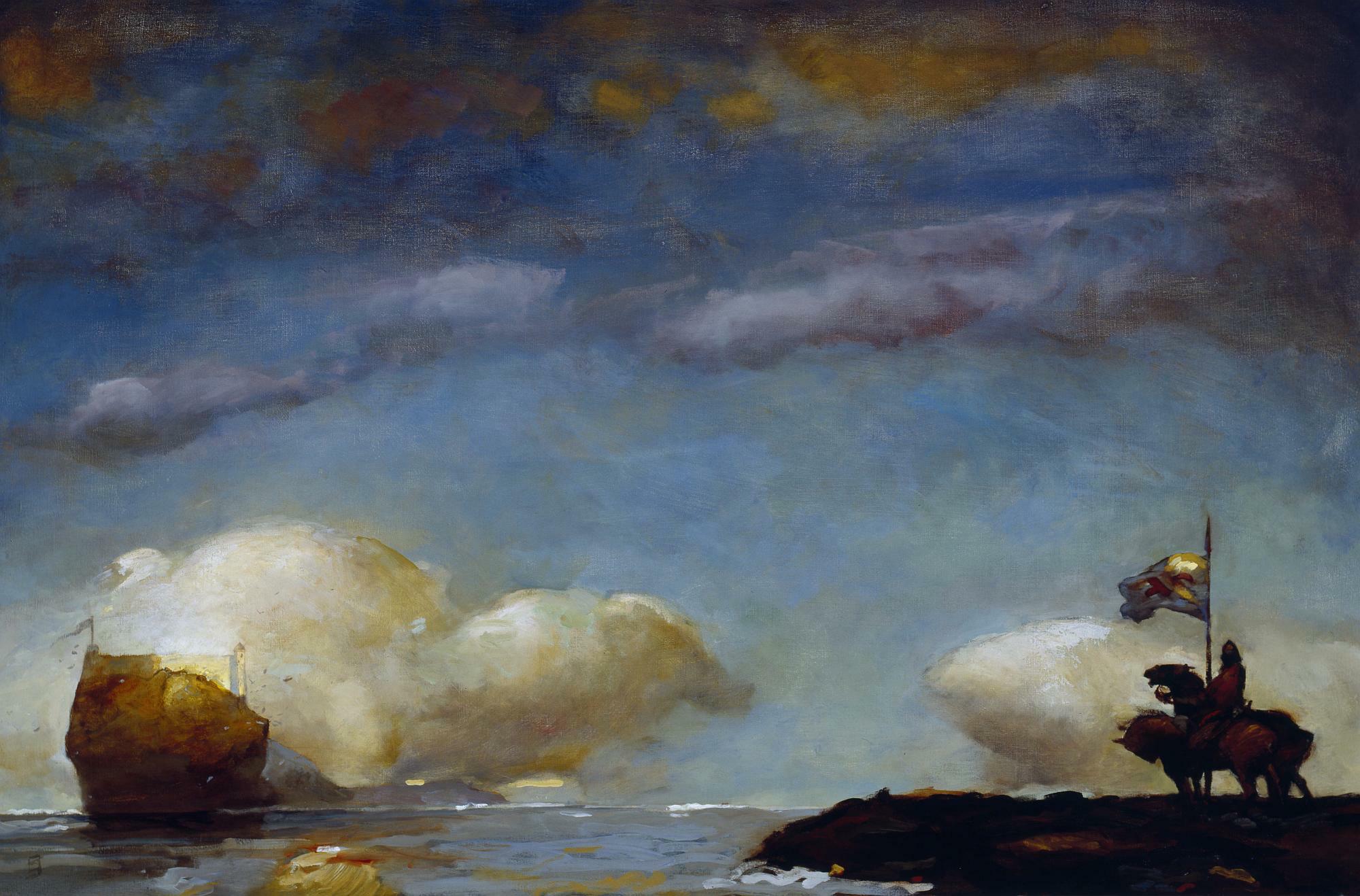
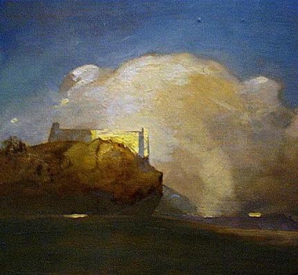
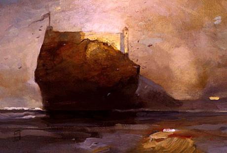
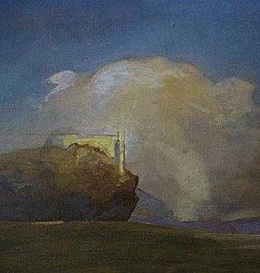
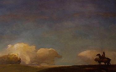
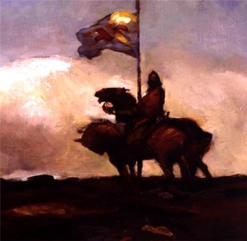
ABOVE: Joseph Mallord William Turner, Wreckers, Coast of Northumberland (c. 1834), oil on canvas, 125.9 x 90.5 cm. Collection of Yale Center for British Art, New Haven, Connecticut, USA. Via Wikimedia Commons.
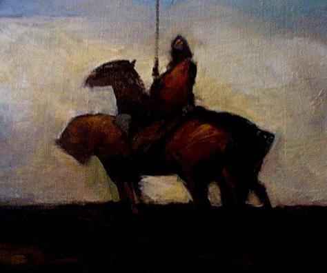
ABOVE: Jeffrey Jones, A Game of Thrones (c. 2000), oil on canvas.
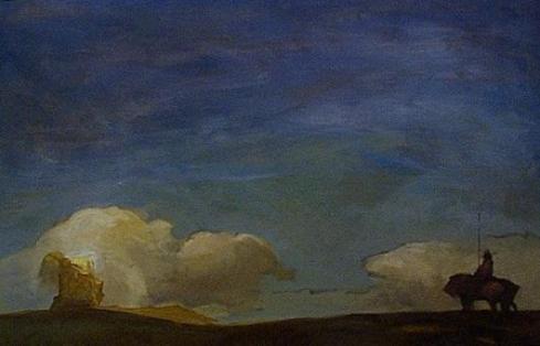
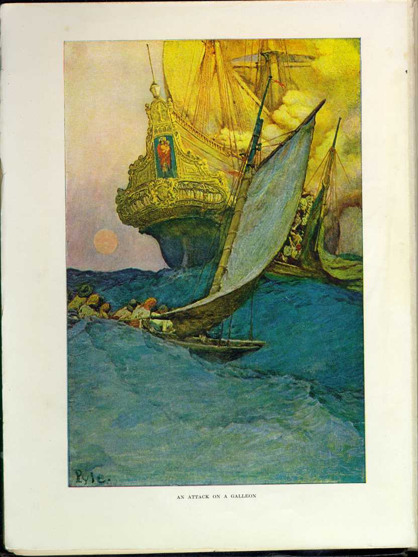
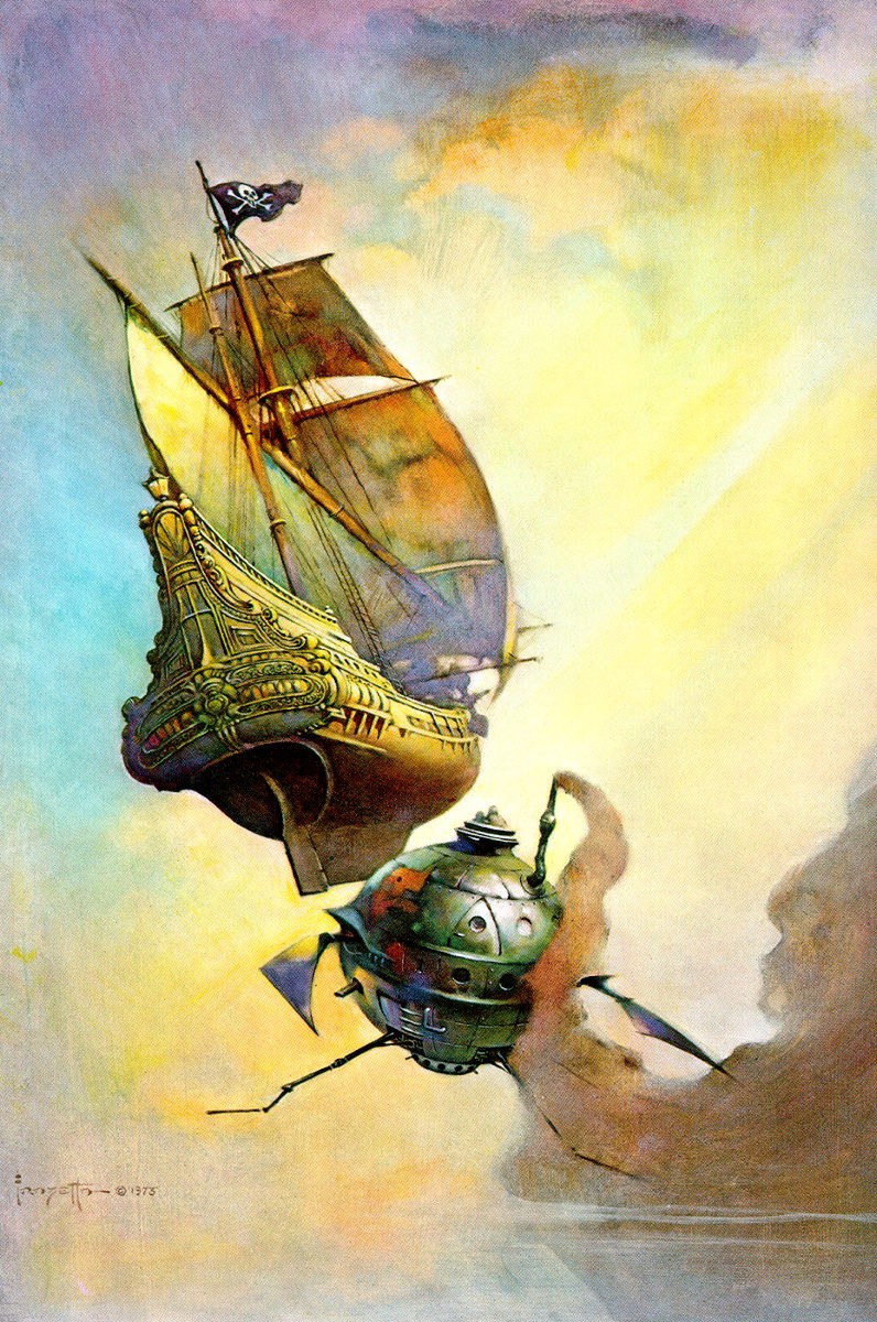
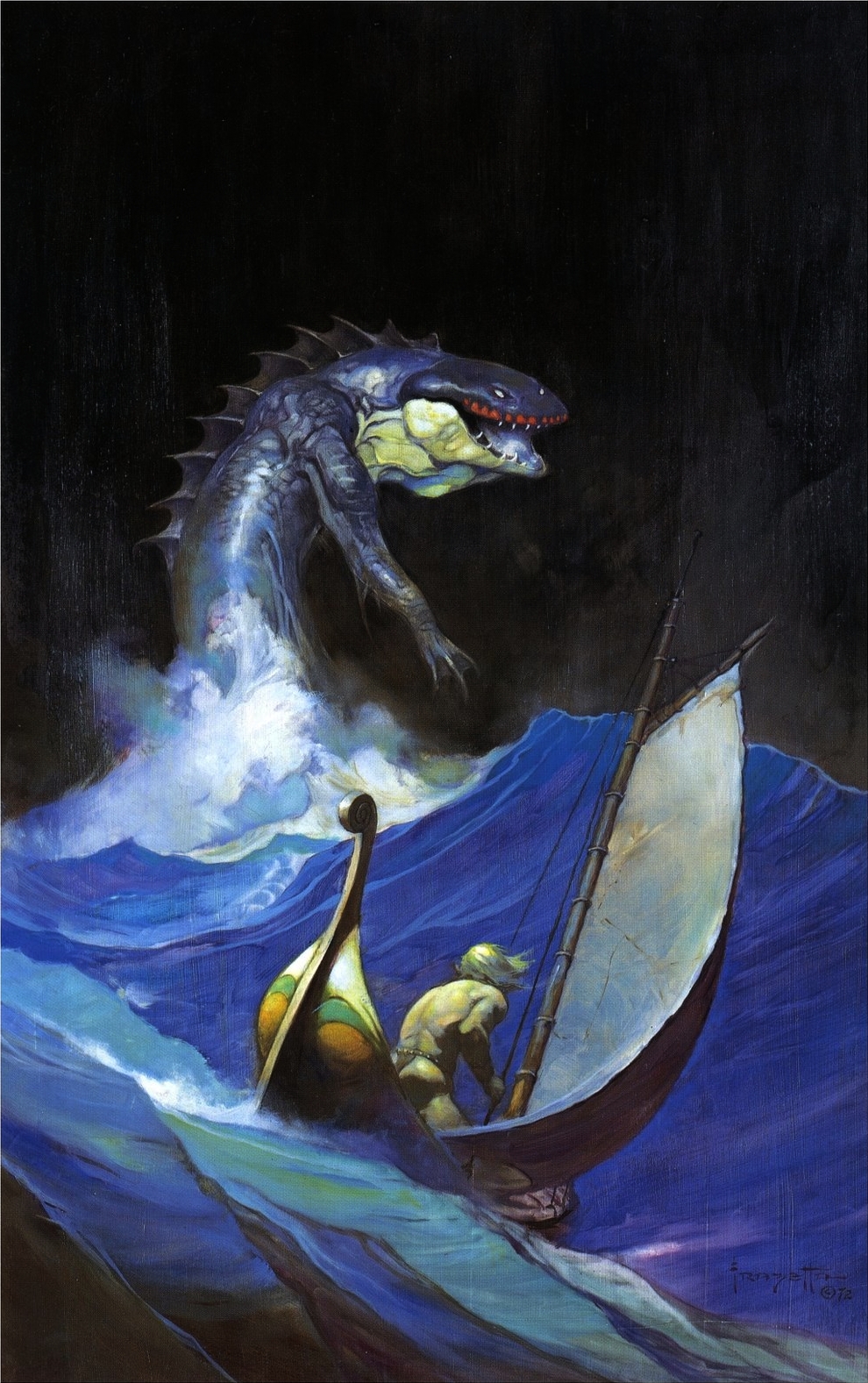
ABOVE: Frank Frazetta, Sea Serpent (1972), oil on canvas. Here’s a bonus: another painting by Frazetta inspired by An Attack on a Galleon by Howard Pyle.
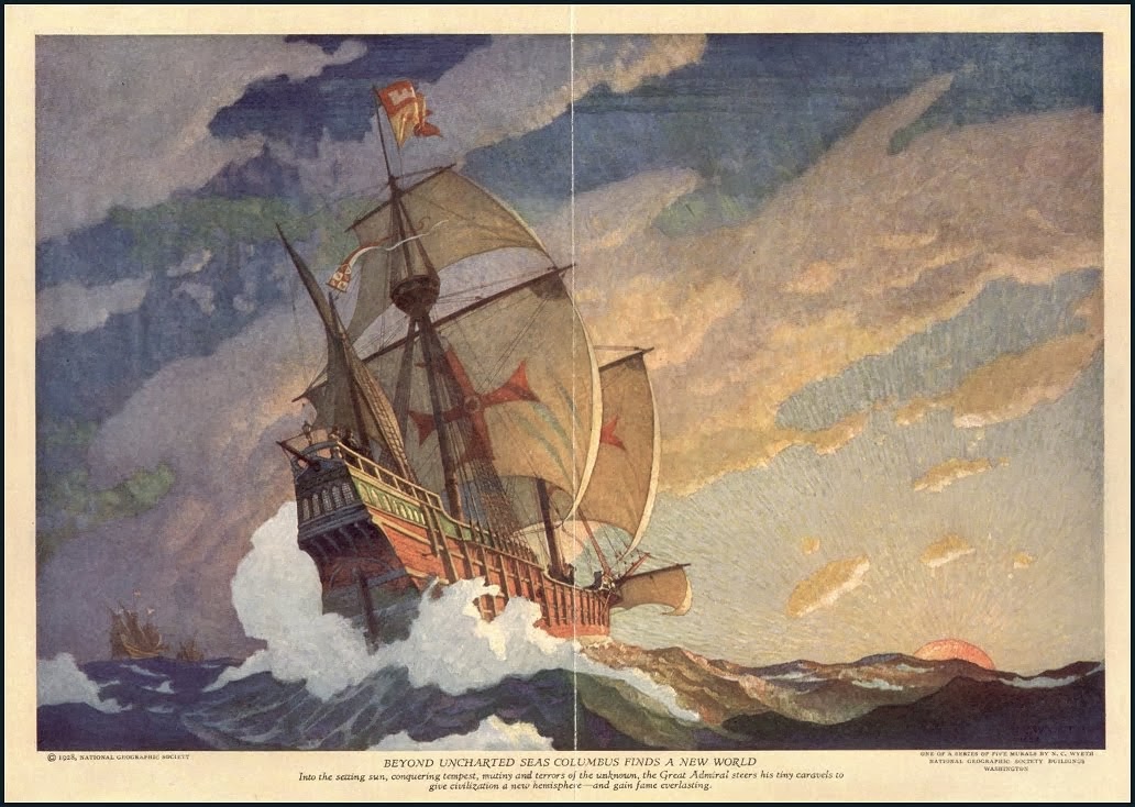
Frazetta’s obvious borrowing from Pyle has been pointed out many times in the past; however, I’ve never seen anyone add Wyeth’s painting to the mix (although surely someone has, the line of influence being so clear). Now, of the three galleon paintings, it seems obvious to me that Pyle’s original effort is not only the first but also the best of the three. It’s the best composed; it’s the most expressively painted; it’s the most dramatic. No wonder Wyeth and Frazetta (who seems to me to have borrowed as much from Wyeth’s galleon as from Pyle’s) were enthralled by Pyle’s Attack on a Galleon. It’s a masterpiece. And which of the remaining two galleon paintings is the weakest, Wyeth’s picturesque, chocolate-box cliché or Frazetta’s virtuosic but underdeveloped pastiche? You decide…
ABOVE: Frank Frazetta, Sea Serpent (1972), oil on canvas. Here’s a bonus: another painting by Frazetta inspired by An Attack on a Galleon by Howard Pyle.
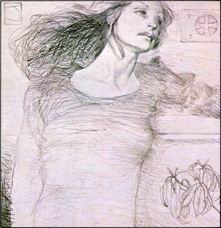
ABOVE: Jeffrey Jones, study for Chastity (1978), pencil on paper.
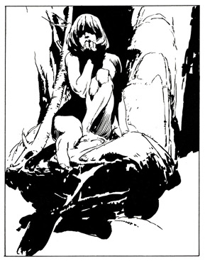
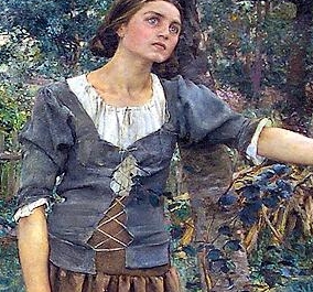
ABOVE: Jeffrey Jones, "Idyl: Aristotle" National Lampoon (issue number?) (1973), p. 94.
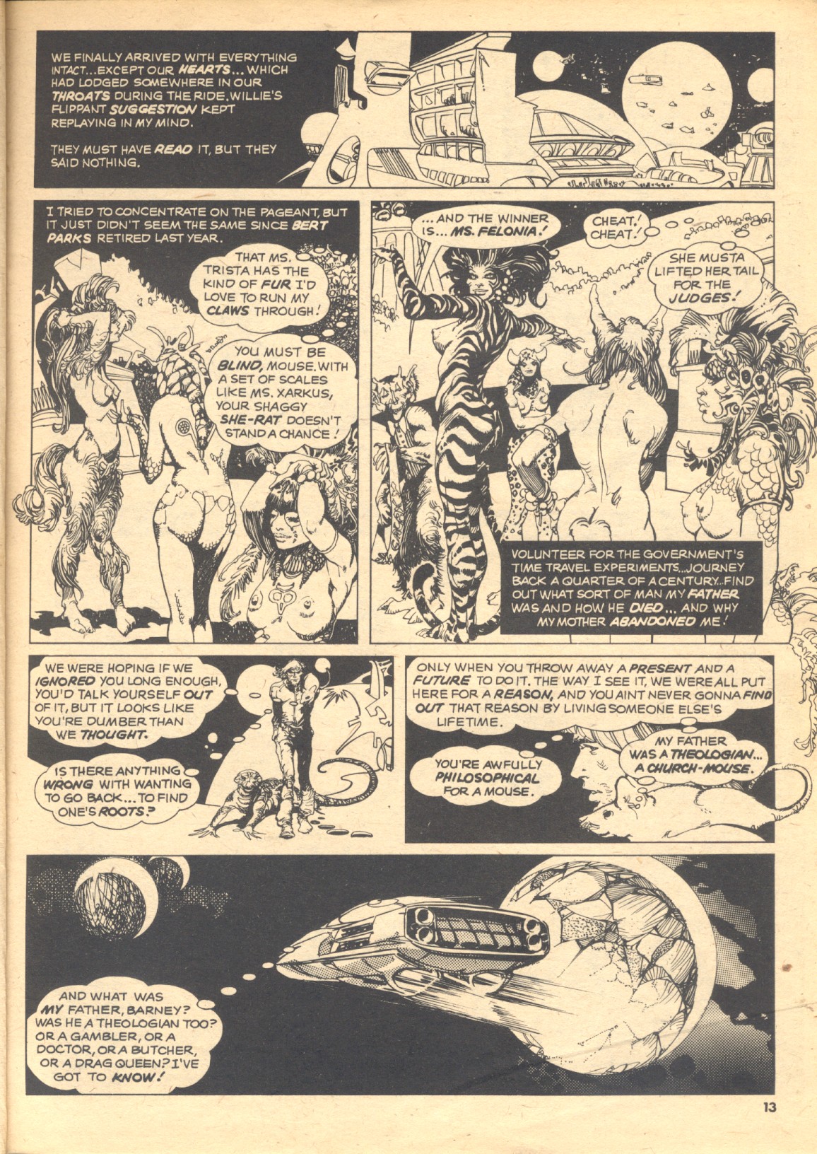
ABOVE: Esteban Maroto, "Second Genesis: Part One: Hamlyn; 2076" ( story by Gerry Boudreau), Creepy #80 (June 1976), p. 12.
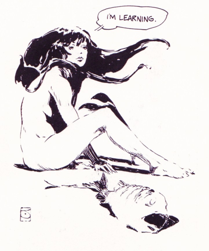
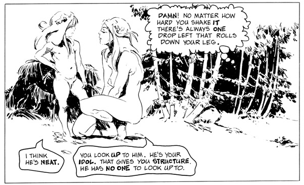
Do you see it? Look for the girl with her hands on her head…
P.S. I’d be tempted to cut Maroto some slack and call this an homage to Jones, if not for his longstanding reputation as a lover of swipes in general and for this proof of his excesses in particular!


