Illustration Art · Look Here · Sergius Hruby

Look Here: Another eight illustrations by Sergius Hruby

According to the RCN webstats, the various posts here of illustrations by Sergius Hruby have been sorta-kinda popular, so in the interest of sucking up to the faceless semi-horde, here’s yet another (and probably the last) more or less random display of Hruby, selected, processed, and posted by me from the Austrian humour/men’s magazine, Die Muskete, via the online archive of the Austrian National Library:

[CLICK IMAGES TO ENLARGE]

Specific publication information for each image is included in the file name, as usual.


RELATED LINKS:

Fine Art · Frank Frazetta · Illustration Art · Look Here · N. C. Wyeth

Connections: Wyeth, Fischl, Frazetta

I’m not going to put forth any arguments here regarding a possible chain of influence from Wyeth to Fischl to Frazetta (because I don’t think there is one), the relative quality of the three paintings pictured below (because none of them is truly first rate), the relative merits of “fine art” versus “illustration art” (because I don’t care about the issue), etc. I just have a hankering to see these three paintings mashed together in one post:

[CLICK IMAGES TO ENLARGE]


BONUS IMAGES:

Heads Up! · Richard Corben

Heads Up: Corben Art Sale, 26 October 2013

On Saturday 26 October 2013 at 12:00 noon CST, thirty-one pages of original comic art by Richard Corben will go on sale via the “Sales” page on the artist’s official website.

The sale will include ten pages from two issues of Ghost Rider, ten pages from Hellblazer: Hard Time, and all eleven pages of “Tales of the Black Diamond, Crypt of Blood,” with script by Rich Margopoulos, a story that was first published in Horror in the Dark #3 (Fantagor, 1991).

All pages are drawn in Sharpie pens and Pigma pens on 11 x 17 inch Strathmore paper.

Scans of the pages are on the Corben website now for “viewing only.” Although the images are tiny, they are nonetheless large enough to see, for instance, that the grey tones used to establish the midnight mood of the published version of “Crypt of Blood” are not part of the original art.

All prices will be posted when the sale goes live, at which point the first person to complete the PayPal shopping cart for each page will receive that page.

Edward Hopper · Look Here · Photos

Look Here: “Film in stolen camera, location unknown”

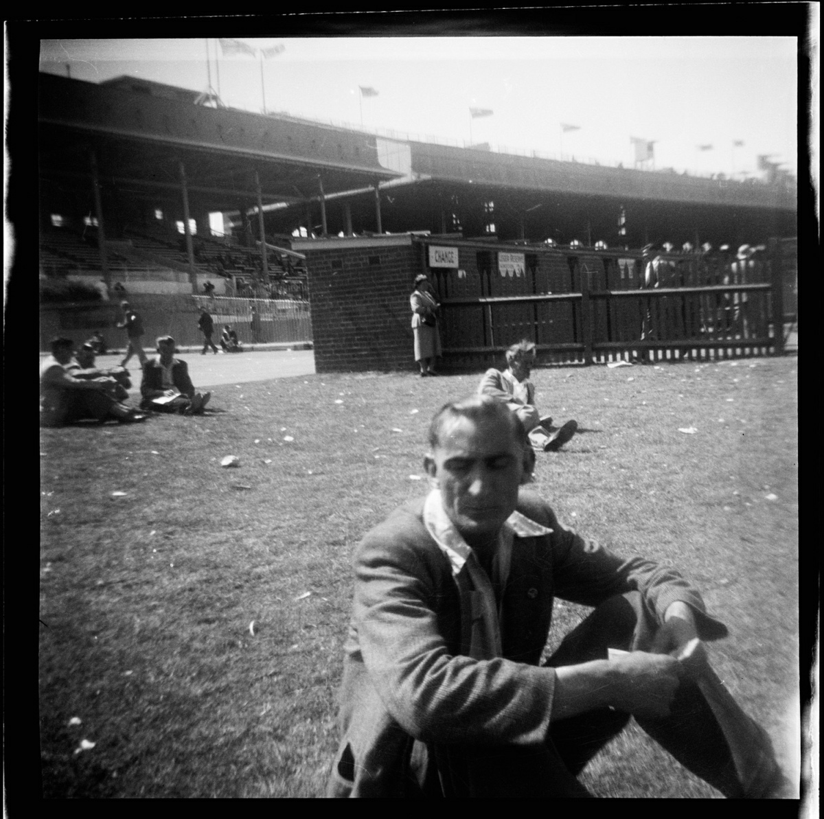
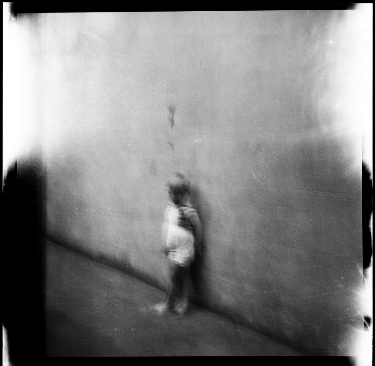
All six of the images posted below come from the website of the Historic Houses Trust (HHT) of New South Wales (NSW), which hosts an amazing digital public archive that includes forensic photography collected and created by the NSW Police between 1912 and 1964:

[CLICK IMAGES TO ENLARGE]

The images are all from envelope no. 55/2763, and have been catalogued and posted by HHT in sequence: 36418, 36419, 36420, 36422, 36423, 36424.

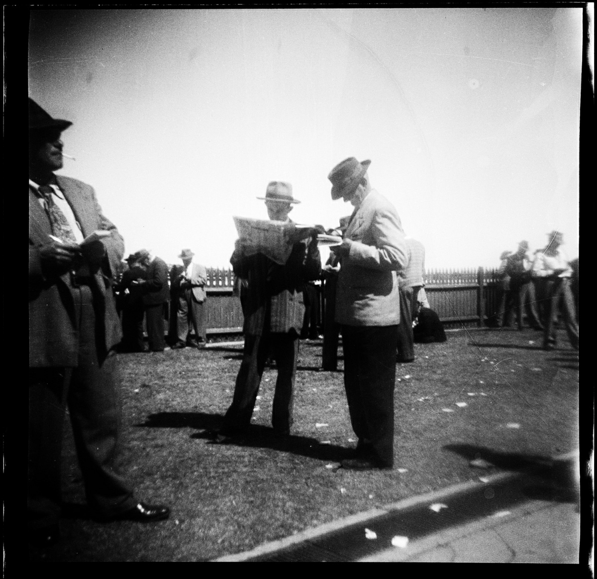
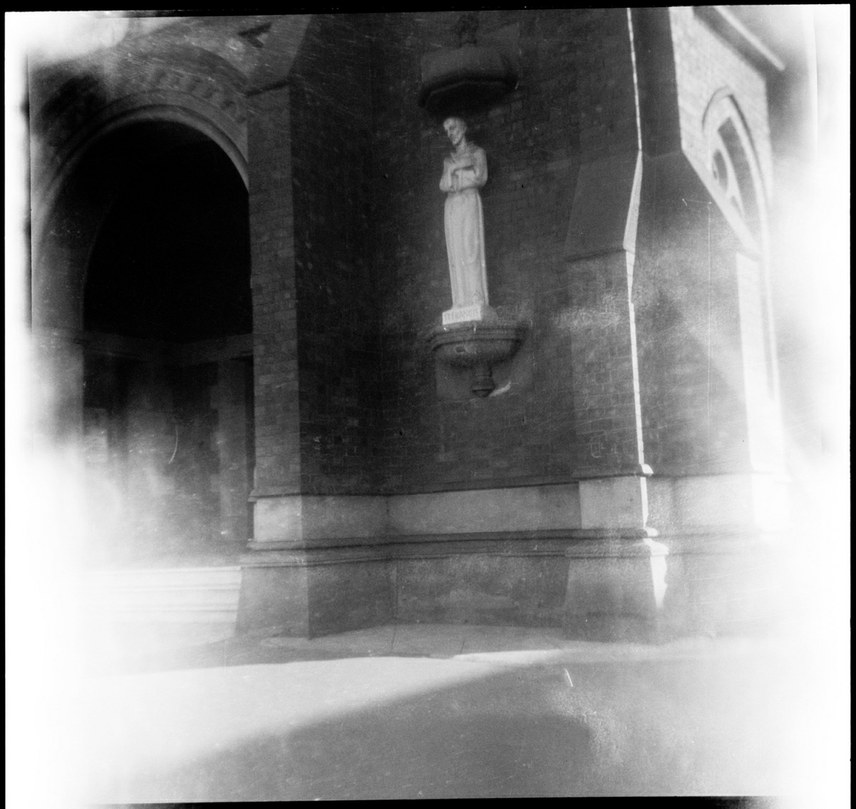
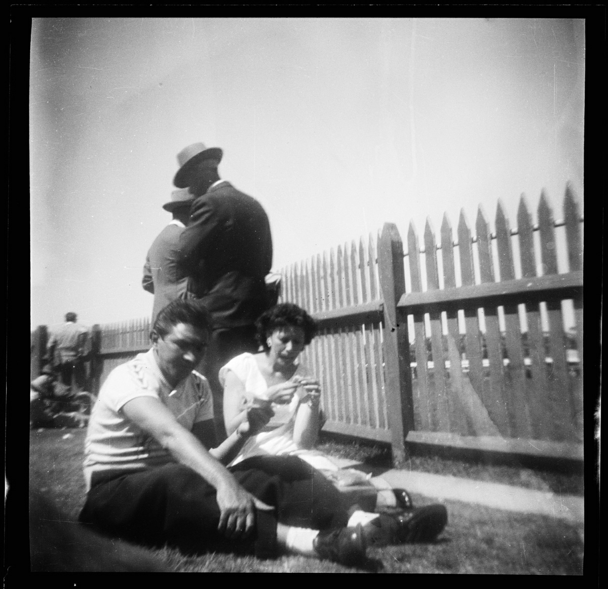
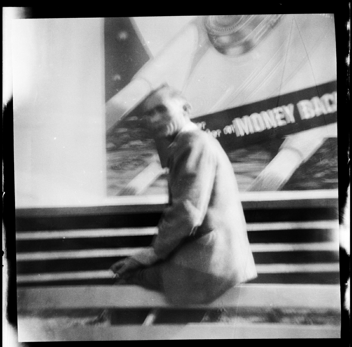
The online records all include the same one line description — “Film in stolen camera, location unknown” — and the same date, 20 October 1955 — 58 years ago today!

Where were the photographs taken? A racetrack? A racetrack for what? Horses? Dogs? Is the person who stole the camera visible in any of the photographs? Are any of those people still alive? Does the ghostly apparition in short pants in the second photograph have grandkids who are excited to squirm into their costumes and haunt the surrounding neighbourhoods at Halloween this year? What was the attraction of the white stone statue — a monk? a saint? — in the niche on the side of that building? What is that building, anyway? A church? The entrance to the track? What is beyond that picket fence?

Why are blurry old black-and-white snapshots of the inscrutable activities of strangers so intriguing, so disturbing, so haunting?

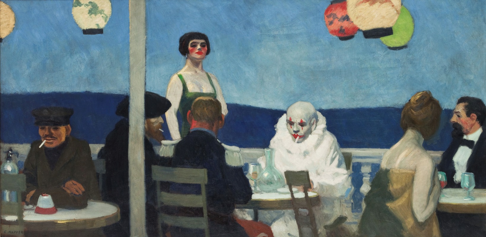
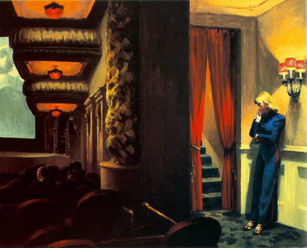
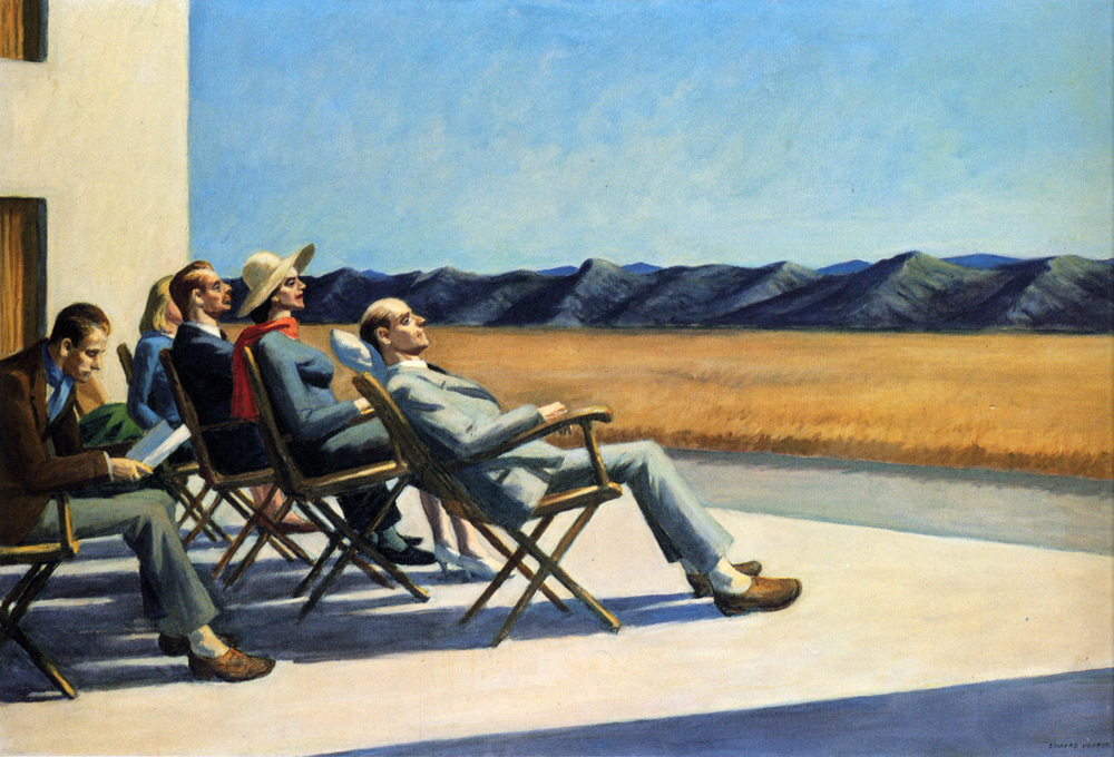
Think they’re boring… scroll back slowly and think again… the tightly composed shot of the middle-aged men in hats, heads down, uncommunicative, one with his nose in a newspaper, the others either writing on or consulting folded pieces of paper — or are those racing forms? — a solemn assembly of punters, perhaps, each out for himself, preserved for posterity on a close-cropped stretch of lawn, with a picket fence marking the limits of their freedom, preventing them from wandering into the void beyond, I say, that snapshot, especially, conveys a Hopperesque feeling of human existential aloneness in a crowd that deepens the mystery of everyday life despite the fact that the effect is, almost certainly, entirely unintentional…


BONUS IMAGES (added 20 October 2013):

[CLICK IMAGES TO ENLARGE]

Bob Haberfield · Book/Magazine Covers (All) · Illustration Art · Look Here

Look Here: A pair of Runestaff paperbacks with cover art by Bob Haberfield

Two more Moorcocks with art by Bob Haberfield this morning, as promised yesterday:

[CLICK IMAGES TO ENLARGE]

Keywords: The Jewel in the Skull, The Mad God’s Amulet, by Michael Moorcock; Bob Haberfield.

Book/Magazine Covers (All) · Illustration Art · Look Here

Look Here: One lovely SF cover with art by David Blossom

Not by Dean Ellis, and not by Paul Lehr, though vaguely reminiscent of both, the illustration on the cover of Robert Silverberg’s Tower of Glass is complemented rather than overwhelmed by a big block of bold, compressed, sans-serif type:

[CLICK IMAGES TO ENLARGE]

The artist here is David Blossom, but who the heck is David Blossom? The following summary of the artist’s career appears on various sites round the Web; my source is New Britain Museum of American Art (NBMAA):

Though born in Chicago, Illinois, Blossom lived most of his life on the East Coast. Growing up in Rye, New York, he later moved with his family to Westport, Connecticut in 1963, where he lived until his death. Early in his career, he worked as an art director at Young & Rubicam, a communications company, where he specialized in advertising for the Ford Motor Company and Pan American Airways. His work in illustration included covers for romance novels and popular magazines such as Outdoor Life and Reader’s Digest. Blossom is also known for creating movie posters for such Clint Eastwood westerns as The Good, The Bad, and The Ugly, A Fistful of Dollars, and A Few Dollars More. In its annual awards for excellence to deserving artists, the Society of Illustrators awarded the Hamilton King award to Blossom for best illustration of the year in 1973.

I’ve done a bit of searching, and I can’t find any information about which Clint Eastwood movie posters, exactly, featured art by Blossom, but possibly/maybe it was the ones that looked like this:

Here’s an example of Blossom’s non-SF illustration work, copied from the NBMAA blog, for comparison:

Oddly enough, a later, photo-based design for The Good, The Bad, and The Ugly is build around more or less the same typographical idea as the design for Silverberg’s Tower of Glass, with art by Blossom:

And thus the serpent eats its tail… sort of…

Bob Haberfield · Book/Magazine Covers (All) · Illustration Art · Look Here

Look Here: Three paperbacks of Corum with cover art by Bob Haberfield

[CLICK IMAGES TO ENLARGE]

I have a couple more Moorcocks with cover art by Haberfield in my collection. Will probably scan and post ’em soon, if not sooner.

Keywords: The Knight of the Swords, The Queen of the Swords, The King of the Swords, by Michael Moorcock; Bob Haberfield; Habberfield.