Alex Toth · Comics · Here, Read · Look Here

Look Here, Read: “Hide Your Love,” with art by Alex Toth

From Young Love #74 (May-June 1969), here’s “Hide Your Love,” with art by Alex Toth and story by an uncredited writer:

[CLICK IMAGES TO ENLARGE]

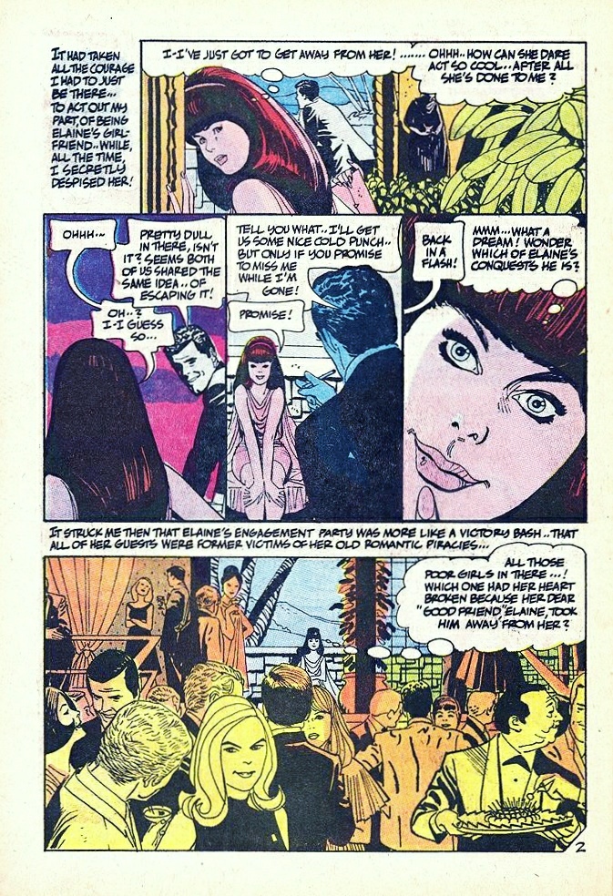
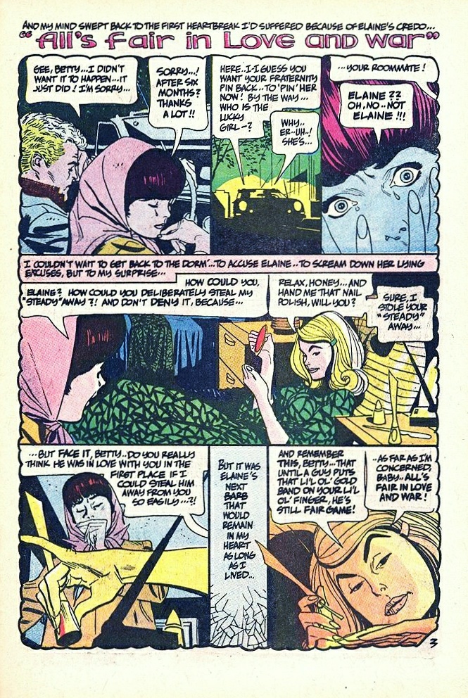
I happen to love beautifully drawn romance comics, but even if you don’t, you will surely recognize the brilliance of Toth’s design of the opening page, with its elegant panel arrangement that steps down in a curve from left to right around the title of the story, which, for our eyes only, Toth has written on the troubling engagement-party invitation card that the main character, Betty, has just received from her “friend” Elaine, a card that is half-hidden inside an envelope the outlines of which define the panel — Betty’s arrival at Elaine’s party — that closes the opening page! If you have read the story, you’ll know why this is significant…

Alex Toth · Comics · Here, Read · Look Here

Look Here, Read: “Dirty Job,” with art by Alex Toth

From Our Army at War #241 (February 1972), here’s a four-page classic with story by Bob Haney and art by Alex Toth:

[CLICK IMAGES TO ENLARGE]

I love how Toth uses the silhouetted panel that extends across the top of page three to provide variety within the six-panel grid while at the same time he cheekily reestablishes/reinforces the grid by breaking the panel into two halves, each framed by the structure of the building, with a support beam where the panel border/gutter would have been. And those word balloons — the tails all go the way from the visual foreground, where the text balloons reside, between and behind the silhouettes of Roman soldiers caught in the act of brutalizing the native population, and into a doorway in the background! It’s an audacious choice, but Toth makes it work!

Comics · John Buscema · Look Here · Original art vs. printed page

Look Here: Four Conan pages by John Buscema

From Conan the Barbarian Movie Special #1 (October 1982), here are four consecutive pages, with art both pencilled and inked by John Buscema, along with the original art for each page:

Unlike many of the inkers who were hired to embellish his pencils over the years, John Buscema never had a reputation as a gifted technician with a quill or a brush, though he did have an instantly recognizable style. His simple, vigorous brushstrokes could suggest fur and grass and hair realistically enough, but look carefully and you’ll see that very similar strokes also delineate musculature, armour, leather clothing, rocks, trees, shadows, etc., etc. Realistic details and textures were simply not Buscema’s strong suit. This was partly because the artist didn’t enjoy research — as he said in several interviews, one big reason he loved to work on Conan was because he could rely on his memory and imagination for everything — and partly because he viewed any “extra” time spent slaving over his comics work as money out of his pocket! But that’s not a bad thing, because what you do get when Buscema inks his own work is nothing less than an object lesson in basic form and gesture by a master draughtsman. And that’s more than enough.

Alex Toth · Comics · Here, Read · Look Here

Look Here, Read: “Alice in Terrorland,” with pencils by Alex Toth

From Lost Worlds #5 (October 1952), here’s “Alice in Terrorland,” with pencils by Alex Toth and inks by Mike Peppe:

In a previous roundup of links to stories with art by Alex Toth, I sent readers to Karswell’s “The Horrors of It All” blog, where you’ll find a copy of “Alice in Terrorland” as it was reprinted/recoloured in Seduction of the Innocent #1 (Eclipse, November 1985). For those who would care to compare the two versions, here’s that link again.

Bill Benulis · Comics · Here, Read · Look Here

Look Here, Read: Two “Strange Tales” with art by Bill Benulis

Born in 1928 in Brooklyn, New York, Bill Benulis began his career in comics in 1949 (near as I can figure) only to give it up about seven years later for the income security of a job with the post office, but his distinctive artwork, both pencils and inks, for stories like “The Voice of Doom,” Strange Tales #9 (August 1952), and, especially, “The Frightful Feet,” Strange Tales #10 (September 1952), shows that, with the right kind of encouragement, he might have been a contender! IMHO, of course…

Comics · Here, Read · Joe Kubert · Look Here

Look Here, Read: “Pony Express,” with art by Joe Kubert

From Apache Kid #13 (April 1955), here’s a tale of the old West with pencils and inks by Joe Kubert, who was about 28 years old at the time of publication:

[CLICK IMAGES TO ENLARGE]

Yes, I suppose that the anonymous writer of “Pony Express” gets points for pointing out that the “Injuns!” were not simply “savages,” but I see no evidence that he knew anything about what the “red-men respected […] above all else” beyond what he might have gleaned from the old myth-enforcing Hollywood “B”-movie Westerns. It is Kubert’s artwork, alone, that makes the story worth preserving.

Book/Magazine Covers (All) · Illustration Art · Leo and Diane Dillon · Look Here

Look Here: More paperbacks with cover art by Leo and Diane Dillon

[CLICK IMAGES TO ENLARGE]

Keywords: A Tale of Two Cities, Nightshade & Damnations, One Million Tomorrows.