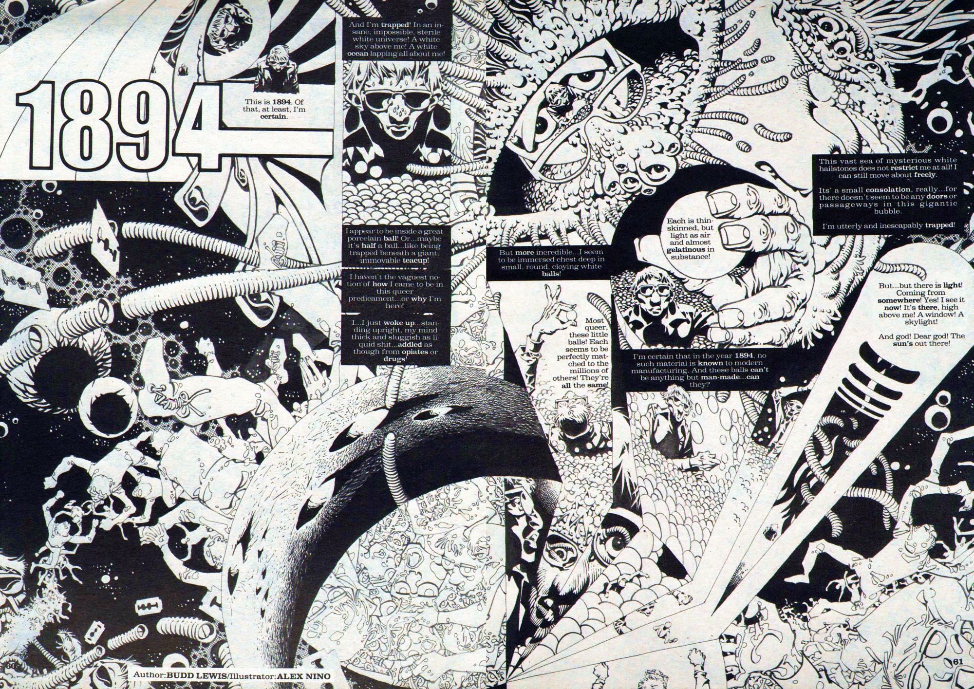
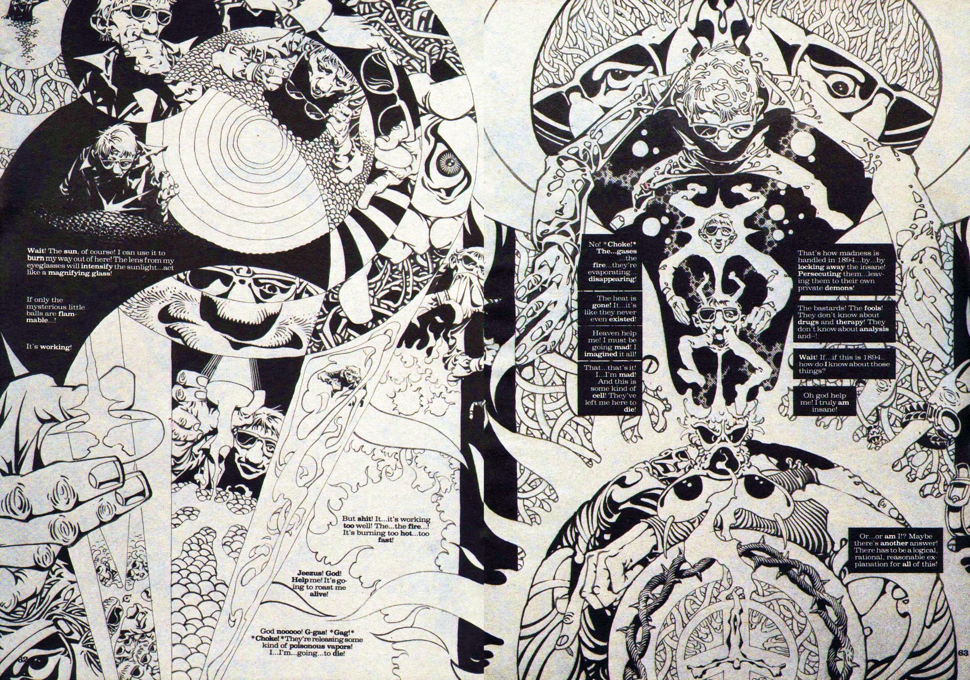
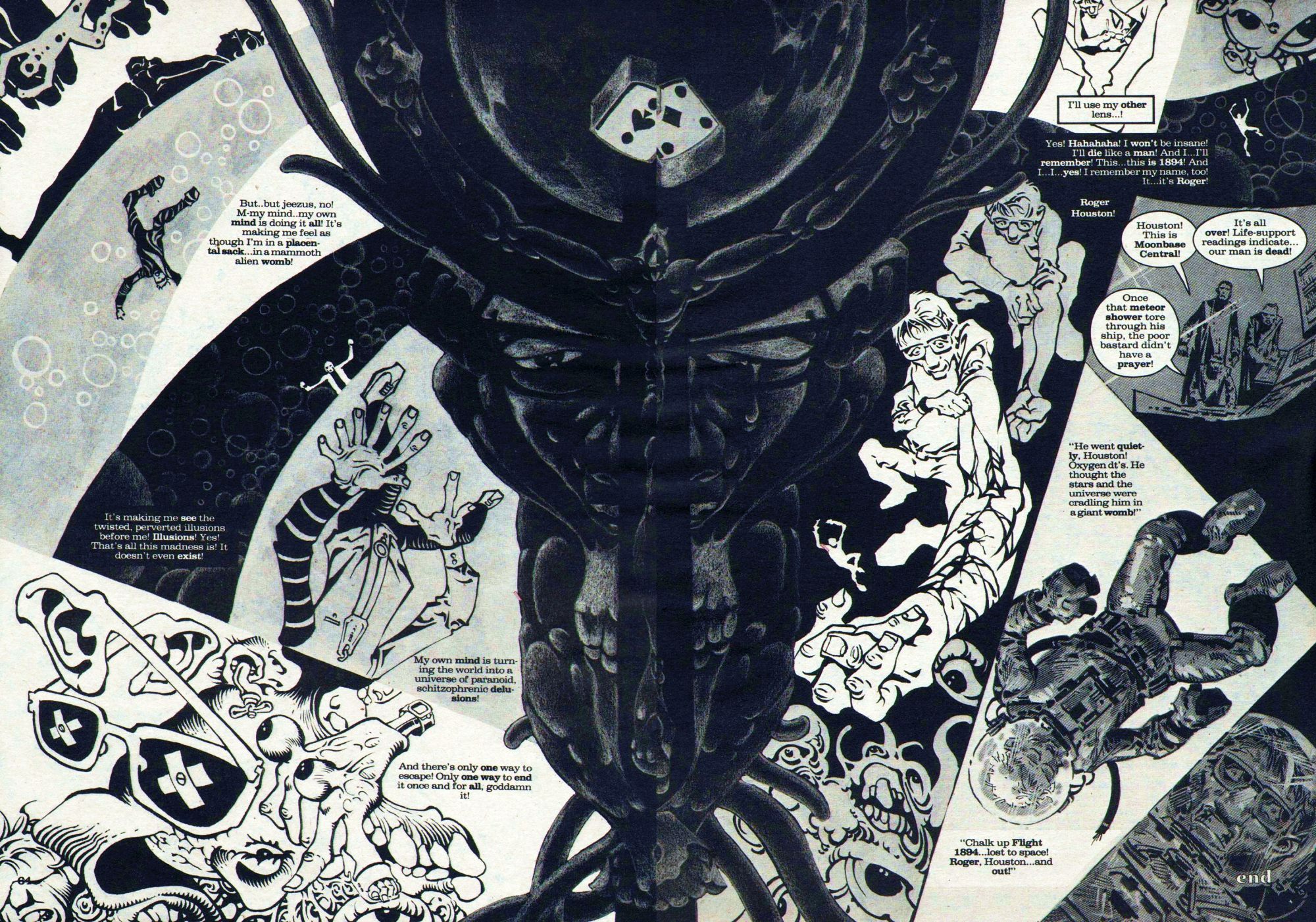
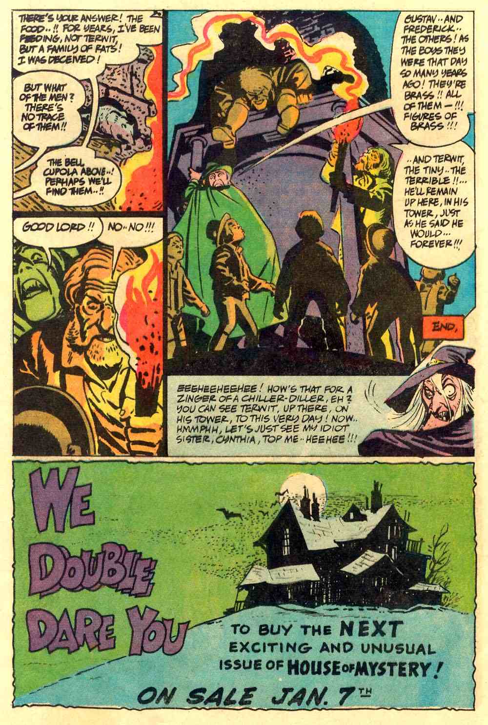
From the Warren magazine 1994 (October 1980), here’s a mad six-pager entitled “1894,” with script by Budd Lewis and sprawling art by Alex Nino:
[CLICK IMAGES TO ENLARGE]
"This day's experience, set in order, none of it left ragged or lying about, all of it gathered in like treasure and finished with, set aside." –Alice Munro, "What is Remembered"

From the Warren magazine 1994 (October 1980), here’s a mad six-pager entitled “1894,” with script by Budd Lewis and sprawling art by Alex Nino:
[CLICK IMAGES TO ENLARGE]
The rioting in Vancouver after the Canucks lost the Stanley Cup to the Boston Bruins in game seven of the playoffs was disgraceful. Now that the smoke has cleared, however, the following photograph has attracted a lot of positive (and some negative) attention, with many hoping that it wasn’t staged but was a true candid shot, as the photographer, Richard Lam of Getty Images, has claimed:
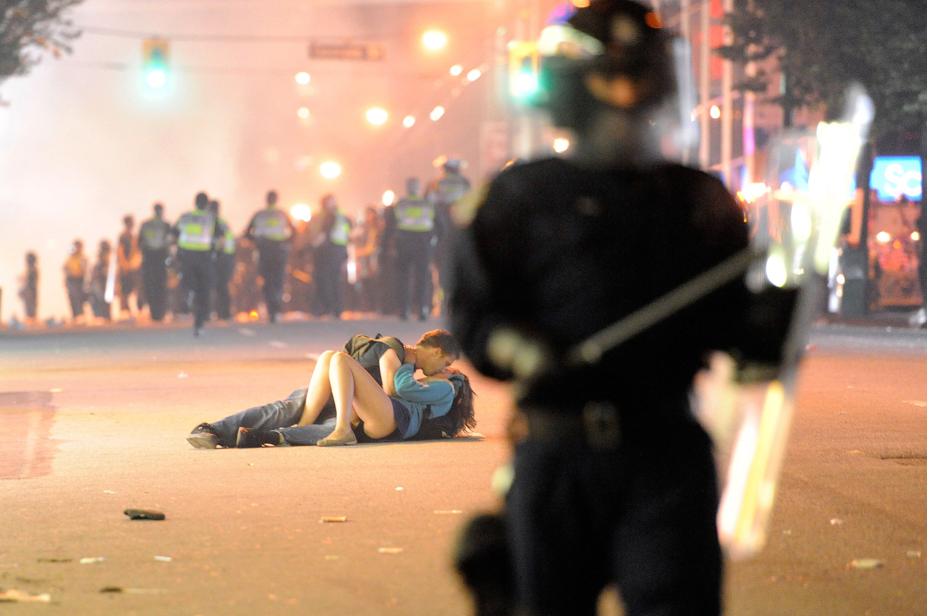
According to a report by Brad Frenette published on the Vancouver Sun Web site on June 17, 2011 5:46 AM, someone named “William” wrote to the paper to describe what he witnessed:
I was on the top floor of a parkade on Seymour, the couple [who have now been identified as Canadian Alexandra Thomas and her Australian boyfriend Scott Jones] was right outside of the parkade on the street in front of me. What happen was the police line rushed the crowd and this couple trying to stay together couldn’t react in time and were run over by 2 riot police officers. The girl who was knocked over landed head first on the pavement with her boyfriend landed partially on top of her. She was in visible pain, crying, but the 2 officers gave them a parting shove and moved on. By standers went to go make sure she was ok. I understand that the front line police have to control the crowd but it is a bit ridiculous that they couldn’t have other officers or paramedics behind the line to help anyone who is hurt.
If William’s account is accurate, then what we have here is neither the artful documentation of a provocative piece of street theatre nor a lurid snapshot of a couple who were “too aroused to seek privacy” (as one idiot going by the name “anon252708922” put it on the Vancouver Sun site), but rather the spontaneous and touching photographic record of one human being taking the time to comfort another who has been harmed, even while they are in the midst of real danger — although, of course, it is the additional, fortuitous frisson of eroticism conveyed by the woman’s bare skin that has given the image legs, so to speak.
UPDATE:
Here’s part of a CBC News report with the headline “Vancouver riot’s kissing couple uncovered”:
Brett Jones [Scott’s father] said the couple had been at the NHL final game, and after the frenzy following the loss spilled into the street, the two were caught in the violence.
“They were between the riot police and the rioters, and the riot police were actually charging forward, and Alex got knocked by a [police] shield and fell to the ground,” he told CBC News. “[Scott] was comforting her and gave her a kiss to say, ‘It’s going to be OK,’ and the photographer just took the shot at that moment.”
Brett Jones said Scott is fine, and Alex suffered a bruised leg from falling to the ground.
The two are overwhelmed by all the coverage the picture has gotten, he said, noting that he has been fielding calls from media around the world.
“They are both just totally stunned by it, actually.”
In an interview this morning with the Toronto Star, the woman in the photograph, Alexandra Thomas, said, “When I first saw it, I thought, ‘No way, that’s not … I can’t believe that’s us.’ Then I looked some more and realized, that is us. That’s a very revealing picture of us.”
Finally, video footage has also been released that confirms the couple’s, and William’s, and the photographer’s, story:
The Vancouver Sun > Video: EXCLUSIVE: Raw video footage of mysterious “Kissing Couple” caught in Vancouver Stanley Cup riot
Final score: Romantics 1, Cynics 0.
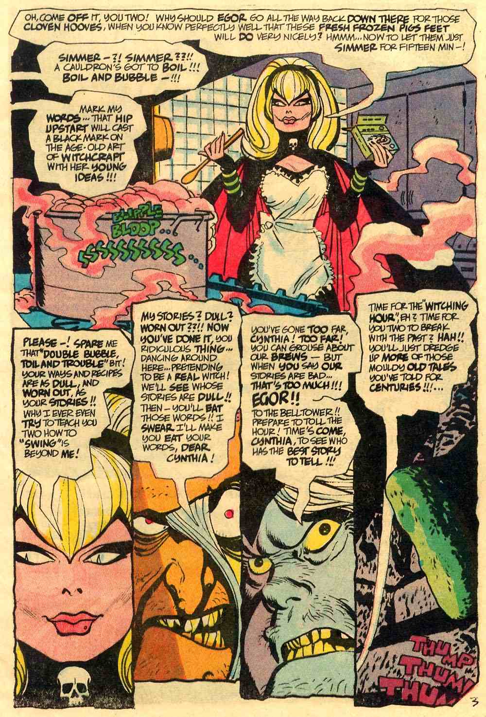
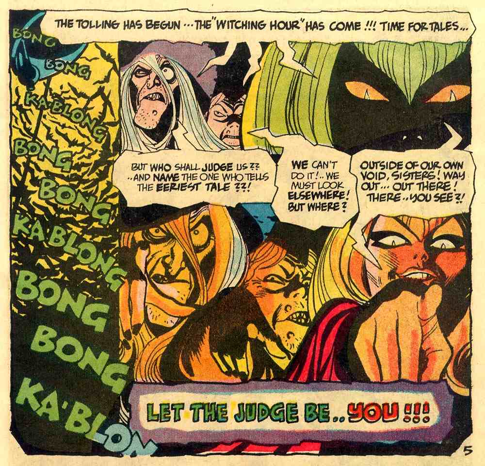
From The Witching Hour #1 (Feb. – March 1969), here’s the introduction to the issue/series as well as the second story, “Eternal Hour,” both with art by Alex Toth:


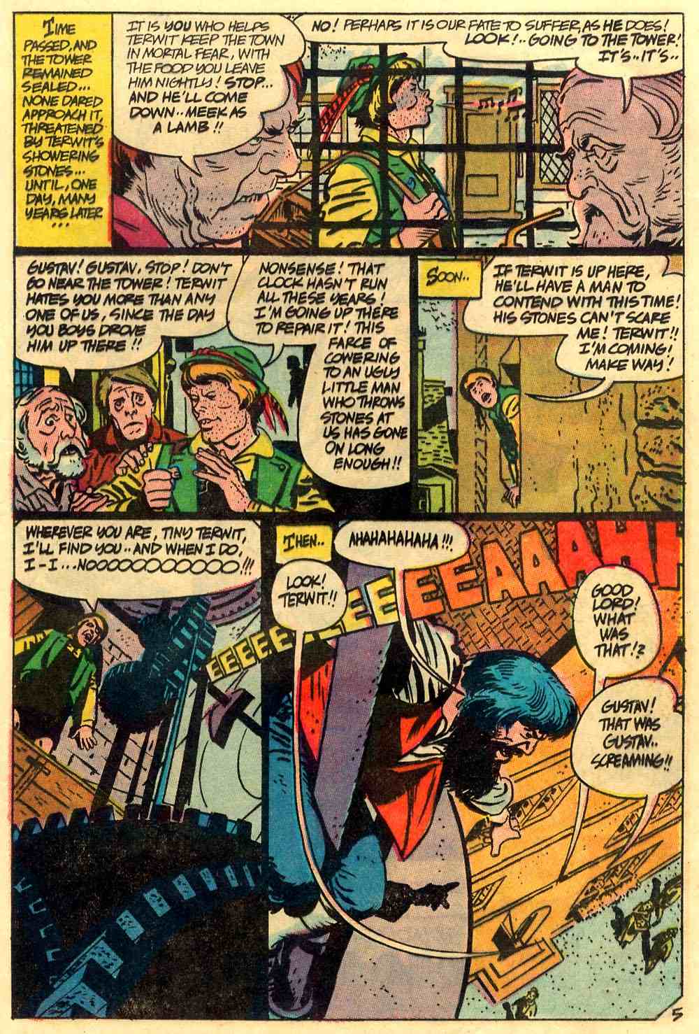
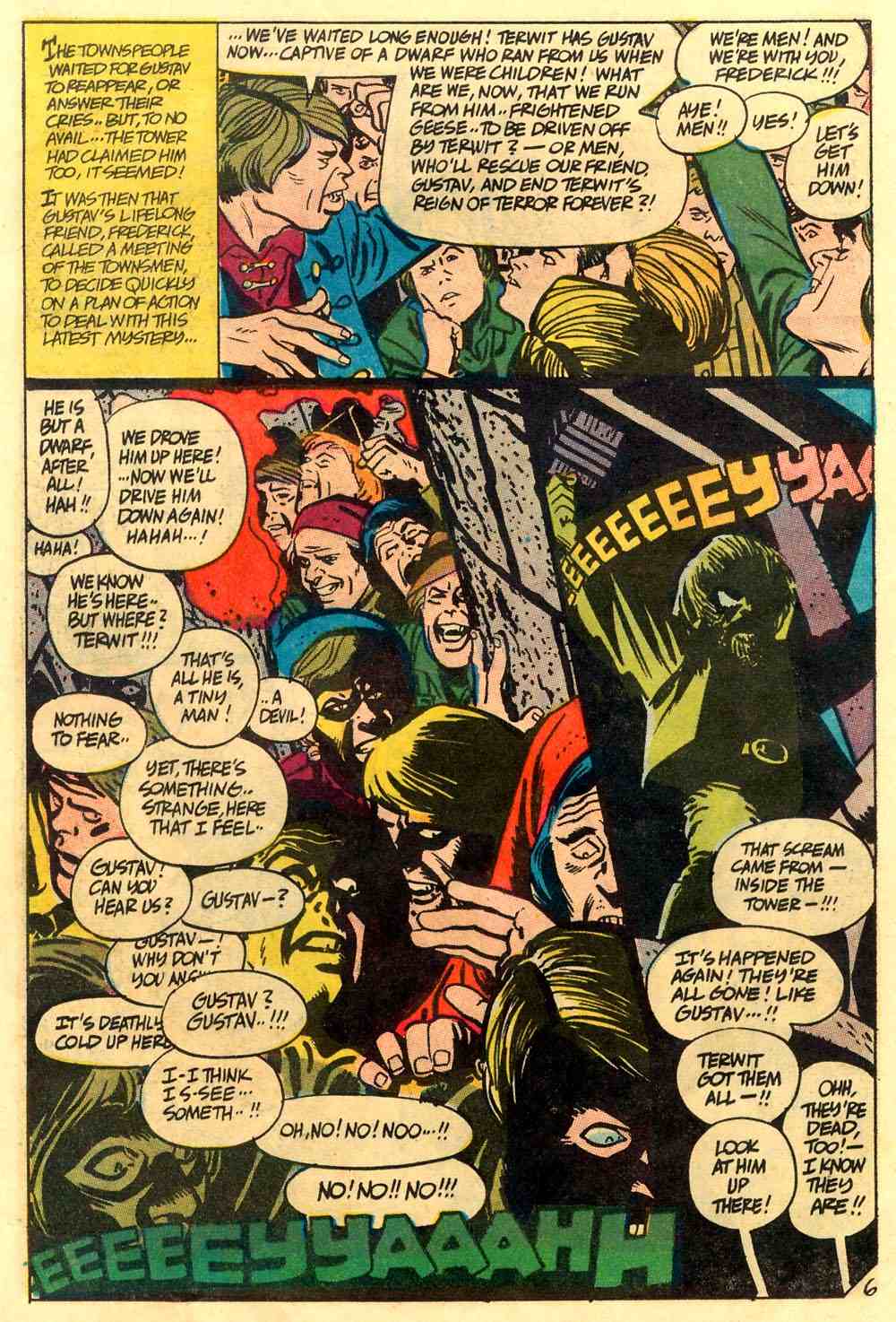

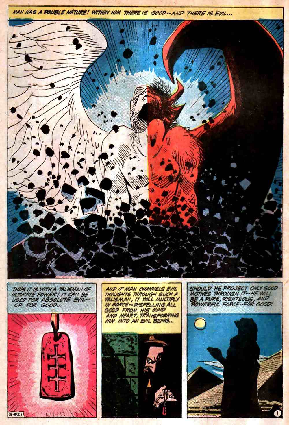
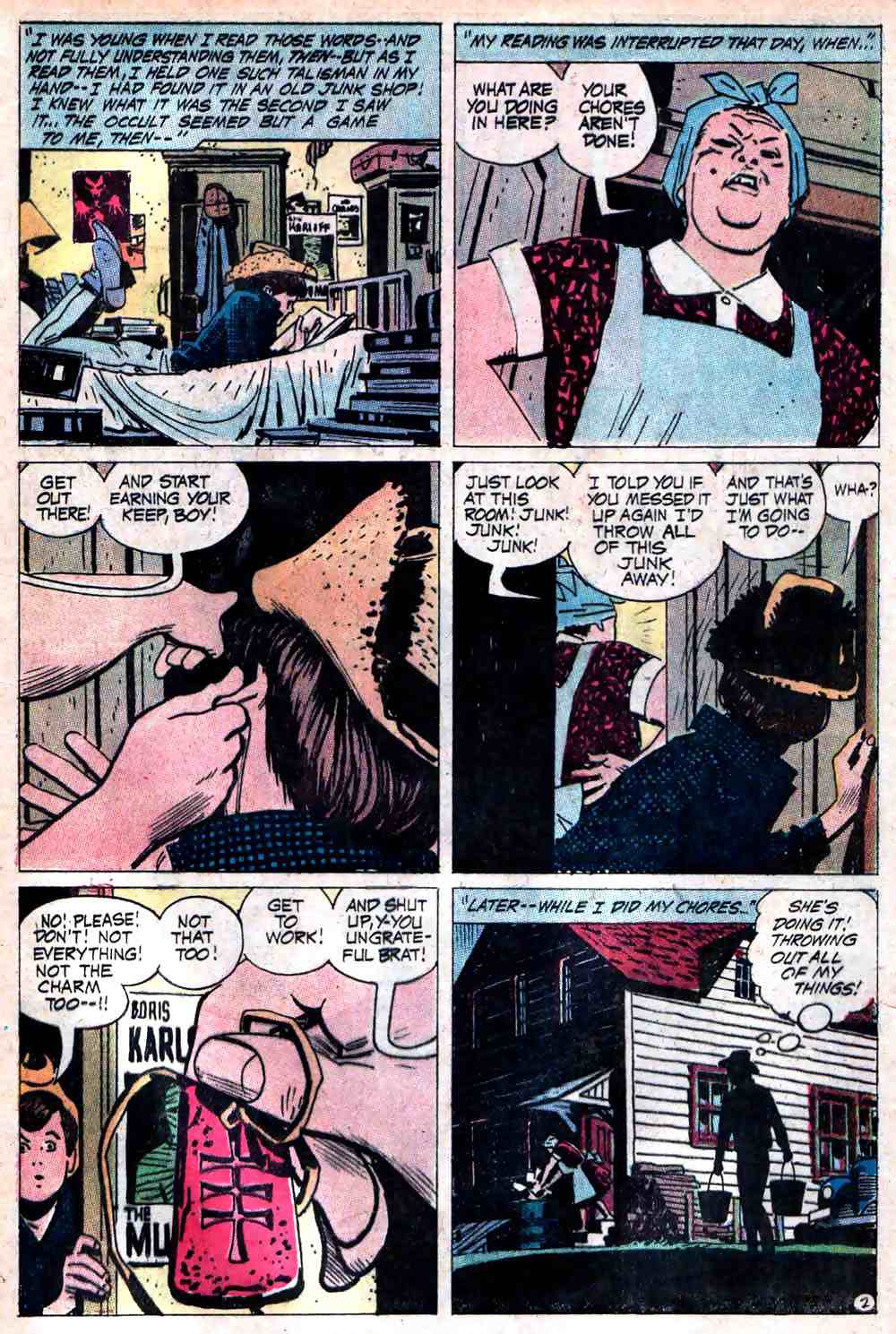
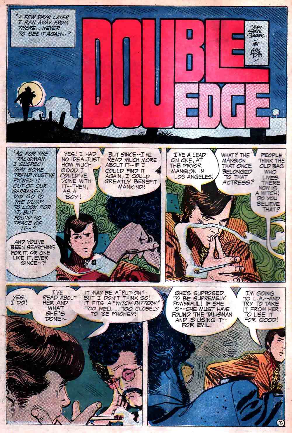
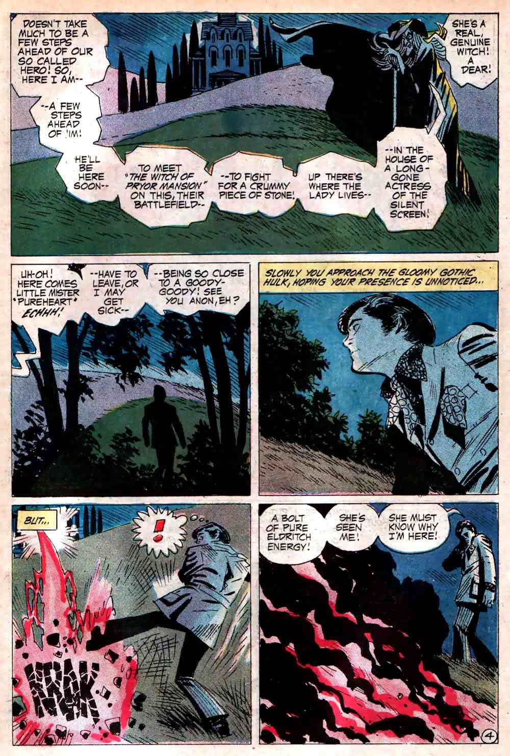
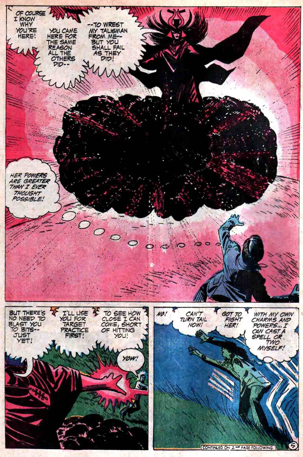
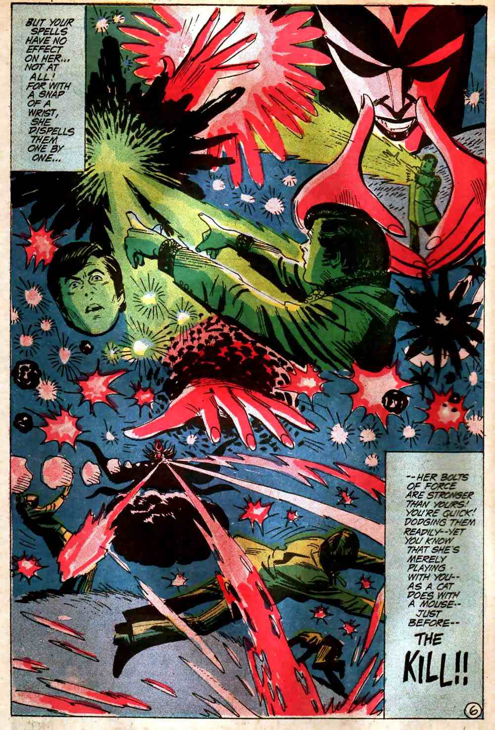
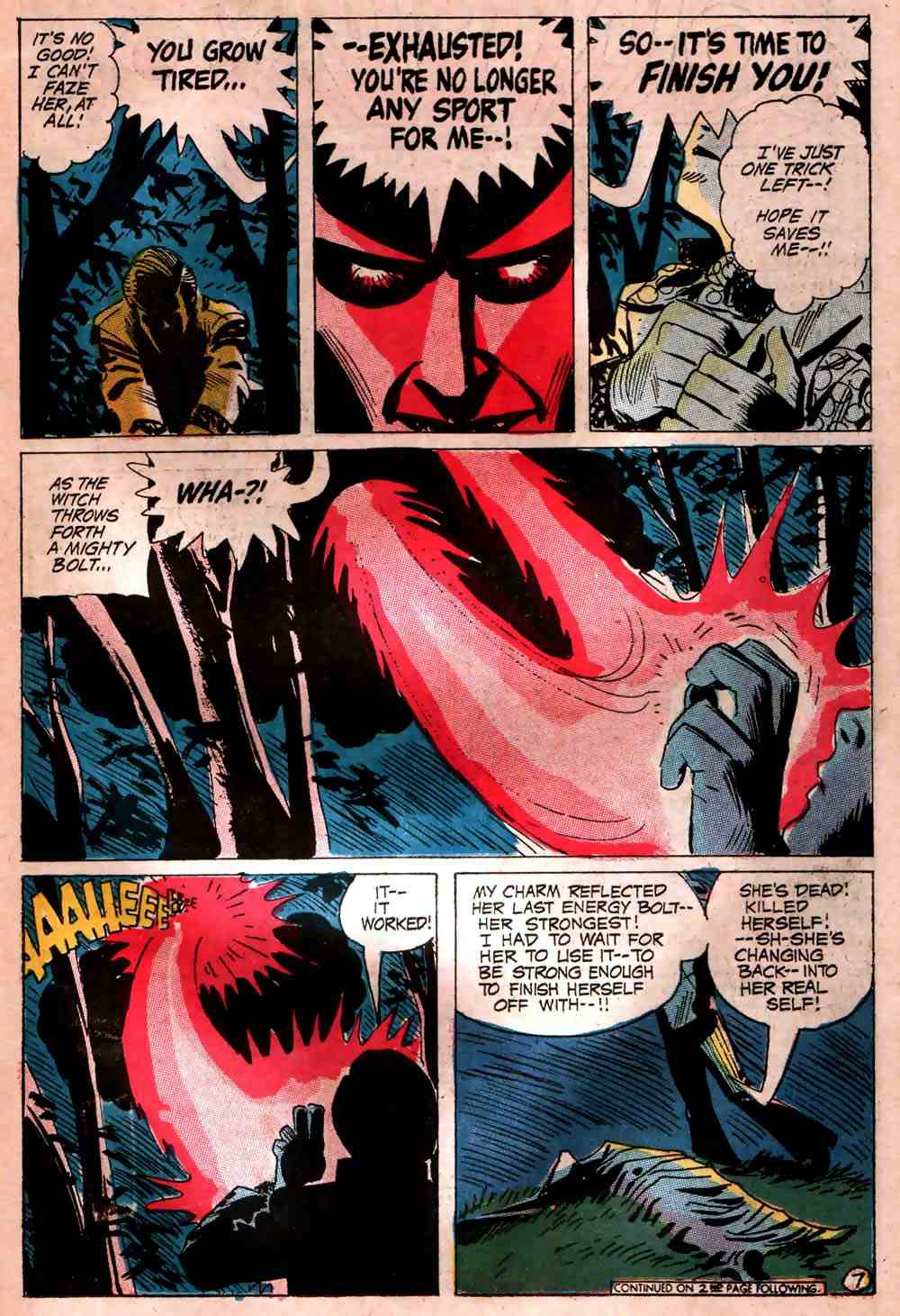
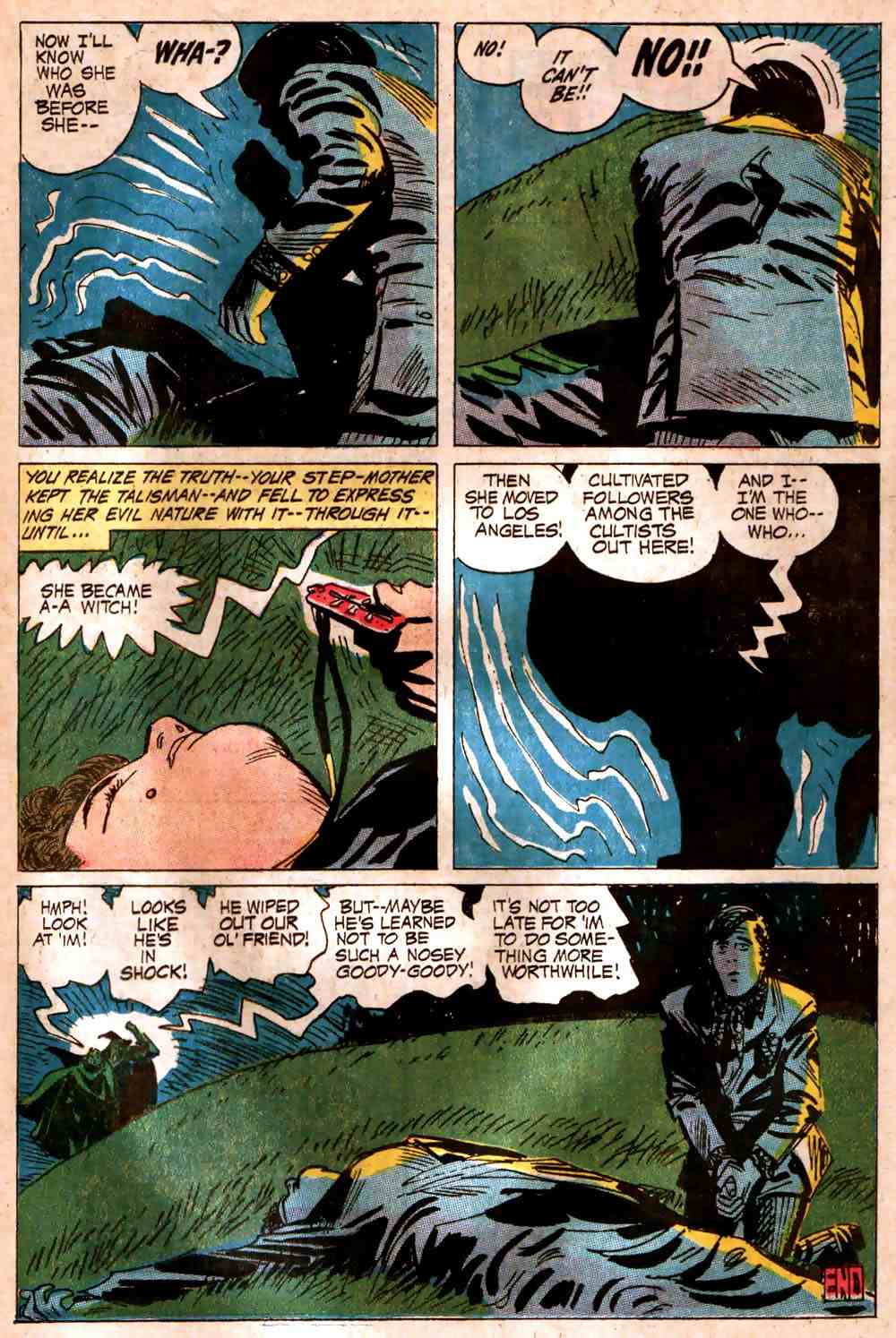
From The Witching Hour #12 (Dec.-Jan. 1970-71), here’s “Double Edge,” with story by Steve Skeates and art by Alex Toth; note that I’ve included the opening page of the issue, drawn by Toth, because it explains the witch-host’s appearance halfway through the story:
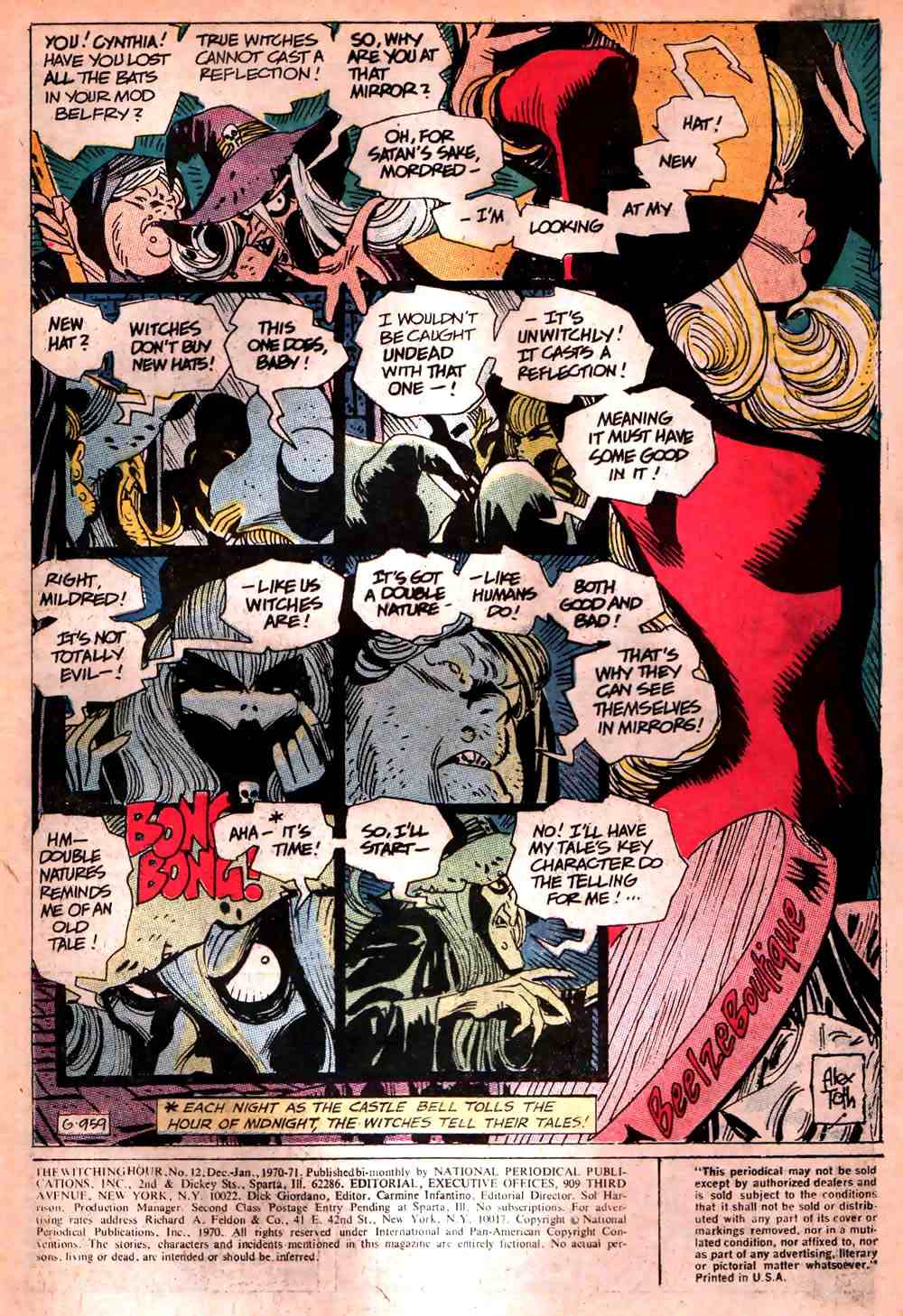


Notice the sizes of those two canvases. They’re tiny! But what they lack in size they more than make up for with their psychological acuity, sensitive design, painterly verve, and sheer presence.
BONUS LINKS:
In 2004, commercial illustrator turned fine artist and art teacher Milt Kobayashi gave a workshop in Scottsdale, Arizona, and allowed the organizers to photograph the five paintings he produced as demonstrations and post them on the Web. Here are the links: one (high res.), two (high res.), three (includes step-by-step photos; high res.), four (high res.), and five (high res.).
Artist Daily > The Oil Painting Blog > Oil Painting: Milt Kobayashi: Paint What You Want to See
With pencils by Jack Kirby and inks by Frank Giacoia:


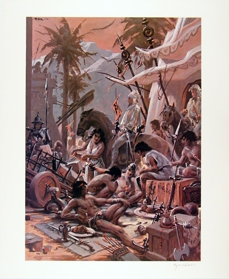
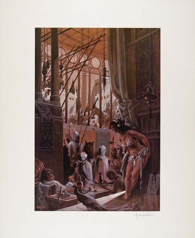
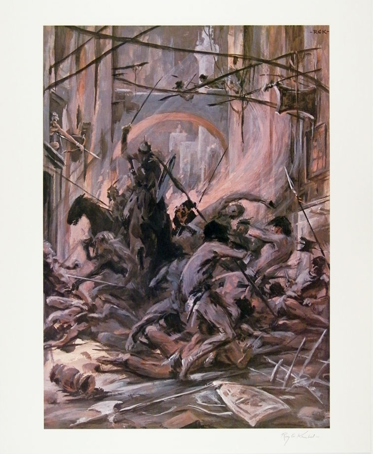
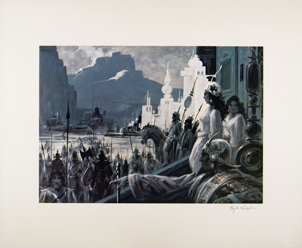
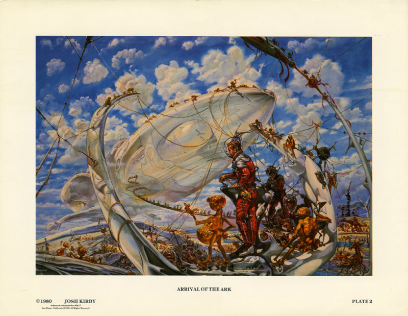
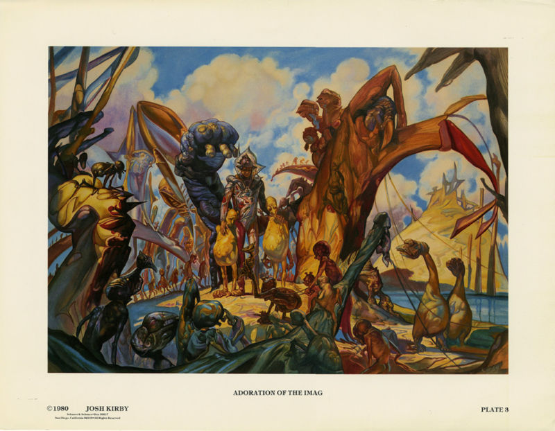
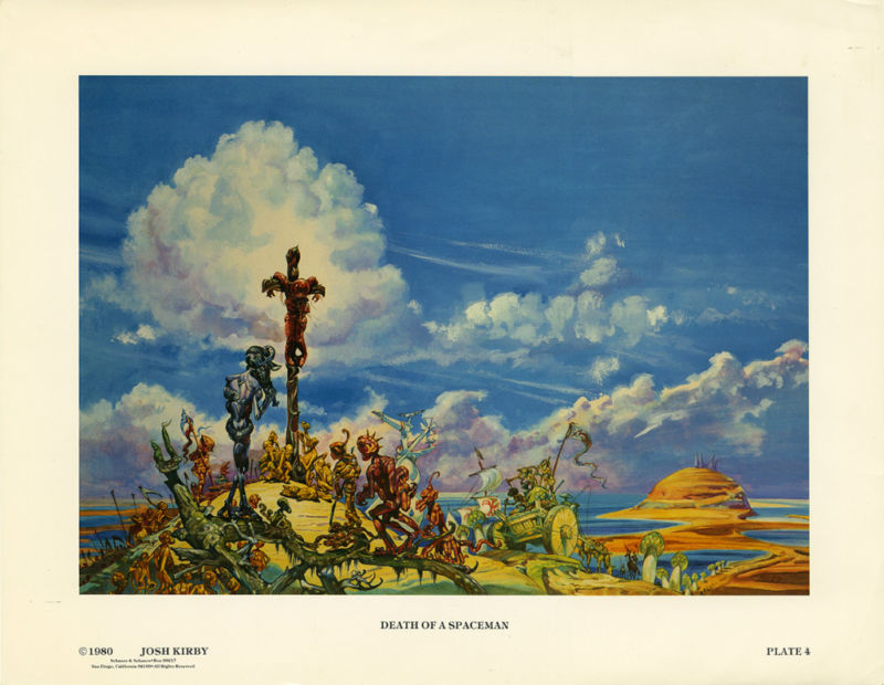
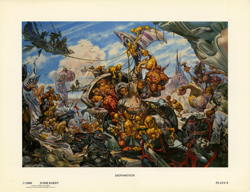
My guess is that the images reproduced in the following prints were originally painted by RGK in gouache on paper or illustration board:
[CLICK IMAGES TO ENLARGE]
Corben’s cover art for the debut album by Meat Loaf and Jim Steinman, Bat Out of Hell, is explosive, iconic, classic. And since Bat Out of Hell is one of the best-selling albums of all time, I suspect that a great many people would recognize Jason Brashill’s cover to Judge Dredd 1996 Mega-Special as a homage to it. Still, I am delighted that the magazine’s editors acknowledged, on the indicia page, that the front cover art is “after MEATLOAF: Bat Out of Hell”; I am disappointed, however, that they didn’t see fit to mention Corben by name. Because technically speaking, it’s Corben’s art alone that Jason Brashill’s work is “after”; the typographical choices of the designer of the Bat Out of Hell cover have been completely ignored.


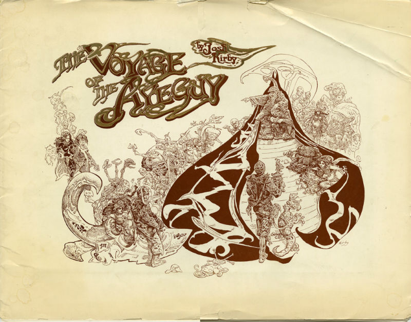
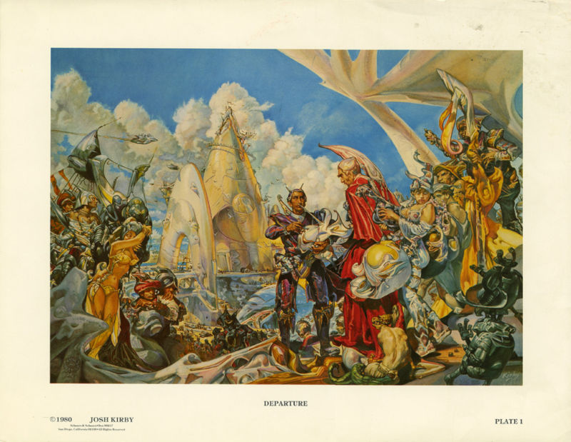
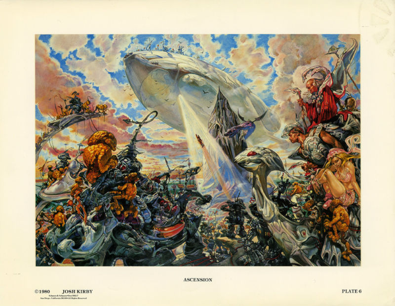
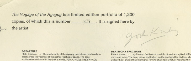
Over on the FLOG! Blog, Mike Baehr has posted to alert readers that Fantagraphics is selling a copy of the signed, limited-edition portfolio, The Voyage of the Ayeguy (1980), by Josh Kirby, via ebay. The portfolio is number 877 of 1,200. The starting bid is set at US$100; the auction ends on Sunday. If you bid and win, you’ll not only have the satisfaction of supporting a respected publishing house with a storied history but here’s what you’ll be able to add to your “print” collection:
UPDATE (08 June 2011):
I see that the “Voyage of the Ayeguy” portfolio didn’t sell the first time around; however, the good news for Josh Kirby fans on a tight budget is that it has now been relisted with a reduced starting bid of US$75.00. Are portfolios of this kind a good investment? I have no idea, though I must admit that I do own a number of them, including the Barry Windsor-Smith’s and Jeffrey Jones’s boxed Cygnus drawing portfolios, Jeffrey Jones’s “As a Child” and “World without End” portfolios, Barry Windsor-Smith’s “Fantastic Islands,” “Sibyla,” and “Excalibur” portfolios, Arthur Suydam’s “Mysterious World: The Art of Arthur Suydam,” Richard Corben’s “Scenes from the Magic Planet,” and Alex Nino’s “Fantasy Worlds.”
On 30 May 2011, I received a private message from Rotomago — co-creator, with the Serb artist Vuyacha, of a forthcoming graphic novel inspired by the pied piper of Hamelin, creator and maintainer of the Alberto Breccia Bibliografía, and a sometimes visitor to Ragged Claws Network — who made me an offer I couldn’t refuse. After confiding to me, in very personal and moving terms, his thoughts on the recent death of Jeffrey Catherine Jones, Rotomago wrote:
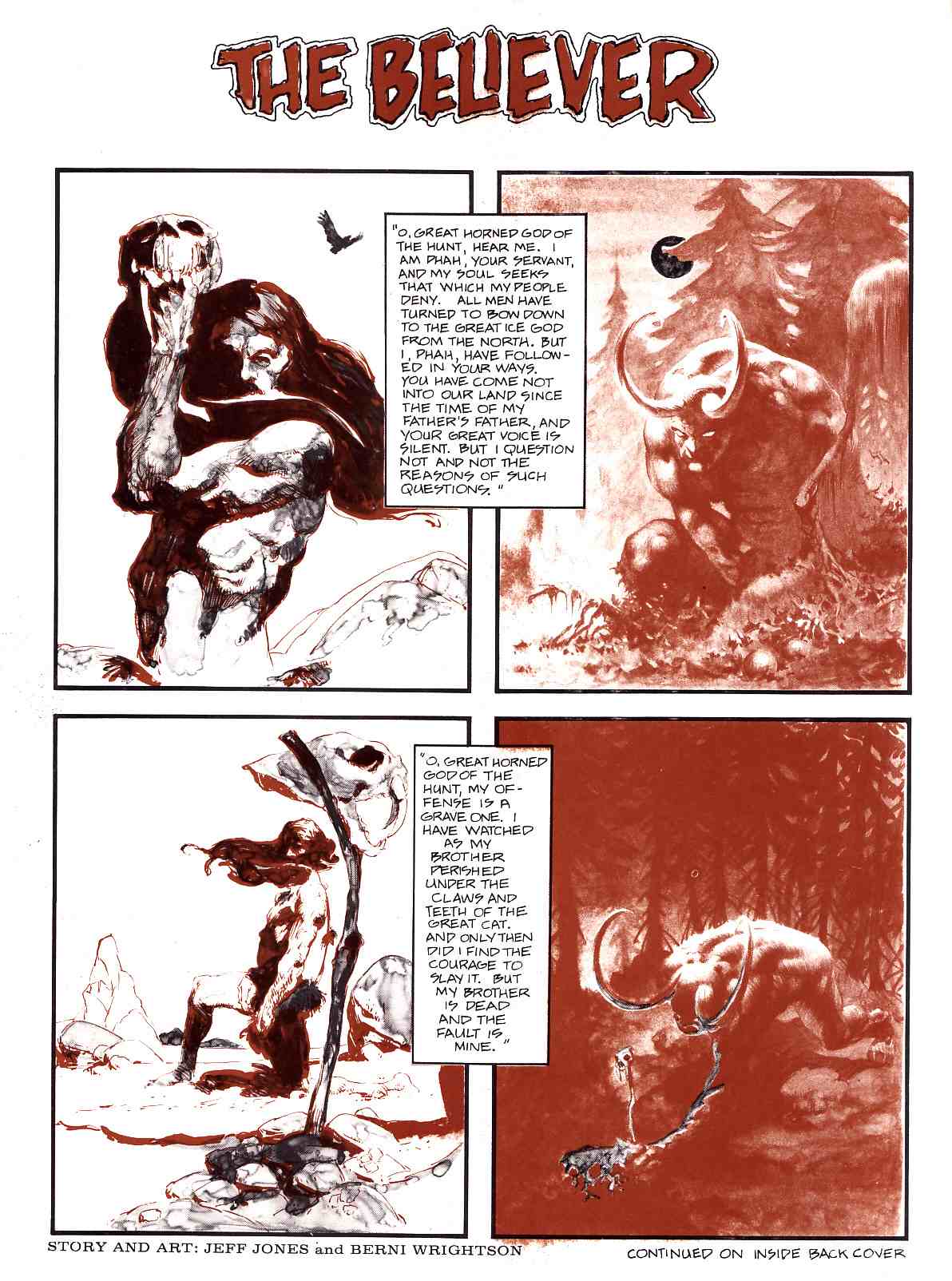
As a way to bring my little rock to the cenotaph, I have a curiosity you may like to put on your website. In the Jeff Jones site, the story THE BELIEVER by Jones and Wrightson is featured. It is mentioned that: «unfortunately the two colors were printed in reverse». The same version is reproduced in the recent book on Jones but it was published in an other way in France, in a four color process printing, in the magazine Special USA n°14/15 in June 1985.
So there it was, out of the blue: in tribute to Jeffrey Jones, a fellow I didn’t know and who didn’t know me wanted provide my blog with scans of “The Believer,” by Jeffrey Jones and Bernie Wrightson, as it was published in a French magazine in 1985, with the colours printed in a way that brought the piece more into line with the intentions of the artists.
I immediately accepted the offer. But it didn’t stop there. The next day, Rotomago emailed me another note, which read, in part, as follows:
Please wait one more day for the Believer. Since both versions are flawed, the original with reversed duotone, the French in four colors with an addition of blue and yellow, I’m actually building a third “virtual” one.
Since I hadn’t yet seen the French version, I had to take Rotomago’s word that it was flawed in some way, but I definitely was intrigued by the promise of a “virtual” version of the story. I did, however, email Rotomago to ask him, please, if he would, to send me the flawed French version as well as his new and improved version. I explained that my plan, hatched at that very moment, was to display the two versions that he would have in hand once he was done together with the original version, which I already had on display here at RCN, in a single post. I said I thought it would be instructive.
This morning, I received the files, and now here I am, ready to share them with you.
But please note: if you wish to share the “virtual” version of “The Believer” with others — I know I can’t stop you — I hope that you will acknowledge Rotomago as the wizard who has brought the story as close as it has ever been to the original intentions of Jones and Wrightson and perhaps even give credit to RCN as the source of the files. Or better yet, don’t just take the files and re-post them but instead simply link to this post.
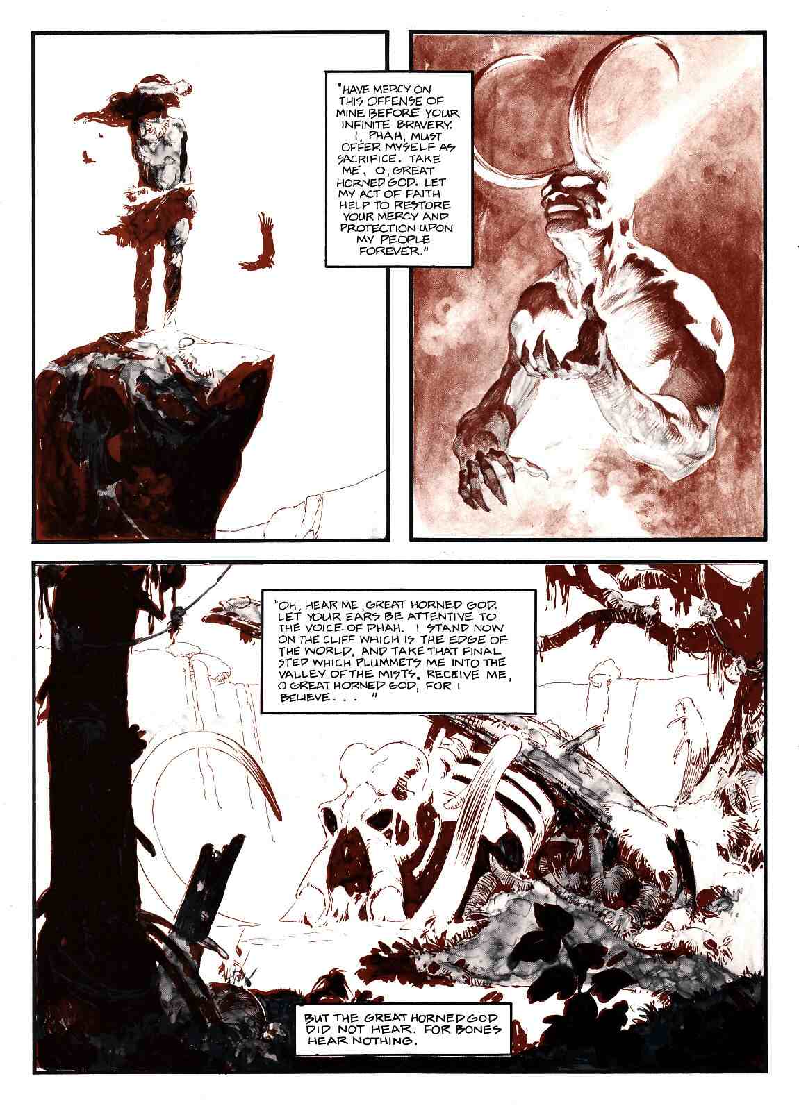
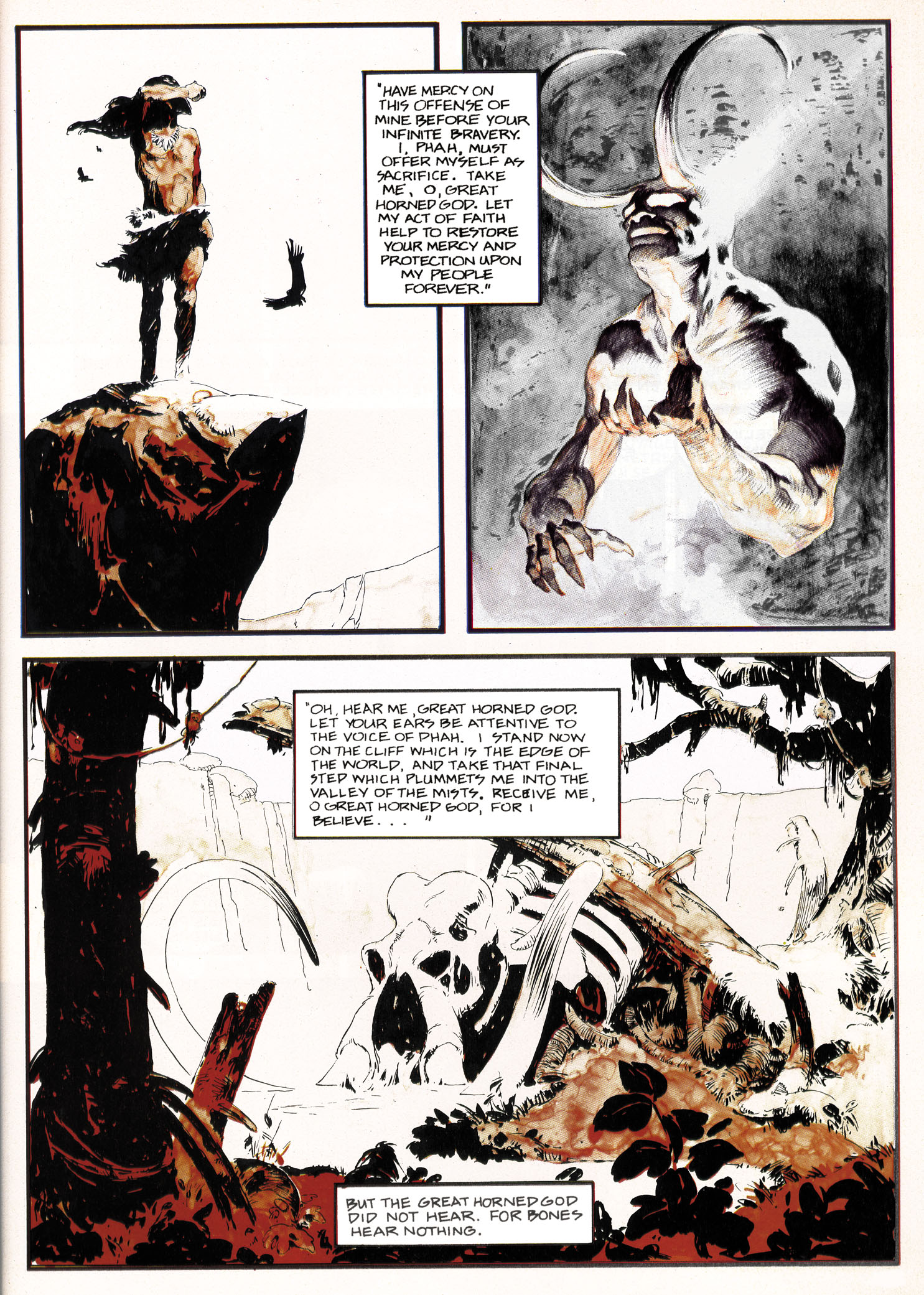
Anyway, that being said, let’s take (another) look at “The Believer” as it originally appeared on the inside-front and inside-back covers of Vampirella #33, way back in 1974; notice that, although most of the panels look okay despite the printing error, one panel in particular, the last panel on the first page, is extremely difficult to decipher:
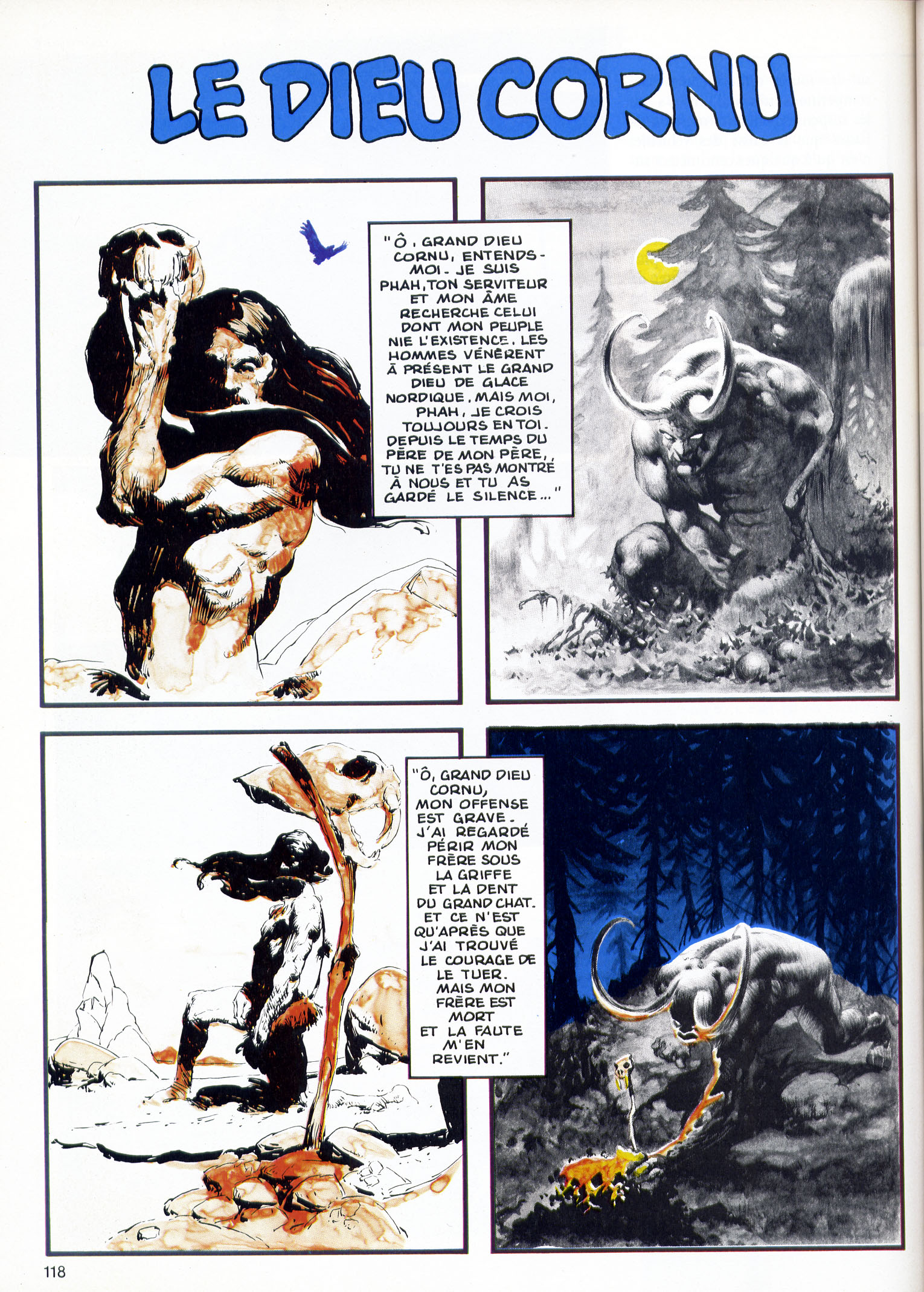
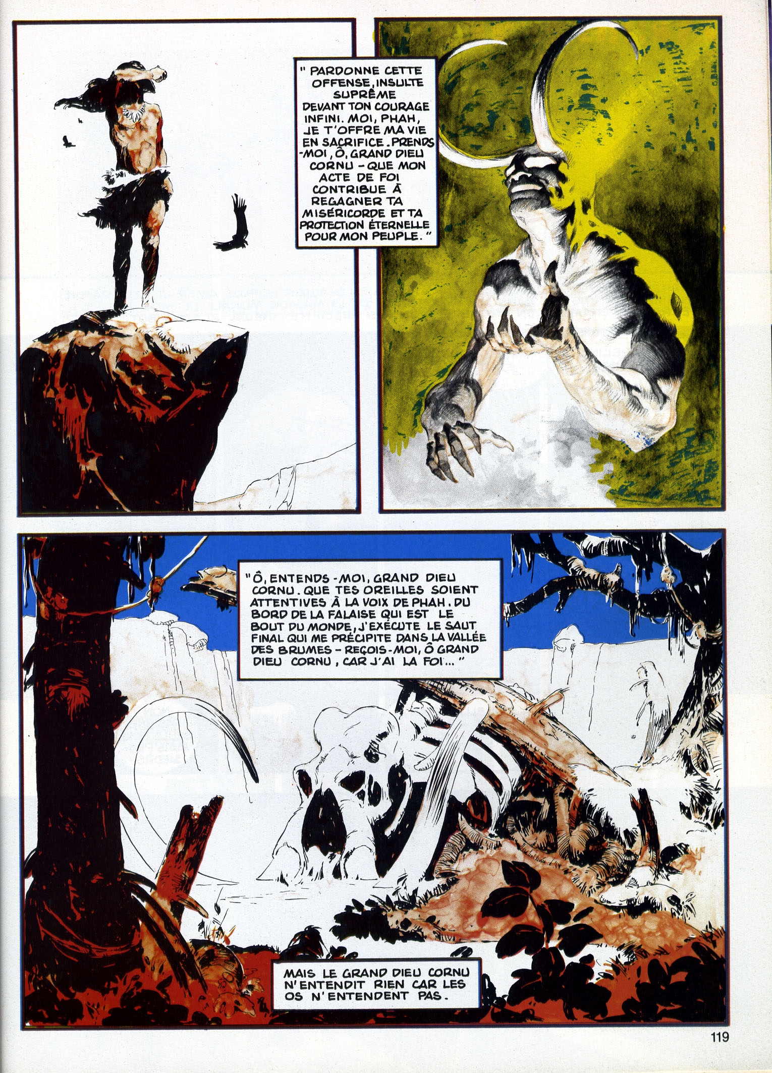
Next up is the version of “The Believer” that appeared, in French, in Special USA #14/15 in June 1985, just over ten years after the story’s original publication; notice that, with four colours at their disposal rather than two, the powers that be at Special USA took it upon themselves to tart up the art with obtrusive swatches of deep cerulean blue and acid yellow:
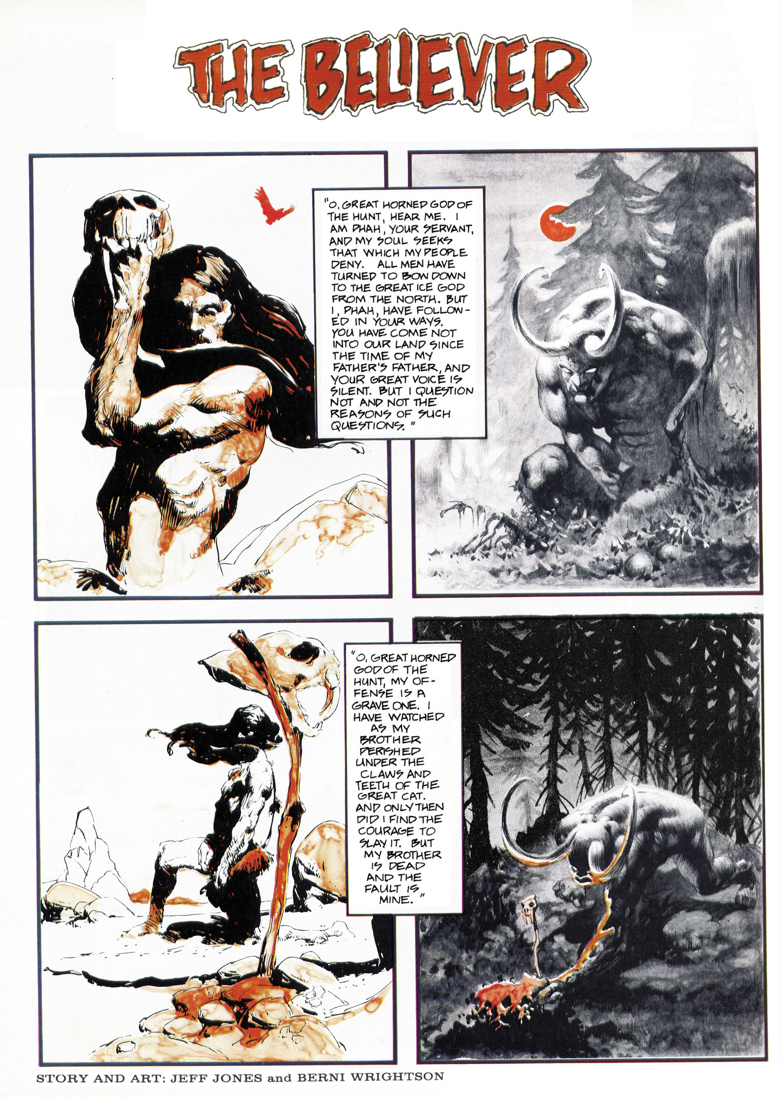
And now, at last, here’s Rotomago’s reconstruction of “The Believer,” with the colours as they ought to have been printed way back in 1974:
In the message that accompanied the files, Rotomago shared the following observations, which I will now share with you:
It surely would be feasible to make a decent reconstructed version fitted for publication. It would require multiple high-quality scans of both versions, a subtle balance of the colors layers, some alteration in the place of colors layers as the overlapping of colors is not always correct in the French version, a very long pixel by pixel cleansing (especially to remove the green stains [probably added by the French color engraver] in the background of Wrightson’s Page2 Panel2), as well as a slight increase in the size of pages to avoid blurring.
But for the web view, I hope that this far from perfect version, will do the job.
Note that after having spent some time studying these two pages on my screen, my fancy for them has even more increased! Such delicate and subtle pictures!
Although I, for one, sort of miss the fiery red-orange cast of Wrightson’s horned-god panels as they appeared in the original printing, I’m sure that fans of Jeffrey Jones and Bernie Wrightson will want to thank Rotomago for the terrific work he has done to reconstruct “The Believer” that should have been but wasn’t. But even if they don’t, I know that I personally want to thank him, again, for his surprising, unsolicited contribution to this site and for going the extra mile to enhance our appreciation of a story that many have admired over the years but none have seen reproduced in exactly this way before, ever.
Finally, one more time, here are the links to Rotomago’s blogs:
