"This day's experience, set in order, none of it left ragged or lying about, all of it gathered in like treasure and finished with, set aside." –Alice Munro, "What is Remembered"
From the paperback collection of yours truly, here are three covers with art by Stephen Miller, produced for a simultaneous six-volume reprint series of works by the great SF author, William Tenn, published by Ballantine Science Fiction back in 1968:
[CLICK IMAGES TO ENLARGE]
The other three books in the series have covers by Stephen Miller that are as good as — and in at least one instance, perhaps two, significantly better than — the covers I’ve posted above. Unfortunately, I don’t own those ones, but you can easily find scans of them on flickr if you’re interested.
Keywords:Of Men and Monsters, Of All Possible Worlds, The Square Root of Man.
I’ve been feeling really bogged down. It’s time, actually far past time, to move forward. So I’ve added all remaining art — Moby-Dick illustrations, first series of Heart of Darkness illustrations, miscellaneous monsters and other stuff — back to my Etsy shop one last time.
The art will remain available and for sale until the end of Sunday November 11, this year. After that, I will take what is left, give a few pieces to close personal friends and destroy the rest. I’ve done that in the past and that kind of creative destruction has always fuelled new avenues of creativity for me.
So that’s it. About two more weeks to get whatever pieces you may have had your eye on. Email me if you have any questions.
While I actually think Kish would be foolish to destroy his published artwork, especially if he intends to stick with illustration for the long haul, I have a feeling that, one way or the other, most of the unsold work will eventually find a home.
At the very least, I know I’ve been doing my part to save Kish’s originals from the fire. Let me explain…
As regular readers of RCN might remember, I bought a Moby-Dick collage from Matt Kish back in June of this year. At the time, because I admire Moby-Dick in Pictures as a whole, and the prices of the individual works of art were very reasonable, I considered buying more. Considered. But didn’t. For various reasons. And promptly moved on to other concerns. Until, that is, I read about Kish’s decision on his blog, at which point I scrambled back to the artist’s etsy shop and browsed through the remaining pieces, hoping that at least one or two of the originals that I had considered buying the first time around would still be available for purchase. Two were. So I bought them both.
And now I’m here for show and tell.
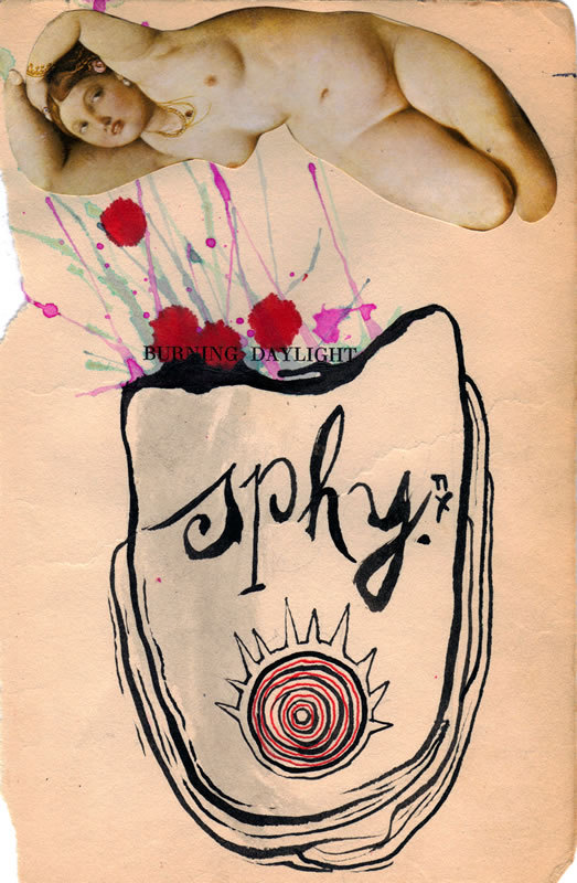
The first piece that I decided, this time around, to add to my wife’s and my collection of original art is Kish’s illustration in collage and ink, five inches wide by eight inches tall, for page 301 of the Signet Classic edition of Herman Melville’s Moby-Dick. Specifically, Kish’s image was inspired by the following passage: “…there, that blood-dripping head hung to the Pequod’s waist like the giant Holofernes’s from the girdle of Judith.” Melville’s description is obviously a play on the traditional metaphor of the ship as woman, so it’s no surprise that a woman — a curvaceous temptress clipped from a reproduction of Ingres’ The Turkish Bath (1862) — makes an appearance in Kish’s illustration, hovering at the top of the page like the Pequod bobbing on the ocean. Through the spatters of red and blue paint — blood and water — that connect the Pequod/Judith with the flabby, lifeless head of the whale/Holofernes, one notices the noun phrase “BURNING DAYLIGHT” imprinted on the “found paper” substrate. The phrase is there because the paper is the half title page — another (metaphorical) severed head — from an early edition of Jack London’s novel of the Yukon gold rush, Burning Daylight, but the words themselves also have symbolic significance (though I’m not going to work it out for you). Across the form of the head, the artist has scrawled in an elaborate script the letters “sphy,” followed by a period, which seems enigmatic until you realize that it is simply an abbreviation of the title of the chapter — “The Sphynx” (notice that the “nx” is stacked vertically after the period: cheeky!) — which, in turn, is a reference to how Captain Ahab views the whale’s severed head. In fact, on the very next page, Ahab himself gives us his thoughts on the matter in an amazing soliloquy:
It was a black and hooded head; and hanging there in the midst of so intense a calm, it seemed the Sphynx’s in the desert. “Speak, thou vast and venerable head,” muttered Ahab, “which, though ungarnished with a beard, yet here and there lookest hoary with mosses; speak, mighty head, and tell us the secret thing that is in thee. Of all divers, thou hast dived the deepest. That head upon which the upper sun now gleams, has moved amid this world’s foundations. Where unrecorded names and navies rust, and untold hopes and anchors rot; where in her murderous hold this frigate earth is ballasted with bones of millions of the drowned; there, in that awful water-land, there was thy most familiar home. Thou hast been where bell or diver never went; hast slept by many a sailor’s side, where sleepless mothers would give their lives to lay them down. Thou saw’st the locked lovers when leaping from their flaming ship; heart to heart they sank beneath the exulting wave; true to each other, when heaven seemed false to them. Thou saw’st the murdered mate when tossed by pirates from the midnight deck; for hours he fell into the deeper midnight of the insatiate maw; and his murderers still sailed on unharmed – while swift lightnings shivered the neighboring ship that would have borne a righteous husband to outstretched, longing arms. O head! thou hast seen enough to split the planets and make an infidel of Abraham, and not one syllable is thine!” [p. 302]
Anyway, I think that’s enough from me about the image. Take a look for yourself and see what you think:
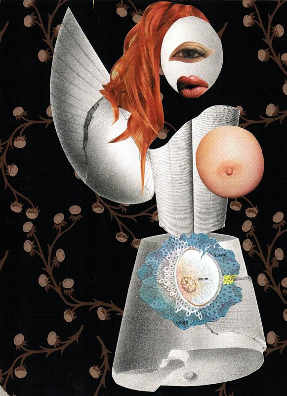
The second piece that I selected is Kish’s illustration, eight inches wide by eleven inches high, for page 384 of Melville’s famous novel. As with the first piece, Kish was inspired by a specific passage — in this case, part of a speech delivered in a court of law by a famous defence counsellor, “the witty Erskine,” who attempts to use a dispute between a husband and the wife that he abandoned and later attempted, unsuccessfully, to reclaim (even though she had by then remarried), as precedent in support of his (Mr. Erskine’s) contention that property that was lost at sea in unusual circumstances by one whaling ship and then claimed as salvage by another ought not to be returned to the original owners but instead ought to be recognized as the legal property of the salvagers. The passage, which Melville clearly wrote with his tongue planted firmly in his cheek, reads as follows: “…though the gentleman had originally harpooned the lady, and had once had her fast, and only by reason of the great stress of her plunging viciousness, had at last abandoned her; yet abandon her he did, so that she became a loose-fish….” In Kish’s visual interpretation of the lawyer’s colourful analogy, the lady takes on a form that is part human being and part one-eyed, one-winged mythological beast, part woman and part white whale, part flame-haired seductress and part one-breasted Amazonian warrior:
In the uterus of the woman/whale/warrior — or is she a (fallen) angel? — visible right through the surface of her white dress/skin/armour, an ovum awaits the arrival of the several sperm that, presumably, will compete to fertilize it. What is the meaning of this? I could hazard a guess… but instead, I think I’ll just let you puzzle it out for yourself…
BONUS IMAGES (added 11 April 2013):
Just realized that I forgot to add two other Moby-Dick pictures by Matt Kish that my wife and I have in our art collection:
[CLICK IMAGES TO ENLARGE]
ABOVE: “In some particulars, perhaps, the most imposing physiognomical view to be had of the Sperm Whale, is that of the full front of his head. This aspect is sublime.”
ABOVE: “Then come out those fiery effulgences, infernally superb; then the evil-blazing diamond, once the divinest symbol of the crystal skies, looks like some crown-jewel stolen from the King of Hell.”
Although I had emailed Matt near the end of his art sale to inquire about the two paintings displayed above — they are paintings that I definitely thought should be preserved for posterity — I want to emphasize, without revealing too much, that the way that the artwork eventually ended up in our collection was totally unexpected and really rather heartwarming…
Have I mentioned that Matt Kish is a mensch? In another online context, I know I have, but it definitely bears repeating: Matt Kish is a mensch!
AND ANOTHER (added a bit later):
ABOVE: Max Ernst, The Chinese Nightingale (1920), photomontage, 8.8 x 12.2 cm.
Think furry fetishism is a twenty-first century innovation in sex? Think again…
[CLICK IMAGES TO ENLARGE]
As is usually the case with the fantasy and SF paperback covers that I post, I myself created the above image from my very own copy of James Broom Lynne’s novel.
And lest you think I am nearing the end of my supply of paperbacks with covers by Jeffrey Jones, let me assure you that I have enough for several more posts, at least.
Yeah, I know… there’s probably no direct connection between Ted CoConis’s stunning illustration for the cover of Vladimir Nabokov’s Ada and H. Rogers’ more workmanlike effort for Ernest Tidyman’s Shaft among the Jews — some design ideas are just “in the air” at certain points in history — but it is amusing to me that the cover of Nabokov’s daring and erudite literary novel, a novel which a reviewer for the New York Times described as “a love story, an erotic masterpiece, a philosophical investigation into the nature of time,” is several orders of magnitude sexier than the cover of a pulp fiction featuring “the black private dick that’s a sex machine to all the chicks.” Thus, this post:
[CLICK IMAGES TO ENLARGE]
Ted CoConis has a JPEG of his Ada cover illustration, sans text, on display on his website. Look there!
BONUS SCAN:
The photographic cover of the movie tie-in edition of Shaft is evocative, I guess. And since I own it, I might as well scan and post it, right?
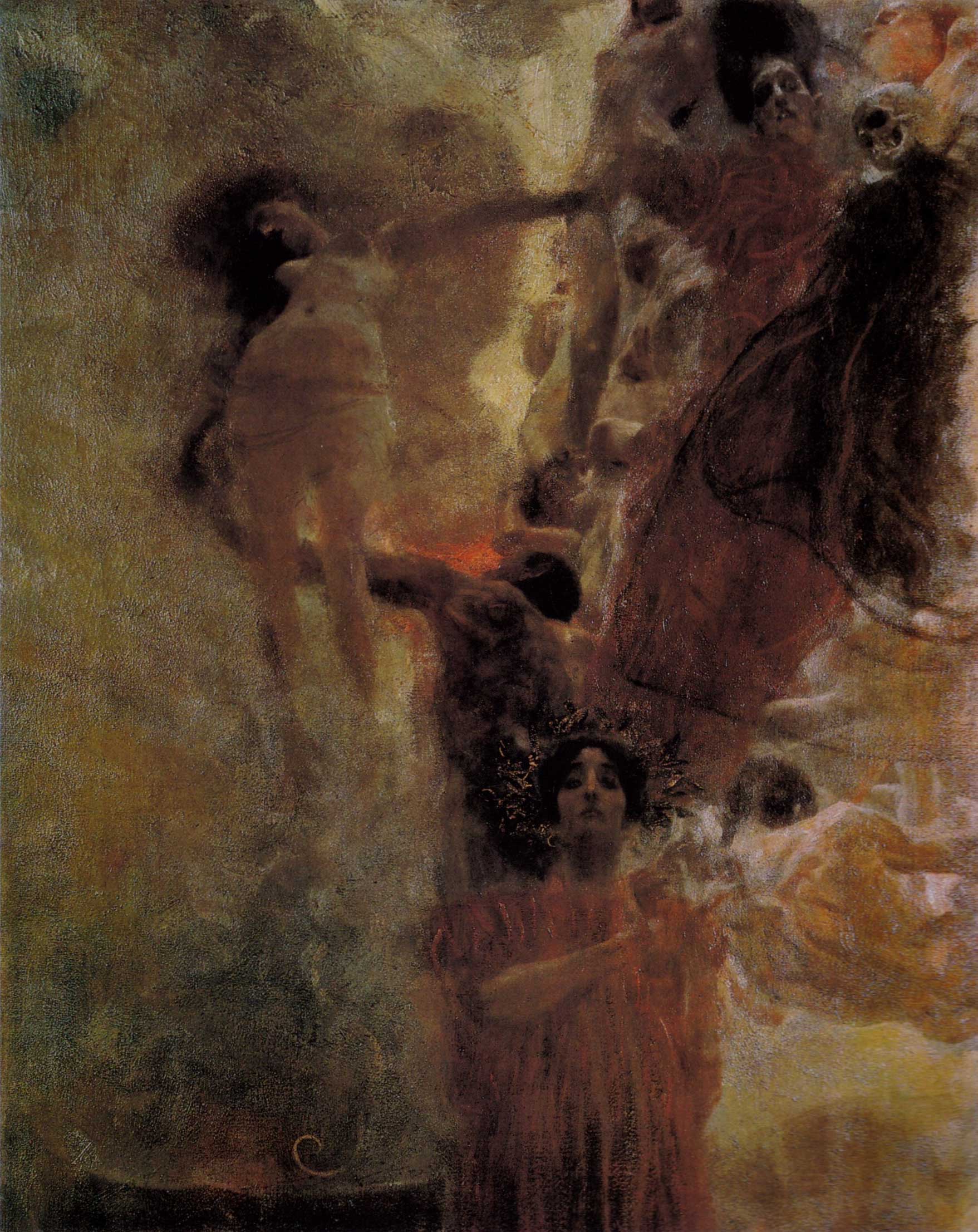
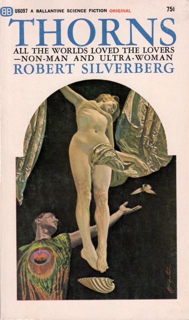
Now, that’s a very strong cover, no doubt, but I think that anyone who is familiar with the work of Gustav Klimt will tell you that the composition of Foster’s illustration owes a clear debt to Klimt’s Medicine (1901), a large-scale ceiling painting that was destroyed in a fire started by the Nazis and is known to us only by a black-and-white photograph of the finished work and a small colour preliminary:
ABOVE: Gustav Klimt, Medicine (1900 – 1907), oil on canvas, 300 x 430 cm. Destroyed by fire in 1945.
ABOVE: Gustav Klimt, Medicine colour preliminary painting (1897 – 98), oil on canvas, 72 x 50 cm.
Although at first glance you might be tempted to conclude that, in addition to being inspired by Klimt’s composition, Foster flat-out swiped the figure of the woman suspended in space in the upper-left-hand quadrant of Klimt’s painting, I think a closer comparison of the two figures suggests that what Foster actually did was hire his own model and instruct her to strike a pose similar to one Klimt chose for his model.
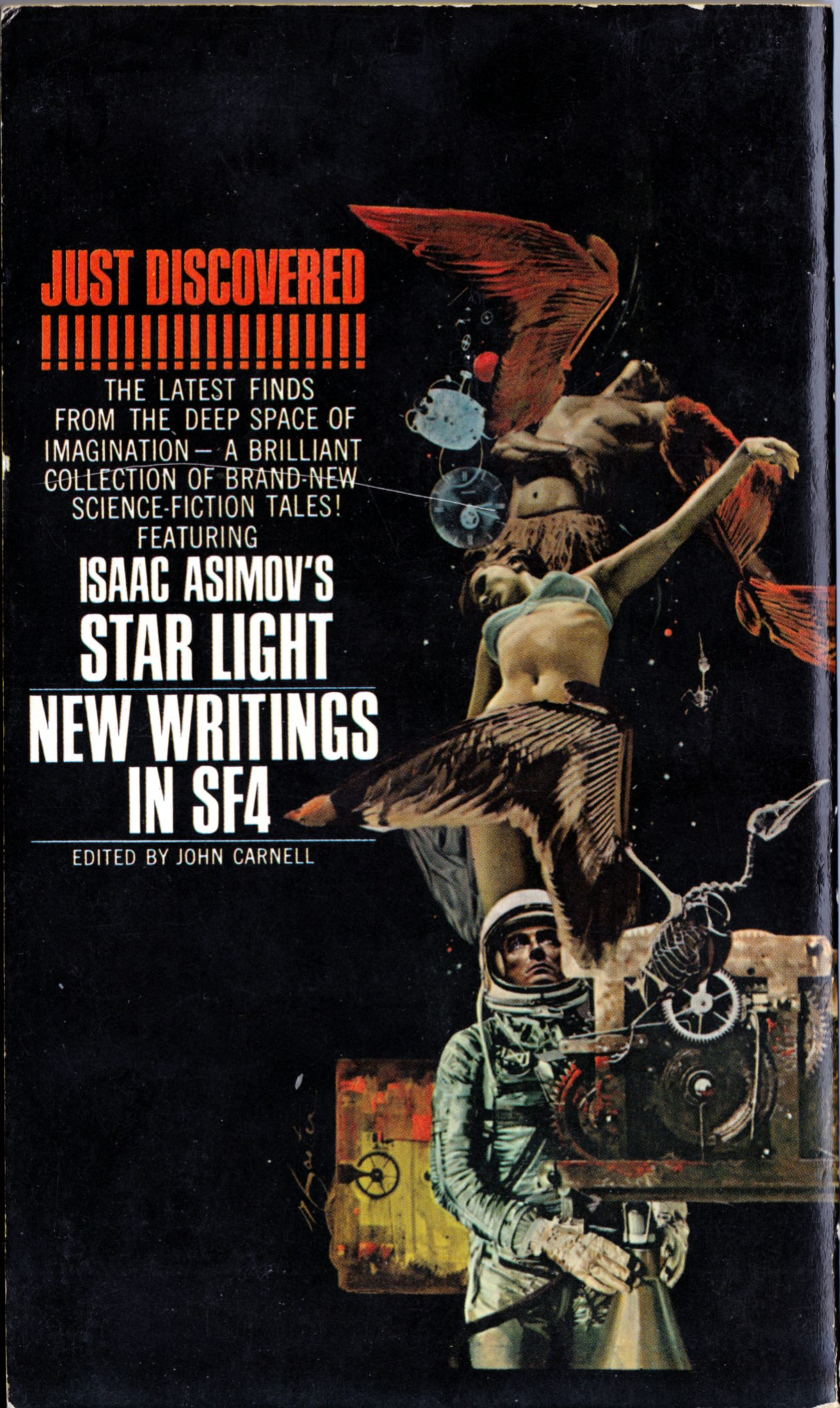
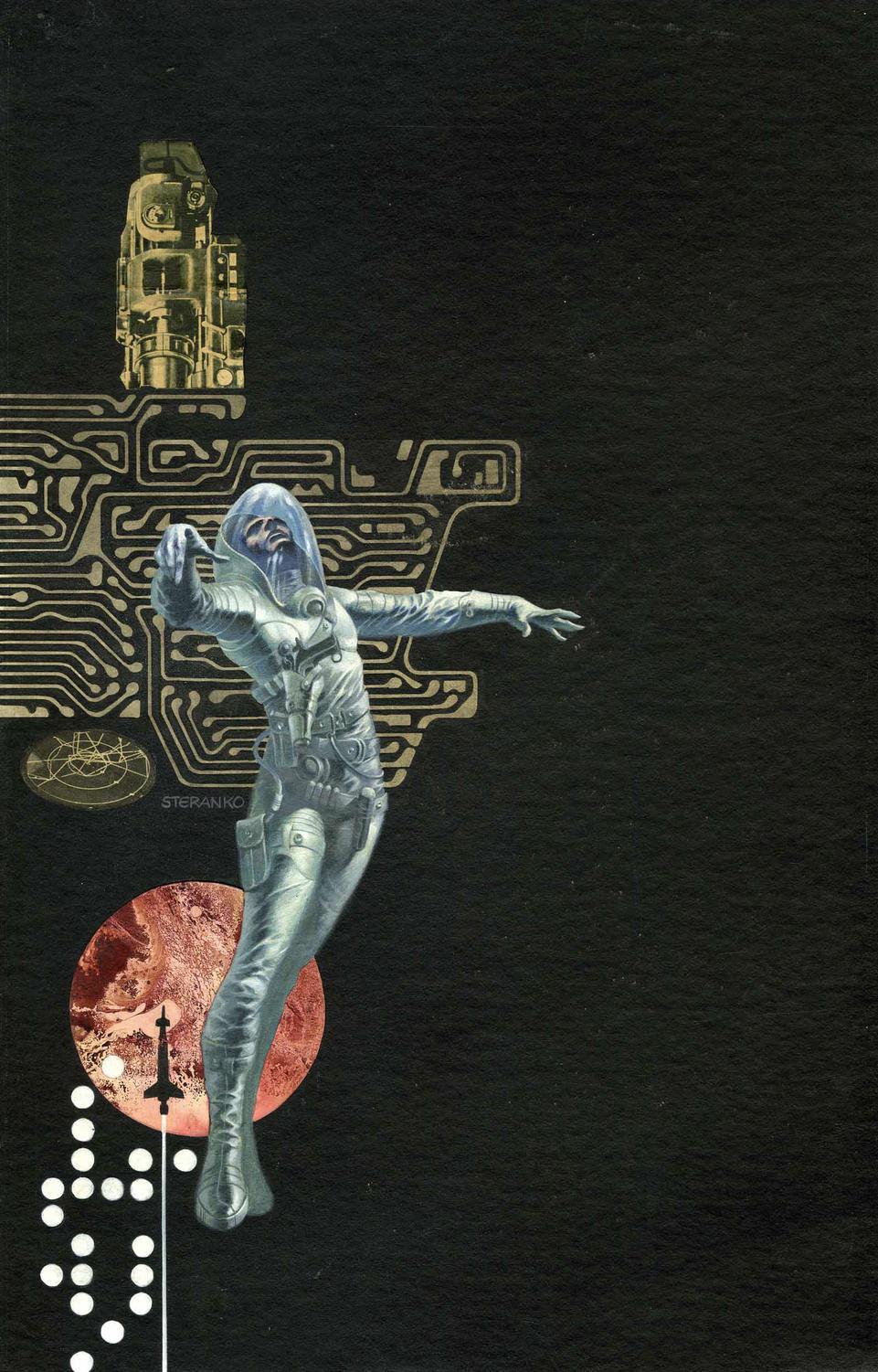
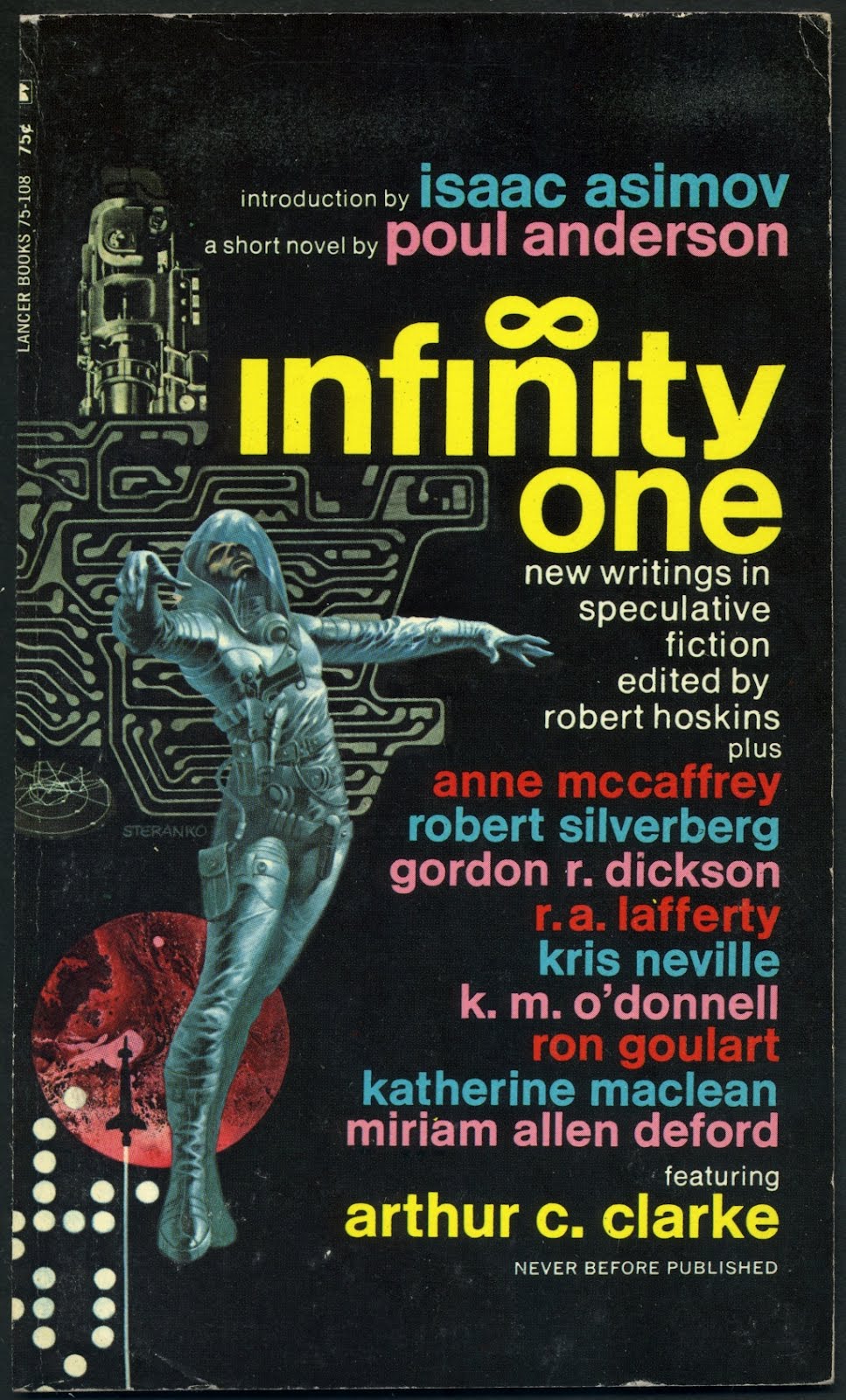
Just came across an illustration (with collage elements) by Jim Steranko, published in 1970, that obviously shares a strong family resemblance with the cover illustration by Foster, published in 1968, featured above:
Went to a church rummage sale yesterday. Picked up three LPs and a small stack of paperbacks, including three with covers by Paul Lehr. Scanned the Lehr covers a few minutes ago. Uploaded the JPEGs to RCN. Typed a few lines of nonsense. Published the post. Tweeted the link. Sat back and admired my busywork.
I purchased The Point Man by Stephen Englehart for three bucks from a local seller of used books last weekend, and not because the author is a well-known comics writer. No, the reason I bought the book is because the cover art is by Richard Corben, and although the painting is, frankly, not one of his best efforts, I’m enough of a Corben collector that I couldn’t pass it up. Of course, the fact that the book is a first edition, and in great condition, was also a factor…
Here’s another “treasure” from the library of yours truly. As far as I am aware, the painting on the cover of Devil Soul has not been reproduced in any form in any collection of the work of Jeffrey Jones published to date. Enjoy!
[CLICK IMAGE TO ENLARGE]
As you can see, my copy of the novel is truly in excellent condition! It makes me happy just to know it is on my bookshelf. Is this what people mean when they talk about “pride of ownership”?
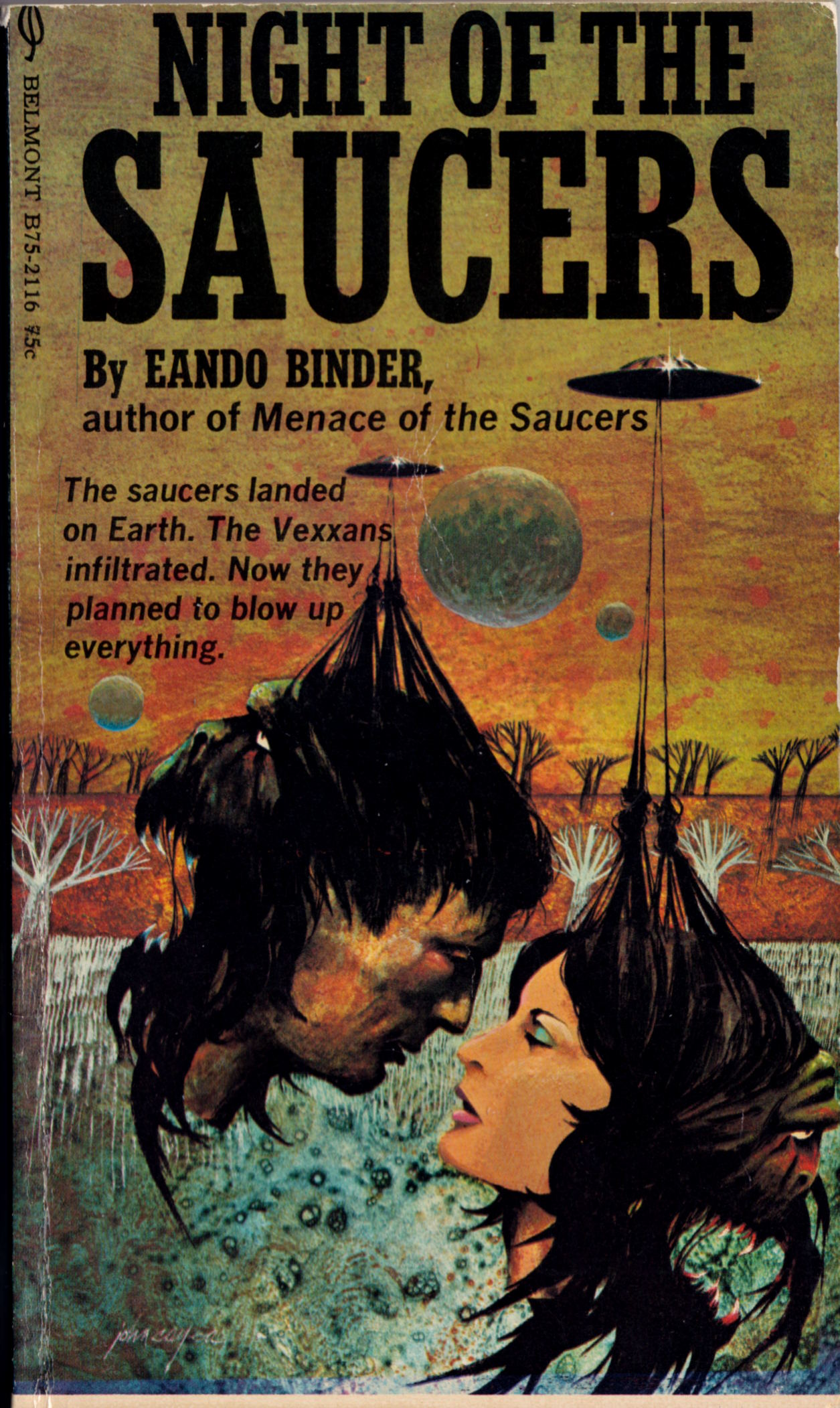
Before today, I had never heard the name John Cayea, but thanks to the Internet Speculative Fiction Database (ISFDB), I was quickly able to find out that Cayea created the expressive but bizarre art featured on the cover of Eando Binder’s Night of the Saucers, which I purchased earlier this morning for a dollar and four cents:
[CLICK IMAGES TO ENLARGE]
One’s first impression of the above cover is of an attractive human couple about to kiss, but closer inspection reveals that what we’ve got here are two severed heads, each of which is suspended from a flying saucer by lines lashed to its hair. And what’s more, each dead head has not one but two faces, one human and the other bestial, that look in opposite directions like the two faces of the Roman god Janus. Judging from the copy on the back cover, I would venture to guess that image is intended to convey the idea of hidden identities, of aliens masquerading as humans, or maybe aliens as the puppeteers of human hosts, although I must admit that don’t intend to read the book any time soon to find out for sure. I just sampled a couple of pages at random and that’s quite enough for me: the writing is dreadful.
Anyway… turns out that Night of the Saucers, published in 1971, is the earliest listing for Cayea in the ISFDB; the latest is his Bosch-inspired cover for Stephen King’s The Stand, published in 1990. Since I can’t find any earlier work by Cayea on any other sites, I’m going to go out on a limb here and say that Night of the Saucers was (probably) one of the first cover illustration jobs of John Cayea’s career, and as such, I’d say it was a fine effort.
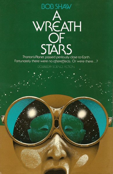
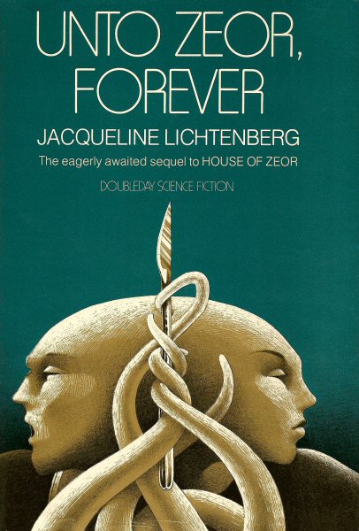
ISFDB has a small selection of covers with art by Cayea, published between 1971 and 1980 (although someone should tell the site admin that not all of them display properly). What one notices immediately as one browses through the images is that Cayea’s later covers are quite far removed, both technically and stylistically, from the cover displayed above; in fact, if one didn’t know better, one might think they were done by a different artist. To give you an idea of what I am going to call Cayea’s “mature style,” here are three of the best that ISFDB has to offer:
My favourite of the three is the cover of A Wreath of Stars — excellent work!
Keywords:Night of the Saucers, Deus Irae, A Wreath of Stars, Unto Zeor, Forever.