"This day's experience, set in order, none of it left ragged or lying about, all of it gathered in like treasure and finished with, set aside." –Alice Munro, "What is Remembered"
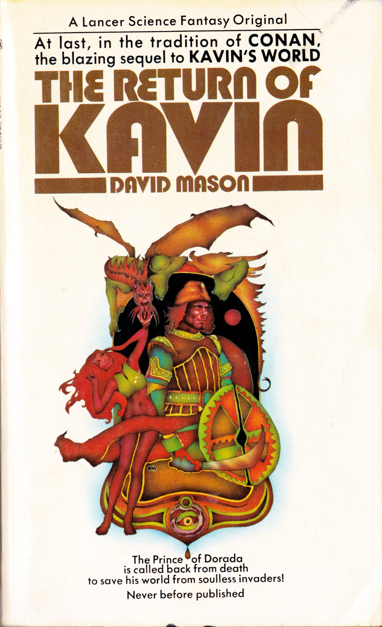
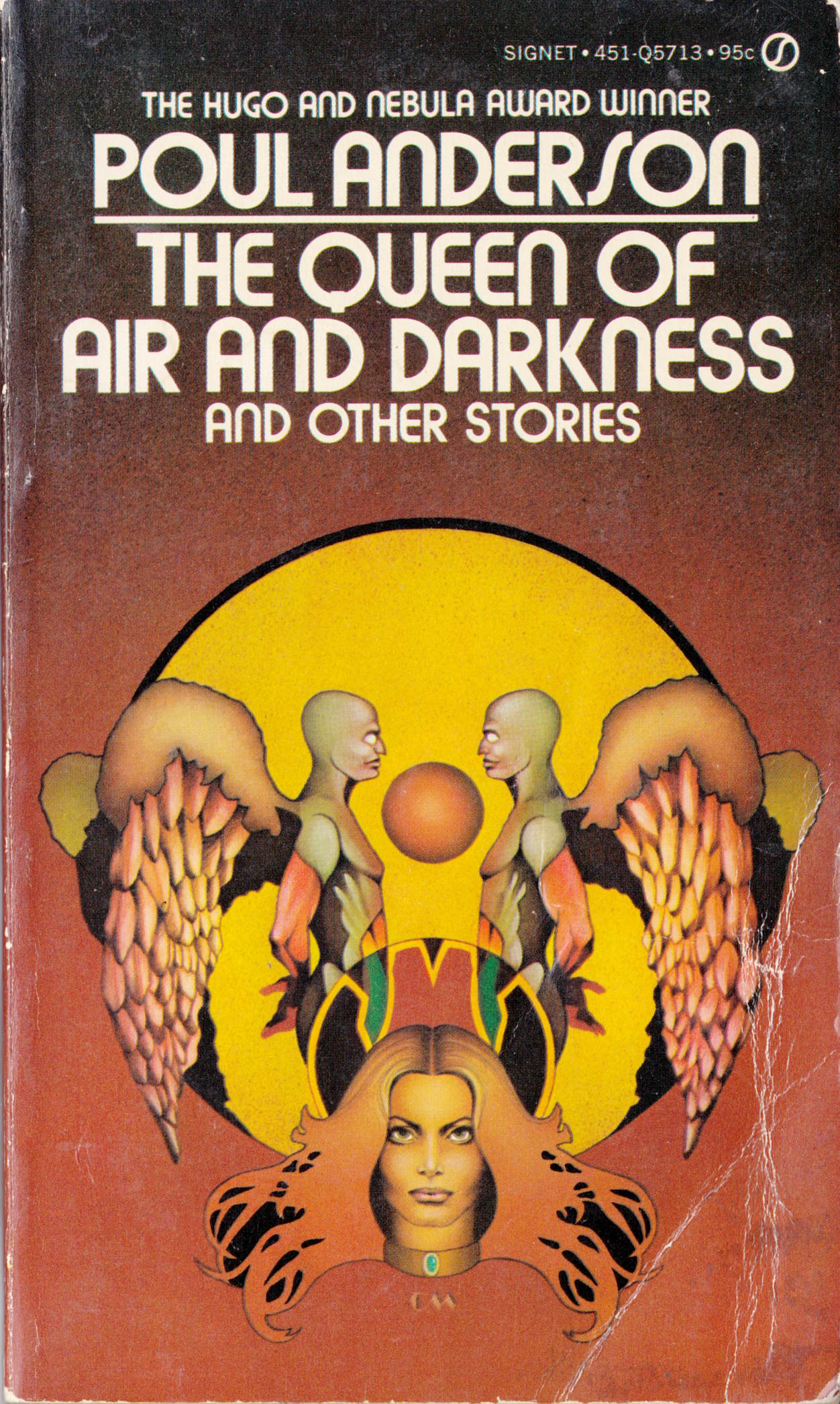
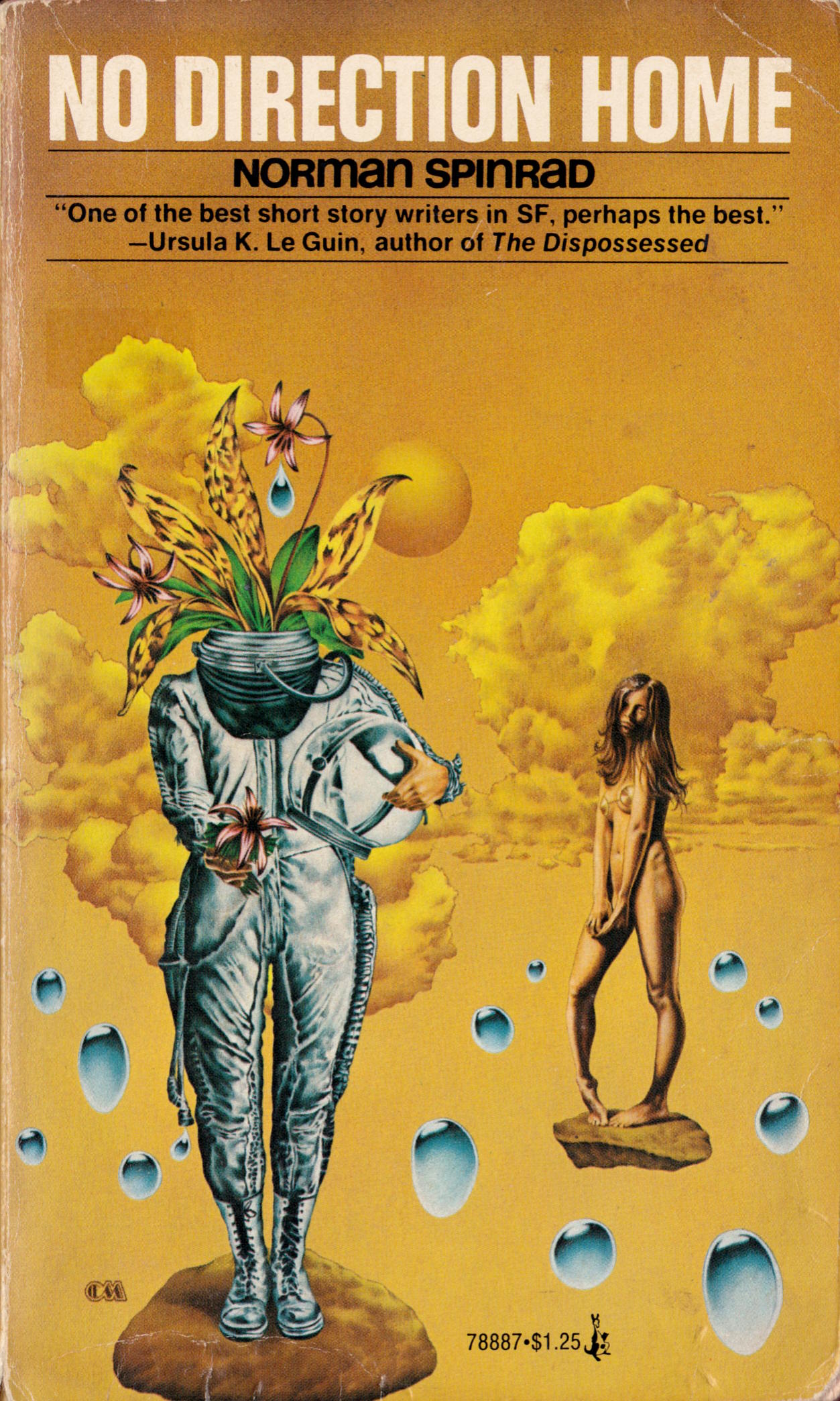
I featured scans of four Malzberg novels with terrific cover art by Moll on 02 December 2012, and this is sort of a follow-up to that post. Although I’m not a huge fan of his work in general, Charles Moll has produced some very strong covers over the years for various fantasy and science fiction novels, along with many weak ones. Combined with the images in my previous post, the following covers, scanned by me from the old paperbacks in my personal library, should give you an good idea of Moll’s weaknesses and strengths as an image maker:
[CLICK IMAGES TO ENLARGE]
ABOVE: David Mason, The Return of Kavin (New York: Lancer, 1972), with cover art by Charles Moll.
ABOVE: Poul Anderson, The Queen of Air and Darkness and Other Stories (Scarborough, ON: Signet, 1973), with cover art by Charles Moll.
ABOVE: Norman Spinrad, No Direction Home (New York: Pocket Books, 1975), with cover art by Charles Moll.
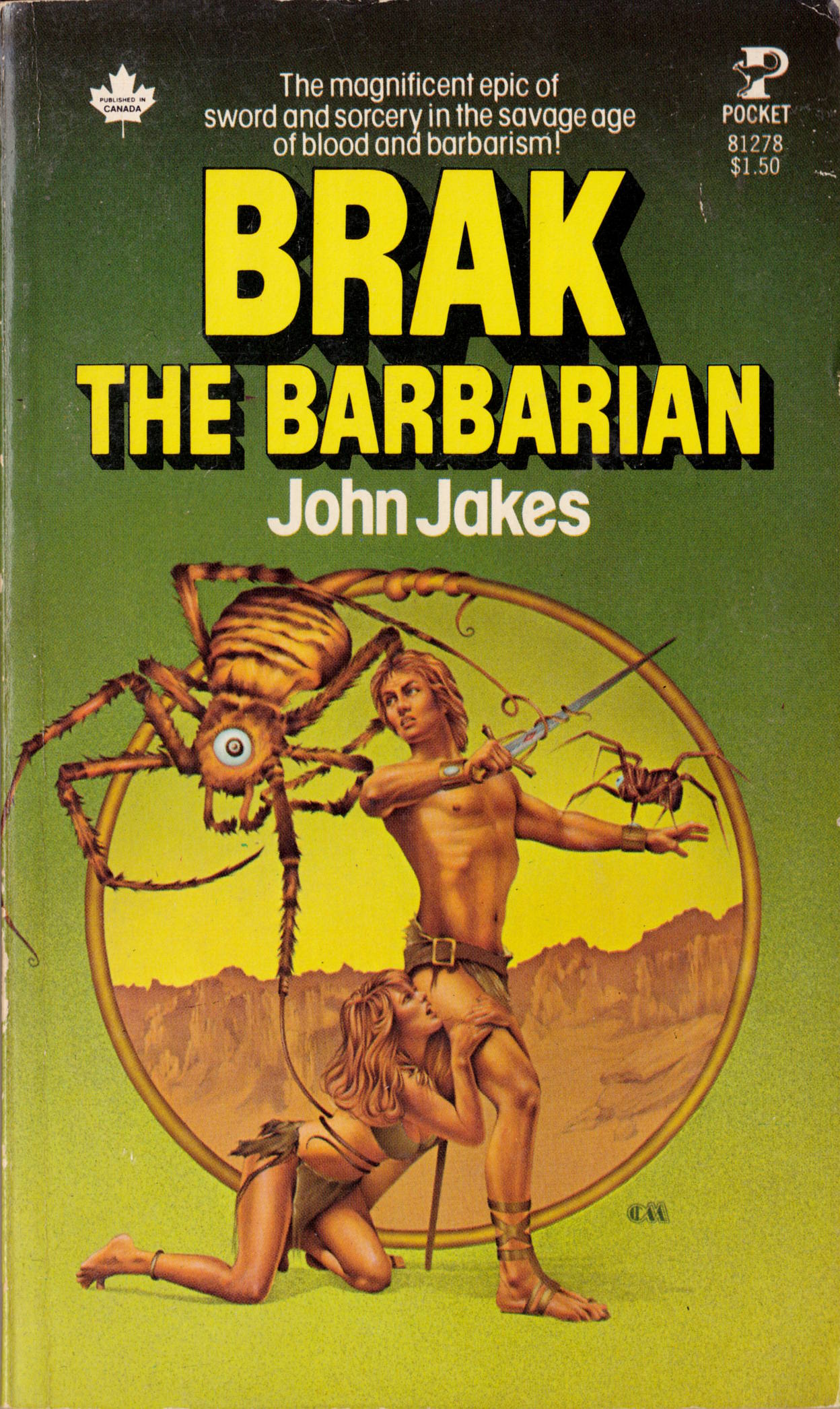
ABOVE: John Jakes, Brak the Barbarian (New York: Pocket Books, 1977), with cover art by Charles Moll.
Moll’s sombre, psychologically engaging surrealist cover art for Spinrad’s No Direction Home is the clear winner here. The other covers are nothing special, although Moll’s art for Brak the Barbarian (1977) gets points for featuring a pretty-boy protagonist who does not conform to reader expectations for a Conan-esque barbarian hero who lives “in the savage age of blood and barbarism.” It’s an interesting choice, though the sterile execution leaves much to be desired.
Whether I’m rummaging through boxes of old paperbacks at a garage sale or tipping the books out quickly, one after the other, from the shelves at a used bookstore or thrift shop to see what the covers look like, I can usually tell at a glance whether the image on the front interests me or not. To speed the plow, I don’t bother looking at “newer” books but instead zero in on anything that looks like it was published in the 1970s or earlier. Also, if the books I’m looking at are divided into genres, I tend to start with the SF and mystery paperbacks, which in my experience tend to have the highest percentage of compelling illustrative covers. But I don’t shy away from other genres, which can produce some nice surprises, like so:
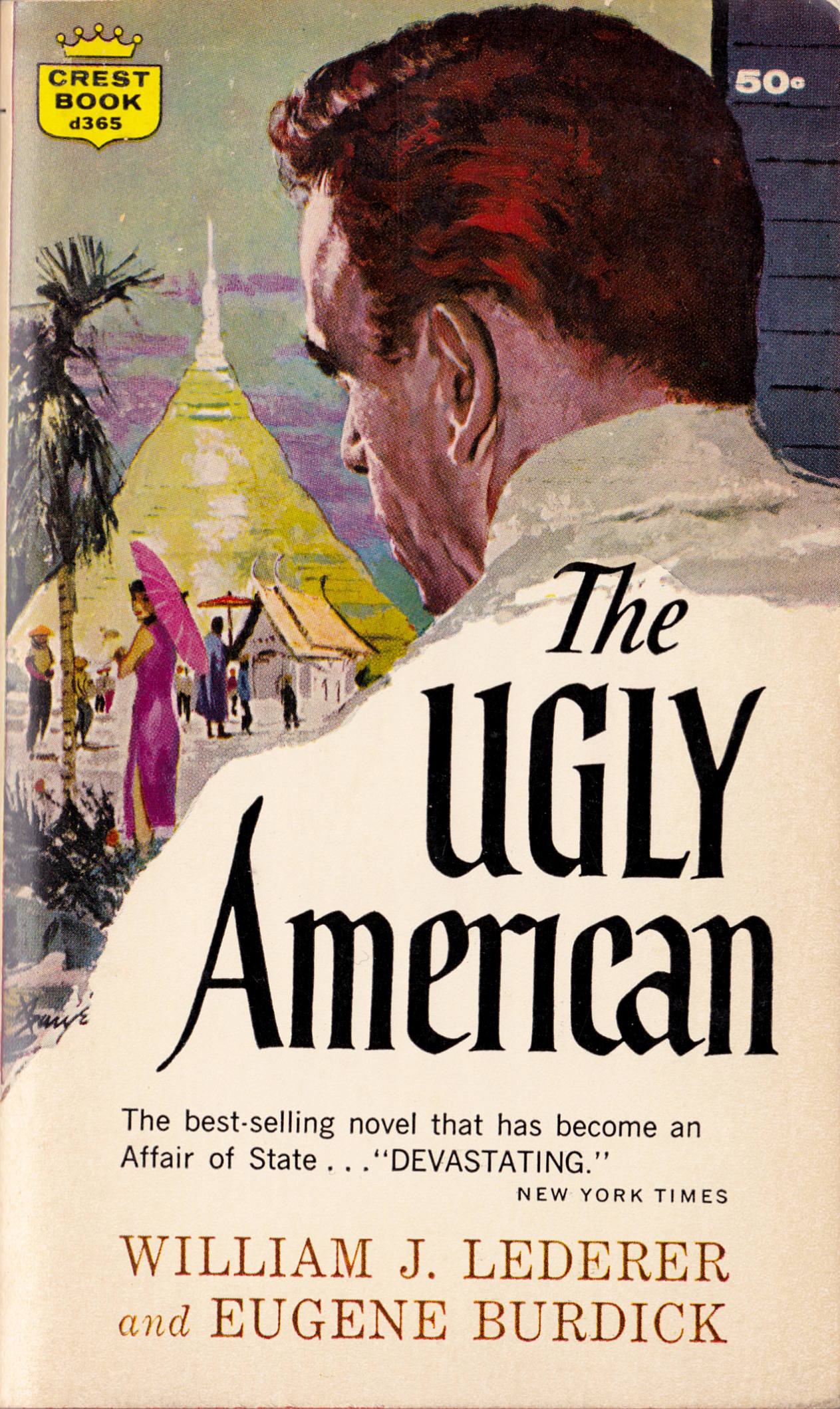
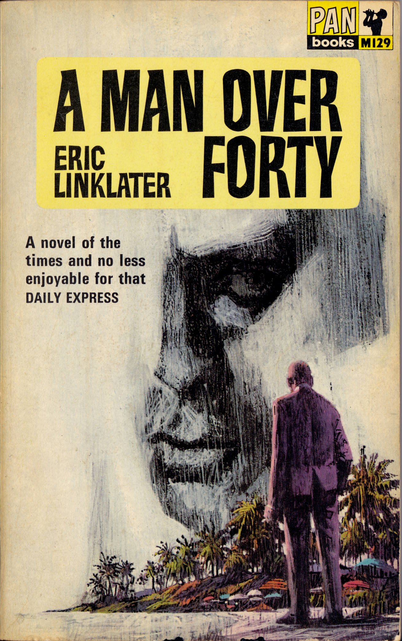
Although uncredited, the cover of The Ugly American is signed by prolific pulp illustrator Barye Phillips. The cover of A Man over Forty, however, is both uncredited and unsigned. Anyone recognize the artist from the style?
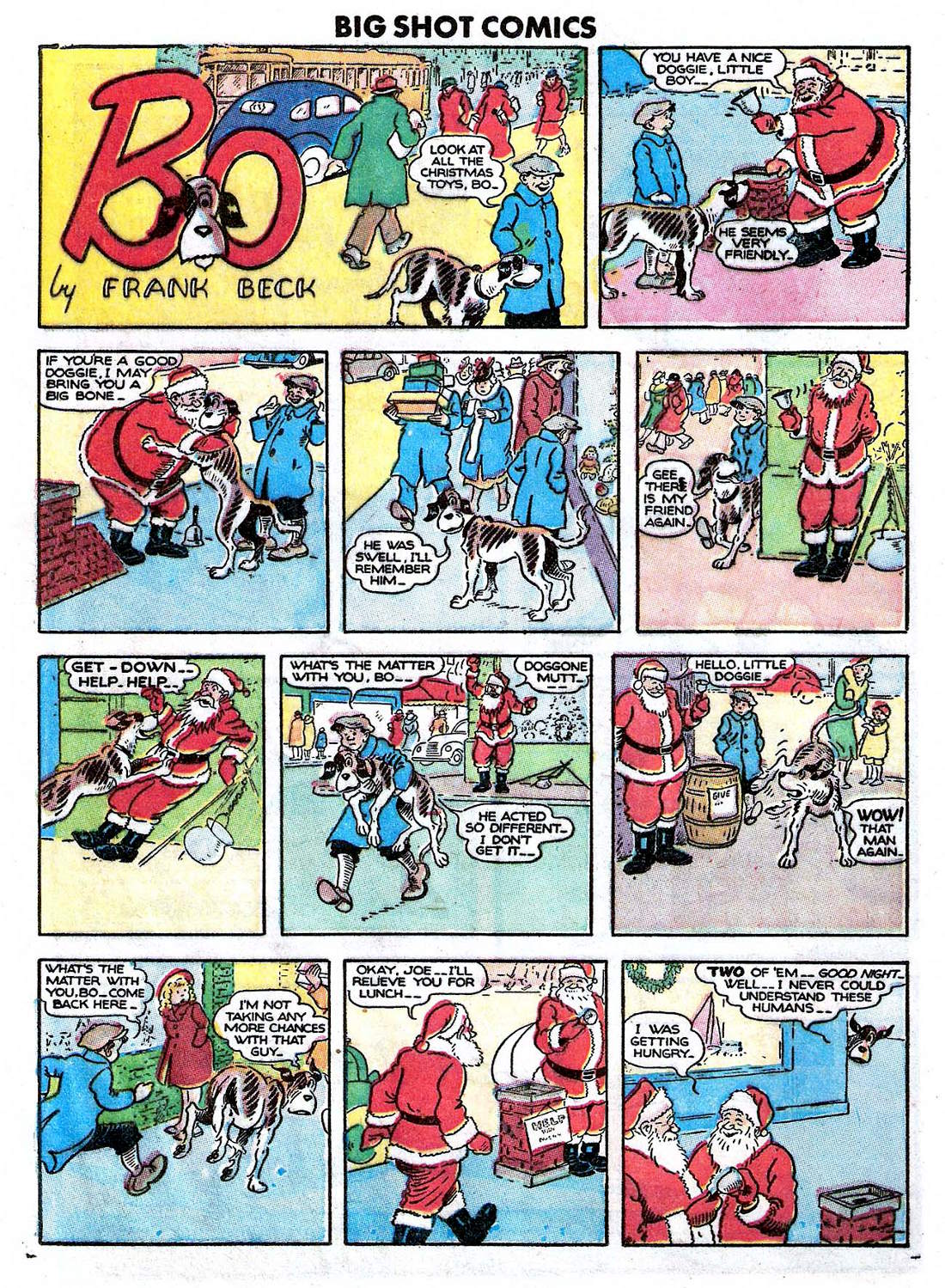
Apologies in advance for the poor quality of the images this time around: I scanned all nine of the single-panel comics by Hilda Terry displayed below — seven from 1942, two from 1945 — from printouts that I made from microfilm of back issues of The Saturday Evening Post. I’ve made some adjustments to my scans of the printouts to make them more readable, but they’re definitely a lot rougher than I’d like. And yet, I still think they’re well worth posting. Enjoy!
[CLICK IMAGES TO ENLARGE]
Publication information is in the file names. Looks like I forgot to record the day and month of the issue of The Saturday Evening Post from 1942 that included the comic with the caption, “We just came in for a glass of water!” I also neglected to record the page numbers. Sorry!
To see more energetic and attractive work by the wonderful Hilda Terry, start here.
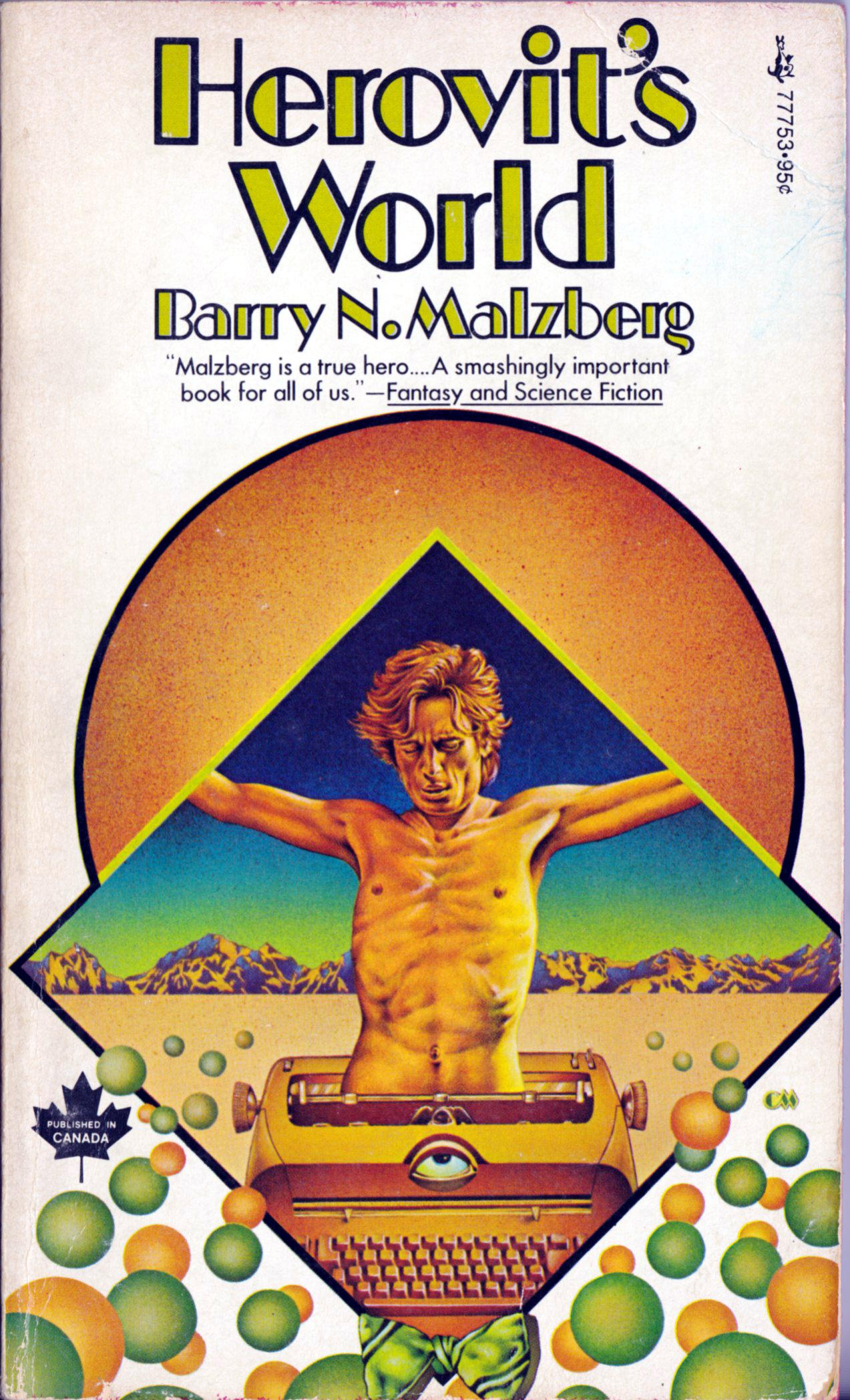
ABOVE: Barry N. Malzberg, Herovit’s World (New York: Pocket Books, 1974), with cover art by Charles Moll.
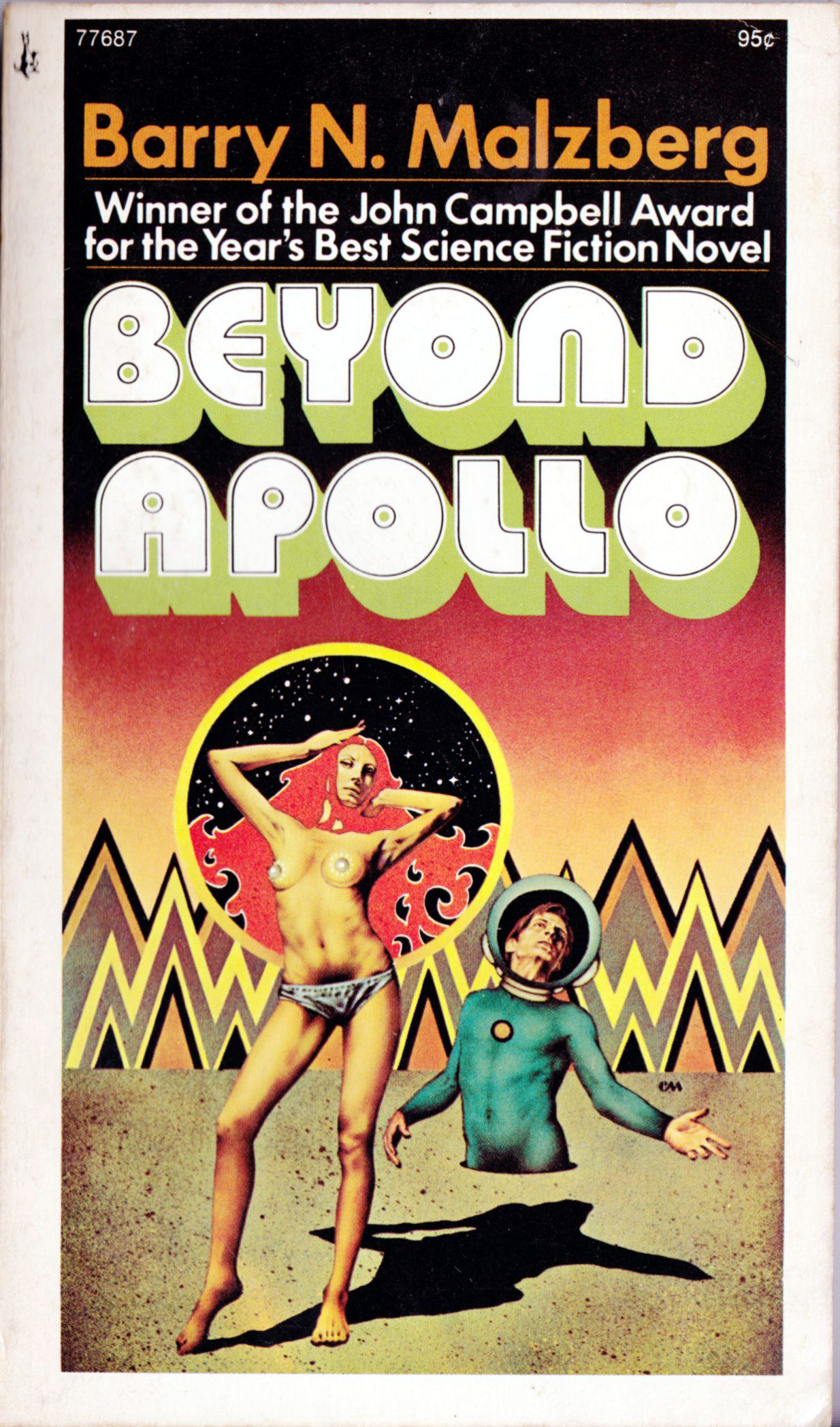
ABOVE: Barry N. Malzberg, Beyond Apollo (New York: Pocket Books, 1974), with cover art by Charles Moll.
ABOVE: Barry N. Malzberg, On a Planet Alien (New York: Pocket Books, 1974), with cover art by Charles Moll.
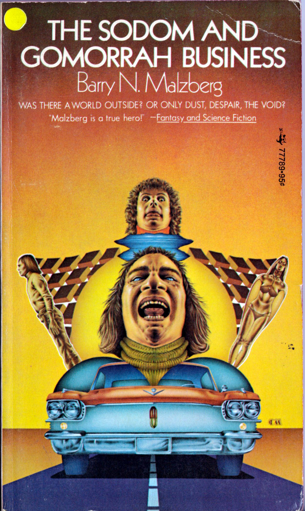
ABOVE: Barry N. Malzberg, The Sodom and Gomorrah Business (New York: Pocket Books, 1974), with cover art by Charles Moll.
I like to think that when Barry N. Malzberg first saw Charles Moll’s terrific cover art for the Pocket Books editions of his novels, he briefly felt hopeful about the future of his career in science fiction.
Keywords:Herovit’s World, Beyond Apollo, On a Planet Alien, The Sodom and Gomorrah Business.
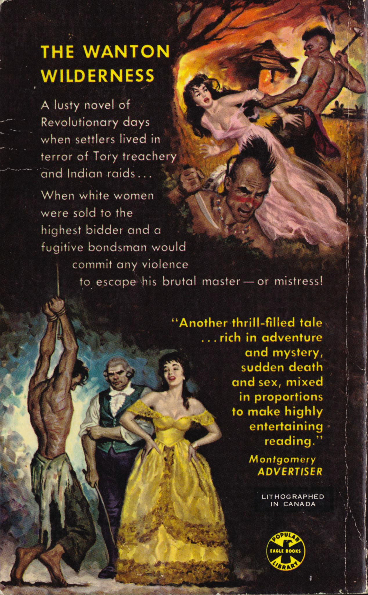
Yep, you guessed it… another book from my paperback collection, freshly scanned and processed:
[CLICK IMAGE TO ENLARGE]
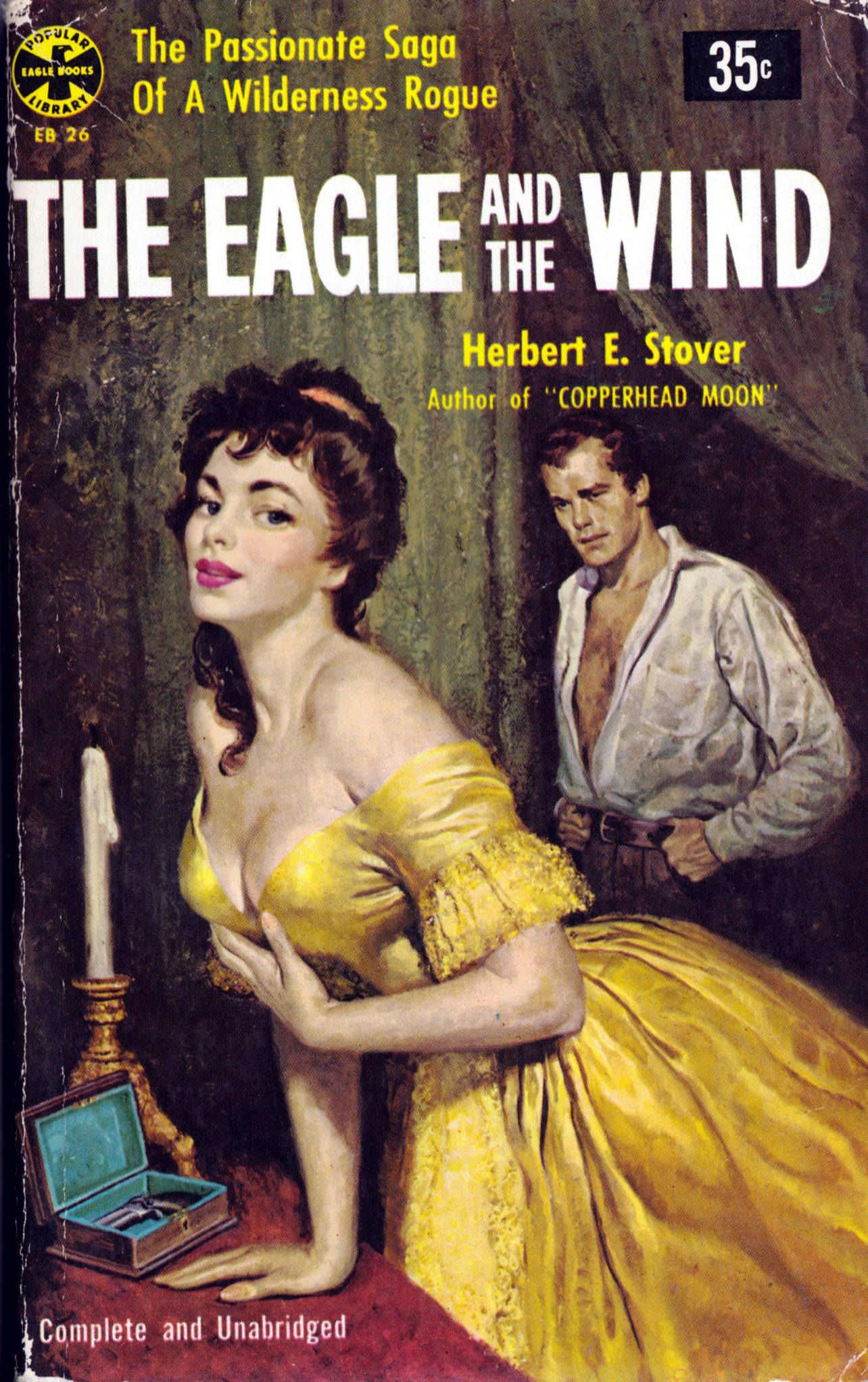
The artwork on the front and back cover of the Popular Library Eagle Books edition of The Eagle and the Wind (1954) by Herbert E. Stover is uncredited, no signature is visible in the paintings themselves, and I can find no information about the cover online. Nonetheless, I wouldn’t be surprised if the artist turned out to be Rafael De Soto. But I’m no expert. I mainly go by what I see.
BONUS IMAGE (12 May 2013):
As has been pointed out in the comments, Rafael De Soto’s original artwork for The Eagle and the Wind is currently available for purchase via All-Star Auctions. Here’s a link to the auction page. And here’s what the painting looks like framed:
[CLICK IMAGE TO ENLARGE]
From my comments below:
It’s cool to see an image of the actual painting — comparing the printed version with the framed version, I would say there is a good chance that the board was cut down at the top at some point after the image was published to enhance the composition sans text.


