Book/Magazine Covers (All) · Illustration Art · Look Here

Look Here: Two SF covers with arresting airbrushed artwork by… ?

I’m not a big fan of pure airbrushed artwork, but here are two airbrushed SF covers — from 1970 and 1979 respectively — that recently caught my eye as I was browsing through my very own library of paperback “classics,” looking for stuff to scan and share:

[CLICK IMAGES TO ENLARGE]

Please note that neither of the above paperbacks includes a formal credit for the cover artist. Yes, the artwork on Bill, the Galactic Hero is signed “McMACKEN,” or “McMALKEN,” but I have no idea who McMacken/McMalken is…

Keywords: The Star Kings, Bill, the Galactic Hero.


UPDATE (07 August 2013):

I can’t say for sure, but my best guess at this point is that the McMacken who produced the cover art for Bill, the Galactic Hero is Dave McMacken. Widely admired in his early career for his skill with an airbrush, McMacken is perhaps best known for his cover illustrations for albums such as Frank Zappa’s Over-Nite Sensation, The Commodores’ Natural High, AC/DC’s Ballbreaker, Cat Stevens’ Greatest Hits, Warrant’s Dog Eat Dog, The Bullet Boys’ Freak Show, Weather Report’s Black Market, The Beatles’ Reel Music, Steve Miller’s The Joker for Steve Miller, and Kansas’s Leftoverture. Some might also remember his poster for Steven’s Spielberg’s 1941.

Book/Magazine Covers (All) · Book/Magazine Covers (Jones) · Illustration Art · Jeffrey "Jeff" Catherine Jones · Look Here

Look Here: Five occult paperbacks by Peter Saxon, with cover art by Jeffrey Jones

I’ve posted some of these covers before, but I recently purchased some copies that, in a couple of instances, and for various reasons (like this, for example), are nicer than the books I scanned previously, so here I am to share with you:

[CLICK IMAGES TO ENLARGE]

Bon appétit!

Keywords: The Guardians, The Killing Bone, Dark Ways to Death, The Haunting of Alan Mais, The Vampires of Finistere, Satan’s Child.

Book/Magazine Covers (All) · Comics · Fred Schrier · Harvey Kurtzman · Here, Read · Illustration Art · Look Here · Victor Moscoso

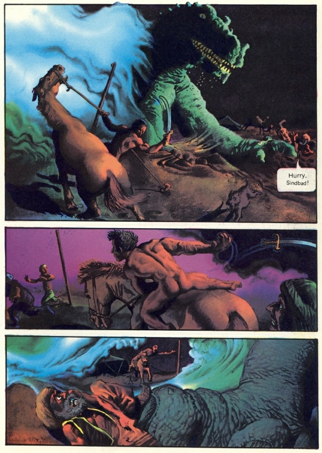
Look Here, Read: Back Cover Comix

Underground comics, or comix, were typically printed in black and white on cheap pulp paper and stapled together with a colour cover printed on glossier stock. While many underground artists/publishers over the years have reserved the back cover as a showcase for full-page illustrations in colour, others have viewed it as an opportunity to give one carefully selected comics page a more lavish treatment! Here are thirteen “back cover comix” — twelve sequential; one non-sequential — from various underground comics with publication dates ranging from 1970 to 1993; information for each piece is embedded in the file title. Listed in the order their work is displayed below, the artists are Victor Moscoso, Foolbert Sturgeon, Fred Schrier, Skip Williamson, Lee Marrs (with Gail Madonea), Victor Moscoso (x2), B. Kliban, Harvey Kurtzman, Pokkettz, Gilbert Shelton, R. Diggs, and Stephane Blanquet:

[CLICK IMAGES TO ENLARGE]

Book/Magazine Covers (All) · Book/Magazine Covers (Jones) · Illustration Art · Jeffrey "Jeff" Catherine Jones · Look Here · Zebra/Kensington Covers (Jones)

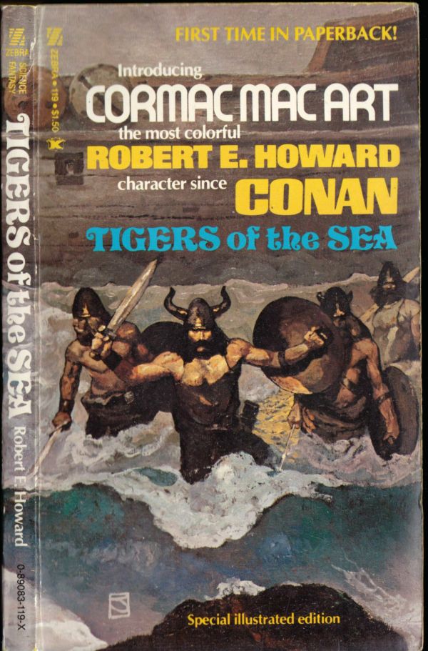
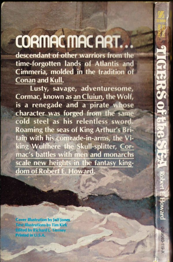
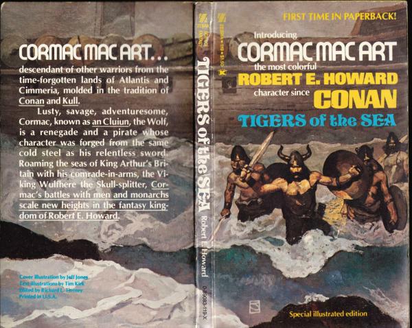
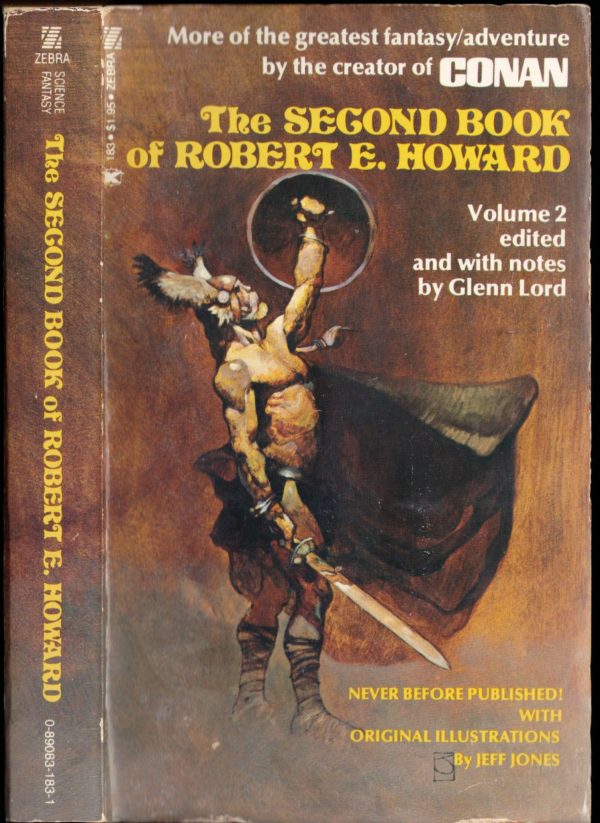
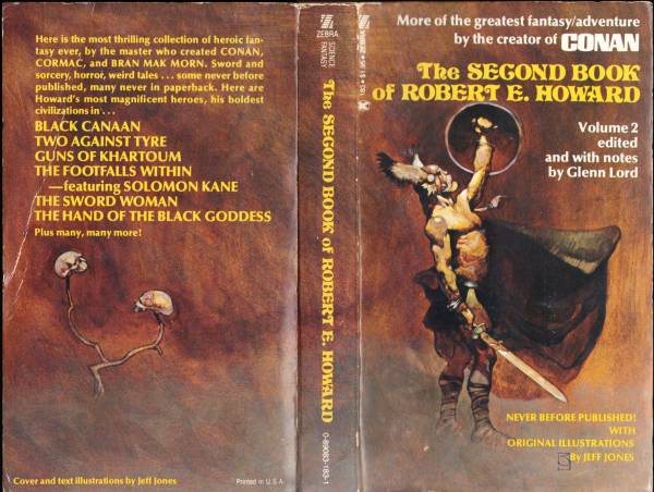
Look Here: Another couple of R.E.H. covers, with wraparound art by Jones

From the paperback collection of yours truly, here are two more classic Zebra/Kensington covers, with wrap-around art by Jeffrey Jones:

To view all of the Zebra/Kensington editions of Robert E. Howard’s books with Jones covers that I’ve posted so far, click here.

Keywords: Tigers of the Sea, The Second Book of Robert E. Howard, Cormac Mac Art.

Book/Magazine Covers (All) · Illustration Art · Look Here · Richard Corben

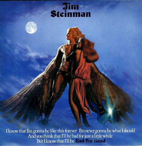
Look Here: BAD FOR GOOD, with cover art by Richard Corben

Bad for Good has attractive but flawed cover art by Corben, but Jim Steinman ought to have given these songs to Meat Loaf to sing, back when Meat Loaf could still bellow like a bull and shriek like a bat out of hell…

LP:

CD:

Pity about the typographical onslaught at the bottom of both the LP and the CD covers. Clearly, somebody — the record company, Steinman himself — didn’t trust that record buyers would notice the “Bad for Good” tattoo on the forearm of Corben’s winged rock god… or read the back cover… or read the labels centred on both sides of the LP… or, well, you get the idea…

Book/Magazine Covers (All) · Heads Up! · Illustration Art · Jack Davis · Look Here

Heads Up Follow-Up: JACK DAVIS: DRAWING AMERICAN POP CULTURE — A CAREER RETROSPECTIVE

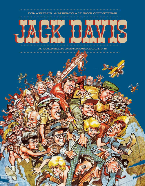
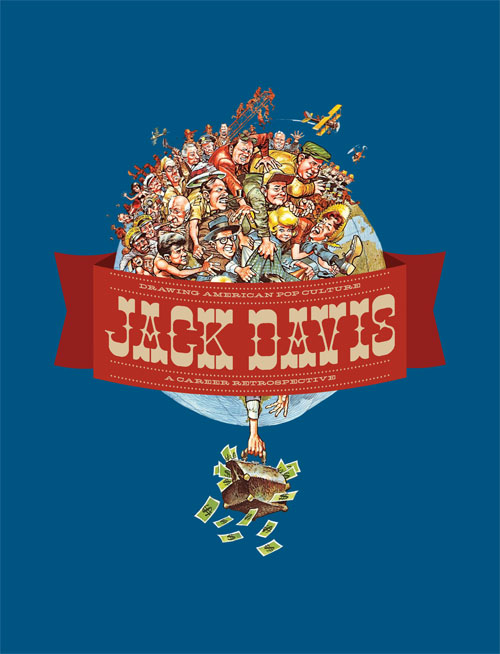
Yesterday on the FLOG! Blog, Mike Baehr announced that Fantagraphics has pulled the first printing of Jack Davis: Drawing American Pop Culture — A Career Retrospective from (almost!) distribution and has gone back to press to correct a problem with the covers, which apparently were prone to warping. At the same time, the publisher has decided to replace the original cover in sepia (?) and orange with a less design-centric confection that gives pride of place to a cropped, colour version of Davis’s illustration from the first printing:

If you purchased a copy of the first printing of the book, you have several options: you can be happy with what you’ve got, you can exchange what you’ve got for a copy of the new printing, or you can keep what you’ve got and buy a copy of the new printing at a discount. Check out this post on the FLOG! Blog for the official details.


Jack Davis: Drawing American Pop Culture — A Career Retrospective was originally the subject of a “Heads Up” post here at RCN back on 08 November 2010. The cover image included with that post, however, was not the final cover of the first printing. This was:

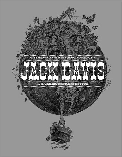
It’s an interesting design, I guess, although I don’t think all of the elements are as readable as they should be. In an effort to diagnose the problem, I converted the cover to greyscale, and the result is instructive, I think:

Notice how the greenish colour on the lighted side of the forms in Davis’s illustration is pretty much the same value as the orange background. It’s that similarity of value, combined with a lack of any truly dark darks, that I think makes the details of the illustration so difficult to discern. Sure, the narrow range of values in the illustration makes the busy letter forms of the superimposed title more readable than they otherwise would be. Just look what happens, for instance, when I bump up the contrast on that greyscale image:

Setting aside the issue of the annoying visual artifacts that have emerged from my amateurish processing of the low-resolution colour JPEG of the original cover, I think it’s obvious that while the title in the above version of the cover has become more difficult to read, the illustration itself is now more easily decipherable and has a lot more pop!

But why mess around with the contrast at all when it would have been so much easier simply not to put really busy lettering over a really busy illustration?

I suppose the fundamental question for me is, what ought to be the main attraction on the cover a coffee-table book devoted to the art of Jack Davis: some old-timey title lettering or Jack Davis’s art? I think it should be the art. The designer, obviously, had a different idea. Until now, that is.


BONUS IMAGE:

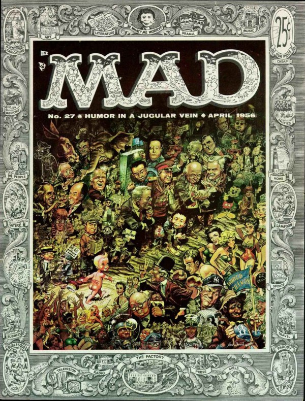
Here’s a really busy cover in which expert designer and all-round comics genius Harvey Kurtzman uses visual hierarchy and contrast to enable the viewer to take in the various elements, all of which are easily readable, in an orderly fashion, without any confusion as to what is most important, what is next most important, and so on, and so forth:

[CLICK IMAGE TO ENLARGE]

To me, Kurtzman and Davis’s cover stands head and shoulders above any of the designs I’ve seen for Jack Davis: Drawing American Pop Culture. But don’t be angry at me for pointing this out, Fantagraphics: I still do plan to buy the book.

P.S. If you work for Fantagraphics and you’re reading this, you ought to mention to the designer of Jack Davis: Drawing American Pop Culture that the blue background that represents the sky on the new cover ought to be visible through the structure of the telescopic fire-truck ladder at the top-centre of Davis’s illustration as well as through the spaces between the upper and lower wings of the biplane, etc. In the image currently featured on the FLOG! Blog, those spaces are white, which suggests to me that the background of the original illustration was also white, though I don’t know that for sure…


BELATED DOUBLE BONUS IMAGE (added 09 February 2013):

Here’s what the cover of the new improved version of Jack Davis: Drawing American Pop Culture actually looked like, when all was said and done:

[CLICK IMAGES TO ENLARGE]

Problems solved!