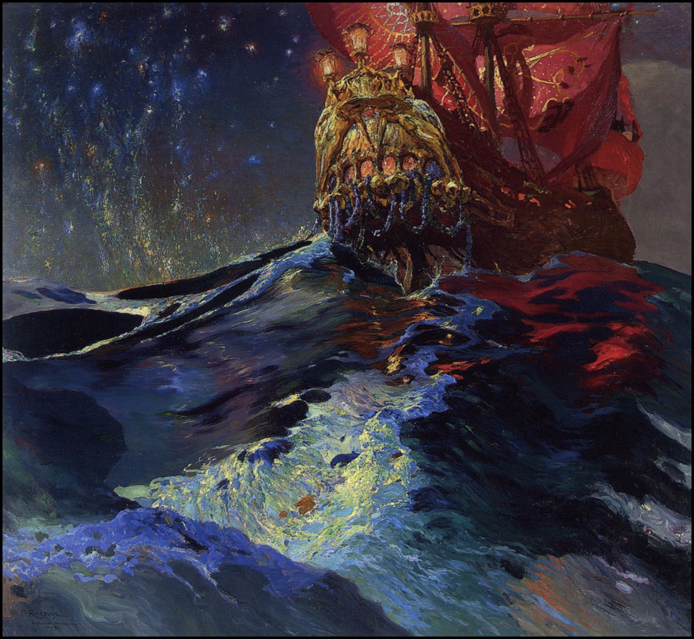
"This day's experience, set in order, none of it left ragged or lying about, all of it gathered in like treasure and finished with, set aside." –Alice Munro, "What is Remembered"
Earlier this morning over at my tumblr, TRANSISTORADIO, I posted scans of seven vibrant, sexy album covers created by designers and photographers whose names are unknown to me for Audio Fidelity recordings released from 1956 to 1960. On tumblr, I generally prefer to post one image at a time, but I thought people here might like to view my selections all together, in a single post:
[CLICK IMAGES TO ENLARGE]
ABOVE: Marimba Chiapas, Marimba Mambo Y Cha-Cha-Cha! (1959), AFLP 1802. Via TRANSISTORADIO.
ABOVE: Pedro Garcia and his Del Prado Orchestra, Cha Cha Cha (1956), AFLP 1810. Via TRANSISTORADIO.
ABOVE: Memo Salamanca and his Cha Cha Orchestra, Cha, Cha, Cha, Vol. 2 (1956), AFLP 1813. Via TRANSISTORADIO.
ABOVE: Rafael Molero, Alberto Salicru, Esperanza La Macarena, and Paco De Jaen, Fiesta en Espana (1957), AFLP 1819. Via TRANSISTORADIO.
ABOVE:Juerga Flamenca [Fiesta Flamenca] (1958), AFLP 1852.
Via TRANSISTORADIO.
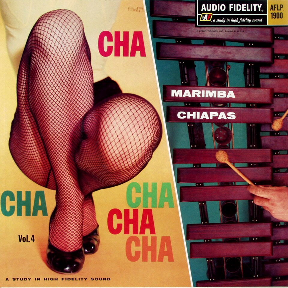
ABOVE: Marimba Chiapas, Cha Cha Cha, vol. 4 (1959), AFLP 1900. Via TRANSISTORADIO.
ABOVE: Mohammed El-Bakkar and his Oriental Ensemble, Dances of Port Said (1960), AFLP 1922. Via TRANSISTORADIO.
I originally copied the above scans from links posted on this page at the Syracuse University Libraries website. Well done, SUL!
ABOVE: Neil Young, On the Beach (Reprise, 1974), with design by Gary Burden, photography by Bob Seiderman, and lettering by Rick Griffin. Via Världshistoriens 101 bästa album.
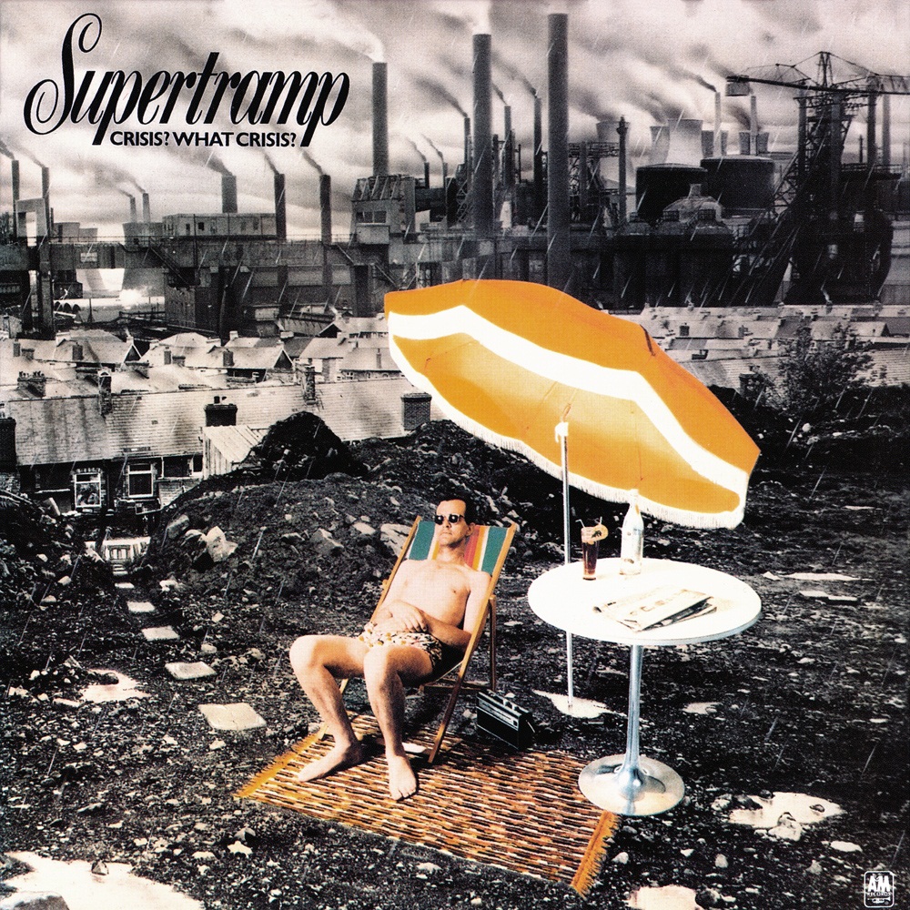
ABOVE: Supertramp, Crisis? What Crisis? (A&M, 1975), with art direction by Fabio Nicoli, photography by Paul Wakefield, and design by Dick Ward, from an idea by Richard Davies. Via Classic Rock Review.
ABOVE: Neil Young, On the Beach (Reprise, 1974), poster, with design by Gary Burden, photography by Bob Seiderman, and lettering by Rick Griffin. Via Catch a Groove.
Keywords:On the Beach by Neil Young, Crisis? What Crisis? by Supertramp.
I’m sure there are many skeptical viewers out there who roll their eyes whenever I post speculative “connections” like my last one (or this one from 2011), so today I’ve decided to post a connection that the artist himself has said was deliberate. Take a look, and perhaps ask yourself if you would have noticed Jeff Wall’s formal references to Delacroix’s Death of Sardanapalus (1827) if the connection hadn’t been pointed out to you:
[CLICK IMAGES TO ENLARGE]
ABOVE: Eugène Delacroix, Death of Sardanapalus (1827), oil on canvas, 496 x 392 cm. Via RCN.
ABOVE: Jeff Wall, The Destroyed Room (1978), transparency in lightbox, 234 x 159.1 cm. Collection of National Gallery of Canada. Via MoMA.
Here’s how Wall interprets his own work:
[…] When I made The Destroyed Room, I worked in reference to the design of commercial window displays of clothing and furniture. I think of these as tableaux morts as opposed to tableau vivants. At the time, they had become very violent, mainly because of an influence from the punk phenomenon which was quickly filtering into the whole cultural economy. At the same time, the picture’s subject matter had something to do with aggression, violence, and revenge in domestic life. I was very interested in Delacroix’s Death of Sardanapalus, partly because I was lecturing on Romanticism. I think the Sardanapalus is a very important picture, historically and psychologically, because it shows the eroticized ideal of military glory which characterized the Napoleonic period being turned inward, back toward domestic life at the end of that epoch, at the beginning of the modern, bourgeois, neurotic private life. This painting interested me as a kind of crystal. My subject was made with this crystal, by passing my ideas and feelings through the historical prism of another work. I felt that this made the subject richer, more suggestive, more aggressive. It was important to filter The Destroyed Room through this other picture because I think I was trying to establish a space for myself by suggesting which historical directions and problems were important to me.
I know that in some ways this is a very artificial way of going about things, very manneristic even, but it was a way to begin, and I had to begin.
[SOURCE: “Typology, Luminescence, Freedom: Selections from a Conversation with Jeff Wall,” in Jeff Wall. Selected Essays and Interviews (New York, NY: The Museum of Modern Art, 2007), pp. 186-87.]
And:
In The Destroyed Room, I was interested in a “remaking” of an existing image, a sort of mannerist attitude toward it. The Delacroix painting seemed very modern to me. I see a lot of so-called “old” art that way. Why shouldn’t we be able to relate to it as contemporary? […]
I was particularly interested in violence at that time, for whatever reason. I was teaching at the university, concentrating on the earlier part of the nineteenth century, and got intrigued by the way that monumental paintings — Delacroix’s preeminent among them — wove together themes of war and military glory, on the one hand, and the conflicts of private life on the other. The intertwining of these two spheres is almost emblematic of that whole period.
[SOURCE: “A Democratic, a Bourgeois Traditon of Art: A Conversation with Jeff Wall by Anne-Marie Bonnet and Rainer Metzger,” in Jeff Wall. Selected Essays and Interviews (New York, NY: The Museum of Modern Art, 2007), p. 246.]
In other words, and in short, not every connection between two works of art is what comic-book guys would dismiss as a swipe.
I must admit, I really do feel ridiculously pleased with myself whenever I notice a possible connection like this…
[CLICK IMAGES TO ENLARGE]
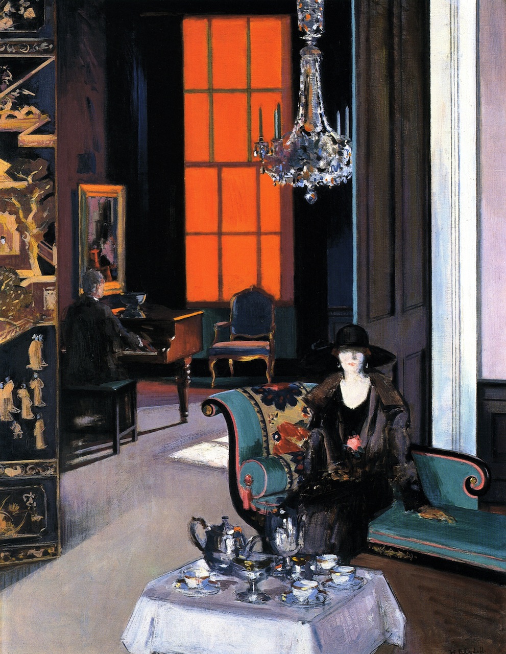
ABOVE: Francis Campbell Bolleau Cadell, Interior: The Orange Blind (c.1927), oil on canvas, 86.5 x 112 cm. Via TRANSISTORADIO.
ABOVE: Francis Bacon, Study for a Portrait, March 1991 (1991), oil and pastel on canvas, 147.5 x 198 cm. Collection of National Galleries of Scotland, UK. Via TRANSISTORADIO.
I posted JPEGs of Milton Glaser’s Angel Alley cover, poster, and artwork, back on 29 January 2013, and now, more than a year later, I have noticed a familiar figure in the foreground of Giulio Aristide Sartorio’s Diana of Ephesus and the Slaves (1895-1899):
[CLICK IMAGES TO ENLARGE]
ABOVE: Giulio Aristide Sartorio, Diana of Ephesus and the Slaves (1895-1899), oil on canvas, 421 x 304 cm. Collection of Galleria Nazionale d’Arte Moderna, Rome, Italy. Via TRANSISTORADIO.
ABOVE: Milton Glaser, original art for the cover of the LP Angel Alley (1978) by Linda Cohen.
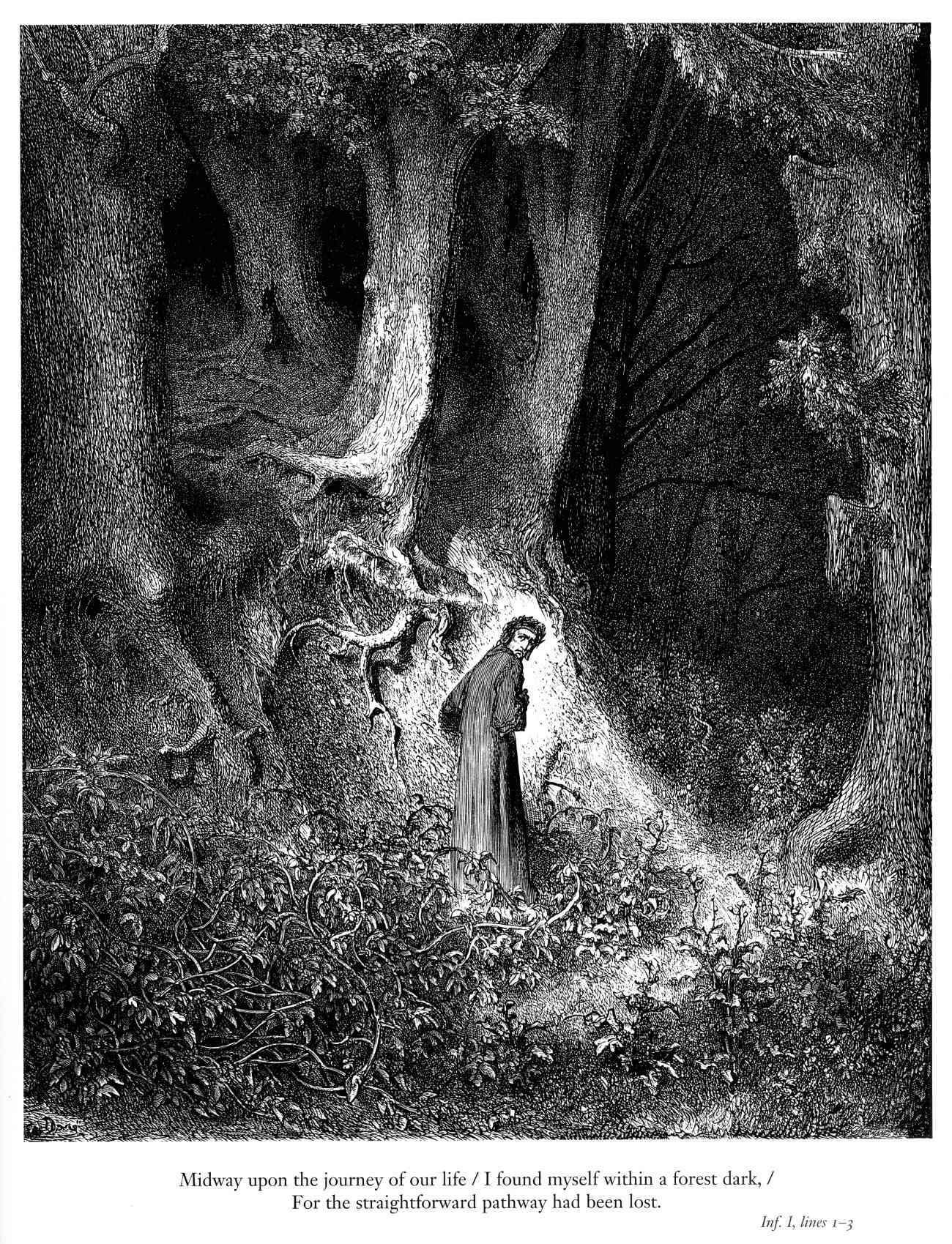
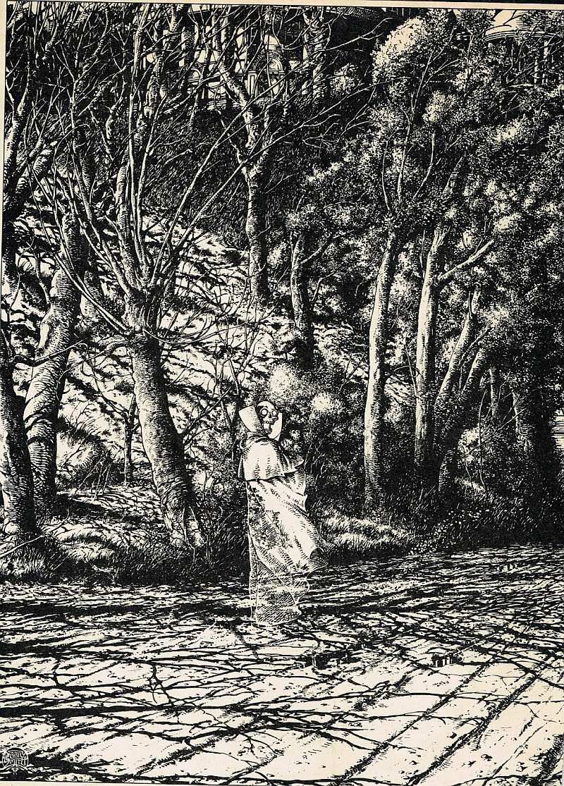
In The Studio (Dragon’s Dream, 1979), on pages 103 and 104, Barry Windsor-Smith provides a brief account of the genesis of Whithering:
“In the spring of 1975 I was working on a pen and ink drawing of trees, just trees. It was inspired, in part, by a wonderful painting of old Hampstead Heath by John Constable. At that time I didn’t think my audience was ready for — or let’s say interested in — a new work by me that was ‘just trees.’ Constable himself had a witticism about painting some of his pictures with ‘eye salve.’ What he meant was that he would make a picture as commercial as possible if he needed to sell it. As I wanted the fantasy market to see my tree drawing, I took a tip from Constable and applied a little ‘fantastic eye balm’: right in the middle of the picture I drew a shrouded figure of Death — a skull-headed man — and off in the distance a dark, foreboding mansion. This made the trees seemingly incidental. I called it Whithering (p. 110)… a deliberate non sequitur.” […]
“One night I got a frenzied call from an associate in London. He’d just shown a reproduction of the picture to a much respected fellow artist whom I’d never met, and whom my associate had only just met. Over the crackling transatlantic line I heard him say, ‘Hey! Guess what!… I just showed Whithering to so-and-so and guess what he said, — ‘Ahh, Constable; those trees. Barry just stuck that dead bloke in there so he could get away with drawing trees, didn’t he’?… He knew! There were a few cackles of laughter and then he hung up; that was the end of the call. I was suffering from insomnia at the time, I recall I slept that night and glowed the next day.”
Does Windsor-Smith’s reminiscence rule out the influence of Doré’s composition on Whithering? I don’t think so, but if you check out the comments section of this post, you’ll find a reader who disagrees with me.
BONUS IMAGES:
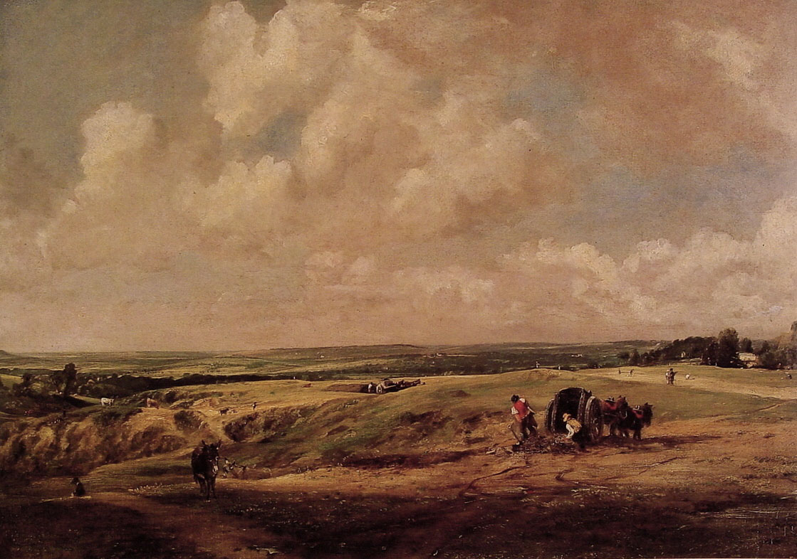
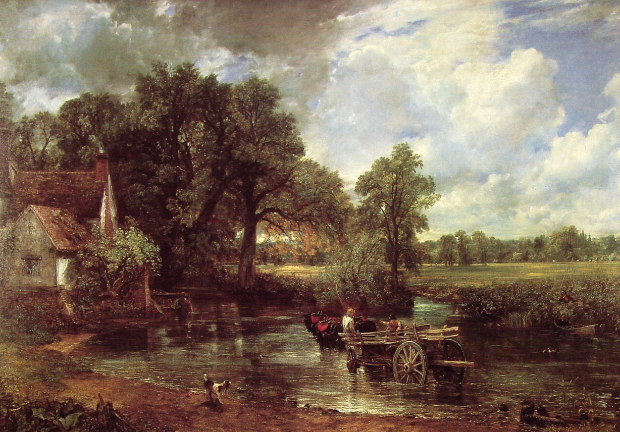
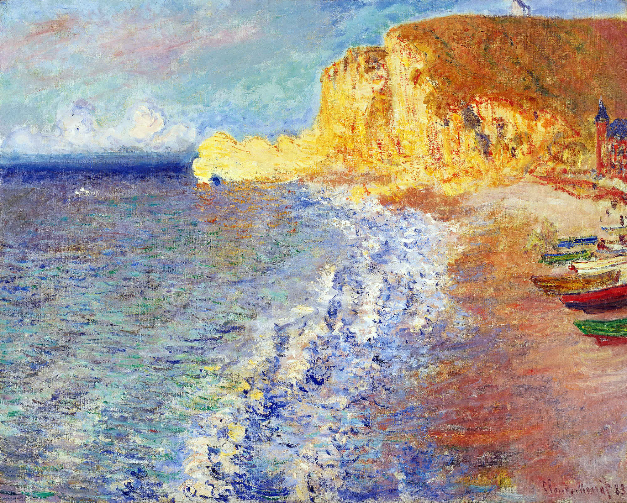
Three paintings of “Hampstead Heath” by John Constable:
I posted the following three images one after the other on TRANSISTORADIO earlier today, but I have since had the thought that perhaps a few folks who don’t follow my tumblr but do follow this blog will appreciate the juxtaposition, too, so here the images are, together again for the first time in a single post:
[CLICK IMAGES TO ENLARGE]
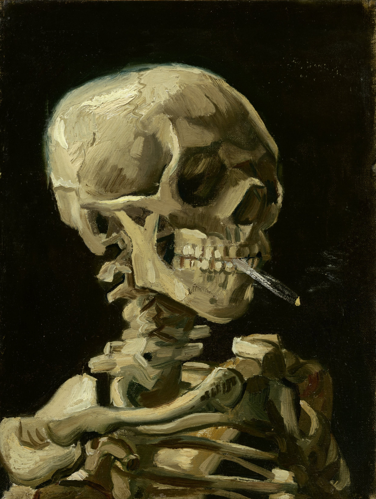
ABOVE: Vincent van Gogh, Head of a Skeleton with Burning Cigarette (1885 – 1886), oil on canvas, 24.5 x 32 cm. Collection of Van Gogh Museum, Amsterdam. Via Wikimedia Commons.
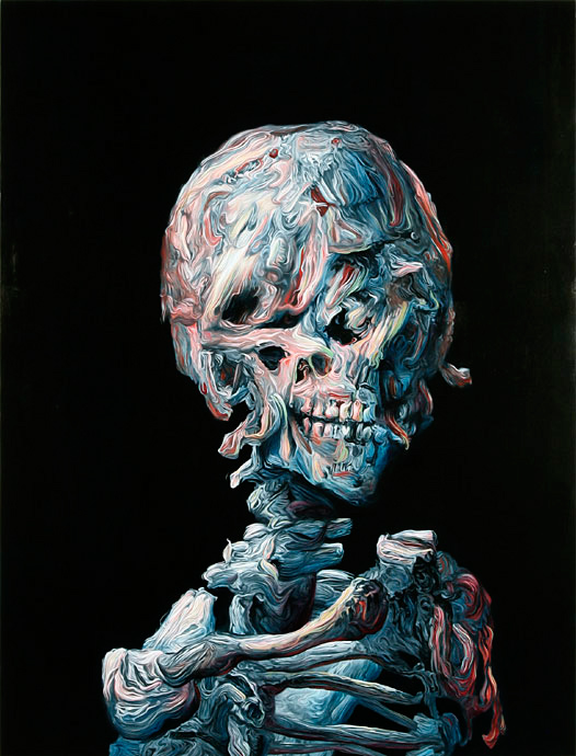
ABOVE: Glenn Brown, Theatre (2006), oil on wood, 93 x 122 cm. Via Galerie Max Hetzler.
ABOVE: Vincent van Gogh, Self-Portrait (1889), oil on canvas, 54 x 65 cm. Collection of Musée d’Orsay, Paris, France. Via Wikimedia Commons.


