Jeffrey "Jeff" Catherine Jones · Look Here · Original art vs. printed page

Look Here: Original art for an “I’m Age” strip by Jeffrey Jones

Here’s a scan of the original art for the installment of “I’m Age” by Jeffrey Jones that appeared in Heavy Metal, vol. 5, no. 11 (February 1982):

[CLICK IMAGES TO ENLARGE]

And here’s the strip as it appeared in print:

If you’d like to read more “I’m Age” strips, click here.

Illustration Art · Jeffrey "Jeff" Catherine Jones · Look Here · Prints (Jones)

Look Here: LORD GREYSTOKE print by Jeffrey Jones

[CLICK IMAGE TO ENLARGE]


UPDATE (12 February 2013):

Earlier today, the producer/director/writer of Better Things: The Life and Choices of Jeffrey Catherine Jones, Maria Cabardo, posted the following picture of Gray Morrow to her Facebook photo album:

The photo was taken by Jeffrey Jones, and I recognized the pose and lighting immediately! Very cool to see! To his credit, and to the great benefit of his painting, Jones didn’t succumb to the desire to spell everything out, to invent all of the forms that he couldn’t make out in his reference photo, but instead simply embraced the idea of lost edges.

If you are able, please contribute to Maria’s Indiegogo fundraiser for Better Things. Documentary films about illustrators and comics artists are few and far between, but if you want more, you need to step up and support the intrepid filmmakers who are willing to stride out on a limb and make it happen. The perks/rewards are cool, and because Maria has chosen to run a “Flexible Funding campaign,” all of the perks will be delivered even if the total money raised does not match the stated goal. In other words, if you contribute at the level to get the art book (for instance), you WILL receive the art book.

Book/Magazine Covers (All) · Heads Up! · Illustration Art · Jack Davis · Look Here

Heads Up Follow-Up: JACK DAVIS: DRAWING AMERICAN POP CULTURE — A CAREER RETROSPECTIVE

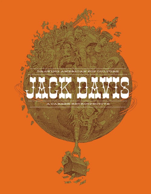
Yesterday on the FLOG! Blog, Mike Baehr announced that Fantagraphics has pulled the first printing of Jack Davis: Drawing American Pop Culture — A Career Retrospective from (almost!) distribution and has gone back to press to correct a problem with the covers, which apparently were prone to warping. At the same time, the publisher has decided to replace the original cover in sepia (?) and orange with a less design-centric confection that gives pride of place to a cropped, colour version of Davis’s illustration from the first printing:

If you purchased a copy of the first printing of the book, you have several options: you can be happy with what you’ve got, you can exchange what you’ve got for a copy of the new printing, or you can keep what you’ve got and buy a copy of the new printing at a discount. Check out this post on the FLOG! Blog for the official details.


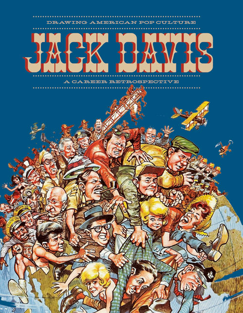
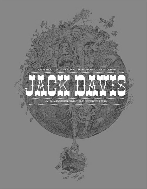
Jack Davis: Drawing American Pop Culture — A Career Retrospective was originally the subject of a “Heads Up” post here at RCN back on 08 November 2010. The cover image included with that post, however, was not the final cover of the first printing. This was:

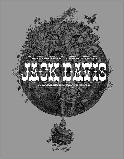
It’s an interesting design, I guess, although I don’t think all of the elements are as readable as they should be. In an effort to diagnose the problem, I converted the cover to greyscale, and the result is instructive, I think:

Notice how the greenish colour on the lighted side of the forms in Davis’s illustration is pretty much the same value as the orange background. It’s that similarity of value, combined with a lack of any truly dark darks, that I think makes the details of the illustration so difficult to discern. Sure, the narrow range of values in the illustration makes the busy letter forms of the superimposed title more readable than they otherwise would be. Just look what happens, for instance, when I bump up the contrast on that greyscale image:

Setting aside the issue of the annoying visual artifacts that have emerged from my amateurish processing of the low-resolution colour JPEG of the original cover, I think it’s obvious that while the title in the above version of the cover has become more difficult to read, the illustration itself is now more easily decipherable and has a lot more pop!

But why mess around with the contrast at all when it would have been so much easier simply not to put really busy lettering over a really busy illustration?

I suppose the fundamental question for me is, what ought to be the main attraction on the cover a coffee-table book devoted to the art of Jack Davis: some old-timey title lettering or Jack Davis’s art? I think it should be the art. The designer, obviously, had a different idea. Until now, that is.


BONUS IMAGE:

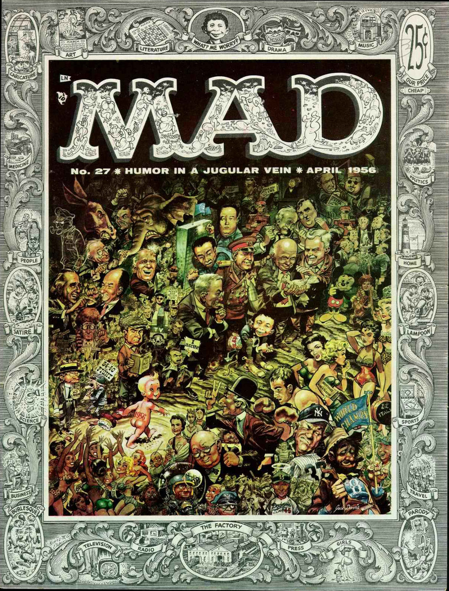
Here’s a really busy cover in which expert designer and all-round comics genius Harvey Kurtzman uses visual hierarchy and contrast to enable the viewer to take in the various elements, all of which are easily readable, in an orderly fashion, without any confusion as to what is most important, what is next most important, and so on, and so forth:

[CLICK IMAGE TO ENLARGE]

To me, Kurtzman and Davis’s cover stands head and shoulders above any of the designs I’ve seen for Jack Davis: Drawing American Pop Culture. But don’t be angry at me for pointing this out, Fantagraphics: I still do plan to buy the book.

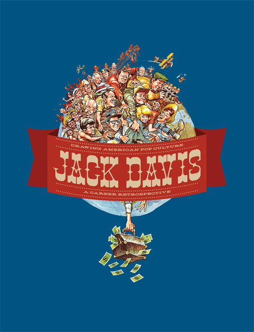
P.S. If you work for Fantagraphics and you’re reading this, you ought to mention to the designer of Jack Davis: Drawing American Pop Culture that the blue background that represents the sky on the new cover ought to be visible through the structure of the telescopic fire-truck ladder at the top-centre of Davis’s illustration as well as through the spaces between the upper and lower wings of the biplane, etc. In the image currently featured on the FLOG! Blog, those spaces are white, which suggests to me that the background of the original illustration was also white, though I don’t know that for sure…


BELATED DOUBLE BONUS IMAGE (added 09 February 2013):

Here’s what the cover of the new improved version of Jack Davis: Drawing American Pop Culture actually looked like, when all was said and done:

[CLICK IMAGES TO ENLARGE]

Problems solved!

Connections · Frank Frazetta · Hal Foster · Idyl · Jeffrey "Jeff" Catherine Jones · Look Here

Connections: Hal Foster vs. Frank Frazetta

Yesterday over at Golden Age Comic Book Stories, the intrepid Mr. Door Tree posted a beautiful collection of Tarzan dailies by Hal Foster. As I browsed through the images, one panel in particular leaped out at me…

[CLICK IMAGES TO ENLARGE]

Compare those Tarzan dailies with Idyl, and I think you’ll be amazed at how much Jeffrey Jones in the 1970s styled his work in pen/brush and ink after the early comic-strip work of Hal Foster.

See also: Connections: Frazetta vs. Ferri

Illustration Art · Look Here · Steele Savage

Look Here: Steele Savage illustrates ADVENTURES WITH THE GIANTS (1950), part 2 of 2

From Adventures with the Giants by Catharine F. Sellew (Boston: Little, Brown & Co., 1950), here is the second part of a two-part display of the cover and all of the interior illustrations created for the book by Steele Savage; the scans were created by me from a copy of the book that was weeded from the collection of Imperial School in Regina, Saskatchewan, spent some time on a shelf in the local Salvation Army Thrift Store, and now resides in the permanent collection of yours truly:


Look Here: Steele Savage illustrates ADVENTURES WITH THE GIANTS (1950), part 1 of 2
Look Here: Steele Savage illustrates ADVENTURES WITH THE GIANTS (1950), part 2 of 2 <– YOU ARE HERE


[CLICK IMAGES TO ENLARGE]


Look Here: Steele Savage illustrates ADVENTURES WITH THE GIANTS (1950), part 1 of 2
Look Here: Steele Savage illustrates ADVENTURES WITH THE GIANTS (1950), part 2 of 2 <– YOU ARE HERE

Illustration Art · Look Here · Steele Savage

Look Here: Steele Savage illustrates ADVENTURES WITH THE GIANTS (1950), part 1 of 2

From Adventures with the Giants by Catharine F. Sellew (Boston: Little, Brown & Co., 1950), here is the first part of a two-part display of the cover and all of the interior illustrations created for the book by Steele Savage; the scans were created by me from a copy of the book that was weeded from the collection of Imperial School in Regina, Saskatchewan, spent some time on a shelf in the local Salvation Army Thrift Store, and now resides in the permanent collection of yours truly:


Look Here: Steele Savage illustrates ADVENTURES WITH THE GIANTS (1950), part 1 of 2 <– YOU ARE HERE
Look Here: Steele Savage illustrates ADVENTURES WITH THE GIANTS (1950), part 2 of 2


[CLICK IMAGES TO ENLARGE]


Look Here: Steele Savage illustrates ADVENTURES WITH THE GIANTS (1950), part 1 of 2 <– YOU ARE HERE
Look Here: Steele Savage illustrates ADVENTURES WITH THE GIANTS (1950), part 2 of 2