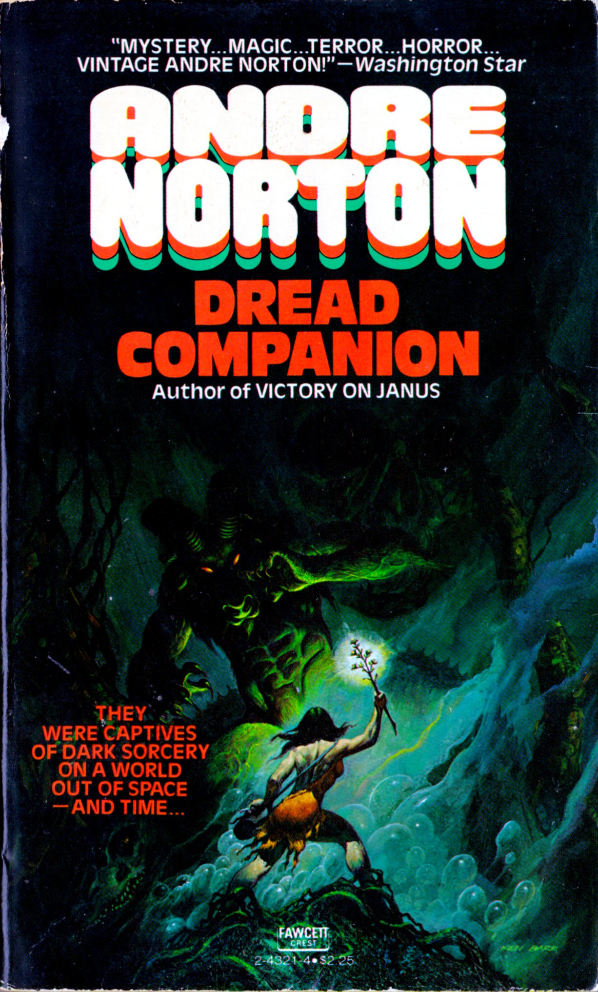
None of these paperbacks includes a formal cover credit, but the paintings are all signed; I wouldn’t call myself a fan of the art of Ken Barr, but I like the images here well enough to scan and post them.
[CLICK IMAGES TO ENLARGE]

"This day's experience, set in order, none of it left ragged or lying about, all of it gathered in like treasure and finished with, set aside." –Alice Munro, "What is Remembered"

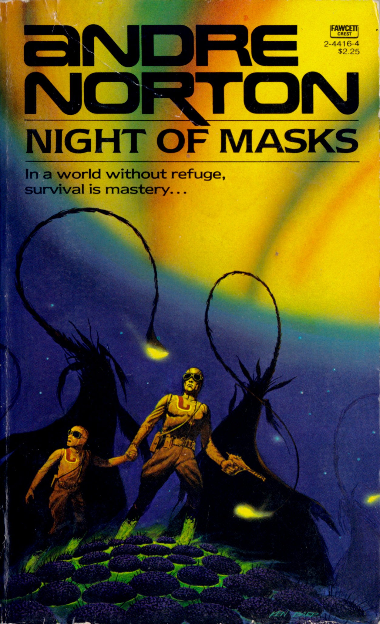
None of these paperbacks includes a formal cover credit, but the paintings are all signed; I wouldn’t call myself a fan of the art of Ken Barr, but I like the images here well enough to scan and post them.
[CLICK IMAGES TO ENLARGE]
The following illustrations by Noel Sickles were originally published in Reader’s Digest Condensed Books: Spring 1956 Selections; I scanned them from a copy of the book that I purchased at a local thrift store:
[CLICK IMAGES TO ENLARGE]


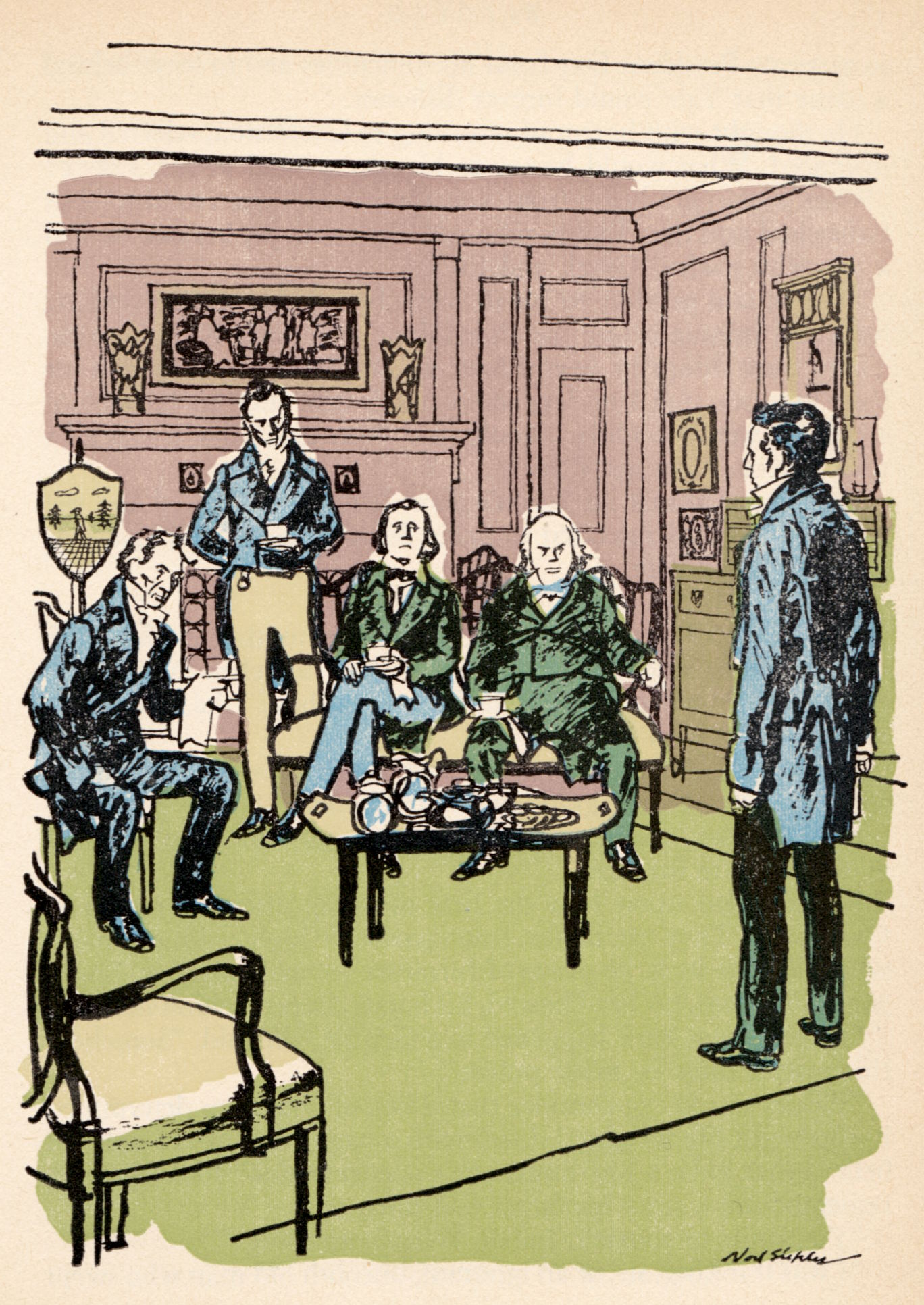


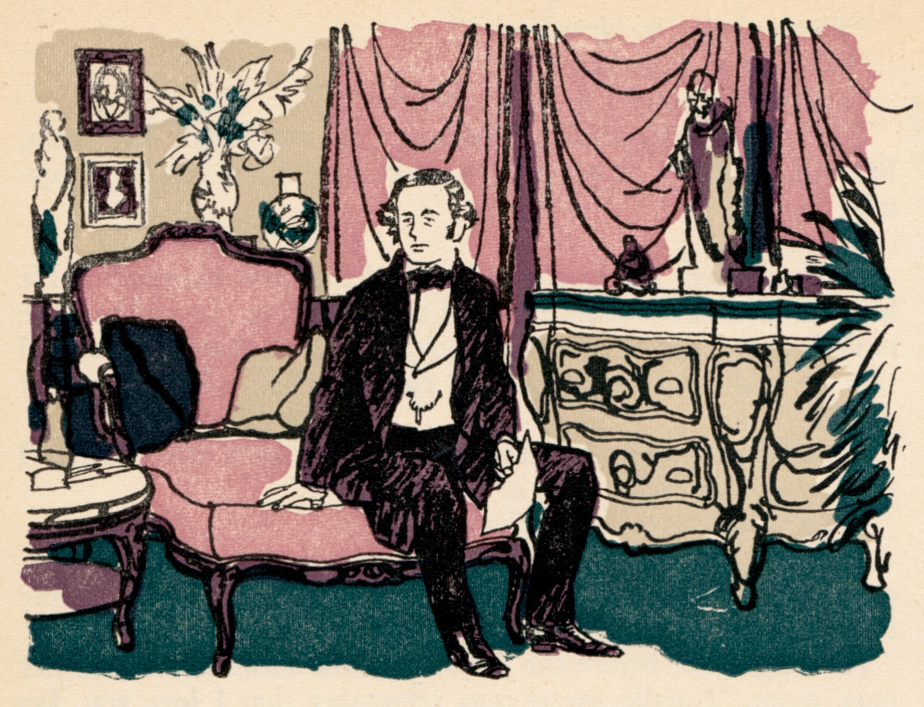

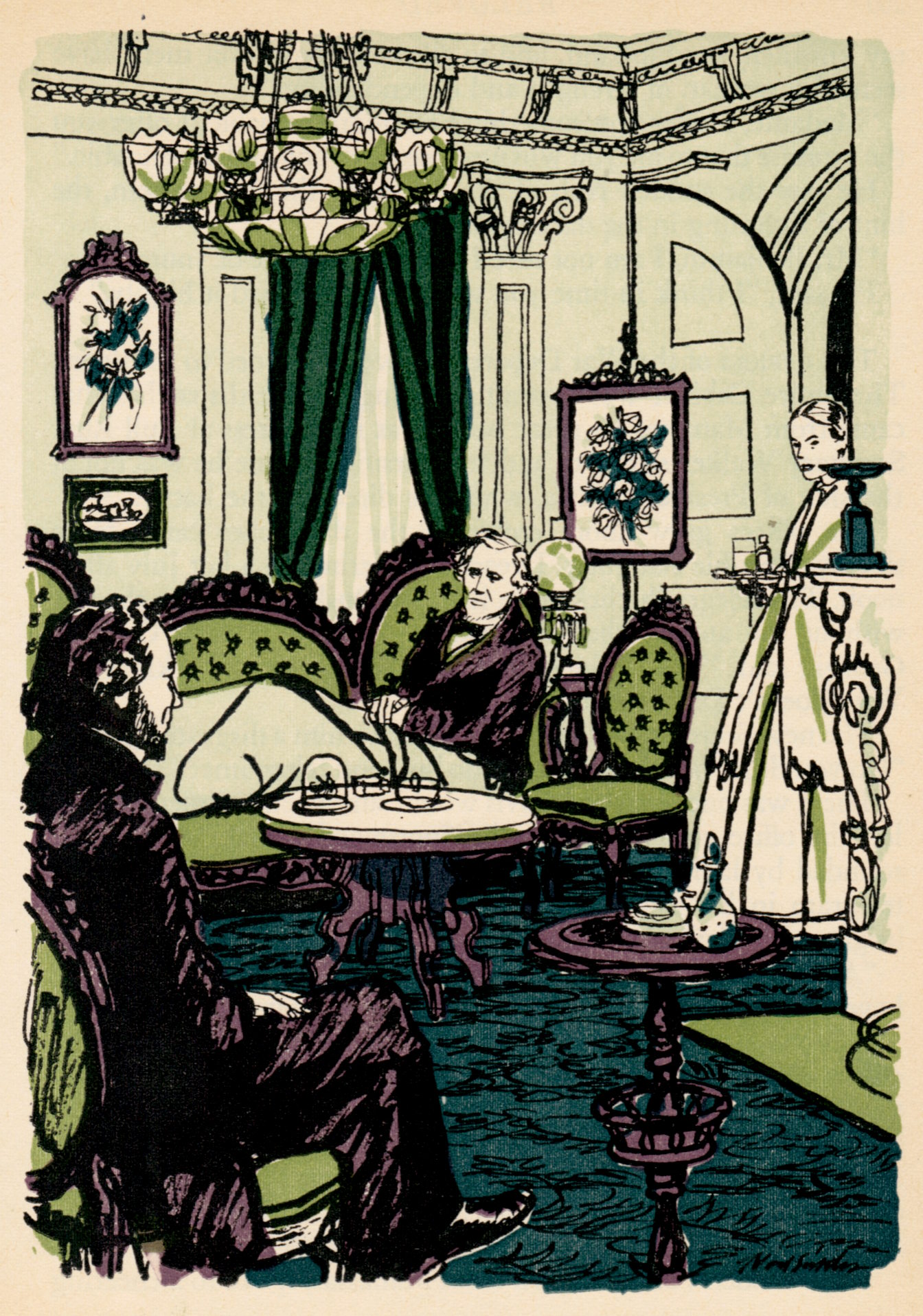
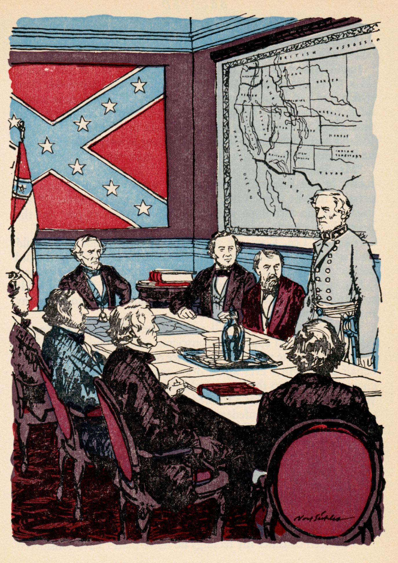
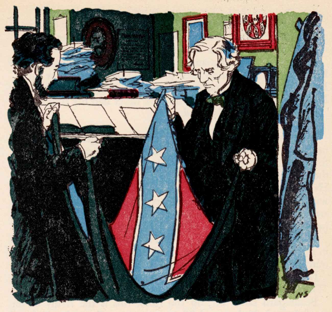
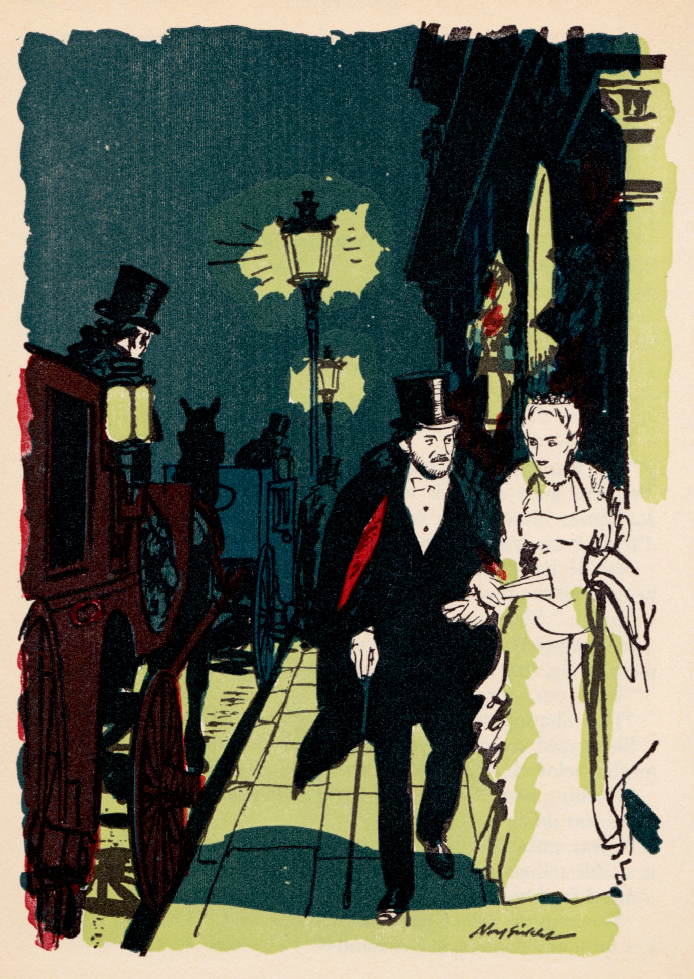

The two-page spreads don’t line up exactly, but I didn’t leave anything out. Whatever is missing from the centre of the images was missing in the original printing.
[CLICK IMAGES TO ENLARGE]

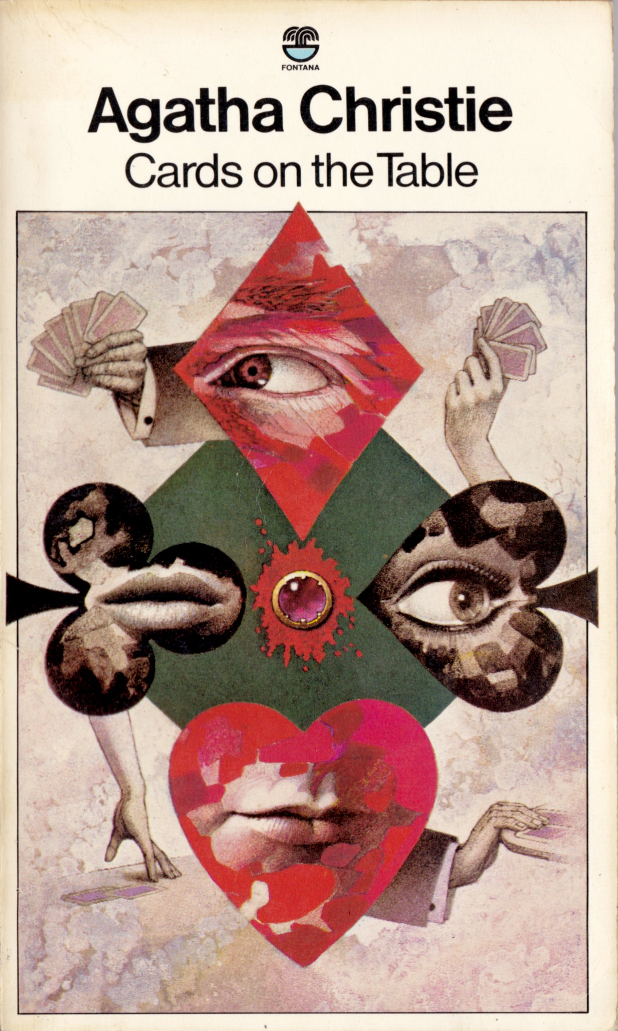


To view all of the Agatha Christie covers with art by Tom Adams that I’ve scanned and posted for your viewing pleasure, start here.
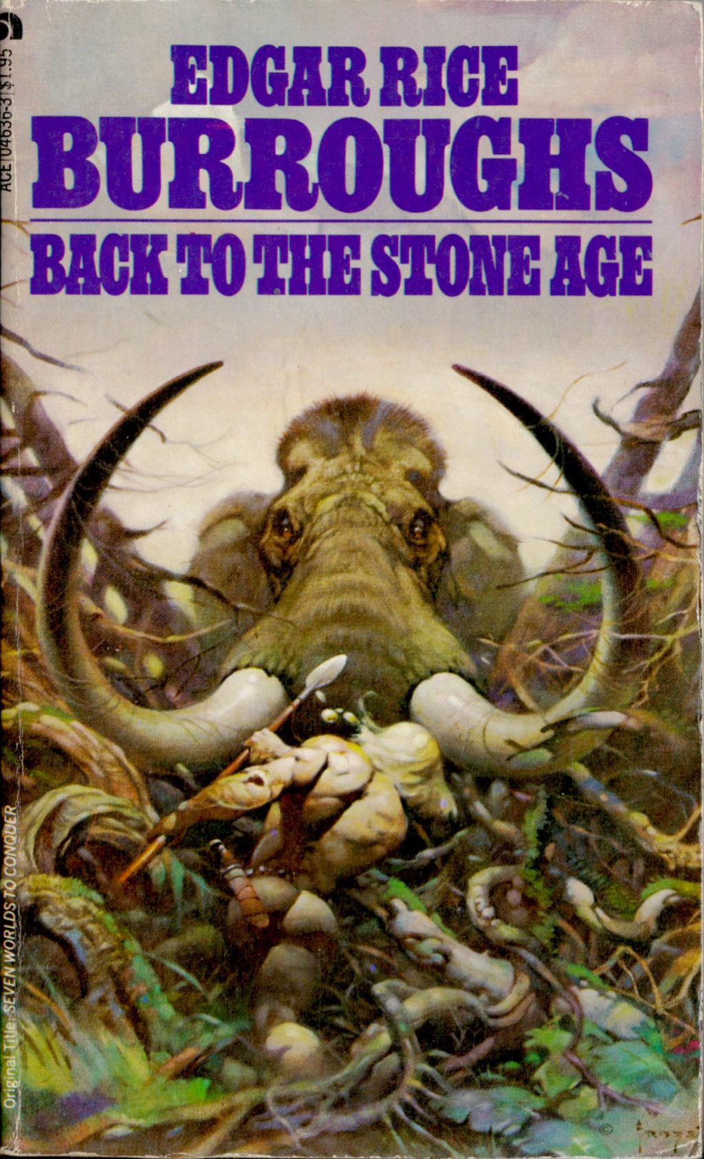
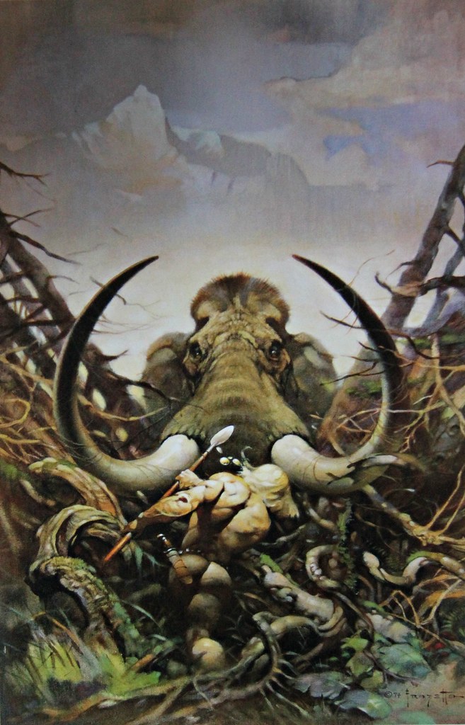
I scanned the cover of Back to the Stone Age by Edgar Rice Burroughs, with pulse-poundin’ art by Frank Frazetta, from the copy of the paperback edition in my personal library.
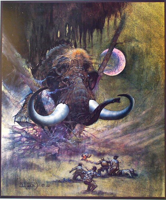
Arthur Suydam’s Mammoth was published as a poster/print in both an unsigned and a signed and limited edition by Glimmer Graphics in 1990. I borrowed the image of Mammoth from the Glimmer Graphics site.
Suydam’s stories in Heavy Metal and Epic Illustrated were among the best those magazines had to offer.
Frazetta, of course, is Frazetta.
BONUS IMAGES:

Perhaps those “Bonus Images” ought to have been a “Connections” post all on their own.
[CLICK IMAGE TO ENLARGE]
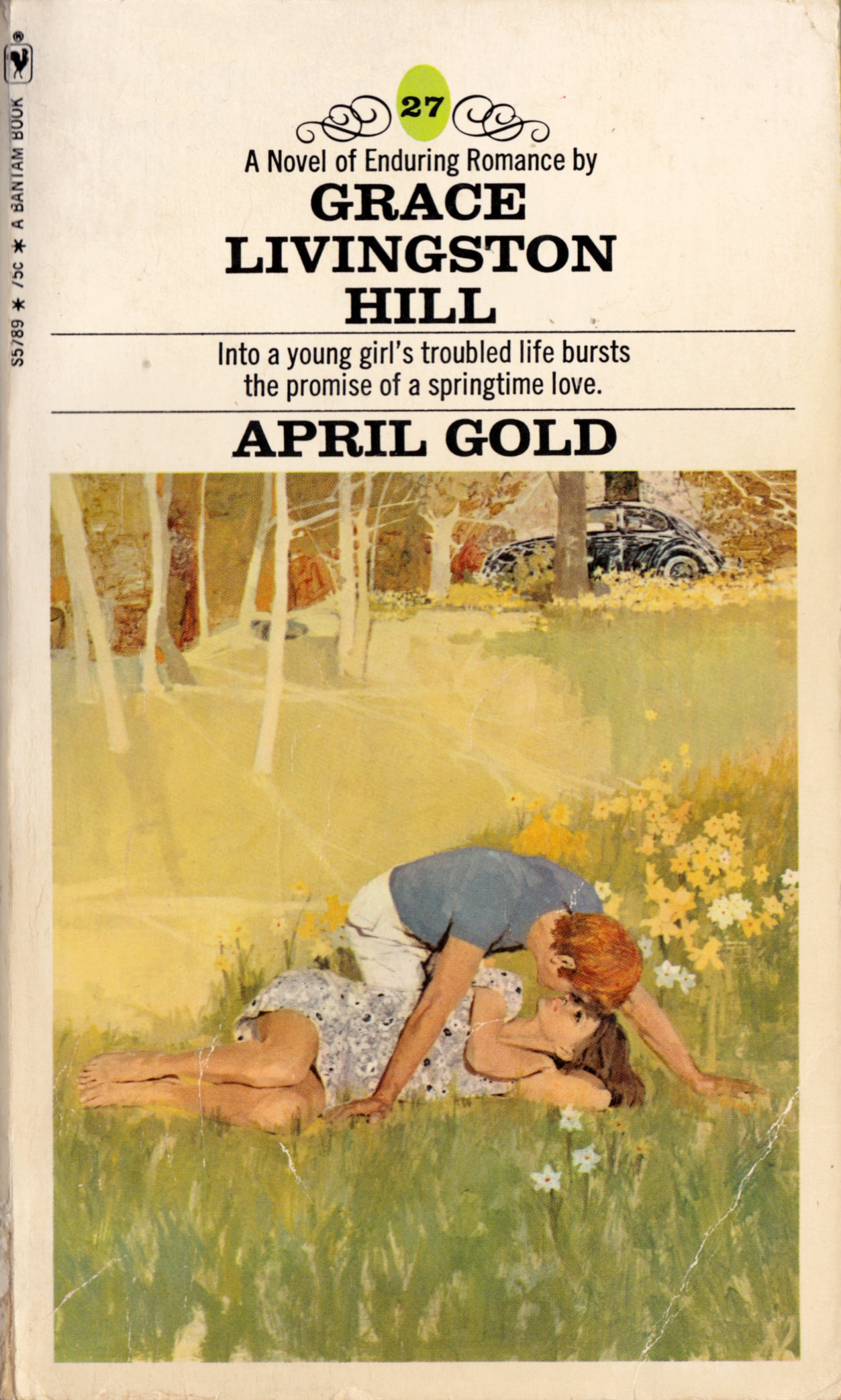
There are a LOT of novels in this numbered series of paperbacks by Grace Livinston Hill — the above is number twenty seven! — and to the publisher’s credit, they all have illustrative covers. But sadly, the level of artistry on the covers is, for the most part, neither excellent nor odd enough to make the novels worth collecting. The illustration on the cover of April Gold, however, is not only a cut above ALL of the others that I’ve seen in the series but is quite lovely and, yes, romantic, in and of itself. Which is why I bought it to scan for display online today, 14 February 2013.
Happy Valentine’s Day!
I can’t remember when I bought the sixth printing of the 1974 Berkley Medallion edition of Philip K. Dick’s The Man in the High Castle for a long time — it was a long time ago — but I do remember being both happy to have the novel to read and unhappy with the cover. Specifically, I’ve always been irritated by the wide red banner that the folks at Berkley Books rudely slapped across the face of Richard Powers’ lovely cover art in order to have a spot to brag about their decision to re-print a much-admired novel and to inform/remind readers that Philip K. Dick’s book had won the Hugo Award for “the best S-F novel of the year” — in 1963! But I am irritated about that no longer, because today I found a copy of the novel with the same cover but without the red banner — Berkley Science Fiction, 1982, tenth printing — in lovely condition, and it only cost me ninety-nine cents and tax to add to my collection.
[CLICK IMAGES TO ENLARGE]
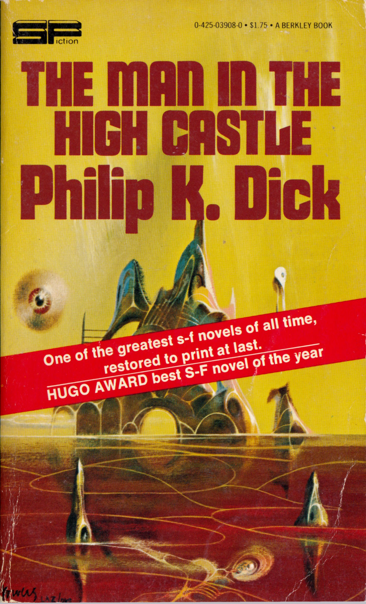
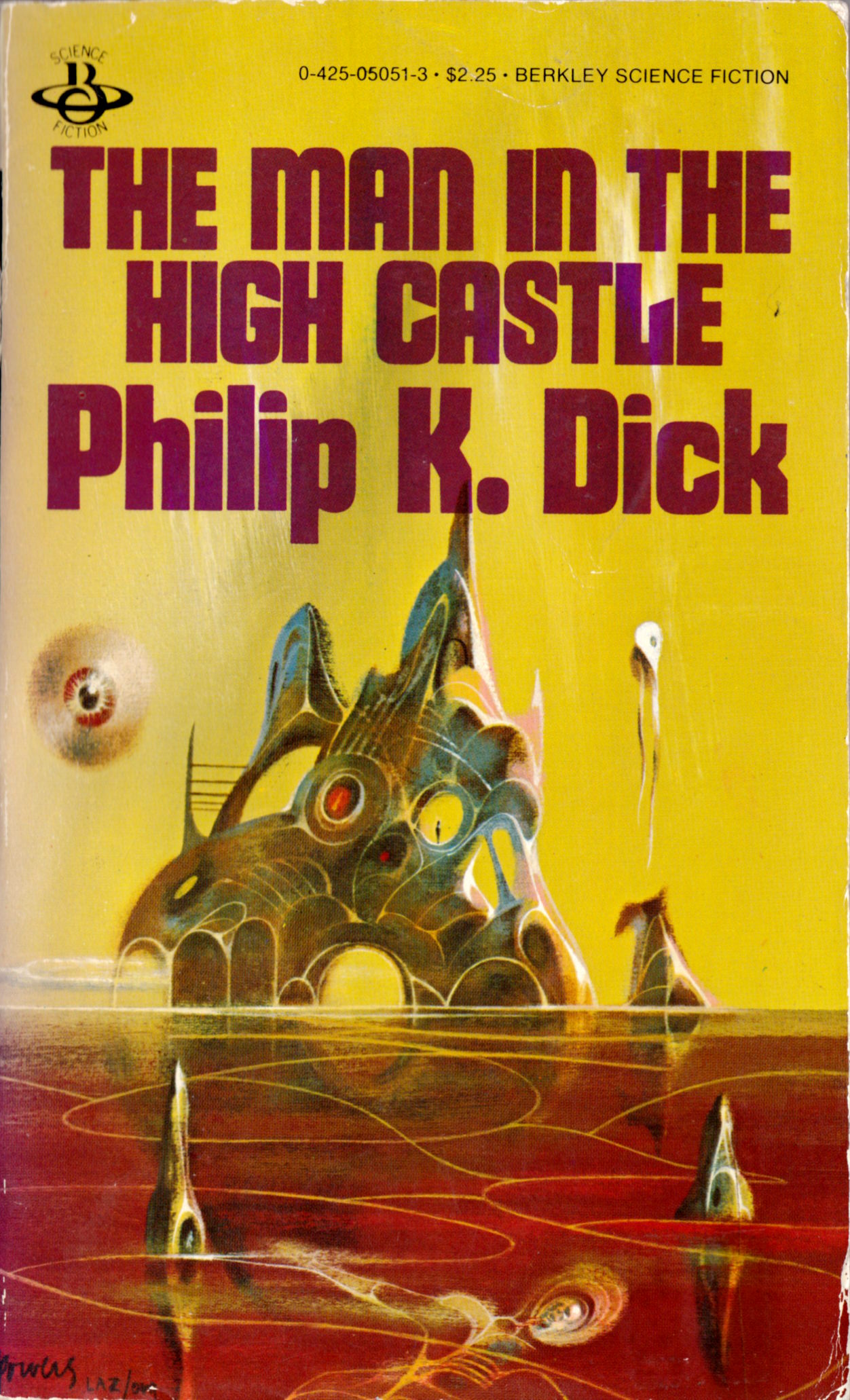
Do you see now what was obscured by the red banner? Ironically, it is none other than a little silhouette of “the man” standing ramrod-straight in a void (or hole, or window, or empty eye socket) in Powers’ oddly sculptural, strangely forbidding “high castle.”
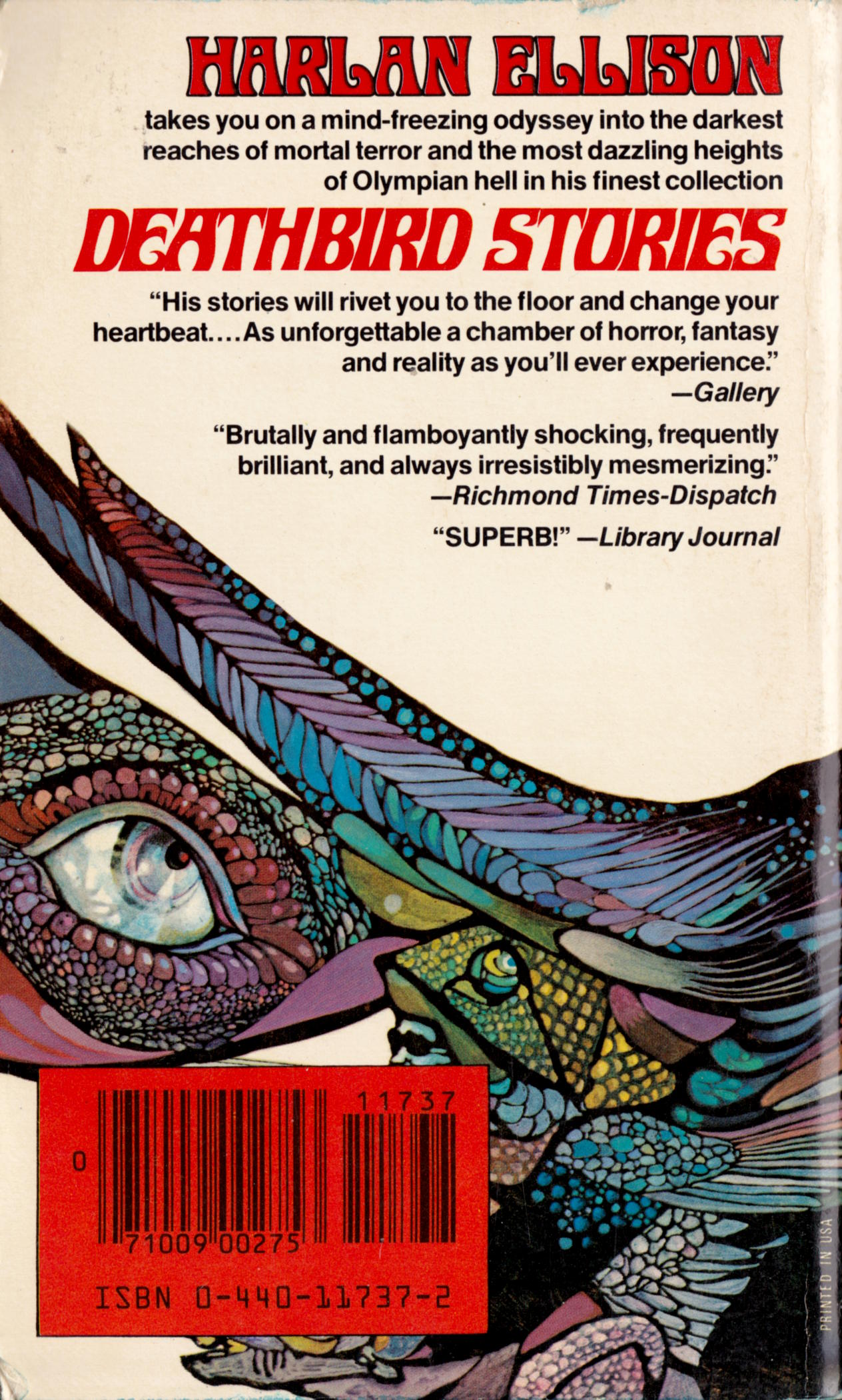
It’s not often that I see paperbacks by Harlan Ellison on the shelves in thrift stores these days — or used-book stores, period — but a couple of months ago, I came across what looks to me to be an unread copy of Deathbird Stories at Value Village — I took it off the shelf just before a local bookseller showed up, looking for underpriced books to stock his shelves, and when I showed him what I had found (I’ve purchased books from his store many times; his prices are reasonable), he told me that I was lucky that I had gotten there before him — and because the book also had the classic cover with both art and design by Leo and Diane Dillon, I bought it. Here’s a scan of the front and back covers along with a rough panorama of the wraparound:
[CLICK IMAGES TO ENLARGE]


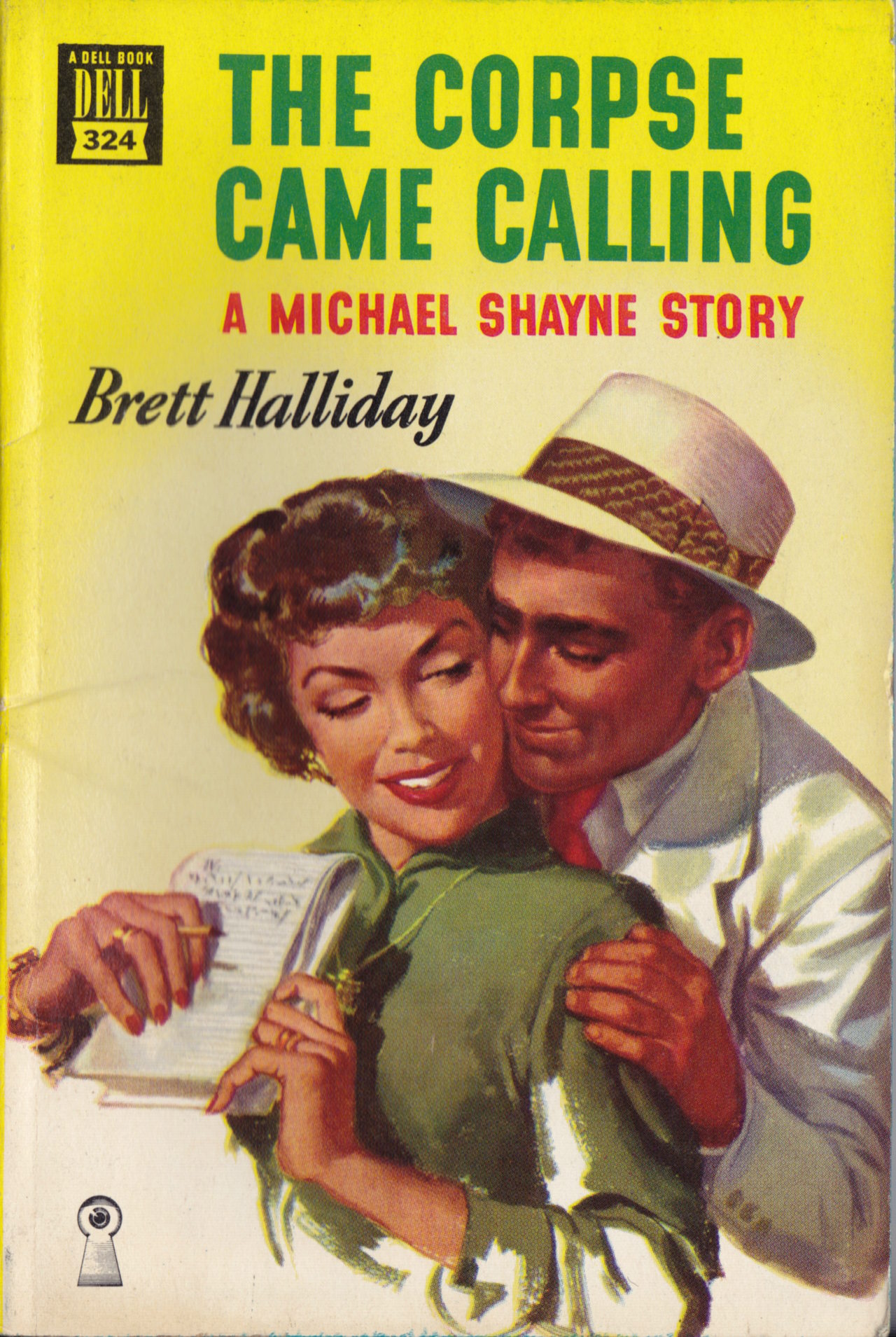
Actually, only A Taste for Violence includes the credit line “Cover painting by Robert Stanley,” but the stylistic and circumstantial evidence strongly suggests that Stanley produced the cover painting for The Corpse Came Calling as well. And yet, the style was common during the period, so maybe someone else deserves the credit:
[CLICK IMAGES TO ENLARGE]
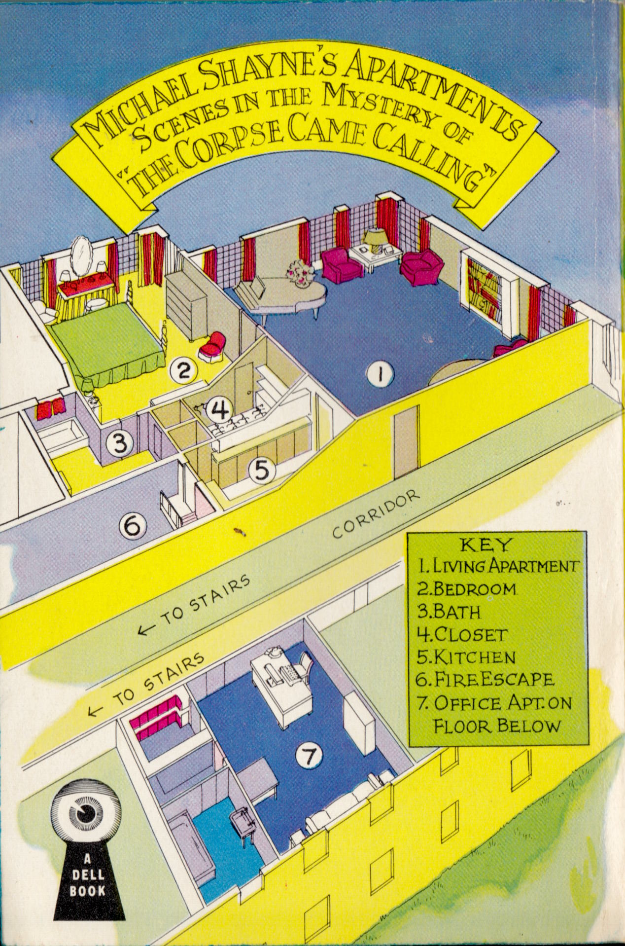

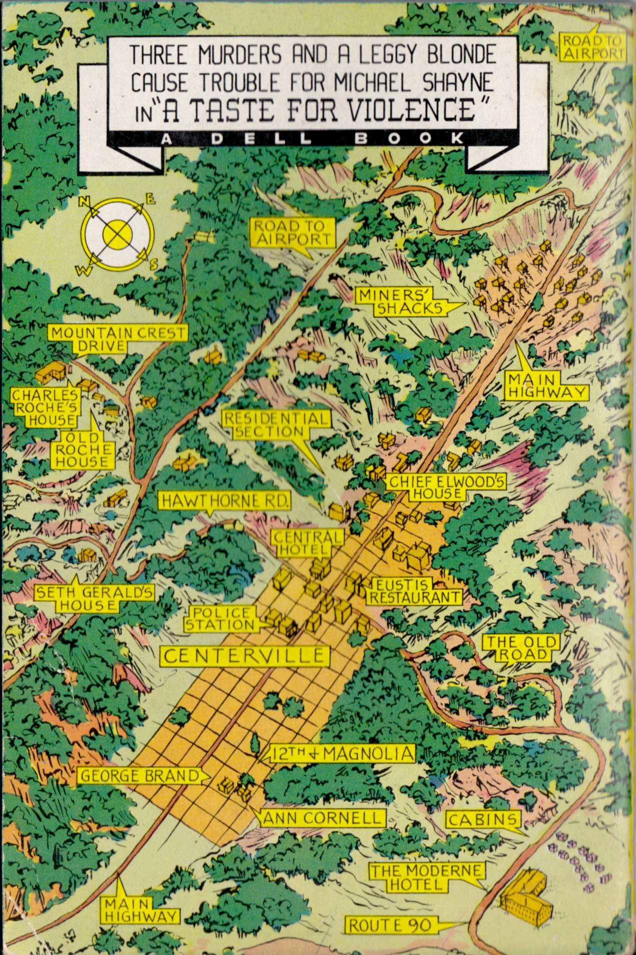
The diagrams on the backs of the novels are not something I personally tend to associate with mystery fiction — fantasy fiction, on the other hand, seems to me to be head-over-heels in love with maps and really ought to marry them — but I do wonder if readers at the time ever actually consulted the back covers as they were reading. The disappearance of the maps and floor plans from later editions of the novels may be a sign that they were not a big selling point, that punchy, suggestive copy did more to whet the reader’s appetite for the story within than a label-festooned diagram of an apartment or a neighbourhood ever could.
I’ve got many more “Michael Shayne Murder Mysteries” to scan and post, all with cover art by everybody’s favourite pulp cover artist, Robert McGinnis, but those will have to wait for another day…