Book/Magazine Covers (All) · Heads Up! · Illustration Art · Michael Wm. Kaluta

Heads Up: KALUTA: THE BIG BOOK

Coming this summer from IDW:

Here’s the publisher’s description:

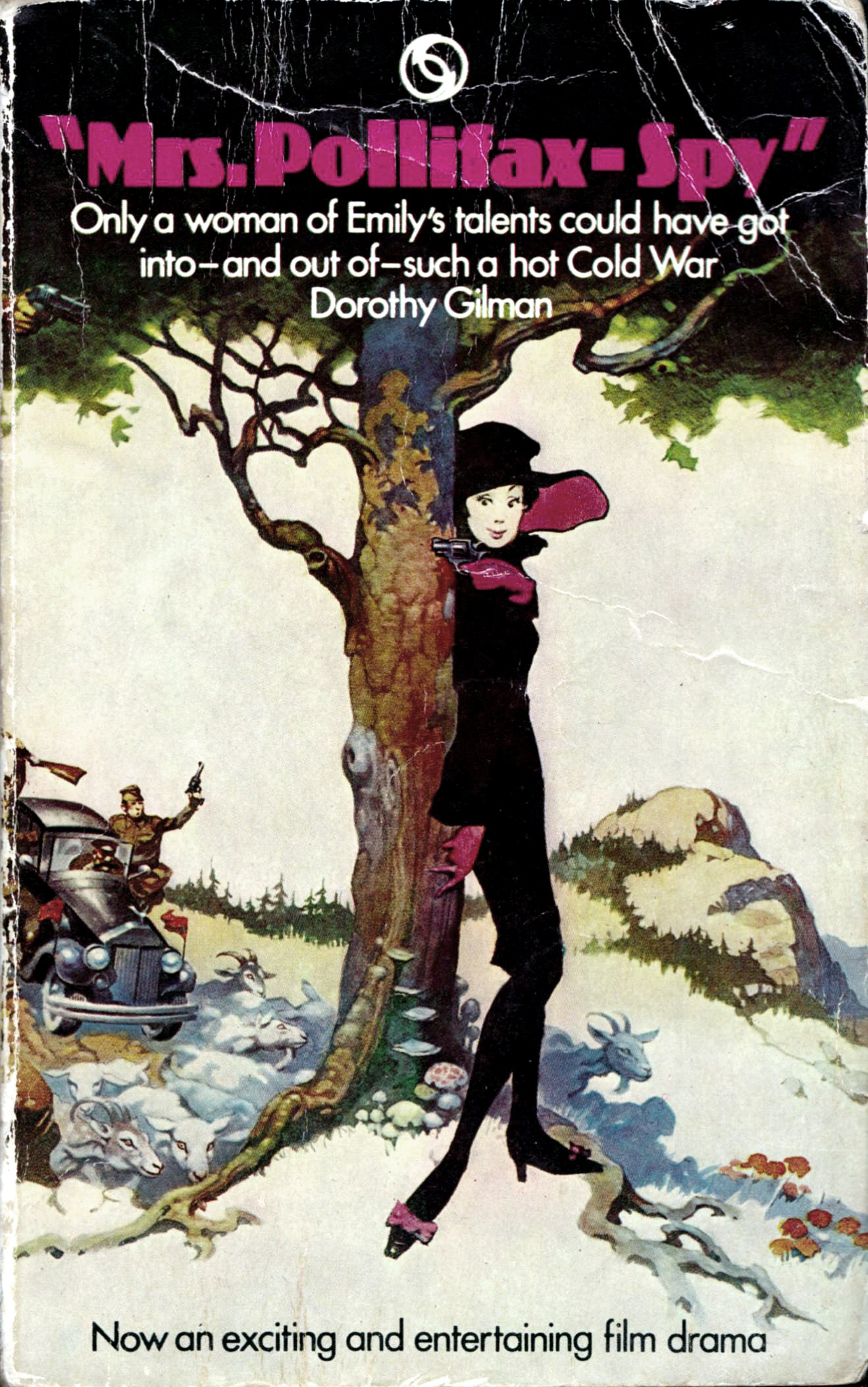
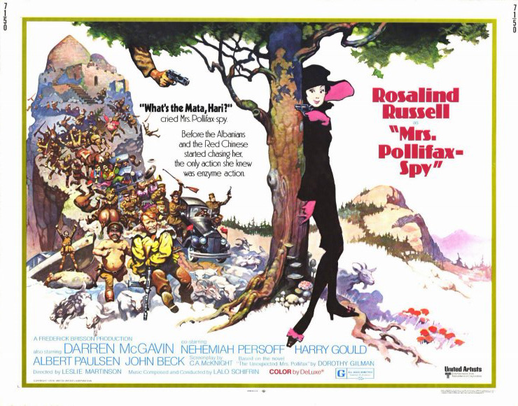
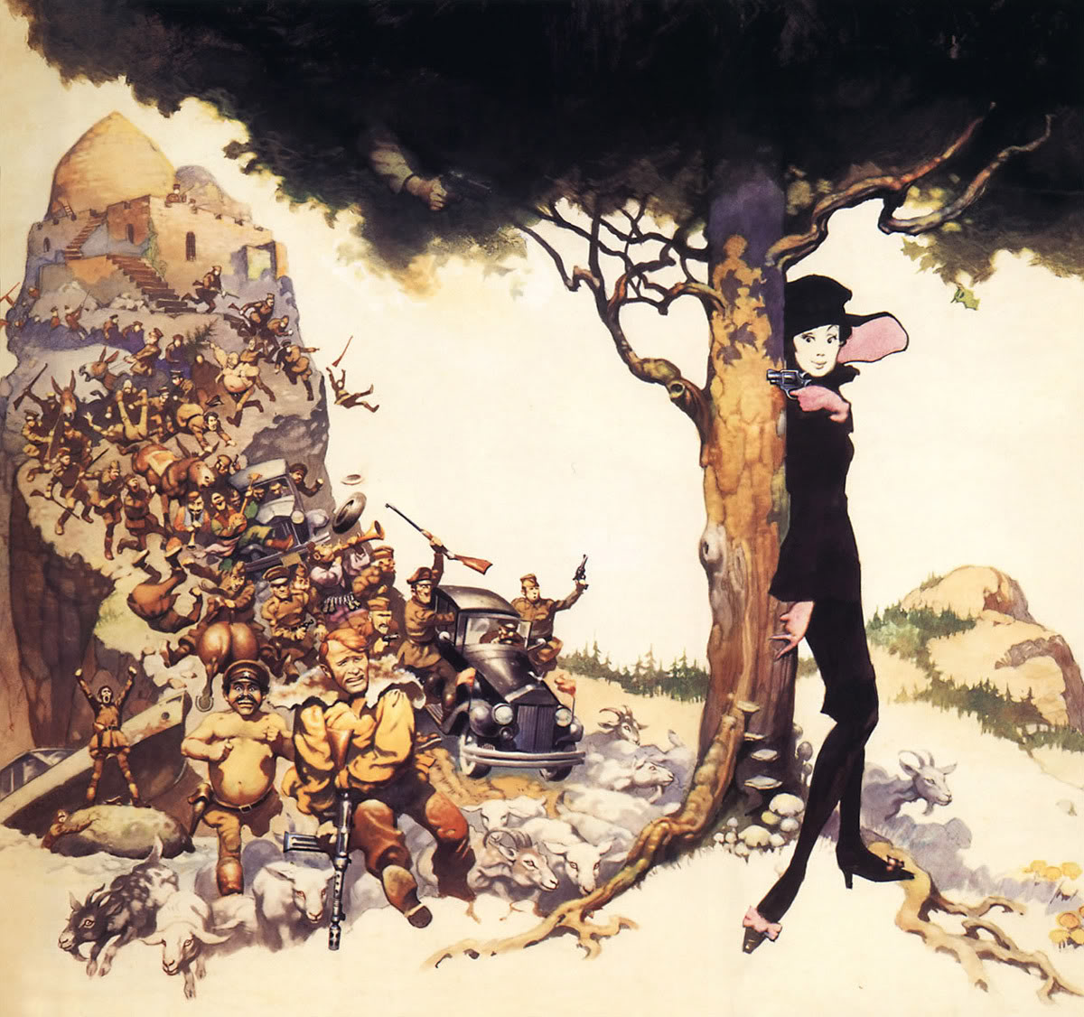
Michael Kaluta’s career has been both diverse and extraordinary. From his origins as a fanzine artist in the 1960s, to his defining rendition of The Shadow in the 1970s, through his stint as part of the legendary art collective known simply as THE STUDIO and beyond, Kaluta has produced countless gorgeous images that never cease to enchant us. Now, for the first time, the work of Michael Wm. Kaluta is presented in an oversized, massive retrospective that showcases his beautiful art. Many of the pieces presented in this very special volume will be scanned from Kaluta’s original art to maximize the quality of printing. If you are a fan of Kaluta’s work, or a lover of fine art, then this is the book for you!

Details:

Format: Hardcover, 304 pages, 9 x 12 inches
Publisher: IDW Publishing (July 23 2013)
Language: English
ISBN-10: 1613776829
ISBN-13: 978-1613776827

Kaluta is a terrific artist. And IDW has a reputation for publishing high-quality art books. So pre-ordering Kaluta: The Big Book is, for me, a no-brainer. YMMV.

Book/Magazine Covers (All) · Frank Frazetta · Illustration Art · Look Here · Movies

Look Here: MRS. POLLIFAX — SPY, with cover art by Frank Frazetta

I bought the following battered paperback for a buck at a church sale on the weekend:

[CLICK IMAGES TO ENLARGE]

The image on the cover is an aggressively cropped section of Frank Frazetta’s unusually expansive poster art for the movie Mrs. Pollifax — Spy (1971), which was based on the novel by Dorothy Gilman.

Here, for ease of comparison, are what the poster and the original art look like, more or less:

Notice how, in the poster image, someone or other — the art director? — not only has intensified the colour and contrast but also has moved the hand with the gun, camouflaged in the canopy of the tree in the original, down and slightly to the left, and trimmed back the foliage a bit, in order to make the “threat from above” ridiculously blatant, and I would argue that both changes work rather nicely; that is, the brighter colours seem to me to be more sympathetic to the comedic intent/content of the image — not to mention, more eye-catching — and the change in the position of the arm, etc., integrates the hidden, would-be assassin in a more satisfying way into the overall comedic situation.

(Oddly enough, on the paperback cover, the hand with the gun appears to be positioned more or less where Frazetta has it in his painting, though its effect in that instance — if one notices it at all — seems to me to be more unsettling than it is humorous.)

Notice also the variations in colour among the three images. I don’t know if Frazetta’s original painting is truly as subdued as it looks in that JPEG. What I do know, however, is that my scan at the top of this post matches my copy of the book quite well.

Book/Magazine Covers (All) · Illustration Art · Robert McGinnis

Look Here: Three more uncredited, vignette-style covers with art by McGinnis

One of the covers displayed below had a spidery splash of red paint over the author’s name in real life so I decided to repair my scan with GIMP; turned out okay, I hope…

[CLICK IMAGES TO ENLARGE]


RELATED LINKS HERE AT RCN:


WORD OF THE DAY: PERSEVERANCE

per·se·ver·ance

Noun

  1. Steadfastness in doing something despite difficulty or delay in achieving success.
  2. Continuance in a state of grace leading finally to a state of glory.

Synonyms
persistence – tenacity – pertinacity – assiduity

Keywords: The Empty Trap, Dead Low Tide, Deadly Welcome.

Book/Magazine Covers (All) · Illustration Art · Look Here · Richard Amsel

Look Here: Two paperbacks with cover art by Richard Amsel

More scans of paperbacks in my increasingly eclectic collection:

[CLICK IMAGES TO ENLARGE]

American illustrator and graphic designer Richard Amsel (December 1947 – November 17, 1985) was perhaps best known for the poster art he produced for Hollywood movies such as The Champ, Chinatown, Julia, The Last Picture Show, The Last Tycoon, The Life and Times of Judge Roy Bean, McCabe & Mrs. Miller, The Muppet Movie, Murder on the Orient Express, Nashville, Papillon, The Shootist, The Sting, Flash Gordon, The Dark Crystal, Raiders of the Lost Ark, and Mad Max Beyond Thunderdome. He also produced over forty covers in 13 years for TV Guide and worked for many other high-profile clients. He was the envy of his peers. He died at the age of 37.

Amsel fans might be interested to know that the cover of Dangerous Summer was published in 1969, the same year that Amsel’s submission to a nationwide talent search for an illustrator to produce the poster art for the Barbra Streisand musical Hello, Dolly! was selected by 20th Century Fox for the film’s campaign. At the time he won the talent search, the 22-year-old Amsel was still a student at the Philadelphia College of Art.

Book/Magazine Covers (All) · Comics · Here, Read · Illustration Art · Look Here · Rebecca Dart

Look Here, Read: “Depression” by Rebecca Dart

From the mini-comic The Other 88% #1, published way back in November 1993, here’s “Depression,” a heartfelt two-page story by Rebecca “Battle Kittens” Dart, who had just turned twenty in April of that year:

[CLICK IMAGES TO ENLARGE]


BONUS SCANS: COVER and ABOUT THE ARTIST


REBECCA DART ON THE WEB:


INTERVIEWS:

Book/Magazine Covers (All) · Illustration Art · Look Here

Look Here: Three sexy, fun, odd, nsfw photo covers

As I’ve mentioned once or twice on this blog in the past, I don’t often buy paperbacks with photo covers, but when I came across a copy of The Secret Sex Curse of Bertha T. — dig that groovy lettering, dig that papier-mâché demon mask, dig the sleek Ms. Bertha Turtle, her upper body bathed in a golden glow, her lower body not merely exposed but over-exposed! — after I came across that book, I say, at a local Salvation Army Thrift Store, I started to watch for a couple of others that I could scan with it to produce a post here at RCN. And, well, it’s not much, but here’s what I’ve got:

[CLICK IMAGES TO ENLARGE]

Does it make any sense to you that the woman on the front of Blondes Don’t Have All the Fun is wearing sheer pantyhose? Because it makes no sense to me… though I am certainly familiar with the theory that being not quite naked is sexier than being totally naked… I just don’t see that it makes much difference here, except that waistband is an unattractive distraction…

Keywords: Juliet of the Spirits, Blondes Don’t Have All the Fun, The Secret Sex Curse of Bertha T.

Book/Magazine Covers (All) · Illustration Art · Look Here · The Brothers Hildebrandt

Look Here: The “Fall of the Towers” trilogy times two

More paperback covers, scanned by yours truly…

First up, here are the covers that the folks at Ace Books designed for their 1970s reprint of Samuel R. Delany’s “Fall of the Towers” trilogy, which was first published in the early 1960s; the pretty, staid cover art is by the Brothers Hildebrandt, who at the time were generally fairly adept at colour mixing for various lighting conditions but not especially good at designing futuristic or alien cities that didn’t look like conglomerations chess pieces (or monsters that didn’t look like slightly modified versions of plastic toys; see, for instance, the cover of Epic Illustrated #5):

[CLICK IMAGES TO ENLARGE]

In contrast, in the UK in the late 1960s, the “Fall of the Towers” trilogy was published by Sphere with relatively adventurous cover art by Russell FitzGerald, although I must say, the artist’s ambition here seems to me to have been tightly hobbled by his weak draftsmanship and indifferent painting technique:

FitzGerald’s work was later featured in and on the cover of the inaugural issue of the SF paperback quarterly Quark (1970), which was edited by Delany and Marilyn Hacker. I know I have a copy of Quark #1 somewhere around here, but damned if I know where it is at the moment… not that it matters, because the cover of Quark #1 is terrible…

Keywords: The Fall of the Towers, Out of the Dead City, The Towers of Toron, City of a Thousand Suns.

Barye Phillips · Book/Magazine Covers (All) · Illustration Art · Look Here

Look Here: Three pulp covers with art by Barye

I might have even more paperbacks with cover art by Barye Phillips on a shelf somewhere… or I might not… I’m not sure…

[CLICK IMAGES TO ENLARGE]

To view all of the paperback covers with Barye art that I’ve posted so far (along with a cover by an artist I’ve been unable to identify), click here.

Keywords: Always Leave ‘Em Dying, Arrowsmith, Brides in Bedlam.

Barry N. Malzberg · Book/Magazine Covers (All) · Davis Meltzer · Illustration Art · Look Here · Samuel R. Delany

Look Here: Two more novels with bold cover art by Davis Meltzer

[CLICK IMAGES TO ENLARGE]

Isn’t it interesting that the art director at Ace put the blurb on The Falling Astronauts cover directly over Meltzer’s signature. No art credit inside the book, either. But Meltzer was probably paid a lot for his work, right? Yeah, right…

Book/Magazine Covers (All) · Fine Art · Francis Bacon · Look Here

Look Here: DARKNESS AT NOON, with cover art by Francis Bacon

How many times has a painting by Francis Bacon appeared on the cover of a book that is not about the life and/or art of Francis Bacon? I’m no expert, but I can only think of one instance — you are welcome to post a comment if you know of more! — and here it is, scanned from my personal library, along with a small, low-quality JPEG of Bacon’s original painting, Man in Blue V:

[CLICK IMAGES TO ENLARGE]

Now, although Bacon’s painting itself is simply composed and nearly monochromatic in colour, the contrasty, cropped, colour-reduced version on display on the cover of Darkness at Noon reads to me as little more than a shadow of The Man.


Francis Bacon was born 28 October 1909 and died on this day, 28 April, back in 1992. In other words, today is the twenty-first anniversary of the death of Francis Bacon.


BONUS IMAGE:

A reader delurked today to bring to my attention another book cover with art by Bacon: Hadrianus VII by Fr. Rolfe (Baron Corvo), with the Fr. being short for “Frederick”. Here’s what it looks like:

The tiny image posted above — the only one I could find on short notice — is from the catalogue of an online bookseller.

Thanks, Arthur!

Keywords: Darkness at Noon.