Alberto Breccia · Comics · Here, Read · Look Here

Look Here, Read: “The Dunwich Horror,” adapted by Breccia and Buscaglia

From Heavy Metal, volume III, number 6 (October 1979), here is Alberto Breccia’s adaptation of H.P. Lovecraft’s “The Dunwich Horror”:

[UPDATE: The version published in Heavy Metal is now followed by a scan of the Spanish-language original, which provides the ocular proof of HM’s legendary translation and relettering butchery — not to mention HM’s failure to give credit to Breccia collaborator Norberto Buscaglia!]

[CLICK EACH IMAGE TO ENLARGE, or RIGHT CLICK > SAVE LINK AS…]

Alberto Breccia (1919–1993) was a 2009 Will Eisner Comic Industry Hall of Fame nominee. That Breccia was passed over for the award says considerably more about the shameful lack of availability of English translations of Breccia’s comics than it does about the quality of the work, which was first-rate.

The artists who were named to the Will Eisner Comic Industry Hall of Fame for 2009: Harold Gray, Graham Ingalls, Matt Baker, Reed Crandall, and Russ Heath. Ah nostalgia… there’s no soporific like it…

Comics · Here, Read · Look Here · Mirko Ilic

Look Here, Read: “Survival” by Mirko Ilić and Les Lilley

Hey, kids! I think it’s time for more comics, so here, straight outta Heavy Metal, volume III, number 10 (February 1980), is Mirko Ilić and Les Lilley’s “Survival”:

[CLICK IMAGES TO ENLARGE]

To read the five single-page fantasies by Mirko Ilić that were published in Epic Illustrated back in the day, click here.

I wonder… is the Corben influence on Ilić’s comics as obvious to you as it is to me?

Another visible influence: Rene Laloux’s 1973 movie, Fantastic Planet.

BONUS LINK:

Success Secrets of the Graphic Design Superstars: Mirko Ilić

Art Collection · Comics · Ebay Win · Look Here · Rod Ruth

Look Here: One more “Toodles” strip, with art by Rod Ruth

The following “Toodles” daily, with art by Rod Ruth, is from 2-19-58:

rod-ruth_original-toodles-daily_2-19-58_img15x4.5in

I recently purchased the strip to go with the daily from 2-20-58, which my wife and I already own. I posted a scan of 2-20-58 previously, but here it is again:

rod-ruth_daily-strip-original-art_the-toodles_2-20-58_img15x4.5in

In part because they come one after the other in the ’58 continuity, and in part because of good fortune and careful selection on my part, the two strips read very nicely as a self-contained vignette and will look great matted together in a single frame!

To view all four of the “Toodles” strips in our art collection, and learn a little bit about Rod Ruth, click here.

Commonplace Book · Drawing

John K. on making superficial copies vs. looking for knowledge and understanding

“I find that it’s not enough to just draw and copy things. I have to try to understand the why of what things look like. Otherwise I am just making superficial copies of a specific pose without being able to draw other poses later.

“So when I am copying, I look for knowledge and understanding. Not just the specific shapes I am copying, but the general forms and relationships causing the specific shapes. I try to find things that make some sense and then write them down in the hopes I remember them and can put them to use later.”

— John K., “Stiff Warm Ups and Studies,” blog entry, posted 25 August 2010, accessed 13 September 2010.

Ephemera (Jones) · Here, Read · Jeffrey "Jeff" Catherine Jones

Here, Read: Jeffrey Jones on the proudest moments of his career

JEFFREY JONES
71 WITTENBERG RD.
BEARSVILLE, NY 12409

Dear Mr. Weaver,

I’m sorry this took so long.

You asked about the proudest moments of my career. I don’t think I sit around and think about the past. There are artists who like to paint and those who like to have painted. I like to paint. I love to paint. The drawing, the way colors leap to life next to each other. I had a teacher once who said “There’s no such thing as an ugly color, it depends on what it’s next to.”

Good luck.

Sincerely,
Jeff Jones

Art Collection · Comics · Ebay Win · Look Here · Rod Ruth

Look Here: Two more “Toodles” strips, with art by Rod Ruth

Here are two more strips by Rod Ruth, from our slowly expanding collection of original art; the first is from 2-20-58, and the second, from 3-12-58:

[CLICK IMAGES TO ENLARGE]

Rod Ruth is by no means a well-known figure in the history of comic strips, but I, for one, find his work terrifically appealing. Ruth’s character designs are distinctive, and the expressions always appropriate to the action: look, for instance, at the way Ann’s expression changes from panel to panel in the first strip as she struggles to stand up for the man she loves in the face of her parents’ stern expressions of disapproval, and then retreats into sullen silence as her mother pointedly puts her father in his place. Ruth’s staging of the action is also first rate: in the first strip, notice how he changes from a three shot in the first panel, with the father on the left, facing right, to a closer two shot of mother and daughter, back out to a three-shot, with the father close on the right, facing left — which, taken together with the first two panels, I read as a sign that the father has been pacing back and forth while the women have been talking — and then ends with a lovely low reverse angle that not only maintains spacial continuity between the three but also places the now visibly weary Ann, both compositionally and symbolically, right in the line of fire between her domineering mother and her stuffed-shirt father; and I especially like the bits of business the artist gives to Ann in the second strip — panel one, she files her nails; panel two, she pumps a bit of moisturizer into her palm; and panel three, she absently rubs the moisturizer into her hands as she wistfully contemplates lost love. Finally, Ruth’s handling of clothing, furniture, props, etc., is always economical and convincing: notice, for instance, the way he uses little dabs and checkmarks of ink to give dimension to the quilting on Ann’s jacket in the second strip, or the way he suggests the folds on the nurse’s overcoat with a few deft strokes of the brush.

To see all three of the “Toodles” strips I’ve posted so far, click here.

BONUS LINKS:

The Haunted Closet: Baleful Beasts and Eerie Creatures (illustrated by Rod Ruth), posted by Brother Bill

The Haunted Closet: Baleful Beasts and Eerie Creatures: The Patchwork Monkey (illustrated by Rod Ruth), posted by Brother Bill

The Haunted Closet: Baleful Beasts and Eerie Creatures: Nightmare in a Box (illustrated by Rod Ruth), posted by Brother Bill

The Haunted Closet: The Rest of Baleful Beasts and Eerie Creatures (illustrated by Rod Ruth), posted by Brother Bill

The Haunted Closet: Album of Dinosaurs (Tod McGowen, Rod Ruth, 1972), posted by Brother Bill

Here, Read · Interviews · Jeffrey "Jeff" Catherine Jones · Michael Wm. Kaluta

Here, Read: Jones on Kaluta, Kaluta on Kaluta vs. Jones

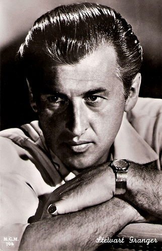
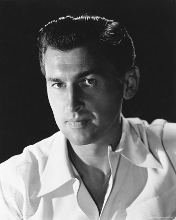
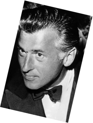
Here’s Jeffrey Jones on Michael Wm. Kaluta, from Comic Book Profiles #7: Michael William Kaluta (Summer 1999), pages 28 – 29:

How did you first meet Michael?

If memory serves, I met Michael and Bernie Wrightson at a New York City convention in the fall of 1968. Michael may dispute this because he is the “memory giant.” But I remember this as being so. We were there to show our fledgling work. I had arrived in New York about a year earlier and had a couple of jobs done. My memory is sketchy as to details but Bernie had a bunch of $5 and $10 ballpoint pen drawings piled on a table in the art show for sale. Michael was more of the portfolio type. I mention Bernie in the Michael question because he was the one who introduced us.

What do you feel is his strength as an artist?

Michael’s greatest strength as an artist has always been his ability to remind us to stay alive. His art is moral in the sense that it, as the best art, has absolutely no function except to exist. It has the promise of function and will remain where that beauty lives. I speak of the human spirit and its passion to rise above everything, except that which we all already know. Michael reminds us of that connection between all lives and all that makes us human. This takes a true artist.

You and Michael worked on projects together, both formally and informally. Does any one project stand out as particularly memorable?

The thing that jumps to mind is a period of time during The Studio days, if you will, when we were trying to decide what to call our upcoming book (The Studio). Michael taped long rolls of brown kraft paper to one wall where each of us, usually clandestinely, would write our suggestions. Well, this certainly started out seriously but quickly degenerated into a list of some of the most preposterous titles imagined by the minds of the deranged. I believe that even though most of these would appear in the dark of night, it was pretty easy to tell who wrote what. We laughed for what seemed months. Definitely a great achievement in the art of cooperation.

Now, it seems to me that what Jones viewed as the “greatest strength” in Kaluta’s work back in 1999 is precisely what Jones has always pursued in her own work.

And I have little doubt that Kaluta was, at the time, flattered by Jones’s praise; I mean, who wouldn’t be?

And yet, based on the very plain-spoken, practical analysis that Kaluta offers up in an early promotional trailer for Better Things: Life + Choices of Jeffrey Jones of the difference between his own unabashedly functional, commercial body of work, and the sometimes obliquely functional but always deeply felt and humanely expressive work of Jones, I’m not entirely sure that Kaluta actually would have agreed with Jones’s contention that his (Kaluta’s) artwork “has absolutely no function except to exist.”

Here is a partial, lightly edited transcript of the trailer, which features a rough-cut interview with Kaluta:

Artistically, [says Kaluta] one works for oneself. You have to. To get anything good, you kind of have to work for the person that’s inside of you; however, to be able to live, you have to work for companies. I had to work for companies; other artists, perhaps, can work for galleries, or posterity. An illustrator is someone who draws for money. I don’t do what some of my friends are able to do, which is paint their souls, their dreams, their nightmares for themselves, and that’s art — and it is. I am happiest when I am reading someone else’s material and crafting it into a picture that will reflect to my best efforts what I think the writer was trying to say, trying to visualize. I would say that Jeffrey Jones is both an illustrator and an artist, using the descriptions we have just talked about. He covers a wide range of self-motivating imagery. It comes through him, and every once in a while he’ll apply that specific power that comes through him to an illustration job, or he’ll use the characters that have been written by other people as a vehicle for his own talents. I wouldn’t say he’s as much of an illustrator as I am. I think that he’s more of a personal storyteller who now and then might come close to illustrating something [laughs], on purpose.

In the portion of the trailer I haven’t transcribed, Kaluta goes on to describe his first meeting with Jones, which Kaluta says occurred at “a World Science Fiction Convention here in New York City in 1967.” LOL!

Bernie Wrightson · Comics · Here, Read · Look Here · Separated at Birth?

Separated at Birth? James Garner and Captain Sternn

Okay, I admit it. This one isn’t an original.

From page 13 of Comic Book Profiles #2 (Spring 1998), here’s Bernie Wrightson’s answer to the question “How did Captain Sternn come about?”: “I realized when I was working on Running Out of Time for Kitchen Sink that Captain Sternn came out of my teenage years, from the movie, The Great Escape. It was always one of my favorite movies. When I was a kid, all my friends identified with the Steve McQueen character, but I was fascinated with the James Garner character, who played a con man. He was a really smooth liar, just this side of being oily. I realized that Captain Sternn looks like James Garner from the Great Escape. So I guess that’s where it came from.”

BONUS CONTENT (added 07 August 2010):

Here’s Wrightson’s first “Captain Sternn” story, as it appeared in Heavy Metal, vol. 3, no. 3 (June 1980):

[CLICK IMAGES TO ENLARGE]

Angelo Torres · Comics · Frank Frazetta · Here, Read · Look Here

Look Here, Read: “The Blank!” with art by Angelo Torres

From the pages of Strange Stories of Suspense #12 (December 1956), here’s a four-page story with a banal script that is partially redeemed by the vivacious Frazetta-influenced art of Angelo Torres:

The lowest point in the story has to be when Lee says to Dora, “Besides, you’re much too lovely a girl to be so brilliant and absorbed in your work!” That’s casual sexism offered up as a compliment, Holmes. Apparently, whether they’re from the past, the present, or the future, men will be men will be men, all mentally mired in the 1950s.

But wait! Did Lee just say future human civilization has “scanners, to look back into time and send men like me, trouble-shooters of the future, back to the past to take care of things like this”? Hm… now that’s interesting… I wonder who was the first to use the term scanners in SF in connection with time travel and surveillance… and I also wonder if Philip K. Dick ever read this story… LOL!

Al Williamson · Archie Goodwin · Comics · Connections · Here, Read · Jeffrey "Jeff" Catherine Jones · Look Here · Sculpture (Jones)

Look Here, Read: “Relic” by Archie Goodwin and Al Williamson

This story from Epic Illustrated #27 (December 1984) not only is “dedicated to the memory of Roy G. Krenkel” but also includes a lovely tribute to Jeffrey Jones, whose girl sculpture — according to comic-book creator, film-maker, and friend of Al Williamson, Kevin VanHook — sat behind Williamson at his drawing board around the time the story was created.

It is also interesting to note that Williamson based the character of Kirth on British actor Stewart Granger (1913 – 1993). Williamson has made Kirth’s nose somwhat shorter and more rounded than Granger’s, but Granger is definitely Williamson’s model here. Enjoy!