[CLICK IMAGES TO ENLARGE]


"This day's experience, set in order, none of it left ragged or lying about, all of it gathered in like treasure and finished with, set aside." –Alice Munro, "What is Remembered"

[CLICK IMAGES TO ENLARGE]
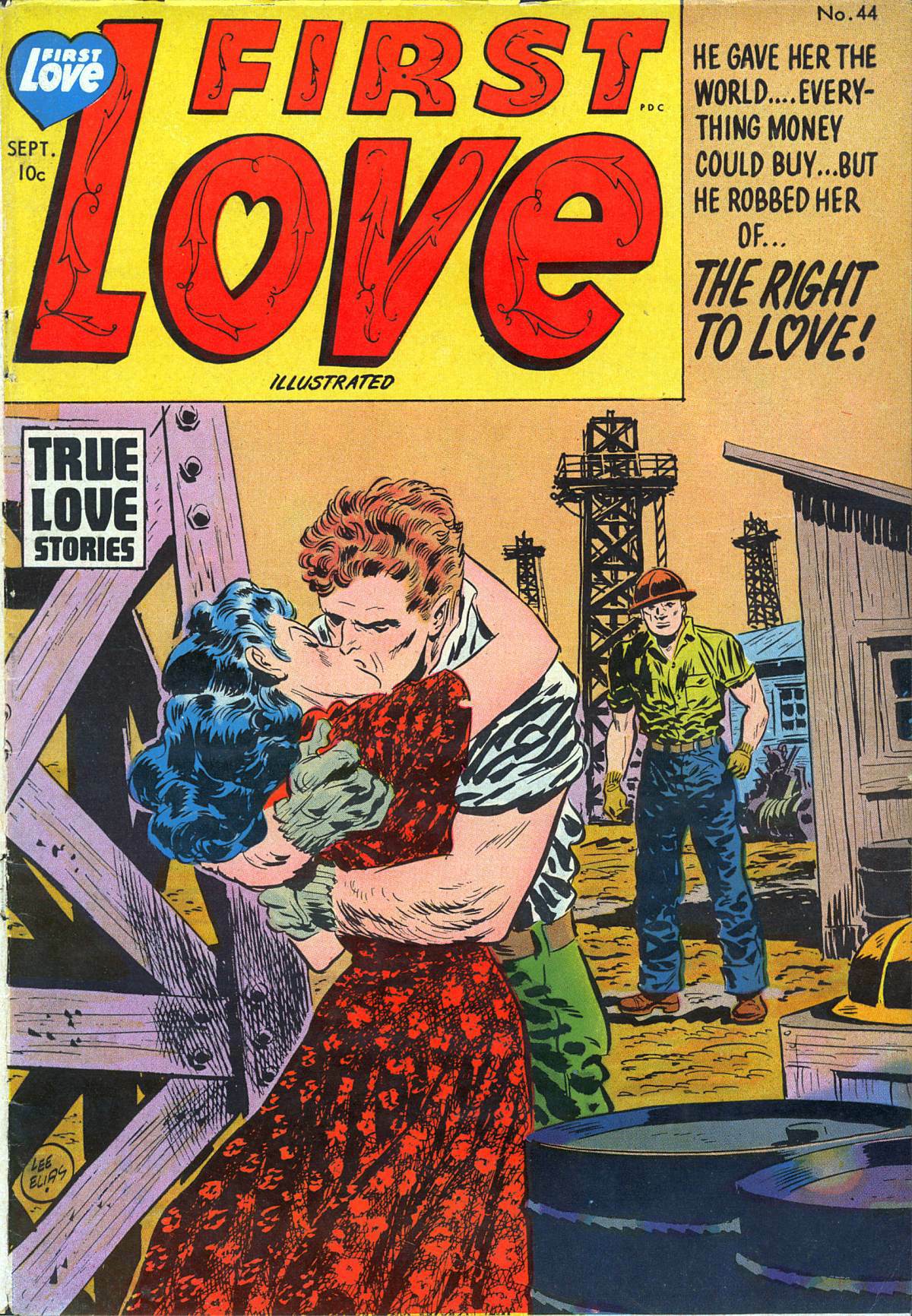
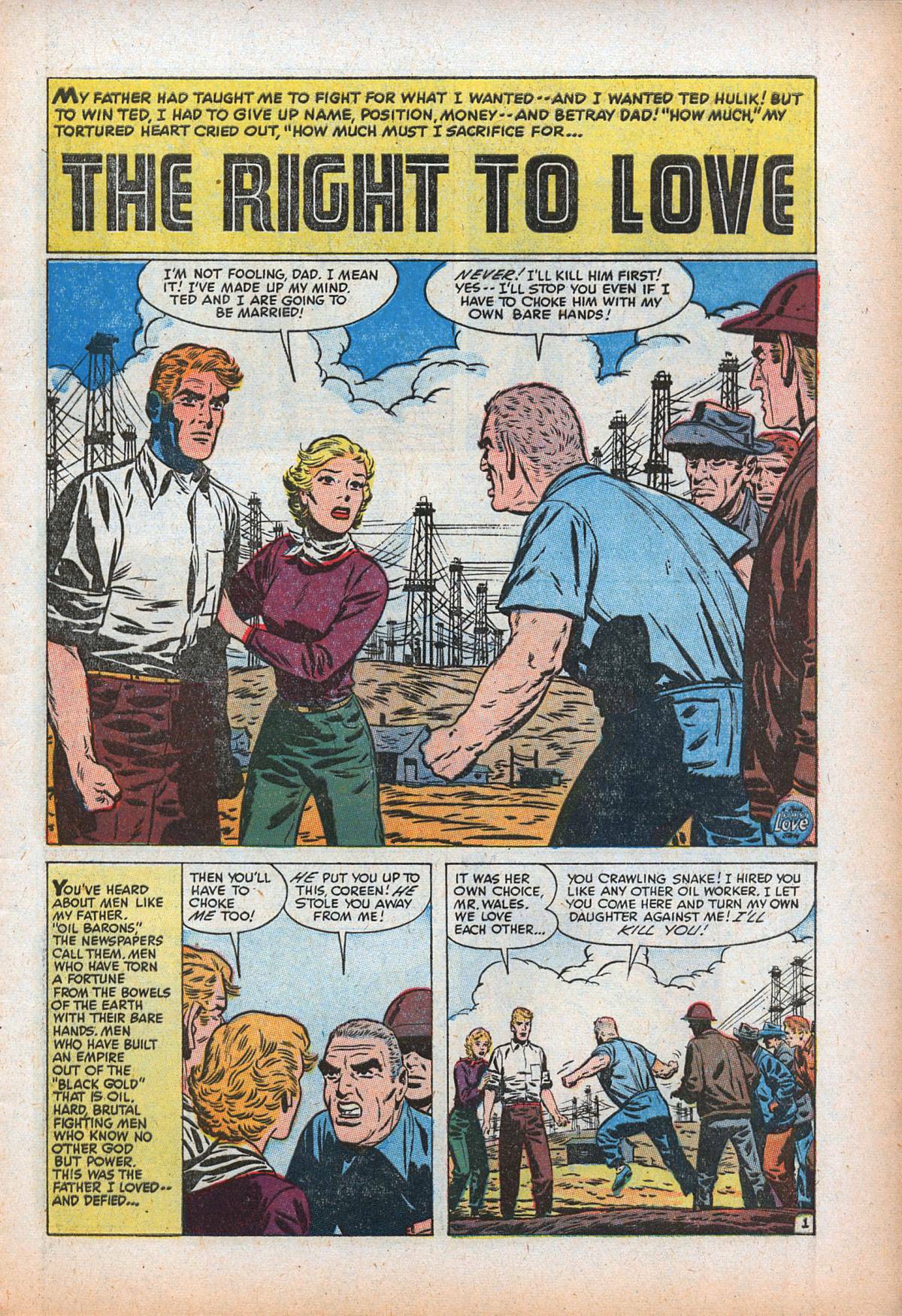
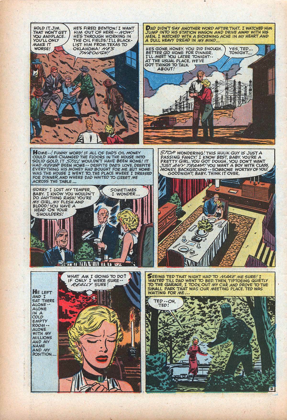
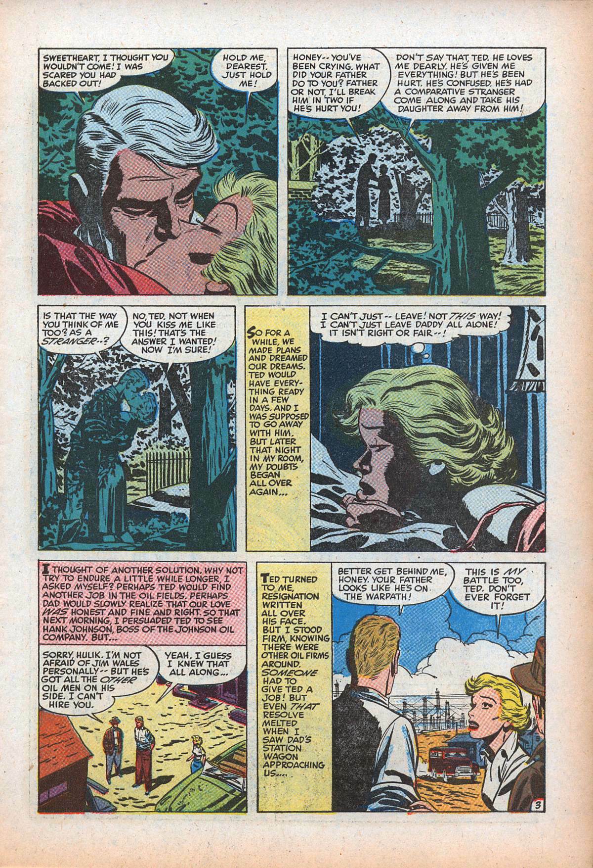
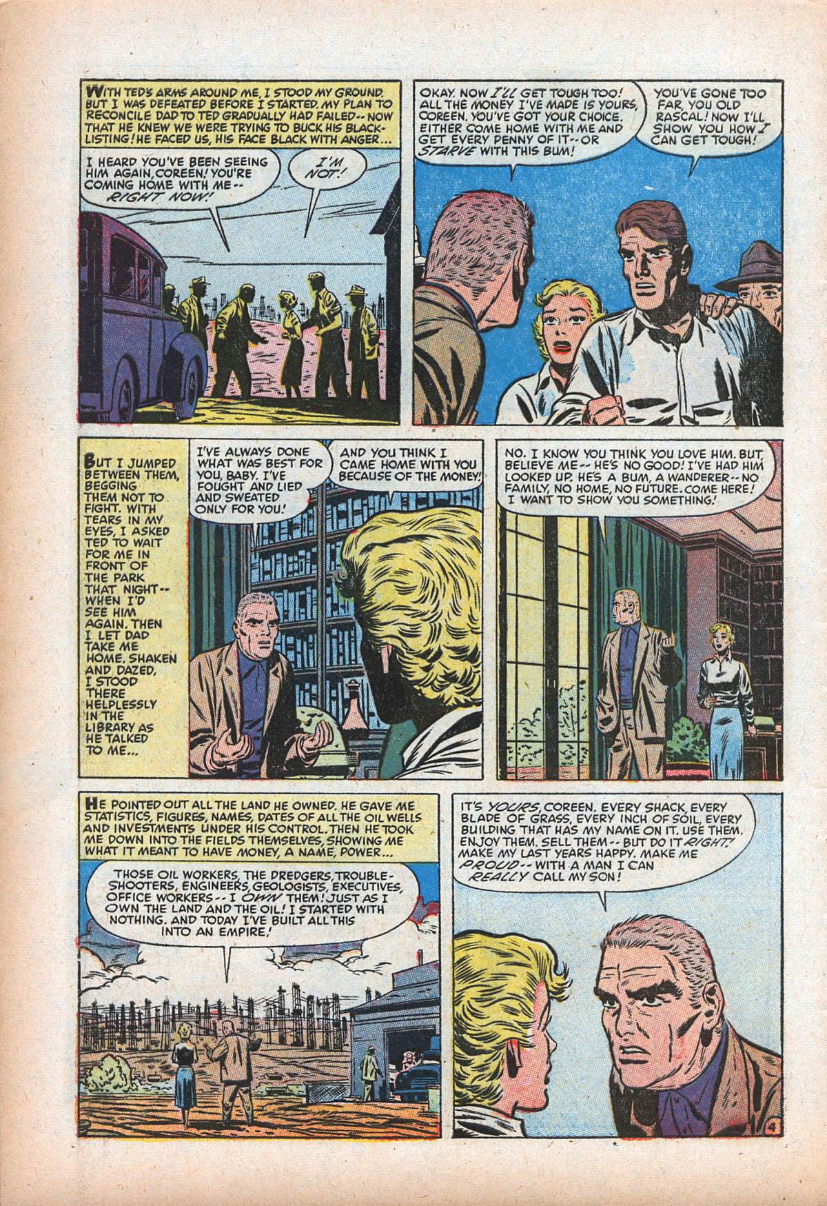
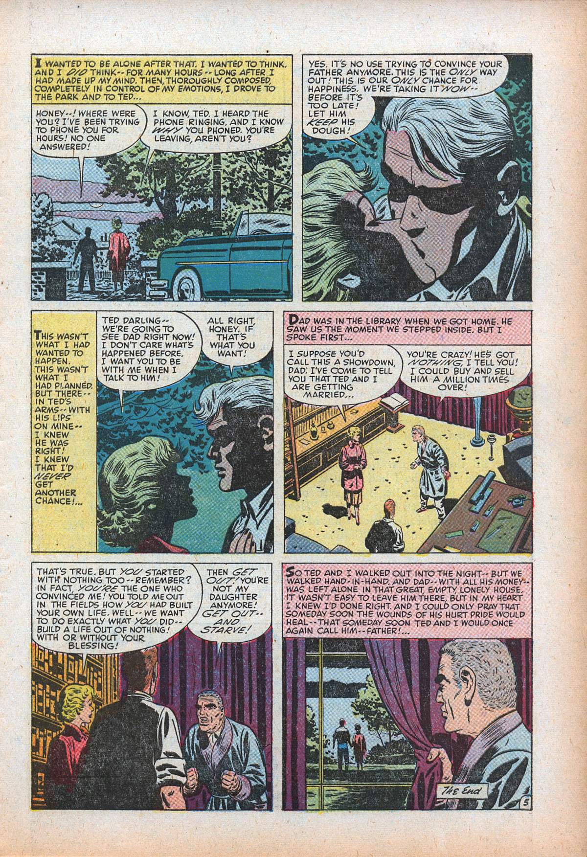
From First Love Illustrated #44 (September 1954), here’s “The Right to Love,” with uncredited story art that “this checklist” on the Kirby Museum site attributes to Bill Draut, whose style here is economical and attractive; the Caniff-influenced cover art, which looks to me to have the hero kissing a totally different woman that the one in the story, is by Lee Elias, who wisely signed his work, thereby ensuring that he would get credit for his contribution, in print, at the time the comic was published:
[CLICK IMAGES TO ENLARGE]
Anyone know if Darwyn Cooke has ever acknowledged Bill Draut’s work as an influence?
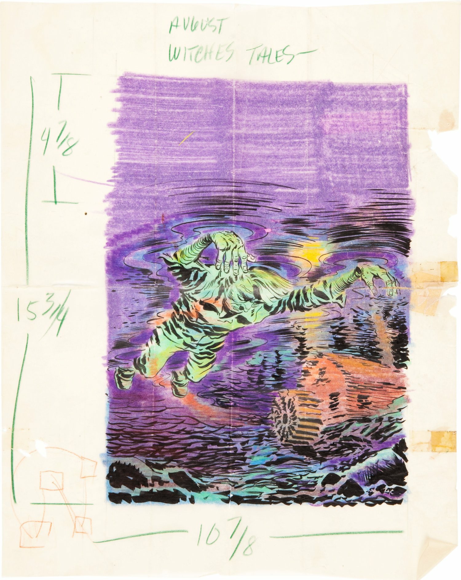
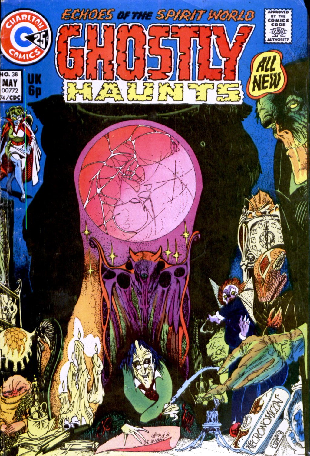
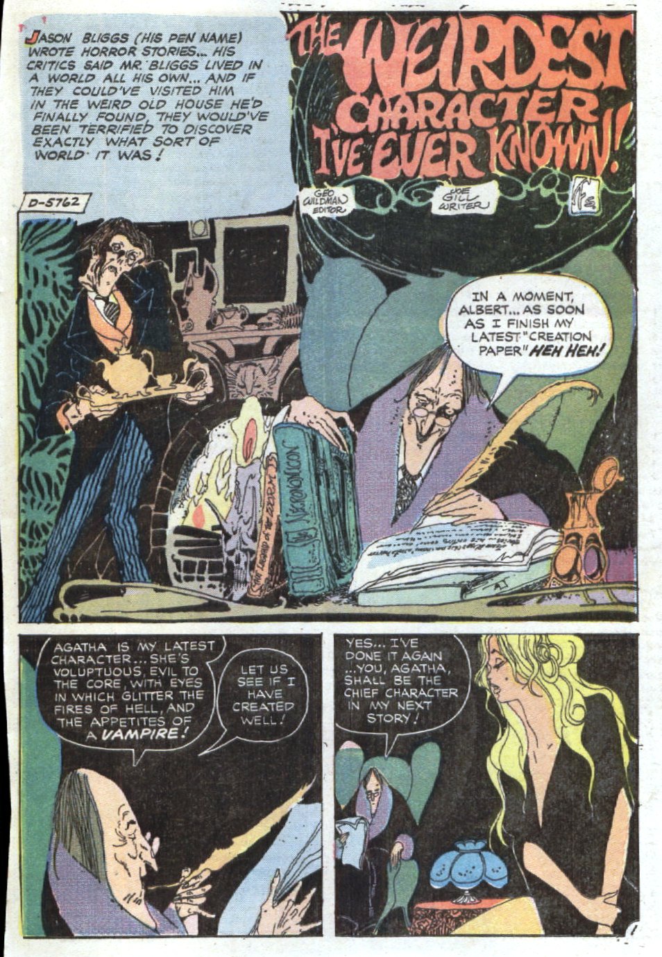
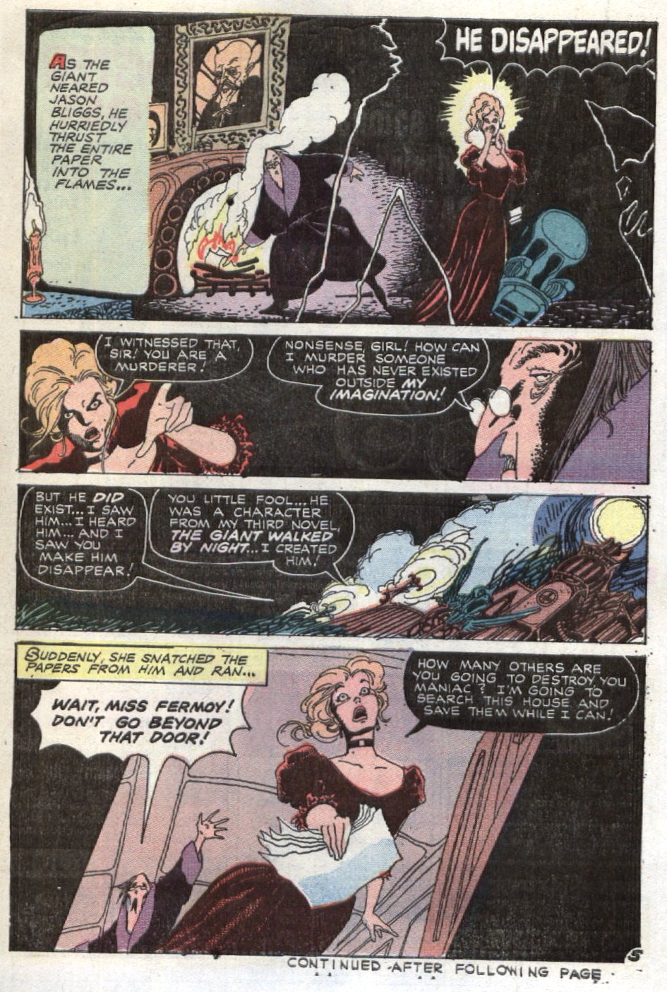
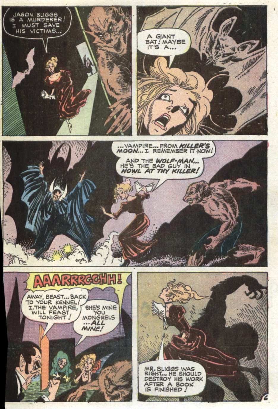
From Ghostly Haunts #38 (May 1974), here’s “The Weirdest Character I’ve Ever Known!” written by Joe Gill and illustrated in fine style by Tom Sutton (1937 – 2002); the striking cover artwork is by Sutton, too:
[CLICK IMAGES TO ENLARGE]


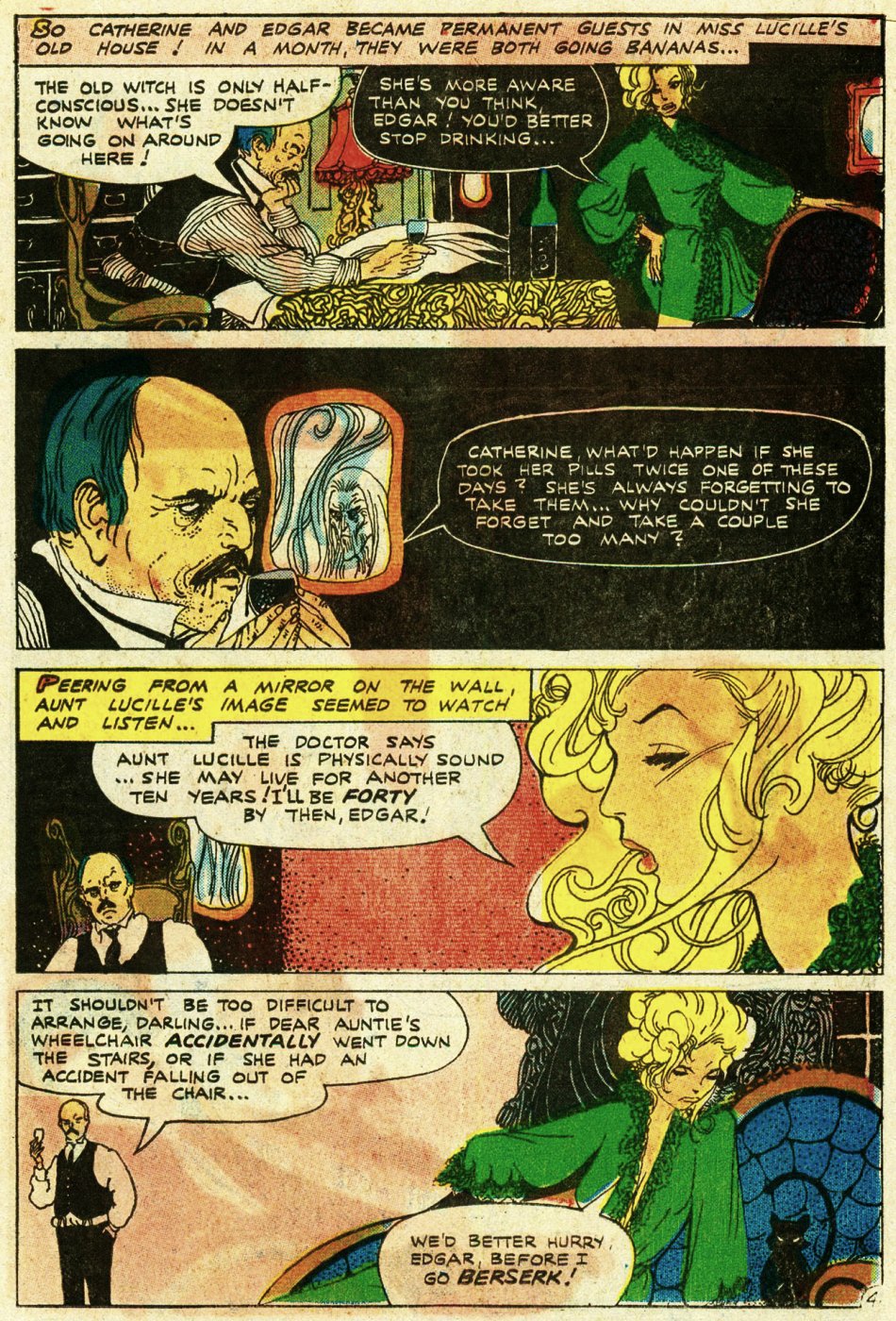
And, from Ghostly Tales #152 (December 1981), here’s “There’s Life in the Old Girl Yet!” written by Joe Gill and illustrated by Tom Sutton:
[AGAIN, CLICK IMAGES TO ENLARGE]


When comics aficionados are asked to name their favourite artists, Tom Sutton’s name almost never comes up. But it’s not because Sutton wasn’t capable of producing elegant, inspired work; it’s because, for whatever reasons, personal, temperamental, financial, etc., Sutton did way too much work in comics that he actively disliked doing and what’s more, let it show on the page — unlike, say, Alex Toth, who tended to give his all to every script, good, bad, or indifferent, that he was hired to illuminate.
[N.B.: I just noticed that the sixth page was missing from the first story. I uploaded it, but I got the image number wrong in the gallery code. So that’s been fixed.]
From Journey into Mystery #3 (October 1952), here’s “The Stroke of Midnight,” with uncredited script and art, although according to this page at comics.org, pencils and inks are by Vic Carrabotta (an artist I’d never heard of until I stumbled across the story a couple of months ago):
[CLICK IMAGES TO ENLARGE]


And, from Tower of Shadows #1 (September 1969), here’s “At the Stroke of Midnight,” with script and art by Jim Steranko:
[AGAIN, CLICK IMAGES TO ENLARGE]
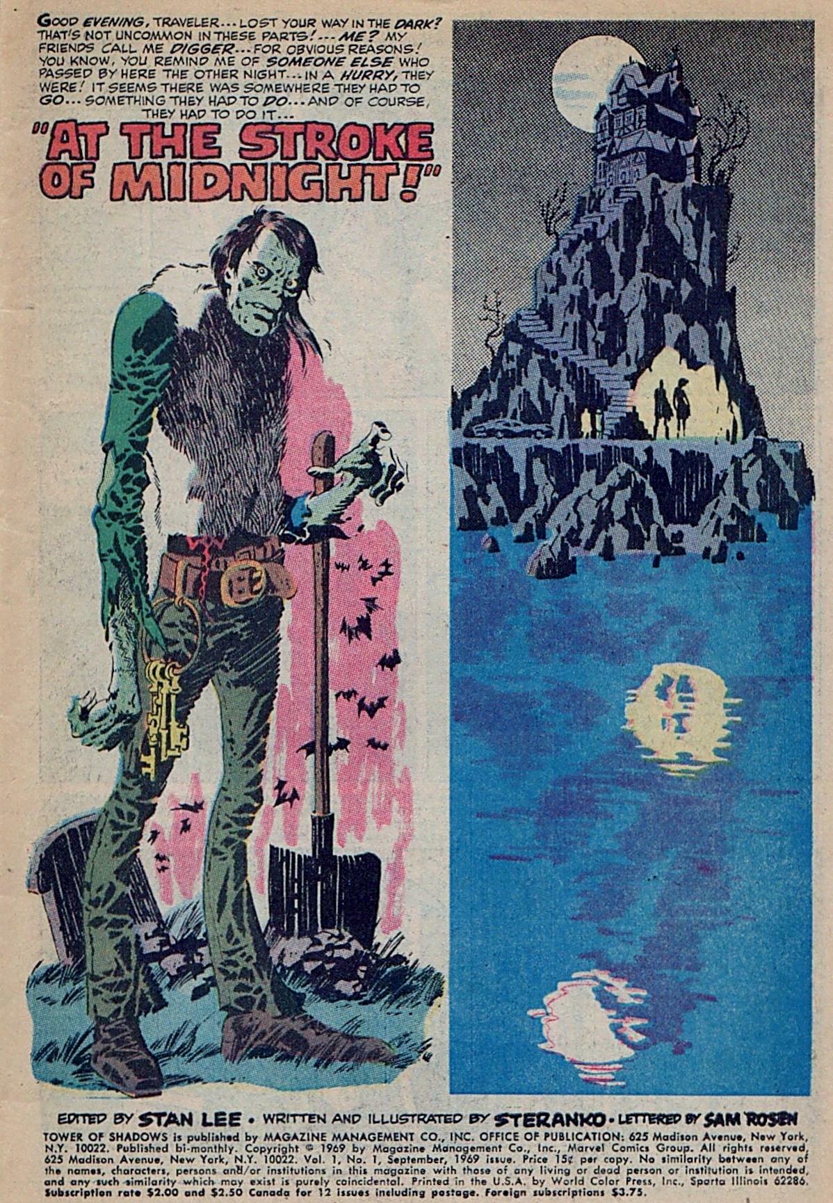
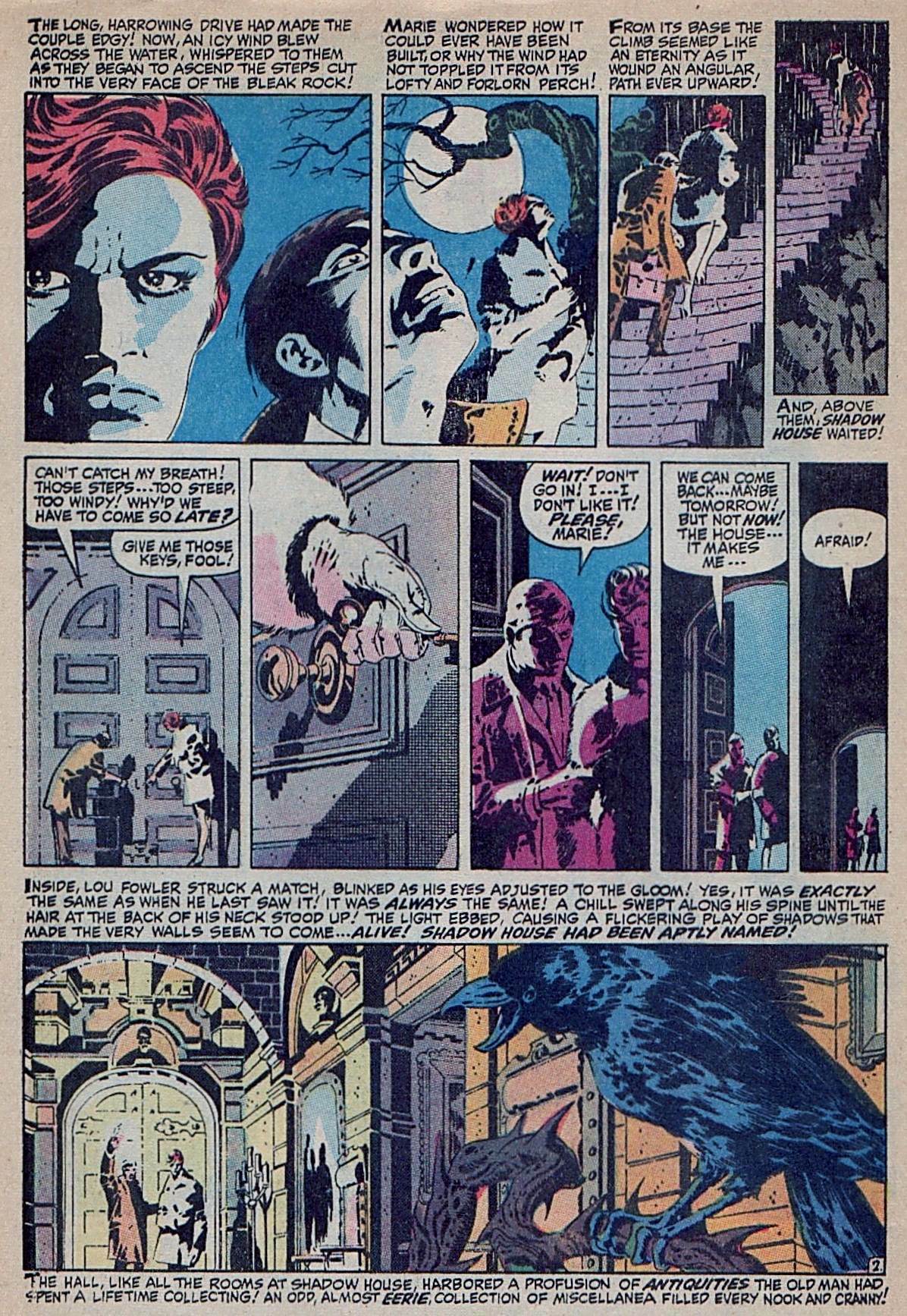


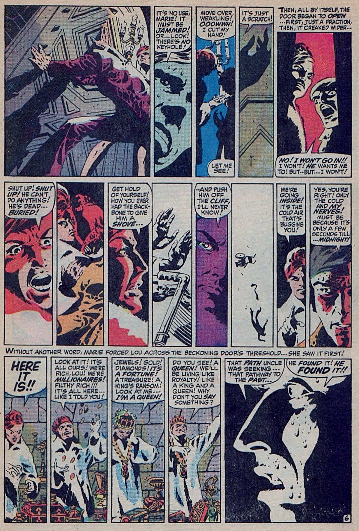

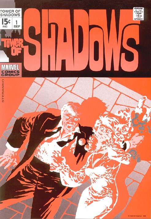

Notice there are two covers above. The one with the couple staring wide-eyed at you, the reader, as they recoil, screaming, from an unseen horror, was designed and illustrated by Steranko specially for the inaugural issue of Tower of Shadows but was (in)famously rejected by editor Stan Lee in favour of a far more pedestrian effort by John Romita, et al., that featured a goofball portrait of the magazine’s host, Digger, in the upper left-hand corner. The title — “At the Stroke of Midnight!” — was also a Stan Lee imposition. Needless to say, Steranko was not pleased with what he viewed as Lee’s picayune editorial busywork. Here’s how the incident is described in the “Tower of Shadows” page at Wikipedia:
“At the Stroke of Midnight,” Steranko’s lead story in the premiere issue (Sept. 1969), won a 1969 Alley Award for Best Feature Story. Its creation had led to a rift between the celebrated Steranko and editor Lee that caused Steranko to stop freelancing for Marvel, the publisher that had showcased his highly influential work. Lee had rejected Steranko’s cover, and the two clashed over panel design, dialog, and the story title, initially “The Lurking Fear at Shadow House.” According to Steranko at a 2006 panel and elsewhere, Lee disliked or did not understand the homage to horror author H. P. Lovecraft, and devised his own title for the story. After much conflict, Steranko either quit or was fired. Lee phoned him about a month later, after the two had cooled down, and Steranko would return to produce several covers for Marvel from 1972-73.
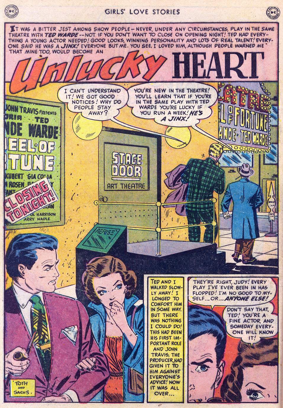
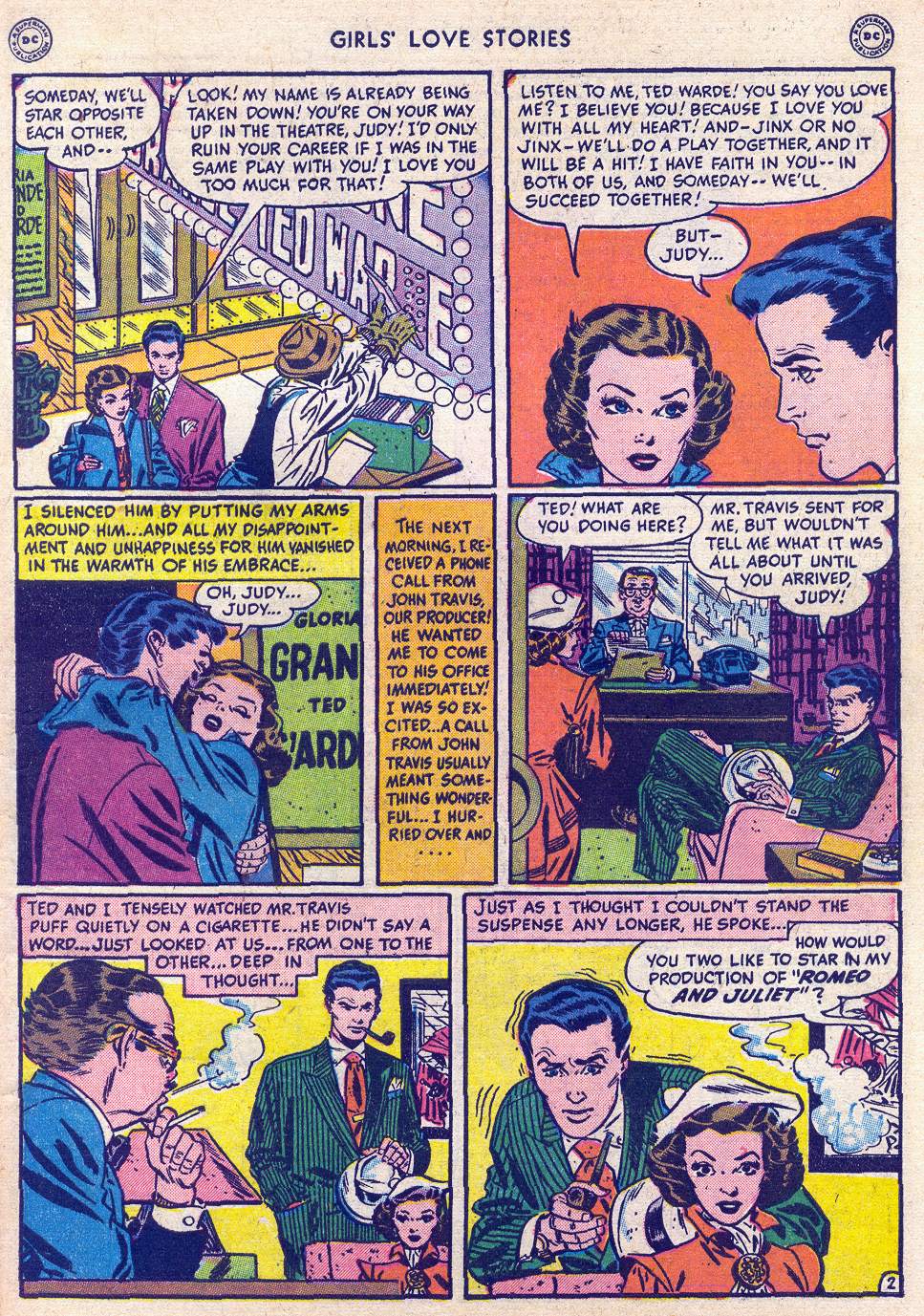
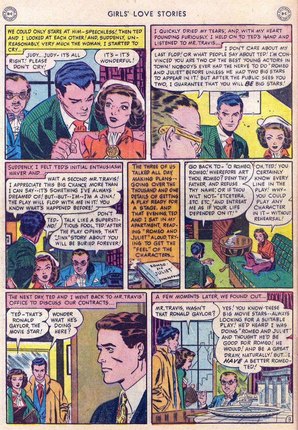
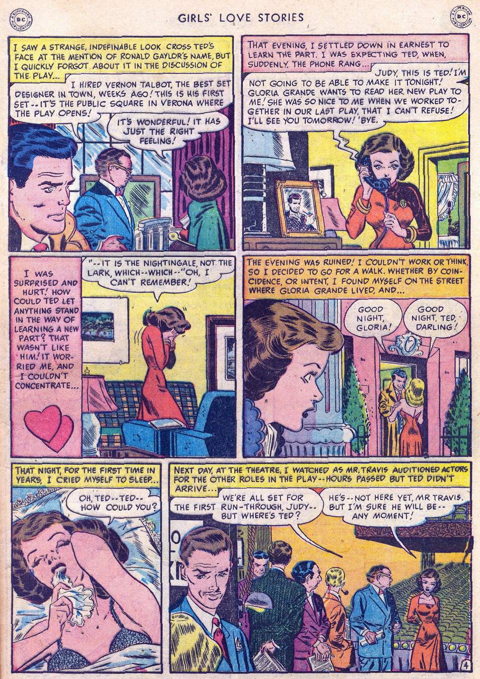
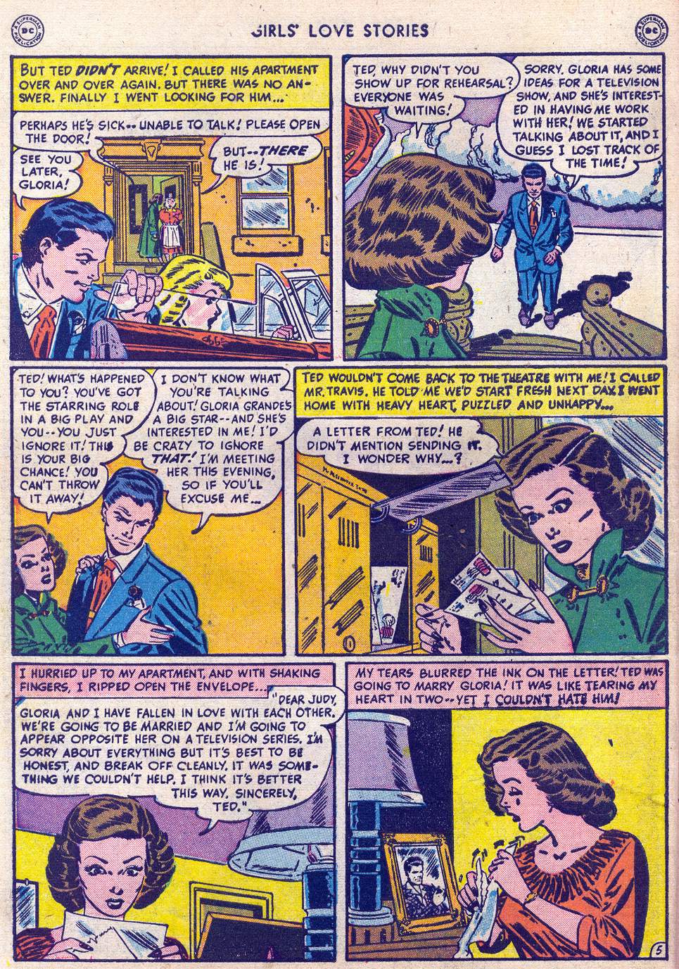
From Girls’ Love Stories #1 (August – September 1949), here’s “Unlucky Heart,” with script by Robert Kanigher (uncredited), pencils by Alex Toth — who had graduated from the High School of Industrial Art less than two years earlier, in 1947 — and inks by Bernie Sachs:
[CLICK IMAGES TO ENLARGE]
[CLICK IMAGE TO VISIT SUGGESTED WEB SITE]

BONUS LINKS:
The Bronze Age of Blogs: “Cimmeria,” poem by Robert E. Howard, art by Barry [Windsor-]Smith and Tim Conrad, Savage Sword of Conan #24 (November 1977).
Barry Windsor-Smith Unofficial Blog: “Cimmeria,” poem by Robert E. Howard, art (in pencil) by Barry [Windsor-]Smith, Savage Tales #2 (October 1973).
Here’s a JPEG of Jack Davis’s original artwork for “Cigar Store Indian, 1957” (with the note “HUMBUG #3” at the top), along with a scan of the piece as it was printed in Humbug #4:
[CLICK IMAGES TO ENLARGE]
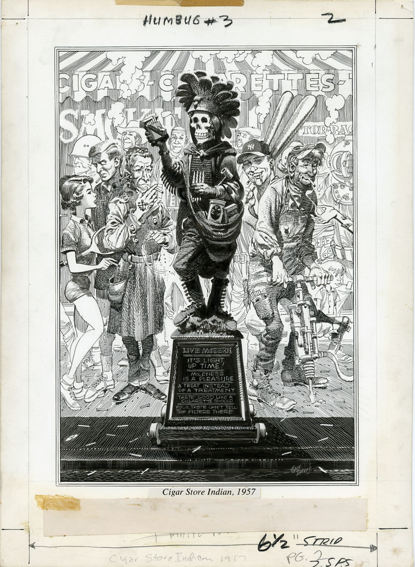

What is immediately evident when one compares the two images above is how much detail was “lost in translation” from the original artwork to the printed page. In the original, Davis’s precisely crosshatched shadows are alive with atmosphere and reflected light. In the reproduction, however, the ink has sunk into the cheap paper to such an extent that Davis’s linework is made to appear a lot more heavy handed that it really is, with carefully designed tonal values congealing at the darker end of the scale into unintended masses of inky blackness. The loss of crucial detail is nowhere more obvious than on the plinth of the statue, which actually contains a lot more text — text that is integral to the joke that the drawing is intended to convey — than was visible to the readers of Humbug (see above), or even to the readers of the two-volume, slip-cased Humbug reconstruction that was published by Fantagraphics Books in 2009. However, unlike the fine folks at Fantagraphics, who clearly didn’t have the original artwork for “Cigar Store Indian, 1957,” on hand when they produced their magnificent tribute to the genius of Harvey Kurtzman and his co-conspirators at Humbug, Kurtzman and Davis would have been painfully aware what sort of damage the dodgy reproduction of Humbug #4 had inflicted on the gag on page three.
UPDATE (16 March 2011):
In an interview with Jeffrey H. Wasserman published in the fanzine Inside Comics #2 (Summer 1974), Kurtzman explained how Humbug came into being and why, in his view, the project was fatally flawed from the first:
KURTZMAN: HUMBUG was a very sentimental undertaking. We all sat around the day after TRUMP was dropped… wondering whether to slash our wrists. Arnold Roth was the only one who kept his head about him. I was sitting with Jack Davis and Al Jaffee and Harry Chester and Arnold was the only one who could think constructively. He went down and got some booze. And in our subsequent drunken state, we decided to carry on and we came out with HUMBUG.
WASSERMAN: TRUMP was a super-slick effort, obviously intended to be well-financed. But HUMBUG was different. It retailed for 15 cents and…
KURTZMAN: HUMBUG was an attempt to work with 15 cents and publish a sensitive cartoon satire magazine. It was a disaster because it wasn’t a realistic effort at all. It totally ignored fundamental business sense. We were carried away by our talent and camaraderie and went ahead with HUMBUG anyway. But I think we turned out some of the most charming stuff that’s ever been done. The format was just so bad. It was like a fart in the wind.
It was a teeny-tiny book in black and white. It had nothing going for it except talent — at least that’s what we told ourselves. We were satisfied with that, but it wasn’t nearly enough.
You can read the entire interview here.
From Eerie #90 (February 1978), here’s “A Woman Scorned,” with story by Bruce Jones and art by Richard Corben:
[CLICK IMAGES TO ENLARGE]


From Young Love #74 (May-June 1969), here’s “Hide Your Love,” with art by Alex Toth and story by an uncredited writer:
[CLICK IMAGES TO ENLARGE]

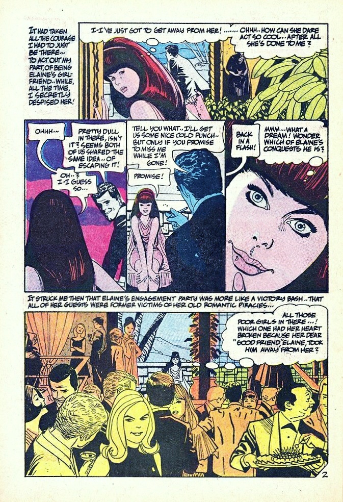
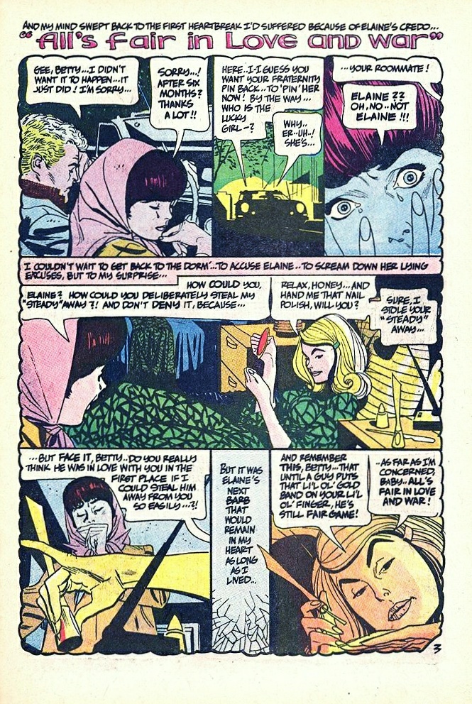

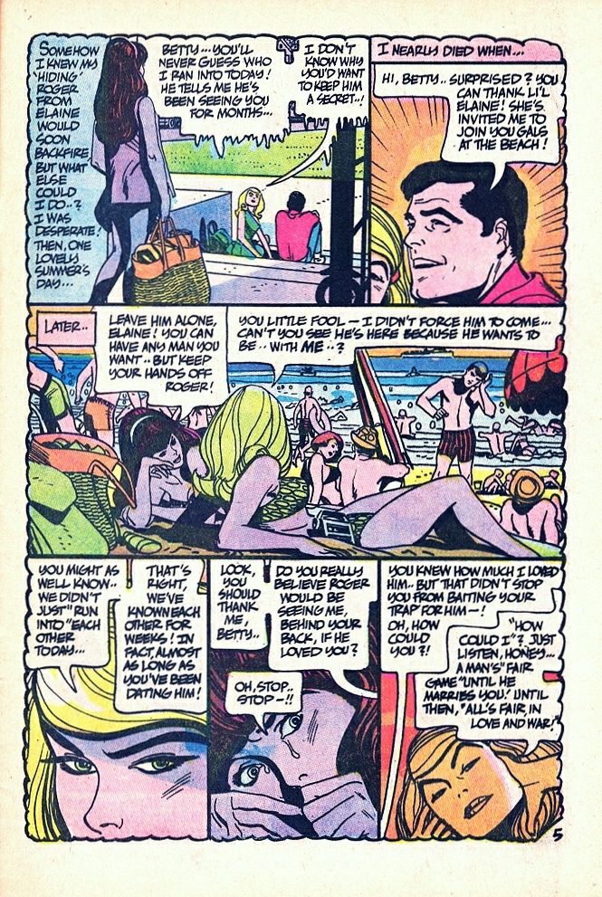

I happen to love beautifully drawn romance comics, but even if you don’t, you will surely recognize the brilliance of Toth’s design of the opening page, with its elegant panel arrangement that steps down in a curve from left to right around the title of the story, which, for our eyes only, Toth has written on the troubling engagement-party invitation card that the main character, Betty, has just received from her “friend” Elaine, a card that is half-hidden inside an envelope the outlines of which define the panel — Betty’s arrival at Elaine’s party — that closes the opening page! If you have read the story, you’ll know why this is significant…
From Our Army at War #241 (February 1972), here’s a four-page classic with story by Bob Haney and art by Alex Toth:
[CLICK IMAGES TO ENLARGE]

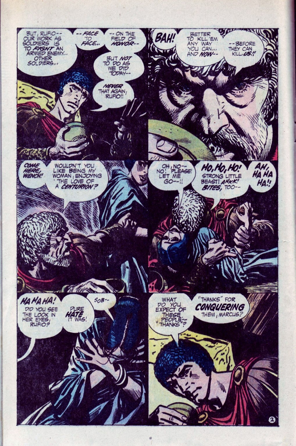

I love how Toth uses the silhouetted panel that extends across the top of page three to provide variety within the six-panel grid while at the same time he cheekily reestablishes/reinforces the grid by breaking the panel into two halves, each framed by the structure of the building, with a support beam where the panel border/gutter would have been. And those word balloons — the tails all go the way from the visual foreground, where the text balloons reside, between and behind the silhouettes of Roman soldiers caught in the act of brutalizing the native population, and into a doorway in the background! It’s an audacious choice, but Toth makes it work!
