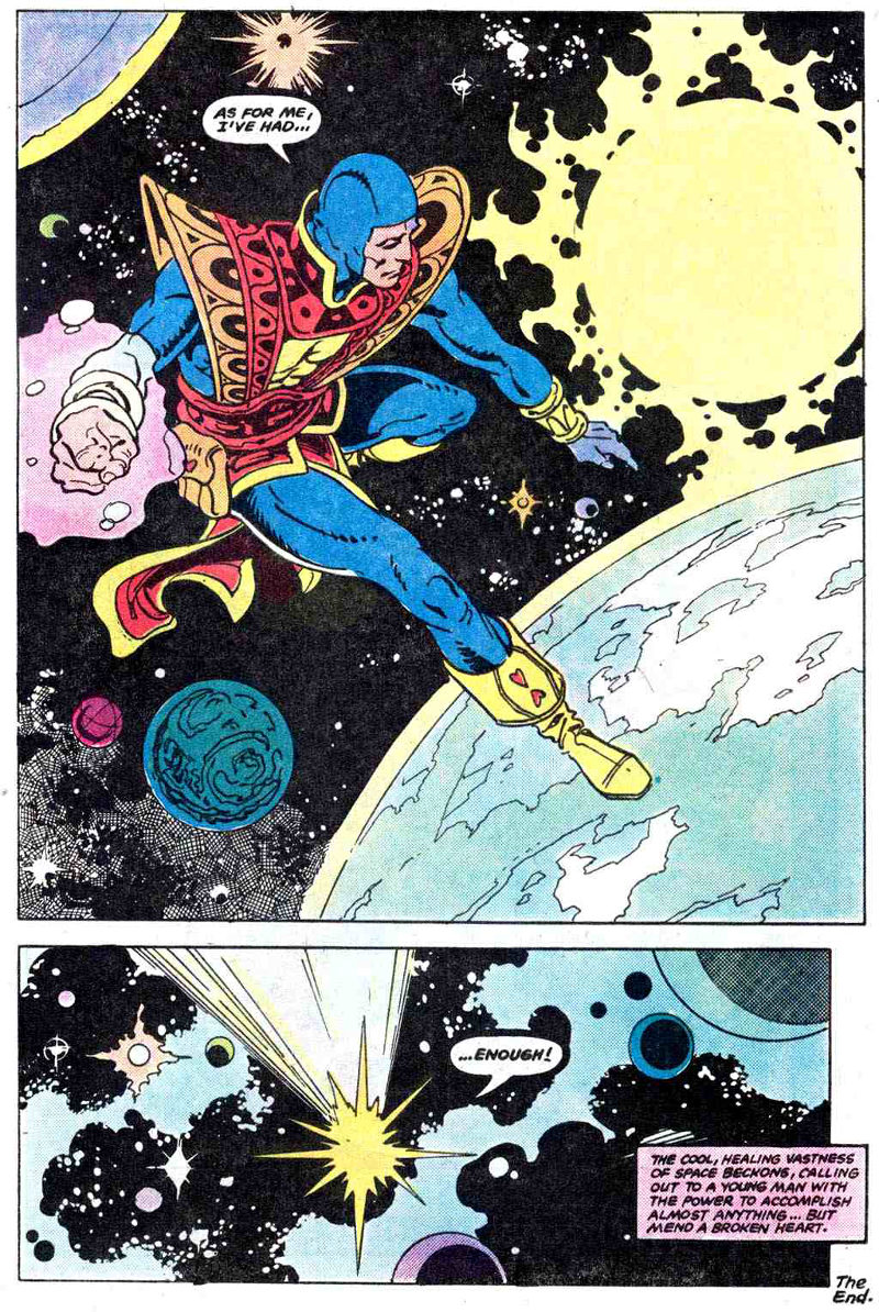
"This day's experience, set in order, none of it left ragged or lying about, all of it gathered in like treasure and finished with, set aside." –Alice Munro, "What is Remembered"
Of the following five covers — all scanned from the dusty, diverse paperback collection of yours truly — only one, A House Divided from Pocket Books, includes a formal illustrator credit, and the lucky artist is/was… wait for it… Jim Avati!
[CLICK IMAGES TO ENLARGE]
The best of the bunch: A House Divided and The Farmers Hotel. IMHO, of course!
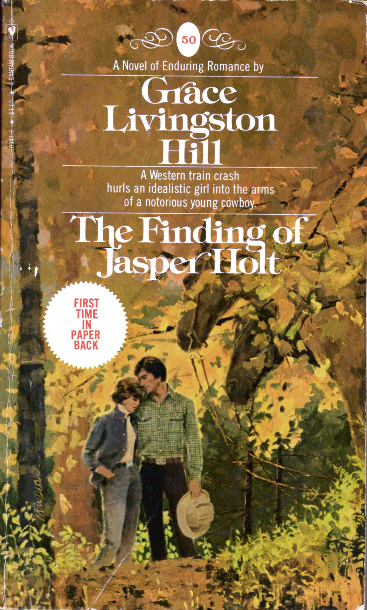
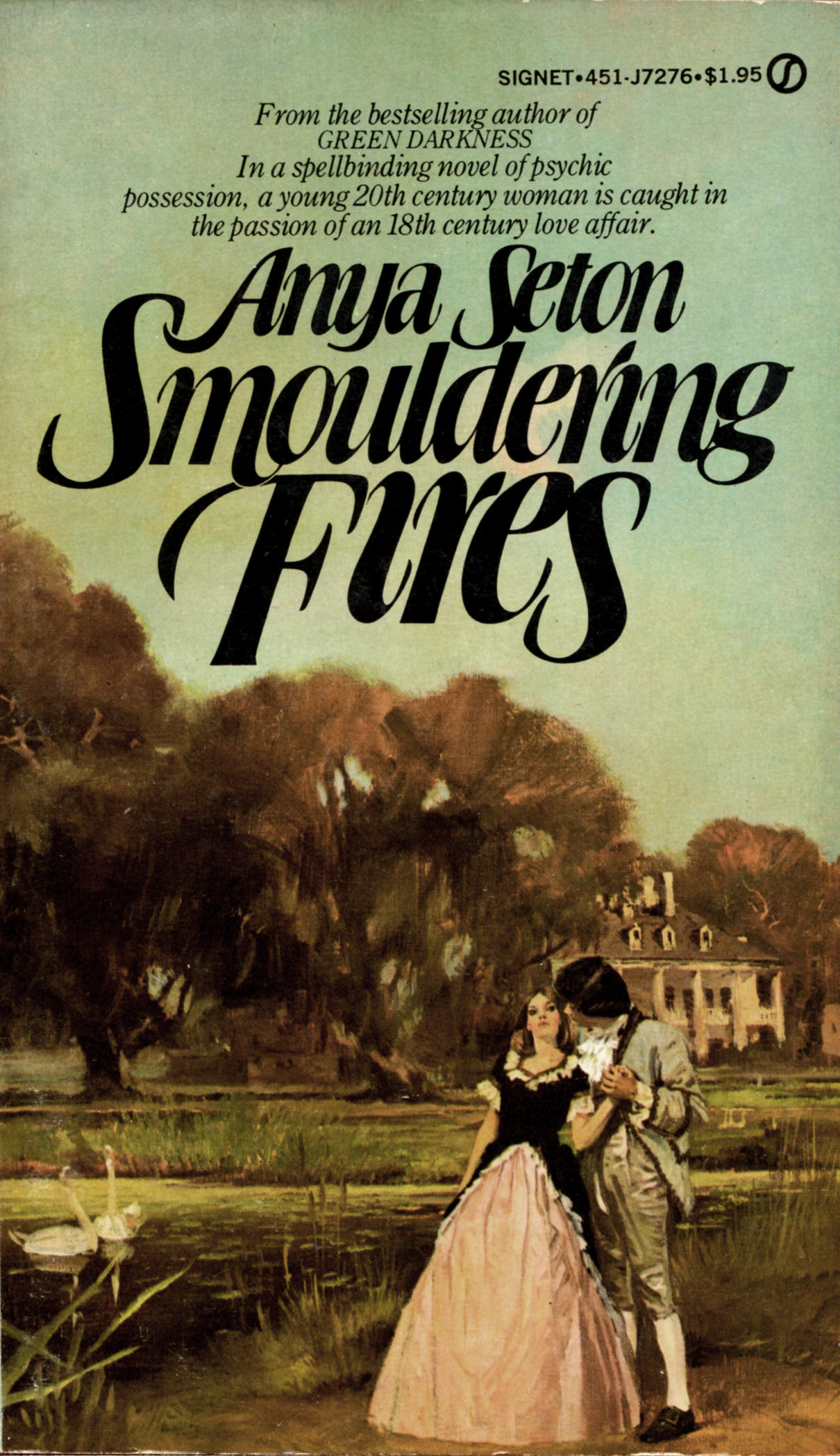
Keywords:Smouldering Fires by Anya Seton, Above Suspicion by Helen MacInnes, The Finding of Jasper Holt by Grace Livingston Hill, The Farmers Hotel by John O’Hara, A House Divided by Pearl S. Buck.
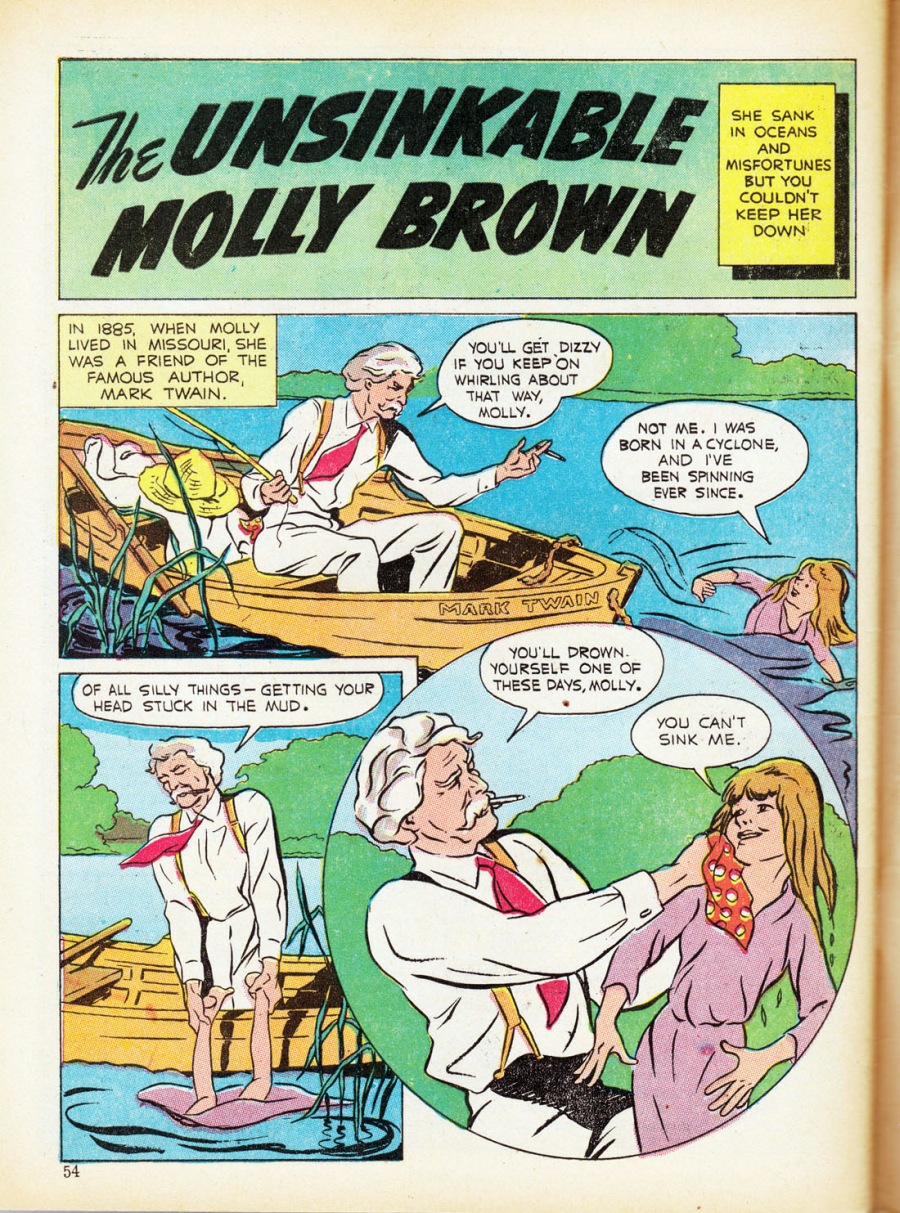
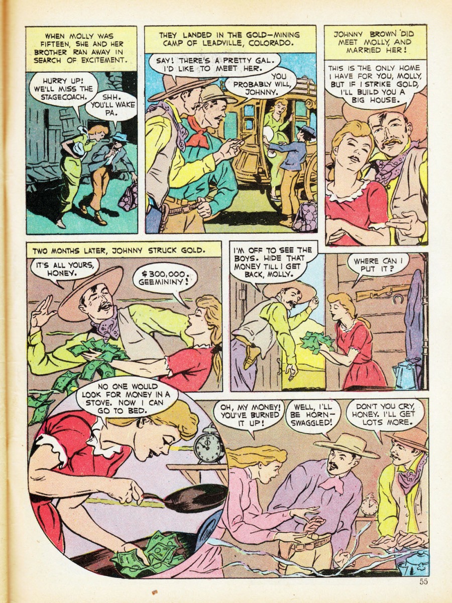
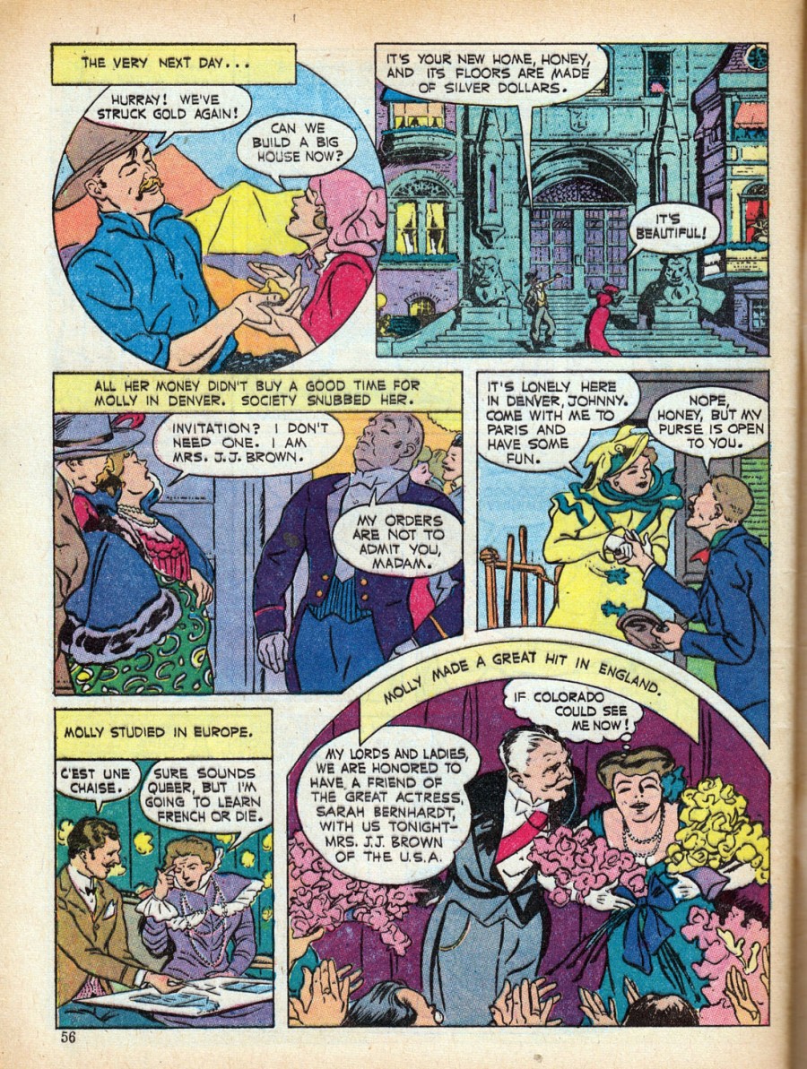
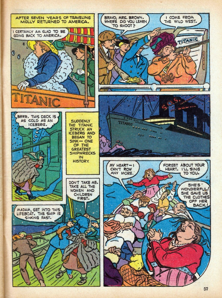
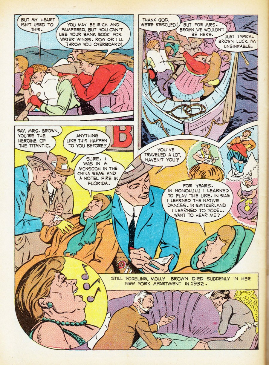
From Calling All Girls #10 (September 1942), here’s “The Unsinkable Molly Brown,” with script and art both by the great unknown:
[CLICK IMAGES TO ENLARGE]
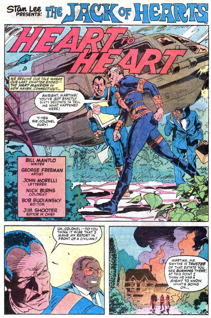
Whoever the artist is here, he or she was in full command of a lovely, loose style that, more than thirty years later, George Freeman of Captain Canuck and Jack of Hearts fame might have envied.
BONUS:
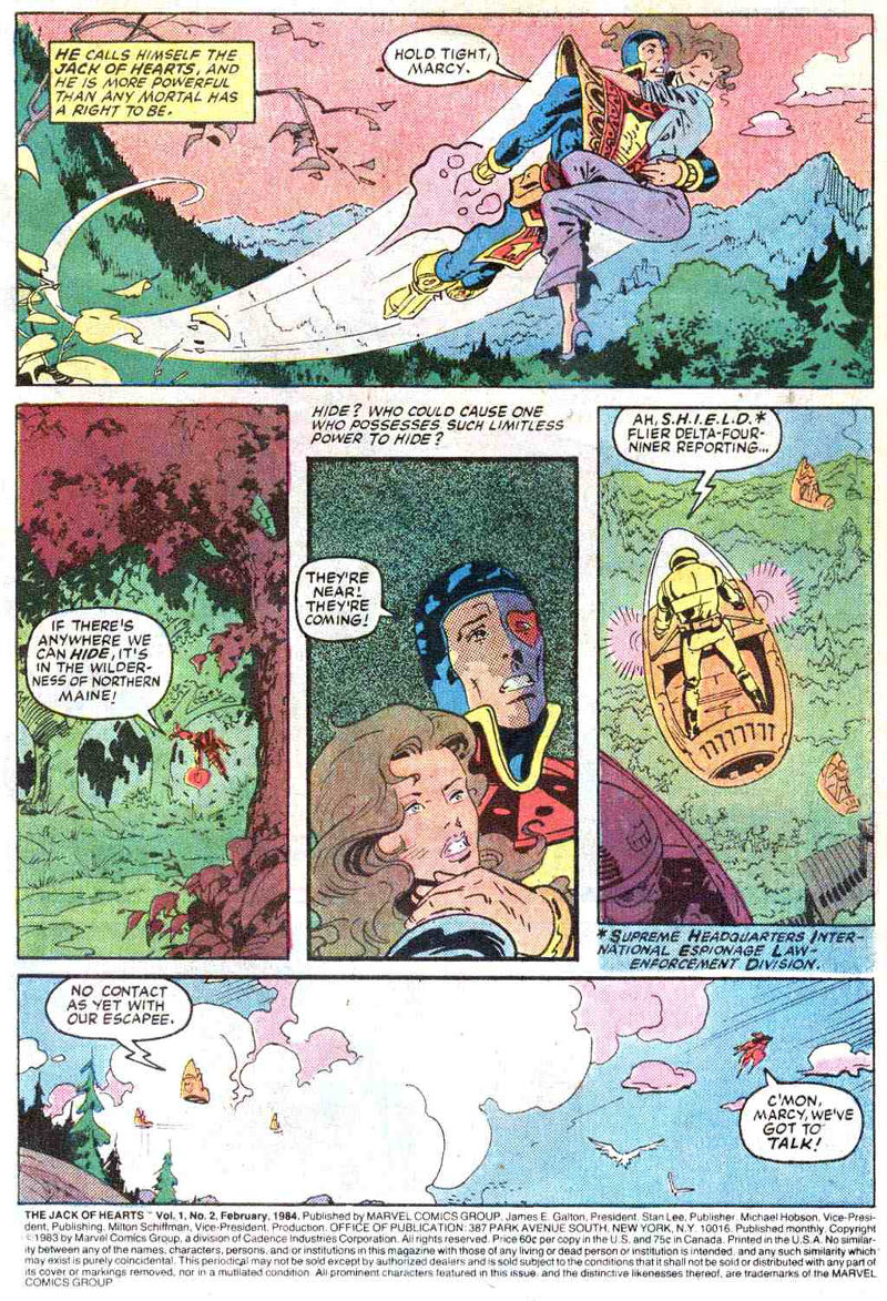
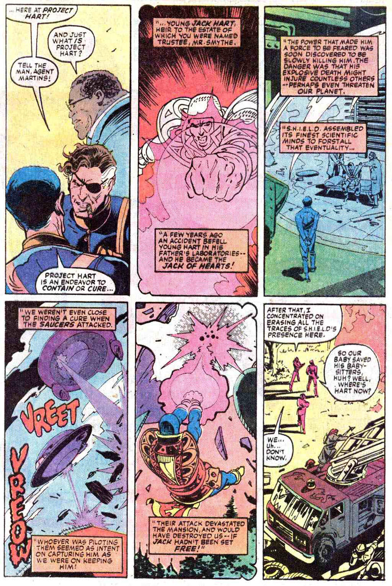
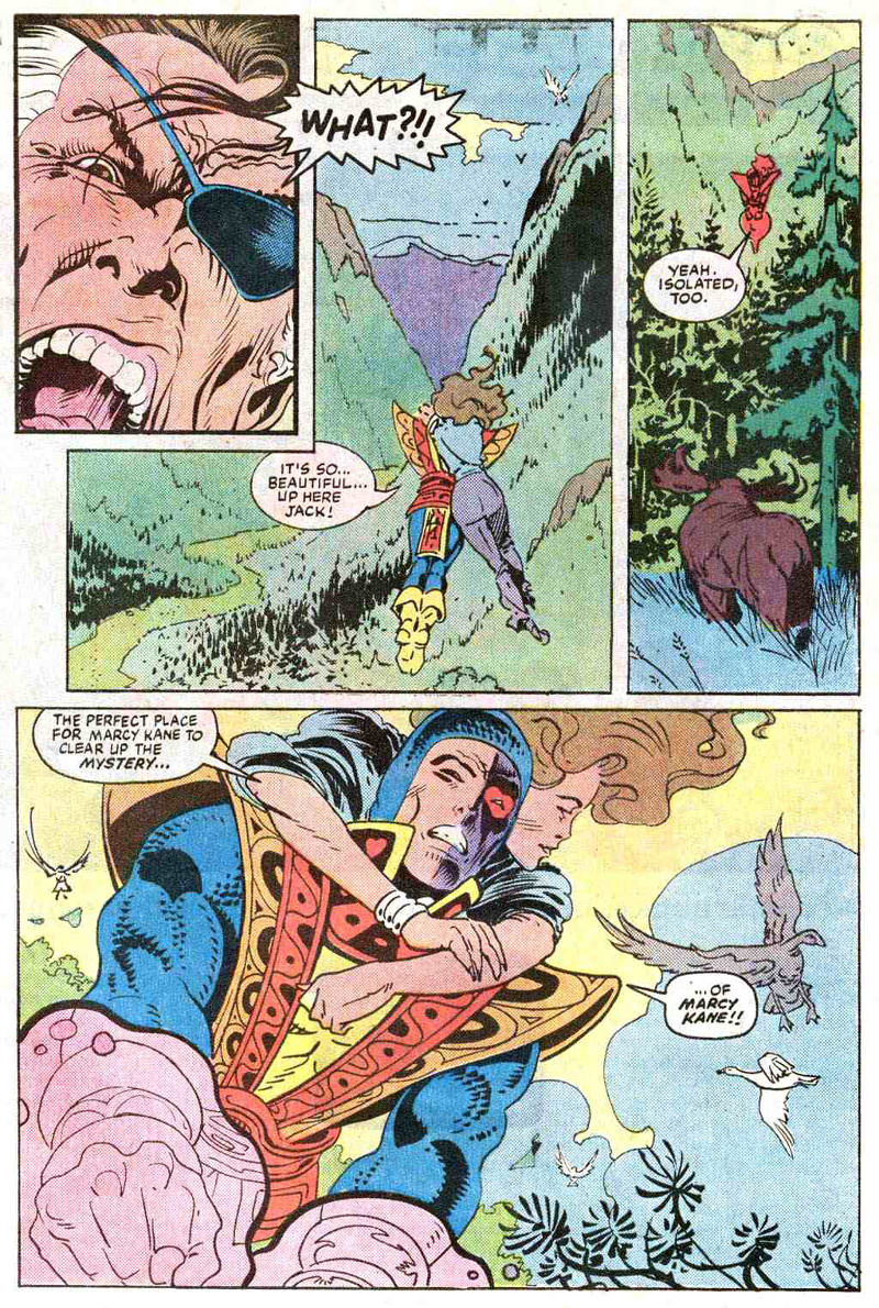
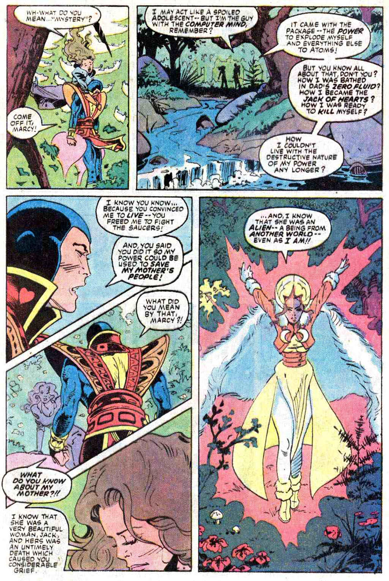
Here are the first five pages of Jack of Hearts #2 (February 1984)…
… along with the last page of the final issue, Jack of Hearts #4 (April 1984), which may or may not have been inked by Freeman, though it is in his style:
Really wish I had some Captain Canuck scans handy I could post… would make the point clearer, I think…
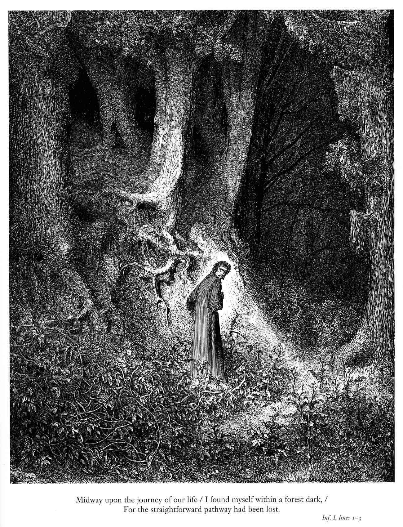
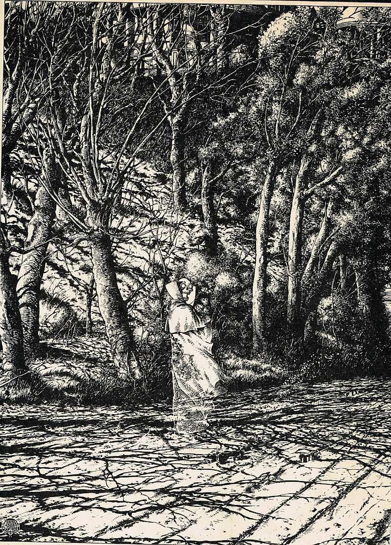
In The Studio (Dragon’s Dream, 1979), on pages 103 and 104, Barry Windsor-Smith provides a brief account of the genesis of Whithering:
“In the spring of 1975 I was working on a pen and ink drawing of trees, just trees. It was inspired, in part, by a wonderful painting of old Hampstead Heath by John Constable. At that time I didn’t think my audience was ready for — or let’s say interested in — a new work by me that was ‘just trees.’ Constable himself had a witticism about painting some of his pictures with ‘eye salve.’ What he meant was that he would make a picture as commercial as possible if he needed to sell it. As I wanted the fantasy market to see my tree drawing, I took a tip from Constable and applied a little ‘fantastic eye balm’: right in the middle of the picture I drew a shrouded figure of Death — a skull-headed man — and off in the distance a dark, foreboding mansion. This made the trees seemingly incidental. I called it Whithering (p. 110)… a deliberate non sequitur.” […]
“One night I got a frenzied call from an associate in London. He’d just shown a reproduction of the picture to a much respected fellow artist whom I’d never met, and whom my associate had only just met. Over the crackling transatlantic line I heard him say, ‘Hey! Guess what!… I just showed Whithering to so-and-so and guess what he said, — ‘Ahh, Constable; those trees. Barry just stuck that dead bloke in there so he could get away with drawing trees, didn’t he’?… He knew! There were a few cackles of laughter and then he hung up; that was the end of the call. I was suffering from insomnia at the time, I recall I slept that night and glowed the next day.”
Does Windsor-Smith’s reminiscence rule out the influence of Doré’s composition on Whithering? I don’t think so, but if you check out the comments section of this post, you’ll find a reader who disagrees with me.
BONUS IMAGES:
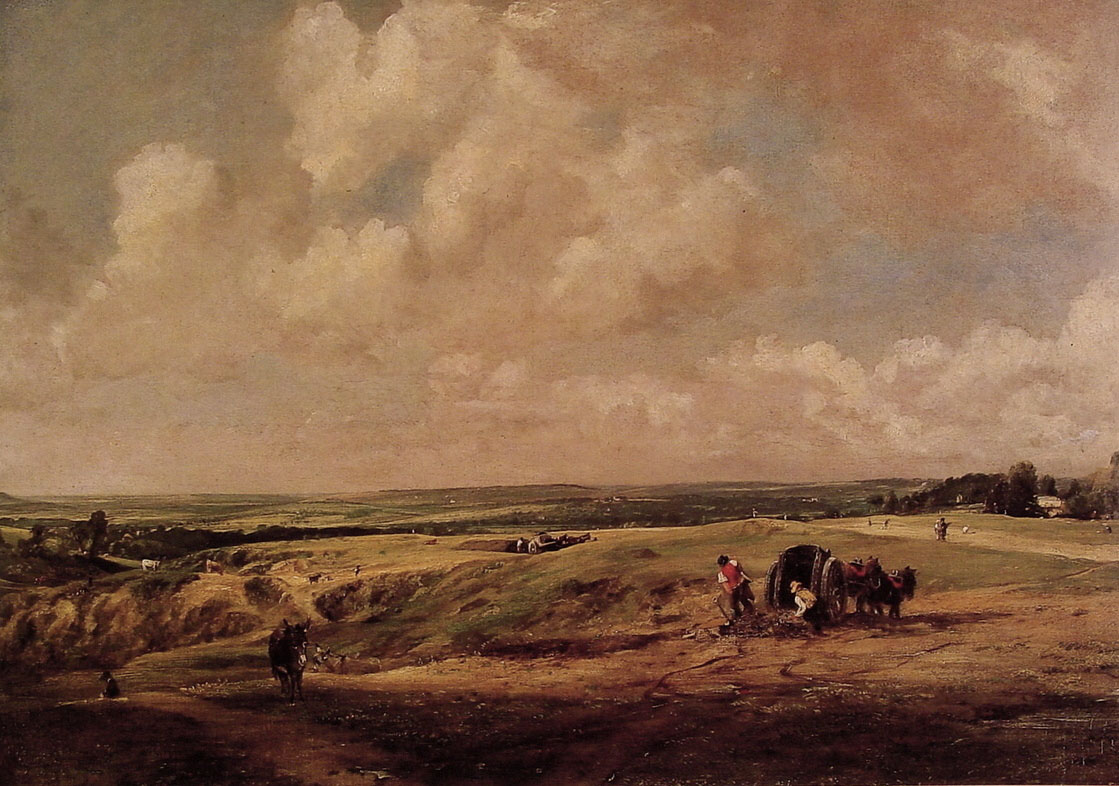
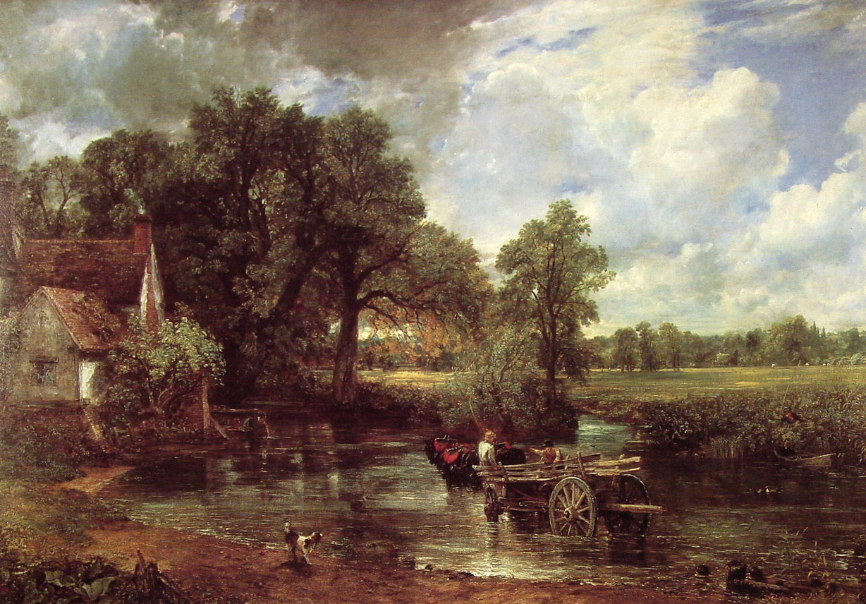
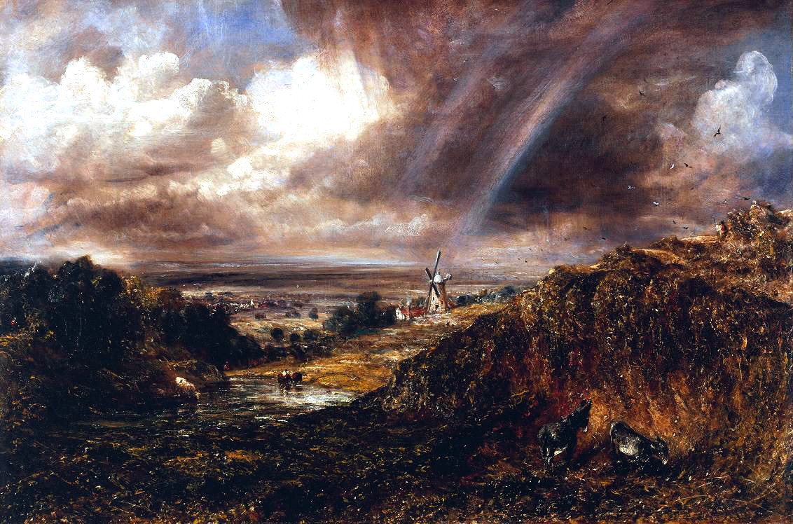
Three paintings of “Hampstead Heath” by John Constable:
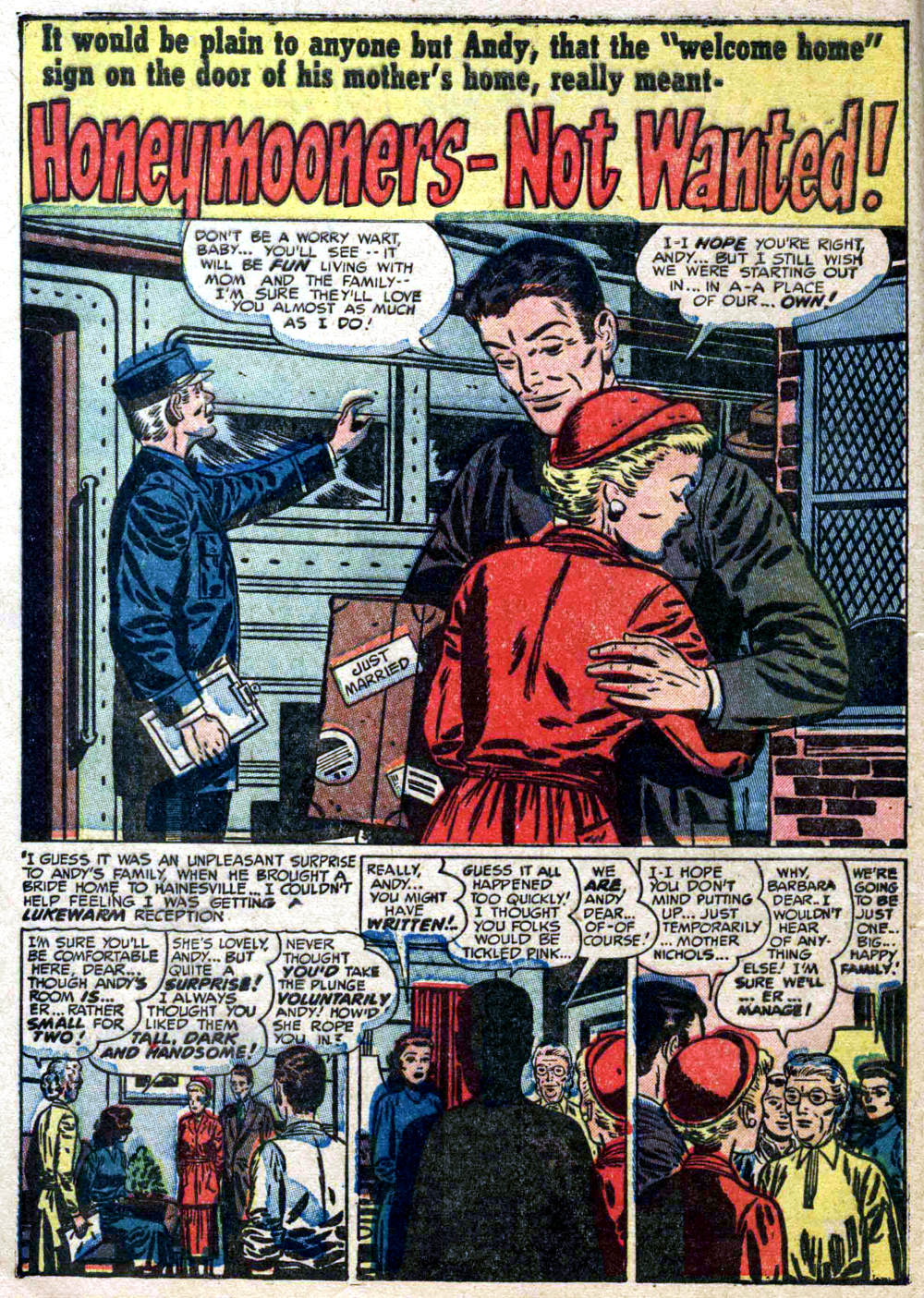
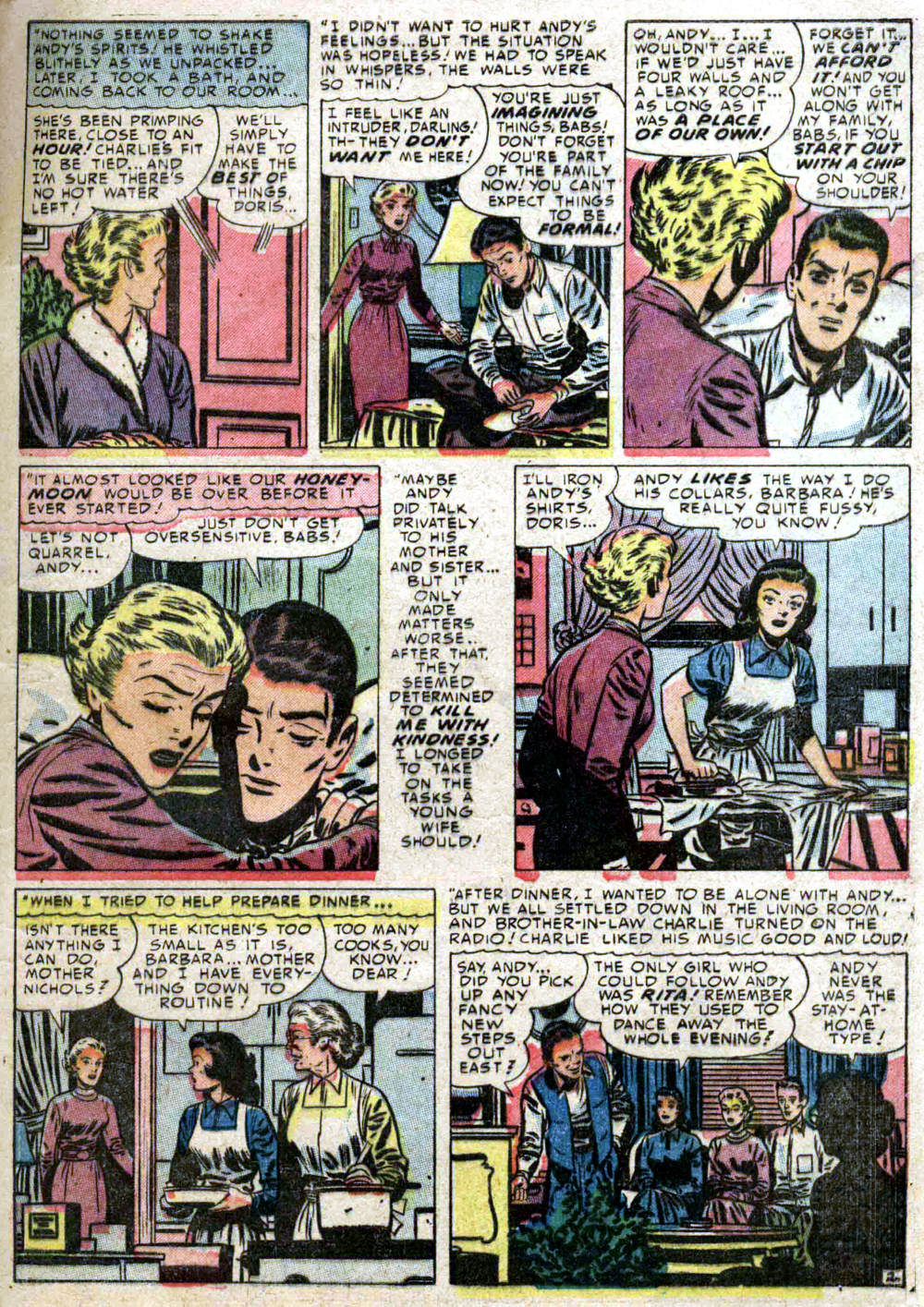
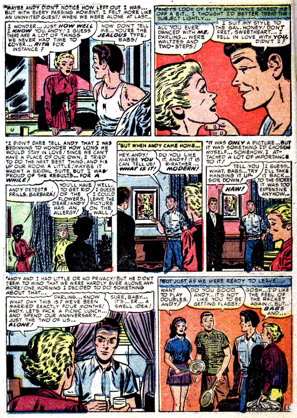
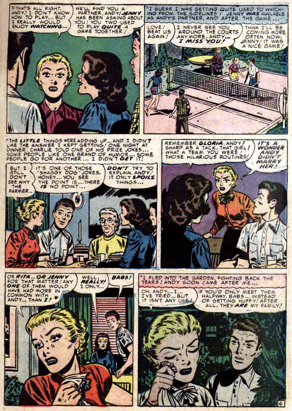
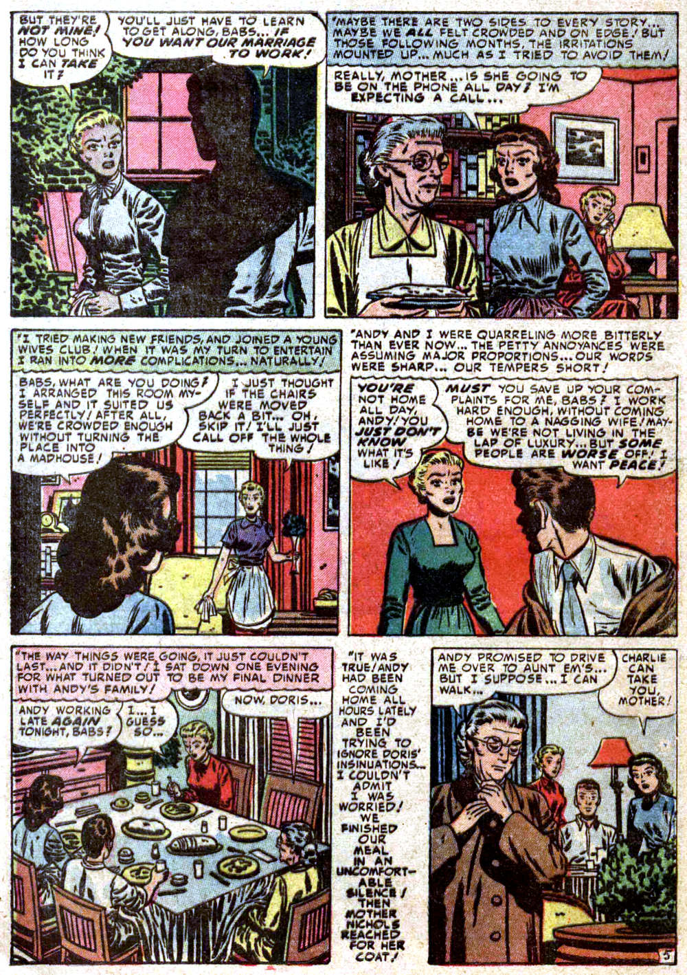
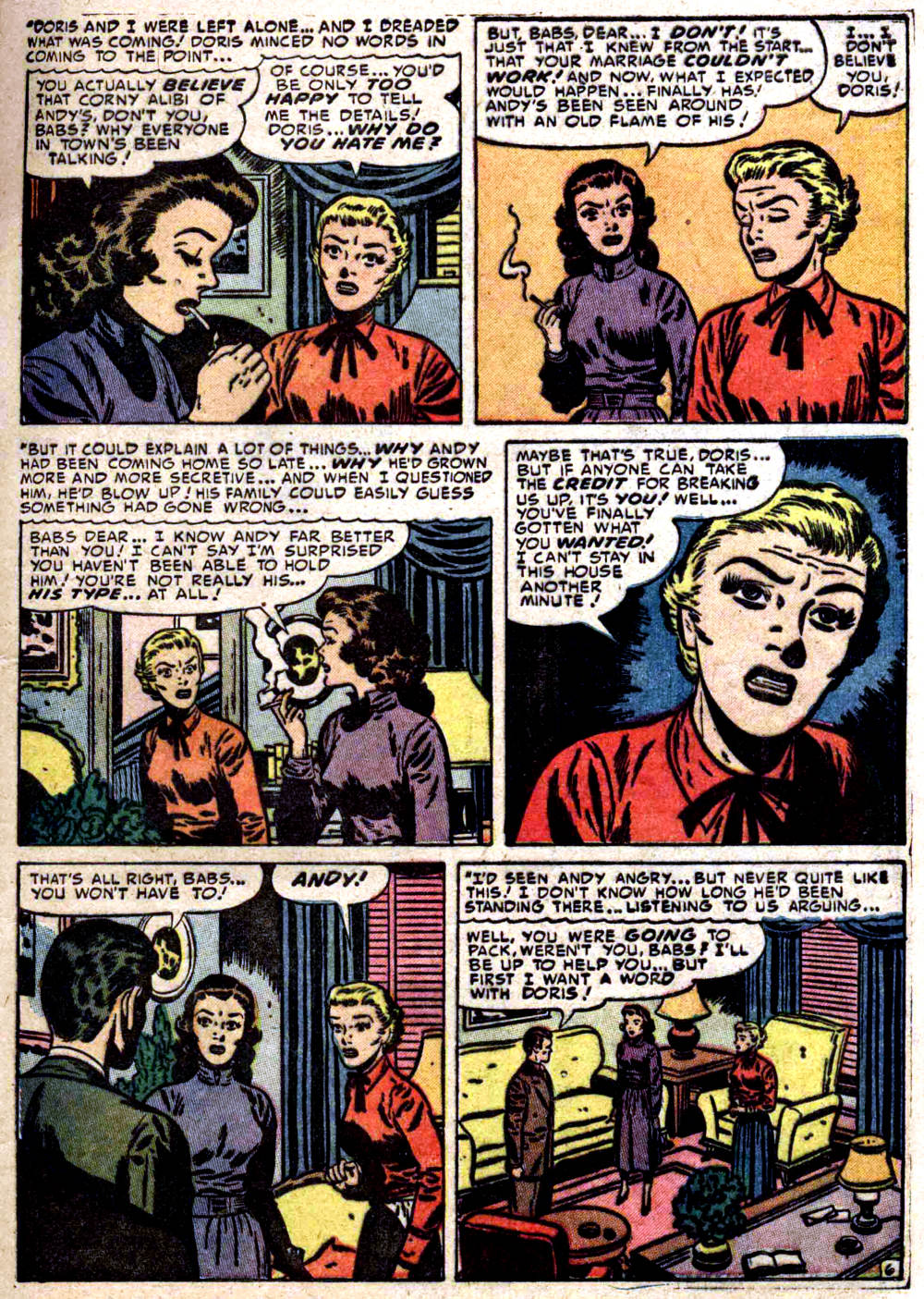
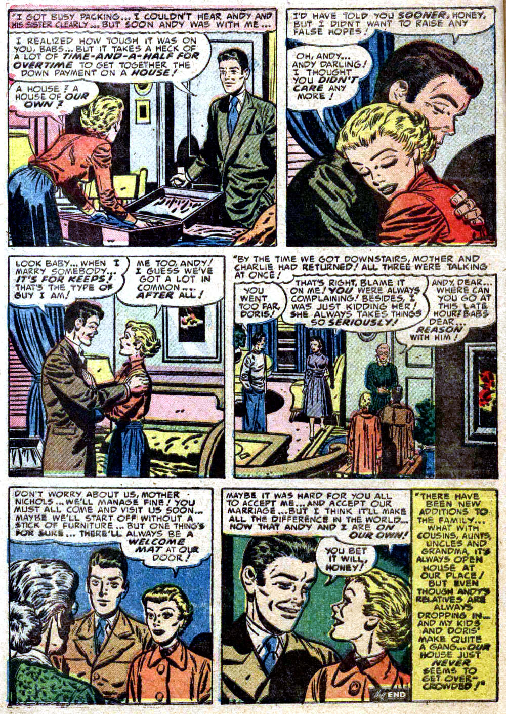
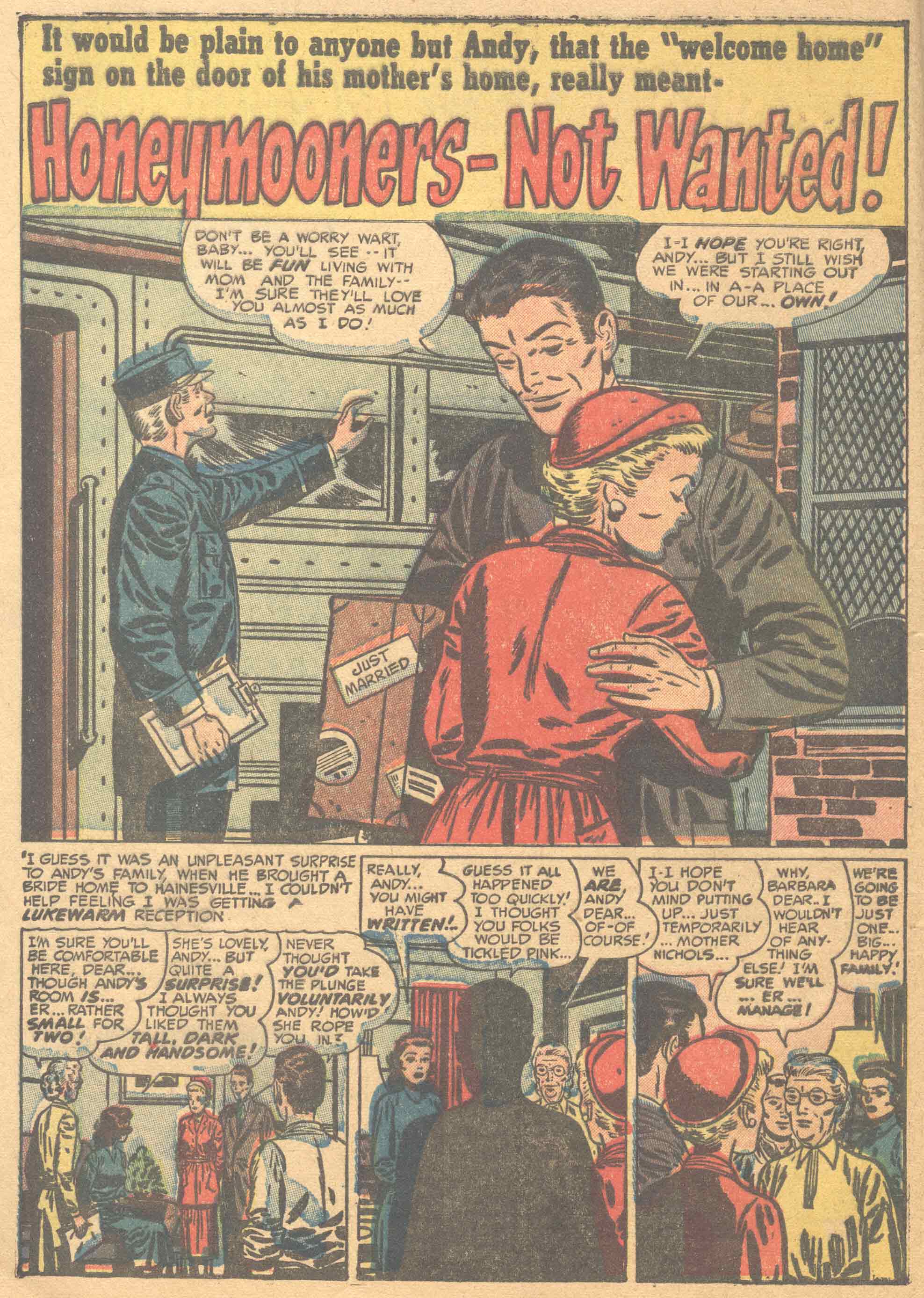
Time for more comics, I think. This time around, we’ve got “Honeymooners — Not Wanted!” from Young Romance #49 (vol. 6, no. 1); neither the script nor the art are credited in the comic, and comics.org hasn’t indexed the issue yet, but foolhardy pseudo-aficionado that I am, I’m going to go head and attribute the art, at least, to a long-time RCN favourite, Bill Draut:
[CLICK IMAGES TO ENLARGE]
The scans are from the Digital Comics Museum, but I’ve processed them a bit for display here. What do I mean by “processed”? Scroll down to the bonus section below for a before-and-after comparison of the opening page.
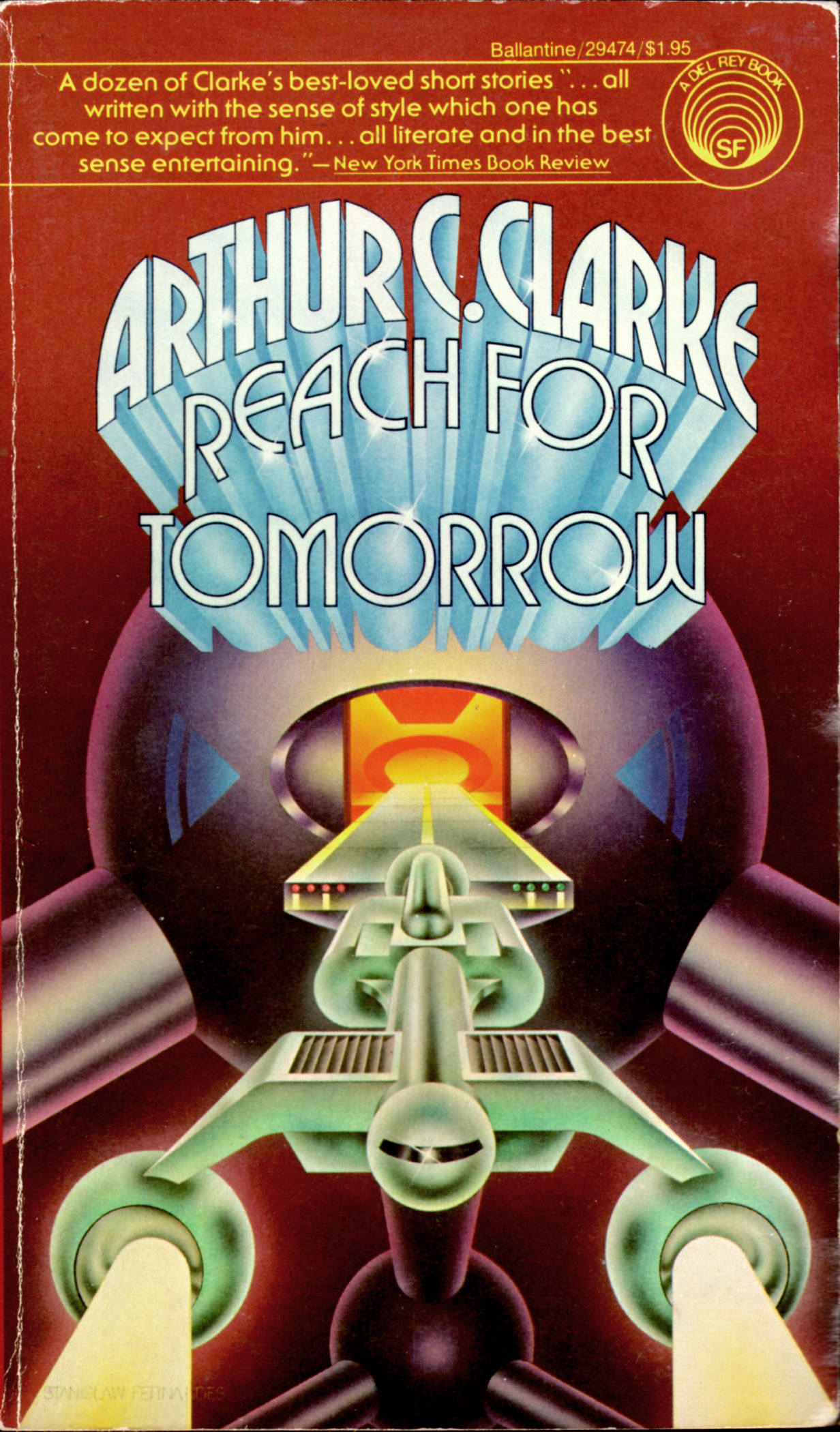
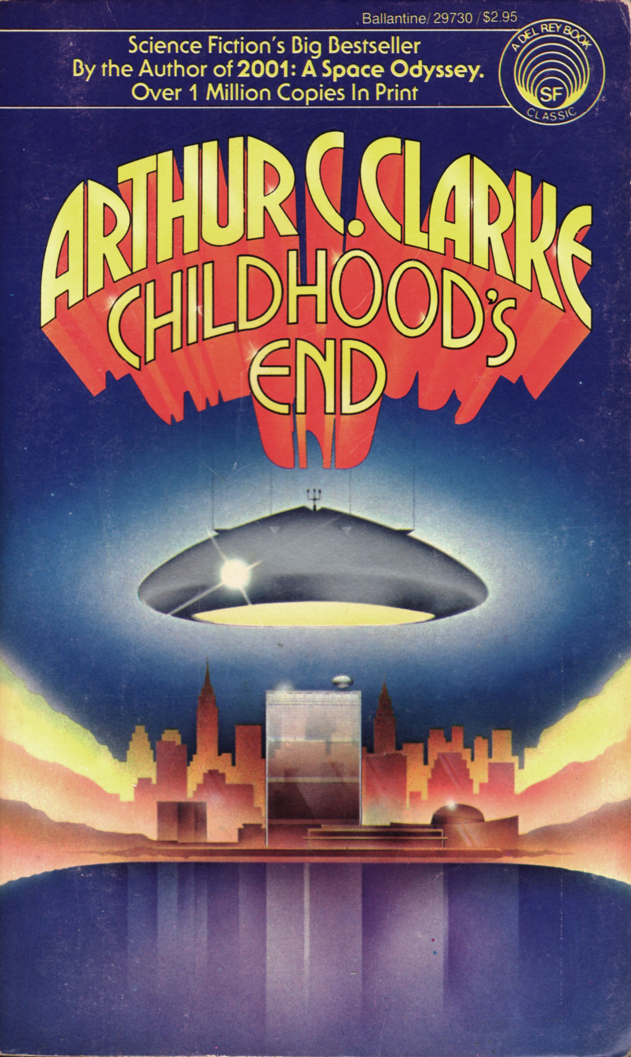
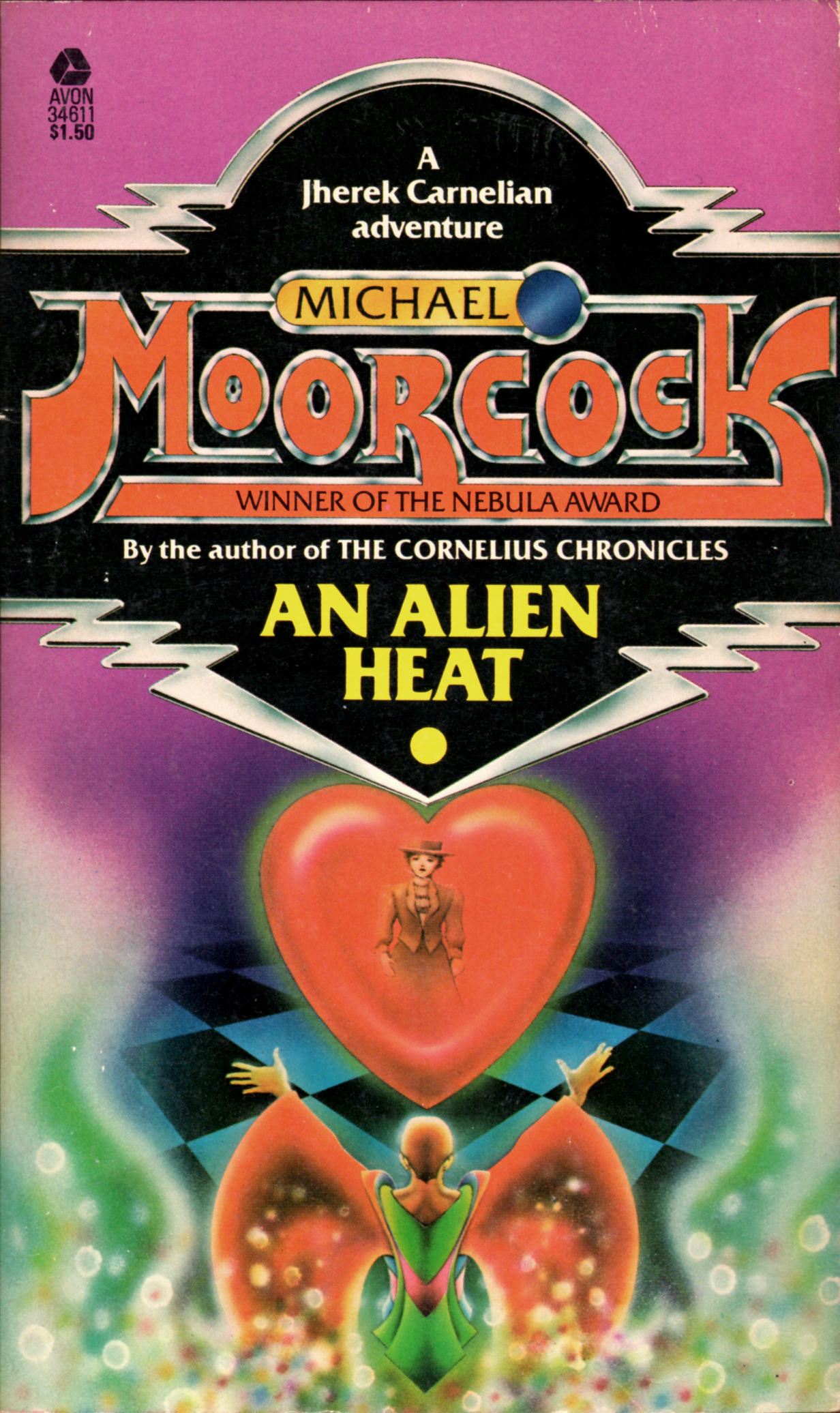
Since I started TRANSISTORADIO back in August, I have been even slower to post new stuff here at RCN than I used to be, but this evening, I found the time to scan and process four covers with airbrush art by Stanislaw Fernandes, whose work has been featured once before here at RCN. Enjoy!
[CLICK IMAGES TO ENLARGE]
ABOVE: Arthur C. Clarke, Reach for Tomorrow (NY: Ballantine, 1972), 29474, with cover art by Stanislaw Fernandes.
ABOVE: Arthur C. Clarke, Childhood’s End (NY: Ballantine, 1974), 29730, with cover art by Stanislaw Fernandes.
ABOVE: Michael Moorcock, The Cornelius Chronicles (NY: Avon, 1977), 31468, with cover art by Stanislaw Fernandes.
ABOVE: Michael Moorcock, An Alien Heat (NY: Avon, 1977), 34611, with cover art by Stanislaw Fernandes.
Keywords:The Cornelius Chronicles and An Alien Heat by Michael Moorcock, Childhood’s End and Reach for Tomorrow by Arthur C. Clarke, Stanislaw Fernandes.
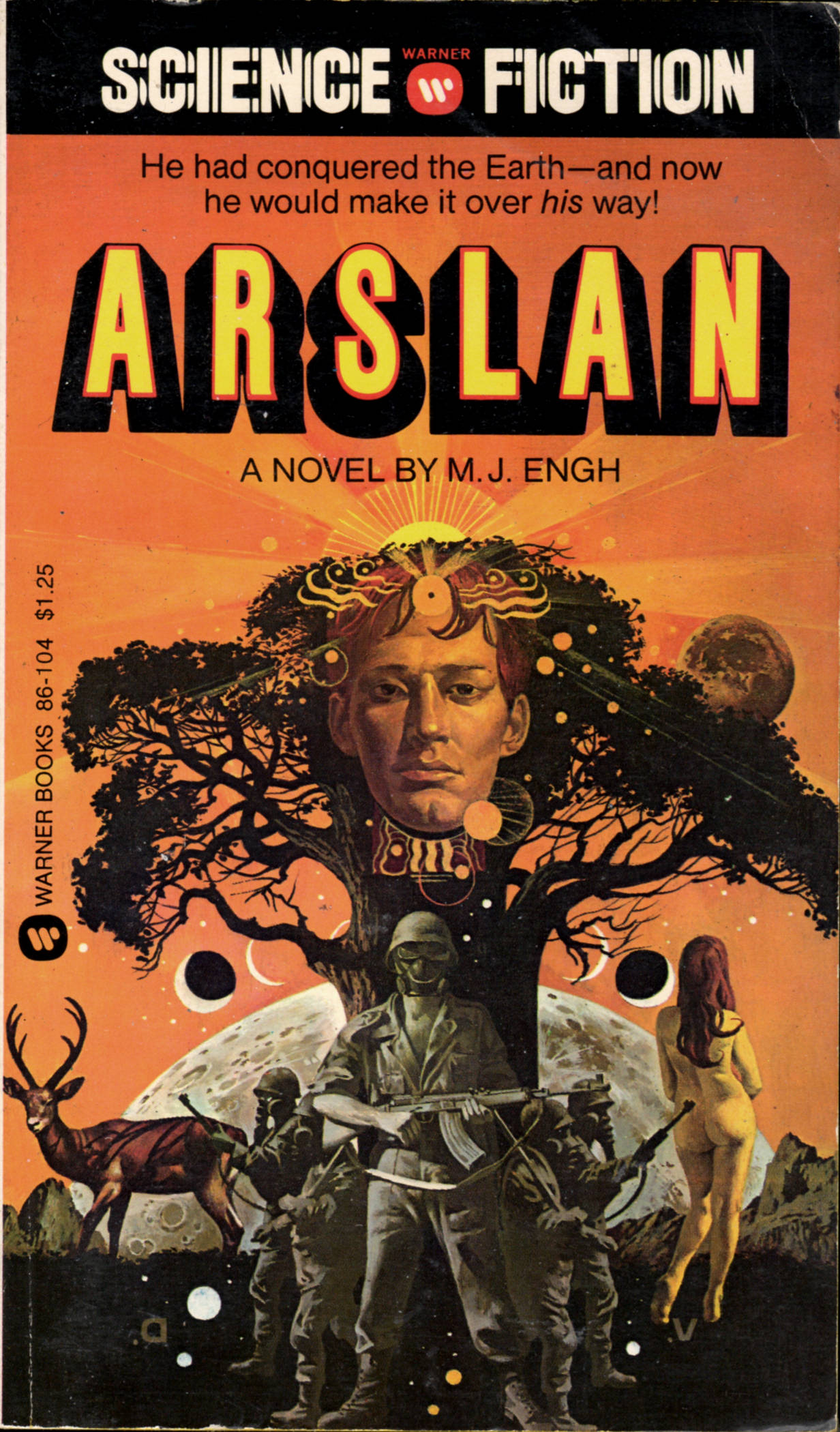
More cover scans this morning! Vincent Di Fate is a big name in SF illustration — he was inducted into the SF Hall of Fame in 2011 — but his work has never been featured on RCN. My problem with Di Fate’s work is that, generally speaking, I find it lacking in originality and oomph, but I’ve tried to keep an open mind, and now I finally have three in hand that I think are interesting, though I still can’t shake the feeling that the images have been cobbled together in an impersonal, stylistically nondescript sort of way:
[CLICK IMAGES TO ENLARGE]
ABOVE: Philip José Farmer, To Your Scatted Bodies Go (NY: Berkley, 1973), with cover art by Vincent Di Fate.
ABOVE: Roger Elwood, ed., The Other Side of Tomorrow (NY: Pyramid, 1975), with cover art by Vincent Di Fate.
ABOVE: M. J. Engh, Arslan (NY: Warner, 1976), 86-104, with cover art by Vincent Di Fate.
BONUS IMAGES:
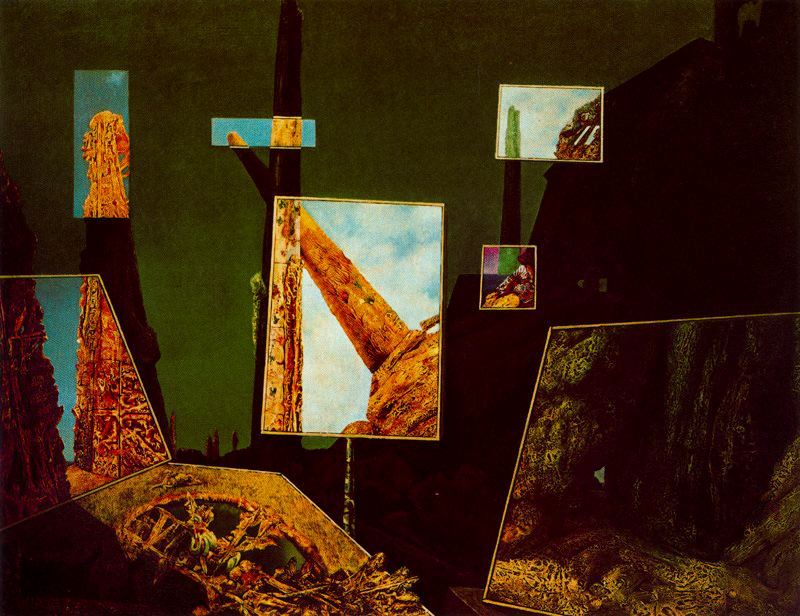
ABOVE: Max Ernst, Day and Night (1941), oil on canvas, 146 x 112 cm. Via TRANSISTORADIO.
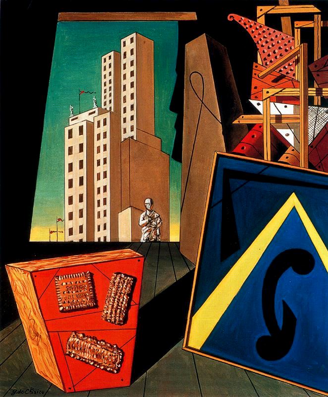
ABOVE: Giorgio de Chirico, Evangelical Still Life (1956), oil on canvas, 50 x 60 cm. Collection of Museo Botero, Bogotá, Colombia. Via TRANSISTORADIO.
Keywords:Arslan by M. J. Engh, To Your Scatted Bodies Go by Philip José Farmer, The Other Side of Tomorrow by Roger Elwood, ed., Vincent Di Fate.
Here at RCN, we are unaccountably proud of our unsung power to distract an uncommunicative coterie of unwashed hipsters from the unbounded corruption of the uncaring world with an unsteady stream of unprofessional scans of unsound books from the unkempt collection of RCN’s undistinguished doofus-in-chief, yours truly. Like these, for instance:
[CLICK IMAGES TO ENLARGE]
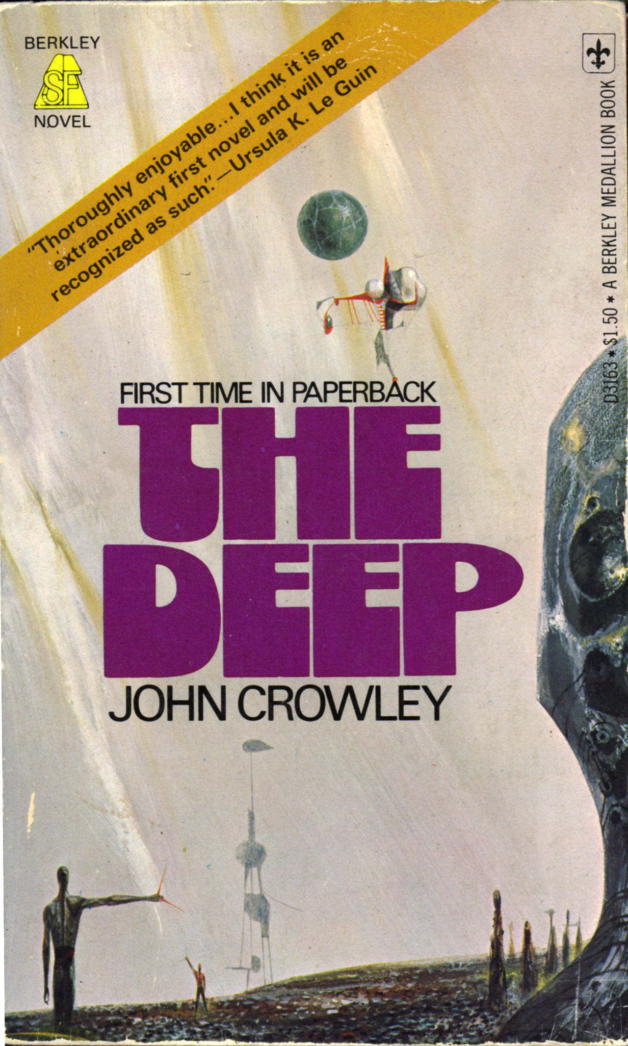
ABOVE: John Crowley, The Deep (NY: Berkley, 1976), D3163, with cover art by Richard Powers.
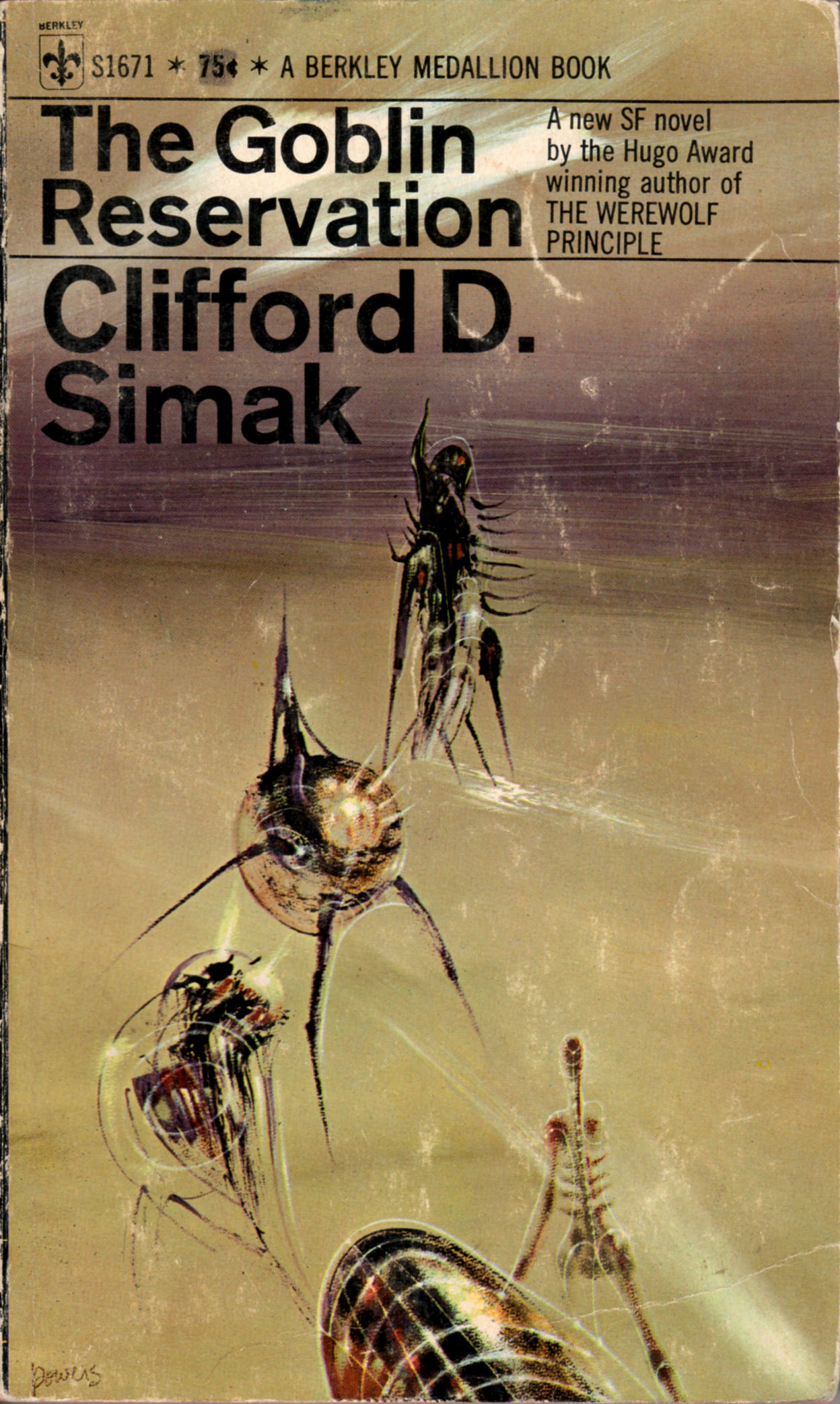
ABOVE: Clifford D. Simak, The Goblin Reservation (NY: Berkley, 1969), S1671, with cover art by Richard Powers.
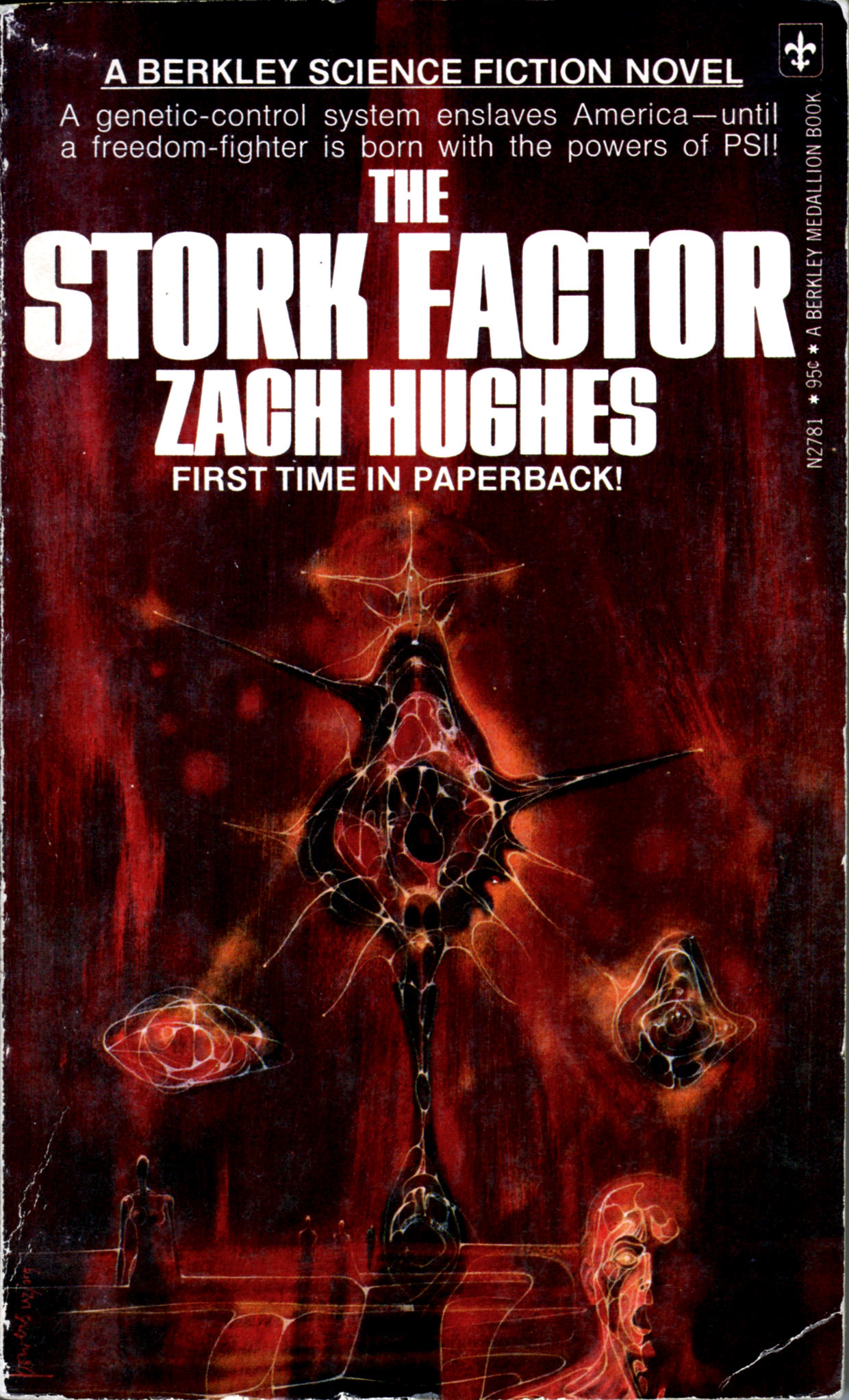
ABOVE: Zach Hughes, The Stork Factor (NY: Berkley, 1975), N2781, with cover art by Richard Powers.
Keywords:The Stork Factor by Zach Hughes, The Deep by John Crowley, The Goblin Reservation by Clifford D. Simak, Richard Powers.
I have all sorts of used books in my personal library that I purchased I can’t remember when for maybe a quarter or fifty cents a piece just for the cover art, including these, which I just scanned for display here at RCN:
[CLICK IMAGES TO ENLARGE]
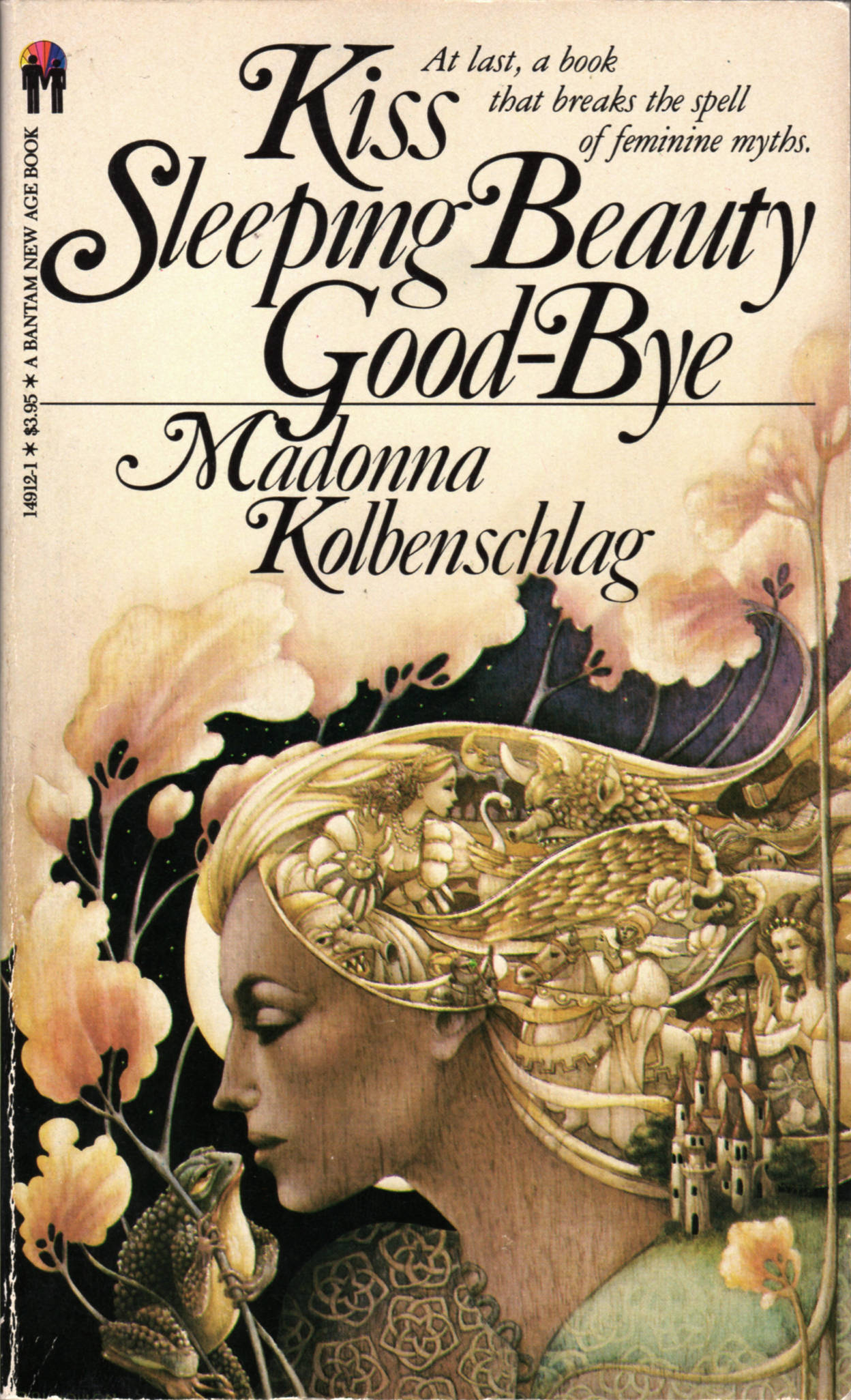
ABOVE: Madonna Kolbenschlag, Kiss Sleeping Beauty Good-Bye (NY: Bantam, 1981), with cover art by Leo and Diane Dillon.
ABOVE: Shakti Gawain, Creative Visualization (NY: Bantam, 1985), with cover art by Leo and Diane Dillon.
Shakti Gawain? Of course, Shakti Gawain! Would anyone in the 1980s have purchased new-age claptrap like Creative Visualization had it been penned by Mike Smith from Canmore, Alberta? Not bloody likely!
And will you look at that: both the copyright page and the author’s acknowledgement credit the Creative Visualization cover art to Rainbow Canyon… wait, what? Rainbow Canyon? Of course, Rainbow Canyon! It’s perfect!
The other cover is uncredited, but you and I both know that the art for both Kiss Sleeping Beauty Good-Bye and Creative Visualization is by the Dillons, right?
Keywords:Kiss Sleeping Beauty Good-Bye by Madonna Kolbenschlag, Creative Visualization by Shakti Gawain, Leo and Diane Dillon.


