"This day's experience, set in order, none of it left ragged or lying about, all of it gathered in like treasure and finished with, set aside." –Alice Munro, "What is Remembered"
I know you want it, but I don’t own the following page, so don’t bother asking me if it’s for sale; I also don’t know who does own it, so don’t bother asking me about that, either:
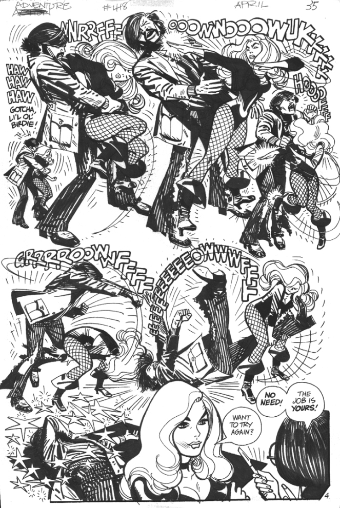
Man, that page looks so much better in black and white than it does in colour! Toth drawing Black Canary was a match made in heaven.
Well… in all fairness, the two paintings posted below are different enough that I probably should have tossed this post into the “Connections” category. And you know what? I think I might have done so, if only Boas’s style here weren’t every bit as derivative as his concept…
[CLICK IMAGES TO ENLARGE]
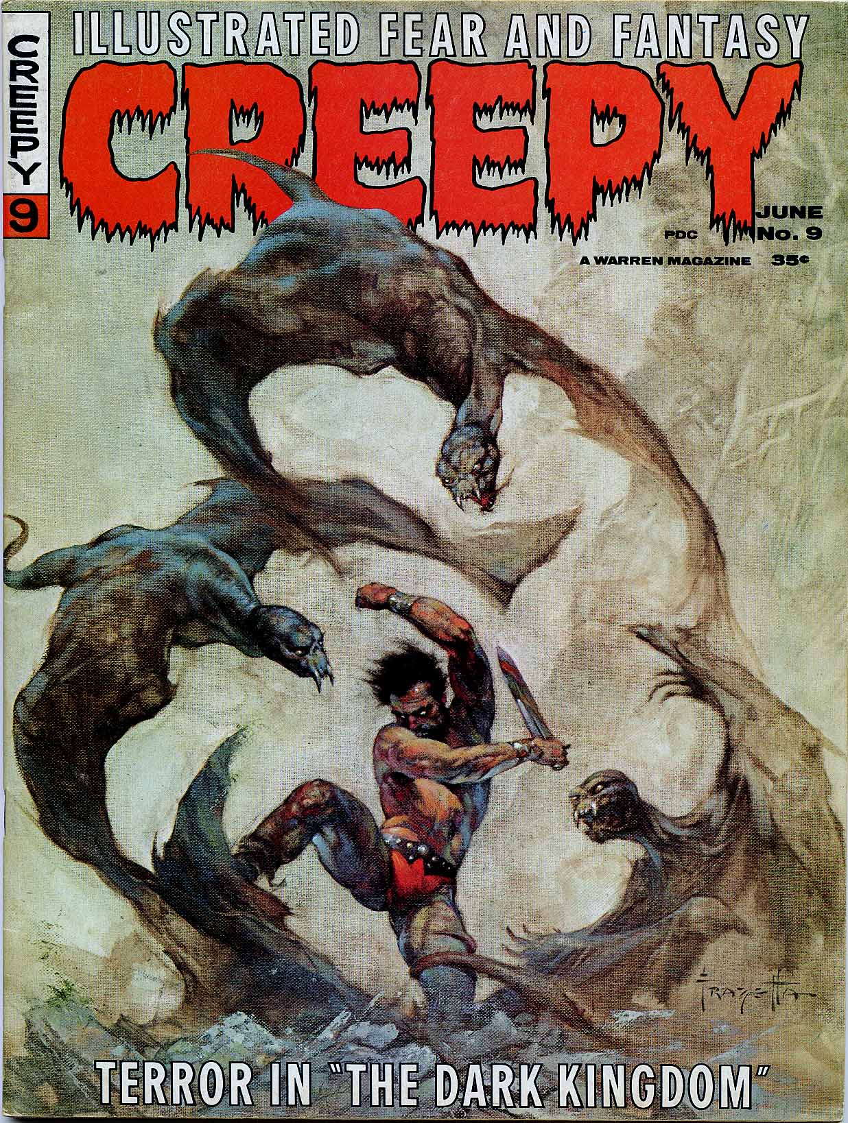
ABOVE: Frank Frazetta, The Dark Kingdom, Creepy, vol. 1, no. 9 (June 1966).
ABOVE: Marcus Boas, untitled illustration, signed and dated 1982, back cover, Heroic Fantasy, vol. 1, no. 1 (February 1984).
Marcus Boas’s debt to Frazetta in the above painting is clear enough, I think; however, in terms of painting technique, colour sense, and model types, Boas owes an even bigger debt to Boris Vallejo circa 1980. Because the fact is, Boas’s Heroic Fantasy painting is pure pastiche. It has nothing original about it other than the poorly designed creatures whose misshapen wings are attached to their bodies by wishful thinking rather than by anatomy and the inevitable awkwardness that seems to emerge whenever a mediocre illustrator attempts to make changes to a composition he has cribbed from an acknowledged master.
BONUS IMAGES:
Two covers by Boris Vallejo, scanned from the paperback library of yours truly:
ABOVE: Donald J. Pfeil, Through the Reality Warp (New York: Ballantine, 1976), with cover art by Boris Vallejo.
ABOVE: Andrew J. Offutt and Richard K. Lyon, Demon in the Mirror (New York: Pocket Books, 1978), with cover art by Boris Vallejo.
As I recall, Boris’s un-Frazetta-like cover for Demon in the Mirror made a big impression on me as a teenager, and truth be told, it remains one of a handful of Boris’s covers that I quite like. In recent years, Boris has unfortunately transformed his fantasy art into a platform to indulge what can only be described as a personal fetish for the bodybuilder physique, both male and female. Notice, however, that no bodybuilders were recruited to pose and flex for either of the above covers — thank god!
Keywords:Through the Reality Warp, Demon in the Mirror.
ABOVE: Daoma Winston, The Return (New York: Avon, 1972), with cover art by Robert McGinnis.
ABOVE: John D. MacDonald, The Crossroads (New York: Fawcett, n.d.), with cover art by Robert McGinnis.
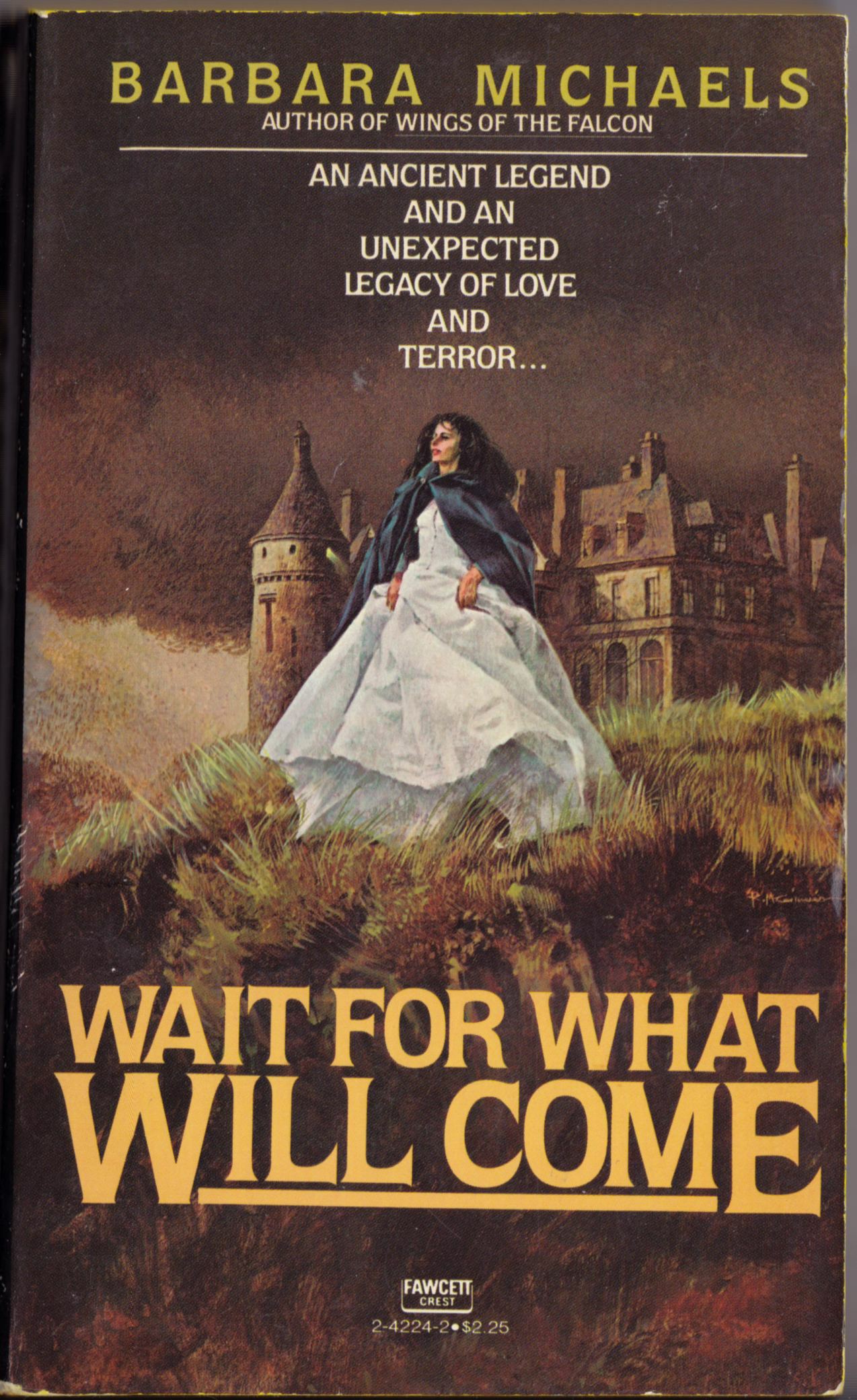
ABOVE: Barbara Michaels, Wait for What Will Come (New York: Fawcett, 1978), with cover art by Robert McGinnis.
The lesson here: if you’re fleeing from danger, or just out taking the air, alone, on the verge of a dangerous precipice, and you’re wearing a dress, you’re going to have to hike it up in front with your hands to avoid tripping headlong into the clutches of an insistent lover or over the brink. Women already know this; men, not so much.
Keywords:The Return, The Crossroads, Wait for What Will Come.
ABOVE: Gustav Klimt, Medicine (1900 – 1907), oil on canvas, 300 x 430 cm. Destroyed by fire in 1945.
ABOVE: Gustav Klimt, Medicine colour preliminary painting (1897 – 98), oil on canvas, 72 x 50 cm.
ABOVE: Jeffrey Jones, Ceremony (1970).
ABOVE: Jeffrey Jones, Tree (1971).
ABOVE: Gustav Klimt, Philosphy (1899 – 1907), oil on canvas, 300 x 430 cm. Destroyed by fire in 1945.
ABOVE: Gustav Klimt, Jurisprudence (1903 – 1907), oil on canvas, 300 x 430 cm. Destroyed by fire in 1945.
A handful of photographs and preparatory sketches are all that is left of Klimt’s controversial “Faculty Paintings.” All three — Philosophy (1900), Medicine (1901), and Jurisprudence (1903) — were destroyed in May 1945 when the retreating Nazis, who had illegally seized Klimt’s paintings from their legitimate owners, set fire to Schloss Immendorf, a castle in Lower Austria to which the paintings had been transported in 1943 for safe keeping.
P.S. The reason I’ve included the photo of Jurisprudence is simply to complete Klimt’s triptych for those who haven’t seen it. It’s not because I think it had a particular influence on the paintings by Jones included above.
P.P.S. Yes, I am aware that there are several other Klimt-inspired paintings by Jones. Maybe another time…
ABOVE: Jeffrey Jones, original art for “Extraordinary Verse: ‘The Tiger’ by William Blake,” Vampirella #34 (June 1974). From the collection of Rob Pistella.
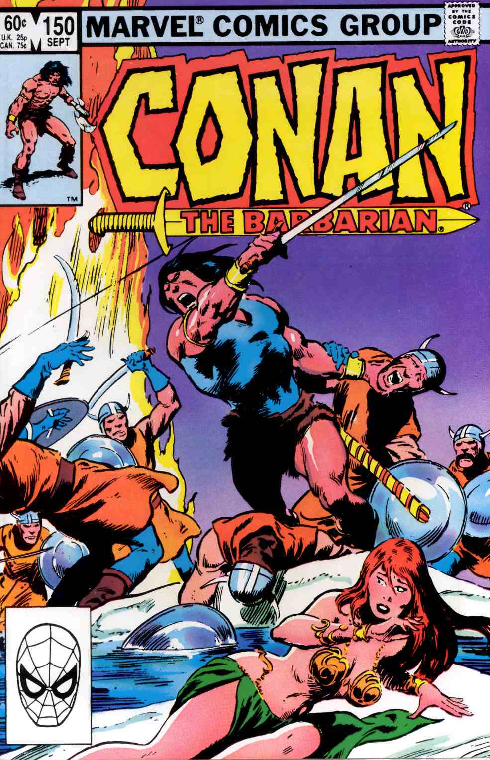
What’s interesting to me about the above comparison is how much of John Buscema’s original composition for the cover of Conan the Barbarian #150 was cropped out of the printed version, presumably either by editor Larry Hama or by editor-in-chief Jim Shooter. Maybe if Buscema hadn’t shown Conan chopping a guy through the throat with his sword, the editors would have published it uncut. Maybe.
The only issues of Conan that I have ever searched through dusty back-issue boxes to find and add to my collection were issues in which Barry Smith inked Barry Smith, John Buscema inked John Buscema or Gil Kane inked Gil Kane. The unpublished cover of Conan the Barbarian #150 looks like pure John Buscema to me.
Bonus Video:
Here’s a youtube video that includes footage of John Buscema pencilling and then inking a pin-up of Captain America along with footage of Bill Sienkiewicz creating a quick portrait Electra with marker, brush and ink, and white-out:
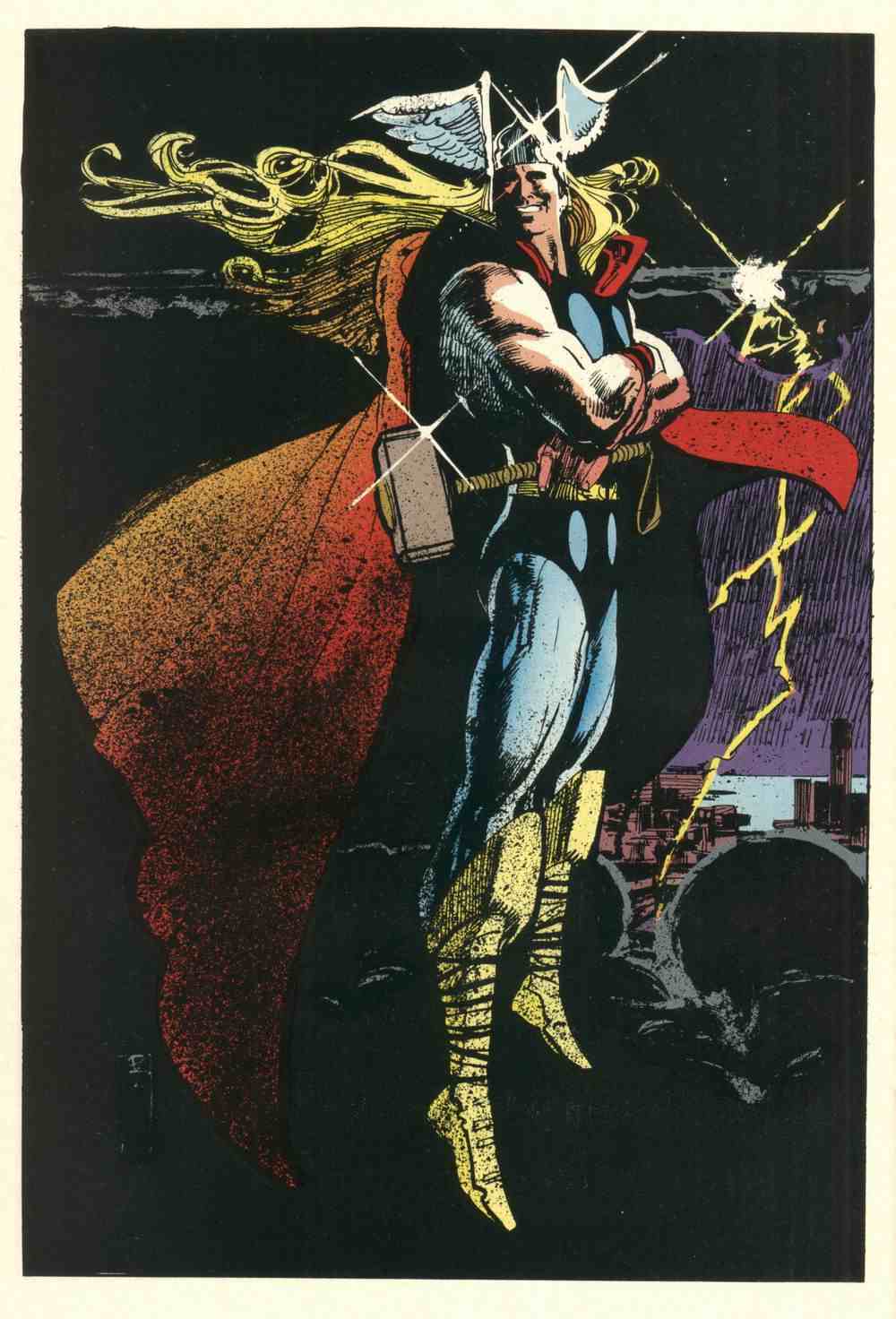
From Marvel Fanfare #8 (May 1983), “The Bill Sienkiewicz Portfolio,” coloured by Christie Scheele:
Notice Sienkiewicz’s Jeffrey Jones-inspired signature. Not really any evidence of Jones’s influence in the drawing, however. Ralph Steadman, maybe. Bob Peak, definitely — especially in the Thor image, but in some of the others as well. Neal Adams, definitely — all over the place. Jones, not so much.
To my eye, at least.
For one thing, Sienkiewicz’s figures are just not specific enough. They’re not carefully observed. There are no details that make you think, yes, that’s how a body really looks, and yes, that’s how it moves! Jones’s best drawings are filled with such details.
ABOVE: First Jones, then Sienkiewicz.
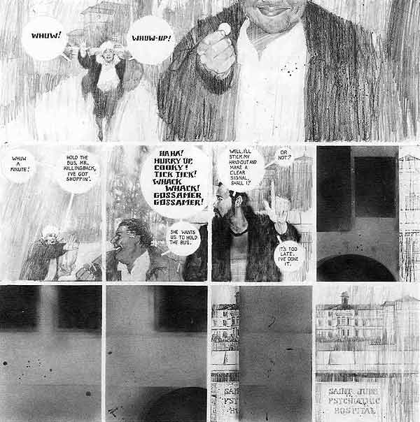
Seven years later, Sienkiewicz was hard at work on the artwork for Big Numbers, where he combined a loose mixed-media illustrative technique with extensive photo reference. Here’s a random sample from issue #1, as featured on Bill Sienkiewicz’s official Web site (where the style is explicitly identified as “photo-realistic”):
And here’s another:
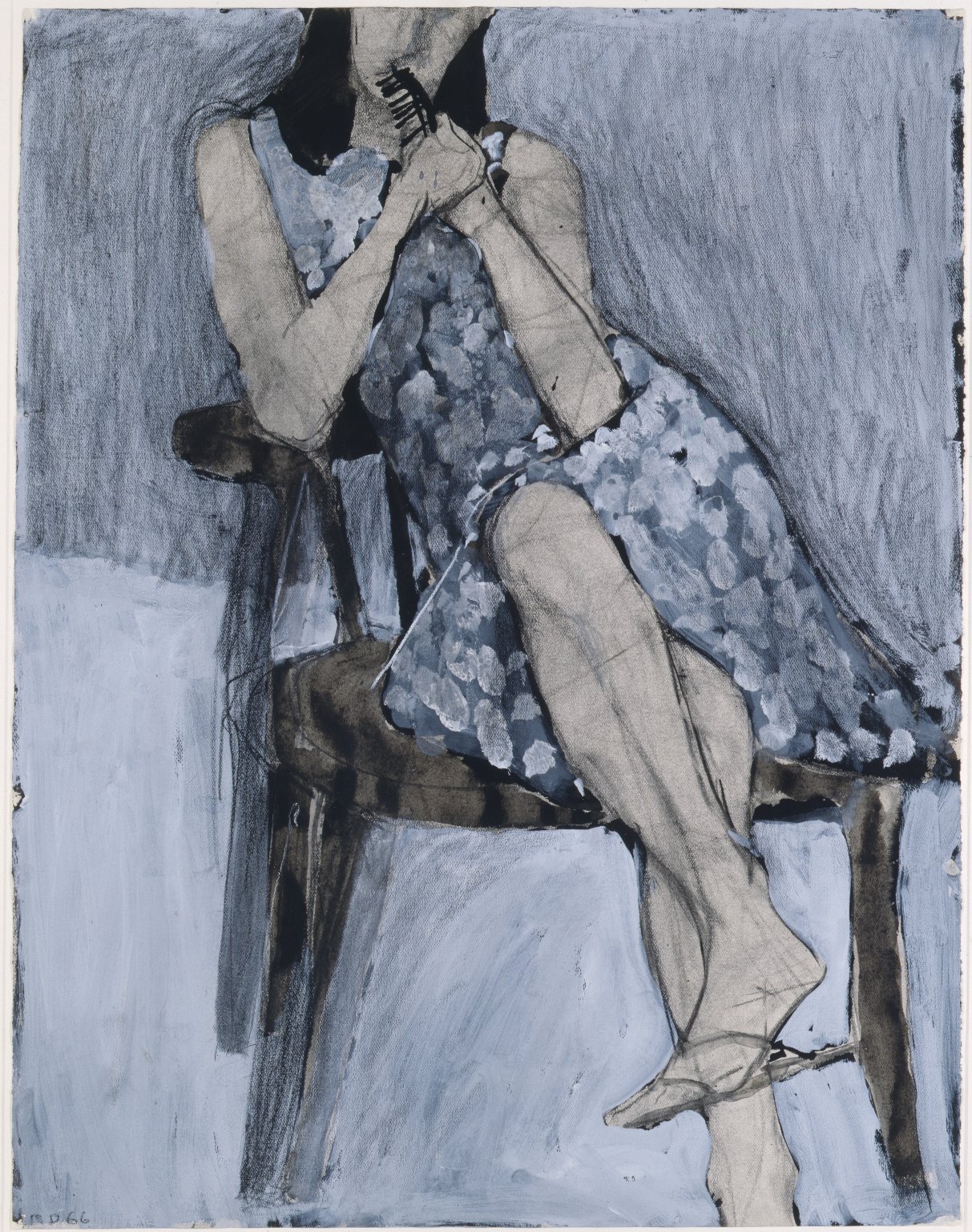
It was a relatively original synthesis of the influences that Sienkiewicz had formerly worn on his sleeve, but still — to my eye — Sienkiewicz’s Big Numbers style owed more to work such as Richard Diebenkorn’s mixed-media figure drawings (see, for instance, Diebenkorn’s Seated Woman No. 44 [1966] posted below) — along with a certain highly influential school of heavily photo-referenced but painterly illustration art that emerged in the 1960s and steamrolled into the 1970s and beyond (Bernie Fuchs comes to mind here, and Robert Heindel, and the various Spanish illustrators whose photo-based work in ink, pencil, charcoal, oil, etc., came to dominate the Warren comics magazines, especially Vampirella) — than it ever did to Jones’s Idyl or I’m Age strips.
Nor did Sienkiewicz’s work have to resemble Jones’s, for Sienkiewicz to claim Jones as an influence.
Because the simple fact is, one can be influenced by a fellow artist’s example of artistic independence, integrity, and experimentation without latching on to specific aspects of his or her style…
The Bud’s Art Books catalogue arrived today, and as I was flipping idly through the pages, I noticed something that seemed familiar in a tiny thumbnail image of a book cover (issue 1010F, page 67, item E). Here, take a look at the much larger images below, and see if you notice it, too.
Is this mere happenstance? Maybe, maybe not. You decide.